Shadcn Studio Illustrations Documentation
Animated, theme-aware visual components that can be added to your project in a single command and dropped into your own components, blocks, and pages.
In recent shadcn releases, an update was introduced to the tooltip component to address an issue related to TooltipProvider. As a result of this change, projects using the Tooltip component without an explicitly defined TooltipProvider may now encounter errors across affected blocks and components.
To resolve this, please ensure that TooltipProvider is added at the appropriate level in your layout file.
What does the Illustration mean?
An Illustration is a self-contained, animated React component crafted by professional designers and developers — an orbit of logos, a draggable card stack, a scrolling marquee, or a pulsing ripple. Instead of building motion from scratch, you can drop a finished illustration into a hero, a bento grid, a feature card, or a dashboard widget at once, ensuring consistency and speeding up the development process.
How to effectively use the illustrations?
Before using the Shadcn Studio Illustrations, make sure that you've installed shadcn in your project by following the official installation guide.
Once your project is ready, you can begin integrating illustrations by following ways:
Visit the Illustrations page to explore categories like Orbit, Card Stack, Marquee, Ripple Effect, and more.


Copy the Code
- Choose your desired illustration (e.g., Logo Orbit).
Hover the card and click the Code icon to view the different files that make up the illustration.
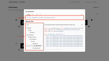
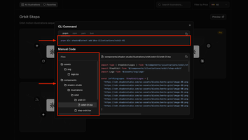
- Copy the code and paste it into your project, following the folder structure shown on the left in the above image.


Using Shadcn CLI
The Shadcn CLI is the fastest way to add an illustration to your project. It handles everything automatically:
- Downloads the illustration and every helper file it is built from
- Installs required dependencies
- Sets up proper file structure
- Configures all necessary imports
Every illustration is more than one file. Alongside the illustration itself, the CLI installs the shared helper it is built on (for example logo-orbit.tsx or auto-card-stacking.tsx) and the UI primitives it depends on (such as components/ui/orbiting.tsx).
If you copy the code by hand instead of using the CLI, keep the following in mind:
- Copy every file in the tree (Recommended):
The file tree in the code dialog lists everything the illustration needs. Copy each file to the path shown, not only the top-level component, or the import will fail.
- Install the animation library
Illustrations animate with
motion. Add it to your project if it is not already installed, along with any shadcn/ui component the illustration imports, such as Avatar or Card.
Using Download Button
Perfect for offline work or when you want full control over file organization. Here's how:


Step 1: Download the ZIP
- Find your desired illustration and hover its card
- Click the Download icon
- Save the ZIP file to your computer
Step 2: Extract Files
- Unzip the downloaded file
- You'll find folders like:
components/,lib/,assets/ - Each folder contains the necessary files for the illustration
Step 3: Move to Your Project
- Copy files to your project's corresponding folders
- Update import paths if your project structure is different
Step 4: Install Dependencies
- Check the included imports.
- Install the dependencies used in the files.
Step 5: Test Integration
- Import the illustration in your desired route/component
- Run your development server
- Check that the animation plays and look for any missing imports or styling issues
Use Cases for Shadcn Illustrations
Shadcn illustrations are widely used across many types of modern web projects.
| Use case | Example |
|---|---|
| Hero section | Replace the screenshot-in-a-browser-frame with a globe, an agent pipeline or a device mockup — an animated illustration that moves. First impression, sorted. |
| Feature section | One illustration beside one paragraph. Swap the illustration and the whole story reframes. |
| Bento grid | Mixed-size tiles, each with its own animated illustration and stat. Ships as a ready-made visual composition so the grid math is done for you. |
| Feature grid | Same layout, six mini-illustrations instead of six icons. |
| Stats & social proof | CountUp stats, avatar stacks, logo clouds — the trust section, animated. |
| Integrations | Logos orbiting your mark or converging into your product. |
| Developer / API pages | Typing commands, request/response arcs, diff views, PR checks running. |
| AI product pages | Prompt boxes, retrieval fan-outs, tool-call rows, voice orbs. Maps directly to the #1 unmet demand in the ecosystem. |
| Pricing & checkout | Card, checkout summary, usage meter. |
| Empty / error states | Empty, error, maintenance and not-found states with motion. |
See each of these rebuilt with a live illustration in the use cases section of the Illustrations page.
Aligning Chart Colors with Shadcn Studio
By default, shadcn provides its own chart color palette. However, these default colors may not compatible with our design system used in our illustrations. To ensure your charts visually align with the illustrations design, follow the steps below to override the chart color variables.
Step 1: Open the Theme Customizer
Access the Theme Customizer from the right-top of navigation
Step 2: Reset the Customizer (Important)
Make sure the Theme Customizer is in its default (reset) state before proceeding.
Step 3: Copy the CSS Variables
- Click the Copy button (located next to the Undo/Redo buttons).
- A dialog will open.
- Navigate to the second tab: Step 2 - CSS Variables.
Step 4: Use the Provided Chart Variables
You will find the following CSS variables:
Step 5: Replace These Variables in Your Global Styles
If you've already set up shadcn, replace the existing --chart-* variables in your global CSS file with the ones above. If not, simply paste them into your global.css. This will override the default chart colors and match them with the illustrations theme
Previewing Illustrations
See exactly how an illustration animates and how it responds to your theme before adding it to your project:
- Click Preview on any section to open every illustration in it full-screen, in a new tab
- Use Select Theme to apply any Shadcn Studio theme and watch the illustrations restyle themselves, then Original Theme to go back
- Toggle between light and dark mode to confirm both look right


Filtering and Finding Illustrations
Shadcn Studio provides a search box and a pricing filter to help you quickly find the perfect illustration for your project. Both are available on the Illustrations page and on each category page.
Search
Type in the search box to instantly narrow the list down to illustrations matching your query.
Filter by pricing
- Select All to browse every available illustration
- Choose Basic or Pro to explore what each plan unlocks
- Pick Free to see only the illustrations you can use for free


How to customize the illustrations?
Because every illustration is a plain React component built with Motion and TailwindCSS, customizing it is easy. Here's how you can do it:
1. Using illustration props:
The helper each illustration is built on exposes props for its size, speed, and direction, so you can tune the motion without touching the animation code.
For example:
Change an orbit: You can enlarge the ring, slow it down, or reverse it using props like
2. Using TailwindCSS:
TailwindCSS provides utility classes to easily adjust the spacing, padding, margin, and other layout properties of the wrapper you place an illustration in.
For example:
Padding: You can adjust padding using classes like
p-2,p-4(increasing the padding).Margin: Similarly, you can adjust margin using classes like
m-2,m-4(increasing the margin).Colors: Swap a token class such as
bg-mutedortext-primaryfor another to recolor one part of the artwork while the rest keeps following your theme.
3. Change the content
The logos, avatars, cards, or stats an illustration shows live in a plain array at the top of its file. Replace the entries with your own brands, team, or numbers to make the illustration yours. Explore the sections built around each one on the Blocks page.
4. Update Icons
Illustrations use Lucide Icons from lucide-react, but you can also use any other icon of your choice.
With these simple steps, you can quickly adjust and style your illustrations using both props and TailwindCSS classes without needing to write extra CSS.
How to Remove Animations from Illustrations
Since every illustration is built with the same animated components as Shadcn Studio blocks, removing or replacing the animated components works exactly the same way as it does for blocks. For the full list of standalone animations you can remove and the static alternatives you can swap in, refer to the Blocks documentation.