Shadcn Widgets Component
Explore modern, user-friendly Shadcn widget blocks to elevate your app and dashboard UI with seamless interactivity and improved user engagement.
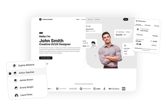
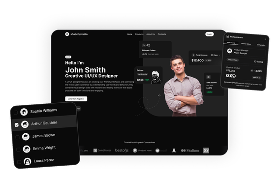
Shadcn Statistics Component Blocks
Shadcn Statistics Component Blocks are modern UI components designed to display key metrics and performance indicators in dashboards and applications. Built using Shadcn UI, Tailwind CSS, and React, these components help developers present numerical insights in a clear and visually structured format.
Statistics components are widely used in admin dashboards, SaaS analytics platforms, business intelligence tools, and financial applications because they highlight the most important metrics at a glance. Instead of scanning raw data tables, users can quickly understand performance trends through visual metric cards and KPI indicators.
At Shadcn Studio, you will find numerous Shadcn Blocks. The statistics component blocks provide responsive metric cards and KPI displays that help developers showcase analytics data such as revenue, orders, engagement, and growth trends in dashboards.
Many teams also integrate these layouts into scalable Base UI Statistics Component Block workflows and reusable Radix UI Statistics Component Block systems for modern React applications.
What Is a Statistics Component in Web Design?
A statistics component is a UI element used to display important numerical data or performance metrics within a dashboard or website interface. These components highlight key indicators that help users quickly evaluate system performance or business results.
A typical statistics component includes:
- Key performance indicators (KPIs) or metric cards
- Large numeric values or counters
- Descriptive labels explaining each metric
- Percentage change indicators or growth trends
- Optional icons or visual indicators
Statistics components transform raw numbers into readable and visually prominent metrics, allowing users to monitor performance and track progress more efficiently.
Why Use Shadcn Statistics Component Blocks?
Shadcn statistics blocks provide structured metric displays that help developers build informative dashboards quickly.
KPI-Focused Design
Statistics components emphasize key metrics such as revenue, orders, or user growth using visually prominent numbers and labels.
Built with React and Tailwind
These Shadcn components are built using React and Tailwind CSS, enabling seamless integration with frameworks like Next.js and modern frontend stacks.
These layouts also work well for composable Base UI Statistics Component Block implementations with scalable analytics interfaces.
Quick Data Insights
By highlighting the most important metrics, statistics blocks allow users to understand performance trends instantly.
Many developers use Radix UI Statistics Component Block patterns for accessible and reusable dashboard metric systems.
Responsive Dashboard Layout
Statistics cards automatically adapt to desktop, tablet, and mobile screen sizes.
Copy-Paste Developer Workflow
Shadcn blocks follow a copy-paste or CLI install workflow, allowing developers to quickly integrate KPI widgets into dashboards.
Key Elements of a High-Quality Statistics Section
Effective statistics components include several important elements.
Large Metric Values
Prominent numeric values help users quickly identify key performance indicators.
Context Labels
Short labels explain what each metric represents.
Trend Indicators
Percentage increases or decreases help users understand performance changes over time.
Visual Icons
Icons or symbols help differentiate metrics visually.
Responsive Grid Layout
Statistics cards are typically arranged in responsive grid layouts for readability.
Types of Statistics Component Layouts
Different applications use different statistics layouts depending on the type of data they display.
KPI Card Layout
Displays individual metric cards highlighting key performance indicators.
Statistics Grid Layout
Multiple metric cards arranged in a grid for quick comparison.
Inline Metrics Layout
Compact metric displays arranged horizontally.
Trend Statistics Layout
Metrics combined with trend indicators or small charts.
Dashboard Metrics Bar
A horizontal statistics bar summarizing key metrics across the application.
Use Cases for Statistics Component Blocks
Shadcn statistics components are widely used across many types of applications.
Admin Dashboards
Display important metrics such as active users, orders, or system activity.
SaaS Analytics Platforms
Track customer engagement, revenue growth, and subscription metrics.
Financial Applications
Monitor income, expenses, and performance indicators.
Business Intelligence Tools
Present company performance statistics and KPIs.
Monitoring Systems
Display operational metrics such as uptime, response times, or usage data.
Features of Shadcn Statistics Component Blocks
Shadcn statistics blocks include several UI features designed for modern dashboards.
Common features include:
- KPI metric cards
- Numeric counters and labels
- Growth and trend indicators
- Icon-based metric displays
- Responsive grid layouts
- Tailwind CSS styling
- Accessible UI components
- Dark mode compatibility
- Flexible composition support for Base UI Statistics Component Block systems
- Accessible dashboard metric patterns for Radix UI Statistics Component Block workflows
These features help developers create clear data summaries that allow users to monitor performance metrics quickly and efficiently.
Base UI Statistics Component Block Support
Shadcn Studio layouts can be integrated into scalable Base UI Statistics Component Block workflows for modern React applications. Developers can build accessible and composable KPI interfaces while maintaining flexible dashboard layouts and reusable analytics structures.
To get proper guidence, refer the tutorial on how to Migrate from Radix UI to Base UI
Radix UI Statistics Component Block Support
The layouts also work well with Radix UI Statistics Component Block implementations commonly used in the Shadcn ecosystem. Developers can leverage accessible primitives, composable metric cards, and reusable analytics patterns for production-ready dashboards.
Many teams prefer Radix UI Statistics Component Block patterns for scalable KPI systems and modern SaaS analytics interfaces.