Shadcn Bento Grid
Display content in a flexible, grid-based layout with Shadcn Bento Grid. Perfect for showcasing products, images, or services in a responsive design.
Shadcn Bento Grid Blocks
Shadcn Bento Grid Blocks are modern UI components designed to display content in visually engaging grid layouts. Built using Shadcn UI, Tailwind CSS, and React, these blocks allow developers to showcase features, products, images, or services in a flexible grid with tiles of different sizes.
Bento grid layouts have become popular in modern SaaS websites, startup landing pages, portfolio sites, and product marketing pages because they create visually dynamic layouts that guide user attention to important information. Instead of traditional uniform grids, bento grids use varying tile sizes to establish visual hierarchy and highlight key content.
At Shadcn Studio, you will find numerous Shadcn Blocks. The bento grid blocks provide responsive layouts that allow developers to combine text, images, icons, and interactive elements in modern grid-based interfaces.
What Is a Bento Grid in Web Design?
A bento grid is a layout style where content is arranged in tiles of different sizes within a grid structure. The design is inspired by Japanese bento boxes, where compartments organize different food items visually.
A typical bento grid includes:
- Grid cards with different sizes
- Feature highlights or content blocks
- Images, icons, or product previews
- Short descriptions or titles
- Interactive hover effects or animations
Unlike traditional grid layouts with identical cards, bento grids create visual hierarchy through varied card sizes, helping emphasize important content and guide user attention.
Why Use Shadcn Bento Grid Blocks?
Shadcn bento grid blocks provide modern layout components that help developers create visually rich landing pages and product showcases.
Modern Asymmetric Layouts
Bento grids break traditional layout patterns by using cards of different sizes to create visually dynamic sections.
Built with React and Tailwind
Shadcn bento grid components are built using React and Tailwind CSS, allowing easy integration with frameworks such as Next.js and modern frontend stacks.
Flexible Content Display
Bento layouts allow developers to combine text, images, metrics, and feature highlights in a single grid.
Responsive Design
Bento grid layouts automatically reorganize content across desktop, tablet, and mobile devices.
Copy-Paste Developer Workflow
Shadcn blocks follow a copy-paste or CLI install workflow, allowing developers to quickly implement modern UI layouts without building complex grid systems from scratch.
Key Elements of a High-Quality Bento Grid Layout
Effective bento grid sections include several important elements.
Featured Tile
A large card highlights the most important feature or message.
Supporting Tiles
Smaller cards provide additional information or supporting content.
Visual Content
Images, icons, or illustrations make the layout visually engaging.
Clear Hierarchy
Different tile sizes help guide the user's attention through the content.
Interactive Effects
Hover animations or transitions can make bento grids more dynamic.
Types of Bento Grid Layouts
Different websites implement different bento grid styles depending on the type of content being presented.
Feature Showcase Bento Grid
Highlights product features using multiple cards with different sizes.
Portfolio Bento Grid
Displays creative work or projects using image-based tiles.
Product Showcase Bento Grid
Showcases product screenshots, tools, or integrations.
Statistics Bento Grid
Combines metrics and charts inside a grid layout.
Content Showcase Bento Grid
Displays blog posts, resources, or media content in a modern grid.
Use Cases for Bento Grid Blocks
Shadcn bento grid blocks are widely used across many types of websites.
SaaS Landing Pages
Highlight product features and benefits using visually engaging layouts.
Startup Websites
Present company value propositions and product highlights.
Portfolio Websites
Showcase projects, design work, or case studies.
Marketing Pages
Display services, features, or testimonials in a modern grid.
Product Showcase Pages
Highlight software tools, integrations, or product capabilities.
Features of Shadcn Bento Grid Blocks
Shadcn bento grid blocks include several UI features designed for modern websites.
Common features include:
- Asymmetric grid layouts
- Variable card sizes for hierarchy
- Image and media support
- Feature highlight cards
- Interactive hover effects
- Responsive grid breakpoints
- Tailwind CSS styling
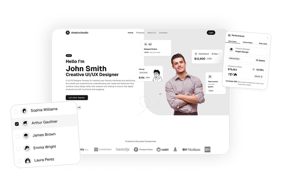
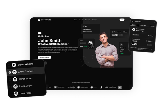
- Dark mode compatibility
These features help developers build visually dynamic landing pages that present diverse content in a structured and engaging layout.