Shadcn App Integration
Showcase app integrations clearly with these Shadcn App Integration blocks. Highlight connected tools, platforms, and services in a sleek, responsive layout.
Shadcn App Integration Blocks
Shadcn App Integration Blocks are modern UI components designed to showcase integrations between your product and third-party tools or services. Built using Shadcn UI, Tailwind CSS, and React, these blocks help developers present connected platforms, APIs, and integrations in clean and visually structured layouts.
Integration sections are widely used on SaaS landing pages, developer platforms, and product websites because they highlight how a product works with other tools in a broader ecosystem. Showing integrations with popular services such as Slack, GitHub, or Google Workspace helps build trust and demonstrates product compatibility.
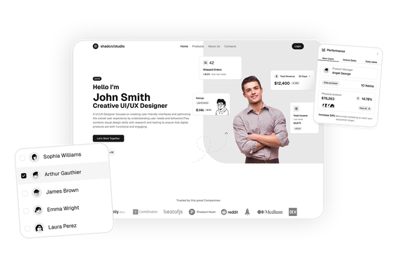
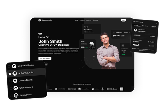
At Shadcn Studio, developers can explore a wide collection of Shadcn Blocks. The app integration blocks include responsive layouts that display integration logos, descriptions, and connection features, helping teams communicate their platform’s capabilities clearly.
Many teams also integrate these layouts into scalable Base UI App Integration Block workflows and reusable Radix UI App Integration Block systems for modern React SaaS applications.
What Is an App Integration Section in Web Design?
An app integration section is a webpage component that highlights the third-party tools or platforms that connect with a product or service. It helps users understand how a platform can integrate with their existing workflows.
A typical integration section includes:
- Logos of supported applications or services
- Short descriptions of each integration
- Icons representing platforms or tools
- Call-to-action buttons for connecting integrations
- Links to documentation or setup guides
These Shadcn Component section help users quickly see which tools a product supports and how it fits into their existing technology stack.
Why Use Shadcn App Integration Blocks?
Shadcn app integration blocks provide structured layouts that help developers present integrations clearly and effectively.
Showcase Product Ecosystem
Integration sections highlight the tools and platforms your product connects with.
Built with React and Tailwind
Shadcn integration components are built using React and Tailwind CSS, allowing seamless integration with frameworks such as Next.js and modern frontend stacks.
These layouts also work well for composable Base UI App Integration Block implementations with scalable SaaS workflows.
Visual Integration Logos
Logos and icons help users quickly recognize supported platforms.
Many developers use Radix UI App Integration Block patterns for accessible and reusable integration interfaces.
Responsive Layout Design
Integration blocks adapt across desktop, tablet, and mobile devices.
Copy-Paste Developer Workflow
Shadcn blocks follow a copy-paste or CLI install workflow, allowing developers to quickly integrate integration sections into landing pages or applications.
Key Elements of an Effective Integration Section
Successful integration sections include several important elements.
Integration Logos
Recognizable logos of tools or platforms help users quickly identify supported services.
Integration Descriptions
Short explanations describe how each integration works or what it enables.
Call-to-Action Buttons
Buttons such as “Connect”, “Learn More”, or “View Integration” guide users to additional resources.
Platform Categories
Some integration sections group tools by categories such as analytics, communication, or productivity.
Documentation Links
Links to integration setup guides help developers configure connections.
Types of App Integration Layouts
Different websites implement different integration layouts depending on the number of supported tools.
Logo Grid Integration
Displays multiple integration logos in a structured grid.
Two-Column Integration Layout
Text explaining integrations appears alongside a grid of app logos.
Integration Cards
Each integration appears as a card with an icon and description.
Tabbed Integration Interface
Integrations are grouped into categories such as communication, analytics, or marketing.
Interactive Integration Showcase
Hover effects or animations highlight integrations visually.
Use Cases for App Integration Blocks
Shadcn app integration blocks are widely used across many types of websites and applications.
SaaS Platforms
Show how the product integrates with tools like Slack, GitHub, or Zapier.
Developer Platforms
Highlight API integrations and developer ecosystem tools.
Workflow Automation Tools
Display supported automation platforms and connected services.
Product Landing Pages
Demonstrate compatibility with widely used software.
Enterprise Platforms
Showcase integrations with enterprise systems and services.
Features of Shadcn App Integration Blocks
Shadcn app integration blocks include several UI features designed for modern product websites.
Common features include:
- Integration logo grids
- App icons and tool branding
- Integration descriptions
- Call-to-action buttons
- Responsive grid layouts
- Interactive hover effects
- Tailwind CSS styling
- Dark mode compatibility
- Flexible composition support for Base UI App Integration Block systems
- Accessible SaaS integration patterns for Radix UI App Integration Block workflows
These features help developers build integration showcase sections that clearly communicate how their product connects with other tools and services.
Base UI App Integration Block Support
Shadcn Studio layouts can be integrated into scalable Base UI App Integration Block workflows for modern React applications. Developers can build accessible and composable integration systems while maintaining flexible platform layouts and reusable SaaS workflows.
To get proper guidence, refer the tutorial on how to Migrate from Radix UI to Base UI
Radix UI App Integration Block Support
The layouts also work well with Radix UI App Integration Block implementations commonly used in the Shadcn ecosystem. Developers can leverage accessible primitives, composable integration structures, and reusable platform workflows for production-ready applications.
Many teams prefer Radix UI App Integration Block patterns for scalable SaaS ecosystems and modern developer platforms.