Shadcn Features Section
Highlight your product's strengths with modern Shadcn Features blocks. Clean layouts, icons, and responsive grids included.
Shadcn Features Section Blocks
Shadcn Features Section Blocks are modern UI components designed to highlight the most important capabilities of a product, platform, or service. Built using Shadcn UI, Tailwind CSS, and React, these feature section components help developers present product benefits clearly while maintaining a clean and scalable layout.
Feature sections are a key part of landing pages, SaaS websites, startup homepages, and product marketing pages. They help visitors quickly understand what a product does and why it matters.
At Shadcn Studio, you will find numerous Shadcn UI Blocks. The features section blocks provide responsive layouts, feature cards with icons, descriptive text, and organized grids that showcase product strengths effectively.
Many teams also integrate these layouts into scalable Base UI Features Section Block workflows and reusable Radix UI Features Section Block systems for modern React applications.
These blocks allow developers to build high-impact product pages and marketing websites without designing UI layouts from scratch.
What Is a Features Section in Web Design?
A features section is a section on a website that highlights the key capabilities, benefits, or differentiators of a product or service. It typically appears below the hero section on landing pages and provides users with a deeper understanding of what the product offers.
A typical features section includes:
- A section headline introducing the product capabilities
- Feature cards with icons or illustrations
- Short descriptions explaining each feature
- Grid or column-based layouts for easy scanning
- Visual elements such as screenshots, diagrams, or illustrations
Feature sections are essential for explaining how a product works and why users should choose it, making them a critical part of modern product landing pages.
Why Use Shadcn Features Section Blocks?
Shadcn feature blocks make it easy to present product functionality in a clear and visually engaging way.
Modern UI Layouts
Shadcn feature sections use clean layouts with icons, typography, and grid systems that improve readability and visual hierarchy.
Built with React and Tailwind
These blocks are built using React components and Tailwind CSS, making them easy to integrate with frameworks like Next.js and modern frontend stacks.
These layouts also work well for composable Base UI Features Section Block implementations with scalable marketing workflows.
Responsive Design
Feature sections automatically adapt to different screen sizes, ensuring the layout works smoothly across mobile, tablet, and desktop devices.
Developer-Friendly Structure
Most Shadcn blocks follow a copy-paste approach, allowing developers to quickly integrate production-ready UI sections.
Many developers use Radix UI Features Section Block patterns for accessible and reusable feature presentation interfaces.
Conversion-Focused Presentation
Feature blocks help translate technical capabilities into clear user benefits, helping visitors understand the value of a product quickly.
Key Elements of a High-Converting Features Section
Well-designed feature sections share several important elements.
Clear Section Headline
The section headline introduces the key value proposition of the product.
Example headlines:
- Powerful Features Built for Modern Teams
- Everything You Need to Build Faster
Feature Cards
Feature cards typically contain an icon, title, and short description that explains the feature.
Visual Icons or Illustrations
Icons help users quickly identify features and improve content scannability.
Short Descriptions
Concise descriptions explain how each feature benefits the user.
Consistent Layout
A consistent layout structure ensures that users can easily scan and compare different features.
Types of Features Section Layouts
Different websites use different layouts to present their product features.
Grid Layout
A common layout that displays multiple feature cards in a responsive grid.
Icon Feature Cards
Features presented as cards with icons, titles, and descriptions.
Alternating Feature Layout
A layout where text and images alternate from left to right across the page.
Image + Feature List
A layout that combines a large visual with a list of product capabilities.
Tabbed or Interactive Features
Some feature sections allow users to explore different capabilities using tabs or interactive shadcn components.
Use Cases for Features Section Blocks
Shadcn feature sections can be used across a wide variety of websites.
SaaS Landing Pages
Explain core software capabilities and highlight the benefits of the product.
Startup Websites
Introduce the main product features and value propositions.
Product Marketing Pages
Showcase product functionality with icons, screenshots, and descriptions.
Mobile App Websites
Highlight app features with visual demonstrations.
Agency Websites
Present services, tools, and solutions offered by the agency.
Features of Shadcn Features Section Blocks
Shadcn feature blocks include a wide range of UI features designed for modern product websites.
Common features include:
- Responsive feature grid layouts
- Icon-based feature cards
- Feature titles with supporting descriptions
- Image and screenshot integration
- Interactive UI patterns
- Clean typography and spacing
- Tailwind CSS styling
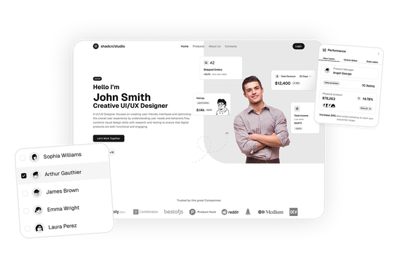
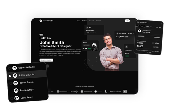
- Dark mode compatibility
- Flexible composition support for Base UI Features Section Block systems
- Accessible feature presentation patterns for Radix UI Features Section Block workflows
These elements help create clear and visually engaging product feature sections.
Base UI Features Section Block Support
Shadcn Studio layouts can be integrated into scalable Base UI Features Section Block workflows for modern React applications. Developers can build accessible and composable feature systems while maintaining flexible grid layouts and reusable marketing interfaces.
To get proper guidence, refer the tutorial on how to Migrate from Radix UI to Base UI
Radix UI Features Section Block Support
The layouts also work well with Radix UI Features Section Block implementations commonly used in the Shadcn ecosystem. Developers can leverage accessible primitives, composable feature structures, and reusable presentation workflows for production-ready applications.
Many teams prefer Radix UI Features Section Block patterns for scalable marketing systems and modern landing page experiences.