Shadcn Card Nav
Build interactive cards with tabbed navigation using Shadcn Card Nav blocks. Perfect for payment methods, performance metrics, and analytics dashboards with seamless content switching.
Shadcn Card Nav Blocks
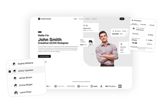
Shadcn Card Nav Blocks are modern UI components designed to provide navigation through visually structured card-based layouts. Built using Shadcn UI, Tailwind CSS, and React, these blocks allow developers to create intuitive navigation systems where each card represents a section, feature, or action within an application.
Card-based navigation is widely used in SaaS dashboards, admin panels, onboarding flows, and complex applications where traditional menus may not provide enough clarity. Instead of relying only on sidebars or dropdowns, card navigation presents options visually, making it easier for users to discover and access different parts of the application.
At Shadcn Studio, developers can explore a large collection of Shadcn Blocks. The card nav blocks include responsive layouts with interactive cards, icons, titles, and descriptions that guide users toward specific actions or sections in a clean and modern interface.
Many teams also use these layouts within scalable Base UI Card Nav Block systems and reusable Radix UI Card Nav Block workflows for modern React applications.
What Is Card-Based Navigation in Web Design?
Card-based navigation is a UI pattern where navigation elements are presented as cards instead of traditional links or menus. Each card acts as a clickable container that directs users to a specific page, feature, or workflow.
A typical card navigation interface includes:
- Clickable cards representing sections or features
- Titles and descriptions for context
- Icons or visuals for quick recognition
- Hover or interactive states
- Grid or layout structure for easy scanning
Card navigation improves usability by grouping related actions into visually distinct sections, making navigation more intuitive and engaging.
Why Use Shadcn Card Nav Blocks?
Shadcn card navigation blocks provide structured layouts that help developers build modern navigation experiences.
Visual Navigation Experience
Cards provide a more engaging and intuitive way to navigate compared to traditional menus.
Built with React and Tailwind
Shadcn components are built using React and Tailwind CSS, enabling seamless integration with frameworks like Next.js and modern frontend stacks.
These layouts also work well for composable Base UI Card Nav Block implementations with scalable navigation systems.
Improved Feature Discovery
Users can quickly understand available features through visual cues and descriptions.
Many developers use Radix UI Card Nav Block patterns for accessible and reusable application navigation.
Flexible Layout System
Card navigation works well for dashboards, onboarding flows, and feature selection pages.
Copy-Paste Developer Workflow
Shadcn blocks follow a copy-paste or CLI install workflow, allowing developers to quickly integrate card-based navigation into applications.
Key Elements of Card Navigation UI
Effective card navigation interfaces include several important elements.
Navigation Cards
Each card represents a section, feature, or action within the application.
Visual Elements
Icons, images, or illustrations help users quickly identify each option.
Titles and Descriptions
Text content provides context about what each card represents.
Interactive States
Hover effects, focus states, and animations improve usability.
Grid Layout
Cards are arranged in structured grids for easy scanning and navigation.
Types of Card Navigation Layouts
Different applications use different card navigation layouts depending on their use case.
Dashboard Navigation Cards
Used to navigate between different dashboard modules such as analytics, reports, and settings.
Feature Selection Cards
Allow users to choose between different tools or features.
Onboarding Navigation Cards
Guide new users through setup steps or product features.
Settings Navigation Cards
Organize configuration options into grouped cards.
Action-Based Cards
Cards that trigger actions such as creating a project or starting a workflow.
Use Cases for Card Nav Blocks
Shadcn card nav blocks are widely used across modern web applications.
SaaS Platforms
Provide a visual overview of product features and tools.
Admin Dashboards
Allow users to navigate between modules such as users, analytics, and reports.
Onboarding Flows
Guide users through setup steps with clear visual options.
Developer Platforms
Display tools, APIs, and integrations in a structured interface.
Enterprise Applications
Simplify navigation across complex systems and workflows.
Features of Shadcn Card Nav Blocks
Shadcn card nav blocks include several UI features designed for modern application interfaces.
Common features include:
- Card-based navigation layouts
- Icon and visual-based navigation elements
- Interactive hover and focus states
- Grid-based layout structures
- Responsive design for all devices
- Clickable navigation cards
- Tailwind CSS styling
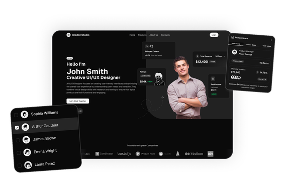
- Dark mode compatibility
- Flexible composition support for Base UI Card Nav Block systems
- Accessible navigation patterns for Radix UI Card Nav Block workflows
These features help developers create intuitive navigation systems that improve discoverability and enhance user experience in dashboards and applications.
Base UI Card Nav Block Support
Shadcn Studio layouts can be integrated into scalable Base UI Card Nav Block workflows for modern React applications. Developers can build accessible and composable navigation systems while maintaining flexible card layouts and reusable interface structures.
To get proper guidence, refer the tutorial on how to Migrate from Radix UI to Base UI
Radix UI Card Nav Block Support
The layouts also work well with Radix UI Card Nav Block implementations commonly used in the Shadcn ecosystem. Developers can leverage accessible primitives, composable card structures, and reusable navigation patterns for production-ready applications.
Many teams prefer Radix UI Card Nav Block patterns for scalable dashboards and modern onboarding experiences.