Shadcn Charts Component
Discover sleek, customizable Shadcn chart blocks to enhance your app and dashboard UI with interactive, engaging visuals for better data representation.
Shadcn Charts Component Blocks
Shadcn Charts Component Blocks are modern UI components designed to visualize data in dashboards and analytics applications. Built using Shadcn UI, Tailwind CSS, and React, these chart components allow developers to display complex datasets these shadcn ui charts components allow developers to display complex datasets through interactive visualizations such as bar charts, line charts, and pie charts.
Charts are essential for admin dashboards, SaaS analytics platforms, financial applications, and business intelligence tools because they transform raw data into visual insights. By representing data trends, comparisons, and distributions visually, charts help users understand information quickly and make better decisions.
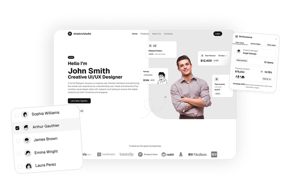
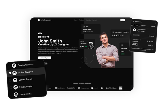
At Shadcn Studio, you will find numerous Shadcn Blocks. The charts component blocks provide responsive and customizable data visualization layouts that help developers present analytics data clearly in modern web applications.
Many teams also integrate these visualizations into scalable Base UI Charts Component Block workflows and modern Radix UI Charts Component Block systems for production-ready analytics interfaces.
What Is a Charts Component in Web Design?
A charts component is a UI element used to display data visually through graphical formats such as bars, lines, or circular charts. Instead of presenting raw numbers, charts help users interpret trends and patterns more easily.
Modern shadcn chart systems often combine reusable visualization layouts, responsive interactions, and scalable charting component patterns for analytics-heavy applications.
Interactive shadcn graph built with shadcn bar charts are commonly used for analytics dashboards, revenue tracking, and performance reporting systems.
A typical charts component includes:
- Data visualization graphs such as bar or line charts
- Axis labels and data markers
- Interactive tooltips showing detailed values
- Legends describing chart categories
- Responsive layout for different screen sizes
Modern chart components are designed to help users analyze trends, compare metrics, and monitor performance in dashboards or reporting interfaces.
Why Use Shadcn Graph Component Blocks?
Shadcn graph blocks provide flexible data visualization components that integrate seamlessly with modern frontend frameworks.
Interactive Data Visualization
Charts help transform complex datasets into clear and understandable visuals that highlight trends and comparisons.
Built with React and Tailwind
Shadcn charts are built using React and Tailwind CSS, and many implementations rely on charting libraries such as Recharts to render graphs efficiently.
These reusable visualization systems also help teams standardize charting define workflows across scalable analytics dashboards and reporting interfaces.
These layouts also work well for composable Base UI Charts Component Block implementations in scalable React applications.
Highly Customizable
Developers can customize chart colors, labels, legends, and layout styles to match their design systems.
Many developers prefer Radix UI Charts Component Block patterns for accessible and reusable analytics interfaces.
Fully Responsive
Chart layouts automatically adapt across desktop, tablet, and mobile screens.
Copy-Paste Developer Workflow
Shadcn blocks follow a copy-paste or CLI install workflow, allowing developers to quickly add chart components into dashboards and analytics interfaces.
Key Elements of a High-Quality Chart Section
Effective chart components include several important elements.
Clear Data Visualization
Charts should present data trends clearly without overwhelming the user.
Legends and Labels
Legends explain chart categories and help users understand what each color or line represents.
Well-structured bar legend layouts improve readability and help users quickly understand chart categories, datasets, and comparisons.
Interactive Tooltips
Tooltips display detailed values when users hover over data points.
Axis Indicators
X-axis and Y-axis markers help users interpret chart data.
Responsive Layout
Charts should remain readable across different screen sizes.
Types of Charts Layouts
Different applications use different chart styles depending on the type of data being visualized.
Bar Charts
Used to compare values across categories.
Line Charts
Ideal for displaying trends over time.
Pie Charts
Used to represent proportions or percentages.
Area Charts
Visualize trends with filled regions beneath lines.
Multi-Series Charts
Display multiple datasets in the same visualization.
Use Cases for Charts Component Blocks
Shadcn charts are widely used across many types of data-driven applications.
Admin Dashboards
Display key performance metrics and operational data.
SaaS Analytics Platforms
Visualize user activity, revenue growth, and product usage.
Financial Applications
Track income, expenses, and financial trends.
Business Intelligence Tools
Present company performance data for decision-making.
Data Monitoring Systems
Display real-time metrics and performance indicators.
Features of Shadcn Charts Component Blocks
Shadcn chart blocks include several UI features designed for modern analytics dashboards.
Common features include:
- Interactive bar, line, and pie charts
- Data tooltips and legends
- Axis labels and gridlines
- Multi-series chart support
- Responsive chart containers
- Real-time data updates
- Tailwind CSS styling
- Dark mode compatibility
- Flexible customization support for Base UI Charts Component Block systems
- Accessible visualization patterns for Radix UI Charts Component Block workflows
- Reusable component chart layouts for scalable analytics dashboards and reporting systems
These features help developers build interactive dashboards that present complex data in an easy-to-understand visual format.
Base UI Charts Component Block Support
Shadcn Studio layouts can be integrated into scalable Base UI Charts Component Block workflows for modern React applications. Developers can build accessible and composable analytics interfaces while maintaining flexible chart customization and reusable visualization systems.
These scalable shadcn charts workflows help teams create reusable visualization systems with responsive layouts, composable analytics sections, and customizable chart interactions.
To get proper guidence, refer the tutorial on how to Migrate from Radix UI to Base UI
Radix UI Charts Component Block Support
The layouts also work well with Radix UI Charts Component Block implementations commonly used in the Shadcn ecosystem. Developers can leverage accessible primitives, composable chart containers, and reusable dashboard structures for production-ready analytics applications.
Many teams prefer Radix UI Charts Component Block patterns for scalable data visualization systems and modern admin dashboards.