
The React ecosystem never stops evolving, and the world of UI primitives is no exception. If you’ve been building with shadcn/ui, you might have noticed a significant shift happening in the community. Base UI, a collaborative effort from the creators of Radix UI, Floating UI, and Material UI, is emerging as a modern alternative that’s rapidly gaining traction among developers.
This isn’t just another UI library. It’s a fundamental rethinking of how we build accessible, composable components in React. And if you’re wondering whether it’s time to make the switch from your current shadcn/ui + Radix UI setup to shadcn/ui + Base UI, or how to navigate that transition, you’re in the right place.
In this guide, you will learn how to migrate from Radix UI to Base UI
Why Base UI Support Matters for shadcn/ui Users
If you’re using shadcn/ui, there’s some great news: shadcn/ui now officially supports Base UI. When you run npx shadcn@latest create to scaffold a new project, you can choose Base UI as your primitive library.
If you have an existing shadcn/ui project built on Radix UI, you’ll need to migrate your components manually. The good news is that shadcn/ui’s documentation now includes Base UI examples for every component. Additionally, you can regenerate components from scratch using the shadcn/ui CLI.
This guide will walk you through the complete migration process, helping you understand what’s changing in the underlying primitives and how to migrate your shadcn/ui components smoothly from Radix UI to Base UI.
Understanding the Shift: Why Base UI?
Before we dive into code and migration strategies, let’s talk about why this matters for your shadcn/ui project. Radix UI has been phenomenal - it brought unstyled, accessible primitives that shadcn/ui leveraged to create beautiful components. So why change?
A Unified Vision with a Stellar Team
Base UI isn’t a competitor trying to dethrone Radix - it’s actually built by many of the same brilliant minds. The team includes Colm Tuite (the creator of Radix UI himself), James Nelson from Floating UI, and the Material UI engineering team, including Michał Dudak and Marija Najdova. This isn’t a fork or a copycat; it’s an evolution backed by decades of collective experience building component libraries.
When people with this much expertise come together, you know they’re solving real problems they’ve encountered over years of maintaining production-grade UI libraries. They’ve seen what works, what doesn’t, and what the future needs to look like.
Modern API Design That Makes Sense
One of the most immediately noticeable improvements in Base UI is the move from Radix’s asChild pattern to a more explicit render prop approach. If you’ve ever felt slightly confused about when and how to use asChild, you’re not alone. The render prop pattern in Base UI is clearer, more predictable, and easier to reason about - both for developers and for the AI coding assistants we’re increasingly working alongside.
Here’s a quick comparison of Radix UI vs Base UI:
// Radix UI with asChild prop
<DialogTrigger asChild>
  <Button>Open Dialog</Button>
</DialogTrigger>

// Base UI with render prop
<DialogTrigger render={<Button>Open Dialog</Button>} />
The difference might seem subtle, but it eliminates the “magic” of slot composition and makes the component hierarchy explicit. You’re no longer merging props through an abstraction - you’re directly composing components.
Single Package, Simpler Dependencies
Radix UI distributes its components across many individual packages (@radix-ui/react-dialog, @radix-ui/react-dropdown-menu, etc.). While this works, it can lead to dependency management headaches, especially in larger projects. Base UI takes a different approach: everything comes from @base-ui/react.
This unified package is tree-shakable, meaning your bundle only includes what you actually use. It’s simpler to install, easier to version, and reduces the mental overhead of tracking dozens of separate packages.
Built to Last
Perhaps most importantly, Base UI is being designed with longevity in mind. The team has explicitly stated their mission: “to provide a future-proof foundation for professional interface design on the Web”. This isn’t about chasing trends - it’s about creating a stable, well-architected foundation that will serve developers for years to come.
Step-by-Step Guide: Migrate from Radix UI to Base UI

Now that you understand why Base UI is worth the switch, let’s walk through the actual migration process. This guide will help you migrate your existing shadcn/ui project from Radix UI to Base UI with minimal disruption.
Note on File Paths: Throughout this guide, we’ll use
components/uias the default path for component files. Your project structure may differ - common variations includesrc/components/uior a custom path defined in yourcomponents.json. Simply adjust the paths in the commands according to your project’s structure. Thecomponents.jsonfile in your project root defines your actual paths under thealiases.uiproperty.
Step 1: Create a Migration Branch
Before making any changes, create a new branch for your migration work. This allows you to test the migration thoroughly without affecting your production code.
git checkout -b radix-to-baseui-migrationThis gives you a safe environment to work in. You can commit your changes incrementally and easily revert if needed. Once you’ve tested everything thoroughly, you can merge this branch back into your main branch.
Step 2: Configure Base UI and Reinstall Your Components
The components.json file controls how shadcn/ui generates and manages your components. To switch from Radix UI to Base UI, you’ll update this configuration and reinstall all components using shadcn’s built-in tooling.
If you have custom components or make any changes in shadcn/ui components, we suggest you to have a backup for it.
# Create a backup of your ui folder
cp -r components/ui components/ui-backup
Next, head to the shadcn project creator. Use the sidebar to select your preferred style and customization options:
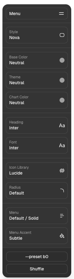
Click Create Project in the top-right corner. In the dialog that appears, select Base UI as your base library, then copy the generated CLI command:
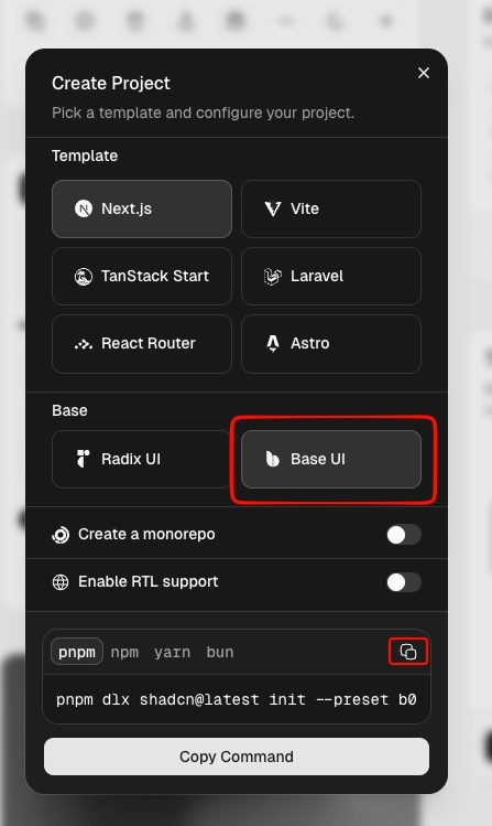
Run the copied command in your project’s terminal. This updates components.json and reinstalls all shadcn ui components with Base UI as the underlying primitive library.
Note: The CLI creates an initial Git commit after installation. If you’d prefer to review changes before committing, you can revert it with
git reset HEAD~1.
Step 3: Update Your Custom Components
You have to know that the above command will only update shadcn/ui components and not your custom components. You have to manually update your custom components.
How to identify which components are from shadcn/ui:
Look for these indicators in the component files:
-
Import statements from
@radix-ui/react-*packages -
File structure matching shadcn/ui patterns (e.g., using
React.forwardRef, className composition withcn()and/orcva())
Your custom components typically won’t have Radix UI imports and will have your own custom logic.
Update radix imports
You may have direct imports from Radix UI packages in custom components or somewhere in your project. These need to be updated to Base UI.
Search for Radix UI imports:
# Search for both types of Radix imports in your project
grep -r "@radix-ui/react-" src/
grep -r "from 'radix-ui'" src/
grep -r 'from "radix-ui"' src/
Update these imports from the Radix packages to the unified Base UI package. There are two common import patterns you might encounter:
Pattern 1: Individual Radix UI packages (older pattern)
// Before: Individual @radix-ui packages
import * as AccordionPrimitive from '@radix-ui/react-accordion'
import * as DialogPrimitive from '@radix-ui/react-dialog'
import * as DropdownMenuPrimitive from '@radix-ui/react-dropdown-menu'

// After: Base UI imports
import { Accordion as AccordionPrimitive } from '@base-ui/react/accordion'
import { Dialog as DialogPrimitive } from '@base-ui/react/dialog'
import { DropdownMenu as DropdownMenuPrimitive } from '@base-ui/react/dropdown-menu'
Pattern 2: Unified radix-ui package (newer Radix pattern)
// Before: Unified radix-ui package
import { Accordion as AccordionPrimitive } from 'radix-ui'
import { Dialog as DialogPrimitive } from 'radix-ui'
import { DropdownMenu as DropdownMenuPrimitive } from 'radix-ui'

// After: Base UI imports
import { Accordion as AccordionPrimitive } from '@base-ui/react/accordion'
import { Dialog as DialogPrimitive } from '@base-ui/react/dialog'
import { DropdownMenu as DropdownMenuPrimitive } from '@base-ui/react/dropdown-menu'
Notice the pattern changes:
-
Old Radix:
@radix-ui/react-[component](multiple individual packages) -
New Radix:
radix-ui(single unified package) -
Base UI:
@base-ui/react/[component](single package with subpath imports)
Step 4: Update Component Usage from asChild to render
This is one of the most significant API changes. Radix UI uses the asChild prop pattern, while Base UI uses the render prop pattern.
Find all instances of asChild:
grep -r "asChild" src/Update the pattern like this:
// Before: Radix UI pattern
<DialogTrigger asChild>
  <Button>Open Dialog</Button>
</DialogTrigger>

// After: Base UI pattern
<DialogTrigger render={<Button>Open Dialog</Button>} />
The render prop is more explicit and easier to understand - you’re directly telling Base UI what component to render instead of relying on the slot composition magic of asChild.
Step 5: Handle Component-Specific API Differences
Beyond the universal asChild → render migration, several components have unique prop changes you’ll need to address. This section covers each one with before-and-after examples.
Accordion
Base UI simplifies the type system and changes how you specify default values:
| Radix UI | Base UI |
|---|---|
type="multiple" | multiple={true} |
type="single" | multiple={false} (default) |
collapsible | Removed (always collapsible) |
defaultValue="item-1" | defaultValue={["item-1"]} |
The defaultValue prop now expects an array in all cases, even for single-selection accordions.
// Radix UI
<Accordion type="multiple" collapsible defaultValue="item-1">
  <AccordionItem value="item-1">
    <AccordionTrigger>Item 1</AccordionTrigger>
    <AccordionContent>Content 1</AccordionContent>
  </AccordionItem>
</Accordion>

// Base UI
<Accordion multiple={true} defaultValue={["item-1"]}>
  <AccordionItem value="item-1">
    <AccordionTrigger>Item 1</AccordionTrigger>
    <AccordionContent>Content 1</AccordionContent>
  </AccordionItem>
</Accordion>
Check ready to use Shadcn Accordion Component.
Button
When using render to swap a button for a non-button element like <a> or <span>, you must add nativeButton={false}. This tells Base UI not to apply native button behaviors to the rendered element.
// ❌ Incorrect — missing nativeButton={false}
<Button render={<a href="/docs" />}>Read the docs</Button>

// ✅ Correct
<Button render={<a href="/docs" />} nativeButton={false}>
  Read the docs
</Button>
The same applies to all the trigger components, which act like a button. For example, PopoverTrigger The component will be used as follows:
<PopoverTrigger render={<InputGroupAddon />} nativeButton={false}>
  Pick date
</PopoverTrigger>
You can consider using ready to use Shadcn Button Components as well.
Hover Card
Base UI moves the delay configuration from the root component to the trigger:
| Radix UI | Base UI |
|---|---|
<HoverCard openDelay={...}> | <HoverCardTrigger delay={...}> |
<HoverCard closeDelay={...}> | <HoverCardTrigger closeDelay={...}> |
Note that openDelay is renamed to simply delay.
// Radix UI
<HoverCard openDelay={10} closeDelay={100}>
  <HoverCardTrigger asChild>
    <Button variant="link">Hover Here</Button>
  </HoverCardTrigger>
  <HoverCardContent className="flex w-64 flex-col gap-0.5">
    <div className="font-semibold">@nextjs</div>
    <div>The React Framework – created and maintained by @vercel.</div>
    <div className="text-muted-foreground mt-1 text-xs">Joined December 2021</div>
  </HoverCardContent>
</HoverCard>

// Base UI
<HoverCard>
  <HoverCardTrigger delay={10} closeDelay={100} render={<Button variant="link">Hover Here</Button>} />
  <HoverCardContent className="flex w-64 flex-col gap-0.5">
    <div className="font-semibold">@nextjs</div>
    <div>The React Framework – created and maintained by @vercel.</div>
    <div className="text-muted-foreground mt-1 text-xs">Joined December 2021</div>
  </HoverCardContent>
</HoverCard>
Progress
Basic usage remains identical between the two libraries:
// Works in both Radix UI and Base UI
<Progress value={66} className="w-[60%]" />
The difference appears when adding labels. Base UI provides built-in ProgressLabel and ProgressValue components, eliminating the need for wrapper Field components:
// Radix UI - requires Field component
import { Field, FieldLabel } from "@/components/ui/field"
import { Progress } from "@/components/ui/progress"

export function ProgressWithLabel() {
  return (
    <Field className="w-full max-w-sm">
      <FieldLabel htmlFor="progress-upload">
        <span>Upload progress</span>
        <span className="ml-auto">66%</span>
      </FieldLabel>
      <Progress value={66} id="progress-upload" />
    </Field>
  )
}

// Base UI - uses built-in composition
import { Progress, ProgressLabel, ProgressValue } from "@/components/ui/progress"

export function ProgressWithLabel() {
  return (
    <Progress value={66} className="w-full max-w-sm">
      <ProgressLabel>Upload progress</ProgressLabel>
      <ProgressValue />
    </Progress>
  )
}
Select
Base UI requires an items array prop on the root Select component. Placeholders are defined as items with value: null rather than using a placeholder prop.
// Radix UI
<Select>
  <SelectTrigger>
    <SelectValue placeholder="Select a fruit" />
  </SelectTrigger>
  <SelectContent>
    <SelectGroup>
      <SelectItem value="apple">Apple</SelectItem>
      <SelectItem value="banana">Banana</SelectItem>
    </SelectGroup>
  </SelectContent>
</Select>

// Base UI
const items = [
  { label: "Select a fruit", value: null },
  { label: "Apple", value: "apple" },
  { label: "Banana", value: "banana" },
]

<Select items={items}>
  <SelectTrigger>
    <SelectValue />
  </SelectTrigger>
  <SelectContent>
    <SelectGroup>
      {items.map((item) => (
        <SelectItem key={item.value} value={item.value}>{item.label}</SelectItem>
      ))}
    </SelectGroup>
  </SelectContent>
</Select>
Base UI also introduces alignItemWithTrigger on SelectContent, which defaults to true. Set it to false If you prefer the previous alignment behavior:
<SelectContent alignItemWithTrigger={false}>
  {/* items */}
</SelectContent>
Explore the collection of the best Shadcn Select components.
Toggle Group
Toggle Group follows the same pattern as Accordion:
| Radix UI | Base UI |
|---|---|
type="multiple" | multiple={true} |
type="single" | multiple={false} (default) |
defaultValue="item-1" | defaultValue={["item-1"]} |
// Radix UI
<ToggleGroup type="multiple" defaultValue="item-1">
  <ToggleGroupItem value="item-1">Item 1</ToggleGroupItem>
</ToggleGroup>

// Base UI
<ToggleGroup multiple={true} defaultValue={["item-1"]}>
  <ToggleGroupItem value="item-1">Item 1</ToggleGroupItem>
</ToggleGroup>
Tooltip
Two changes to note: the delay prop is renamed, and the default offset has changed.
| Radix UI | Base UI |
|---|---|
delayDuration | delay |
sideOffset default: 0 | sideOffset default: 4 |
// Radix UI
<TooltipProvider delayDuration={300}>
  <Tooltip>
    <TooltipTrigger>Hover me</TooltipTrigger>
    <TooltipContent>Tooltip content</TooltipContent>
  </Tooltip>
</TooltipProvider>

// Base UI
<TooltipProvider delay={300}>
  <Tooltip>
    <TooltipTrigger>Hover me</TooltipTrigger>
    <TooltipContent>Tooltip content</TooltipContent>
  </Tooltip>
</TooltipProvider>
If your design relies on the previous zero-offset positioning, explicitly set sideOffset={0} on TooltipContent.
Checkout the best Shadcn Tooltip Components.
Step 6: Update State-Based Class Names
Radix UI exposes component state through data-* attributes, while Base UI uses standard ARIA attributes. This affects how you apply conditional styling.
Find data attribute, selectors:
grep -r "data-" src/Update to ARIA attributes:
// Accordion example
// Before: Radix UI
<AccordionTrigger className="data-[state=open]:rotate-180">
<AccordionTrigger className="data-disabled:cursor-not-allowed">

// After: Base UI
<AccordionTrigger className="aria-expanded:rotate-180">
<AccordionTrigger className="aria-disabled:cursor-not-allowed">
The exact ARIA attribute depends on the component - always refer to the Base UI documentation for the specific component you’re working with.
Step 7: Clean Up Unused Dependencies
After migrating all your components to Base UI, you can safely remove the Radix UI packages from your project.
List all Radix UI packages in your project:
grep "radix-ui" package.jsonUninstall all Radix UI packages:
# If you have the unified radix-ui package
pnpm uninstall radix-ui
# or if you have individual @radix-ui packages
# For example, if you had button, badge, accordion, dialog, dropdown-menu, sidebar, and card
pnpm uninstall @radix-ui/react-slot @radix-ui/react-accordion @radix-ui/react-dialog @radix-ui/react-dropdown-menu
Note: The @radix-ui/react-slot package is particularly important to remove since Base UI doesn’t use the slot pattern anymore.
Install Base UI if it wasn’t automatically added:
While the shadcn CLI should have handled this when you regenerated components above, if you still need to add Base UI to your project, you can do so with:
pnpm add @base-ui/reactStep 8: Test Your Application Thoroughly
After completing the migration, thorough testing is crucial:
Run your development server:
pnpm devTest checklist:
-
All components render correctly
-
Interactive components (dropdowns, dialogs, etc.) open and close properly
-
Keyboard navigation works as expected
-
Focus management is correct
-
Screen reader announcements are appropriate
-
Animations and transitions work smoothly
-
State changes (hover, active, disabled) display correctly
-
Responsive behavior is maintained
-
Dark mode (if applicable) works properly
Check for console errors or warnings - Base UI might have different prop requirements or behaviors.
Step 9: Finalize and Deploy
Once testing is complete, update any documentation that references Radix UI - including README files, component documentation, and internal guides - to reflect the Base UI migration. Then commit your changes and merge through your normal review process.
Common Migration Pitfalls and How to Avoid Them
Even with a detailed guide, migrations can hit unexpected snags. Here are the most common issues developers encounter when migrating from Radix UI to Base UI, along with solutions to keep you moving forward.
TypeScript Type Errors
Problem: After switching to Base UI, you might see TypeScript errors about incompatible prop types, especially if you have wrapper components or utility functions that accept component props.
Solution:
-
Update your type imports from Radix to Base UI:
// Before import type { DialogProps } from '@radix-ui/react-dialog' // After import type { Dialog } from '@base-ui/react/dialog' type DialogProps = Dialog.Root.Props -
Base UI uses
.Propspattern for type exports:ComponentName.Root.Props,ComponentName.Trigger.Props, etc. -
If you have custom wrapper components, regenerate their type definitions after the migration
Lingering CSS Class Selectors
Problem: Your styles might not apply correctly because you still have data-* attribute selectors in your CSS or Tailwind classes that are now aria-* attributes.
Solution:
-
Search your entire codebase for data attribute selectors:
grep -r "data-" . -
Update to ARIA attributes as shown in Step 7. The specific attribute depends on the component and state:
-
For state changes (open/closed):
data-[state=open]→aria-expanded -
For disabled states:
data-disabled→aria-disabled
-
-
Review each instance carefully and refer to Step 7 for more details
Missing Component Props
Problem: Some props that existed in Radix UI might not have direct equivalents in Base UI, or they might be named differently.
Solution:
-
Consult the Base UI documentation for each component you’re using
-
Common missing props usually have alternative patterns:
-
Radix’s
asChild→ Base UI’srenderprop -
Check the shadcn/ui Base UI examples for the canonical implementation
-
-
If a prop is truly missing, consider whether it’s actually needed or if there’s a different Base UI pattern to achieve the same result
Build Errors After Dependency Cleanup
Problem: After uninstalling Radix packages, your build might fail with import errors or missing dependencies.
Solution:
-
Clear your node_modules and reinstall:
rm -rf node_modules pnpm install -
Clear your build cache:
# For Next.js rm -rf .next # For Vite rm -rf dist node_modules/.vite -
Verify all imports are updated using the search commands from Step 4
-
Check that
@base-ui/reactis in yourpackage.jsondependencies
Unexpected Runtime Warnings
Problem: Console warnings about deprecated props or incorrect component usage.
Solution:
-
Base UI is stricter about certain patterns. Common warnings include:
-
Incorrect
defaultValueformat (must be an array for multi-select components) -
Portal components used outside of the required providers
-
-
Address warnings one by one - they’re usually pointing to legitimate issues that should be fixed
-
Check the Base UI migration notes for component-specific breaking changes
What About Future Updates?
One of the biggest questions when considering a migration like this is: “Is this going to be supported long-term?” Let’s address that head-on.
Base UI’s Backing and Commitment
Base UI isn’t a side project or an experimental library - it’s a serious, long-term commitment from some of the most respected names in the React ecosystem:
-
Material UI team: Years of experience maintaining one of the most popular React component libraries
-
Colm Tuite: Creator of Radix UI, bringing deep expertise in accessible primitives
-
James Nelson: Creator of Floating UI, the positioning engine powering countless UI libraries
This team combination isn’t accidental. They’re building Base UI to be the foundation for professional React applications for years to come. The explicit mission is to provide a “future-proof foundation for professional interface design on the Web”.
shadcn/ui’s Direction
shadcn/ui officially supports both Radix UI and Base UI, but the direction is clear:
-
New projects get Base UI by default when you select it during shadcn/ui
createsetup -
The documentation now includes Base UI examples for every component
-
The CLI makes it trivial to generate Base UI components
-
The community is actively migrating and sharing their experiences
Shadcn/ui will continue supporting Radix UI for existing projects, but Base UI is the future. This isn’t a risky early adoption - it’s aligning with where the ecosystem is heading.
When Should You Migrate?
Migrate now if:
-
You’re starting a new shadcn/ui project (choose Base UI from the start)
-
You’re actively developing your application and can allocate time for testing
-
You want to benefit from the unified package structure and clearer
renderprop API -
You’re experiencing issues with Radix UI’s dependency management
-
You’re planning a major refactor anyway
Wait if:
-
Your application is in a critical phase where stability is paramount
-
You have very limited development resources right now
-
Your Radix UI setup is working perfectly, and you don’t need new features
-
You’re waiting for specific Base UI features that are still in development
The migration is straightforward, but it does require testing. Choose a time when you can properly validate the changes.
Staying Updated
As Base UI and shadcn/ui evolve, stay informed through:
-
shadcn/ui changelog & releases: Changelog and GitHub releases
The ecosystem is moving fast, but it’s also mature enough that you won’t be constantly fixing breaking changes. Both Base UI and shadcn/ui are built with stability in mind.
Additional Resources
To help you succeed with your migration, here are the essential resources you’ll want to bookmark:
Official Documentation
-
Base UI Documentation: - Complete API reference for all Base UI components
-
shadcn/ui Base UI Components: - Every component with Base UI examples. Just select the Base UI tab on any component page
Code Examples and Inspiration
-
shadcn/ui GitHub Examples: - Reference implementations of all Base UI components
-
Base UI Component Demos: - Interactive examples with code samples
Community and Support
-
shadcn/ui GitHub Discussions: - Ask questions, share your experience, and get help from the community
-
shadcn/ui GitHub Issues: - Report bugs or request features related to Base UI components in shadcn/ui
-
Base UI GitHub Issues: - Report bugs or request features related to Base UI components
-
Base UI Discord: - Join the Base UI community for real-time support and discussions
Conclusion
Migrating from Radix UI to Base UI represents more than just a technical update - it’s an investment in the future of your application. You’re aligning with a modern, well-backed ecosystem that prioritizes clarity, developer experience, and long-term stability.
Yes, the migration requires effort. You’ll spend time updating configurations, regenerating components, and testing your changes. But what you gain is significant: a clearer API, simpler dependency management, and a foundation built by a team that deeply understands what production applications need.
The React ecosystem is consolidating around better patterns, and Base UI embodies many of those improvements. The render prop is more explicit than asChild. The unified package is easier to manage than dozens of individual packages. The team behind it includes the original creator of Radix UI, which means they’re not abandoning what worked - they’re evolving it.
If you’ve followed this guide, you now have a clear pathway forward. Your components are modernized, your dependencies are cleaner, and your application is built on a foundation designed to last. Take the time to test thoroughly, but don’t let perfect be the enemy of good. The Base UI ecosystem is mature enough for production use, and thousands of developers are making this transition successfully.
What’s Next?
Once your migration is complete:
-
Share your experience - Write about what you learned, challenges you faced, and solutions you discovered
-
Contribute back - Found a bug or have an improvement? Both Base UI and shadcn/ui welcome contributions
-
Help others - Answer questions in GitHub issues, GitHub discussions or Discord to support others who are migrating
-
Stay updated - Follow the projects and participate in the ecosystem
The future of React UI primitives looks bright, and you’re now part of that future. Welcome to the Base UI community.