
Forms are the backbone of web applications, yet they’re notoriously difficult to get right. You need to handle:
-
State management without performance issues
-
Validation that’s both type-safe and user-friendly
-
Accessibility for all users
-
UX patterns like error messages, loading states, and progressive disclosure
-
Complex inputs like date pickers and multi-selects
Building production-ready forms in React doesn’t have to be painful. In this comprehensive guide, we’ll build a complete form handling system using React Hook Form, Zod validation, and Shadcn UI components.
Note: All complete source code, including full components and implementations, is available in the GitHub repository. This guide focuses on key concepts and patterns.
By the end of this tutorial, you’ll have built a complete form system featuring:
-
Different input types (text, email, password, date, select, multi-select, checkboxes, radio groups, switches, and more)
-
Type-safe validation with Zod schemas
-
Accessible components built with Shadcn UI
-
Validation mode comparison to understand when validation should occur
-
Production-ready patterns you can use immediately
Why This Stack? (TL;DR)
Building forms is deceptively complex. It’s not just about collecting input; it’s about performance, validation, accessibility, scalability, and user experience all working together seamlessly.
This stack: React Hook Form + Zod + Shadcn UI, solves these challenges in a way that feels both developer-friendly and production-ready.
What makes this stack awesome is,
-
High Performance – React Hook Form minimizes re-renders using uncontrolled inputs, making even large forms fast and smooth.
-
Type-Safe Validation – Zod combines validation + TypeScript types in one place, reducing bugs and duplication.
-
Full UI Control – Shadcn UI gives you copy-paste components you own—fully customizable, no library lock-in.
-
Handles Real-World Forms – From multi-step flows to dynamic fields and complex inputs, it scales effortlessly.
-
Accessible by Default – Built on Radix primitives with proper ARIA patterns for inclusive UX.
-
Great Developer Experience – Simple APIs, less boilerplate, and predictable patterns.
Bottom line: A modern stack for building fast, scalable, and production-ready forms, without the usual headaches.
React Hook Form vs Formik
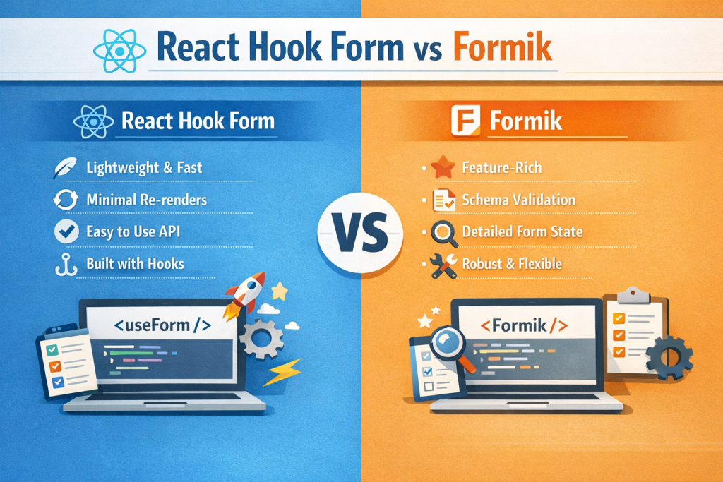
React Hook Form outperforms traditional solutions:
| Feature | React Hook Form | Formik |
|---|---|---|
| Re-renders | Minimal (uncontrolled) | Heavy (controlled) |
| TypeScript | Excellent | Good |
| Performance | Excellent | Moderate |
| API | Intuitive | Verbose |
Key advantage: React Hook Form uses uncontrolled components, meaning it doesn’t trigger React re-renders on every keystroke. This results in significantly better performance, especially for large forms.
Zod for Validation
Zod provides:
-
Type inference - Write your schema once, get TypeScript types automatically
-
Runtime validation that matches compile-time types
-
Composable schemas for reusable validation logic
-
Clear error messages out of the box
-
Smaller than Yup
// Define once, use everywhere
const schema = z.object({
  email: z.string().email(),
  age: z.number().min(18)
})

// TypeScript types automatically inferred!
type FormData = z.infer<typeof schema>
Shadcn UI
Unlike traditional component libraries, Shadcn UI:
-
Copies components into your project (you own the code)
-
Built on Radix UI (accessible primitives)
-
Fully customizable (no CSS overrides needed)
-
Type-safe with TypeScript
-
Consistent styling with Tailwind CSS
Project Setup
Step 1: Initialize the Project
We’ll use Shadcn’s CLI to set up both Next.js and Shadcn UI in one command:
pnpm dlx shadcn@latest initYou’ll be prompted with several questions. Here are the recommended settings:
-
Q: Would you like to start a new project?
- A: Next.js
-
Q: What is your project named?
- A: form-handling-masterclass
-
Q: Which color would you like to use as the base color?
- A: Neutral
This creates a Next.js project with:
-
Tailwind CSS configured
-
Shadcn UI component system is ready
-
TypeScript setup
-
Proper directory structure
Step 2: Install Form Dependencies:
pnpm add react-hook-form @hookform/resolvers zod date-fnsWhat each package does:
-
react-hook-form- Form state management and validation -
@hookform/resolvers- Connects Zod to React Hook Form -
zod- Schema validation library -
date-fns- Date formatting and manipulation (used for date picker formatting)
Step 3: Add Shadcn UI Components
Add all the UI components we’ll need:
pnpm dlx shadcn@latest add button input textarea label select checkbox radio-group switch calendar popover separator command fieldStep 4: Add the Multi-Select Component
The multi-select component isn’t part of Shadcn’s default registry, so we’ll add it manually.
Get the component: The full multi-select implementation is available in the GitHub repository.
Key features it provides:
-
Search/filter functionality
-
Multiple selection with badges
-
Keyboard navigation
-
Max selection limit
-
Custom empty state
-
Async option loading
-
Creatable options
Install the required dependency:
pnpm add cmdkYour project structure should now look like this:
project-root/
├── app/
│   ├── globals.css
│   ├── layout.tsx
│   └── page.tsx
├── components/
│   └── ui/
│       ├── button.tsx
│       ├── input.tsx
│       ├── field.tsx
│       ├── multi-select.tsx
│       └── ... (other components)
├── lib/
│   └── utils.ts
├── package.json
└── next.config.ts
Understanding Validation Modes
Before building complex forms, it’s crucial to understand when validation should occur. React Hook Form offers four validation modes, each with different UX implications.
The Four Validation Modes
| Mode | When Validation Occurs | Best For | UX Impact |
|---|---|---|---|
| onSubmit (default) | Only on form submission | Simple login/signup forms | Minimal interruption until submit |
| onChange | Every keystroke | Password strength, real-time format validation | ⚠️ Can be intrusive, many re-validations |
| onBlur | When field loses focus | Most general forms | ✅ Natural, non-intrusive |
| onTouched | On blur first, then onChange | Hybrid approach | Minimal interruption until submission |
📺 Interactive Demo: See these modes in action in the live demo. The full demo component code is in the GitHub repository.
Example configuration:
const form = useForm({
  mode: 'onBlur',  // or 'onChange', 'onTouched', 'onSubmit'
  resolver: zodResolver(schema),
  defaultValues: { /* ... */ }
})
Key Takeaways
🎯 Recommended: Use onBlur mode for most forms - it validates when users complete a field, providing a natural, non-intrusive experience.
⚡ Use onChange when:
-
Building password strength indicators
-
Validating format as users type (e.g., phone numbers)
-
Providing real-time character count for length-limited fields
🎯 Use onSubmit when:
-
Building simple login/signup forms
-
You want to minimize validation interruptions
-
The form is short (2-3 fields)
🎯 Use onTouched when:
-
You want a hybrid approach
-
Initial validation on blur, then real-time updates
-
Balancing immediate feedback with non-intrusive first interaction
Understanding React Hook Form Fundamentals
Before building complex forms, let’s understand how React Hook Form works under the hood and the key APIs you’ll use.
How React Hook Form Achieves Performance
React Hook Form’s speed comes from using uncontrolled components with refs instead of React state.
Traditional approach: Each field uses useState(), triggering re-renders on every keystroke. With 20 fields, you get 20+ re-renders.
React Hook Form approach:
-
register()returns arefthat React Hook Form (RHF) attaches to the input -
Values stored in RHF’s internal store (not React state)
-
No re-renders on keystroke
-
Re-renders only when validation errors change, form submits, or you use
watch()
Result: 10x faster for large forms.
register() vs Controller: When to Use Each
Use register() for Native HTML Inputs
Best for: Standard <input>, <textarea>, <select> elements.
function SimpleForm() {
  const { register, handleSubmit } = useForm()
  return (
    <form onSubmit={handleSubmit(onSubmit)}>
      <input {...register('email', { required: 'Email required' })} />
      <input type='password' {...register('password')} />
      <button type='submit'>Submit</button>
    </form>
  )
}
Advantages: Simpler syntax, slightly better performance.
Use Controller for Custom/Controlled Components
Best for: UI libraries like Shadcn UI, Material-UI, or any controlled component.
function CustomForm() {
  const { control, handleSubmit } = useForm()

  return (
    <form onSubmit={handleSubmit(onSubmit)}>
      <Controller
        name='country'
        control={control}
        render={({ field }) => (
          <Select value={field.value} onValueChange={field.onChange}>
            <SelectTrigger><SelectValue /></SelectTrigger>
            <SelectContent>
              <SelectItem value='us'>USA</SelectItem>
              <SelectItem value='uk'>UK</SelectItem>
            </SelectContent>
          </Select>
        )}
      />
    </form>
  )
}
The field object provides: value, onChange, onBlur, name, ref.
Quick decision: Native HTML elements → register(), UI library components → Controller.
Hybrid Approach (Common in Real Apps)
function HybridForm() {
  const { register, control, handleSubmit } = useForm()

  return (
    <form onSubmit={handleSubmit(onSubmit)}>
      {/* Native input - use register() */}
      <input {...register('email')} placeholder='Email' />

      {/* Custom date picker - use Controller */}
      <Controller
        name='birthDate'
        control={control}
        render={({ field }) => <DatePicker {...field} />}
      />

      {/* Native textarea - use register() */}
      <textarea {...register('bio')} />

      {/* Custom select - use Controller */}
      <Controller
        name='country'
        control={control}
        render={({ field }) => <CustomSelect {...field} />}
      />
    </form>
  )
}
Why our tutorial uses only Controller:
-
We’re building with Shadcn UI (controlled components)
-
Consistent pattern throughout
-
Better for teaching custom component integration
In your own projects:
-
Use
register()for native inputs (simpler, faster) -
Use
Controllerfor UI library components (necessary)
Key Takeaways
-
Performance: RHF uses refs, not state → minimal re-renders
-
Native inputs: Use
register()(simpler syntax) -
Custom components: Use
Controller(required for controlled components) -
Hybrid approach: Mix both methods in the same form
-
Our tutorial: Uses
Controllerfor Shadcn UI consistency
Now, let’s build a comprehensive form using these concepts.
Special Mention: Shadcn Studio

Shadcn Studio goes beyond animations by providing animated blocks and sections built on top of Shadcn UI. It’s perfect for teams that want speed without compromising design quality.
Key Features:
-
Pre-animated components, blocks, and layouts
-
Built specifically for Shadcn UI
-
Consistent motion patterns
-
Great for marketing and landing pages
Furthermore, Animated variants with motion add smooth, modern animations to your components, enhancing user experiences with minimal effort.
Best For: Startups, agencies, and rapid MVP development.
Additionally, it comes with the following features:
-
Open-source: Dive into a growing, community-driven collection of copy-and-paste shadcn UI components, Shadcn blocks, and templates.
-
Component & Blocks variants: Access a diverse collection of customizable shadcn blocks and component variants to quickly build and style your UI with ease.
-
Landing pages & Dashboards: Explore 20+ premium & free Shadcn templates for dashboards, landing pages & more. Fully customizable & easy to use.
-
shadcn/ui for Figma: Speed up your workflow with Shadcn Figma UI kit with components, blocks & templates – a full design library inspired by shadcn/ui.
-
Powerful theme generator: Customize your UI instantly with Shadcn Theme Generator. Preview changes in real time and create consistent, on-brand designs faster.
-
shadcn/studio MCP: Integrate shadcn/studio MCP Server directly into your favorite IDE and craft stunning shadcn/ui Components, Blocks, and Pages inspired by shadcn/studio.
-
Shadcn Figma To Code Plugin: Convert your Figma designs into production-ready code instantly with the Shadcn Figma Plugin.
-
Drag & Drop Builder: Build complete pages visually with drag and drop Shadcn Builder. Search and drag pre-built blocks (Hero, Features, Pricing, etc.) onto a canvas, rearrange them instantly, preview in real time, and export production-ready code or CLI install commands.
Building the Registration Form
Now let’s build a comprehensive registration form that demonstrates all major input patterns. This form will include:
-
Text inputs with various validations
-
Email and password fields
-
Date picker
-
Number input
-
Select dropdowns
-
Multi-select with search
-
Checkbox groups
-
Radio groups
-
Toggle switches
-
Textarea with character counter
Part 1: Define the Zod Schema
Create components/registration-form.tsx and start with the validation schema. Here are the key validation patterns:
📦 Full Schema: View complete schema in GitHub
const formSchema = z.object({
  // 1. Progressive String Validation - Multiple rules = specific errors
  fullName: z
    .string()
    .min(1, 'Full name is required.')        // Check exists first
    .min(3, 'Must be at least 3 characters.')  // Then check length
    .max(50, 'Must be at most 50 characters.'),
  // 2. Regex Validation - Complex patterns with clear messages
  password: z
    .string()
    .min(8, 'Password must be at least 8 characters.')
    .regex(
      /^(?=.*[a-z])(?=.*[A-Z])(?=.*\\d)/,
      'Must contain uppercase, lowercase, and number.'
    ),
  // 3. Type-Specific Validation - Date, Number, Enum
  dateOfBirth: z.date({
    required_error: 'Date of birth is required.'
  }),
  ageRange: z
    .number({ invalid_type_error: 'Must be a number.' })
    .int('Must be a whole number.')
    .min(18, 'Must be at least 18.'),
  accountType: z.enum(['personal', 'business', 'enterprise']),
  // 4. Array Validation - For multi-selects and checkboxes
  interests: z
    .array(z.object({ value: z.string(), label: z.string() }))
    .min(1, 'Select at least one.')
    .max(5, 'Max 5 selections.'),
  // 5. Optional Fields
  language: z.string().optional(),
  // 6. Boolean Fields
  emailNotifications: z.boolean()
  // ... +7 more fields (country, bio, newsletterTopics, etc.)
})

type FormValues = z.infer<typeof formSchema> // Auto-generated TypeScript types!
Key Patterns:
-
Progressive Validation - Chain multiple rules for specific error messages
-
Regex Validation - Use
.regex()for complex patterns (passwords, phone numbers) -
Type Safety - Zod types (date, number, enum) provide runtime + compile-time safety
-
Array Constraints - Min/max for multi-select and checkbox arrays
-
Optional Fields - Use
.optional()When the field isn’t required -
Conditional Logic - Use
.refine()for custom business rules (covered in Production section)
Part 2: Define Form Options
Define options as simple arrays. Example pattern:
const countries = [
  { value: 'us', label: 'United States' },
  { value: 'uk', label: 'United Kingdom' },
  { value: 'ca', label: 'Canada' }
  // ... +5 more countries
]
Full Options: Similar arrays for languages, interestOptions, newsletterTopics, and accountTypes - see complete options
Part 3: Initialize the Form
export function RegistrationForm() {
  const form = useForm<FormValues>({
    resolver: zodResolver(formSchema),  // Connect Zod validation
    defaultValues: {
      fullName: '',
      email: '',
      interests: [],
      emailNotifications: true,  // Smart defaults
      // ... all fields with initial values
    }
  })

  function onSubmit(data: FormValues) {
    console.log('Form submitted:', data)
  }

  return (
    <form onSubmit={form.handleSubmit(onSubmit)}>
      {/* Form fields */}
    </form>
  )
}
Key Points:
-
resolver: zodResolver(formSchema)- Connects Zod validation to React Hook Form -
defaultValues- Set initial values for all fields (required for controlled components) -
form.handleSubmit(onSubmit)- Validates before calling your submit function
📦 Complete Implementation: View full component
Part 4: Building the Form UI
The complete registration form includes 4 major sections with different input types. Rather than listing all 600+ lines of UI code here, let’s focus on the key patterns each section demonstrates:
📺 See it in action: Check Live Demo | Full Source Code
Personal Information Section
-
Text inputs (fullName, email)
-
Password with toggle visibility
-
Proper autocomplete attributes
-
Grid responsive layout
Profile Details Section
-
Date picker with Radix UI Popover + Calendar
-
Number input with type conversion
-
Select dropdowns (country, language)
-
Textarea with character counter
-
Optional field indicators
Preferences Section
-
Multi-select with search (interests)
-
Checkbox array (newsletter topics)
-
Radio group with rich content (account type)
-
FieldSet for proper accessibility
Communication Settings Section
-
Switch components (horizontal layout)
-
Toggle preferences (email notifications, marketing, 2FA)
-
FieldContent pattern for label + description
Key Controller Pattern:
Every field follows this structure:
<Controller
  name='fieldName'
  control={form.control}
  render={({ field, fieldState }) => (
    <Field data-invalid={fieldState.invalid}>
      <FieldLabel htmlFor={field.name}>Label</FieldLabel>
      <Input {...field} id={field.name} aria-invalid={fieldState.invalid} />
      <FieldDescription>Helper text</FieldDescription>
      {fieldState.invalid && <FieldError errors={[fieldState.error]} />}
    </Field>
  )}
/>
Why Controller? React Hook Form’s Controller component wraps controlled inputs (like Shadcn components) and connects them to the form state. The field object contains value, onChange, onBlur, name, and ref - everything needed for two-way binding.
Advanced Form Patterns
Pattern 1: Password Field with Visibility Toggle
const [showPassword, setShowPassword] = React.useState(false)

<div className='relative'>
  <Input type={showPassword ? 'text' : 'password'} className='pr-10' />
  <button onClick={() => setShowPassword(!showPassword)}
    aria-label={showPassword ? 'Hide password' : 'Show password'}>
    {showPassword ? <EyeOff /> : <Eye />}
  </button>
</div>
Pattern 2: Textarea with Character Counter
const [count, setCount] = React.useState(0)

<Textarea onChange={e => {
  field.onChange(e)
  setCount(e.target.value.length)
}} />
<FieldDescription>{count}/500 characters</FieldDescription>
Key technique: Track count in a separate state, call both field.onChange and setCount
Pattern 3: Date Picker with Constraints
<Popover>
  <PopoverTrigger asChild>
    <Button>{field.value ? format(field.value, 'PPP') : 'Pick date'}</Button>
  </PopoverTrigger>
  <PopoverContent>
    <Calendar selected={field.value} onSelect={field.onChange}
      disabled={date => date > new Date()} />  {/* Future dates disabled */}
  </PopoverContent>
</Popover>
Key technique: Use disabled prop to constrain date selection, format with date-fns
Pattern 4: Multi-Select with Search
<MultipleSelector
  value={field.value}  // Array of {value, label} objects
  onChange={field.onChange}
  defaultOptions={options}
  maxSelected={5} />
Key technique: Multi-select expects an array of objects { value: string, label: string }[]
Pattern 5: Checkbox Array
<Controller name='topics' render={({ field }) => (
  <FieldGroup>
    {topics.map(topic => (
      <Checkbox
        checked={field.value.includes(topic.id)}
        onCheckedChange={checked => {
          field.onChange(checked
            ? [...field.value, topic.id]           // Add to array
            : field.value.filter(v => v !== topic.id))  // Remove from array
        }} />
    ))}
  </FieldGroup>
)} />
Key technique: Manage array with includes/filter, use immutable updates
Pattern 6: Radio Group with Rich Content
<RadioGroup value={field.value} onValueChange={field.onChange}>
  {types.map(type => (
    <FieldLabel className='has-checked:border-primary cursor-pointer'>
      <FieldContent>
        <FieldTitle>{type.title}</FieldTitle>
        <FieldDescription>{type.description}</FieldDescription>
      </FieldContent>
      <RadioGroupItem value={type.id} />
    </FieldLabel>
  ))}
</RadioGroup>
Key technique: Wrap the entire label to make it clickable, use has-checked: for visual feedback
Pattern 7: Number Input with Type Coercion
<Input type='number'
  onChange={e => field.onChange(
    e.target.value === '' ? undefined : parseInt(e.target.value, 10)
  )}
  value={field.value ?? ''}
/>
Key technique: Convert a string to a number with parseInt, handle empty as undefined
Pattern 8: Select with Optional Field
<FieldLabel>
  Language <span className='text-muted-foreground'>(Optional)</span>
</FieldLabel>
<Select value={field.value} onValueChange={field.onChange}>
  <SelectTrigger>
    <SelectValue placeholder='Select...' />
  </SelectTrigger>
  <SelectContent>
    {options.map(opt => <SelectItem value={opt.value}>{opt.label}</SelectItem>)}
  </SelectContent>
</Select>
Key technique: Mark optional fields visually, use z.string().optional() in schema
Pattern 9: Dynamic Fields with useFieldArray
One of React Hook Form’s most powerful features is useFieldArray - for managing dynamic lists of fields.
Common use cases:
-
Add/remove phone numbers
-
Multiple addresses
-
Dynamic work experience entries
-
Variable number of skills/hobbies
Example: Phone Numbers List
import { useFieldArray } from 'react-hook-form'

// Schema for dynamic phone numbers
const formSchema = z.object({
  phones: z.array(
    z.object({
      type: z.enum(['mobile', 'home', 'work']),
      number: z.string().min(10, 'Invalid phone number')
    })
  ).min(1, 'At least one phone number required')
})

type FormValues = z.infer<typeof formSchema>

function DynamicPhoneForm() {
  const form = useForm<FormValues>({
    resolver: zodResolver(formSchema),
    defaultValues: {
      phones: [{ type: 'mobile', number: '' }]  // Start with one field
    }
  })

  // useFieldArray hook - manages array of fields
  const { fields, append, remove } = useFieldArray({
    control: form.control,
    name: 'phones'
  })

  return (
    <form onSubmit={form.handleSubmit(onSubmit)}>
      <div className='space-y-4'>
        {fields.map((field, index) => (
          <div key={field.id} className='flex gap-2'>
            {/* Phone type select */}
            <Controller
              name={`phones.${index}.type`}
              control={form.control}
              render={({ field }) => (
                <Select value={field.value} onValueChange={field.onChange}>
                  <SelectTrigger className='w-32'>
                    <SelectValue />
                  </SelectTrigger>
                  <SelectContent>
                    <SelectItem value='mobile'>Mobile</SelectItem>
                    <SelectItem value='home'>Home</SelectItem>
                    <SelectItem value='work'>Work</SelectItem>
                  </SelectContent>
                </Select>
              )}
            />

            {/* Phone number input */}
            <Controller
              name={`phones.${index}.number`}
              control={form.control}
              render={({ field, fieldState }) => (
                <div className='flex-1'>
                  <Input {...field} placeholder='Phone number' />
                  {fieldState.error && (
                    <span className='text-sm text-red-600'>
                      {fieldState.error.message}
                    </span>
                  )}
                </div>
              )}
            />

            {/* Remove button (only show if more than 1) */}
            {fields.length > 1 && (
              <Button
                type='button'
                variant='destructive'
                size='icon'
                onClick={() => remove(index)}
              >
                <Trash2 className='h-4 w-4' />
              </Button>
            )}
          </div>
        ))}

        {/* Add new phone button */}
        <Button
          type='button'
          variant='outline'
          onClick={() => append({ type: 'mobile', number: '' })}
        >
          <Plus className='mr-2 h-4 w-4' />
          Add Phone Number
        </Button>
      </div>

      <Button type='submit'>Submit</Button>
    </form>
  )
}
Key concepts:
-
useFieldArrayreturns:fields,append(value),remove(index),insert(index, value),update(index, value),move(from, to) -
Field naming: Use bracket notation
phones.${index}.number -
Unique keys: Always use
field.id(not index) -
Default value: Initialize with at least one item in
defaultValues
Advanced patterns (used within the fields.map() loop):
// Conditional fields - hide/show based on another field's value
const watchCurrent = form.watch(`experience.${index}.current`)
{!watchCurrent && <DatePicker {...field} />}  // Hide end date if "current job" is checked

// Reordering items - add up/down buttons
<Button onClick={() => move(index, index - 1)}>Move Up</Button>
<Button onClick={() => move(index, index + 1)}>Move Down</Button>

// Programmatic manipulation - access/update entire array
form.setValue('phones', newPhoneArray)  // Replace entire array
const current = form.getValues('phones')  // Get current values
Performance tip: For large lists (100+ items), consider virtualization with react-window or react-virtual.
Accessibility & UX
Accessibility Checklist
Our form implements all WCAG 2.1 Level AA requirements:
Keyboard Navigation
-
All inputs are focusable via Tab
-
Modal dialogs (popover, select) trap focus
-
Esc closes modals
-
Arrow keys navigate options
Screen Reader Support
<Input
  aria-invalid={fieldState.invalid}
  aria-describedby={`${field.name}-description ${field.name}-error`}
/>
<FieldDescription id={`${field.name}-description`}>
  Helper text
</FieldDescription>
<FieldError id={`${field.name}-error`} role='alert'>
  Error message
</FieldError>
Visual Indicators:
-
Focus rings on all interactive elements
-
Error states with color AND icon/text
-
Disabled states are clearly indicated
-
High contrast ratios
Form Structure:
<form onSubmit={form.handleSubmit(onSubmit)}>
  <fieldset>
    <legend>Personal Information</legend>
    {/* Fields */}
  </fieldset>
</form>
Labels and Descriptions
-
Every input has an associated label
-
Related inputs grouped in fieldsets
-
Helper text provides guidance
-
Error messages are specific and actionable
UX Best Practices
-
Clear Error Messages: Provide specific, actionable feedback for each validation rule (as shown in our schema above with progressive
.min()checks). -
Contextual Help: Provide help text before errors:
<FieldDescription>
  Must be at least 8 characters with uppercase, lowercase, and numbers
</FieldDescription>- Instant Feedback for Success, not just errors:
{submitAttempts > 0 && (
  <p className='text-xs text-green-600'>✓ Submitted successfully</p>
)}- Smart Defaults: Set sensible defaults to reduce user effort
defaultValues: {
  emailNotifications: true,  // Most users want this
  marketingEmails: false,    // Opt-in, not opt-out
  twoFactorAuth: false       // Advanced feature
}- Visual Hierarchy: Group related fields with clear sections:
<div className='space-y-6 rounded-lg border p-6'>
  <div className='space-y-1'>
    <h3>Personal Information</h3>
    <p className='text-muted-foreground'>Provide your basic info</p>
  </div>
  {/* Fields */}
</div>- Responsive Design: Two-column grid collapses on mobile:
<div className='grid gap-6 md:grid-cols-2'>
  {/* Side-by-side on desktop, stacked on mobile */}
</div>- Loading States: Always show feedback for async operations:
<Button type='submit' disabled={form.formState.isSubmitting}>
  {form.formState.isSubmitting ? 'Submitting...' : 'Submit'}
</Button>
Advanced Form State Management
React Hook Form’s formState and utility functions provide powerful tools for managing complex form behavior. Let’s explore the essential APIs.
Understanding formState
The formState The object contains reactive properties that track your form’s state. These are lazy-loaded - only accessed properties trigger re-renders.
function FormWithState() {
  const { formState } = useForm()

  // ✅ Only subscribes to isDirty - efficient
  const { isDirty } = formState

  // ❌ Subscribes to ALL formState properties - inefficient
  // const isDirty = formState.isDirty
}
Key formState Properties
isDirty- Has any field been modified?
function UnsavedChangesWarning() {
  const { formState } = useForm()

  useEffect(() => {
    const handleBeforeUnload = (e: BeforeUnloadEvent) => {
      if (formState.isDirty) {
        e.preventDefault()
        e.returnValue = ''  // Show browser warning
      }
    }

    window.addEventListener('beforeunload', handleBeforeUnload)
    return () => window.removeEventListener('beforeunload', handleBeforeUnload)
  }, [formState.isDirty])

  return (
    <div>
      {formState.isDirty && (
        <Alert>
          <AlertCircle className='h-4 w-4' />
          <AlertDescription>You have unsaved changes</AlertDescription>
        </Alert>
      )}
    </div>
  )
}dirtyFields- Which specific fields changed?
function DirtyFieldsIndicator() {
  const { formState } = useForm()

  return (
    <div>
      {Object.keys(formState.dirtyFields).length > 0 && (
        <p>Modified fields: {Object.keys(formState.dirtyFields).join(', ')}</p>
      )}

      {/* Show asterisk on modified fields */}
      {formState.dirtyFields.email && <span className='text-red-500'>*</span>}
    </div>
  )
}touchedFields- Which fields were focused/blurred?
function TouchedFieldsTracker() {
  const { formState } = useForm()

  // Show validation only for touched fields
  return (
    <div>
      {formState.touchedFields.email && formState.errors.email && (
        <span>{formState.errors.email.message}</span>
      )}
    </div>
  )
}isValid- Is the entire form valid?
function ConditionalSubmit() {
  const { formState } = useForm({ mode: 'onChange' })  // Required for real-time isValid

  return (
    <Button type='submit' disabled={!formState.isValid}>
      Submit
    </Button>
  )
}**isValidating**- Is async validation running?
function AsyncValidationIndicator() {
  const { formState } = useForm()

  return (
    <div>
      {formState.isValidating && (
        <Spinner />  // Show loading indicator during validation
      )}
    </div>
  )
}**isSubmitting**- Is the Form currently submitting?
// Already covered in Loading States section
<Button disabled={formState.isSubmitting}>
  {formState.isSubmitting ? 'Saving...' : 'Save'}
</Button>isSubmitted- Has form been submitted at least once?
function SubmissionFeedback() {
  const { formState } = useForm()

  return (
    <div>
      {formState.isSubmitted && formState.isSubmitSuccessful && (
        <Alert variant='success'>Form submitted successfully!</Alert>
      )}

      {formState.isSubmitted && !formState.isSubmitSuccessful && (
        <Alert variant='error'>Submission failed. Please fix errors.</Alert>
      )}
    </div>
  )
}submitCount- How many times submitted?
function SubmitCounter() {
  const { formState } = useForm()

  return (
    <p>Submission attempts: {formState.submitCount}</p>
  )
}errors- Current validation errors
// Standard error handling
{formState.errors.email && <span>{formState.errors.email.message}</span>}

// Show error count
<p>{Object.keys(formState.errors).length} errors</p>
Using watch() for Reactive Values
The watch() function lets you subscribe to field changes and react to them in your UI.
Watch Single Field
function ConditionalFields() {
  const { watch, control } = useForm()

  const accountType = watch('accountType')  // Subscribe to accountType changes

  return (
    <div>
      <Controller name='accountType' control={control}
        render={({ field }) => (
          <Select value={field.value} onValueChange={field.onChange}>
            <SelectItem value='personal'>Personal</SelectItem>
            <SelectItem value='business'>Business</SelectItem>
          </Select>
        )}
      />

      {/* Show company field only for business accounts */}
      {accountType === 'business' && (
        <Controller name='companyName' control={control}
          render={({ field }) => <Input {...field} placeholder='Company name' />}
        />
      )}
    </div>
  )
}
Watch Multiple Fields
function PasswordStrengthMeter() {
  const { watch } = useForm()

  const [password, confirmPassword] = watch(['password', 'confirmPassword'])

  const passwordsMatch = password === confirmPassword && password.length > 0

  return (
    <div>
      <Input type='password' {...register('password')} />
      <Input type='password' {...register('confirmPassword')} />

      {passwordsMatch && <span className='text-green-600'>✓ Passwords match</span>}
      {!passwordsMatch && password && confirmPassword && (
        <span className='text-red-600'>✗ Passwords don't match</span>
      )}
    </div>
  )
}
Watch All Fields
function FormDebugger() {
  const { watch } = useForm()

  const allValues = watch()  // Watch entire form

  return (
    <pre>{JSON.stringify(allValues, null, 2)}</pre>
  )
}
Watch with Callback
function AutoSave() {
  const { watch } = useForm()

  useEffect(() => {
    const subscription = watch((data, { name, type }) => {
      console.log(`Field ${name} changed (${type})`)
      // Auto-save to backend
      saveToServer(data)
    })

    return () => subscription.unsubscribe()
  }, [watch])
}
Reset Form State
function ResetExample() {
  const { reset, resetField } = useForm()

  // Reset to default values
  return <Button onClick={() => reset()}>Reset All</Button>

  // Reset to new values (e.g., from API)
  useEffect(() => {
    fetchUser(userId).then(user => reset({ user }))
  }, [userId])

  // Reset single field
  return <Button onClick={() => resetField('email')}>Clear Email</Button>

  // Reset with options
  reset(values, {
    keepDirtyValues: true,  // Keep user changes
    keepErrors: true        // Keep validation errors
  })
}
Clear Errors & Set Values
function FormMethods() {
  const { clearErrors, setValue, getValues } = useForm()

  // Clear errors
  clearErrors('email')              // Single field
  clearErrors(['email', 'password']) // Multiple fields
  clearErrors()                     // All errors

  // Set values programmatically
  setValue('email', 'user@example.com', {
    shouldValidate: true,  // Trigger validation
    shouldDirty: true,     // Mark as dirty
    shouldTouch: true      // Mark as touched
  })

  // Get values
  const email = getValues('email')  // Single field
  const allData = getValues()       // All fields
}
Practical Patterns
Save Draft Button
function DraftSaver() {
  const { getValues, formState } = useForm()

  const saveDraft = () => {
    const data = getValues()
    localStorage.setItem('draft', JSON.stringify(data))
    toast.success('Draft saved!')
  }

  return (
    <Button
      onClick={saveDraft}
      disabled={!formState.isDirty}
    >
      Save Draft
    </Button>
  )
}
Multi-Page Form Navigation
function MultiPageForm() {
  const { trigger, getValues, formState } = useForm()
  const [page, setPage] = useState(1)

  const nextPage = async () => {
    const fieldsToValidate = page === 1
      ? ['email', 'password']  // Page 1 fields
      : ['name', 'bio']        // Page 2 fields

    const isValid = await trigger(fieldsToValidate)
    if (isValid) setPage(page + 1)
  }

  return (
    <div>
      {page === 1 && <PersonalInfoPage />}
      {page === 2 && <ProfilePage />}

      <Button onClick={nextPage} disabled={formState.isValidating}>
        Next Page
      </Button>
    </div>
  )
}
Production Considerations
Server-Side Validation
Never trust client-only validation! Share your Zod schema:
// app/api/register/route.ts
import { formSchema } from '@/lib/schemas'

export async function POST(request: Request) {
  const result = formSchema.safeParse(await request.json())
  if (!result.success) {
    return Response.json({ errors: result.error }, { status: 400 })
  }
  // Process result.data (validated & type-safe)
}
Error Handling
Map server errors to form fields:
async function onSubmit(data: FormValues) {
  try {
    const response = await fetch('/api/register', {
      method: 'POST',
      body: JSON.stringify(data)
    })
    if (!response.ok) {
      const errors = await response.json()
      Object.entries(errors).forEach(([field, msg]) => {
        form.setError(field, { type: 'server', message: msg })
      })
    }
  } catch {
    form.setError('root', { message: 'Network error' })
  }
}
Form Persistence & Multi-Step
// Auto-save to localStorage
const form = useForm({
  defaultValues: JSON.parse(localStorage.getItem('draft') || '{}')
})

React.useEffect(() => {
  const sub = form.watch(data =>
    localStorage.setItem('draft', JSON.stringify(data))
  )
  return () => sub.unsubscribe()
}, [form])

// Multi-step validation
async function nextStep() {
  const isValid = await form.trigger(['email', 'password'])  // Validate subset
  if (isValid) setStep(step + 1)
}
File Uploads & Performance
// File validation
const schema = z.object({
  avatar: z.instanceof(File)
    .refine(f => f.size <= 5_000_000, 'Max 5MB')
    .refine(f => ['image/jpeg', 'image/png'].includes(f.type), 'JPG/PNG only')
})

// Lazy load heavy components
const MultiSelect = dynamic(() => import('@/components/ui/multi-select'))

// Async validation (check if email taken)
const schema = z.object({
  email: z.string().email().refine(
    async email => !(await fetch(`/api/check-email?email=${email}`)).ok,
    'Email taken'
  )
})
Scaling Large Forms with Context
For large forms split across multiple components, use FormProvider and useFormContext:
import { FormProvider, useFormContext } from 'react-hook-form'

// Parent wraps form with provider
function RegistrationForm() {
  const form = useForm<FormValues>({
    resolver: zodResolver(formSchema)
  })

  return (
    <FormProvider {...form}>
      <form onSubmit={form.handleSubmit(onSubmit)}>
        <PersonalSection />
        <AddressSection />
        <Button type='submit'>Submit</Button>
      </form>
    </FormProvider>
  )
}

// Children access form context directly (no prop drilling)
function PersonalSection() {
  const { control, formState, register } = useFormContext<FormValues>()

  return (
    <div>
      <Controller
        name='firstName'
        control={control}
        render={({ field }) => <Input {...field} />}
      />
      {formState.errors.firstName && <span>Error</span>}

      <input {...register('lastName')} />
      {formState.errors.lastName && <span>Error</span>}
    </div>
  )
}

function AddressSection() {
  const { control, watch } = useFormContext<FormValues>()
  const country = watch('country')

  return (
    <Controller name='city' control={control} render={({ field }) => <Input {...field} />} />
  )
}
Benefits:
-
No prop drilling
-
Cleaner boundaries
-
Type-safe access.
When to use:
-
✅ Forms with 20+ fields across multiple components
-
✅ Multi-page forms
-
✅ Reusable form sections
-
❌ Small forms (<10 fields) in one component
6. Security & Testing
Security:
// Sanitize user input
import DOMPurify from 'isomorphic-dompurify'

function onSubmit(data: FormValues) {
  const sanitized = {
    ...data,
    bio: DOMPurify.sanitize(data.bio)
  }
}

// CSRF protection
<form><input type='hidden' name='csrf' value={token} /></form>
Testing:
// Test Zod schema
it('validates email', () => {
  const result = formSchema.safeParse({ email: 'invalid' })
  expect(result.success).toBe(false)
})

// Test form component
import { render, screen } from '@testing-library/react'
import userEvent from '@testing-library/user-event'

it('shows errors on submit', async () => {
  render(<Form />)
  await userEvent.click(screen.getByRole('button', { name: 'Submit' }))
  expect(screen.getByText('Email is required')).toBeInTheDocument()
})
Conclusion
Congratulations! 🎉 You’ve mastered production-ready form handling with:
-
React Hook Form - Performant, uncontrolled form state management with refs
-
Zod - Type-safe validation with automatic TypeScript inference
-
Shadcn UI - Beautiful, accessible components you own
-
Different input types - Text, email, password, date, select, multi-select, checkboxes, radios, switches, and more
-
register() vs Controller - Understanding when to use each approach
-
useFieldArray - Dynamic add/remove fields for real-world forms
-
Form state management - isDirty, watch(), reset(), and more
-
FormProvider & Context - Scaling large forms across components
-
Validation modes - Deep understanding of when to validate
-
Accessibility - WCAG 2.1 Level AA compliant
-
Production patterns - Error handling, persistence, multi-step flows
Key Takeaways
Understand React Hook Form’s Architecture
-
Performance: Uses refs instead of React state → minimal re-renders
-
Native inputs: Use
register()for simplicity and speed -
Custom components: Use
Controllerfor UI libraries like Shadcn -
Internal mechanism: RHF stores values in refs, only re-renders on validation/submit
Choose the Right Validation Mode
-
Default:
onSubmit(validates only on form submission) -
Recommended for most forms:
onBlur(validates when field loses focus - best UX) -
Real-time feedback:
onChange(password strength, character limits) -
Hybrid:
onTouched(progressive validation)
Use Zod for Type Safety
// Define once, use everywhere
const schema = z.object({ ... })
type FormData = z.infer<typeof schema> // Auto-generated!-
Master formState Properties
-
isDirty- Unsaved changes warning -
dirtyFields- Track specific changed fields -
touchedFields- Show errors only for touched fields -
isValid- Enable/disable submit button -
isSubmitting- Loading states
-
-
Use watch() for Reactive UI
-
Watch a single field for conditional rendering
-
Watch multiple fields for computed values
-
Watch the entire form for auto-save/debug
-
-
Handle Dynamic Fields with useFieldArray
-
Add/remove items (phones, addresses, work experience)
-
Reorder with
move(from, to) -
Validate arrays with Zod
-
Essential for real-world applications
-
-
Scale with FormProvider
-
Avoid prop drilling in large forms
-
Split forms into logical sections
-
Each component accesses context independently
-
Type-safe with
useFormContext<FormValues>()
-
-
Always Validate Server-Side
-
Client validation is for UX
-
Server validation is for security
-
Share Zod schemas between client and server
-
-
Focus on Accessibility
-
Proper labels and ARIA attributes
-
Keyboard navigation
-
Screen reader support
-
Visual feedback for all states
-
Next Steps
Extend this project:
-
Add file upload support (without drag-and-drop)
-
Add drag-and-drop file upload
-
Implement a multi-step wizard
-
Add async validation (email availability)
-
Integrate with your API
-
Add form state persistence
-
Implement conditional fields
-
Create custom input components
Learn more:
Resources
Bonus: Quick Reference
Common Patterns Cheat Sheet
Basic Text Input:
<Controller
  name='fieldName'
  control={form.control}
  render={({ field, fieldState }) => (
    <Field data-invalid={fieldState.invalid}>
      <FieldLabel htmlFor={field.name}>Label</FieldLabel>
      <Input {...field} aria-invalid={fieldState.invalid} />
      <FieldDescription>Helper text</FieldDescription>
      {fieldState.invalid && <FieldError errors={[fieldState.error]} />}
    </Field>
  )}
/>
Select Dropdown:
<Select value={field.value} onValueChange={field.onChange}>
  <SelectTrigger>
    <SelectValue placeholder='Select...' />
  </SelectTrigger>
  <SelectContent>
    {options.map(opt => (
      <SelectItem key={opt.value} value={opt.value}>
        {opt.label}
      </SelectItem>
    ))}
  </SelectContent>
</Select>
Checkbox:
<Checkbox
  checked={field.value}
  onCheckedChange={field.onChange}
/>
Radio Group:
<RadioGroup value={field.value} onValueChange={field.onChange}>
  {options.map(opt => (
    <div key={opt.id}>
      <RadioGroupItem value={opt.id} id={opt.id} />
      <FieldLabel htmlFor={opt.id}>{opt.label}</FieldLabel>
    </div>
  ))}
</RadioGroup>
Switch:
<Switch
  checked={field.value}
  onCheckedChange={field.onChange}
/>
Date Picker:
<Popover>
  <PopoverTrigger asChild>
    <Button variant='outline'>
      {field.value ? format(field.value, 'PPP') : 'Pick date'}
    </Button>
  </PopoverTrigger>
  <PopoverContent>
    <Calendar
      mode='single'
      selected={field.value}
      onSelect={field.onChange}
    />
  </PopoverContent>
</Popover>
Zod Validation Cheat Sheet
// String validation
z.string()
  .min(1, 'Required')
  .min(3, 'Too short')
  .max(50, 'Too long')
  .email('Invalid email')
  .url('Invalid URL')
  .regex(/pattern/, 'Invalid format')
  .optional()
// Number validation
z.number()
  .min(18, 'Too young')
  .max(120, 'Too old')
  .int('Must be integer')
  .positive('Must be positive')
  .optional()
// Date validation
z.date({
  required_error: 'Date required',
  invalid_type_error: 'Invalid date'
})
// Enum validation
z.enum(['option1', 'option2', 'option3'])
// Array validation
z.array(z.string())
  .min(1, 'Select at least one')
  .max(5, 'Max 5 selections')
// Object validation
z.object({
  value: z.string(),
  label: z.string()
})
// Boolean validation
z.boolean()
// Conditional validation
z.object({
  type: z.enum(['personal', 'business']),
  companyName: z.string().optional()
}).refine(
  data => data.type === 'business' ? !!data.companyName : true,
  { message: 'Company name required for business accounts' }
)
Happy form building! 🚀
If you found this tutorial helpful, please:
-
⭐ Star the GitHub repo
-
📢 Share with your team
-
💬 Leave feedback in the comments
-
🐛 Report issues or suggest improvements