Shadcn Dashboard Dialog
Elegant, user-friendly Shadcn dashboard modal blocks to enrich dashboard and app UI with interactive, responsive pop-ups for a better user experience.
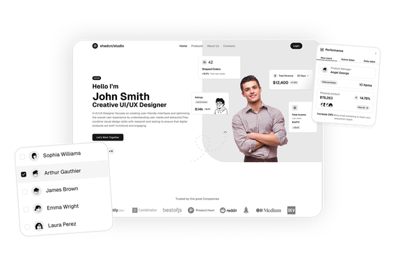
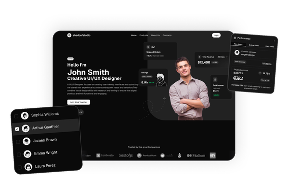
Dashboard Dialog 3
BasicThis Shadcn dialog block provides a secure payment method form with credit card inputs, live card preview, and validation for adding new cards.
Shadcn Dashboard Dialog Blocks
Shadcn Dashboard Dialog Blocks are modern UI components designed to display interactive modal dialogs within dashboards and web applications. Built using Shadcn UI, Tailwind CSS, and React, these blocks allow developers to create focused popup interfaces for tasks such as forms, confirmations, settings, and payment workflows.
Dashboard dialogs are commonly used in SaaS dashboards, admin panels, analytics platforms, and enterprise web applications. They appear as overlay windows above the main interface and temporarily focus user interaction on a specific task or decision.
At Shadcn Studio, you will find numerous Shadcn Blocks. The dashboard dialog blocks include responsive modal layouts for subscription plan selection, payment forms, and application settings that enhance dashboard interactivity and user workflows.
Many teams also integrate these layouts into scalable Base UI Dashboard Dialog Block workflows and reusable Radix UI Dashboard Dialog Block systems for modern React applications.
What Is a Dashboard Dialog in Web Design?
A dashboard dialog is a modal UI component that appears above the main application interface to capture user input or present important information. It temporarily disables interaction with the underlying interface until the user completes or dismisses the action.
A typical dashboard dialog includes:
- A modal container overlaying the interface
- A title and description explaining the action
- Form inputs or action controls
- Primary and secondary action buttons
- Close or cancel controls
Dialogs help users complete focused tasks without navigating away from their current page.
Why Use Shadcn Dashboard Dialog Blocks?
Shadcn dashboard dialog blocks provide structured modal interfaces that help developers build interactive dashboards efficiently.
Focused User Interaction
Dialogs guide users through specific tasks such as editing data, confirming actions, or entering information.
Built with React and Tailwind
Shadcn components are built using React and Tailwind CSS, enabling seamless integration with frameworks like Next.js and modern frontend stacks.
These layouts also work well for composable Base UI Dashboard Dialog Block implementations with scalable modal workflows.
Accessible Modal Behavior
Shadcn dialogs support focus trapping, keyboard navigation, and proper accessibility roles.
Many developers use Radix UI Dashboard Dialog Block patterns for accessible and reusable dashboard interactions.
Reusable Application UI
Dialog components can be reused for multiple dashboard actions such as editing profiles, managing settings, or adding resources.
Copy-Paste Developer Workflow
Shadcn blocks follow a copy-paste or CLI install workflow, allowing developers to quickly integrate modal interfaces into dashboards.
Key Elements of a Dashboard Dialog
Effective dashboard dialog components include several important elements.
Dialog Header
Displays the title and description explaining the purpose of the dialog.
Form Inputs
Dialogs often contain form elements for collecting user data.
Action Buttons
Primary and secondary buttons allow users to confirm or cancel actions.
Overlay Background
The overlay dims the background interface to focus attention on the dialog.
Close Controls
Dialogs usually include a close icon, cancel button, or escape key support.
Types of Dashboard Dialog Layouts
Different web applications use different dialog layouts depending on the task being performed.
Form Dialog
Used for editing profile settings, creating resources, or submitting forms.
Confirmation Dialog
Requests user confirmation before performing important actions.
Payment Dialog
Allows users to add payment methods or manage billing information.
Settings Dialog
Displays configuration options within dashboards.
Multi-Step Dialog
Used for onboarding workflows or complex setup processes.
Use Cases for Dashboard Dialog Blocks
Shadcn dashboard dialog blocks are widely used across modern web applications.
SaaS Dashboards
Allow users to manage subscriptions, billing, and account settings.
Admin Panels
Enable administrators to create, update, or delete records.
Analytics Platforms
Display configuration dialogs for reports or data filters.
Project Management Tools
Allow users to create tasks, assign team members, or edit projects.
Enterprise Applications
Provide modal interfaces for workflows and system configuration.
Features of Shadcn Dashboard Dialog Blocks
Shadcn dashboard dialog blocks include several UI features designed for modern web applications.
Common features include:
- Modal dialog overlays
- Form-based dialog layouts
- Confirmation dialog components
- Payment and billing dialogs
- Keyboard navigation and accessibility support
- Responsive modal layouts
- Tailwind CSS styling
- Dark mode compatibility
- Flexible composition support for Base UI Dashboard Dialog Block systems
- Accessible modal interaction patterns for Radix UI Dashboard Dialog Block workflows
These features help developers create interactive dashboard interfaces that allow users to perform tasks quickly without leaving their current page.
Base UI Dashboard Dialog Block Support
Shadcn Studio layouts can be integrated into scalable Base UI Dashboard Dialog Block workflows for modern React applications. Developers can build accessible and composable modal interfaces while maintaining flexible dialog structures and reusable dashboard interactions.
To get proper guidence, refer the tutorial on how to Migrate from Radix UI to Base UI
Radix UI Dashboard Dialog Block Support
The layouts also work well with Radix UI Dashboard Dialog Block implementations commonly used in the Shadcn ecosystem. Developers can leverage accessible primitives, composable modal structures, and reusable interaction patterns for production-ready dashboards.
Many teams prefer Radix UI Dashboard Dialog Block patterns for scalable application workflows and modern admin interfaces.