Shadcn Datatable Columns
Give every column real control, drag to reorder, click to sort, or filter by a single field. Built for tables where the header does more than just label data.
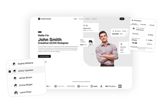
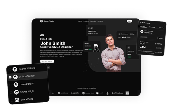
Shadcn Datatable Columns: Reorderable, Sortable Column Examples
A row is only half the story. The column is where people decide what matters: which field to sort by, which order fields should read in, which ones to hide when the screen gets busy. These datatable column blocks handle that part. Drag handles, sort arrows, column filters and column-aware footers are already built into finished screens, so you're not wiring up drag-and-drop from scratch.
Every block is built with React, Tailwind CSS and shadcn/ui, and works with both Base UI and Radix UI. Open one, drag a column, sort a header, and copy it once it behaves the way your users would expect.
What Is a Datatable Column?
A datatable column is a single vertical field in a data table, like Name, Status or Amount, that holds one type of information for every row. Each column has a header at the top, and the header controls how that field behaves: whether it can be sorted, filtered, dragged to a new position, or hidden.
In a basic table, columns are fixed. In these blocks, the header does real work: click it to sort, drag it to reorder, or use it to filter that field specifically. That's what makes them column blocks rather than plain data tables.
Each one combines the Data Table component with Checkbox, Select, Badge, Input and Pagination, so the column behavior comes built in.
Components Used in These Columns Blocks
- shadcn/ui components Table, Select, Input, Checkbox, Avatar, Badge, Button, Progress, Tooltip and Pagination, all parts your project already has.
- Base UI or Radix UI Works with either, so there's nothing to change when you drop it into your project.
What You Get in Every Columns Block
- Drag-to-reorder columns. A handle on each header so people can put the field they care about first.
- Sortable headers. Click a column to sort by it, with a visible direction indicator.
- A saved column order. The order survives a reload instead of resetting to default.
- Column-aware filters. Filters that target a specific column, like status or industry, instead of the whole row.
- Footer totals. Some blocks roll up a column into a summary, like a running count or total.
- Dark mode. The examples follow your theme, so you can match your brand with the theme generator.
Where to Use These Column Blocks
Support and ticketing tools use column reordering to match a team's review process. CRM and sales tools use it so each rep can put their own priority field first. Admin and finance tools use sortable columns for coupons, invoices and pricing lists where one field, like code or amount, gets checked constantly. Pair them with a dashboard sidebar or a dashboard dialog for a full admin screen.
Related Datatable Block Categories
Columns is one of nine datatable categories on shadcn studio. Browse the others depending on what your table needs to do:
- Datatable Example
- Datatable Drag & Drop
- Datatable Editing
- Datatable Expansion
- Datatable Filtering
- Datatable Grouping
- Datatable Infinite Scroll
- Datatable Export
Explore More Shadcn Block Groups
Browse the full shadcn studio blocks library by product surface. Each group bundles category-level blocks you can mix and match across your project.
- Shadcn Marketing UI Blocks: Hero, pricing, testimonials, FAQ and login pages for landing sites.
- Shadcn Dashboard & Application Blocks: Dashboard shells, charts, widgets and account settings.
- Shadcn eCommerce UI Blocks: Product lists, carts, checkout and order summaries.
- Shadcn Datatable UI Blocks: Data tables across 9 categories, including the column examples on this page.
- Shadcn Bento Grid UI Blocks: Asymmetric grid layouts for feature sections.
- Shadcn Free Blocks: A free set across marketing, dashboard and eCommerce, handy for trying the library first.