Shadcn Datatable Filtering
Help users find exactly what they're looking for. These blocks pair Shadcn DataTable with search boxes, condition builders, and category filters for large, searchable datasets.
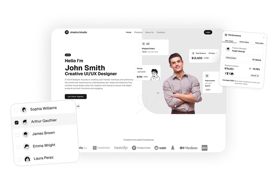
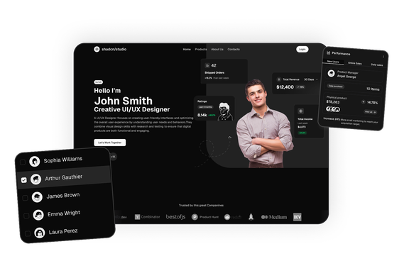
Shadcn Datatable Filtering: Searchable, Condition-Based Filter Examples
A long list only helps if people can narrow it down fast. A good datatable filter does that: search box, condition builder, category dropdowns, date ranges, whatever the data needs, so the table only shows what someone's actually looking for. These datatable filtering blocks have that already wired in, from a single search box up to a multi-condition filter builder.
Every block is built with React, Tailwind CSS and shadcn/ui, and works with both Base UI and Radix UI. Open one, add a filter, and watch the table narrow down live before you install anything.
Want to lay out a full page around one of these tables without hand-coding it? The Shadcn Builder lets you drag and drop blocks, including Datatable blocks, straight onto a page and export the code.
What Is a Datatable Filter?
A datatable filter narrows the rows a table shows, without touching the underlying data. It can be as simple as a search box that matches text, or as specific as a condition like "contains" or "does not contain" applied to one field.
Some blocks stack several filters at once, so a table can be narrowed by category, status and a date range all together, with a Clear control to reset everything back to the full list.
Components Used in These Filtering Blocks
- shadcn/ui components Input, Select, Button, Badge, Avatar, Progress, Tabs, Date Picker and Dropdown Menu, all parts your project already has.
- Base UI or Radix UI Works with either, so there's nothing to change when you drop it into your project.
What You Get in Every Filtering Block
- A search box. Free-text search that narrows rows as you type.
- Condition-based filters. "Contains" and "does not contain" style rules, stackable into more than one condition at a time.
- Category and status dropdowns. Narrow by a specific field, like service, status or line type, instead of searching by text.
- Date range filtering. A calendar-based range picker for tables with a time dimension.
- A Clear control. One click removes every active filter and returns the table to its full list.
- A live result count. The table updates its own row count or summary as filters change, so the current state is always visible.
- Dark mode. The blocks follow your theme, so you can match your brand with the theme generator.
Where to Use These Filtering Blocks
Project and task tools use condition-based filters so a team can isolate exactly the tasks that match several rules at once, the way the task delivery table does. Finance tools use category and date filters to narrow a long ledger down to one line type over one period, which fits the treasury waterfall layout. Release and ops tools use service and status dropdowns to cut a long review queue down to what actually needs attention right now, paired well with a statistics component for an at-a-glance summary above the table.
Related Datatable Block Categories
Filtering is one of nine datatable categories on shadcn studio. Browse the others depending on what your table needs to do:
- Datatable Example
- Datatable Columns
- Datatable Drag & Drop
- Datatable Editing
- Datatable Expansion
- Datatable Grouping
- Datatable Infinite Scroll
- Datatable Export
Explore More Shadcn Block Groups
Browse the full shadcn studio blocks library by product surface. Each group bundles category-level blocks you can mix and match across your project.
- Marketing UI Blocks: Hero, pricing, testimonials, FAQ and login pages for landing sites.
- Dashboard & Application Blocks: Dashboard shells, charts, widgets and account settings.
- eCommerce UI Blocks: Product lists, carts, checkout and order summaries.
- Datatable UI Blocks: Data tables across 9 categories, including the filtering blocks on this page.
- Bento Grid UI Blocks: Asymmetric grid layouts for feature sections.
- Free Blocks: A free set across marketing, dashboard and eCommerce, handy for trying the library first.