Shadcn Bento Cards
Explain features at a glance with Shadcn Bento Cards. Perfect for showcasing data flows, workflows, and exports as bento tiles in a bento grid.
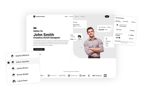
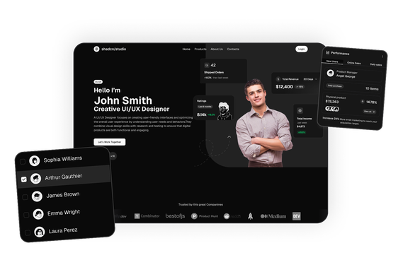
This Shadcn Bento Card shows a data distribution beam from a PostgreSQL source to cache, CDN, and backup nodes, with a title and description.
This Shadcn Bento Card shows an idea-to-result AI workflow with flipping text, a typing prompt box, and animated connection beams, with a title and description.
This Shadcn Bento Card shows an AI search box linked to document and task icons with a sample prompt and result, with a title and description.
Shadcn Bento Cards Blocks
Shadcn Bento Cards Blocks are modern UI components designed to explain products, features, and workflows through compact illustrated cards. Built using Shadcn UI, Tailwind CSS, and React, these blocks pair a small diagram with a short title and a one-line description, so each card tells one idea at a glance.
Bento cards are widely used to build a bento grid on SaaS landing pages, developer tools, documentation sites, and product feature sections where a feature is easier to show than to describe. A card can show data flowing between systems, an AI search box, a filter feeding an export, or a terminal running one command, and the layout stays clean enough to sit in a grid.
At Shadcn Studio, developers can explore a wide collection of Shadcn Blocks. The bento cards blocks include responsive layouts with node-and-line diagrams, icon chips, and short captions that help developers build feature sections quickly. You can use these bento cards to build a Bento Grid or a full bento section, arranging them as bento tiles that are easy to scan.
What Is a Bento Card in Web Design?
A bento card is a self-contained card that presents one feature or idea with a small illustration on top and a short caption below. The illustration usually shows how something works, using icons, labeled chips, and connecting lines instead of long paragraphs.
A typical bento card includes:
- A diagram or illustration of the feature in action
- Icon chips and labeled nodes
- Connecting lines or flows between nodes
- A short bold title
- A one-line description of the benefit
Bento cards help visitors understand a feature in a few seconds. When several are arranged side by side, they become bento tiles in a grid, each one answering a different question about the product. You can use these cards to make a Shadcn Bento Grid or a bento section for your landing page.
Components Used in These Bento Cards Blocks
Bento cards blocks are assembled from a small set of shadcn/ui components: Card for the card container, Badge for labels and status chips, Button for export and action chips, Input for search fields, Checkbox for filter options, Avatar for people and brand icons and Toggle for light and dark mode switches. The connecting lines and flow diagrams are custom markup.
Why Use Shadcn Bento Cards Blocks?
Shadcn bento cards blocks provide ready-made illustrated cards that help developers explain features clearly and consistently.
- Show Instead of Tell: A diagram on each card that explains how a feature works without a long description.
- Built with React and Tailwind: Easy to integrate with frameworks such as Next.js and modern frontend stacks.
- Consistent Card Structure: The same layout of illustration, title, and description across every card, so a set of bento tiles looks cohesive.
- Easy to Scan: Short titles and one-line descriptions that let visitors read a whole section in seconds.
- Responsive Layouts: Cards stack and reflow across desktop, tablet, and mobile devices.
- Copy-Paste Developer Workflow: A copy-paste or CLI install workflow for adding bento cards with Shadcn components to your pages quickly.
- Dark Mode Compatibility: Blocks follow your theme, so they work in light and dark modes.
Key Elements of a Bento Card
Effective bento cards include several important elements.
- Illustration Area: A diagram at the top of the card that shows the feature visually.
- Nodes and Chips: Small labeled elements with icons that stand for systems, steps, files, or fields.
- Connecting Lines: Lines or flows between nodes that show how data or steps move.
- Short Title: A bold headline that names the feature or the outcome.
- One-Line Description: A sentence that explains the benefit in plain words.
Types of Bento Cards Layouts
Different products need different kinds of bento cards. Shadcn Bento Cards Blocks include layouts for several common feature stories.
- Data Flow Cards: A source feeding caches, CDNs, and backups, or an API and a database kept in sync, with nodes joined by lines.
- Workflow Cards: A step-by-step flow, such as an idea turning into a prompt, code, and a working result, or a pipeline with filters and live transfer rates.
- Routing Cards: One input split between several destinations, with throughput rates shown on each path.
- Search and AI Cards: A search box that finds answers across documents and tasks, with result placeholders and an AI label.
- Integration Hub Cards: A central hub connected to a column of frameworks on one side and the services it delivers on the other.
- Export Cards: Filter chips and field chips that lead to an export button or a downloadable file, such as a CSV.
- Theme and Setup Cards: Cards for syncing themes between code and design files, switching light and dark modes, and installing with one terminal command.
Bento Builder
You can also use these bento cards blocks in our Bento Builder to build a bento grid. Pick the cards you need, arrange them as bento tiles, and put together a complete bento grid or bento section without laying it out by hand.
The Bento Builder works alongside the Bento Grid blocks, so you can combine illustrated bento cards with other tiles to build the layout you need.
All Shadcn Block Groups
Bento cards are one part of the shadcn studio library, which is organized into six block groups. Browse the rest to build the other parts of your product:
- Marketing UI Blocks: Landing page sections including hero, features, pricing, testimonials, bento grid and more.
- Dashboard & Application Blocks: Dashboard shells, charts, widgets, statistics and dialogs for app interfaces.
- eCommerce UI Blocks: Product lists, carts, checkout pages and order summaries for online stores.
- Datatable UI Blocks: Interactive data tables with sorting, filtering, grouping and row actions.
- Bento Grid UI Blocks: Asymmetric grid layouts for feature showcases, with the bento cards blocks on this page.
- Free Blocks: A free set across marketing, dashboard and eCommerce, handy for trying the library first.
Use Cases for Bento Cards Blocks
Shadcn bento cards blocks are widely used across many types of websites.
- Bento Grid and Bento Sections: Use the cards as the tiles of a bento grid or place them in a bento section on a landing page.
- SaaS Landing Pages: Show core features, such as syncing, search, and exports, as a grid of illustrated cards.
- Developer Tools: Explain integrations, data pipelines, and one-command installs with simple diagrams.
- Documentation Sites: Give each concept a visual summary that readers can take in before reading the details.
- Data and Analytics Products: Show how data is filtered, routed, enriched, and exported between systems.
- Design System and Theme Products: Present theme syncing, light and dark switching, and setup steps as quick cards.
Features of Shadcn Bento Cards Blocks
Shadcn bento cards blocks include UI features designed for modern feature sections.
- Illustrated cards with node-and-line diagrams
- Icon chips, labeled nodes, and status indicators
- Short titles and one-line descriptions
- Filter, search, and export controls shown inside the illustration
- Consistent card spacing and typography across a set of bento tiles
- Responsive layouts, Tailwind CSS styling, and dark mode compatibility
- Reusable Shadcn UI components and customizable source code
These features help developers create feature sections that explain products visually and keep visitors reading.
Base UI Bento Cards Block Support
Shadcn Studio layouts can be integrated into scalable Base UI Bento Cards Block workflows for modern React applications. Developers can build accessible and composable feature sections while maintaining flexible card layouts and reusable marketing components, and many teams prefer these patterns for scalable feature sections and modern product pages.
To get proper guidance, refer the tutorial on how to Migrate from Radix UI to Base UI