Shadcn Blocks Free
Explore free Shadcn Studio blocks to build faster with ready-to-use UI components. Copy, customize, and ship modern interfaces with ease.
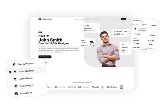
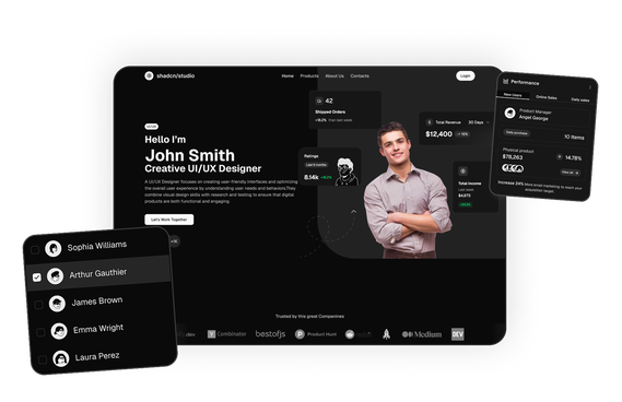
Free Shadcn Blocks
Free Shadcn Blocks are ready-to-use UI components that developers can use to build modern web interfaces without paying for premium templates. Built using Shadcn UI, Tailwind CSS, and React, these blocks help developers quickly create landing pages, dashboards, and application interfaces with production-ready layouts.
Free blocks are ideal for developers exploring Shadcn UI, startups building MVPs, and teams testing UI components before upgrading to premium collections. These blocks can be copied directly into projects and customized to match different design systems and branding requirements.
At Shadcn Studio, the Free Shadcn Blocks category provides a curated set of UI blocks that developers can use immediately. These blocks allow developers to experiment with layouts, test components, and build fully functional web interfaces faster.
Many teams also integrate these layouts into scalable Base UI Free Blocks workflows and reusable Radix UI Free Blocks systems for modern React applications.
What Are Free UI Blocks in Web Development?
Free UI blocks are pre-built interface sections that developers can reuse in their projects without writing code from scratch. These blocks provide complete layout structures that can be copied, customized, and integrated into applications.
A typical free UI block includes:
- Pre-designed layout structures
- Responsive Tailwind CSS styling
- React component architecture
- Interactive UI elements
- Customizable code and styles
Free blocks help developers prototype, build, and launch web interfaces quickly while maintaining consistent design systems.
Components Used in These Free Blocks
Free blocks are assembled from a small set of shadcn/ui components, the same ones used across the library: Button for calls-to-action, Card for content panels, Input for forms and search, Badge for labels, Avatar for profile images, Accordion for FAQs and Tabs for switching between views.
Why Use Free Shadcn Blocks?
Free Shadcn blocks provide an accessible way for developers to start building modern interfaces quickly.
Fast UI Development
Developers can copy and paste production-ready components instead of designing layouts from scratch.
Built with React and Tailwind
Free blocks are built using React and Tailwind CSS, making them easy to integrate with frameworks like Next.js and modern frontend stacks.
These layouts also work well for composable Base UI Free Blocks implementations with scalable frontend workflows.
Great for Prototyping
Free blocks allow developers to experiment with layouts and quickly create MVPs or prototypes.
Fully Customizable
Developers can modify the code, styling, and structure to match their project requirements.
Many developers use Radix UI Free Blocks patterns for accessible and reusable interface systems.
Responsive Design
Free blocks are designed to work across desktop, tablet, and mobile devices.
Key Elements of Free UI Blocks
Effective UI blocks usually include several core elements.
Reusable Layout Structures
Blocks provide reusable layouts that can be applied across multiple pages.
Component-Based Design
Each block is built as a modular component that can be reused in different projects.
Tailwind Utility Styling
Tailwind CSS classes allow developers to customize styles quickly.
Interactive UI Elements
Blocks often include buttons, forms, or interactive components.
Responsive Grid Layouts
Layouts automatically adjust for different screen sizes.
Types of Free UI Blocks
Different types of free blocks can be used depending on the page being built.
Hero Section Blocks
Used at the top of landing pages to introduce products or services.
Feature Section Blocks
Highlight product capabilities or benefits.
Navigation Blocks
Include headers, navbars, and menus.
Authentication Blocks
Provide login, registration, and password recovery interfaces.
Content Layout Blocks
Display blog posts, galleries, or portfolios.
All Shadcn Block Groups
Free blocks are one part of the shadcn studio library, which is organized into six block groups. Browse the rest to build the other parts of your product:
- Marketing UI Blocks: Landing page sections including hero, features, pricing, testimonials and more.
- Dashboard & Application Blocks: Dashboard shells, charts, widgets, statistics and dialogs for app interfaces.
- eCommerce UI Blocks: Product lists, carts, checkout pages and order summaries for online stores.
- Datatable UI Blocks: Interactive data tables with sorting, filtering, grouping and row actions.
- Bento Grid UI Blocks: Asymmetric grid layouts for feature showcases.
- Free Blocks: A free set across marketing, dashboard and eCommerce, handy for trying the library first, with the free blocks on this page.
Use Cases for Free Shadcn Blocks
Free Shadcn blocks are widely used across many types of projects.
Startup MVP Development
Build early-stage products quickly without designing every Shadcn UI component.
Landing Page Development
Create marketing pages for SaaS products and startups.
Developer Prototyping
Test product ideas using ready-made UI layouts.
Educational Projects
Learn modern frontend development using real UI components.
Open Source Projects
Add polished interfaces to community tools and applications.
Features of Free Shadcn Blocks
Free Shadcn blocks include several UI features designed for modern web development.
Common features include:
- Copy-paste ready UI components
- Modular React component structure
- Responsive layout design
- Tailwind CSS styling
- Interactive UI elements
- Dark mode compatibility
- Customizable component code
- Compatibility with modern React frameworks
- Flexible composition support for Base UI Free Blocks systems
- Accessible interface patterns for Radix UI Free Blocks workflows
These features allow developers to build complete user interfaces faster while maintaining flexibility and customization.
Base UI Free Blocks Support
Shadcn Studio layouts can be integrated into scalable Base UI Free Blocks workflows for modern React applications. Developers can build accessible and composable UI systems while maintaining flexible layout structures and reusable frontend interfaces.
To get proper guidance, refer the tutorial on how to Migrate from Radix UI to Base UI
Radix UI Free Blocks Support
The layouts also work well with Radix UI Free Blocks implementations commonly used in the Shadcn ecosystem. Developers can leverage accessible primitives, composable interface structures, and reusable UI workflows for production-ready applications.
Many teams prefer Radix UI Free Blocks patterns for scalable frontend systems and modern development experiences.
FAQs
Free Shadcn blocks are ready-to-use UI components built with Shadcn UI, Tailwind CSS, and React that developers can use to build modern web interfaces without cost.
Yes. Most free Shadcn blocks can be used in personal and commercial projects, depending on the license terms provided by the platform.
Yes. Developers can modify the layout, styling, and functionality of free Shadcn blocks to match their project requirements.
Free Shadcn blocks are ideal for developers, startups, designers, and teams who want to build modern interfaces quickly without creating UI components from scratch.
Yes. Developers can integrate these layouts into scalable Base UI workflows with reusable and customizable interface systems.
Yes. The layouts work well with Radix UI primitives and composable interface structures commonly used in modern React applications.
Yes, the design file is included with the premium blocks, but it is available only if you have purchased the Pro, Enterprise, or Team plan.
Yes, the Pro, Enterprise, and Team plan comes with Pro blocks included.
Please join our Discord channel and let one of the project maintainers know that you have purchased Shadcn Studio Pro. You will then have access to a private support channel.
You can reach us for any account, billing, or license questions through the chat feature located at the bottom right corner of our website's pages.