Shadcn Testimonials Component
Highlight client feedback with Shadcn Testimonials sections. Slider and static layouts designed to boost credibility and trust.
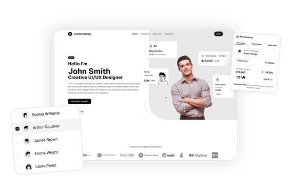
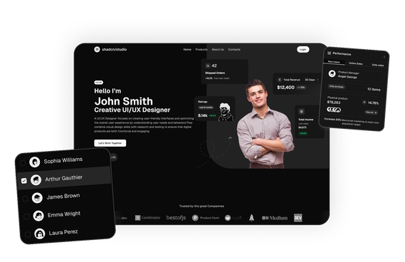
Shadcn Testimonials Blocks
Shadcn Testimonials Blocks are modern UI components designed to showcase customer feedback, reviews, and success stories on landing pages and marketing websites. Built using Shadcn UI, Tailwind CSS, and React, these testimonial sections help businesses present social proof in a visually engaging way.
Testimonials are one of the most effective ways to build trust with potential customers. By displaying real user experiences, businesses can demonstrate credibility and reduce skepticism when visitors evaluate a product or service.
At Shadcn Studio, you will find numerous Shadcn UI Blocks. The testimonial blocks include responsive layouts such as review cards, testimonial sliders, customer story sections, and carousel components designed to highlight customer experiences and strengthen credibility.
What Is a Testimonials Section in Web Design?
A testimonials section is a part of a website that displays customer feedback, reviews, or success stories about a product or service. These sections typically appear on landing pages, product pages, and marketing websites to help establish trust and credibility.
A typical testimonials section includes:
- Customer quotes or reviews
- Customer names and roles
- Company logos or brand attribution
- Star ratings or feedback scores
- Customer avatars or profile images
Testimonials help demonstrate real experiences from existing customers, making them a powerful form of social proof that influences purchasing decisions.
Components Used in These Testimonials Blocks
Testimonial blocks are assembled from a small set of shadcn/ui components: Card for review cards, Avatar for customer photos, Carousel for rotating testimonials, Badge for ratings and labels and Button for slider controls and calls-to-action.
Why Use Shadcn Testimonials Blocks?
Shadcn testimonial blocks make it easy to showcase customer feedback using professional and conversion-focused UI layouts.
- Modern Social Proof Layouts: Clean layouts designed to highlight customer quotes, ratings, and success stories.
- Built with React and Tailwind: Easy to integrate with frameworks like Next.js.
- Responsive Testimonial Sections: Layouts adjust across desktop, tablet, and mobile devices.
- Trust-Focused UI Design: Avatars, names, company attribution, and rating indicators that emphasize authenticity.
- Developer-Friendly Implementation: A copy-paste or registry install workflow for quick integration.
- Dark Mode Compatibility: Blocks follow your theme, so they work in light and dark modes.
Types of Testimonials Layouts
- Testimonial Grid: Multiple testimonials displayed in a grid format.
- Carousel Testimonials: Testimonials that rotate automatically in a slider or carousel.
- Single Featured Testimonial: A large highlighted testimonial emphasizing one customer story.
- Card-Based Testimonials: Each testimonial as a card with quote, avatar, and attribution.
- Video Testimonials: Embedded video reviews or customer interviews.
Related Shadcn Marketing UI Block Categories
Testimonials Component is one of nine Marketing UI categories on shadcn studio. A good landing page pairs the testimonials section with these:
- Shadcn Hero Section: Opening banners with a headline, call-to-action and product visual for the top of a landing page.
- Shadcn Features Section: Highlight what your product does with feature grids, icon lists and visual breakdowns.
- Shadcn Pricing Component: Plan cards and comparison layouts that make the cost of each tier clear.
- Shadcn Social Proof: Stats, user counts and trust signals that show people already rely on you.
- Shadcn Portfolio: Showcase layouts for projects, case studies and creative work.
- Shadcn Team Section: Introduce the people behind the product with profile cards and role details.
- Shadcn CTA Section: Closing call-to-action banners that push visitors toward signing up or getting started.
- Shadcn Logo Cloud: Rows of customer or partner logos that show who you work with.
All Shadcn Block Groups
Testimonials sections are one part of the shadcn studio library, which is organized into six block groups. Browse the rest to build the other parts of your product:
- Marketing UI Blocks: Landing page sections including hero, features, pricing, testimonials and more, with the testimonials blocks on this page.
- Dashboard & Application Blocks: Dashboard shells, charts, widgets, statistics and dialogs for app interfaces.
- eCommerce UI Blocks: Product lists, carts, checkout pages and order summaries for online stores.
- Datatable UI Blocks: Interactive data tables with sorting, filtering, grouping and row actions.
- Bento Grid UI Blocks: Asymmetric grid layouts for feature showcases.
- Free Blocks: A free set across marketing, dashboard and eCommerce, handy for trying the library first.
Use Cases for Testimonials Blocks
Shadcn testimonial blocks are widely used across many types of websites.
- SaaS Landing Pages: Showcase customer success stories and product outcomes.
- Startup Websites: Build trust with early adopters and potential customers.
- Product Marketing Pages: Display feedback from real users to reinforce value.
- Agency Websites: Highlight client experiences and project results.
- Enterprise Software Websites: Showcase testimonials from executives or company leaders.
Base UI and Radix UI Testimonials Block Support
Shadcn Studio layouts can be integrated into scalable Base UI Testimonials Block workflows for modern React applications. Developers can build accessible and composable testimonial systems while maintaining flexible customer feedback layouts and reusable review presentation interfaces.
The layouts also work well with Radix UI Testimonials Block implementations commonly used in the Shadcn ecosystem. Developers can leverage accessible primitives, composable testimonial structures, and reusable social proof workflows for production-ready applications, and many teams prefer these patterns for scalable marketing systems and modern credibility-focused experiences.
To get proper guidance, refer the tutorial on how to Migrate from Radix UI to Base UI
FAQs
A testimonials section displays feedback, reviews, or success stories from customers. It helps build credibility and trust by showing real user experiences with a product or service.
Shadcn testimonials blocks are reusable UI components built with shadcn/ui, Tailwind CSS, and React that showcase customer reviews, quotes, ratings, and social proof on landing pages.
Yes. Shadcn testimonial blocks are built using React components and work seamlessly with frameworks like Next.js and other modern frontend stacks.
Testimonials provide social proof by showing real customer experiences. This helps potential users trust a product and increases the likelihood of conversion.
Yes. Developers can integrate these layouts into scalable Base UI workflows with reusable and customizable testimonial systems.
Yes. The layouts work well with Radix UI primitives and composable testimonial structures commonly used in modern React applications.
Yes. Developers can customize layout, typography, avatars, icons, sliders, and spacing using Tailwind CSS while maintaining compatibility with React components.
Yes, the design file is included with the premium blocks, but it is available only if you have purchased the Pro, Enterprise, or Team plan.
Yes, the Pro, Enterprise, and Team plan comes with Pro blocks included.
Please join our Discord channel and let one of the project maintainers know that you have purchased Shadcn Studio Pro. You will then have access to a private support channel.
You can reach us for any account, billing, or license questions through the chat feature located at the bottom right corner of our website's pages.