Shadcn Gallery Component
Showcase images with Shadcn Gallery blocks. Ideal for portfolios, projects, or product displays in responsive, grid-based layouts.
Gallery 3
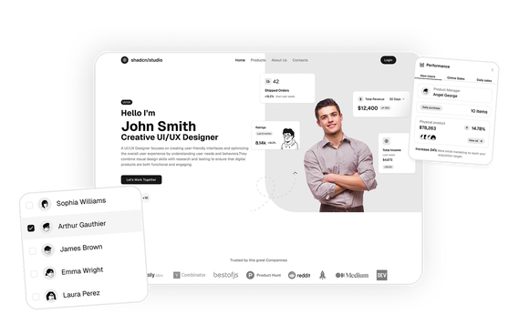
BasicThis Shadcn Gallery offers an interactive carousel with thumbnail navigation, autoplay, dynamic opacity, and a responsive layout with a "See all" button.
Shadcn Gallery Component Blocks
Shadcn Gallery Component Blocks are modern UI components designed to showcase images, visual content, and media collections in structured layouts. Built using Shadcn UI, Tailwind CSS, and React, these components help developers create visually engaging sections that highlight photos, products, projects, or creative work.
Gallery sections are widely used on portfolio websites, product pages, marketing websites, and creative platforms to present visual content in an organized way. By arranging images in responsive grids or interactive layouts, galleries help users explore content more easily.
At Shadcn Studio, you will find numerous Shadcn Blocks. The gallery component blocks provide responsive layouts for image grids, media showcases, and interactive galleries that allow developers to display visual content in a professional format.
Many teams also integrate these layouts into scalable Base UI Gallery Component Block workflows and reusable Radix UI Gallery Component Block systems for modern React applications.
What Is a Gallery Component in Web Design?
A gallery component is a UI section used to display multiple images or visual items in a structured layout. These components allow users to browse visual content such as photos, case studies, product images, or design work.
A typical gallery component includes:
- Image thumbnails or previews
- Grid or masonry layouts
- Navigation or carousel controls
- Hover animations or transitions
- Optional titles or captions
These Shadcn components help present visual collections in a browsable and visually engaging format, making them ideal for showcasing media-heavy content.
Why Use Shadcn Gallery Component Blocks?
Shadcn gallery blocks provide flexible layouts that make it easier to display images and media on modern websites.
Modern Visual Layouts
These blocks use grid-based or interactive layouts that organize images in a visually appealing structure.
Built with React and Tailwind
Shadcn gallery components are built using React and Tailwind CSS, allowing seamless integration with frameworks like Next.js and modern frontend stacks.
These layouts also work well for composable Base UI Gallery Component Block implementations with scalable visual content workflows.
Fully Responsive
Gallery layouts automatically adapt to desktop, tablet, and mobile devices.
Improved Visual Presentation
Well-designed galleries help users explore images, projects, and products without cluttering the page.
Many developers use Radix UI Gallery Component Block patterns for accessible and reusable media presentation interfaces.
Copy-Paste Developer Workflow
Shadcn blocks follow a copy-paste or CLI install workflow, allowing developers to integrate ready-to-use UI sections quickly.
Key Elements of a High-Converting Gallery Section
A well-designed gallery section includes several important elements.
High-Quality Images
Clear, high-resolution images help create a strong visual impression.
Structured Layout
Grid or masonry layouts keep visual content organized.
Interactive Navigation
Carousel or scrolling controls allow users to explore gallery items easily.
Captions and Descriptions
Optional titles or captions provide context for each image.
Hover Effects
Subtle animations make the gallery feel interactive and engaging.
Types of Gallery Component Layouts
Different websites use different gallery styles depending on the type of content being displayed.
Grid Gallery
Displays images in a structured grid layout.
Masonry Gallery
Images are arranged in staggered columns with varying heights.
Carousel Gallery
Users browse images sequentially using arrows or swipe gestures.
Lightbox Gallery
Clicking an image opens a full-screen preview.
Case Study Gallery
Combines images with titles and descriptions for project showcases.
Use Cases for Gallery Component Blocks
Shadcn gallery components are widely used across many types of websites.
Portfolio Websites
Showcase creative work, photography, or design projects.
SaaS Marketing Websites
Display product screenshots and feature highlights.
E-commerce Platforms
Present product images in visually engaging layouts.
Creative Agency Websites
Showcase client projects and case studies.
Content Platforms
Display visual media such as artwork, videos, or illustrations.
Features of Shadcn Gallery Component Blocks
Shadcn gallery blocks include several UI features designed for modern websites.
Common features include:
- Responsive image grid layouts
- Masonry and gallery-style arrangements
- Carousel and navigation controls
- Image hover animations
- Optional captions and metadata
- Tailwind CSS styling
- Accessible UI interactions
- Dark mode compatibility
- Flexible composition support for Base UI Gallery Component Block systems
- Accessible media showcase patterns for Radix UI Gallery Component Block workflows
These features help developers create visually engaging sections that showcase media content effectively.
Base UI Gallery Component Block Support
Shadcn Studio layouts can be integrated into scalable Base UI Gallery Component Block workflows for modern React applications. Developers can build accessible and composable gallery systems while maintaining flexible media layouts and reusable visual presentation interfaces.
To get proper guidence, refer the tutorial on how to Migrate from Radix UI to Base UI
Radix UI Gallery Component Block Support
The layouts also work well with Radix UI Gallery Component Block implementations commonly used in the Shadcn ecosystem. Developers can leverage accessible primitives, composable gallery structures, and reusable visual browsing workflows for production-ready applications.
Many teams prefer Radix UI Gallery Component Block patterns for scalable media systems and modern visual showcase experiences.