Shadcn Navbar Component
Navigate in style with responsive Shadcn Navbar blocks. Includes sticky headers, dropdowns, and mobile-ready layouts.
Shadcn Navbar Component Blocks
Shadcn Navbar Component Blocks are modern UI components designed to provide structured navigation at the top of a website. Built using Shadcn UI, Tailwind CSS, and React, these navbar components help developers create responsive navigation menus that guide users through different sections of a website.
Navigation bars are one of the most important UI elements on a website because they allow visitors to quickly access pages such as product features, pricing, documentation, or contact information. A well-designed navbar improves usability by providing clear navigation and quick access to important actions.
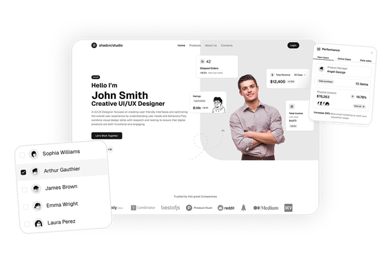
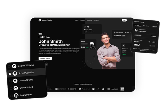
At Shadcn Studio, you will find numerous Shadcn Blocks. The navbar component blocks include responsive layouts with logos, navigation links, dropdown menus, search inputs, and action buttons that help developers build professional website headers quickly.
Many teams also integrate these layouts into scalable Base UI Navbar Component Block workflows and reusable Radix UI Navbar Component Block systems for modern React applications.
What Is a Navbar in Web Design?
A navbar (navigation bar) is a UI component typically placed at the top of a webpage that provides links to the main sections of a website. It helps users move between pages and access key resources without searching through the entire site.
A typical navbar includes:
- A website logo or brand identity
- Navigation links to important pages
- Dropdown menus for grouped content
- Call-to-action buttons such as Sign Up or Get Started
- Mobile navigation menus or hamburger icons
These Shadcn Components serve as the primary navigation system for most websites, making it easier for users to explore different sections and find information quickly.
Why Use Shadcn Navbar Component Blocks?
Shadcn navbar blocks provide flexible layouts that make it easier to create professional navigation systems.
Modern Navigation Layouts
These components use structured layouts that organize logos, links, and action buttons clearly.
Built with React and Tailwind
Shadcn navbar components are built using React and Tailwind CSS, allowing seamless integration with frameworks such as Next.js and modern frontend stacks.
These layouts also work well for composable Base UI Navbar Component Block implementations with scalable navigation workflows.
Fully Responsive
Navbar layouts automatically adapt to desktop, tablet, and mobile screens with responsive menu patterns.
Improved User Navigation
Well-designed navigation bars help users quickly move between pages and access key features.
Many developers use Radix UI Navbar Component Block patterns for accessible and reusable navigation interfaces.
Copy-Paste Developer Workflow
Shadcn blocks follow a copy-paste or CLI install workflow, allowing developers to integrate ready-to-use navigation components quickly.
Key Elements of a High-Converting Navbar
Effective navigation bars include several important elements.
Clear Navigation Links
Navigation links should guide users to the most important sections of the website.
Brand Logo
A recognizable logo reinforces brand identity and typically links back to the homepage.
Call-to-Action Buttons
Buttons like Sign Up, Start Free Trial, or Login encourage user engagement.
Dropdown Menus
Dropdown menus organize complex navigation structures without cluttering the interface.
Mobile Navigation
Responsive menus ensure the navbar works smoothly across all screen sizes.
Types of Navbar Layouts
Different websites use different navbar styles depending on their design and navigation needs.
Centered Navbar
The logo appears in the center with navigation links on either side.
Split Navbar
The logo appears on the left while navigation links and actions appear on the right.
Minimal Navbar
A simplified navigation bar with only essential links.
Mega Menu Navbar
Large dropdown menus that display multiple navigation categories.
Sticky Navbar
A fixed navigation bar that remains visible while users scroll the page.
Use Cases for Navbar Component Blocks
Shadcn navbar components are widely used across many types of websites.
SaaS Product Websites
Provide navigation links to product features, pricing, and documentation.
Startup Websites
Highlight key pages such as product overview, blog, and sign-up pages.
Developer Platforms
Link to documentation, tutorials, and developer resources.
E-commerce Websites
Guide users to product categories, shopping carts, and account pages.
Content Platforms
Allow readers to navigate blog posts, categories, and featured content.
Features of Shadcn Navbar Component Blocks
Shadcn navbar blocks include several UI features designed for modern web applications.
Common features include:
- Responsive navigation menus
- Dropdown and mega menu support
- Logo and branding sections
- Call-to-action buttons
- Mobile hamburger menus
- Search input integration
- Tailwind CSS styling
- Dark mode compatibility
- Flexible composition support for Base UI Navbar Component Block systems
- Accessible navigation patterns for Radix UI Navbar Component Block workflows
These features help developers create clear, accessible navigation systems that improve user experience and website usability.
Base UI Navbar Component Block Support
Shadcn Studio layouts can be integrated into scalable Base UI Navbar Component Block workflows for modern React applications. Developers can build accessible and composable navigation systems while maintaining flexible header layouts and reusable website navigation interfaces.
To get proper guidence, refer the tutorial on how to Migrate from Radix UI to Base UI
Radix UI Navbar Component Block Support
The layouts also work well with Radix UI Navbar Component Block implementations commonly used in the Shadcn ecosystem. Developers can leverage accessible primitives, composable navigation structures, and reusable menu workflows for production-ready applications.
Many teams prefer Radix UI Navbar Component Block patterns for scalable website systems and modern navigation experiences.