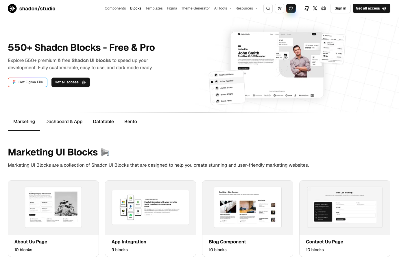
shadcn/studio Blocks Documentation
Build responsive layouts with shadcn/studio Blocks for rapid, professional web development.
In recent shadcn releases, an update was introduced to the tooltip component to address an issue related to TooltipProvider. As a result of this change, projects using the Tooltip component without an explicitly defined TooltipProvider may now encounter errors across affected blocks and components.
To resolve this, please ensure that TooltipProvider is added at the appropriate level in your layout file.
What does the Block mean?
A Block refers to a segment of pre-designed code, crafted by professional designers and developers to provide reusable components or structures within a project. This modular approach helps streamline the development process, ensuring consistency and efficiency.
How to effectively use the blocks?
Before using the shadcn/studio Blocks, make sure that you've installed shadcn in your project by following the official installation guide.
Once your project is ready, you can begin integrating blocks by following ways:
Copy the Code
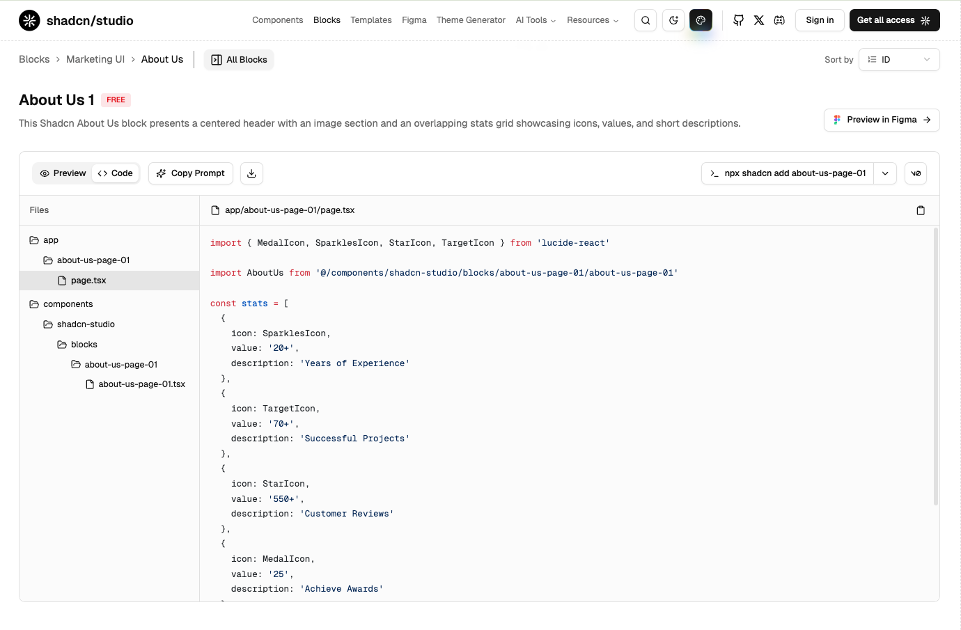
- Choose your desired block (e.g., About us Section).
- Click the Code tab to view different files containing respective code.
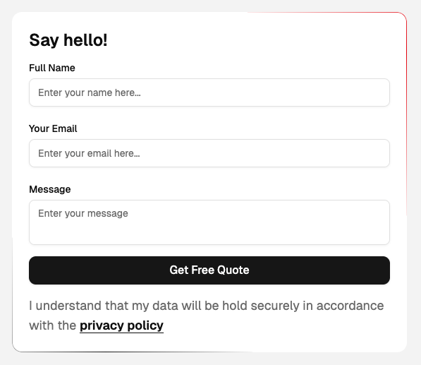
- Copy the code and paste it into your project, following the folder structure shown on the left in the above image.
Using Shadcn CLI
The Shadcn CLI is the fastest way to add blocks to your project. It handles everything automatically:
- Downloads the block code
- Installs required dependencies
- Sets up proper file structure
- Configures all necessary imports
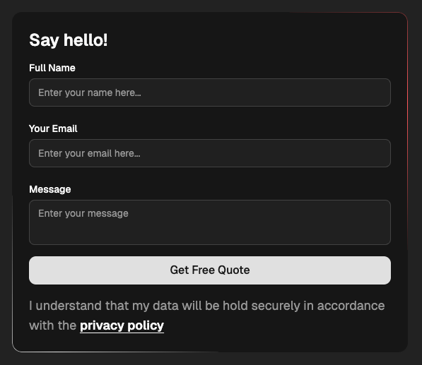
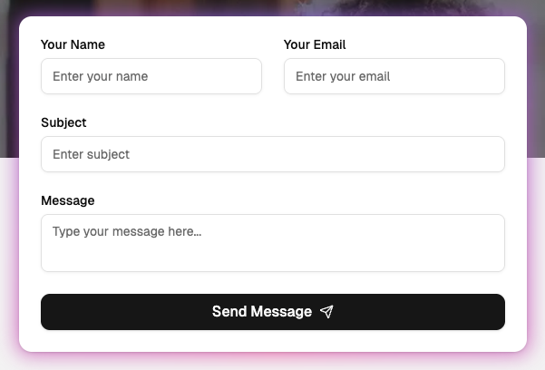
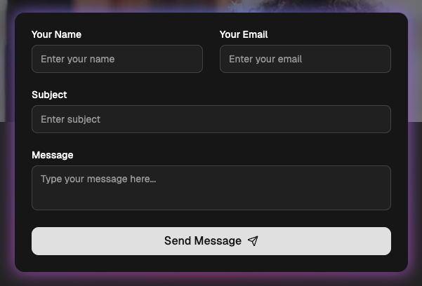
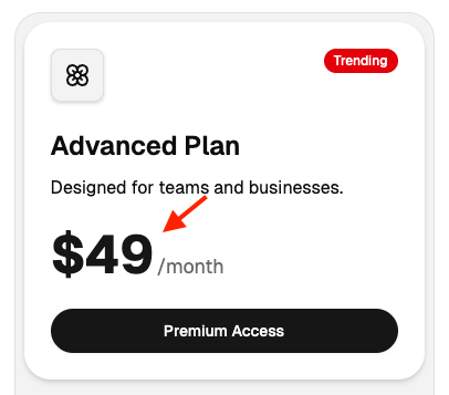
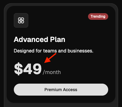
Some components in blocks may still appear rounded when using the Lyra or Sera styles/themes, even though these themes are designed to have a square look. This happens because some cards or buttons use custom styling to make the blocks look good across different styles/themes
If you prefer to enforce a fully square appearance while using the Lyra or Sera themes, you have the following options:
- Remove rounded utility classes from installed blocks (Recommended):
If you only want specific blocks to follow the square theme while preserving rounded corners elsewhere in your project, you will need to manually remove the
rounded-*utility classes from the installed block/components. - Apply a global border radius override
Update the
Please note that this will remove border radius across the entire blocks/templates/project.radiusvariable to0in yourglobals.cssfile:
Aligning Chart Colors with Shadcn Studio
By default, shadcn provides its own chart color palette. However, these default colors may not compatible with our design system used in our blocks. To ensure your charts visually align with the blocks design, follow the steps below to override the chart color variables.
Step 1: Open the Theme Customizer
Access the Theme Customizer from the right-top of navigation
Step 2: Reset the Customizer (Important):
Make sure the Theme Customizer is in its default (reset) state before proceeding.
Step 3: Copy the CSS Variables
- Click the Copy button (located next to the Undo/Redo buttons).
- A dialog will open.
- Navigate to the second tab: Step 2 – CSS Variables.
Step 4: Use the Provided Chart Variables
You will find the following CSS variables:
Step 5: Replace These Variables in Your Global Styles
If you've already set up shadcn, replace the existing --chart-* variables in your global CSS file with the ones above. If not, simply paste them into your global.css. This will override the default chart colors and match them with the blocks theme
Using Download Button
Perfect for offline work or when you want full control over file organization. Here's how:
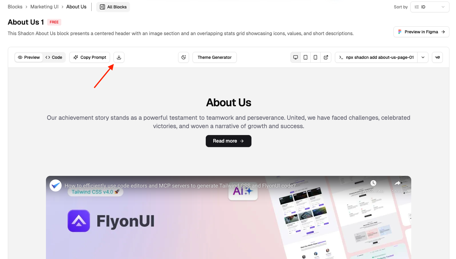
Step 1: Download the ZIP
- Find your desired block
- Click the Download button
- Save the ZIP file to your computer
Step 2: Extract Files
- Unzip the downloaded file
- You'll find folders like:
components/,lib/,assets/ - Each folder contains the necessary files for the block
Step 3: Move to Your Project
- Copy files to your project's corresponding folders
- Update import paths if your project structure is different
Step 4: Install Dependencies
- Check the included imports.
- Install the dependencies using in the files.
Step 5: Test Integration
- Import the block in your desired page/component
- Run your development server
- Check for any missing imports or styling issues
Using Copy Prompt
Let AI do the heavy lifting! Perfect for quick iterations and smart customizations.
- Click Copy Prompt on any block
- Paste into your AI editor (VS Code, Cursor, Windsurf)
- Add custom instructions like: "Add this block below the hero section."
- Let AI generate the perfect code for your needs
Using Figma Preview
See exactly how blocks look before coding:
- Click "Preview in Figma"
- View blocks in professional design environment
- Perfect for design reviews and team collaboration
- Ensure pixel-perfect implementation
Sorting and Finding Blocks
shadcn/studio provides powerful sorting and filtering options to help you quickly find the perfect blocks for your project. The sorting feature is available on the blocks page to organize content based on your preferences.
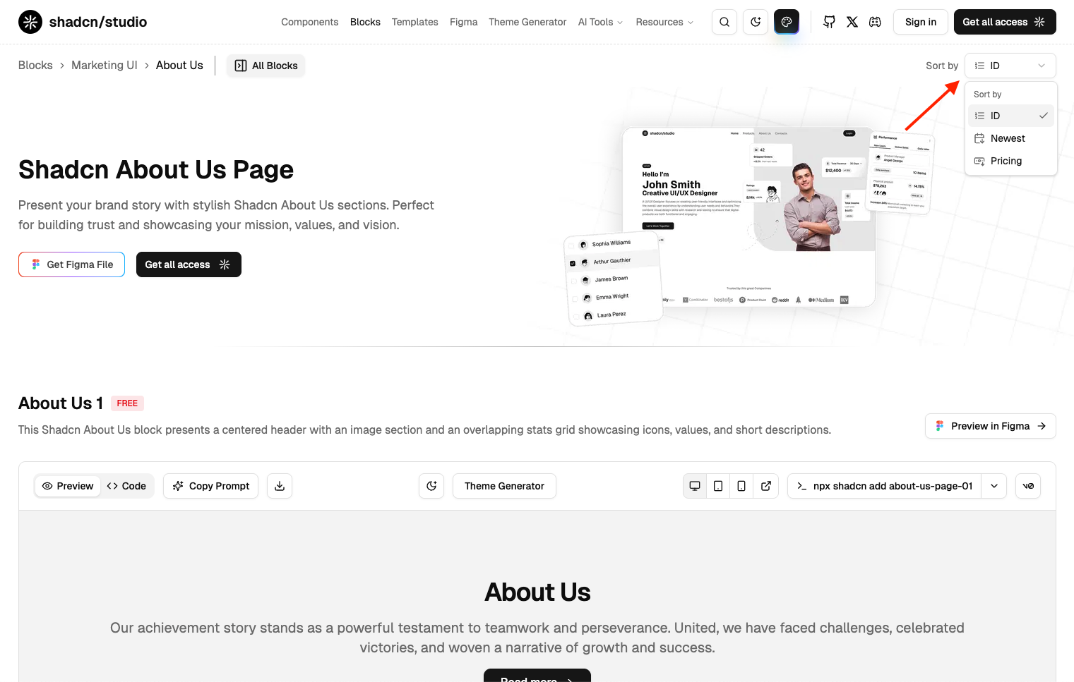
How to Use Block Sorting
Step 1: Access the Sorting Menu
- Navigate to the Blocks page
- Look for the Sort by dropdown in the top-right corner
- Click on the dropdown to reveal sorting options
Step 2: Choose Your Sorting Preference
- Select Newest to see the latest blocks and stay updated with fresh designs
- Choose Pricing to quickly identify free blocks or explore Pro features
- Pick ID for a systematic approach to browsing through all available blocks
Step 3: Browse and Select
- Blocks will automatically reorder based on your selection
- Use this organized view to quickly identify blocks that match your needs
How to customize the blocks?
Customizing blocks is easy with shadcn/ui and TailwindCSS. Here's how you can do it:
1. Using Shadcn components:
Shadcn offers predefined props for common UI elements like size, variant, many more.
For example:
Change Button size: You can change button size using props like
2. Using TailwindCSS:
TailwindCSS provides utility classes to easily adjust the spacing, padding, margin, and other layout properties.
For example:
Padding: You can adjust padding using classes like
p-2,p-4(increasing the padding).Margin: Similarly, you can adjust margin using classes like
m-2,m-4(increasing the margin).Gap: You can also use the
gapclass to adjust the space between elements within a flex or grid layout.
3. Update Icons
Blocks uses Lucide Icons from lucide-react, but you can also use any other icon of your choice.
With these simple steps, you can quickly adjust and style your blocks using both shadcn/ui and TailwindCSS classes without needing to write extra CSS.
How can I modify shadcn/studio block using shadcn/studio MCP?
You can easily modify shadcn/studio blocks using the MCP (MCP Server) by using the /rui command. This command allows you to interact with the MCP Server and make changes to the blocks as per your requirements.
Example: /rui Update the layout of hero section from vertical to Horizontal.
How to Remove Animations from Blocks
While our animations enhance the user experience, you might want to remove them to use only the UI elements or to implement your own custom animations. Follow these guidelines to modify animation behavior in your blocks:
Method 1: Remove Standalone Animation Components
For many blocks, you can simply remove the animated component's import and usage. Here are the most common standalone animations you can remove without affecting functionality:
1. Background Stars
Remove the StarsBackground component import and all instances where it's used.

2. Border Beam
Remove the BorderBeam component import and usage from your block.
3. Cursor Effects
Remove these cursor-related components: CursorProvider, Cursor, and CursorFollow
4. Glow Effect
Remove the GlowEffect component import and usage for a cleaner interface without the glowing animation.
Method 2: Replace with Static Alternatives
For animations that are integrated with content display, replace the animated components with standard HTML or React components:
1. Number Ticker
Replace the NumberTicker component with a simple span element to display static numbers.
For example:
2. Global Tooltip
Replace components imported from /global-tooltip with standard tooltip components from /tooltip
3. Motion Presets
Replace animation wrappers like MotionPreset with standard HTML elements.
For example: