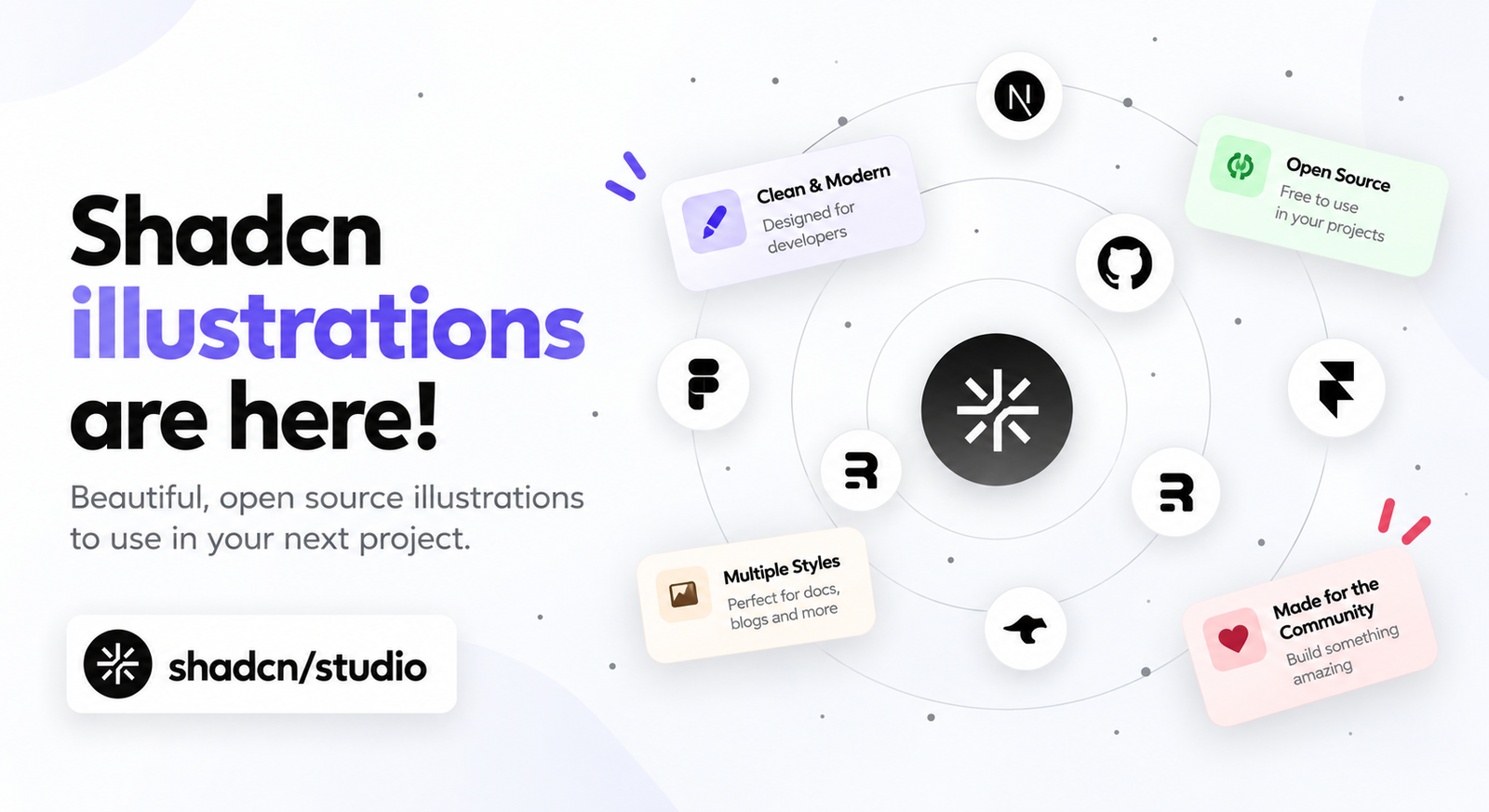
We're excited to introduce Shadcn illustrations: a growing collection of 70+ animated and static visuals built for modern React applications. Add polished graphics to a hero, bento grid, feature section, or product page without designing every visual from scratch.
Each illustration is a self-contained React component built with Tailwind CSS and designed to work naturally with shadcn/ui. Explore the collection at Shadcn illustrations, preview an illustration, and add the source code directly to your project.
More Than Simple Icons
Text and icons can communicate a feature, but they do not always show how it feels. These animated illustrations add motion, depth, and personality to the parts of a page that need to attract attention or explain an idea quickly.
The collection includes orbiting elements, stacked cards, ripple effects, scrolling marquees, charts, AI chats, terminals, globes, device frames, payment cards, and more. Use one on its own or combine several into visual compositions that tell a complete product story.
Key highlights:
- 70+ ready-to-use illustrations
- Animated and static options for different layouts
- Reusable React components built with Tailwind CSS
- Visuals for SaaS, AI, developer tools, e-commerce, and more
Motion, Theming, and Installation Are Handled
Every animated illustration includes polished motion patterns for entrance, in-view, and scroll-replay effects. You can also turn animation off with a prop when a static visual is a better fit, while reduced-motion preferences are respected by default.
Illustrations read your shadcn CSS variables, so your brand color, radius, and dark mode carry over automatically. You can then adjust colors, sizing, spacing, and animation speed with familiar Tailwind utility classes.
Install an illustration with the shadcn CLI, copy and paste its source file, or ask your coding agent to add it through the Shadcn Studio MCP server. Whichever workflow you choose, the component lives in your project and remains fully editable.
Key highlights:
- Motion is built in and can be disabled
- Theme tokens and dark mode are inherited automatically
- Source code stays inside your project
- Install through the CLI, MCP, or copy and paste
Built for the Sections That Matter
Shadcn illustrations can replace a static screenshot in a hero, bring individual benefits to life in a feature grid, or give every tile in a bento layout its own story. They also work well for integrations, stats and social proof, pricing and checkout flows, developer tools, empty states, and AI product experiences.
For larger landing-page sections, pair an illustration with Shadcn blocks to start with a production-ready layout and then adapt the visual and copy to your product.
You can also use the collection inside Shadcn pages, giving complete page layouts more movement while keeping their sections responsive and consistent.
When you need a complete starting point instead of an individual visual or section, a Shadcn template can provide the wider application structure while the illustrations help explain its most important features.
Designed to Match Your Brand
Because the components use standard shadcn/ui theme tokens, you do not need to configure a separate color system for every graphic. Switch themes or update your tokens and the illustrations continue to feel like part of the same interface.
Create a matching palette with the Shadcn Theme Generator, then use that theme across your components and illustrations for a consistent visual language.
Why Developers Will Love Shadcn Illustrations
Custom animated graphics can take significant design and development time. This release gives teams a faster starting point without giving up control over the result.
Key highlights:
- Add visual polish without creating graphics from scratch
- Own and edit every line of the component source
- Work with Next.js, React, Astro, Vite, React Router, and TanStack Start
- Reuse the same visual language across marketing and product experiences
- Start with free illustrations and unlock the full collection with Pro
Start Building with Shadcn Illustrations
The new illustration library makes it easier to create memorable product experiences while keeping the flexibility of source-owned React components. Choose a visual, match it to your theme, and drop it into the section where it can tell the story best.
Browse all Shadcn illustrations and bring your next hero, bento grid, feature section, or AI product page to life.