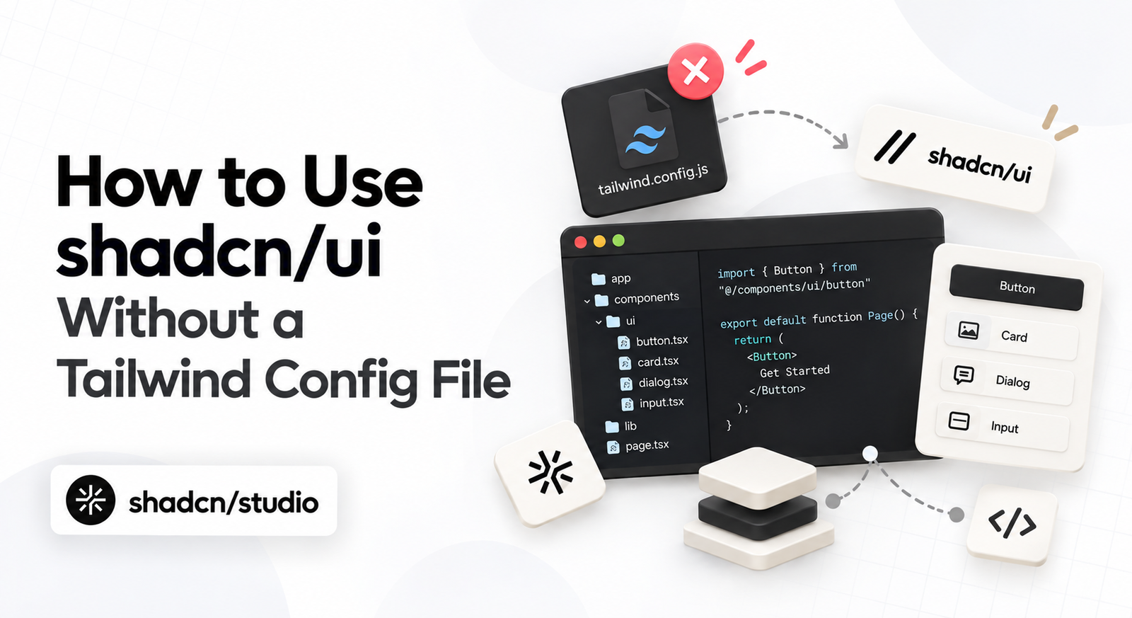
Can you use shadcn/ui without a tailwind.config.js file? Absolutely.
With Tailwind CSS v4, configuration has moved from JavaScript to CSS. Instead of maintaining a separate config file, you can define your theme, colors, fonts, and design tokens directly in your stylesheet.
shadcn/ui embraces this new CSS-first approach, making it possible to build and customize your components without a Tailwind config file.
Once the CSS-first setup is in place, Shadcn templates give you a complete starting point for dashboards, landing pages, and apps without changing how your theme tokens work.
If you only need individual sections, Shadcn blocks let you add ready-made UI while keeping the same components and CSS variables covered in this guide.
In this guide, let’s see how it works and how you can set up Shadcn without Tailwind Config File (tailwind.config.js) i.e Tailwind CSS v4 from scratch.
Tailwind v3 vs v4: What Actually Changed
| Tailwind v3 | Tailwind v4 | |
|---|---|---|
| Config location | tailwind.config.js | globals.css |
| Importing Tailwind | @tailwind base/components/utilities | @import "tailwindcss" |
| Defining tokens | theme.extend object | @theme directive |
| Color format | HSL | OKLCH |
| Dark mode | darkMode: "class" | @custom-variant dark |
| Content paths | content: [...] array | Auto-detected |
| Animations | tailwindcss-animate | tw-animate-css |
| Setup files | JS config + PostCSS config | One CSS file |
This makes Tailwind’s configuration simpler and keeps your design system closer to the styles that actually use it.
Step 1: Install Tailwind CSS
If you’re creating a new Next.js application, Tailwind CSS will be already bundled during project setup:
npx create-next-app@latest my-appFor an existing project, install Tailwind CSS along with its PostCSS plugin:
npm install tailwindcss @tailwindcss/postcss postcssThen create postcss.config.mjs in your project root:
const config = {
  plugins: {
    "@tailwindcss/postcss": {},
  },
};

export default config;
Pro Tip: On Vite, skip PostCSS entirely. Install @tailwindcss/vite and add it to the plugins array in vite.config.ts. It’s faster and needs no separate config file.
Step 2: Configure globals.css
This is where the biggest difference from Tailwind v3 becomes apparent.
With Tailwind v4, you don’t need:
@tailwind base;
@tailwind components;
@tailwind utilities;
Instead, simply import Tailwind:
/* app/globals.css */
@import "tailwindcss";
Then import the stylesheet from your root layout:
// app/layout.tsx
import "./globals.css";
That’s enough to get Tailwind running.
Example: Adding Custom Design Tokens
Custom tokens go in a @theme block. This is the direct replacement for theme.extend:
@import "tailwindcss";

@theme {
  --color-brand: oklch(0.62 0.19 265);
  --color-brand-soft: oklch(0.95 0.03 265);
  --font-display: "Poppins", sans-serif;
  --radius-card: 0.75rem;
}
Tailwind reads that block and generates utilities from it automatically. No config, no restart, no plugin:
export default function Card() {
  return (
    <div className="bg-brand-soft rounded-card p-6">
      <h2 className="font-display text-brand text-2xl">Config-free Tailwind</h2>
    </div>
  );
}
The naming prefix decides the utility family. --color-* produces color utilities, --font-* produces font utilities, --radius-* produces radius utilities.
Step 3: Initialize shadcn/ui
There are several ways to get started with shadcn/ui. Two common approaches are using shadcn/create or the shadcn CLI.
-
Using shadcn/create
Open shadcn/create and build your preset visually. Choose your style, colors, fonts, icons, and more.
Click Create Project, choose your package manager, and copy the generated command.
The generated command will look similar to this:
npx shadcn@latest init --preset [CODE] --template next -
Using CLI
Run the
initcommand to scaffold a new Next.js project. Follow the prompts to configure your project: base, preset, monorepo, and more.npx shadcn@latest init -t next
The CLI detects Tailwind v4, skips looking for a JS config, and writes its theme directly into your globals.css. And it setups the components.json in which all the required things regarding theming, styling, etc are defined for shadcn.
Step 4: Add shadcn/ui Components
Once shadcn/ui is initialized, you can start adding components.
For example, to add the Button component:
npx shadcn@latest add buttonComponents land in components/ui/ and pick up the theme immediately.
You can also add multiple components using a single command:
npx shadcn@latest add --allFor the complete list of available CLI commands and options, refer to the official shadcn/ui CLI documentation.
Example: globals.css After shadcn Init
After initializing shadcn/ui, your globals.css will contain the Tailwind import, animation utilities, theme variables, dark-mode configuration, and base styles.
@import "tailwindcss";
@import "tw-animate-css";

@custom-variant dark (&:is(.dark *));

:root {
  --radius: 0.625rem;
  --background: oklch(1 0 0);
  --foreground: oklch(0.145 0 0);
  --card: oklch(1 0 0);
  --card-foreground: oklch(0.145 0 0);
  ...
}

.dark {
  --background: oklch(0.145 0 0);
  --foreground: oklch(0.985 0 0);
  --card: oklch(0.205 0 0);
  --card-foreground: oklch(0.985 0 0);
  ...
}

@theme inline {
  --radius-sm: calc(var(--radius) - 4px);
  --radius-md: calc(var(--radius) - 2px);
  --radius-lg: var(--radius);
  --radius-xl: calc(var(--radius) + 4px);
  --color-background: var(--background);
  --color-foreground: var(--foreground);
  --color-card: var(--card);
  ...
}

@layer base {
  * {
    @apply border-border outline-ring/50;
  }
  body {
    @apply bg-background text-foreground;
  }
}
You generally won’t need to modify most of this file. Your primary customization points are the theme variables and the values inside :root and .dark.
Understanding globals.css
This part trips people up, so it’s worth slowing down on.
The :root and .dark blocks hold your actual values. They’re plain CSS variables, and they’re what changes when someone toggles the theme.
The @theme inline block holds the mapping. It tells Tailwind that --color-primary is a color token, which is what generates bg-primary, text-primary, and border-primary.
Splitting them keeps the two jobs separate. Your semantic names stay readable, and Tailwind still gets tokens in the exact shape it expects.
Pro Tip: The inline keyword matters. Without it, Tailwind wraps your values in its own variables, and theme switching breaks because the reference resolves once instead of following .dark.
Usage of Shadcn Component
Once your theme is configured, using shadcn/ui components works just as you’d expect.
Simply import the component and use it:
import { Button } from "@/components/ui/button";

export default function Page() {
  return (
    <div className="bg-background p-8 text-foreground">
      <Button>Get started</Button>
      <Button className="bg-brand">Custom brand</Button>
    </div>
  );
}
Your shadcn/ui components automatically use the CSS variables defined in globals.css. This means you can change a single theme token and have that change reflected across every component that uses it.
The same CSS variables also carry across Shadcn pages, so you can add complete layouts and bring them in line with the rest of your interface from globals.css.
For design-to-code workflows, the Shadcn Figma Plugin can turn Figma designs into shadcn/ui code that follows the theme you have already configured.
Conclusion
Thanks to Tailwind CSS v4, building with shadcn/ui has become simpler than ever. With a CSS-first approach, you can keep your design tokens in globals.css and build without the need for a tailwind.config.js file.
Combined with the simplicity and flexibility of shadcn/ui, this setup gives you everything you need to build modern, accessible, and maintainable interfaces with less configuration.
Hopefully, this guide gives you a clear starting point for using shadcn/ui without Tailwind Config and helps you confidently move away from the traditional Tailwind config setup.
Key Takeaways
- Configuration lives in
globals.css. There is no JS config file to create. - Setup is four steps: install Tailwind, import it, run
shadcn init, add components. @themereplacestheme.extendfor your own tokens.- Keep raw values in
:rootand.dark, and mappings in@theme inline.
Happy building! 🌟