Change --primary in one file and every component that references it - primary buttons, badges, links - updates at once. Focus rings do not, because those read from --ring. Knowing which token drives what is most of the skill here, and it rests on one chain: CSS custom properties hold the values, @theme inline publishes them to Tailwind, and Tailwind generates the utilities your components already use.
This guide covers that chain, how to change colors correctly, and - just as usefully - when to stop editing tokens by hand and let the CLI do it.
Version note: This reflects shadcn/ui’s current Tailwind CSS v4 scaffold as of August 2026. The generated theme structure has changed across releases, so if your project is older, compare it against the structure below rather than assuming it matches.
The short version:
- Colors live as CSS custom properties in your global stylesheet, usually
app/globals.css. :rootholds light values;.darkoverrides them.@theme inlinemaps each into Tailwind’s--color-*namespace, which is what createsbg-*,text-*, andborder-*.- To recolor your app you change the variable, not the component classes.
- Tokens come in semantic pairs - a surface plus its
-foregroundpartner. - Current themes are generated in OKLCH:
oklch(lightness chroma hue). - Base color seeds the neutral palette at initialization.
--primaryis your brand color. They are not the same thing. - For a whole coordinated look, a preset is faster than editing tokens one by one.
Where Shadcn/ui Colors Live
In a current shadcn/ui project on Tailwind v4, theme colors are CSS custom properties in your global stylesheet. shadcn/ui recommends the CSS-variable approach and the CLI uses it by default.
@import "tailwindcss";
@import "shadcn/tailwind.css";

@custom-variant dark (&:is(.dark *));

@theme inline {
  --color-background: var(--background);
  --color-foreground: var(--foreground);
  --color-primary: var(--primary);
  --color-primary-foreground: var(--primary-foreground);
}

:root {
  --background: oklch(1 0 0);
  --foreground: oklch(0.145 0 0);
  --primary: oklch(0.205 0 0);
  --primary-foreground: oklch(0.985 0 0);
}

.dark {
  --background: oklch(0.145 0 0);
  --foreground: oklch(0.985 0 0);
  --primary: oklch(0.922 0 0);
  --primary-foreground: oklch(0.205 0 0);
}
That second import is easy to misread. shadcn/tailwind.css ships with the shadcn package and is added during initialization. It provides shared Tailwind v4 utilities - custom variants like data-open: and data-closed:, plus animation helpers. It contains none of your color values. Those live entirely in your own :root and .dark blocks.
The Three Layers: Variable → Mapping → Utility
Every shadcn color passes through three layers:
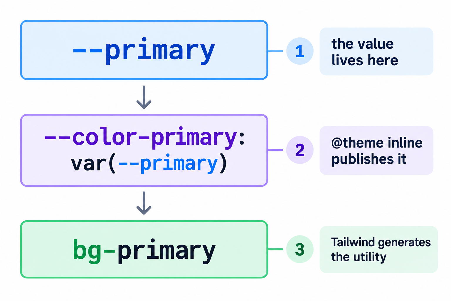
Tailwind v4 decides which utilities exist based on theme-variable namespaces. A variable in the --color-* namespace produces the matching color utilities - bg-*, text-*, border-*, and the rest.
The inline keyword matters. Tailwind recommends it whenever a theme variable references another CSS variable: the generated utility then uses the referenced value rather than adding a second resolution layer. Without it, utilities can resolve to unexpected values, because CSS resolves variables at their point of definition rather than at use.
That’s the whole point of the system: you change the variable, not the components. If a component already uses bg-primary, redefining --primary changes what that color means everywhere it appears. And because the standard mappings already exist in a generated project, changing an existing color means editing one line - --primary - and nothing else. You only write a new --color-* mapping when you add a token that didn’t exist before.
The same inheritance applies when you bring in new Shadcn Components: variants built with semantic utilities adopt your palette without needing their color classes rewritten.
How :root and .dark Work
Component markup stays identical across themes:
<Button className="bg-primary text-primary-foreground">Continue</Button>The theme scopes supply different values underneath:
:root {
  --primary: oklch(0.205 0 0);
  --primary-foreground: oklch(0.985 0 0);
}

.dark {
  --primary: oklch(0.922 0 0);
  --primary-foreground: oklch(0.205 0 0);
}
When .dark applies, that same bg-primary resolves through the dark value.
Give a custom token a .dark value when it should differ between themes. That doesn’t mean every variable must be repeated under .dark - a color that’s intentionally identical in both modes can keep inheriting from :root.
This guide assumes your app already applies the .dark class; theme-provider setup is a separate concern.
Semantic Foreground Pairs
Each surface pairs with the color of the content on it - primary with primary-foreground, muted with muted-foreground. That convention is what lets components stay semantic instead of hard-coding bg-blue-700 text-white. When you change a surface, review its foreground at the same time.
Pairing is a convention, not a contrast guarantee. Semantic pairs make consistent contrast easier to manage, but they do not produce accessible results automatically once you change the values. Check the real contrast of the colors you pick.
Reading an OKLCH Value
Current themes are generated in OKLCH - the Tailwind v4 migration converted the older HSL palette to it. The syntax is oklch(lightness chroma hue), so oklch(0.488 0.243 264.376) is lightness 0.488, chroma (intensity) 0.243, hue 264.376.
It’s the default generated format, not the only CSS color syntax you can use. To pick colors visually rather than by number, the Shadcn color picker roundup covers tools built for that.
Changing Your Primary Brand Color
Start with --primary and --primary-foreground. The values below are Tailwind’s current OKLCH blue palette rather than guesses - blue-700 for light, blue-400 for dark. Tailwind’s docs write lightness as a percentage (oklch(48.8% 0.243 264.376)); the decimal form is identical in value and matches what shadcn generates.
:root {
  --primary: oklch(0.488 0.243 264.376);
  --primary-foreground: oklch(0.985 0 0);
}

.dark {
  --primary: oklch(0.707 0.165 254.624);
  --primary-foreground: oklch(0.205 0 0);
}
You don’t touch the @theme inline mapping - it already exists. Components using the semantic tokens pick up the new values immediately, with no per-component edits.
A full brand redesign will also involve secondary, accent, ring, sidebar, and chart tokens. At that point hand-editing stops being the efficient path - see choosing an approach below.
Base Color Is Not Your Brand Color
tailwind.baseColor in components.json controls the default theme-token values generated when the project is initialized. The base colors currently offered are Neutral, Stone, Zinc, Mauve, Olive, Mist, and Taupe.
It’s not another name for your brand color. A project can be initialized on a neutral base while using blue for --primary - exactly what the previous section did. Changing baseColor after initialization behaves differently from editing --primary, and it gets its own walkthrough in how to change the shadcn base color in an existing project.
The Token Reference
| Token | Purpose |
|---|---|
--background / --foreground | Default page surface and text |
--card / --card-foreground | Cards and dashboard panels |
--popover / --popover-foreground | Floating surfaces - menus, popovers |
--primary / --primary-foreground | High-emphasis actions and surfaces |
--secondary / --secondary-foreground | Lower-emphasis filled controls |
--muted / --muted-foreground | Subtle surfaces, descriptions, secondary text |
--accent / --accent-foreground | Interactive state - hovered menu items, active rows |
--destructive | Destructive actions and error emphasis |
--border | Default borders and separators |
--input | Form-control border and surface treatment |
--ring | Focus rings and outlines |
--chart-1 … --chart-5 | Data-visualization palette |
--sidebar, --sidebar-foreground, --sidebar-primary(-foreground), --sidebar-accent(-foreground), --sidebar-border, --sidebar-ring | Sidebar shell, so it can diverge from the page palette |
Three things worth knowing about that list:
--destructivehas no-foregroundpair in the current generated theme. Also avoid reusing it as a general brand-red just because your brand is red - its meaning should stay destructive.- Chart colors accept more than variables. The Chart component supports CSS-variable theming and also takes colors in hex, HSL, or OKLCH directly where you need them.
--border,--input, and--ringare easy to over-apply. An aggressive primary change doesn’t mean every border should become that brand color.
Testing the palette on composed Shadcn Blocks can expose token relationships that are easy to miss on an isolated button, such as muted text inside cards or borders across a full pricing section.
Adding a Custom Color Token
To add a brand token rather than reusing primary, define the value and then publish it. These use Tailwind’s blue-600 and blue-400 as reproducible examples:
:root {
  --brand: oklch(0.546 0.245 262.881);
  --brand-foreground: oklch(0.985 0 0);
}

.dark {
  --brand: oklch(0.707 0.165 254.624);
  --brand-foreground: oklch(0.205 0 0);
}

@theme inline {
  --color-brand: var(--brand);
  --color-brand-foreground: var(--brand-foreground);
}
Now bg-brand, text-brand-foreground, and border-brand all exist.
The distinction that trips people up: --brand defines the value, --color-brand: var(--brand) connects it to Tailwind’s utility namespace. Defining only --brand won’t create a bg-brand utility.
Theming Without Editing Tokens by Hand
Hand-editing is right for one or two colors. For a whole coordinated look - every surface, chart, and sidebar token, plus fonts and radius - the CLI is faster.
It also helps to evaluate a theme at page scale. Examples from Shadcn Pages put navigation, forms, cards, and content surfaces together, making inconsistent tokens easier to spot before you commit to a palette.
A preset is a complete design configuration encoded as a short code. You can inspect exactly what one holds:
pnpm dlx shadcn@latest preset resolve npx shadcn@latest preset resolve yarn dlx shadcn@latest preset resolve bunx --bun shadcn@latest preset resolve Preset
code bdvxHg2K
style mira
baseColor zinc
theme cyan
chartColor zinc
iconLibrary lucide
font public-sans
radius default
menuAccent subtle
menuColor default
url https://ui.shadcn.com/create?preset=bdvxHg2KThat’s an entire design system captured in a compact, shareable code. How shadcn UI presets work covers the encoding in depth.
Build one visually with shadcn/create
ui.shadcn.com/create is the preset builder: every setting a preset holds, edited against a live preview instead of guessed from variable names.
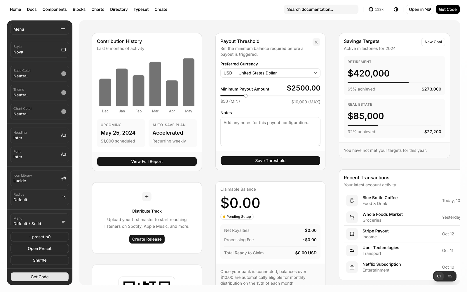
“Get Code” then hands you the command for your situation. For a new project:
pnpm dlx shadcn@latest init --preset b0 --template next npx shadcn@latest init --preset b0 --template next yarn dlx shadcn@latest init --preset b0 --template next bunx --bun shadcn@latest init --preset b0 --template next For a project that already exists:
pnpm dlx shadcn@latest apply --preset b0 npx shadcn@latest apply --preset b0 yarn dlx shadcn@latest apply --preset b0 bunx --bun shadcn@latest apply --preset b0 Where b0 is your preset code. Use the package-manager tabs above to copy the right command for your project. This is the shortest path from “I want a specific look” to a configured project - no token editing at all.
Using a built-in style
If you don’t need something custom, shadcn ships eight built-in styles: nova, vega, maia, lyra, mira, luma, sera, and rhea. The CLI accepts a style name anywhere it expects a preset, so you can apply one directly:
For a new project:
pnpm dlx shadcn@latest init --preset vega npx shadcn@latest init --preset vega yarn dlx shadcn@latest init --preset vega bunx --bun shadcn@latest init --preset vega For an existing project:
pnpm dlx shadcn@latest apply vega --only theme npx shadcn@latest apply vega --only theme yarn dlx shadcn@latest apply vega --only theme bunx --bun shadcn@latest apply vega --only theme --only accepts theme and font. In a real run on a project initialized with baseColor: "zinc", apply vega --only theme rewrote baseColor to neutral and the theme variables in globals.css, while touching no component files.
applyreplaces your whole theme, not just the neutrals. A custom--primarygets overwritten. There’s no base-color-only flag, so copy your brand values out first - or edit tokens by hand instead.
Building a custom theme
Built-in styles give you a fixed set of looks. For your own coordinated palette, the Shadcn Theme Generator edits every token visually: Brand, Base, Other, Sidebar and Chart groups, each as an OKLCH value or hex swatch, with a light/dark toggle, undo/redo, and a contrast checker that flags failing pairs. It also ships prebuilt themes to start from - Claude, Spotify, Perplexity, Neo Brutalism and Nature among them.
If you are theming a complete application rather than a single screen, Shadcn Templates are useful references for seeing how one token system holds up across dashboards, landing pages, and repeated layouts.
Its “Copy” dialog then walks you through setup in three steps, for Base UI or Radix UI:
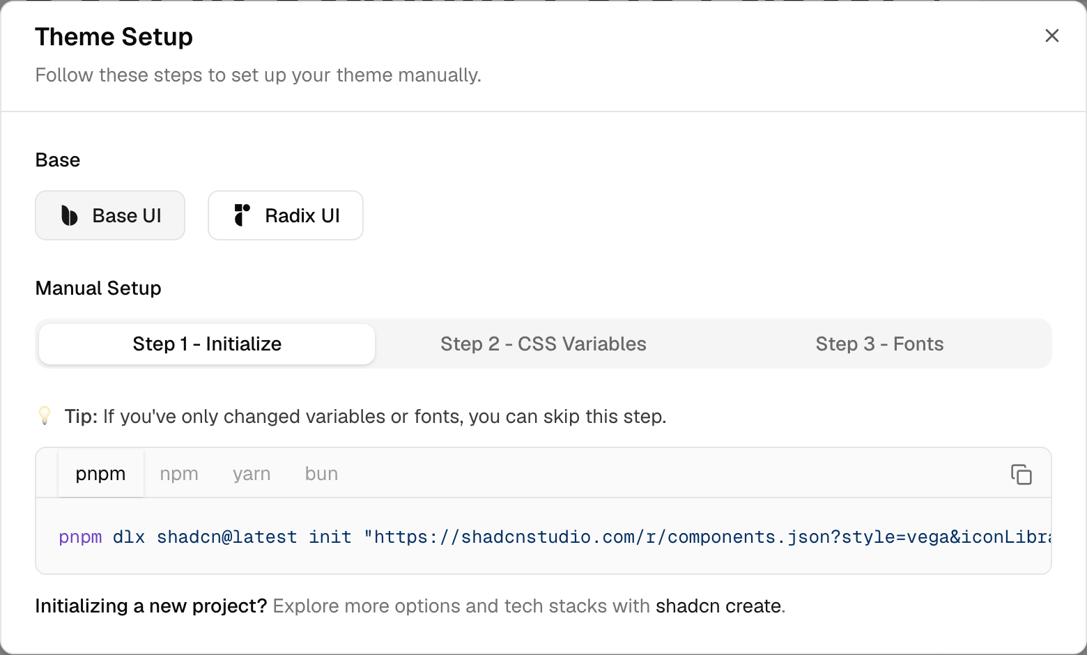
Step 1 initializes from a registry URL that carries your configuration:
pnpm dlx shadcn@latest init "https://shadcnstudio.com/r/components.json?style=vega&iconLibrary=lucide&menuColor=default&menuAccent=subtle" --base base npx shadcn@latest init "https://shadcnstudio.com/r/components.json?style=vega&iconLibrary=lucide&menuColor=default&menuAccent=subtle" --base base yarn dlx shadcn@latest init "https://shadcnstudio.com/r/components.json?style=vega&iconLibrary=lucide&menuColor=default&menuAccent=subtle" --base base bunx --bun shadcn@latest init "https://shadcnstudio.com/r/components.json?style=vega&iconLibrary=lucide&menuColor=default&menuAccent=subtle" --base base Step 2 gives you the CSS variables, and step 3 the fonts. Two details save real time here: if you only changed colors or fonts you can skip step 1 entirely, and when pasting the variables you should merge each section into your existing globals.css rather than replacing the file - otherwise you lose your own customizations. Export is available in OKLCH, HSL, RGB, or HEX, and saved themes persist in browser storage on the free tier.
Which Approach Should You Use?
| Situation | Use | Why |
|---|---|---|
| Change one or two colors | Edit :root / .dark directly | Fastest, surgical, preserves everything else |
| Add a color that does not exist | --brand + --color-brand mapping | Only way to generate new utilities |
| Start a new project with a look in mind | init --preset <code> via shadcn/create | Correct style, base, fonts, and radius from the start |
| Restyle an existing project wholesale | apply <preset> --only theme | No component reinstall - but overwrites custom colors |
| Build and reuse your own palette | Shadcn Theme Generator | Visual editing across light and dark, with export |
Troubleshooting
| Symptom | Common cause | Fix |
|---|---|---|
| Changed a color, nothing happened | Wrong variable or stylesheet, or the component uses a different token | Inspect the component’s classes. bg-primary → change --primary; bg-accent → change --accent. Confirm components.json points at the CSS file you edited. |
bg-brand does not exist | --brand defined but never published to Tailwind | Add --color-brand: var(--brand) inside @theme inline. |
| Text unreadable after a change | Foreground pair no longer suits the new surface | Update the matching -foreground token and check contrast. |
| Light mode fine, dark mode wrong | .dark still holds an old value | Update the token under .dark, or let it inherit if the value is intentionally shared. |
| Your project looks nothing like this | Project or tutorial targets Tailwind v3 | See the next section. |
If your project has no shadcn theming structure at all, adding shadcn/ui to an existing project is a better starting point than rebuilding the theme by hand.
Coming from an Older Tutorial?
Plenty of shadcn theming content was written for Tailwind v3, where colors were registered in a config file:
// tailwind.config.js - Tailwind v3 era
theme: {
  extend: {
    colors: {
      primary: "hsl(var(--primary))";
    }
  }
}:root {
--primary: 222.2 47.4% 11.2%;
}Current Tailwind v4 projects are CSS-first: values are CSS variables, mapped through @theme inline, generated in OKLCH - and the components.json docs say to leave the Tailwind config path blank. If a tutorial opens by adding shadcn colors to a tailwind.config.js object, check which version it targets. Existing v3 apps don’t suddenly become invalid; their setup just won’t resemble a new v4 project.
A project can also look unfamiliar because it was created with init --no-css-variables, which sets cssVariables: false and emits literal utilities like bg-zinc-950 dark:bg-white instead of tokens. That’s an initialization-time choice - switching later means deleting and reinstalling components. cssVariables: true remains the default.
FAQ
Can I use HSL instead of OKLCH in a Tailwind v4 shadcn project?
- Yes. OKLCH is the format new themes are generated in, not a requirement - shadcn’s own Tailwind v4 migration documentation shows valid variables written with
hsl(...)alongside@theme inline. For a new project, staying on the generated OKLCH format is usually simplest unless you have a specific reason to switch.
Do theme changes affect components I already added?
- Yes, as long as those components use the semantic tokens you changed - that’s the point of the mapping. The exception is components where you replaced semantic classes with literal utilities like
bg-blue-600; those no longer follow--primary. And if you’re still assembling the component set itself, adding shadcn components in one command covers doing that in bulk.
Conclusion
The system is smaller than it first appears: values in :root and .dark, published by @theme inline, consumed by the utilities your components already use. From there, theming is two moves - change a variable to recolor what exists, or add a variable plus a --color-* mapping to create something new.
The rest is matching the tool to the job. One or two colors are quicker to edit by hand; a whole new look is a style away; and a palette that’s genuinely yours is worth building visually. Start with --primary, check the contrast, and work outward.