If you’re working with shadcn/ui, you already know how powerful it is for building consistent, modern, and themeable UIs with Tailwind CSS and Radix primitives. But when it comes to fine-tuning design systems, theme colors, and real-time brand customization — a good Shadcn Color Picker can make all the difference.
In this collection, we’ll explore the best Shadcn Color Pickers and tools that simplify theme creation, palette management, and color generation for developers and designers alike.
What Are Shadcn Color Pickers?
Shadcn Color Pickers are React components designed to integrate natively with shadcn/ui’s design system. They provide an interactive interface for selecting colors, supporting formats like HEX, RGB, HSL, and more, while adhering to shadcn’s principles of accessibility, theming, and composability.
Unlike traditional color inputs (e.g., the native ), these pickers offer advanced controls like hue sliders, opacity adjustments, eyedroppers, and preset swatches, all styled with Tailwind classes for effortless customization.
Key benefits include:
-
Consistent Branding: Maintain uniform theme colors across your entire UI.
-
Faster Theming: Quickly build, preview, and export Tailwind-compatible color palettes.
-
Accessibility Ready: Easily check color contrast and visual balance.
-
Designer–Developer Sync: Simplifies collaboration by converting color choices directly into usable design tokens.
-
Customization Flexibility: Users or clients can change theme colors dynamically in apps or dashboards.
Features**:**
-
Interactive color selection with HEX, RGB, and HSL support
-
Real-time preview across UI components
-
Integration with shadcn/ui, Tailwind CSS, and Radix colors
-
Light/dark mode theme generation
-
Export to CSS variables, JSON, or Tailwind configuration
-
Minimal, responsive, and accessible UI design
Core Components
-
Color Selector: The main gradient or wheel interface for choosing hues.
-
Input Fields: Manual HEX or RGB value entry for precision.
-
Preview Swatch: Displays current and previous selections.
-
Palette Generator: Creates shade variations or gradients.
-
Theme Exporter: Outputs ready-to-use code for your Tailwind or Shadcn config.
-
ColorArea: Draggable saturation/lightness pad.
-
ColorThumb: The handle on the pad/slider.
-
ColorHueSlider/ColorOpacitySlider: Linear controls for hue and alpha.
-
ColorInput: Text field for manual entry/validation.
Popular Shadcn Color Picker
Below are the popular Shadcn Color Picker. Check them out
Shadcn/ui Themes
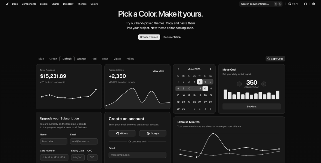
The shadcn/ui themes page provides a set of hand‑picked colour themes that you can copy and paste into your project, enabling you to quickly apply consistent colour palettes and theming to a project where you’re already using shadcn.
Features:
-
Ready-made color themes like blue, green, orange, red, and more
-
CSS variable–based theming using
--primary,--background, etc. -
Built-in light and dark mode support
-
Works seamlessly with Tailwind CSS
-
Simple copy-and-paste theme setup
Use cases:
-
Quickly change accent colors in React/Next.js projects using shadcn/ui
-
Maintain consistent themes across multiple modules or apps
-
Start projects with pre-made, professional color palettes
-
Toggle easily between light/dark and accent variations
-
Rapidly prototype and test different color themes
Installation:
-
Ensure you have shadcn/ui and its dependencies installed (React‑based, with Tailwind CSS, etc). See the shadcn installation docs.
-
In your
components.json(or the config for shadcn/ui) set the theming option. For example to enable CSS variables, you might set:
{
  "tailwind": {
    "cssVariables": true
  }
}- In your global CSS (for example
globals.css), paste the theme variables you copied from the themes page:
:root {
  --primary: ...;
  --primary-foreground: ...;
  --background: ...;
  /* etc */
}
.dark {
  /* dark mode override variables */
}
```css

- Use the utilities/components referencing the variables: e.g.
Or via reserved classes like bg-primary etc.
- Optionally implement a theme toggle (light/dark) or switch among multiple accent themes — e.g., wrap your app with a ThemeProvider and toggle classes (or use a library like
next‑themesin Next.js) to switch.darkclass or a custom class.
Achromatic Color Picker
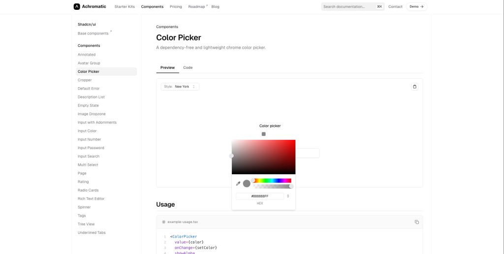
The Achromatic Color Picker is a dependency‐free, lightweight color picker component designed for web applications, offering hue, alpha, and eyedropper support.
Furthermore, it is intended for seamless integration in projects based on React/Next.js + Tailwind + shadcn/ui ecosystem.
Features:
-
No external dependencies required (so minimal bundle overhead)
-
Supports hue, alpha transparency controls (showHue, showAlpha)
-
Allows a live color preview (showColorPreview)
-
Inputs for manual color values (showInputs) — handy for precise color picking
-
Eye‑dropper mode to pick a color from screen/context (showEyeDropper)
-
Integrates well into modern web stacks (type‑safe, React/TSX usage)
-
Lightweight and designed for ease of use, rather than overly complex UI.
Use Cases:
-
Theme or brand color selection in dashboards or SaaS tools
-
Design-system playgrounds with live color adjustments
-
CMS/admin panels for easy color customization
-
Lightweight color picker for React + Tailwind + Shadcn projects
Installation:
-
Ensure your project uses the Achromatic UI toolkit (or you have access to the component).
-
Import the component into your React/TSX file. For example (from docs):
<ColorPicker
  value={color}
  onChange={setColor}
  showAlpha
  showHue
  showColorPreview
  showInputs
  showEyeDropper
/>-
Manage the state (
value,onChange) in your component: e.g.,const [color, setColor] = useState("#ff0000");. -
Style/integrate it within your UI. Since it’s part of the Achromatic/shadcn ecosystem, it should fit with Tailwind theming, etc.
-
Optionally toggle features (e.g., hide alpha if you don’t need transparency) by omitting
showAlphaetc.
shadcn/studio Theme Generator (Special Mention)
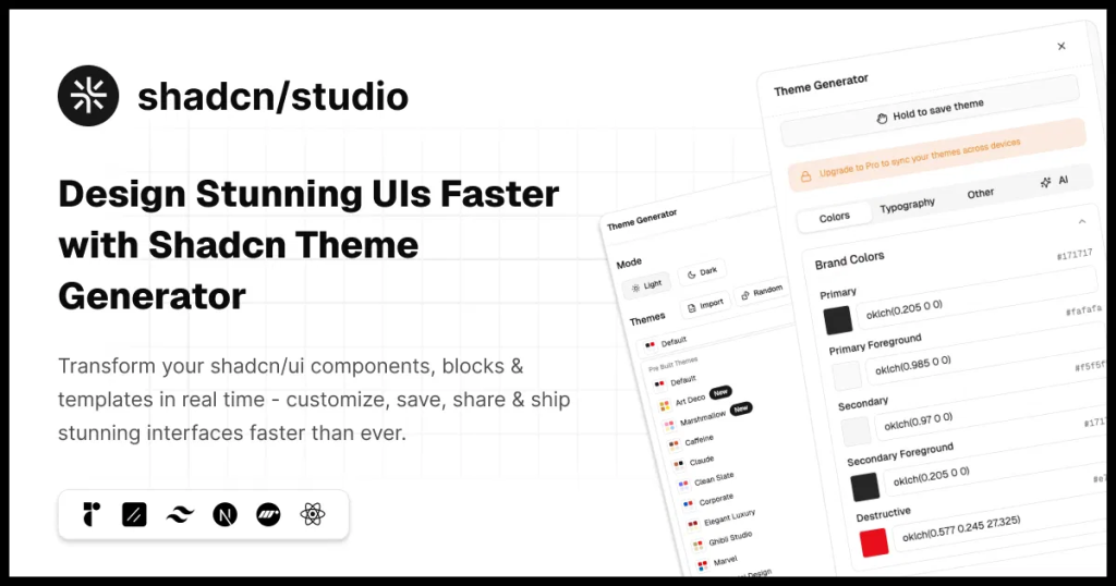
Shadcn Theme Generator by shadcn/studio is an awesome tool for designers who wants to streamline their UI experience. With this tool you can easily transform your shadcn/ui components, blocks & templates in real time. Customize, save, share & ship stunning interfaces faster than ever. It comes with color picker, typography variants & much more.
What makes it even better is, AI. Simply leave things on AI by giving it promot and let it take care for you. You can generate stunning themes with AI prompts, reference designs with Theme, and track progress with checkpoints.
Features:
-
Real time customization, color mastery, typography Fine-tuning, import/export themes
-
AI theme generation
-
Theme sharing & collaboration
-
Color contrast validation
-
Undo & Redo Changes
-
Theme registry
Use Cases:
-
Quickly align your shadcn/ui + Tailwind project with your brand using live color, typography, and component previews.
-
Create and manage multiple theme variants like light/dark modes or client-specific skins with ease.
-
Rapidly prototype color or style changes and see instant updates without editing CSS manually.
-
Maintain consistent styling tokens across component libraries and export reusable code.
-
Enable non-designers to adjust UI themes visually without touching code.
Installation:
-
Sign up to unlock Pro features
-
Navigate to the Theme Generator from the main menu
-
Provide appropriate LLM API key
-
Use the manual controls or AI generation to create your theme
-
Export your theme CSS or save it to your account
Btw, shadcn/studio also offers:
-
550+ Shadcn Blocks
-
1000+ Shadcn Component Variants
-
Shadcn AI MCP server
-
Shadcn Figma Design System
-
Shadcn Templates (Upcoming)
Jolly UI’s Color Picker
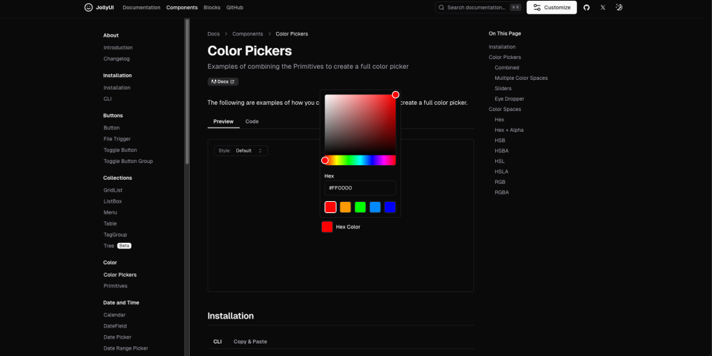
Jolly UI’s Color Pickers component provides a flexible, accessible colour‑selection UI built as part of its React + Tailwind + React Aria Components ecosystem. It allows selecting colours in various colour‑spaces (Hex, HSL, RGB, etc), with optional sliders, eyedropper support, and more.
Features:
-
Supports multiple color spaces: Hex, HSL, RGB, with alpha variants
-
Hue, saturation, brightness, and alpha sliders
-
Native eyedropper support via EyeDropper API
-
Accessible: keyboard, focus, and screen-reader ready (React Aria)
-
Tailwind/shadcn-compatible for easy integration
Use Cases:
-
Brand, primary, or accent color selection with full color-space control
-
Theme customizers with light/dark variants
-
Accessible UI setups needing keyboard and screen-reader support
-
Creative apps requiring eyedropper sampling
-
Drop-in React + Next.js + Shadcn projects for consistent styling
Installation:
-
Ensure your project is set up with React (TSX), Tailwind CSS, and a compatible UI stack. Jolly UI is designed to work with shadcn/ui‑style workflows.
-
Install / add the component via the CLI or copy‑paste method. The docs show:
npx shadcn@latest add https://jollyui.dev/default/color- Import the colour picker primitives into your component. For example (simplified):
import { ColorPicker, ColorPickerStateContext } from 'jollyui/components/color';

function MyPicker() {
  const [color, setColor] = useState('#ff0000');
  return (
    <ColorPicker
      value={color}
      onChange={setColor}
      // optionally include sliders, eyedropper etc
    />
  );
}
Note: Use the props/settings as indicated in the Jolly UI docs.
- If you want the eyedropper feature: ensure browser supports the
EyeDropperAPI; in the example the code shows:
if (typeof EyeDropper === 'undefined') {
  return null;
}
new EyeDropper().open().then((result) => {
  state.setColor(parseColor(result.sRGBHex))
});- Use it anywhere in your UI where you need colour input. Manage state, propagate the selected colour to wherever you style UI elements.
Flexoki
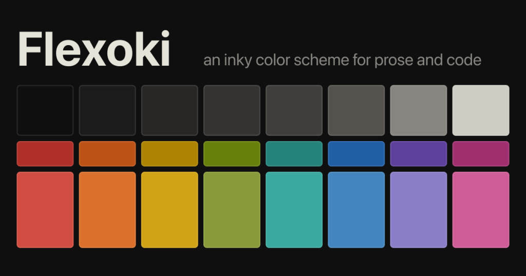
Flexoki is an inky color scheme for prose and code. Flexoki is designed for reading and writing on digital screens. It is inspired by analog printing inks and warm shades of paper.
It offers both light and dark variants, and is intended for digital reading/writing environments.
Features:
-
Base palette of neutral “paper” / “ink” tones (e.g.,
#FFFCF0for paper) and deep neutrals for backgrounds. -
Accent colour palette with colours scaled (50‑950) for UI usage (red, orange, yellow, green, cyan, blue, purple, magenta) in both light & dark modes.
-
Ready ports for many environments/tools: terminals, editors (VS Code, Sublime), UI frameworks (Tailwind, Shadcn), theming systems.
-
Designed with readability and comfort in mind: warm base tones reduce eye strain while retaining crisp ink contrast for code or text.
-
Licensed MIT, easy to extend or incorporate into custom workflows.
Use Case:
-
Brand, primary, or accent color selection with full color-space control
-
Theme customizers with light/dark variants
-
Accessible UI setups needing keyboard and screen-reader support
-
Creative apps requiring eyedropper sampling
-
Drop-in React + Next.js + Shadcn projects for consistent styling
Installation:
- Get the palette: Clone or download the repository:
git clone https://github.com/kepano/flexoki.git-
Pick the variant: Use the light or dark mode palette (Flexoki provides both). For example use the
paper,base‑50, and accent colours in your CSS variables. -
Define CSS variables in your project’s global stylesheet, e.g.:
:root {
  --color-bg: #FFFCF0;       /* paper light background */
  --color-base-100: #E6E4D9;  /* etc */
  --color-red-600: #AF3029;
  /* ... and so on from the palette */
}

.dark {
  --color-bg: #1C1B1A;       /* dark background paper equivalent */
  /* dark mode variables */
}-
Use the variables in your design system / components: e.g., for Tailwind you might configure
theme.extend.colorswith these values, or map tobg‑color,text‑color,border‑color, etc. If using shadcn/ui you can align such variables with--background,--foreground,--primary, etc. -
Adopt style for components or editors: If your project uses an editor theme (VS Code, Neovim) you can use one of the ports provided by Flexoki (see repository list) to apply the palette.
-
Customize: You can tweak or extend the palette, but keep the perceptual relationships (Flexoki uses Oklab colour space to maintain consistency) if you want to remain faithful to the ink‑on‑paper feel.
Gradient Picker
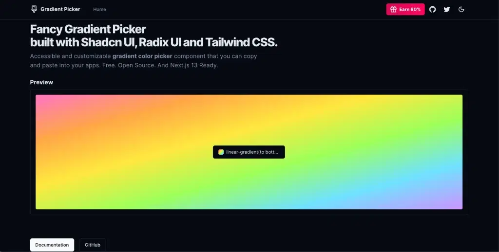
Gradient Picker is a React component for selecting solid colours, gradients, or background images in a UI. It’s designed for seamless integration into a component‑library/UI system (especially with the shadcn‑ui ecosystem).
Features:
-
Supports solid colors, gradients, and background images
-
Built-in swatches and presets for quick selection
-
Popover UI with tabs (Solid / Gradient / Image)
-
Manual input for custom background strings
-
Lightweight React component, shadcn/ui compatible
-
MIT licensed
Use Case:
-
Background selection for cards, sections, or themes
-
SaaS theme customizers with live previews
-
Website builders and visual editors for non-technical users
-
Component library demos showcasing dynamic backgrounds
-
Advanced background picker integration in React + shadcn projects
Installation:
-
Ensure your project uses React + TSX and is set up with shadcn/ui or a compatible UI library (since the component expects Button, Popover, Tabs from that library).
-
Install any required dependencies (according to the docs). It says to run:
npx shadcn-ui@latest add tabs button input popover- Simply copy paste the below code into a file called
GradientPicker.tsxand import it accordingly. ThePickerExamplebelow demonstrates simple usage. You are free to change and modify the file as you see fit.
'use client'

import { Button } from '@/components/ui/button'
import { Input } from '@/components/ui/input'
import {
  Popover,
  PopoverContent,
  PopoverTrigger,
} from '@/components/ui/popover'
import { Tabs, TabsContent, TabsList, TabsTrigger } from '@/components/ui/tabs'
import { cn } from '@/utils'
import { Paintbrush } from 'lucide-react'
import Link from 'next/link'
import { useMemo, useState } from 'react'

export function PickerExample() {
  const [background, setBackground] = useState('#B4D455')

  return (
    <div
      className="w-full h-full preview flex min-h-[350px] justify-center p-10 items-center rounded !bg-cover !bg-center transition-all"
      style={{ background }}
    >
      <GradientPicker background={background} setBackground={setBackground} />
    </div>
  )
}

export function GradientPicker({
  background,
  setBackground,
  className,
}: {
  background: string
  setBackground: (background: string) => void
  className?: string
}) {
  const solids = [
    '#E2E2E2',
    '#ff75c3',
    '#ffa647',
    '#ffe83f',
    '#9fff5b',
    '#70e2ff',
    '#cd93ff',
    '#09203f',
  ]

  const gradients = [
    'linear-gradient(to top left,#accbee,#e7f0fd)',
    'linear-gradient(to top left,#d5d4d0,#d5d4d0,#eeeeec)',
    'linear-gradient(to top left,#000000,#434343)',
    'linear-gradient(to top left,#09203f,#537895)',
    'linear-gradient(to top left,#AC32E4,#7918F2,#4801FF)',
    'linear-gradient(to top left,#f953c6,#b91d73)',
    'linear-gradient(to top left,#ee0979,#ff6a00)',
    'linear-gradient(to top left,#F00000,#DC281E)',
    'linear-gradient(to top left,#00c6ff,#0072ff)',
    'linear-gradient(to top left,#4facfe,#00f2fe)',
    'linear-gradient(to top left,#0ba360,#3cba92)',
    'linear-gradient(to top left,#FDFC47,#24FE41)',
    'linear-gradient(to top left,#8a2be2,#0000cd,#228b22,#ccff00)',
    'linear-gradient(to top left,#40E0D0,#FF8C00,#FF0080)',
    'linear-gradient(to top left,#fcc5e4,#fda34b,#ff7882,#c8699e,#7046aa,#0c1db8,#020f75)',
    'linear-gradient(to top left,#ff75c3,#ffa647,#ffe83f,#9fff5b,#70e2ff,#cd93ff)',
  ]

  const images = [
    'url(https://images.unsplash.com/photo-1691200099282-16fd34790ade?ixlib=rb-4.0.3&ixid=M3wxMjA3fDB8MHxwaG90by1wYWdlfHx8fGVufDB8fHx8fA%3D%3D&auto=format&fit=crop&w=2532&q=90)',
    'url(https://images.unsplash.com/photo-1691226099773-b13a89a1d167?ixlib=rb-4.0.3&ixid=M3wxMjA3fDB8MHxwaG90by1wYWdlfHx8fGVufDB8fHx8fA%3D%3D&auto=format&fit=crop&w=2532&q=90',
    'url(https://images.unsplash.com/photo-1688822863426-8c5f9b257090?ixlib=rb-4.0.3&ixid=M3wxMjA3fDB8MHxwaG90by1wYWdlfHx8fGVufDB8fHx8fA%3D%3D&auto=format&fit=crop&w=2532&q=90)',
    'url(https://images.unsplash.com/photo-1691225850735-6e4e51834cad?ixlib=rb-4.0.3&ixid=M3wxMjA3fDB8MHxwaG90by1wYWdlfHx8fGVufDB8fHx8fA%3D%3D&auto=format&fit=crop&w=2532&q=90)',
  ]

  const defaultTab = useMemo(() => {
    if (background.includes('url')) return 'image'
    if (background.includes('gradient')) return 'gradient'
    return 'solid'
  }, [background])

  return (
    <Popover>
      <PopoverTrigger asChild>
        <Button
          variant={'outline'}
          className={cn(
            'w-[220px] justify-start text-left font-normal',
            !background && 'text-muted-foreground',
            className
          )}
        >
          <div className="w-full flex items-center gap-2">
            {background ? (
              <div
                className="h-4 w-4 rounded !bg-center !bg-cover transition-all"
                style={{ background }}
              ></div>
            ) : (
              <Paintbrush className="h-4 w-4" />
            )}
            <div className="truncate flex-1">
              {background ? background : 'Pick a color'}
            </div>
          </div>
        </Button>
      </PopoverTrigger>
      <PopoverContent className="w-64">
        <Tabs defaultValue={defaultTab} className="w-full">
          <TabsList className="w-full mb-4">
            <TabsTrigger className="flex-1" value="solid">
              Solid
            </TabsTrigger>
            <TabsTrigger className="flex-1" value="gradient">
              Gradient
            </TabsTrigger>
            <TabsTrigger className="flex-1" value="image">
              Image
            </TabsTrigger>
          </TabsList>

          <TabsContent value="solid" className="flex flex-wrap gap-1 mt-0">
            {solids.map((s) => (
              <div
                key={s}
                style={{ background: s }}
                className="rounded-md h-6 w-6 cursor-pointer active:scale-105"
                onClick={() => setBackground(s)}
              />
            ))}
          </TabsContent>
Raily dev Shadcn Color Picker
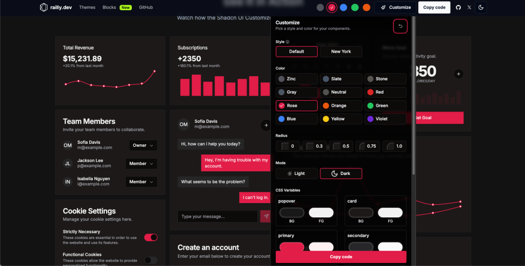
Raily Dev’s Shadcn UI Customizer is a visual theme-customisation tool built for the shadcn/ui component library. It lets users change colour tokens, typography, and other design-variables via interactive colour-pickers and live preview, then produce a ready-to-use theme for their project.
Features:
-
Interactive color pickers for CSS variables (background, foreground, primary, accent, etc.)
-
Real-time component preview with shadcn/ui
-
AI-assisted or manual theme generation
-
One-click export/CLI integration
-
Open-source, Next.js + TypeScript + Tailwind + shadcn/ui
Use Case:
-
Align UI with brand palettes in shadcn projects
-
Designer-developer theme collaboration with live preview
-
Generate multiple theme variants for clients or brands
-
Rapid prototyping without manual CSS edits
-
Quick theming for small projects or open-source libraries
Installation:
- Install with CLI
npx shadcn add <theme-url>-
In your project (React/Next.js + Tailwind + shadcn/ui), apply the theme:
-
Add the theme files (CSS variables, config) that were generated.
-
Update your
tailwind.config.jsand/or component config to reference the new variables. -
Ensure your global stylesheet defines the CSS variables (e.g.,
:root { --primary: … }).
-
-
Use your UI components as usual; the theme will now apply across your shadcn/ui components (buttons, cards, popovers, etc).
-
Optionally, set up theme toggling (light/dark or variant switching) by switching CSS variable sets or classes.
-
For production, commit the generated theme files to version control for reproducibility, and optionally extend/customise further as needed.
Kibo UI Color Picker:
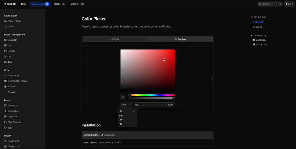
The Kibo Color Picker is a component in Kibo UI that allows users to select colours in a UI, modelled after the picker in Figma. If you need a powerful, polished colour-picker component in a React + Tailwind project, the Kibo UI Color Picker is a very good option.
It strikes a balance between richness of features and customisability, fits well with modern UI stacks, and sits within a broader component ecosystem (Kibo UI), which may be beneficial if you will use more complex components in your app.
Features:
-
Interactive colour selection with drag-and-drop, similar to what you see in design tools.
-
Hue slider + alpha (transparency) slider support for finer control.
-
EyeDropper tool allows users to pick colours from anywhere on the screen.
-
Support for multiple colour output formats: HEX, RGB, CSS, HSL.
-
Fully customizable via className and component props for styling/behaviour tweaks.
-
Built to work with shadcn/ui design system and Tailwind CSS (accessible & composable).
Use Case:
-
Embed in settings panels for users to pick custom accent or button colours in shadcn/ui + Tailwind apps.
-
Add a theme editor where non-developers adjust colours, transparency, and see live previews.
-
Use in dashboards or CMS tools for selecting backgrounds or highlight colours.
-
Maintain consistent design tokens by letting users tweak colours visually instead of editing CSS.
Installation:
- Install the component via Kibo UI CLI:
npx kibo-ui add color-picker- Import and use in your React component:
import { ColorPicker } from 'kibo-ui/components/color-picker';

const [color, setColor] = useState<string>('#ff0000');

<ColorPicker
  value={color}
  onChange={setColor}
  showAlpha={true}
  // additional props as needed
/>;
(Assuming typical props; check the docs for exact API)
- Use the selected
colorvalue in your theming logic or CSS variables:
:root {
  --primary: #ff0000;
}
.dark {
  --primary: #1a75ff;
}
And in Tailwind config if needed:
module.exports = {
  theme: {
    extend: {
      colors: {
        primary: "var(--primary)",
      },
    },
  },
}-
Customize styling via
classNameor pass props to adjust behaviour (e.g., disable transparency, limit formats). -
Integrate into your UI: use the selected value from Colour Picker in buttons, backgrounds, text colours, etc. to reflect live theming changes.
Rangeen
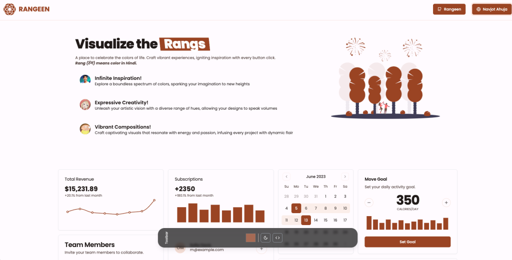
Rangeen is an open-source tool that helps you create a colour palette for your website, especially suited to projects using the shadcn/ui (and Tailwind CSS) ecosystem. It aims to let you pick colours, visualise them, and generate theme files or palettes you can drop into your UI system.
Features:
-
Lets you create custom colour palettes for web projects using shadcn/ui or Tailwind, including base and accent tones.
-
Offers live visualisation so you can preview colour harmony and contrast across UI elements.
-
Exports ready-to-use theme files such as CSS variables or Tailwind configs for easy integration.
-
Open-source (MIT) and freely adaptable for personal or commercial projects.
-
Lightweight tool focused purely on palette and theme generation, not a full component library.
Use Case:
-
Build cohesive brand or application palettes for frontend projects
-
Designer-developer workflow for theme export and integration
-
Rapid prototyping with multiple light/dark variants
-
Generate distinct palettes for multi-brand or client-specific themes
Installation:
- Clone or download the repository:
git clone https://github.com/navnote/rangeen.git
cd rangeen- Install dependencies (likely using npm or yarn):
npm installor
npm yarn- Run the tool (either locally or via a UI) — for example:
npm run devor whichever script is defined in the package.json.
-
In the UI/tool, pick your base colour(s), adjust accents, check the preview, export the generated palette or theme file.
-
Integrate into your project: add generated CSS variables or extend your
tailwind.config.jswith the palette. Example:
// tailwind.config.js
module.exports = {
  theme: {
    extend: {
      colors: {
        brand: {
          50: '#f5f9ff',
          100: '#e1edff',
          200: '#b3d1ff',
          300: '#80b3ff',
          400: '#4d94ff',
          500: '#1a75ff',
          600: '#005be6',
          700: '#0045b4',
          800: '#003182',
          900: '#001c51',
        },
      },
    },
  },
}-
Use the colours in your components / theme: e.g.,
bg-brand-500,text-brand-700, etc. -
Optionally support dark mode or variants by generating separate palette sets and toggling via
.darkclass or CSS variable overrides.
Shadcn Color Picker (By Nightspite)
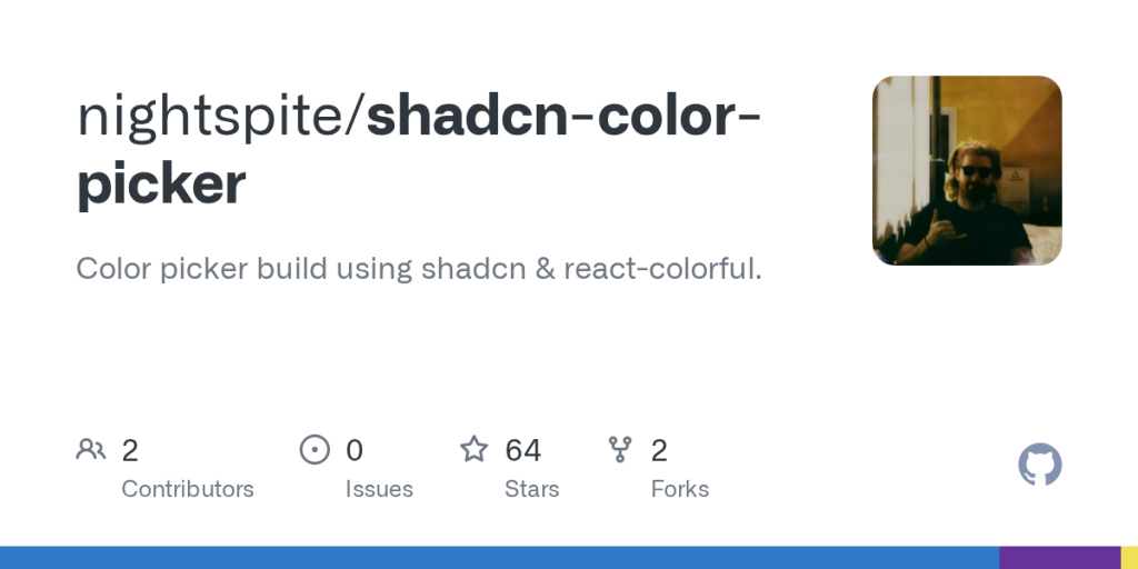
shadcn-color-picker is a React component built on top of react‑colorful and designed to integrate smoothly with the shadcn/ui ecosystem (Tailwind + CSS variables + component-library style). The live demo shows a minimal UI for color selection.
Features:
-
Basic colour picker UI component allowing selection of a colour (likely using react-colorful under the hood).
-
Tailwind / shadcn/ui friendly styling (fits the design system paradigm of shadcn/ui).
-
Live demo available (via Vercel) showing the component in action.
-
Lightweight and focused: it doesn’t appear to include heavy extras (so good for embedding in themes/theming workflows).
Use Cases:
-
Theme editors or UIs for custom accent/primary colors
-
Settings panels/dashboard color updates via CSS variables
-
Design system demos with live color previews
-
React + Tailwind + shadcn projects needing a simple picker
Installation:
-
Add the component to your project (via npm/yarn) from its GitHub or npm package (check repository).
-
Import it into your React/TSX file. Example:
import { ColorPicker } from 'shadcn-color-picker';

const [color, setColor] = useState('#ff0000');

<ColorPicker value={color} onChange={setColor} />
(Assuming the component exposes value and onChange props).
- Integrate it with your theme system: when the user changes the colour, you can update a CSS variable (e.g.,
--primary) or your Tailwind config via a custom hook or class toggle.
:root {
  --primary: #ff0000;
}
.dark {
  --primary: #1a75ff;
}
Use the colour in your UI components:
<button className="bg-primary text-primary-foreground">Click me</button>(Assuming you have defined --primary and --primary-foreground in your theme).
- Optionally, add theme switching (light/dark) or store the selected colour in user settings/local storage and apply on load.
FYI: The Evolution: From Community Requests to Robust Implementations
The demand for a color picker in shadcn/ui dates back to mid-2023. A GitHub issue opened in July 2023 (#1026) lamented the absence of such a component, calling it a “general component” missing from the docs. This sparked discussions, with users proposing integrations with libraries like @radix-ui/color-picker (though Radix doesn’t have an official one).
Fast-forward to 2025, and the landscape is rich with options. Community registries like Kibo UI (launched around 2024) have formalized these into production-ready blocks. Developers on X praise their ease— one user in October 2025 shared a 6-hour saga refining a controlled input version based on community docs, while another in September 2025 hailed a shadcn-compatible picker using react-colorful for its accessibility and responsiveness.
Custom registries, like ui.steellgold.fr (August 2025), even automate copy-pasting to combat repetitive setup. These evolutions reflect shadcn’s ethos: open-source collaboration turning ideas into polished tools. Today, you can find Shadcn Color Pickers in npm packages, Vercel deployments, and even AI-generated variants via v0.dev.
Conclusion:
Whether you’re designing a theme editor, a SaaS dashboard, or a personal portfolio; integrating a Shadcn Color Picker can make your project stand out with brand consistency and user-driven customization.
From full-featured visual tools like Shadcn Themes and Railly Customizer, to developer-focused libraries like Rangeen and Shadcn-Color-Picker, these options help you manage colors effortlessly in your modern React + Tailwind workflow.