Icons play a crucial role in shaping the visual experience of any interface. With the rise of shadcn/ui, developers now prefer flexible UI systems that allow them to integrate icons from multiple libraries without limitations. This is where choosing the right Shadcn Icons Library becomes essential for creating a polished and intuitive design.
Top 4 Recommended Shadcn Icon Libraries
Shadcn/ui supports complete customization, which means you can pick an icon set that aligns with your brand personality, design language, and product goals. Below is a curated list of the top 4 Shadcn Icon libraries. Check them out.
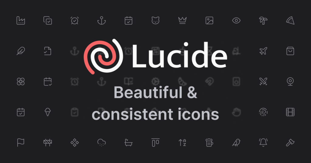
Lucide Icons
Lucide stands out as the most recommended Shadcn icon library because it delivers modern, consistent, and customizable icons that blend perfectly with Tailwind-based interfaces. It supports smooth scaling, easy styling, and a wide icon variety that covers almost every design need.
The shadcn/ui kit for Figma uses the Lucide icons as its main icon library.
Features:
-
Open-source
-
1,600+ crisp icons
-
Fully customizable
-
Consistent stroke design
-
React-friendly components
-
Lightweight structure
-
Dark/light adaptability
What makes it the best Shadcn Icons library:
-
Lucide integrates seamlessly with shadcn/ui and allows developers to style icons using simple Tailwind classes, which speeds up UI building.
-
Its broad icon collection ensures you always find the right asset without compromising on aesthetic consistency or performance.
Use Cases:
-
Dashboard UI icons
-
Navigation menus
-
Buttons & action triggers
-
Form inputs & status indicators
-
Landing page visuals
-
Mobile-first layouts
-
SaaS product interfaces
Getting Started:
- Install with
npm install lucide-reactand import the icons into your shadcn components.
Heroicons
Heroicons is a popular Shadcn Icon library crafted specifically for modern frontend frameworks like Tailwind and shadcn/ui. Its clean outline and solid-style icons make it a reliable choice for building user-friendly interfaces with a polished visual feel.
Features:
-
Free and open-source
-
300+ Icons with 3 variations: Outline, Solid, Mini & Micro
-
Tailwind-friendly designs
-
Easy React integration
-
Pixel-perfect strokes
-
Lightweight components
-
Consistent styling
Benefits:
- They enhance navigation clarity by giving visual context to actions. Their friendly shapes work well in both user-facing and internal applications.
Use Cases:
-
Admin dashboards
-
App navigation
-
Form elements
-
E-commerce UI
-
Notifications & alerts
-
Mobile app layouts
-
Marketing websites
Getting Started:
- Install via
npm install @heroicons/reactand add icons wherever needed.
Material Icons
Material Icons is Google’s official icon library designed around the Material Design system. It offers a vast collection of polished, versatile icons that fit seamlessly into modern UI frameworks, including Tailwind and shadcn/ui setups.
Features:
-
2,200+ icons
-
Multiple styles (Outlined, Filled, Rounded, Sharp, Two-Tone)
-
Free to use
-
Highly scalable
-
Web-friendly
-
React integration support
-
Pixel-perfect design
What Makes it Best Shadcn Icon Library:
-
Material Icons provides an extensive icon range with multiple visual styles, giving designers more control over UI aesthetics.
-
Its clean geometry and consistent guidelines help maintain a professional look across components, making it a strong match for shadcn/ui projects that need variety without breaking design harmony.
Use Cases:
-
Enterprise dashboards
-
Mobile apps
-
SaaS platforms
-
Navigation menus
-
Action buttons
-
Status indicators
-
Marketing websites
Getting Started:
- Install with
npm install @mui/icons-materialand use icons like any React component.
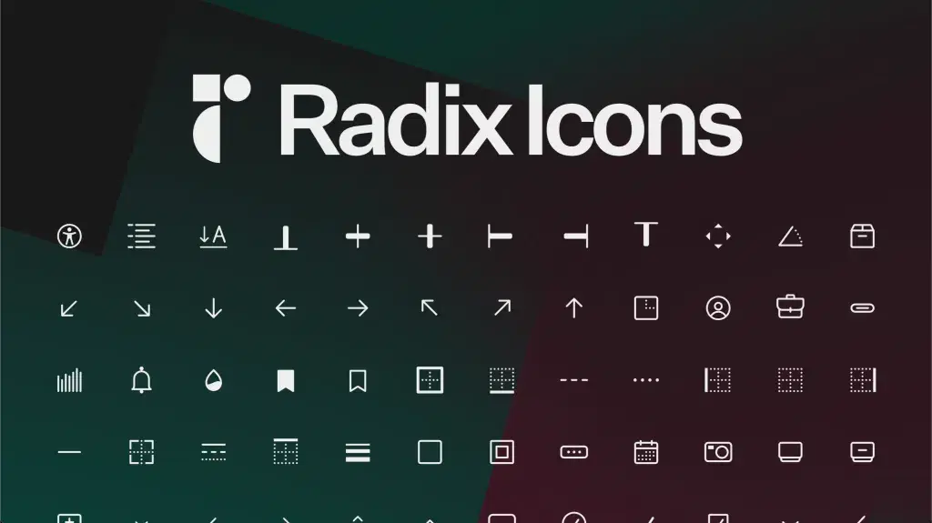
Radix Icons
Radix Icons is a minimalist, carefully crafted icon library built specifically for modern React-based interfaces. Its clean geometry and lightweight design make it a natural fit for shadcn/ui projects that demand clarity and simplicity.
Features:
-
Open-source
-
Pixel-perfect 300+ icons
-
Minimalist design
-
React-first components
-
Lightweight size
-
Consistent strokes
-
Easy customization
What makes it the Best Shadcn Icon Library?
- Radix Icons delivers pure simplicity with a highly consistent visual language that blends effortlessly into Tailwind and shadcn/ui components. Its minimal style keeps interfaces clean and modern, while ensuring icons remain readable even in dense layouts.
Use Cases:
-
toolbars, form controls, settings
-
Admin dashboards
-
Form UI
-
Navigation systems
-
Icon buttons
-
Compact layouts
-
SaaS product UIs
-
Developer tools
Getting Started
- Use
npm install @radix-ui/react-iconsto add them to your UI.
Special Recommendation: shadcn/studio
This isn’t a traditional component library or a replacement for Shadcn. Instead, it’s a unique collection that offers customizable variants of components, blocks, and templates. Preview, customize, and copy-paste them into your apps with ease.
Building on the solid foundation of the Shadcn components & blocks, we’ve enhanced it with custom-designed components & blocks to give you a head start. This allows you to craft, customize, and ship your projects faster and more efficiently.
Features:
-
Open-source: Dive into a growing, community-driven collection of copy-and-paste shadcn ui components, shadcn blocks, and templates.
-
Component & Blocks variants: Access a diverse collection of customizable shadcn blocks and component variants to quickly build and style your UI with ease.
-
Animated variants with Motion: Add smooth, modern animations to your components, enhancing user experiences with minimal effort.
-
Landing pages & Dashboards: Explore 20+ premium & free Shadcn templates for dashboards, landing pages & more. Fully customizable & easy to use.
-
shadcn/ui for Figma: Speed up your workflow with Shadcn Figma UI components, blocks & templates — a full design library inspired by shadcn/ui.
-
Powerful theme generator: Customize your UI instantly with Shadcn Theme Generator. Preview changes in real time and create consistent, on-brand designs faster.
-
shadcn/studio MCP: Integrate shadcn/studio MCP Server directly into your favorite IDE and craft stunning shadcn/ui Components, Blocks, and Pages inspired by shadcn/studio.
-
Shadcn Figma To Code Plugin: Convert your Figma designs into production-ready code instantly with the Shadcn Figma Plugin.
Checkout the All Shadcn Collection that offers awesome shadcn resources. If you have a unique & helpful shadcn product to promote, submit your product and get featured.
Recommended React Icons Libraries for Shadcn/UI
Following are some of the best & recommended React Icon Libraries which can also be suitable for shadcn/ui.
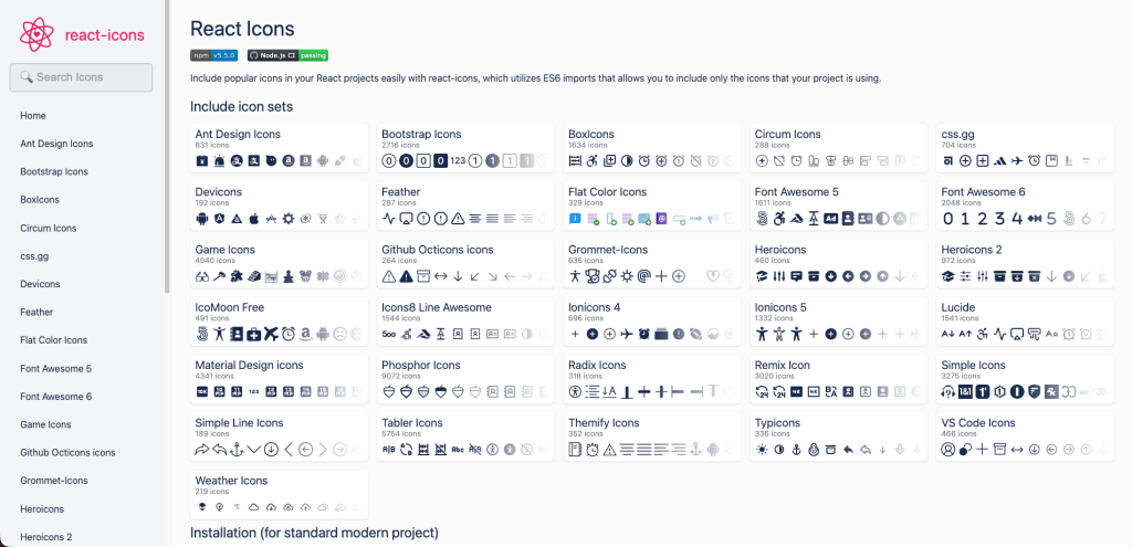
React Icons
React Icons is a versatile icon library that brings together multiple popular icon packs under one unified React interface. It offers an easy way to access thousands of icons while keeping your shadcn/ui workflow simple and efficient.
Key Features:
-
Multiple icon packs in one library
-
10,000+ icons
-
Easy React integration
-
Flexible styling
-
Lightweight imports
-
Wide design variety
-
Tailwind-friendly
Features:
-
Multiple icon packs in one library
-
10,000+ icons
-
Easy React integration
-
Flexible styling
-
Lightweight imports
-
Wide design variety
-
Tailwind-friendly
Why Use This as Shadcn Icon Library?
- React Icons provides unmatched flexibility by combining numerous icon libraries into a single package, giving developers more design options without extra setup. Its simple import system and Tailwind compatibility make it highly efficient for shadcn/ui projects of any scale.
Use Cases:
-
Multi-style dashboards
-
Marketing websites
-
Landing pages
-
App headers & footers
-
E-commerce UI
-
Status indicators
-
Blogs & content pages
Phosphor Icons
Phosphor Icons is a flexible icon library designed for modern interfaces, offering multiple visual styles that adapt effortlessly to different UI themes. Its smooth, rounded aesthetic makes it a strong fit for shadcn/ui projects aiming for a polished and friendly design.
Features:
-
1500+ Icons with multiple styles: Regular, Bold, Fill, Duotone, Thin)
-
Open-source
-
React-ready components
-
Scalable vector icons
-
Consistent design language
-
Tailwind-friendly
-
Lightweight imports
Why Use This Shadcn Icon Library?
- Phosphor Icons stands out for its rich style variations that let designers match moods and themes without switching libraries. Its clean curves and cohesive styling blend smoothly with shadcn/ui components, allowing you to maintain a modern and friendly visual tone across your entire interface.
Use Cases:
-
SaaS dashboards
-
Mobile apps
-
Landing pages
-
Marketing interfaces
-
Action buttons
-
Status indicators
-
User profiles & settings
Iconoir Icons
Iconoir Icons is a sleek, open-source icon library built with a focus on simplicity and readability. Its clean line-based design makes it a great choice for modern shadcn/ui interfaces that require clarity without visual noise.
Features:
-
Open-source
-
1,600+ icons
-
Clean line-style design
-
React-friendly components
-
Scalable SVG icons
-
Lightweight usage
-
Tailwind-compatible
Why Use it?
- Iconoir Icons’ minimalist geometry pairs naturally with shadcn/ui’s clean component styling. Its consistent stroke design ensures that icons look sharp and balanced, making it ideal for polished, modern interfaces that value simplicity and visual harmony.
Use Cases
-
SaaS dashboards
-
Minimalist websites
-
Forms & input UI
-
Buttons & toolbars
-
Finance & business apps
-
Settings and utilities
-
Documentation platforms
Some of The Other Considerable Icon Libraries for Shadcn
Check out some of the other considerable Shadcn Icon Library options:
Font Awesome
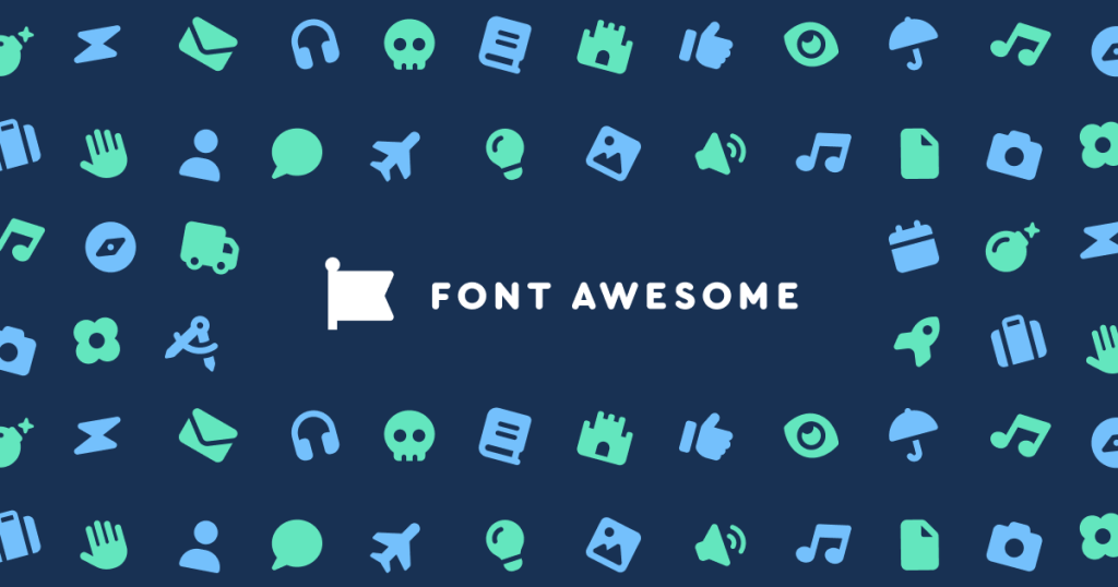
Font Awesome is one of the most recognized icon libraries, offering thousands of icons across multiple categories, including brands.
Features:
-
Brand icons
-
Extensive library with 60k+ Icons
-
Multiple styles
-
Regular updates
Benefits:
- It covers nearly all functional and brand-related icon needs. Its versatility supports various design and marketing requirements.
Use Cases:
- Useful for login pages, social sharing sections, blogs, and eCommerce interfaces.
Getting Started:
- Install via
npm install @fortawesome/react-fontawesomeand import the needed icons.
Akar Icons
Akar Icons offer a more rounded and friendly design language. They bring a softer and more welcoming feel to user interfaces.
Features:
-
300+ Icons
-
Rounded shapes
-
Modern design
-
MIT licensed
-
Easy React usage
Benefits:
- They make your UI more approachable and visually comforting. Their gentle style fits consumer-facing apps well.
Use Cases:
- Ideal for lifestyle apps, mobile-first designs, onboarding screens, and user dashboards.
Getting Started:
- Install with
npm install akar-iconsand import icons into your project.
Ant Design Icons
Ant Design Icons focus on detailed, enterprise-grade visuals. They support complex workflows and data-driven applications.
Features:
-
Enterprise-focused
-
Detailed 800+ icons
-
Multiple categories
-
Maintained by Ant Design
Benefits:
- Their precise shapes improve clarity in feature-rich products. They fit naturally in structured and corporate UIs.
Use Cases:
- Suited for CRM platforms, ERP tools, analytics dashboards, and enterprise products.
Getting Started
- Install using
npm install @ant-design/iconsand add icons as needed.
Open Iconic
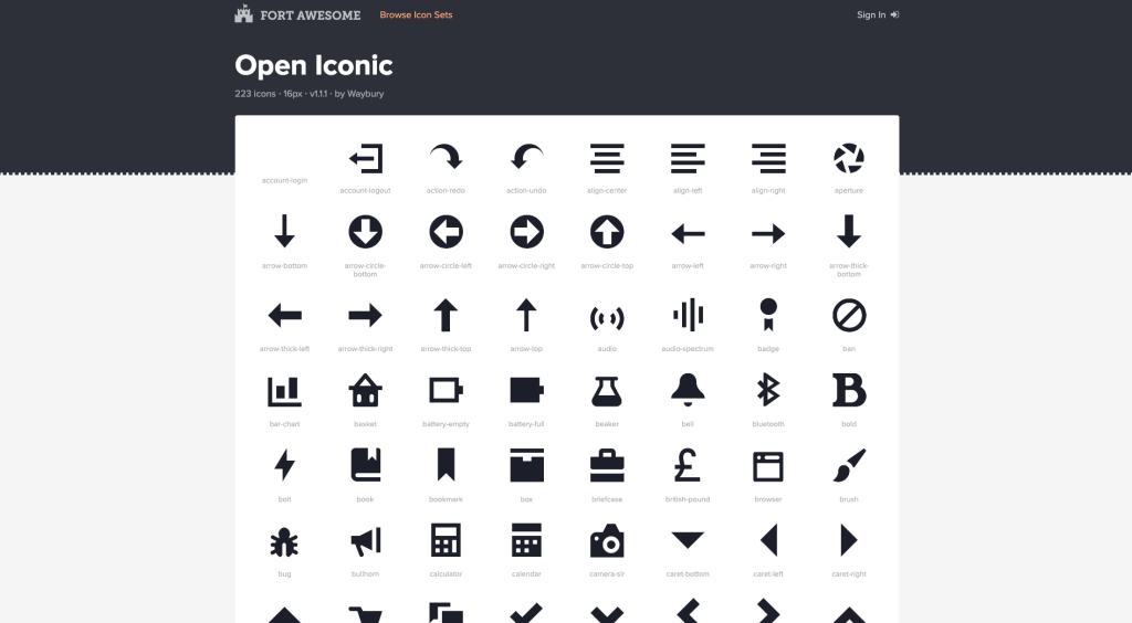
Open Iconic offers a minimal and lightweight icon set suitable for simple, distraction-free interfaces.
Features:
-
Lightweight
-
Minimal set
-
Easy to embed
-
MIT licensed
Benefits:
- Its simplicity supports fast-loading interfaces. It helps keep UI components functional and clean.
Use Cases
- Ideal for basic dashboards, simple apps, and minimal design systems.
Getting Started
- Import SVGs directly or use a community React package for integration.
Also check:
Final Thoughts
Selecting the right Shadcn Icon Library enhances your user interface, strengthens visual communication, and improves overall product experience. Whether you prefer the expressiveness of Lucide, the structure of Material Icons, or the versatility of Font Awesome, shadcn/ui lets you integrate the perfect icon set without compromise.