
Modern frontend development is moving toward highly customizable component systems, and shadcn/ui is leading that shift. Unlike traditional UI libraries, it doesn’t ship precompiled components - instead, it gives you full control by adding editable code directly into your project.
Here’s the thing: adding shadcn/ui to an existing project is actually easier than starting fresh. No boilerplate setup, no wrestling with configs, just drop it in. In this guide, you will learn how to add Shadcn to an existing project without starting over and breaking things just to use a UI library.
What is shadcn/ui?
shadcn/ui is a set of copy-and-paste React components implemented using Radix UI primitives and Tailwind CSS. Unlike traditional UI libraries, which you install via npm, shadcn copies the components right into your codebase as .tsx files.
This means no node_modules dependencies, no version conflicts, and full control over the code. You can read it, change it, and shape it to your needs without struggling with the API of a library.
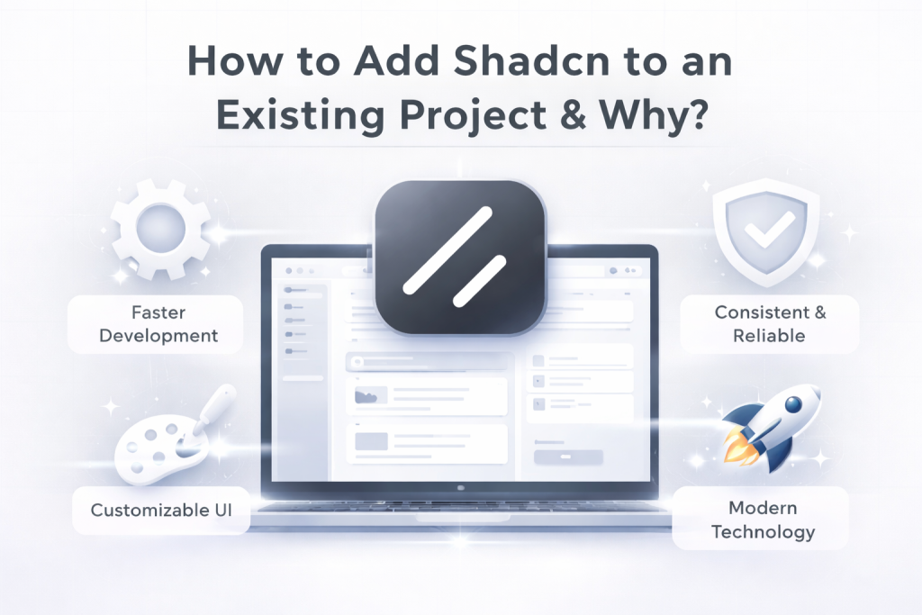
How to Add Shadcn to an Existing Project & Why?
Here’s the thing: Shadcn/ui doesn’t work like normal UI libraries.
When you install a component, it doesn’t add a dependency to your package.json. Instead, it copies the actual component code into your project.
The Button component isn’t coming from node_modules. It’s literally a .tsx file sitting in your components/ folder that you can open, read, and modify.
This means:
-
No conflicts with your existing setup
-
No breaking changes when shadcn updates (because you own the code)
-
No fighting with APIs when you need custom behavior
-
No bundle bloat from unused components
You’re not adopting a library. You’re getting well-written starter code that you can treat as your own.
Follow along with the code
We’ve created a repository so you can follow along: nextjs-shadcn-template
The repo has two branches:
-
starter- Basic Next.js setup with a hero section built using plain Tailwind CSS classes. This is where we’ll start. -
final- The complete implementation after adding shadcn/ui. This is what we’ll build together.
Clone the starter branch to follow along:
git clone <https://github.com/themeselection/nextjs-shadcn-template.git>
cd nextjs-shadcn-template/starter
pnpm install
pnpm run dev
Prerequisites
Before we dive in, you should have:
-
Tailwind CSS - Basic understanding of utility classes
-
Next.js - Familiarity with the App Router
-
React - Understanding of components and props
If you’re comfortable building a basic Next.js app with Tailwind, you’re ready to go.
Initialize shadcn/ui in Your Existing Project
Alright, let’s add shadcn/ui to your project. Here’s the thing: This won’t break anything you’ve already built.
Running shadcn init
Open your terminal in your project root and run:
npx shadcn@latest initThis command does three main things:
-
Installs required dependencies
-
Adds a
cnutility function for merging Tailwind classes -
Configures CSS variables in your global CSS file
The CLI will walk you through an interactive setup. Here’s what you’ll see:
Choosing directory and style options
This will ask you to select a default base color. You can select whatever you want:
“Which color would you like to use as a base color?”
I usually pick Neutral here.
› Slate
  Gray
  Zinc
  Neutral
  Stone
What files get generated
Once the init completes, shadcn creates and modifies a few files:
my-nextjs-app/
├── components.json        ← New: Configuration file
├── lib/
│   └── utils.ts          ← New: Contains cn() utility
└── app/globals.css       ← Modified: CSS variables added
Here’s what each file does:
components.json - The control center
{
  "$schema": "<https://ui.shadcn.com/schema.json>",
  "style": "new-york",
  "rsc": true,
  "tsx": true,
  "tailwind": {
    "config": "",
    "css": "app/globals.css",
    "baseColor": "neutral",
    "cssVariables": true,
    "prefix": ""
  },
  "iconLibrary": "lucide",
  "rtl": false,
  "aliases": {
    "components": "@/components",
    "utils": "@/lib/utils",
    "ui": "@/components/ui",
    "lib": "@/lib",
    "hooks": "@/hooks"
  },
  "registries": {}
}
lib/utils.ts - Class merging utility
import { clsx, type ClassValue } from "clsx"
import { twMerge } from "tailwind-merge"

export function cn(...inputs: ClassValue[]) {
  return twMerge(clsx(inputs))
}
This cn() function lets you merge Tailwind classes intelligently, handling conflicts automatically.
app/globals.css - CSS variables added
At the top of your globals.css, you’ll see new CSS variables:
These variables power your theme system. We’ll explore them more in the theming section.
Your existing code? Still works perfectly. I half-expected something to break (you know how it goes with new dependencies), but nope—everything just… worked.
Understanding components.json
The components.json file is the configuration center for shadcn/ui in your project. It tells the CLI how your project is structured and where to place components.
What this file controls
This file contains all the settings shadcn needs to work with your project:
{
  "$schema": "<https://ui.shadcn.com/schema.json>",
  "style": "new-york",
  "rsc": true,
  "tsx": true,
  "tailwind": {
    "config": "",
    "css": "app/globals.css",
    "baseColor": "neutral",
    "cssVariables": true,
    "prefix": ""
  },
  "aliases": {
    "components": "@/components",
    "utils": "@/lib/utils",
    "ui": "@/components/ui"
  }
}
Key configuration options
-
style- The design style for your components ("new-york"or"default"). This cannot be changed after initialization. -
rsc- Enables React Server Components support. Whentrue, the CLI automatically adds"use client"to client components. -
tsx- Whether to use TypeScript (.tsx) or JavaScript (.jsx) files. -
tailwind.css- Path to your global CSS file where Tailwind is imported. -
tailwind.baseColor- The neutral color palette (slate,gray,zinc,neutral, orstone). This cannot be changed after initialization. -
tailwind.cssVariables- Whether to use CSS variables (true) or Tailwind utility classes (false) for theming.
Path configuration
The aliases section tells shadcn where to place different types of files:
{
  "aliases": {
    "components": "@/components",
    "utils": "@/lib/utils",
    "ui": "@/components/ui"
  }
}-
components- Base path for your components -
utils- Where utility functions likecn()live -
ui- Specific directory for shadcn UI components
These aliases must match the path mappings in your tsconfig.json:
{
  "compilerOptions": {
    "paths": {
      "@/*": ["./*"]
    }
  }
}
How shadcn knows where to place components
When you run a command like:
npx shadcn add buttonThe CLI:
-
Reads
components.json -
Looks at
aliases.ui(which is@/components/ui) -
Creates the file at
components/ui/button.tsx -
Imports utilities from the path specified in
aliases.utils
If you want components in a different location, just update the aliases:
{
  "aliases": {
    "ui": "@/app/components/ui"  // Components will now go here
  }
}
The components.json file is just a roadmap that tells shadcn how your project is organized.
Install shadcn Components
Now that shadcn is initialized, let’s add some actual components to our project. For this tutorial, we’ll need two components: Button and Badge.
Using the add command
The add command downloads the component code and adds it directly to your project:
npx shadcn@latest add [component]Adding Button and Badge components
Let’s add both components we need in one command:
npx shadcn@latest add button badgeCheck your project structure. You should now see:
components/
└── ui/
    ├── button.tsx  ← New file added
    └── badge.tsx   ← New file added
What just happened?
When you ran this command, shadcn:
-
Downloaded the component code from the registry
-
Placed the files in
components/ui/(based on yourcomponents.jsonconfig) -
Installed any required peer dependencies (like
@radix-ui/react-slotfor Button)
Important: These are now your files. Open components/ui/button.tsx or components/ui/badge.tsx and you’ll see regular React component code that you can read, modify, and customize however you want.
Update page.tsx with shadcn Components
Now let’s replace the custom-styled elements with our shadcn components.
Add the imports
First, add these imports at the top of /app/page.tsx:
import { Button } from "@/components/ui/button"
import { Badge } from "@/components/ui/badge"
Replace the Badge
Find this code in your hero section:
<div className="flex items-center gap-2.5 rounded-full border bg-zinc-100 px-3 py-2 dark:bg-zinc-800">
  <span className="inline-flex items-center rounded-full border border-transparent bg-zinc-900 px-2.5 py-0.5 text-xs font-semibold text-white shadow dark:bg-zinc-50 dark:text-zinc-900">
    AI-Powered
  </span>
  <span className="text-zinc-500 dark:text-zinc-400">
    Solution for client-facing businesses
  </span>
</div>
Replace it with:
<div className='bg-muted flex items-center gap-2.5 rounded-full border px-3 py-2'>
  <Badge>AI-Powered</Badge>
  <span className='text-muted-foreground'>Solution for client-facing businesses</span>
</div>
Replace the Button
Find this code:
  href="#"
  className="inline-flex h-11 items-center justify-center rounded-md bg-zinc-900 px-8 text-sm font-medium text-white shadow transition-colors hover:bg-zinc-900/90 focus-visible:outline-none focus-visible:ring-1 focus-visible:ring-ring disabled:pointer-events-none disabled:opacity-50 dark:bg-zinc-50 dark:text-zinc-900 dark:hover:bg-zinc-50/90"
>
  Try It Now
</a>
Replace it with:
<Button size='lg' asChild>
  <a href='#'>Try It Now</a>
</Button>
What improved?
-
Less code: Reduced by ~70% while maintaining the same visual result
-
Design tokens: Using semantic tokens like
mutedandmuted-foregroundfor automatic theme support -
Maintainability: Components are centrally managed in
components/ui/- update once, apply everywhere -
Accessibility: shadcn components include built-in accessibility features from Radix UI
💡While you can update the shadcn component itself, it’s best practice to avoid modifying core components. Instead, override styles using Tailwind CSS utility classes.
In the example below, we enhanced the button’s appearance by adding a subtle translate animation, along with a border and rounded corners.
<Button size='lg' asChild className="hover:ring-2 hover:ring-primary/30 hover:-translate-y-1 transition-all duration-300 rounded-full">
  <a href='#'>Try It Now</a>
</Button>
Understanding Themes in shadcn/ui
What “theme” actually means in shadcn
Here’s where shadcn gets clever. Instead of hardcoding colors like bg-blue-500, it uses design tokens
-
Instead of
bg-blue-500, you usebg-primary -
Instead of
text-gray-600, you usetext-muted-foreground -
Instead of writing
dark:bg-zinc-900, you just usebg-background- it automatically adapts!
These semantic tokens automatically adapt to your theme, making it trivial to switch between light/dark modes or completely change your color scheme.
How shadcn uses CSS variables
Open your app/globals.css and look at the :root section. You’ll see something like:
:root {
  --background: 0 0% 100%;
  --foreground: 240 10% 3.9%;
  --primary: 240 5.9% 10%;
  --primary-foreground: 0 0% 98%;
  /* ... more variables */
}
These are HSL color values (Hue, Saturation, Lightness) defined as CSS custom properties. When you use bg-primary in your components, Tailwind resolves it to var(--primary).
Here’s how it works: When dark mode is active, the .dark class overrides these variables with different values, and your entire UI automatically updates!
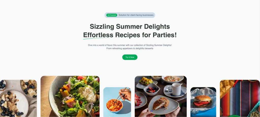
Update our Hero section with semantic classes
Let’s refactor our hero to use shadcn’s semantic tokens, eliminating the need for dark: prefixes:
Before: Manual dark mode classes
<h1 className='text-zinc-900 dark:text-zinc-50'>
  Sizzling Summer Delights
</h1>
<p className='text-zinc-600 dark:text-zinc-400'>
  Dive into a world of flavor...
</p>
After: Semantic tokens that adapt automatically
Replace your entire hero section in /app/page.tsx with:
<section className="flex min-h-[calc(100dvh-4rem)] flex-1 flex-col justify-between gap-12 overflow-x-hidden pt-8 sm:gap-16 sm:pt-16 lg:gap-24 lg:pt-24">
  {/* Hero Content */}
  <div className="mx-auto flex max-w-7xl flex-col items-center gap-8 px-4 text-center sm:px-6 lg:px-8">
    <div className="bg-muted flex items-center gap-2.5 rounded-full border px-3 py-2">
      <Badge>AI-Powered</Badge>
      <span className="text-muted-foreground">
        Solution for client-facing businesses
      </span>
    </div>

    <h1 className="text-3xl leading-[1.29167] font-bold text-balance sm:text-4xl lg:text-5xl">
      Sizzling Summer Delights
      <br />
      <span className="relative">
        Effortless
        <svg width="223" height="12" viewBox="0 0 223 12" fill="none" xmlns="<http://www.w3.org/2000/svg>" className="absolute inset-x-0 bottom-0 w-full translate-y-1/2 max-sm:hidden" > <path d="M1.11716 10.428C39.7835 4.97282 75.9074 2.70494 114.894 1.98894C143.706 1.45983 175.684 0.313587 204.212 3.31596C209.925 3.60546 215.144 4.59884 221.535 5.74551" stroke="url(#paint0_linear_10365_68643)" strokeWidth="2" strokeLinecap="round" /> <defs> <linearGradient id="paint0_linear_10365_68643" x1="18.8541" y1="3.72033" x2="42.6487" y2="66.6308" gradientUnits="userSpaceOnUse" > <stop stopColor="var(--primary)" /> <stop offset="1" stopColor="var(--primary-foreground)" /> </linearGradient> </defs> </svg>
      </span>{" "}
      Recipes for Parties!
    </h1>

    <p className="text-muted-foreground">
      Dive into a world of flavor this summer with our collection of
      Sizzling Summer Delights!
      <br />
      From refreshing appetizers to delightful desserts
    </p>

    <Button
      size="lg"
      asChild
      className="hover:ring-2 hover:ring-primary/30 hover:-translate-y-1 transition-all duration-300 rounded-full"
    >
      <a href="#">Try It Now</a>
    </Button>
  </div>

  {/* Image */}
  <img
    src="<https://cdn.shadcnstudio.com/ss-assets/blocks/marketing/hero/image-19.png>"
    alt="Dishes"
    className="min-h-67 w-full object-cover"
  />
</section>
Key changes:
-
Added
text-foregroundto the h1 - adapts to light/dark automatically -
Updated SVG gradient to use
hsl(var(--primary))instead ofvar(--primary) -
text-muted-foregroundalready handles dark mode for the paragraph
Now your hero section automatically adapts to any theme without manual dark mode classes!
Customizing Your Theme
⚠️ Important: Installing a new theme will completely replace your existing CSS variables. If you’ve customized any colors, back up your
globals.cssfirst.
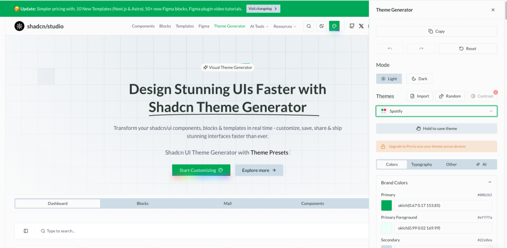
Using shadcn Studio Theme Generator
The easiest way to create a custom theme is to use the Shadcn Theme Generator. This tool lets you:
-
Pick colors visually and see them applied in real-time
-
Generate both light and dark mode variants automatically
-
Export production-ready CSS variables
Let’s apply a custom theme to our project. For this tutorial, I’ll use the Spotify theme:
Two ways to install your theme
-
Click the Copy button at the top right of the theme generator
-
A dialog will appear with two installation options:
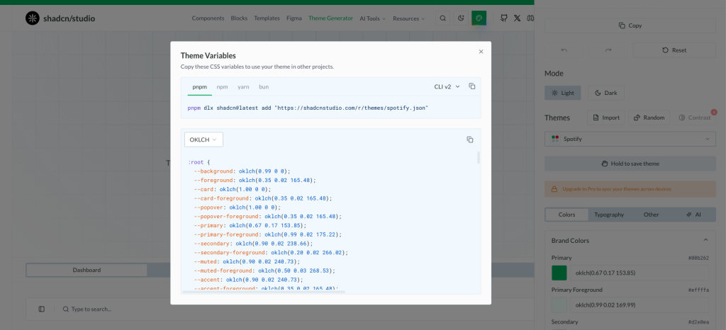
Option 1: CLI Installation (I recommend)
I prefer the CLI method; it’s faster and less error-prone. Copy the CLI command:
# For shadcn CLI v3 (latest)
pnpm dlx shadcn@latest add @ss-themes/spotify

# For shadcn CLI v2 (if you're on an older version)
pnpm dlx shadcn@latest add "<https://shadcnstudio.com/r/themes/spotify.json>"
This automatically updates your globals.css with the new theme variables.
Option 2: Manual Copy-Paste
If you prefer more control, you can manually copy the CSS variables:
-
Click the “Copy CSS” tab in the dialog
-
Copy the generated CSS code (it will look like this):
@layer base {
  :root {
	  --background: oklch(0.99 0 0);
	  --foreground: oklch(0.35 0.02 165.48);
	  --card: oklch(1.00 0 0);
	  --card-foreground: oklch(0.35 0.02 165.48);
	  --popover: oklch(1.00 0 0);
    /* ... more variables */
  }

  .dark {
	    --background: 0 0% 3.9%;
	    --foreground: 0 0% 98%;
	    --primary: 142.1 70.6% 45.3%;
	    --primary-foreground: 144.9 80.4% 10%;
    /* ... more variables */
  }
}-
Open
app/globals.cssin your project -
Find the existing
:rootand.darksections (around line 10-50) -
Replace them with the copied CSS code
-
Save the file
Tip: Manual installation gives you full control to tweak individual color values before applying them.
See the transformation
Your entire application now uses the Spotify theme. Here’s what changed:
-
Primary colors now use Spotify’s signature green (
#1DB954) -
Background and foreground colors match Spotify’s dark aesthetic
-
All components automatically adapt to the new theme
-
Dark mode seamlessly switches between light and dark variants
Before vs After:
-
The default neutral theme → vibrant Spotify green accents
-
Manual
dark:classes → automatic theme adaptation -
Single color scheme → professional, cohesive design system
Try toggling between light and dark mode to see how the theme adapts. Every shadcn component in your project now uses this new color scheme without any additional code changes!
How Light & Dark Mode Works
Now that we have our theme set up, let’s implement light and dark mode switching. We’ll follow the official shadcn documentation for Next.js dark mode.
Understanding the setup
shadcn uses next-themes to handle theme switching. This library provides:
-
Automatic system preference detection
-
Persistent theme selection (saves the user’s choice)
-
No flash of unstyled content on page load
-
Easy theme switching with a simple hook
Install next-themes
First, install the required package:
npm install next-themesCreate a Theme Provider
Create a new file components/theme-provider.tsx:
"use client"

import * as React from "react"
import { ThemeProvider as NextThemesProvider } from "next-themes"
import { type ThemeProviderProps } from "next-themes/dist/types"

export function ThemeProvider({ children, ...props }: ThemeProviderProps) {
  return <NextThemesProvider {...props}>{children}</NextThemesProvider>
}
This wrapper lets us use the next-themes with Next.js App Router. It’s a necessary step because next-themes needs client-side access
Wrap your app with the provider
Open app/layout.tsx and wrap your application with the ThemeProvider:
import { ThemeProvider } from "@/components/theme-provider"

export default function RootLayout({ children }: { children: React.ReactNode }) {
  return (
    <html lang="en" suppressHydrationWarning>
      <body>
        <ThemeProvider
						attribute="class"
						defaultTheme="light"
						enableSystem={false}
        >
          {children}
        </ThemeProvider>
      </body>
    </html>
  )
}
Key props explained:
-
attribute="class"- Addsclass="dark"to the HTML element in dark mode -
defaultTheme="light"- Respects the user’s system preference by default -
enableSystem- Allows system preference detection -
disableTransitionOnChange- Prevents CSS transitions when switching themes (avoids jarring animations)
Important: Add
suppressHydrationWarningto the<html>tag to prevent hydration warnings from next-themes.
Create a theme toggle component
Now let’s create a button to switch between themes. Add a new file components/theme-toggle.tsx:
"use client";

import * as React from "react";
import { Moon, Sun } from "lucide-react";
import { useTheme } from "next-themes";

import { Button } from "@/components/ui/button";

export function ThemeToggle() {
  const { theme, setTheme } = useTheme();
  const [mounted, setMounted] = React.useState(false);

  // Avoid hydration mismatch
  React.useEffect(() => {
    setMounted(true);
  }, []);

  if (!mounted) {
    return null;
  }

  return (
    <Button
      size="icon"
      onClick={() => setTheme(theme === "light" ? "dark" : "light")}
    >
      <Sun className="h-5 w-5 rotate-0 scale-100 transition-all dark:-rotate-90 dark:scale-0" />
      <Moon className="absolute h-5 w-5 rotate-90 scale-0 transition-all dark:rotate-0 dark:scale-100" />
      <span className="sr-only">Toggle theme</span>
    </Button>
  );
}
This creates a button with smooth icon transitions between sun (light mode) and moon (dark mode).
Add the toggle to the page.tsx
Now let’s add the theme toggle button to the top-right corner of our page. Update app/page.tsx:
Add the import at the top:
import { ThemeToggle } from "@/components/theme-toggle"Add the toggle button inside your page component, right after the opening <main> tag:
<div className="h-16 max-w-6xl mx-auto flex items-center">
  <ThemeToggle />
</div>

{/* Hero Section */}
<section className='flex min-h-[calc(100dvh-4rem)] flex-1 flex-col justify-between gap-12 overflow-x-hidden pt-8 sm:gap-16 sm:pt-16 lg:gap-24 lg:pt-24'>
  {/* ... rest of your hero content ... */}
</section> 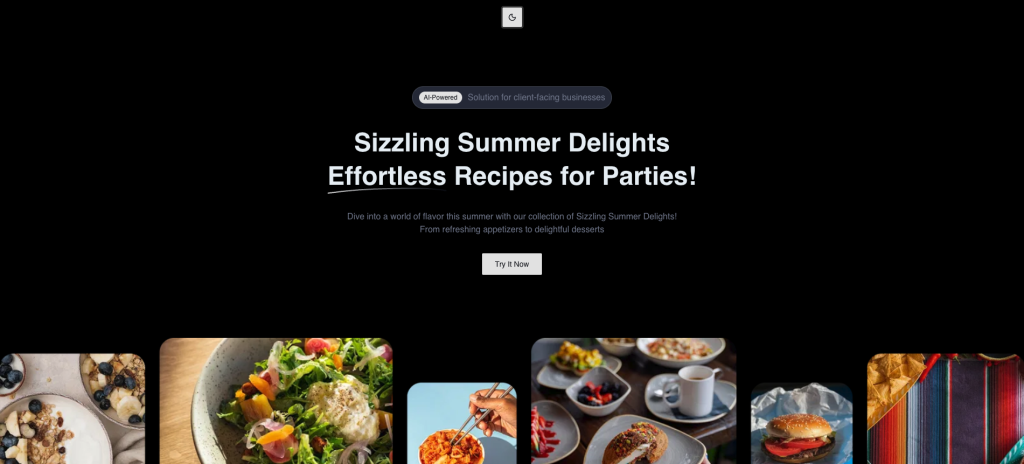
Test it out
Your app now has a fully functional dark mode:
-
Look for the sun/moon icon at the top
-
Click the theme toggle button
-
Watch your entire UI switch between light and dark themes
-
Your choice is saved - refresh the page, and your preference persists
-
Try changing your system theme to see automatic detection in action
How it works behind the scenes
When you click the toggle:
-
next-themesadds/removes thedarkclass from the<html>element -
CSS variables in your
globals.cssswitch from:rootto.darkvalues -
All shadcn components automatically use the new color values
-
Your preference is saved to
localStorage
This is why using semantic tokens like bg-background and text-foreground is so powerful - they automatically adapt without any component changes!
Conclusion
You’ve successfully added shadcn/ui to your existing Next.js project without starting from scratch. You configured the library, integrated reusable components, implemented a custom theme, and set up automatic light/dark mode switching-all while keeping full control over your codebase.
Unlike traditional component libraries that lock you into their API, shadcn gives you the source code. Every component lives in your project, where you can read it, modify it, and adapt it to your exact needs. This approach means no version conflicts, no breaking changes from upstream updates, and complete freedom to build your design system your way.
From here, explore the full range of shadcn components, experiment with new themes using the Theme Generator, or start building your own custom variants. The components you’ve added are just the beginning.
Happy building! 🚀