Modern web interfaces rely heavily on reusable components and consistent visual systems. Designers and developers both benefit when UI elements follow a clear structure that can be reused across a product.
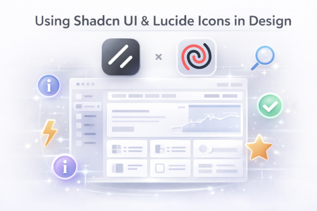
Two tools that work especially well together for this purpose are shadcn/ui and Lucide.
shadcn/ui provides a collection of accessible, customisable UI components built with Tailwind CSS, while Lucide offers a clean, consistent icon library for modern interfaces. When used together, they make it easier to design and build interfaces that are both visually consistent and easy to implement.
In this article, we’ll explore how these tools work and how they can be used together when designing interfaces. Also, you will learn to design a website with Shadcn UI and Lucide Icons
Understanding shadcn/ui
shadcn/ui is a component-based UI library that focuses on flexibility and accessibility. Instead of installing a traditional UI package, developers copy components directly into their projects and customise them as needed.
This approach gives teams more control over how components look and behave. Because the components are built using Tailwind CSS and follow modern design practices, they provide a strong foundation for creating consistent interfaces.
Each component follows a clear structure and consistent spacing system. This makes it easier to design layouts that remain visually balanced across different pages.
Another advantage is accessibility. Many components include built-in accessibility support, which helps ensure that interfaces are usable for a wide range of users.
Bringing shadcn Components into Figma
When designing interfaces that will eventually be built using shadcn/ui, it’s useful to mirror those components inside your design files. This helps keep the design aligned with what developers will implement later.
There are two main ways to do this.
Build Your Own UI Kit
One option is to create a small UI kit in Figma based on the common shadcn design system and components.
For example, you can design reusable components such as:
-
Primary and secondary buttons
-
Input fields
-
Card layouts
-
Dialog or modal layouts
By converting these elements into Figma components, you can reuse them across multiple pages while maintaining consistent spacing, typography, and visual structure.
This approach works well when building design systems or when working closely with developers using shadcn/ui.
Use a Ready-Made UI Kit
Another option is to use a ready-made UI kit that already mirrors shadcn components. These kits provide pre-built elements and layouts, making it easier to design quickly while staying aligned with the component system.
For example, tools like shadcn Studio provide the Shadcn Figma UI kit that replicates the component structure used in shadcn. This can help teams move faster during early design stages without needing to build every component from scratch.
Regardless of the approach, the goal is the same: keeping design components consistent with the components used in development.
Using Shadcn UI and Lucide Icons in Design
Icons are an important part of modern interface design. They help users quickly understand actions, navigation items, and features without relying entirely on text.
Lucide is a lightweight icon set designed specifically for modern web applications. The icons are built as SVGs and use a consistent stroke style, keeping them visually balanced across different UI elements.
Because all icons follow the same design system, they work well across different interface sections without feeling visually inconsistent.
Adding Lucide Icons to Figma
Using Lucide icons in a design tool like Figma is straightforward.
Basic steps:
-
Install the Lucide icon plugin in Figma
-
Open the plugin and browse the icon library
-
Insert icons directly into your design
-
Adjust size and stroke to match your layout
-
Save commonly used icons as components for reuse
Creating a small icon library inside your design file can make future layouts faster and more consistent.
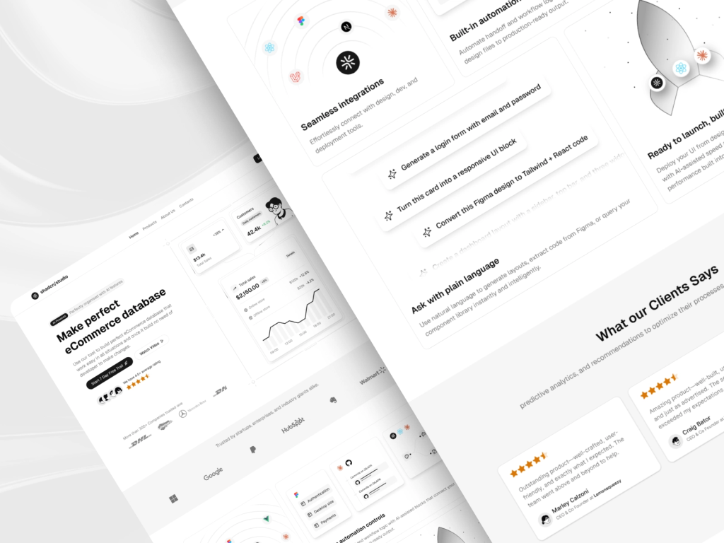
Putting It All Together
After understanding how shadcn/ui components and Lucide icons work, the next step is to see how they come together in a real interface.
Instead of designing every element from scratch, modern interfaces are often built using reusable components. This approach helps maintain consistency across layouts while making it easier for teams to move from design to development.
To demonstrate this workflow, I designed a simple landing page using components inspired by shadcn/ui and icons from the Lucide library. The goal was not to create a complex layout, but to show how a page can be structured using common UI patterns like navigation, hero sections, feature cards, and call-to-action elements.
Each section of the page uses familiar components, buttons, cards, and navigation elements combined with simple icons that help guide user attention and improve clarity.
Below are a few parts of the layout and how these components work together.
Hero Section
The hero section introduces the product and highlights its main purpose. The layout combines strong typography, call-to-action buttons, and supporting UI cards to create a clear entry point. The dashboard-style cards are built using the card component from shadcn/ui, while small icons help make the information easier to scan without adding visual clutter.
Features Section
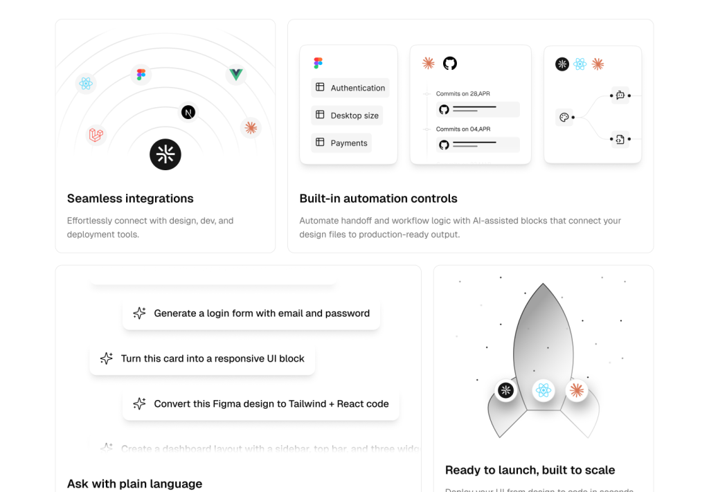
The features section presents key capabilities using a grid of cards. Each feature is placed inside a shadcn card component, which keeps the layout structured and consistent. Icons from Lucide give each feature a clear visual identity while maintaining a minimal and clean look.
Testimonials Section
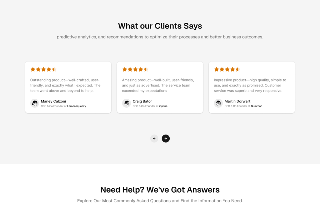
Testimonials help build trust by showing feedback from real users. Each review is displayed inside a card component, keeping the section organised and easy to read. Rating stars are shown using filled icons to highlight user satisfaction while still fitting naturally within the overall design. Keep in mind that Lucide provides only outline icons, but if required, you can use it like this.
FAQ Section
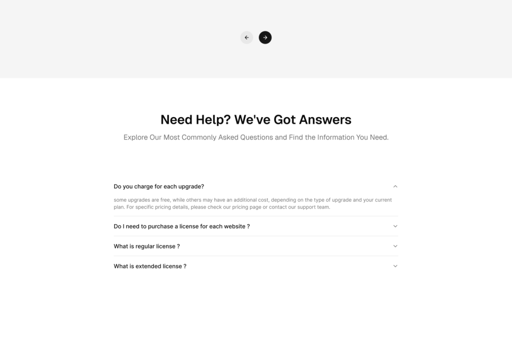
The FAQ section uses a simple accordion layout built with the accordion component from shadcn/ui. This allows users to expand questions only when needed, keeping the interface clean and uncluttered. It’s a practical pattern for organising content-heavy sections like frequently asked questions.
CTA and Footer section
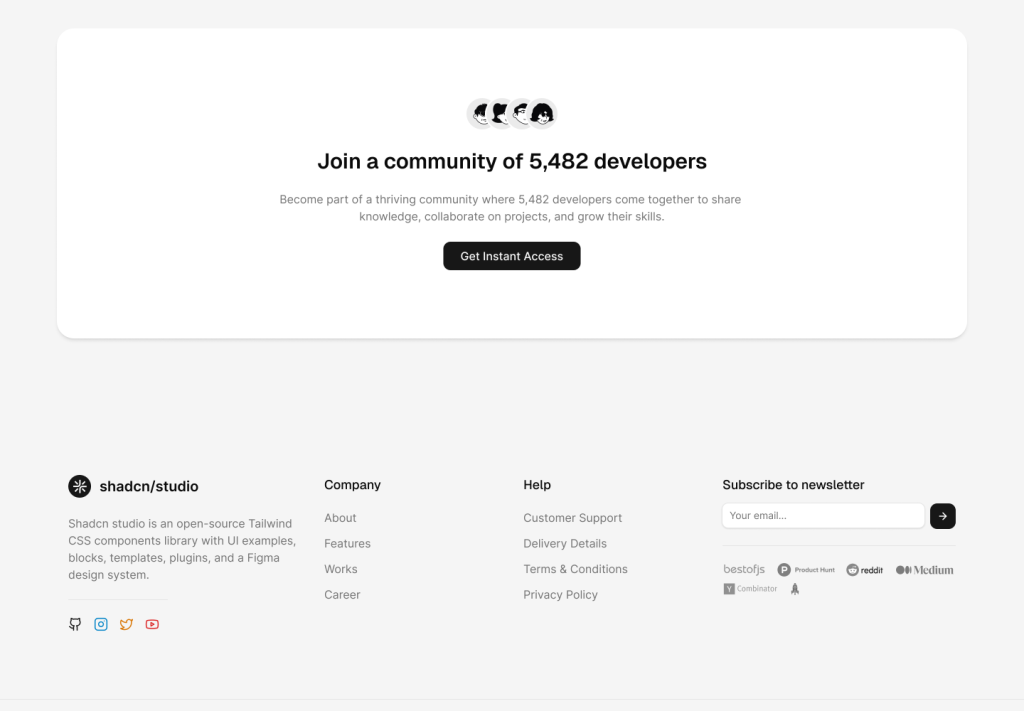
The final section encourages users to take action with a clear call-to-action block. Below it, the footer organises navigation links, product information, and contact details into structured columns. Social media icons from Lucide fit naturally into the minimal design and provide quick access to external platforms.
This example shows how quickly an interface can take shape when using reusable components and a consistent icon set. Instead of focusing on individual UI elements, the design process becomes more about arranging components and creating a clear layout structure.
Best Practices When Designing with Component Libraries
When working with component-based UI libraries, a few simple practices can help maintain consistency.
Keep components reusable
- Avoid designing elements that can only be used once. Reusable components make design systems easier to maintain.
Follow consistent spacing
- Spacing systems help keep layouts visually organised. Try to maintain consistent padding and margins across components.
Use icons intentionally
- Icons should support the interface rather than overwhelm it. Use them where they improve clarity or speed up user recognition.
Document components
- Keeping a simple component library inside your design file can help teams understand how UI elements should be used across different screens.
Conclusion
Designing modern interfaces often involves working with component libraries and structured design systems. Tools like shadcn/ui make it easier to build flexible UI components, while Lucide provides a consistent set of icons that fit naturally into modern layouts.
By combining reusable components with a clear icon system, teams can create interfaces that are easier to design, implement, and maintain over time.
When design and development tools follow the same structure, the entire workflow becomes smoother, and the resulting interfaces become more consistent and scalable.