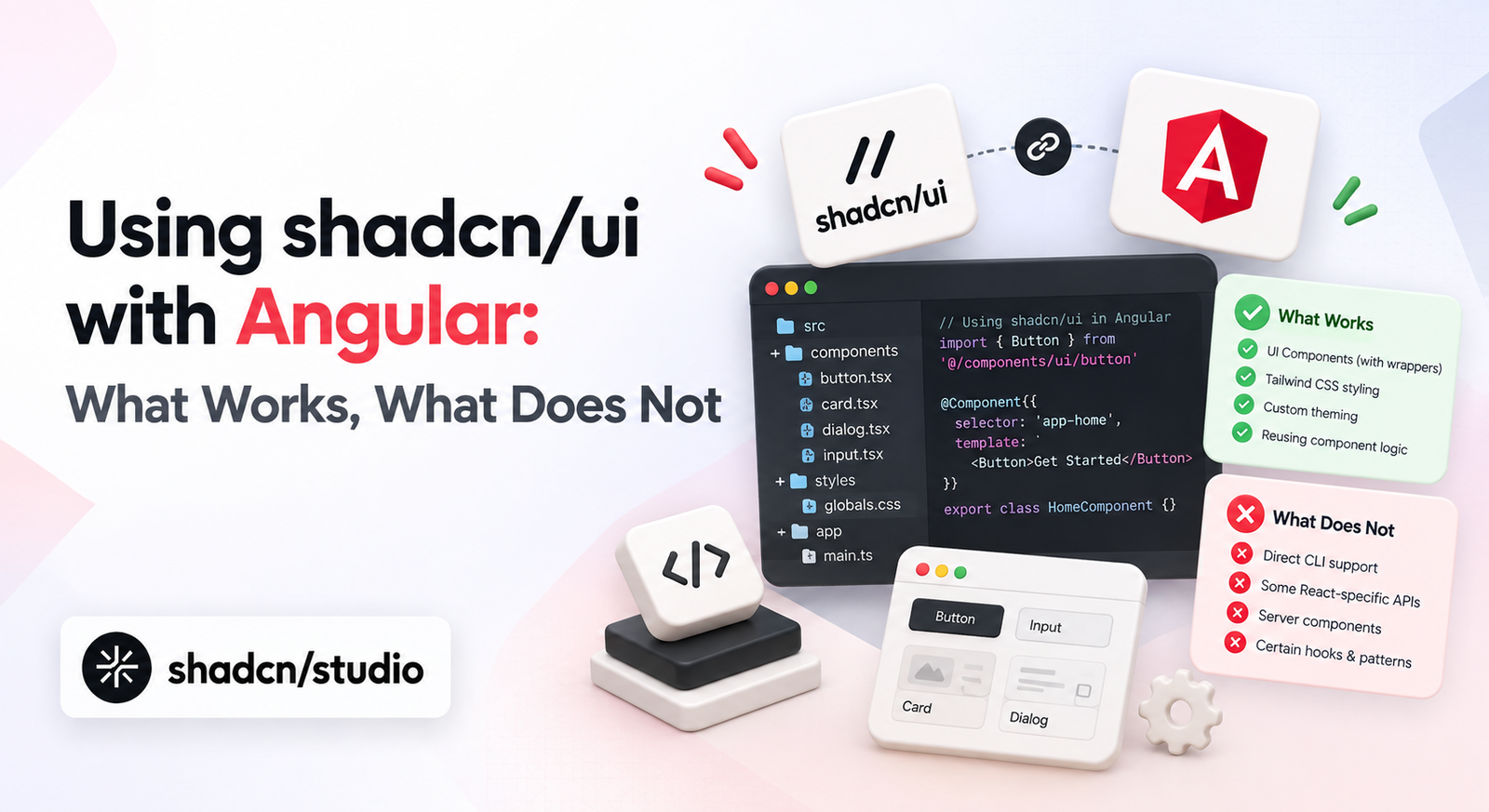
If you are an Angular developer looking at shadcn/ui, the first question is usually whether you can use these components in your own application. The short answer is no: official shadcn/ui components cannot run directly in Angular, and there is no official Angular implementation.
The Angular support discussion in the shadcn/ui repository has been open since January 2024 with 93 👍 reactions and 39 comments, and it still has no accepted answer or announced roadmap. Two separate Angular feature requests were closed without an implementation.
That doesn’t make shadcn/ui irrelevant to Angular work. The more useful question is whether you can bring the shadcn/ui approach to Angular, and there the answer is yes. The components do not transfer, but the pattern behind them does - and several Angular projects have already rebuilt that pattern on Angular’s own primitives.
Version note: Verified in August 2026 against
shadcn@4.19.0, Angular 21.2,@spartan-ng/brain@1.3.2and Zard UI’s beta CLI. Component counts and framework requirements move between releases, so check them against each project’s own docs before committing to one.
Why shadcn/ui components do not work directly in Angular
shadcn/ui components are not framework-independent web components. They are React components written with React-specific technologies, so the problem isn’t that they need a bit of adaptation - it’s that nothing underneath them is portable.
A typical shadcn component looks like this:
import * as React from "react"

export function Button() {
  return (
    <button>
      Click me
    </button>
  )
}
An Angular component follows a completely different model:
@Component({
  selector: "app-button",
  template: `
    <button>
      Click me
    </button>
  `
})
export class ButtonComponent {}
The syntax difference is the surface-level issue. The deeper one is the runtime model, and that shows up in two places.
shadcn/ui depends on React concepts
Official shadcn/ui components use JSX/TSX rendering, hooks, React state, and React context. A dialog tracks its open state with something like const [open, setOpen] = React.useState(false), which Angular has no way to execute. The Angular equivalent would be const open = signal(false), and getting there means rewriting the component’s behavior rather than copying it.
shadcn/ui uses React component primitives
Most shadcn/ui components are built on a React primitive library - Base UI by default, with Radix UI and React Aria as supported alternatives. Those primitives supply dialogs, menus, popovers, focus management, keyboard interaction, and accessibility wiring. All of them are React-specific, so an Angular project needs Angular-native equivalents for the same behavior.
What actually transfers: the pattern, not the components
The reason developers like shadcn/ui is not only the components themselves. It is the development model: components belong to your application, styling is transparent, customization is expected, and design tokens keep everything consistent. Those ideas work just as well in Angular.
Own your component source code
Traditional component libraries follow a familiar path - install a package, import a component, then customize it through whatever API the maintainers exposed. shadcn/ui inverts that. You add a component, its source lands in your project, and you edit it directly.
In Angular that means maintaining real files instead of importing from a black box:
components/
 └── button/
      ├── button.ts
      ├── button.html
      └── button.css
The tradeoff is the same one shadcn/ui makes: you take on maintenance of the component in exchange for being able to change anything in it without fighting an abstraction.
Tailwind-based styling
shadcn/ui uses Tailwind classes instead of hiding styles behind configuration-heavy theme APIs, and that workflow is framework-agnostic. A button styled className="rounded-md bg-primary px-4 py-2" in React becomes class="rounded-md bg-primary px-4 py-2" in an Angular template. The framework changes; the styling workflow doesn’t.
A Shadcn template can still be a useful visual reference for an Angular build. Its component code needs to be rewritten, but its spacing, responsive layout, and Tailwind class choices can guide the equivalent Angular implementation.
Design tokens and CSS variables
One of shadcn/ui’s strongest ideas is treating CSS variables as design tokens. Rather than hardcoding background: blue, components consume background: var(--primary), and the tokens are defined once:
:root {
  --primary: ...;
  --background: ...;
  --foreground: ...;
}
Angular applications can adopt this directly, and it’s the single easiest part of the shadcn/ui approach to carry over, since it lives entirely in CSS. If you want the full picture of how these tokens are structured, see Mastering shadcn/ui Colors and Theme Variables.
The Shadcn Theme Generator is useful here because the CSS variables it produces are not tied to React. You can bring the resulting token values into an Angular stylesheet, then connect Angular-native components to the same color system.
What happens if you run the shadcn CLI in an Angular project
It’s worth separating two things that often get conflated: the CLI is a distribution mechanism, and the components are React source files. The CLI working in your project wouldn’t make the components run.
Running npx shadcn@latest init inside an Angular project fails, but not immediately, and the order it fails in is the interesting part. In a real Angular 21 project with Tailwind already set up, the CLI asked which component library to use and which preset to start from, and only checked the framework after both answers:
- Preflight checks.
✔ Preflight checks.
- Verifying framework.
✖ Verifying framework.

We could not detect a supported framework at /path/to/angular-project.
Visit https://ui.shadcn.com/docs/installation/manual to manually configure your project.
Once configured, you can use the cli to add components.
Two details matter here. Preflight passes - an Angular project with Tailwind installed clears that stage without complaint, which is why this one catches people out: you answer two setup questions, watch a check go green, and then hit the wall. It’s the separate framework verification step that stops the run, because Angular is not among the supported targets.
The other detail is that nothing is written when it fails. No components.json is created and no files are touched, so a failed run leaves the project exactly as it was and retrying is safe.
What about using the registry directly?
The registry can technically hand you component definitions without the CLI, but the output is still React. A dialog fetched from the registry starts with import * as React from "react" and pulls in the primitive package for whichever style you requested:
| Style | Primitive package |
|---|---|
base-nova (current default) | @base-ui/react |
radix-nova | radix-ui |
new-york (legacy) | @radix-ui/react-dialog |
Older tutorials tend to show the legacy @radix-ui/react-* packages, which is a useful signal that they predate the current CLI. Either way the conclusion is the same: the distribution mechanism is separate from the component implementation, and the files it delivers are written for React.
Angular alternatives to shadcn/ui
Getting the shadcn/ui philosophy in Angular means using projects that rebuilt it on Angular architecture rather than porting React code. Three options cover most situations.
Shadcn blocks are useful for planning these rebuilds even though they cannot be copied directly. They show how smaller components fit together into dashboards, forms, and navigation patterns that you can reproduce with an Angular-native library.
Spartan UI
Spartan UI is the closest match to shadcn/ui’s architecture, and the reason is more specific than a shared design sensibility.
Spartan splits every component into two layers. Brain is the behavior layer, handling accessibility, keyboard interaction, and component logic. Helm is the visual layer, supplying the Tailwind classes and presentation. What makes this notable is how each layer is delivered: per Spartan’s CLI documentation, adding a component installs the Brain primitive from npm and copies the Helm styles into your codebase.
That is the same division shadcn/ui makes:
| Primitive (npm dependency) | Component source (copied to your project) | |
|---|---|---|
| shadcn/ui | @base-ui/react | components/ui/*.tsx |
| Spartan UI | @spartan-ng/brain | Helm files |
| Zard UI | (none) | entire component |
So Spartan isn’t merely shadcn-like in appearance - it reproduces the underlying split between an installed behavior primitive and owned, editable styling.
The same thinking shows up in how it handles visual styles. Spartan ships six presets - nova, vega, lyra, maia, mira, and luma - selected when you first run the CLI and stored in a style field in components.json. The names and the mechanism both match shadcn/ui, which is a reasonable signal that the two projects are working from the same design-system assumptions rather than converging by coincidence.
Minimal setup:
npm i -D @spartan-ng/cli
ng g @spartan-ng/cli:ui-theme
ng g @spartan-ng/cli:ui button
Spartan currently documents 60 components, covering the harder patterns such as data tables, comboboxes, date pickers, and command palettes. If you’ve read older threads calling it incomplete, that criticism is out of date.
Two practical constraints are worth knowing before you commit. @spartan-ng/brain declares a peer dependency on @angular/core >=21.0.0 <23.0.0, so the current release needs Angular 21 or newer - relevant if you’re on an older LTS. It also builds on @angular/cdk, which means choosing Spartan gives you CDK underneath rather than instead of it.
One more similarity is worth flagging if you work with right-to-left layouts. Spartan’s CLI applies a write-time transformation that converts physical classes such as left-* and right-* into logical start-* and end-*, and flips supported icons with rtl:rotate-180. That is the same mechanism shadcn/ui’s CLI uses, so if you’ve already worked through RTL support for shadcn/ui in Next.js, the behavior will be familiar.
Zard UI
Zard UI takes the same philosophy in a simpler direction. It documents 57 components, putting its coverage close to Spartan’s, and it copies everything into your project - there’s no runtime Zard package at all. In a test project the copied button pulled in class-variance-authority, clsx, and tailwind-merge, the same utility stack shadcn/ui uses, plus @ng-icons for icons.
Its CLI is also closer to shadcn/ui’s ergonomics:
npx zard-cli init
npx zard-cli add button
The tradeoff is maturity and naming. Zard started in March 2025 against Spartan’s April 2023, so it has less production history behind it, and its CLI is still pre-1.0 - npx zard-cli currently resolves to 1.0.0-beta.107. That isn’t a reason to avoid it, but it’s worth knowing that the tooling is still moving. It also prefixes its API in a way that takes adjustment - more on that in the syntax comparison below.
Angular CDK
Angular CDK takes a different approach entirely. Instead of finished components it provides lower-level building blocks: overlays, dialogs, accessibility utilities, drag and drop, and keyboard interaction. You build the visual layer yourself.
It’s a good fit when you’re creating a custom design system, when your UI requirements are specific enough that a component library would mostly get in the way, or when you want to avoid a dependency on someone else’s design decisions. The tradeoff is straightforward: more implementation work up front.
Component syntax compared
The three projects diverge most visibly in how you write a component in a template:
<!-- shadcn/ui (React) -->
<Button variant="outline" size="sm">Save</Button>

<!-- Spartan UI -->
<button hlmBtn variant="outline" size="sm">Save</button>

<!-- Zard UI -->
<button z-button zType="outline" zSize="sm">Save</button>
Both Angular projects attach to a real <button> element through an attribute selector, which is idiomatic Angular and keeps native button semantics intact. The difference is in the property names. Spartan prefixes only the directive itself (hlmBtn) and keeps shadcn/ui’s variant and size names, so most of what you know carries over. Zard prefixes the inputs as well, turning variant into zType and size into zSize - though the accepted values are unchanged, so outline, ghost, secondary, link, and destructive all mean what you would expect.
Neither approach is technically better, and Zard’s prefixing is a deliberate convention rather than an oversight - dropping it is currently the most-discussed open request in the project. But if your team is moving between a React codebase using shadcn/ui and an Angular one, Spartan’s naming means less translation.
Spartan UI vs Zard UI vs Angular CDK
| Solution | Approach | Components | Maturity | Good fit for | Tradeoff |
|---|---|---|---|---|---|
| Spartan UI | Brain primitive from npm + copied Helm styles | 60 | Since Apr 2023, stable releases | Teams wanting the closest match to shadcn/ui’s architecture | Two-layer model takes learning; needs Angular 21+ |
| Zard UI | Full component source copied into your project | 57 | Since Mar 2025, younger project | Teams wanting a simpler, single-file component model | Less production history; prefixed input names |
| Angular CDK | Low-level Angular primitives, no styling | n/a | Maintained by the Angular team | Teams building a custom design system | Requires building the entire visual layer |
| Angular Material | Complete component library with theming API | n/a | Maintained by the Angular team | Apps needing standard components quickly | Little ownership over component source |
Coming from Angular Material?
Most teams asking about shadcn/ui in Angular aren’t starting from zero. They have an Angular Material application and are weighing a more Tailwind-based, customizable approach - which is a bigger change than swapping a dependency.
Shadcn pages can help define the target experience during that transition. Treat them as layout and interaction references while migrating each screen to Angular components at a pace that fits the existing application.
The two follow different models. Angular Material has you install a package, configure a theme, and use the components it provides. The shadcn-style approach has you add source code, own the components, and customize them directly. There’s no automated migration between the two, because the second model doesn’t have an equivalent of the first model’s theme configuration.
The practical approach is incremental: keep Angular Material in place, introduce Tailwind alongside it, migrate screens as you touch them, and replace components only where the customization is actually needed. Treat it as adopting a different ownership model rather than replacing one package with another.
Which Angular alternative should you choose?
Spartan UI is the closest match if you want the shadcn/ui experience specifically. It mirrors the primitive-plus-owned-styling split, keeps familiar prop names, and has the longer track record. Check your Angular version first.
Zard UI is a good fit if you prefer a single-file component model without a separate behavior package, and you’re comfortable with a younger project and its naming conventions.
Angular CDK is a good fit if you are building a design system from the ground up and want complete control over the visual layer, accepting more implementation work in exchange.
FAQ
- Will shadcn/ui officially support Angular?
There’s no official Angular implementation and no announced roadmap for one - the support discussion linked at the top of this article has been open since January 2024 without an accepted answer. Because shadcn/ui ships React source files rather than a framework-agnostic package, Angular support would mean maintaining a parallel implementation, which is essentially what Spartan UI and Zard UI already are.
- Should I choose Spartan UI or Zard UI?
Component coverage is close enough that it shouldn’t decide it - 60 documented components against 57. Spartan has been in development since 2023, separates behavior from styling in two layers, and keeps shadcn/ui’s variant and size naming. Zard is newer, keeps each component in a single copied file, and prefixes its inputs. Spartan is the safer choice for a long-lived application; Zard is quicker to get moving with.
- Can I copy shadcn/ui styles into Angular?
Yes. Tailwind conventions, CSS variables, design tokens, and component organization all carry over without modification, because none of them depend on React. The component implementations are the part that has to be rewritten.
- Can I use shadcn/ui blocks or templates in Angular?
Not directly. Blocks and templates are larger compositions built from the same React component files, so they carry the same constraint as the individual components - there’s no way to drop them into an Angular project and have them run. What does carry over is everything that isn’t React: the layout structure, the Tailwind class conventions, and the token-driven theming. Reading through a block to see how a dashboard or auth screen is assembled is a reasonable way to plan the Angular equivalent, as long as you expect to rebuild the components themselves.
Conclusion
You cannot use official shadcn/ui components inside an Angular application, and the reason is architectural rather than cosmetic - React components, hooks, primitives, and rendering model all the way down. Running the CLI in an Angular project confirms it: preflight passes, framework verification fails, and nothing gets written.
The ideas behind shadcn/ui aren’t limited to React, though. Owning your component source, styling with Tailwind, and building around design tokens all work in Angular, and Spartan UI, Zard UI, and Angular CDK each offer a different balance between how much you get and how much you own.
The components do not transfer. The pattern does.