You changed baseColor in components.json, restarted your app, and nothing happened.
This is one of the most common points of confusion when customizing shadcn/ui themes.
The reason is simple: baseColor is not a live theme switch that updates your existing components whenever you edit the configuration file.
Instead, baseColor is used during shadcn/ui initialization and theme generation. Once your project already has generated components and CSS variables, changing the value alone does not rewrite those files.
To change the base color of an existing project, you need to update the generated theme values using the appropriate workflow.
Version note: Verified against
shadcn@4.18.0in August 2026. Base-color behaviour has changed across releases, so check your CLI version before following older guides.
What does baseColor actually do?
baseColor in components.json defines the default base palette used when shadcn generates your theme.
A typical configuration looks like:
{
  "tailwind": {
    "baseColor": "zinc"
  }
}
The base colors currently offered are Neutral, Stone, Zinc, Mauve, Olive, Mist, and Taupe. They all sit at roughly the same lightness and differ mainly in chroma - a small hue bias across your greys. Comparing the light-mode --foreground token makes it concrete: Neutral is the only one with zero chroma (oklch(0.145 0 0)), Zinc leans slightly blue (oklch(0.141 0.005 285.823)), and Stone slightly warm (oklch(0.147 0.004 49.25)).
They influence the initial values generated for your theme, but they are not the same as your application’s brand color.
If you want to see them before committing to one, ui.shadcn.com/create has a Base Color control that previews each option against real components. It offers the same seven, and it is also where you would set the base color for a new project - for an existing one, preview here and then apply the tokens using Option 2 below.
If you would rather start a new application with its palette and layout already coordinated, Shadcn templates can provide themed foundations instead of making you configure every design decision from scratch.
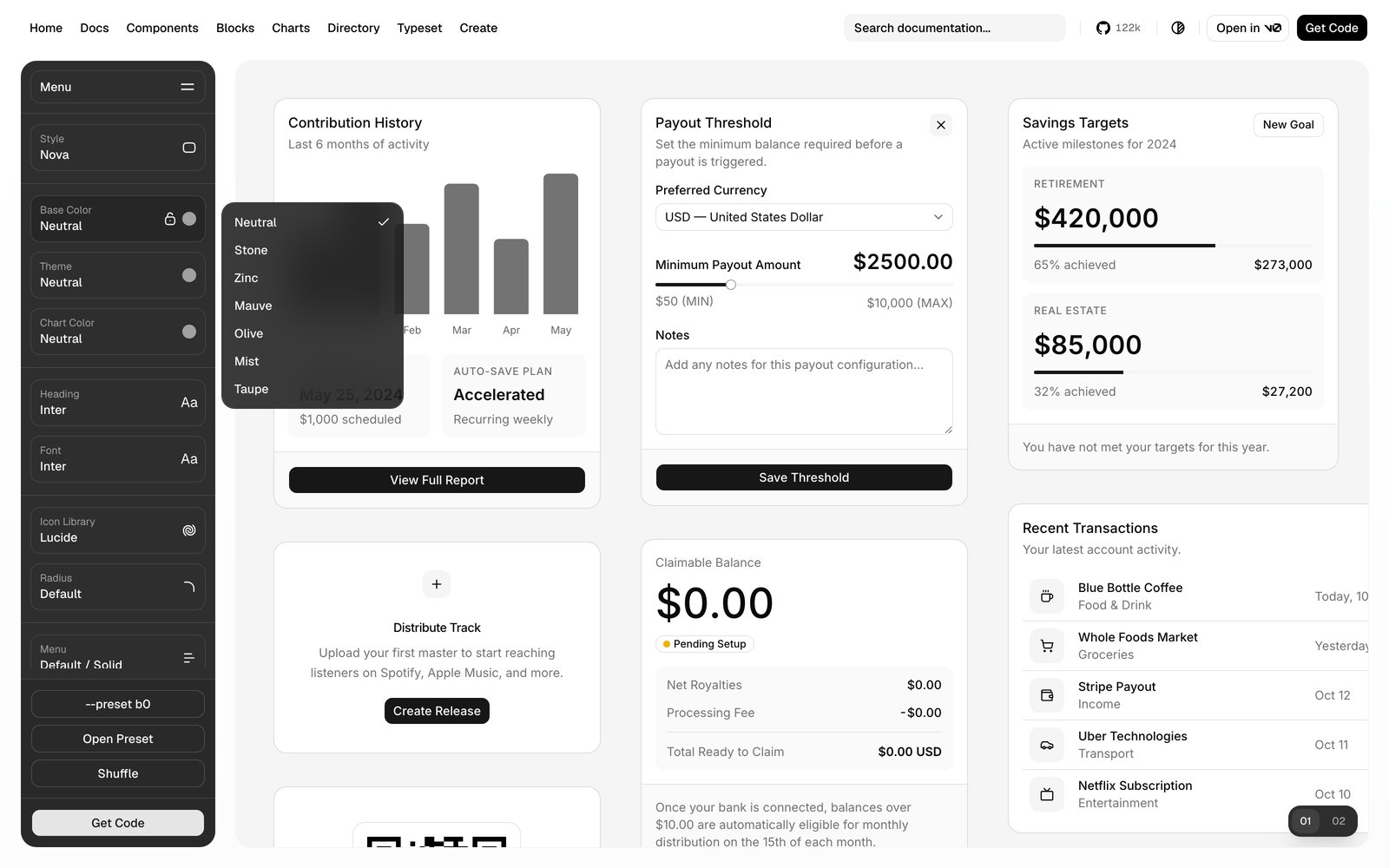
If your project predates these, you may see slate or gray in components.json. Both still resolve from the registry and still provide OKLCH values for Tailwind v4, so a project already on one keeps working. They are simply not part of the list offered for new projects.
For example:
baseColordefines the foundation of the generated palette.--primarycontrols your primary action color.- Custom brand colors can be created separately.
If you want to understand how shadcn theme variables work internally, see our guide on Shadcn Colors and Theme Variables.
Why changing baseColor in components.json does nothing
A common mistake is:
- Open
components.json - Change:
{
  "tailwind": {
    "baseColor": "zinc"
  }
}
to:
{
  "tailwind": {
    "baseColor": "neutral"
  }
}- Restart the development server.
Nothing changes, and that is the expected behaviour rather than a bug. components.json is configuration for the CLI, not a runtime theme file - nothing reads it at render time, and editing it does not trigger a regeneration of anything already in your project. Your current colors were written into CSS variables at initialization and they are still sitting there, usually in:
app/globals.cssor:
src/app/globals.cssChanging the configuration file does not automatically replace those existing generated values.
The mechanism is worth knowing, because it explains the exception. The CLI does read baseColor on every add - but the step that applies it is skipped whenever cssVariables is true, which is the default. In that mode your components reference semantic tokens (bg-card, text-muted-foreground), so what they actually resolve to is whatever is already written in your CSS. The base color never enters the picture.
In a cssVariables: false project the opposite is true: baseColor is applied to components you add after the change, though never retroactively to ones already on disk. That mode is rare, and with the current OKLCH base colors the values it inlines don’t compile to working Tailwind classes - so it isn’t a workaround either.
The correct ways to change shadcn/ui base color
The right approach depends on what you are trying to achieve.
| Situation | Recommended approach |
|---|---|
| New project | Set the base color during initialization |
| Existing project, happy with neutral or taupe | shadcn apply <style> --only theme |
| Existing project, want another base color | Swap the base color tokens manually |
| Existing project with custom branding | Swap tokens manually so brand colors survive |
| Only changing one or two colors | Edit the relevant theme variables directly |
Option 1: Apply a new theme to an existing project
For an existing project, the recommended CLI approach is using apply.
Example:
pnpm dlx shadcn@latest apply vega --only theme npx shadcn@latest apply vega --only theme yarn dlx shadcn@latest apply vega --only theme bunx --bun shadcn@latest apply vega --only theme This rewrites baseColor in components.json and the token block in your global CSS, and touches no component files - verified on a real project, where apply sera --only theme moved baseColor from zinc to taupe and rewrote around 110 lines of globals.css.
There is a limit worth knowing before you rely on it. Styles carry their own base color, and seven of the eight ship neutral - only Sera ships taupe. So apply can realistically land you on neutral or taupe, and there is no style that will give you Zinc, Stone, Mauve, Olive, or Mist. For those, use the manual route below.
Before running this on a real application, review what will change because applying a theme replaces your existing theme values.
For example, if you previously customized:
--primary
--secondary
--accent
those values may be replaced by the new theme.
Always keep a Git checkpoint before applying a new theme:
git add .
git commit -m "backup before changing shadcn theme"
Then apply the new theme and review the diff.
Option 2: Swap the base color tokens manually
This is the only route to Zinc, Stone, Mauve, Olive, or Mist in an existing project, and it is also the most surgical - it changes the neutral ramp and leaves everything else, including a custom --primary, exactly where it is.
Every base color is published as JSON. Fetch the one you want:
curl https://ui.shadcn.com/r/colors/mauve.jsonThe response carries the full light and dark token sets. Copy those values over the matching entries in your :root and .dark blocks - --background, --foreground, --card, --popover, --muted, --border, --input, and the rest of the neutral ramp - and leave your brand tokens untouched.
Then update components.json so future init or apply runs agree with what is now in your CSS:
{
  "tailwind": {
    "baseColor": "mauve"
  }
}
This approach is better when:
- your project already has a custom design system,
- you want a specific base color the styles don’t offer,
- you do not want to overwrite existing customizations.
After the neutral ramp is settled, reusable Shadcn blocks can help you assemble larger interface sections while keeping those theme tokens consistent across the project.
If what you actually want is a new brand color rather than a new neutral ramp, that is a different edit - see changing --primary and adding custom tokens.
Option 3: Use a visual theme generator
If you are redesigning the complete application theme, manually editing every value becomes difficult.
A visual workflow can help when you need to adjust:
- base palette
- brand colors
- sidebar colors
- chart colors
- typography
- radius settings
The Shadcn Theme Generator gives you a visual way to build the whole palette and export it as CSS variables, in OKLCH, HSL, RGB, or HEX.
Getting that export into an existing project works the same way as Option 2. The generator hands you a full :root and .dark block, so merge it into your globals.css section by section rather than pasting it over the file - a wholesale replace will take your own additions with it, including any custom tokens and brand colors you added on top of the defaults. If you picked new fonts as well, those need wiring into your layout separately; the CSS export does not carry them.
This is useful when you are moving beyond a single base color change and want a consistent application-wide design system.
Once the theme is ready, browsing complete Shadcn pages is a practical way to see how the palette behaves across real screens rather than isolated components.
Base color vs primary color: what should you change?
A lot of base-color changes are really brand-color changes in disguise. If the goal is “make the buttons purple”, the base color is the wrong lever - that is --primary, and swapping the whole neutral ramp to get there will change every surface in the app as a side effect.
| Goal | Change |
|---|---|
| Change the app’s primary brand color | --primary |
| Change neutral tones across the UI | Base color/theme |
| Create a completely new visual style | Apply a new theme |
| Add a custom brand color | Add a custom token |
A typical SaaS app ends up using all three at once: a neutral base for surfaces and borders, a blue --primary for actions, and a custom token or two for accents. They are independent decisions, and only the first one is what baseColor controls.
FAQ
Should I change the base color or just edit the CSS variables?
For one or two colors, edit the variables - it is faster and it leaves everything else alone. Reach for apply or a theme generator when you are redoing the whole palette and the neutral ramp along with it.
Does changing the base color affect dark mode too?
Yes. The generated theme writes both :root and .dark, so applying a preset rewrites the light and dark token blocks together. That is worth knowing before you review the diff - and worth checking both modes in the browser afterwards, since a neutral that reads well on white can go flat against a dark background.
Conclusion
Changing the base color in an existing project is not a config edit and a refresh. baseColor feeds theme generation, so once your styles exist on disk, the only things that move them are the CLI or your own editor.
Match the method to the size of the job: edit the tokens directly for a small adjustment, apply a preset when you are replacing the palette wholesale, and build it visually when you need a coordinated set of your own. Whichever route you take, check the result in both light and dark before committing - the diff will have touched both.