Choosing the right UI foundation is an important decision when building modern React applications. Two of the most widely adopted options today are Shadcn UI and Chakra UI. While both help developers build interfaces faster, they differ significantly in philosophy, customization, styling approach, and component ownership.
This guide provides a practical comparison of Shadcn UI vs Chakra UI to help you determine which solution is the better fit for your project.
What Are React UI Component Libraries?
React UI libraries provide reusable components such as buttons, forms, modals, menus, navigation elements, and layout systems. These libraries reduce development time by handling common UI patterns while maintaining consistency across applications.
Some libraries provide fully styled components that are ready to use immediately. Others provide building blocks that allow developers to customize every aspect of the interface.
Both Chakra UI and Shadcn UI help developers build modern React applications more efficiently, but they approach the problem differently.
What Is Shadcn UI?

Shadcn UI is a collection of reusable React components built using Radix UI primitives and Tailwind CSS. Instead of installing a traditional component library, developers copy components directly into their projects and own the source code.
Key Reasons Shadcn UI Is Chosen
- Full source code ownership
- Tailwind-first workflow
- Modern design patterns
- Built on Radix UI accessibility
- Highly customizable components
Benefits
- Unlimited customization
- No vendor lock-in
- Better design flexibility
- Easier long-term maintenance
Why Is Shadcn UI Used?
Developers choose Shadcn UI when they want complete control over their component system while still benefiting from accessible, production-ready building blocks.
Common Use Cases
- Modern SaaS products
- Startup applications
- Design systems
- Marketing websites
- Highly customized products
What Is Chakra UI?

Chakra UI is an open-source React component library that provides accessible and fully styled UI components out of the box. It uses a props-based styling system and focuses on developer productivity by reducing the amount of custom CSS required.
Key Reasons Chakra UI Is Chosen
- Large collection of pre-built components
- Built-in accessibility support
- Consistent design system
- Fast development workflow
- Strong TypeScript support
Benefits
- Faster implementation
- Minimal styling setup
- Easy component composition
- Great developer experience
Why Is Chakra UI Used?
Developers choose Chakra UI when they want a complete component library that allows them to build applications quickly without spending significant time creating UI foundations from scratch.
Common Use Cases
- SaaS applications
- Admin dashboards
- Internal tools
- Enterprise applications
- MVP development
Core Difference Between Shadcn UI vs Chakra UI
While Chakra UI and Shadcn UI both help developers build modern interfaces, they take fundamentally different approaches to component development, styling, and customization.
The primary differences stem from philosophy, architecture, styling workflows, and how components are distributed.
Shadcn UI vs Chakra UI: Philosophy & Approach
Shadcn UI:
- Ownership-first approach
- Components become part of your codebase
- Less opinionated structure
- Greater customization freedom
Chakra UI:
- Component-first library
- Ready-to-use UI components
- Opinionated design system
- Faster setup experience
In short:
- Shadcn UI → Customizable component system
- Chakra UI → Complete component library
Shadcn UI vs Chakra UI: Component Architecture
Shadcn UI:
- Components live inside your project
- Direct source code ownership
- Easier component modifications
- No dependency lock-in for components
Chakra UI:
- Components are imported from a package
- Centralized dependency management
- Consistent API structure
- Library updates handled through version upgrades
Shadcn UI vs Chakra UI: Styling Approach
Shadcn UI works best with:
- Tailwind CSS
- Utility-first workflows
- Direct component styling
- Modern design patterns
Chakra UI works best with:
- Chakra styling props
- Theme tokens
- Design system workflows
- Component variants
Shadcn UI vs Chakra UI: Customization
Shadcn UI:
- Direct component editing
- No styling restrictions
- Full code ownership
- Unlimited flexibility
Chakra UI:
- Customization through themes
- Component variants supported
- Design tokens encouraged
- Consistent customization model
Shadcn UI vs Chakra UI: Accessibility
Shadcn UI:
- Accessibility powered by Radix UI
- Keyboard interactions included
- Accessible primitives underneath
- Production-ready accessibility patterns
Chakra UI:
- Accessibility built in
- ARIA support included
- Keyboard navigation supported
- Accessible defaults provided
Shadcn UI vs Chakra UI: Performance
Shadcn UI:
- Components live locally
- No large component package dependency
- More control over shipped code
- Easier optimization opportunities
Chakra UI:
- Additional library runtime
- Theme system overhead
- Optimized component architecture
- Mature production performance
Shadcn UI vs Chakra UI: Developer Experience
Shadcn UI:
- More flexible workflow
- Better for advanced customization
- Tailwind-focused development
- Greater control over implementation
Chakra UI:
- Beginner friendly
- Excellent documentation
- Fast onboarding
- Consistent APIs
Shadcn UI vs Chakra UI: Theming & Design Systems
Shadcn UI:
- Tailwind-driven theming
- CSS variable support
- Custom design systems
- More implementation freedom
Chakra UI:
- Advanced theming system
- Design tokens built in
- Global theme configuration
- Consistent design language
Shadcn UI vs Chakra UI Comparison Table
| Feature | Shadcn UI | Chakra UI |
|---|---|---|
| Component Model | Copied into your project | Installed as a dependency |
| Styling | Tailwind CSS | Style Props & Theme System |
| Customization | Very High | High |
| Code Ownership | Full Ownership | Library Managed |
| Accessibility | Powered by Radix UI | Built In |
| Tailwind Support | Native | Limited |
| Theming | CSS Variables & Tailwind | Advanced Theme System |
| Learning Curve | Moderate | Beginner Friendly |
| Best For | Custom Products & Design Systems | Rapid Application Development |
When Should Each Be Used?
Choose Shadcn UI when:
- Tailwind CSS is already adopted
- Full component ownership is required
- Design flexibility is important
- Long-term customization is a priority
Choose Chakra UI when:
- Development speed is critical
- A complete component library is preferred
- Team consistency is important
- Minimal UI setup is desired
Since Shadcn UI has grown into a much larger ecosystem beyond its core components, it’s worth highlighting a related tool - shadcn/studio.
Special Recommendation: shadcn/studio
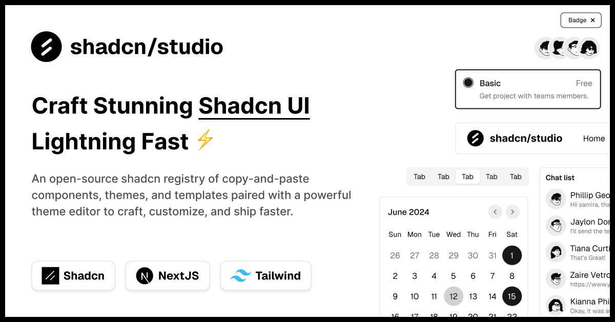
This isn’t a traditional component library or a replacement for Shadcn. Instead, it’s a unique collection that offers customizable variants of components, blocks, and templates. Preview, customize, and copy-paste them into your apps with ease.
Building on the solid foundation of the Shadcn components & blocks, we’ve enhanced it with custom-designed components & blocks to give you a head start. This allows you to craft, customize, and ship your projects faster and more efficiently.
Features:
-
Open-source: Dive into a growing, community-driven collection of copy-and-paste shadcn ui components, Shadcn blocks, and templates.
-
Component & Blocks variants: Access a diverse collection of customizable shadcn blocks and component variants to quickly build and style your UI with ease.
-
Animated variants with Motion: Add smooth, modern animations to your components, enhancing user experiences with minimal effort.
-
Landing pages & Dashboards: Explore 20+ premium & free Shadcn templates for dashboards, landing pages & more. Fully customizable & easy to use.
-
shadcn/ui for Figma: Speed up your workflow with Shadcn Figma UI components, blocks & templates - a full design library inspired by shadcn/ui.
-
Powerful theme generator: Customize your UI instantly with Shadcn Theme Generator. Preview changes in real time and create consistent, on-brand designs faster.
-
shadcn/studio MCP: Integrate shadcn/studio MCP Server directly into your favorite IDE and craft stunning shadcn/ui Components, Blocks, and Pages inspired by shadcn/studio.
-
Shadcn Figma To Code Plugin: Convert your Figma designs into production-ready code instantly with the Shadcn Figma Plugin.
API Design Example: Shadcn UI vs Chakra UI
One of the most practical differences between Shadcn UI and Chakra UI becomes clear when looking at how components are created, styled, and customized in real applications.
Shadcn UI API Example
Shadcn UI provides production-ready components that live inside your project. Components can be customized directly because the source code belongs to your application.
import {
  Dialog,
  DialogTrigger,
  DialogContent,
  DialogHeader,
  DialogTitle,
  DialogDescription,
} from "@/components/ui/dialog";

export function ShadcnDialog() {
  return (
    <Dialog>
      <DialogTrigger>Open</DialogTrigger>

      <DialogContent>
        <DialogHeader>
          <DialogTitle>Dialog Title</DialogTitle>

          <DialogDescription>
            Dialog content goes here.
          </DialogDescription>
        </DialogHeader>
      </DialogContent>
    </Dialog>
  );
}
What this shows:
- Cleaner Tailwind-first workflow
- Components live inside your codebase
- Full source code ownership
- Easier long-term customization
- Greater flexibility for custom design systems
Chakra UI API Example
Chakra UI provides pre-styled components that are ready to use immediately. Most customization happens through props, theme tokens, and component variants.
import {
  Button,
  Modal,
  ModalOverlay,
  ModalContent,
  ModalHeader,
  ModalBody,
  useDisclosure,
} from "@chakra-ui/react";

export function ChakraModal() {
  const { isOpen, onOpen, onClose } = useDisclosure();

  return (
    <>
      <Button onClick={onOpen}>Open</Button>

      <Modal isOpen={isOpen} onClose={onClose}>
        <ModalOverlay />
        <ModalContent>
          <ModalHeader>Modal Title</ModalHeader>
          <ModalBody>
            Modal content goes here.
          </ModalBody>
        </ModalContent>
      </Modal>
    </>
  );
}
What this shows:
- Fully styled components out of the box
- Minimal setup required
- Consistent API patterns
- Fast implementation for common interfaces
- Customization handled through props and themes
Conclusion
Shadcn UI and Chakra UI solve similar problems, but they approach UI development from different perspectives.
Shadcn UI focuses on ownership and flexibility. By placing components directly inside your project, it gives developers complete control over styling, behavior, and long-term maintenance while still benefiting from modern accessibility standards.
Chakra UI focuses on providing a complete component library that helps developers build applications quickly with minimal setup. Its pre-built components, powerful theming system, and consistent APIs make it an excellent choice for teams that prioritize speed and productivity.
The right choice depends on your priorities. If you want a traditional component library with fast implementation, Chakra UI is often the better option. If you value customization, Tailwind-first workflows, and full component ownership, Shadcn UI is usually the stronger choice.
Both provide a solid foundation for building modern React applications and can successfully power production-ready products at any scale.