Choosing the right React component solution has become more important than ever as modern applications demand accessibility, customization, and fast development workflows. Among the most discussed options today are Base UI and shadcn/ui. While they’re often compared against each other, they actually solve different parts of the UI development process.
Base UI provides unstyled, accessible primitives that give developers complete control over styling and design systems, while shadcn/ui offers pre-styled, customizable components that help teams ship products faster. Understanding how these tools differ can save you significant development time and help you build a more maintainable frontend architecture.
In this guide, we’ll compare Base UI vs shadcn/ui across architecture, styling, accessibility, customization, performance, and real-world use cases to help you decide which approach is the right fit for your next React project.
Base UI vs Shadcn UI: Understanding the Key Differences
If you’ve spent any time researching React UI tools recently, you’ve probably seen these two names mentioned in the same breath. That’s not a coincidence — they’re both built around the same core idea: give developers accessible components without forcing a specific look on them.
But “similar idea” doesn’t mean “same thing.” Base UI and shadcn/ui solve the styling-and-ownership problem in genuinely different ways, and picking the wrong one can mean rebuilding your component layer six months into a project.
This guide breaks down exactly how they differ — architecture, styling approach, accessibility, customization, and which one fits your project best.
Quick Answer
Base UI is a headless component library. It ships unstyled, fully accessible components as an installed npm package (@base-ui/react). You bring your own CSS — there’s zero visual opinion baked in. It’s built by the team behind Radix UI, Floating UI, and Material UI.
shadcn/ui is a copy-paste component collection. It uses Radix UI (or increasingly, Base UI) under the hood for behavior, pre-styles everything with Tailwind CSS, and hands you the actual source code to own and edit.
The short version:
- Base UI = unstyled primitives you install and style yourself, full control over behavior + zero visual opinion
- shadcn/ui = pre-styled, ready-to-use components you copy into your project and customize from there
If you want a styling-agnostic foundation to build your own design system from scratch, choose Base UI. If you want a head start with components that already look good and are easy to restyle, choose shadcn/ui.
What Is Base UI?
Base UI is an unstyled, headless React component library released by the team behind some of the most influential tools in the React ecosystem — the original creators of Radix UI, Floating UI, and Material UI joined forces to build it.
It reached a stable 1.0 release in late 2025 and is already used in production by companies like Unsplash, Zed, and Paper.
Key facts about Base UI:
- Fully unstyled — no CSS shipped with the components
- Built-in accessibility: keyboard navigation, focus management, ARIA attributes
- Tree-shakable — your bundle only includes what you import
- Works with any styling solution: Tailwind, CSS Modules, CSS-in-JS, plain CSS
- TypeScript-first
- Around 35 components and counting (Accordion, Dialog, Menu, Select, Combobox, Autocomplete, Toast, Tabs, Slider, and more)
Installation is a standard npm install:
npm install @base-ui/reactUsage looks like this — note there’s no styling included, only structure and behavior:
import { Dialog } from "@base-ui/react/dialog";

function MyDialog() {
  return (
    <Dialog.Root>
      <Dialog.Trigger className="my-button">Open</Dialog.Trigger>
      <Dialog.Portal>
        <Dialog.Backdrop className="my-backdrop" />
        <Dialog.Popup className="my-dialog">
          <Dialog.Title>Settings</Dialog.Title>
          <Dialog.Description>Manage your preferences.</Dialog.Description>
        </Dialog.Popup>
      </Dialog.Portal>
    </Dialog.Root>
  );
}
You write every class name. Base UI handles focus trapping, escape-key closing, ARIA roles, and portal rendering — the hard, easy-to-get-wrong parts.
What Is shadcn/ui?

shadcn/ui is a different kind of tool entirely. It’s not a package you install and import from — it’s a CLI that copies component source code directly into your codebase.
Each component is a small, readable file that lands in your components/ui folder. From that point on, it’s just your code. There’s no version to upgrade, no package to update — you maintain it yourself.
npx shadcn@latest add dialogThis drops a fully working, pre-styled dialog.tsx file into your project, built with Tailwind CSS classes already applied:
import { Dialog, DialogContent, DialogTrigger } from "@/components/ui/dialog";

function MyDialog() {
  return (
    <Dialog>
      <DialogTrigger>Open</DialogTrigger>
      <DialogContent>Settings content here.</DialogContent>
    </Dialog>
  );
}
Notice the difference: shadcn/ui’s Dialog already looks like a finished component out of the box. You can restyle it, but you don’t have to.
Beyond individual components, the broader ecosystem includes Shadcn UI Blocks for ready-to-use sections and shadcn ui Templates for complete page layouts, making it easier to build larger interfaces without starting every section from scratch.
Important update for 2025: shadcn/ui historically used Radix UI as its accessibility engine under the hood. As of recent releases, the shadcn/ui team has begun migrating select components to use Base UI instead, since Base UI is maintained by an overlapping team and offers a more modern API. Depending on which version you scaffold, you may see either Radix UI or Base UI powering your components behind the scenes.
The Core Relationship Between Them
This is the part most comparisons miss: Base UI and shadcn/ui aren’t really direct competitors — they operate at different layers.
| Layer | What it handles | Tool |
|---|---|---|
| Behavior & accessibility | Keyboard nav, focus, ARIA, state | Base UI (or Radix UI) |
| Visual styling | Colors, spacing, typography, variants | Tailwind CSS |
| Distribution model | How code reaches your project | shadcn/ui CLI |
shadcn/ui is increasingly being built on top of Base UI, not instead of it. So in many real-world projects, the actual comparison isn’t “Base UI vs shadcn/ui” — it’s “use Base UI directly and style it yourself” vs “let shadcn/ui hand you pre-styled Base UI components.”
That reframing matters a lot for your decision, so keep it in mind as you read on.
Architecture and Philosophy
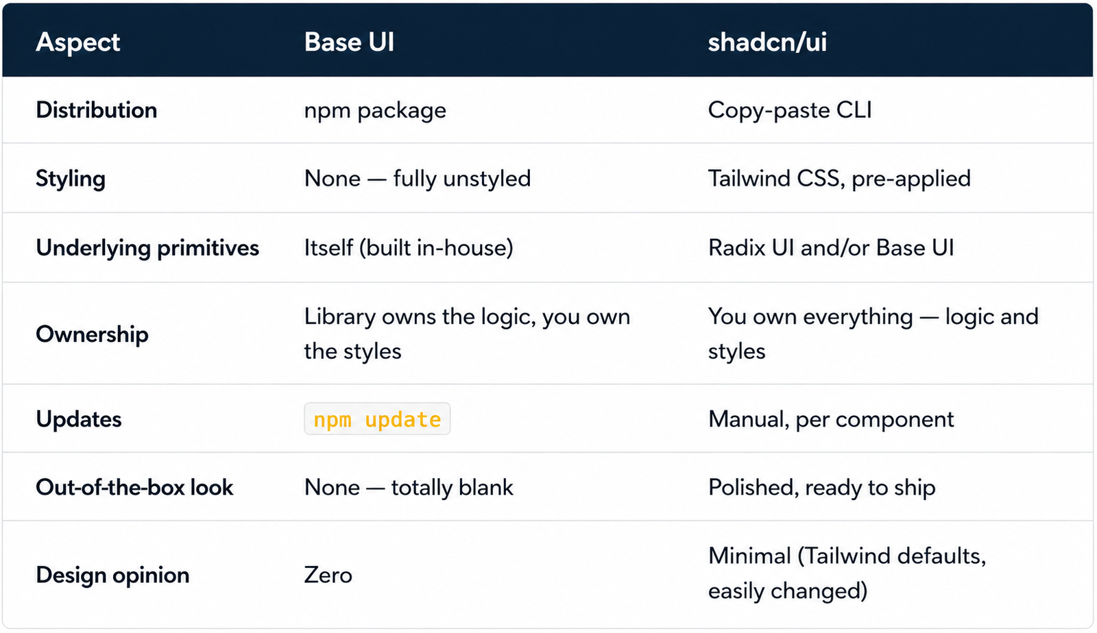
Base UI’s philosophy: “Here’s solid, accessible behavior. You decide what it looks like.”
shadcn/ui’s philosophy: “Here’s behavior plus a good-looking starting style. Change whatever you want.”
Styling Approach
Base UI Styling
Because Base UI ships zero CSS, you have complete freedom — and complete responsibility. Common approaches:
- Tailwind CSS — apply utility classes directly to component parts
- CSS Modules — scoped class names per component
- CSS-in-JS — styled-components, vanilla-extract, etc.
- Plain CSS — target Base UI’s data attributes (e.g.
[data-state="open"])
Base UI exposes state through data attributes, which makes styling state changes (open/closed, hover, disabled) straightforward without JavaScript:
.my-dialog[data-state="open"] {
  animation: slideIn 200ms ease-out;
}
This is a clean, framework-agnostic pattern — but you’re writing all of it from scratch.
shadcn/ui Styling
shadcn/ui is tightly coupled to Tailwind CSS. Every component ships pre-styled with utility classes and supports variants through Class Variance Authority (CVA):
<Button variant="outline" size="sm">
  Cancel
</Button>
Theming is handled through CSS variables defined in your global stylesheet:
:root {
  --primary: 262.1 83.3% 57.8%;
  --radius: 0.5rem;
}
Change a variable, and every component using it updates instantly. It’s faster to get a polished result, but you’re working within Tailwind’s conventions.
Winner for styling speed: shadcn/ui. Winner for styling freedom: Base UI.
Accessibility
Both libraries take accessibility seriously — this isn’t really a point of differentiation, which is worth calling out explicitly since it’s often a deciding factor between other UI libraries.
- Base UI is built by the original Radix UI authors and treats accessibility as a first-class requirement: full keyboard navigation, correct ARIA roles, focus management, and screen reader support are implemented at the primitive level.
- shadcn/ui inherits this same accessibility foundation, since its components are built on Radix UI and/or Base UI under the hood.
Winner: Tie — both are excellent, because shadcn/ui’s accessibility is Base UI/Radix UI’s accessibility.
Customization Depth
Base UI Customization
Since there’s no default style, there’s nothing to “override.” You’re building your design system from a blank canvas, which means:
- No fighting pre-applied class names
- No CSS specificity battles
- No risk of “leftover” library styles bleeding into your design
- Full control over animations, transitions, and responsive behavior from day one
The tradeoff: more upfront work. You’re responsible for every visual decision, including things shadcn/ui gives you for free, like sensible default spacing and color contrast.
shadcn/ui Customization
Because you get the actual component source file, you can edit anything:
// Inside your local button.tsx
const buttonVariants = cva("inline-flex items-center ...", {
  variants: {
    variant: {
      default: "bg-primary text-primary-foreground",
      gradient: "bg-gradient-to-r from-violet-500 to-fuchsia-500 text-white",
    },
  },
});
You’re not overriding anything remotely — you’re editing your own file directly. This is nearly as flexible as Base UI, with the benefit of a sensible starting point already in place.
Winner for raw flexibility: Base UI (truly blank slate). Winner for practical, fast customization: shadcn/ui (edit from a good baseline instead of starting at zero).
Bundle Size and Performance
Base UI
Base UI is tree-shakable by design — only the components you import are included in your bundle. Since there’s no CSS shipped with the library, you also avoid pulling in unused style rules.
import { Dialog } from "@base-ui/react/dialog"; // only Dialog code is bundledshadcn/ui
shadcn/ui has the same advantage by nature of its copy-paste model — you only have the components you’ve explicitly added in your project. Combined with Tailwind’s CSS purging, the final CSS output stays minimal.
Winner: Tie — both are lean by design, for different structural reasons.
Learning Curve
Base UI
Base UI has a moderate learning curve. You need to:
- Understand the compound component pattern (
Dialog.Root,Dialog.Trigger,Dialog.Popup, etc.) - Learn how state is exposed via data attributes
- Build your own styling layer from scratch
If you’ve used Radix UI before, this will feel immediately familiar — Base UI intentionally keeps its API close to Radix UI’s.
shadcn/ui
shadcn/ui is faster to get productive with, especially for smaller teams:
- Run
npx shadcn@latest init - Add components as needed with
npx shadcn@latest add [component] - Components already look finished — customize only what you need to
Winner for fastest start: shadcn/ui. Winner for deepest understanding of your UI layer: Base UI, since you build the styling system yourself and know exactly how everything works.
When to Use Base UI
Choose Base UI when:
- You’re building your own design system from scratch — a component library for your company or product
- You need a styling-agnostic foundation — your team uses CSS Modules, styled-components, or plain CSS instead of Tailwind
- You want zero visual debt — no risk of fighting default styles you didn’t choose
- You’re building a component library to publish or share — and don’t want to force Tailwind on consumers
- Brand consistency is critical — and you want full control of every visual decision from the start
Good fits: design system teams, component library authors, teams with strict, pre-existing style guides.
When to Use shadcn/ui
Choose shadcn/ui when:
- You want to ship fast — pre-styled, accessible components save real time
- Your team already uses Tailwind CSS — shadcn/ui fits naturally into that workflow
- You want a polished starting point — and plan to customize incrementally, not from zero
- You’re building a product, not a design system — a SaaS app, dashboard, or marketing site
- You want full code ownership without building everything yourself — get the best of both worlds
Good fits: startups, product teams, Next.js/Vercel projects, solo developers who want speed without sacrificing quality.
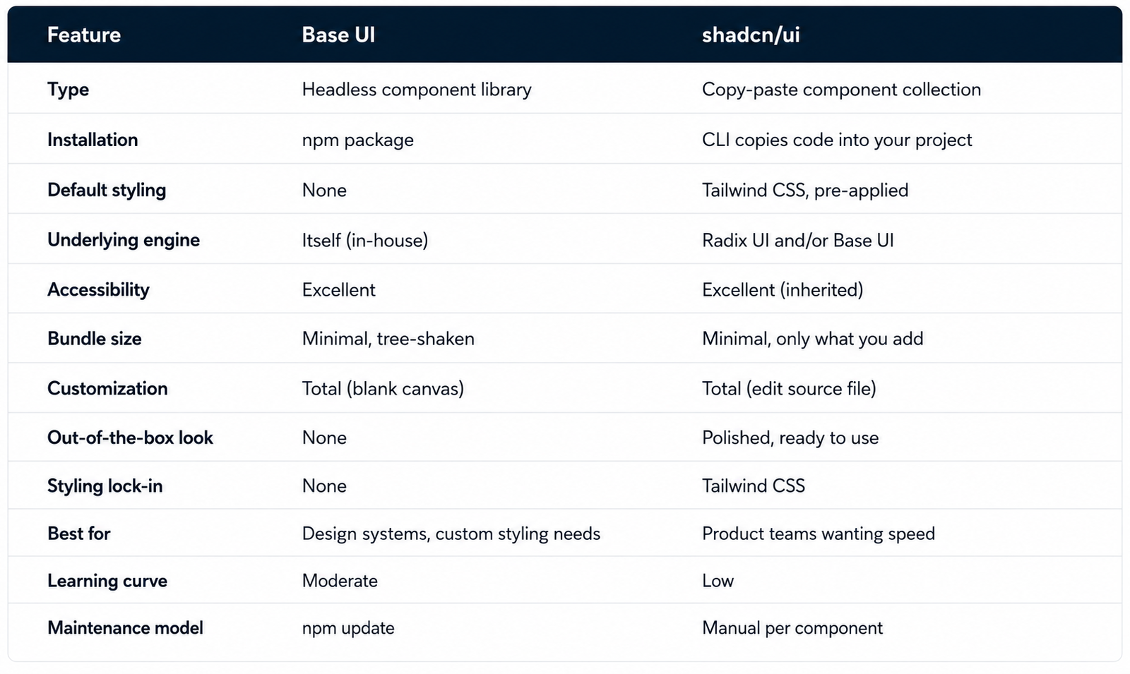
Side-by-Side Comparison
Can You Use Both Together?
Yes — and in many cases, you already are. Since shadcn/ui increasingly builds its components on top of Base UI, choosing shadcn/ui doesn’t mean abandoning Base UI’s accessibility engine. You’re getting Base UI’s behavior with Tailwind styling and source-code ownership layered on top.
Some teams also use Base UI directly for highly custom, brand-specific components (like a unique navigation system) while using shadcn/ui for standard UI patterns (dialogs, dropdowns, forms) where the default styling is a good enough starting point.
Key Takeaways
-
Base UI is unstyled; shadcn/ui is pre-styled. That’s the single biggest practical difference.
-
They’re not strictly competitors. shadcn/ui increasingly uses Base UI under the hood — the real choice is often “style it yourself” vs “start from a styled baseline.”
-
Both are excellent for accessibility. Base UI was built by the original Radix UI team, and shadcn/ui inherits that same accessibility foundation.
-
Base UI gives you a blank canvas. Ideal if you’re building a design system or don’t want any visual opinion baked in.
-
shadcn/ui gives you a head start. Ideal if you want to ship fast and customize incrementally.
-
shadcn/ui requires Tailwind CSS. Base UI works with any styling approach.
-
Both are tree-shakable and lightweight — bundle size isn’t a major differentiator here.
-
You own the code either way at the styling layer — with shadcn/ui you also own the component logic, since it’s copied into your project.
-
Base UI has a steeper initial learning curve but pays off with full styling-system understanding.
-
Many production apps use both — Base UI as the engine, shadcn/ui as the fast path to a polished UI.
FAQ
Is Base UI the same as MUI Base?
Not exactly. MUI Base (@mui/base) was deprecated and replaced by Base UI (@base-ui/react), a more modern, complete rewrite. If you’re starting a new project, use Base UI — MUI Base is no longer actively developed.
Does shadcn/ui use Base UI or Radix UI?
Historically, shadcn/ui was built entirely on Radix UI. As of recent updates, the shadcn/ui team has begun migrating some components to use Base UI instead. Depending on which version of shadcn/ui you install, you may get either — check the component source after adding it if you need to know.
Is Base UI free and open source?
Yes. Base UI is free, open source, and MIT licensed — same as shadcn/ui.
Can I use Base UI without Tailwind CSS?
Yes. Base UI ships with zero styles, so it works with any CSS approach — Tailwind, CSS Modules, styled-components, vanilla CSS, or anything else you prefer.
Can I use shadcn/ui without Tailwind CSS?
Not practically. shadcn/ui’s components are built using Tailwind utility classes by default. Removing Tailwind would mean rewriting every component’s styling, which defeats the purpose of using it.
Which is more accessible, Base UI or shadcn/ui?
They’re effectively equal. shadcn/ui’s accessibility comes directly from Radix UI and/or Base UI, the same primitives Base UI itself is built on.
Is Base UI production-ready?
Yes. Base UI reached a stable 1.0 release and is already used in production by companies including Unsplash, Zed, and Paper.
Which is better for building a component library to share across teams?
Base UI. Since it ships with zero styling opinions, it won’t force Tailwind (or any other styling choice) on the teams consuming your library. shadcn/ui’s Tailwind dependency makes it less suitable for shared, styling-agnostic libraries.
Do I need to know Radix UI to use Base UI?
No, but it helps. Base UI intentionally keeps its API close to Radix UI’s, so if you’ve used Radix before, Base UI will feel very familiar.
Which one should a beginner start with?
shadcn/ui. The pre-styled components and simple CLI workflow make it much faster to get a good-looking result without learning CSS architecture from scratch. Base UI is better suited once you’re comfortable building your own styling system.
Conclusion
Base UI and shadcn/ui aren’t really fighting for the same job — they’re solving adjacent problems at different layers of your UI stack.
Base UI gives you rock-solid, accessible component behavior with zero visual opinion. It’s the right foundation when you’re building a design system from the ground up, or when you need styling freedom that doesn’t assume Tailwind CSS.
shadcn/ui gives you that same caliber of accessible behavior — increasingly powered by Base UI itself — wrapped in components that already look good and are easy to restyle. It’s the right choice when speed matters and you don’t want to build your styling system from scratch.
The real question isn’t “which is better” — it’s “do I want to build my own styling layer, or start from one that’s already built?”
If you want full control from a blank canvas, choose Base UI. If you want a fast, polished starting point you can still fully customize, choose shadcn/ui. Either way, you’re standing on the same solid, accessible foundation.