In the React ecosystem, both Ant Design and shadcn/ui have become popular choices for building modern user interfaces. While Ant Design offers a comprehensive component library with a well-defined design system, shadcn/ui takes a more flexible, developer-first approach. In this comparison, we’ll explore their strengths, differences, and ideal use cases to help you choose the right UI solution for your next project in 2026.
Ant Design vs shadcn/ui: Which UI Library Should You Use in 2026?
Choosing the wrong UI library can cost you weeks of refactoring. Choose the right one and your entire team ships faster, your codebase stays clean, and your UI looks exactly how you want it.
Ant Design and shadcn/ui are two of the most popular choices in the React ecosystem right now - but they solve the problem in completely different ways. One is a full-featured component library with its own design language. The other isn’t even a traditional library at all.
This guide breaks down every important difference: philosophy, customization, bundle size, accessibility, ecosystem, and when each one actually makes sense for your project.
Quick Answer
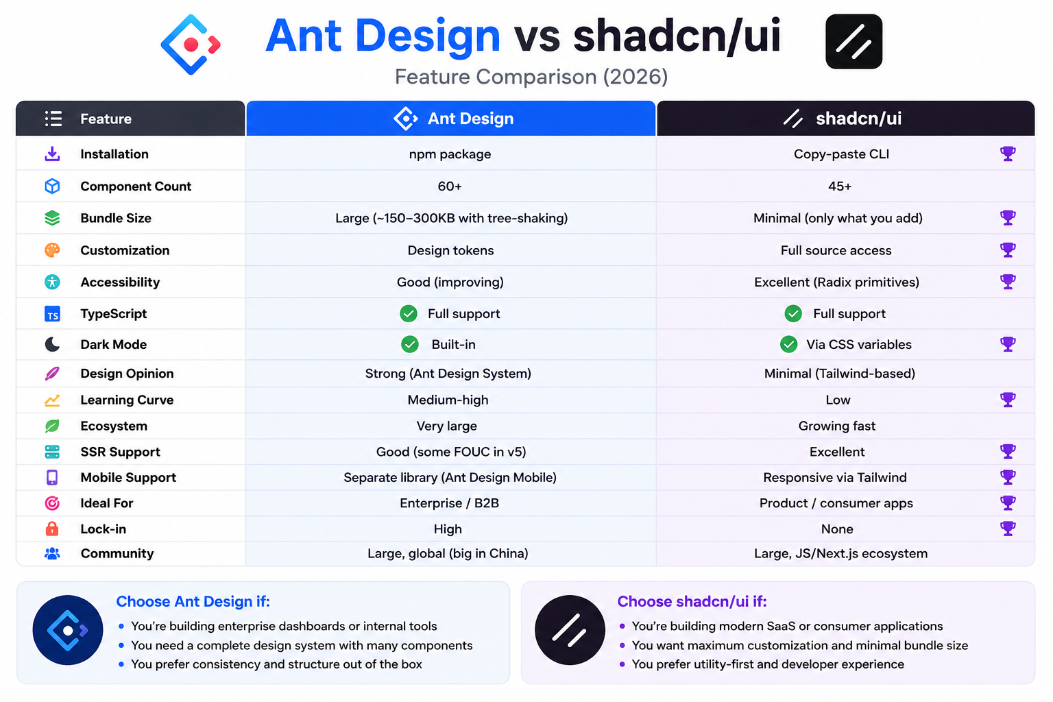
If you want a fully-featured, enterprise-ready component system with minimal setup, go with Ant Design. It ships with 60+ polished components, built-in form handling, and a consistent design language used by some of the largest apps in the world.
If you want complete control over your code and design, go with shadcn/ui. It copies component source code directly into your project. You own every line. There’s no dependency to update, no design opinion to fight, and no bundle bloat you didn’t ask for.
The short version:
- Ant Design = batteries included, opinionated, enterprise-ready
- shadcn/ui = copy-paste components, zero lock-in, fully customizable
What Is Ant Design?
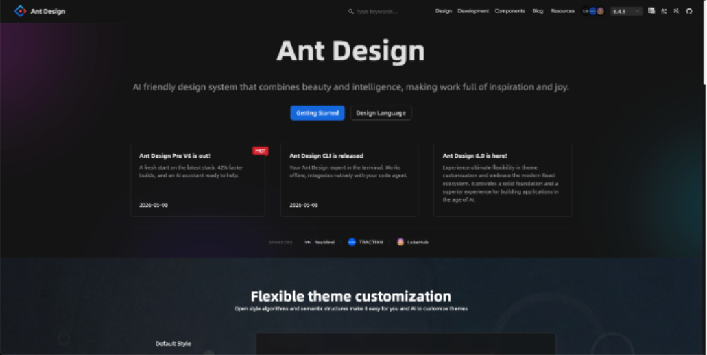
Ant Design (often written as AntD) is an enterprise-grade UI component library built by the team at Alibaba. It was originally designed for internal Alibaba products and open-sourced in 2015. Today it’s one of the most starred React libraries on GitHub.
It follows the Ant Design System - a comprehensive design language that defines typography, colors, spacing, and component behavior. Everything is standardized and consistent out of the box.
Key facts about Ant Design:
- 60+ production-ready components
- Built-in TypeScript support
- Internationalization (i18n) for 50+ languages
- Used by companies like Alibaba, Tencent, and Baidu
- Active community with 90k+ GitHub stars
- Works with React, Vue (via Ant Design Vue), and Angular It installs like any npm package:
npm install antdAnd you import and use components directly:
import { Button, DatePicker } from 'antd';

export default function App() {
  return <Button type="primary">Click me</Button>;
}
What Is shadcn/ui?
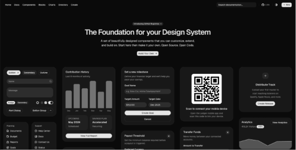
shadcn/ui is a collection of reusable UI components built by shadcn and released in 2023. Here’s the twist: it’s not a component library in the traditional sense.
Instead of installing a package and importing components from it, you use a CLI to copy component source code directly into your project. The components live in your codebase. You own them completely.
Under the hood, shadcn/ui is built on:
- Radix UI - for accessible, headless component primitives
- Tailwind CSS - for styling
- TypeScript - for type safety
- Class Variance Authority (CVA) - for managing component variants You add components like this:
npx shadcn-ui@latest add buttonThis copies a button.tsx file into your project. You can edit it however you want — it’s just your code now.
import { Button } from "@/components/ui/button";

export default function App() {
  return <Button variant="outline">Click me</Button>;
}
shadcn/ui hit 50k+ GitHub stars within months of launch, which says a lot about how developers felt about the copy-paste model.
The Core Philosophy Difference
This is the most important thing to understand before comparing features.
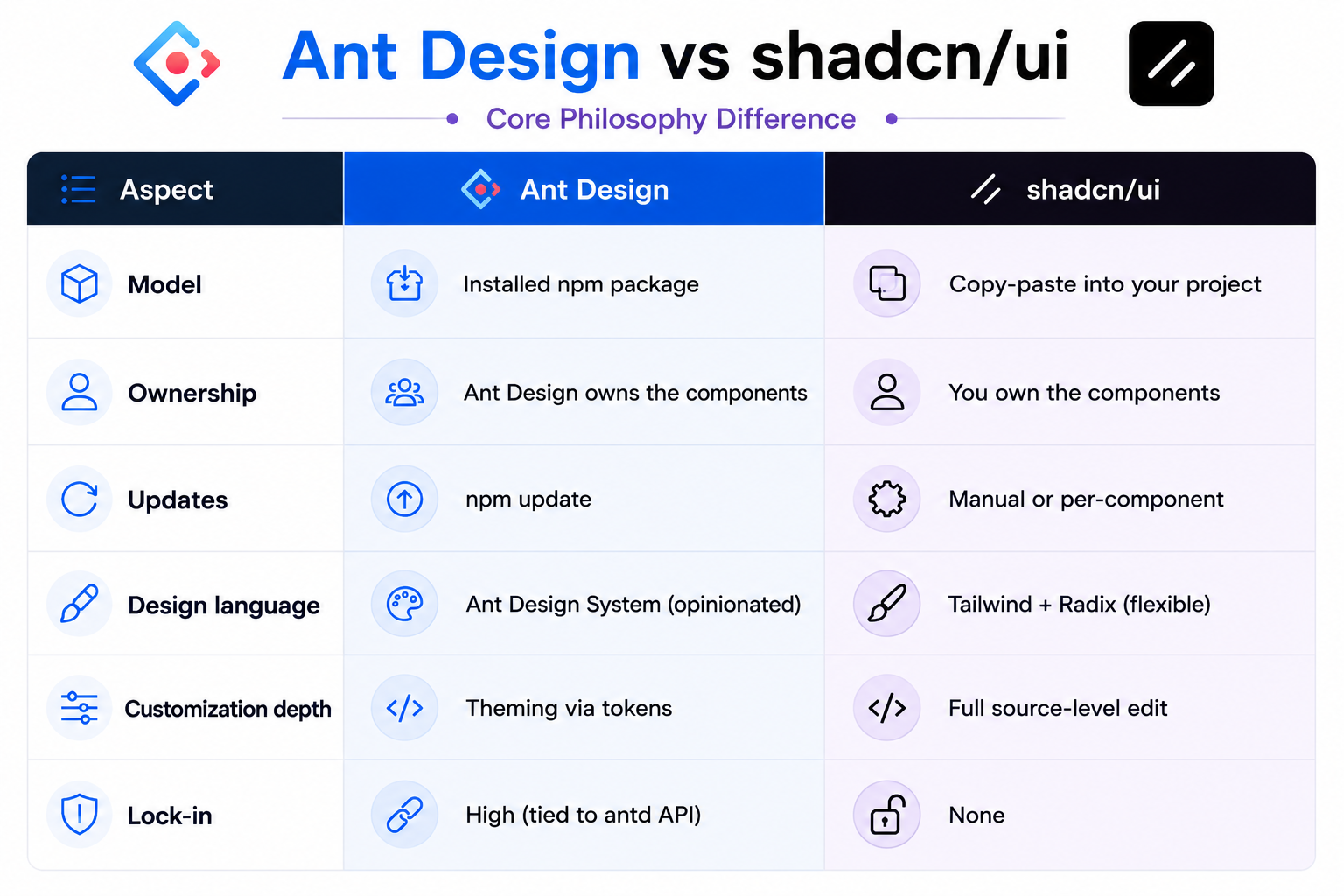
Ant Design’s philosophy is: “Here are great components. Use them.”
shadcn/ui’s philosophy is: “Here’s a starting point. Make it yours.”
Neither is wrong. They just serve different needs.
Customization: How Deep Can You Go?
Ant Design Customization
Ant Design uses a Design Token system introduced in version 5. You can customize the global theme by passing a theme prop to the ConfigProvider:
import { ConfigProvider } from 'antd';

<ConfigProvider
  theme={{
    token: {
      colorPrimary: '#6366f1',
      borderRadius: 8,
      fontFamily: 'Inter, sans-serif',
    },
  }}
>
  <App />
</ConfigProvider>
This is clean and powerful for global changes. But if you need a one-off component that behaves differently than the standard? You’re fighting the API.
For deep customization, Ant Design also supports:
- Component-level tokens for fine-grained overrides
- CSS-in-JS with
@ant-design/cssinjs - Legacy Less variable theming (v4 and below) The limitation is that you’re still working within Ant Design’s mental model. You can adjust knobs, but you can’t rewrite the machine.
shadcn/ui Customization
shadcn/ui’s approach is the opposite: you have the source code, so there are no limits.
Want to add a new variant to a button? Edit button.tsx. Want to change how a dialog animates? Open dialog.tsx and change the animation class. Want to add a new prop that no library would ship? Add it yourself.
// In your button.tsx - add a custom `gradient` variant
const buttonVariants = cva(
  "inline-flex items-center ...",
  {
    variants: {
      variant: {
        default: "bg-primary text-primary-foreground",
        gradient: "bg-gradient-to-r from-violet-500 to-fuchsia-500 text-white",
      },
    },
  }
);
This is genuinely powerful. The tradeoff is maintenance - if the upstream shadcn/ui component gets an accessibility fix, you won’t automatically get it. You need to check the changelog and apply changes yourself.
Winner for customization: shadcn/ui, unless you only need theme-level changes.
Component Count and Completeness
Ant Design Components
Ant Design is extraordinarily comprehensive. Some highlights:
-
Data Entry: Input, Select, DatePicker, TimePicker, Form, Upload, Slider, Switch, TreeSelect, Cascader, AutoComplete, ColorPicker, Transfer
-
Data Display: Table, Tree, Calendar, Badge, Avatar, Tag, Timeline, Statistic, Carousel, Image (with preview), Descriptions
-
Feedback: Alert, Modal, Drawer, Notification, Message, Progress, Spin, Skeleton, Result
-
Navigation: Menu, Breadcrumb, Pagination, Steps, Tabs, Anchor
That’s 60+ components, many with deep sub-features. The Table component alone supports virtual scrolling, row selection, drag-to-reorder, fixed headers, expandable rows, and more - all out of the box.
shadcn/ui Components
shadcn/ui ships a leaner but growing set of components. As of 2026, it includes around 45+ components including:
Button, Input, Select, Dialog, Drawer, Sheet, Popover, DropdownMenu, Card, Badge, Avatar, Tooltip, Alert, Table, Form, Calendar, DatePicker, Combobox, Sonner (toasts), Separator, Skeleton, Tabs, Accordion, Command, Breadcrumb, Pagination, Progress, Slider, Switch, Checkbox, RadioGroup, Textarea, Toggle, and more.
It doesn’t have the depth of Ant Design’s Table or DatePicker. For complex data-heavy applications, you’ll hit walls faster.
Winner for completeness: Ant Design - significantly more components with more features per component.
Bundle Size and Performance
This is where the difference gets stark.
Ant Design Bundle Size
Ant Design is a large library. Even with tree-shaking, importing a few components adds meaningful weight:
- Full antd bundle: ~2MB+ (uncompressed)
- With tree-shaking + selective imports: ~100–300KB depending on components used
- CSS: additional 70–100KB In v5, Ant Design switched to CSS-in-JS, which means styles are injected at runtime. This eliminates the need for a separate CSS import but can cause flash-of-unstyled-content (FOUC) issues in some SSR setups.
shadcn/ui Bundle Size
shadcn/ui’s copy-paste model means you only get the code you actually added. No tree-shaking configuration needed - there’s nothing extra to shake out.
Each component is a small TypeScript file. A Button is maybe 2KB. A Dialog might be 5KB. Your bundle only grows as you add components. Since it uses Tailwind CSS, the CSS output is minimal thanks to Tailwind’s purging.
Winner for bundle size: shadcn/ui - by a significant margin.
Accessibility
Ant Design
Ant Design has improved its accessibility over the years but it’s not its strongest suit historically. The components mostly follow ARIA standards, and the team has been investing more in a11y improvements in recent versions. Complex components like Cascader, TreeSelect, and Transfer can have inconsistent keyboard navigation.
shadcn/ui
shadcn/ui is built on Radix UI primitives, which were designed from the ground up with accessibility as the primary concern. Every interactive component handles:
- Full keyboard navigation
- Focus management
- ARIA attributes
- Screen reader announcements
- WAI-ARIA patterns This is a genuine differentiator. If your app needs to meet WCAG 2.1 AA or similar standards, shadcn/ui starts in a better position.
Winner for accessibility: shadcn/ui - Radix UI primitives are best-in-class.
Theming and Design System Integration
Ant Design Theming
Ant Design ships with its own design language. If you want your app to look like an Ant Design app, it’s effortless. If you want to match a custom brand design system, you can get most of the way there with design tokens, but the underlying “Ant Design aesthetic” will always be present in subtle ways - the transition speeds, border radii defaults, font sizing scales.
It also includes a dark mode out of the box:
<ConfigProvider theme={{ algorithm: theme.darkAlgorithm }}>
  <App />
</ConfigProvider>
shadcn/ui Theming
shadcn/ui uses CSS custom properties (CSS variables) for theming, defined in your global CSS. This is framework-agnostic and extremely clean:
:root {
  --background: 0 0% 100%;
  --foreground: 222.2 84% 4.9%;
  --primary: 262.1 83.3% 57.8%;
  --radius: 0.5rem;
}

.dark {
  --background: 222.2 84% 4.9%;
  --foreground: 210 40% 98%;
}
Change a CSS variable and every component using it updates instantly. It’s simple, transparent, and works with any CSS tooling.
Winner for theming: Tie - Ant Design is easier for enterprise design systems, shadcn/ui is more flexible for custom brands.
TypeScript Support
Both libraries have excellent TypeScript support.
- Ant Design ships with built-in type definitions. Every component is typed, with IntelliSense for props, events, and configurations.
- shadcn/ui is written in TypeScript from the start. Since you own the code, you can extend types freely. Winner: Tie - both are TypeScript-first.
Learning Curve
Getting Started with Ant Design
Ant Design has a steeper initial learning curve, largely because there’s more to learn — 60+ components, the form system, the table API, the design token system. Reading the docs is essentially reading a comprehensive design system manual.
That said, once you’re familiar with the API patterns, productivity is high. Everything follows consistent conventions.
Getting Started with shadcn/ui
shadcn/ui has a very low entry barrier:
- Install dependencies (Tailwind, Radix)
- Run
npx shadcn-ui@latest init - Add components with
npx shadcn-ui@latest add [component]Each component file is readable, understandable code. There’s no magic or black box. If something looks wrong, you open the file and look at it.
Winner for learning curve: shadcn/ui — faster to get started, more transparent internals.
Ecosystem and Community
Ant Design Ecosystem
- GitHub stars: 90k+
- Weekly npm downloads: 1M+
- Ant Design Pro: Full admin template with pages, routing, and mock data
- Ant Design Charts: Visualization library (wraps G2)
- Ant Design Mobile: Mobile-first component library
- ProComponents: Advanced components for enterprise CRUD interfaces
- Figma kit: Official design kit available The Ant Design ecosystem is massive, especially in the Chinese tech industry. There’s a solution for almost every enterprise need.
shadcn/ui Ecosystem
- GitHub stars: 60k+ (and growing fast)
- Weekly npm downloads: Growing rapidly (harder to track since it’s copy-paste)
- v0.dev: Vercel’s AI UI generation tool uses shadcn/ui by default
- Third-party registries: Community-contributed components available via
shadcn/uiregistry - shadcn/ui themes: Sites like shadcn-themes.com for custom theme generators. Another notable tool in the ecosystem is Shadcn Studio, which helps developers generate, customize, and accelerate shadcn/ui-based interfaces without starting from scratch. It has become a useful resource for teams that want production-ready components, layouts, and design inspiration while maintaining the flexibility that makes shadcn/ui popular.
Winner for ecosystem: Ant Design - larger, more mature, more comprehensive tooling.
When to Use Ant Design
Ant Design is the right choice when:
- You’re building enterprise internal tools - dashboards, admin panels, data management systems
- Your team needs to move fast - lots of complex components ready to use without building from scratch
- You need deep data features - complex tables, form systems, date pickers with range selection, transfer widgets
- Design consistency across a large team matters - the opinionated system keeps everyone aligned
- You’re building for the Chinese market - first-class i18n and CJK font support
- You’re working on a B2B product - where the Ant Design aesthetic is widely accepted and expected
Ant Design shines in projects like:
- Internal company portals
- Data analytics dashboards
- ERP/CRM systems
- Back-office admin interfaces
When to Use shadcn/ui
shadcn/ui is the right choice when:
- Your app needs a custom, branded look - you don’t want the “Ant Design look”
- Bundle size is a concern - especially for public-facing apps
- Accessibility is a priority - Radix primitives give you a strong foundation
- You want full control over component code - no fighting library APIs
- Your team is already using Tailwind - shadcn/ui fits naturally into a Tailwind workflow
- You’re building a marketing site or consumer product - where visual differentiation matters
- You’re using Next.js/Vercel - the ecosystem integration is excellent
shadcn/ui shines in projects like:
- SaaS product frontends
- Marketing landing pages with custom UI
- Developer tools and documentation sites
- Apps where WCAG accessibility compliance is required
Side-by-Side Comparison
Can You Use Both?
Yes, and some teams do. A common pattern is using shadcn/ui for customer-facing pages (where branding matters) and Ant Design for internal admin panels (where completeness matters).
That said, mixing two design systems adds complexity and inconsistency. If possible, commit to one per project.
Key Takeaways
- shadcn/ui is not a component library - it’s a collection of code you copy into your project. This is a fundamental difference from Ant Design.
- Ant Design is more complete - with 60+ components and deep features per component, it handles complex enterprise requirements out of the box.
- shadcn/ui has zero bundle bloat - you only include what you use, and nothing more.
- shadcn/ui is more accessible - built on Radix UI primitives, which set the standard for accessible component design.
- Ant Design is more opinionated — great if you want consistency, limiting if you want a unique design.
- shadcn/ui gives you full ownership - edit components without limits, but maintain them yourself.
- Ant Design has a larger ecosystem - Ant Design Pro, Charts, Mobile, and ProComponents are all mature and production-tested.
- shadcn/ui is growing fast - especially in the Next.js/Vercel community, with v0.dev driving major adoption.
- Neither is universally better - the right choice depends on your project type, team, and design requirements.
- Bundle size matters for public apps - if you’re building a consumer-facing product, Ant Design’s size can be a real concern.
FAQ
Is shadcn/ui free?
Yes, shadcn/ui is completely free and open source (MIT license). There are no paid tiers, pro components, or subscription plans.
Is Ant Design free?
Yes, Ant Design is also MIT licensed and free to use. Some advanced templates and tooling from the Ant Design ecosystem may be commercial, but the core library is free.
Does shadcn/ui work without Tailwind CSS?
shadcn/ui is tightly integrated with Tailwind CSS. Using it without Tailwind would require rewriting all the styles, which defeats the purpose. If you can’t use Tailwind, shadcn/ui is not a good fit.
Can I use Ant Design with Next.js?
Yes, but it requires some configuration - especially for App Router and SSR, since Ant Design v5 uses CSS-in-JS. The antd team provides a @ant-design/nextjs-registry package to handle this.
Does shadcn/ui support Vue or Angular?
The original shadcn/ui is React-only. However, there are community ports: shadcn-vue for Vue 3 and community efforts for Svelte. These are unofficial and vary in completeness.
Which is better for a startup?
It depends on your product. If you’re building a B2B SaaS with complex data tables and forms, Ant Design lets you move faster in the early stages. If you’re building a consumer product where design quality differentiates you, shadcn/ui is worth the extra setup.
Is Ant Design good for accessibility?
Ant Design has improved accessibility but is not known as a best-in-class a11y library. For applications with strict WCAG requirements, shadcn/ui (via Radix UI) is the safer choice.
How do I update shadcn/ui components?
Since you own the code, there’s no automatic update. You compare your component to the latest version on the shadcn/ui website and apply changes manually. Some teams use git diffs or tooling to streamline this.
Which library has better performance?
shadcn/ui generally wins on performance due to smaller bundle size and no CSS-in-JS runtime. Ant Design’s CSS-in-JS approach in v5 adds some runtime overhead, though it’s acceptable for most use cases.
Can I use shadcn/ui in a non-Next.js project?
Yes. shadcn/ui works with any React project including Vite, Remix, Astro, and Create React App. The setup varies slightly - check the official docs for your specific framework.
Conclusion
Ant Design and shadcn/ui are both excellent choices - but they solve fundamentally different problems.
Ant Design is the right tool when you need to move fast in an enterprise context. The component depth, consistency, and mature ecosystem are hard to beat for internal tools and B2B applications where the design language doesn’t need to be unique.
shadcn/ui is the right tool when your design needs to stand on its own. The accessibility foundation, zero bundle bloat, and full code ownership make it ideal for consumer products, modern SaaS interfaces, and teams that care deeply about tailored user experiences.
The decision ultimately comes down to a single question: Do you want a tool that works for you, or do you want code that belongs to you?
Ant Design works for you. shadcn/ui belongs to you.
Pick the one that matches how your team works and what your users need - and you’ll make the right call.