shadcn/ui already gives you everything needed for runtime theming.
Its design tokens live in CSS custom properties, which means they can be changed directly in the browser without rebuilding the app. That makes it possible to build a theme customizer that controls colours, fonts, radius, and colour mode from one place.
In this guide, we will wire those pieces together in a Next.js App Router project.
By the end, your theme will persist across reloads, sync between tabs, and render correctly on the first server response.
Why Build Dynamic Themes?
Changing a shadcn theme means editing app/globals.css, saving, and waiting for the reload. That part is fine. The problem is that you can only ever see the theme you are looking at, never the one from four edits ago, so comparing options is a memory test you will lose.
A client asked me “can we see it in something warmer?” and that turned into a week of screenshots. Then I actually read the CSS I had been editing all along:
:root {
  --primary: oklch(0.205 0 0);
  --radius: 10px;
}
That is the whole theme. Custom properties on :root — not a build step, not a Sass map, not a config object. Just properties sitting in the cascade, where an inline style on <html> beats them without needing !important.
Which means the entire feature is three moves.
Override. An inline style beats :root, so the whole UI restyles instantly:
root.style.setProperty("--primary", "oklch(0.62 0.14 39)");Reset. Delete the override and the browser falls back to whatever globals.css says. That is your “Default” theme, and you never author it twice:
root.style.removeProperty("--primary");Persist. In a cookie, so the server can read it during SSR and paint the right theme on the first byte:
document.cookie = `settings=${JSON.stringify(settings)}`;Everything below is plumbing around those three lines. It is genuinely not much code, and the parts that took me longest were not the parts I expected.
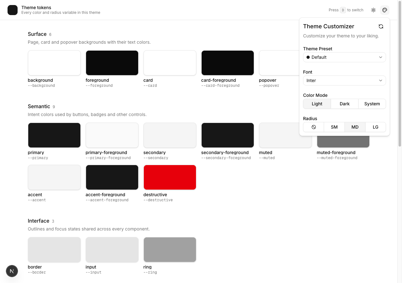
What you are building
A theme customizer with exactly four controls, and a page to see them working on.
| Control | What it changes |
|---|---|
| Theme preset | About 30 shadcn CSS variables for colours, charts, and sidebar |
| Font | --font-sans and the font-family on <html> |
| Radius | --radius, from which Tailwind derives the corner scale |
| Colour mode | light, dark, or system |
Pick a preset and everything moves together:
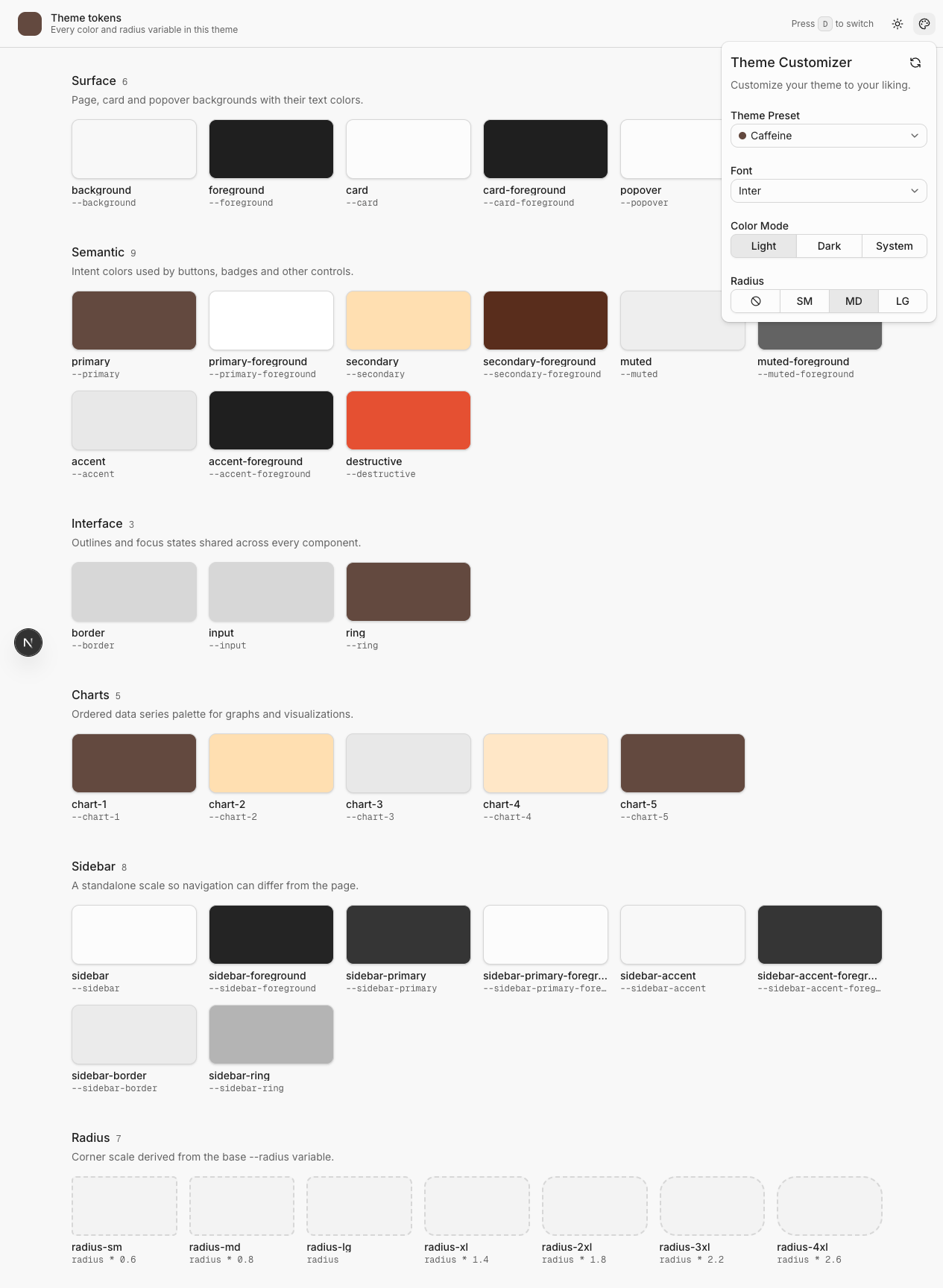
That is one click. Every swatch on the page, the header mark, the ring colour, the chart series. The customizer itself is styled with the same tokens, which is why the popover recolours along with the page.
Settings survive a reload, sync across open tabs, and are read on the server so there is no flash of the wrong theme on first paint. The server-side work begins in section 11, and section 13 removes the remaining colour flash.
Prerequisites
- Node 20 or newer, and pnpm, npm or yarn. Commands below use pnpm.
- A Next.js App Router project with Tailwind v4 and shadcn/ui. Section 1 sets one up from scratch in about two minutes if you do not have one.
- Comfortable with React hooks and TypeScript. Nothing exotic.
- No API keys, no accounts, no paid anything. It is all CSS variables.
Version note: This tutorial was reviewed on October 6, 2026 against the reference project, which uses Next.js 16.2.6, React 19.2.4, shadcn 4.18.0, and Tailwind CSS 4. Check the current package file if you are following it later.
How to read this
Every file is here in full, in the order I wrote it, except two: utils/theme-presets.ts and utils/fonts.ts are long lists of data rather than logic, so I show the shape and a couple of entries. Grab those two whole from the repo.
Sections are in the order I built them, and each one has:
- Why this exists — the problem the code solves. Read this even if you skip the code.
- Checkpoint — what to run and what should be on screen. If it fails, the bug is in the section you just did.
Sections 1 and 2 give you a page worth looking at. Sections 3 through 12 make it dynamic. Section 13 removes the last flash, while sections 14 and 15 show how to add your own theme and font.
1. Start with a shadcn project
Why this exists
I did not hand-roll the Next.js and Tailwind setup and there is no reason you should. shadcn has a page that builds the starter for you, theme and all. About two minutes.
If you would rather begin with a complete application structure, a Shadcn template can give you realistic navigation, layouts, and components before you add the customizer.
1.1 Build your starter
Go to ui.shadcn.com/create and click Get Started.
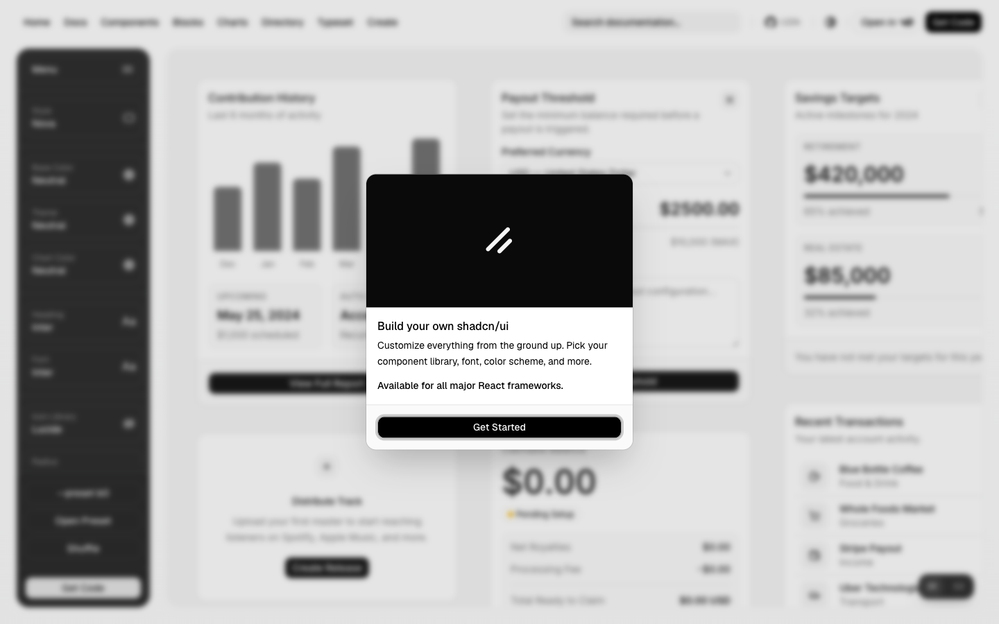
Pick a theme using the panel on the left. Style, base colour, theme, chart colour, heading font, body font, icon library and radius.
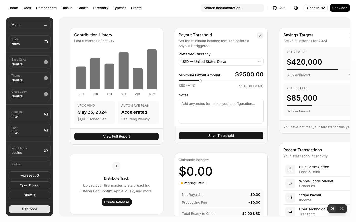
Click Get Code. Choose Next.js and Base UI, leave the three toggles off, then Copy Command.
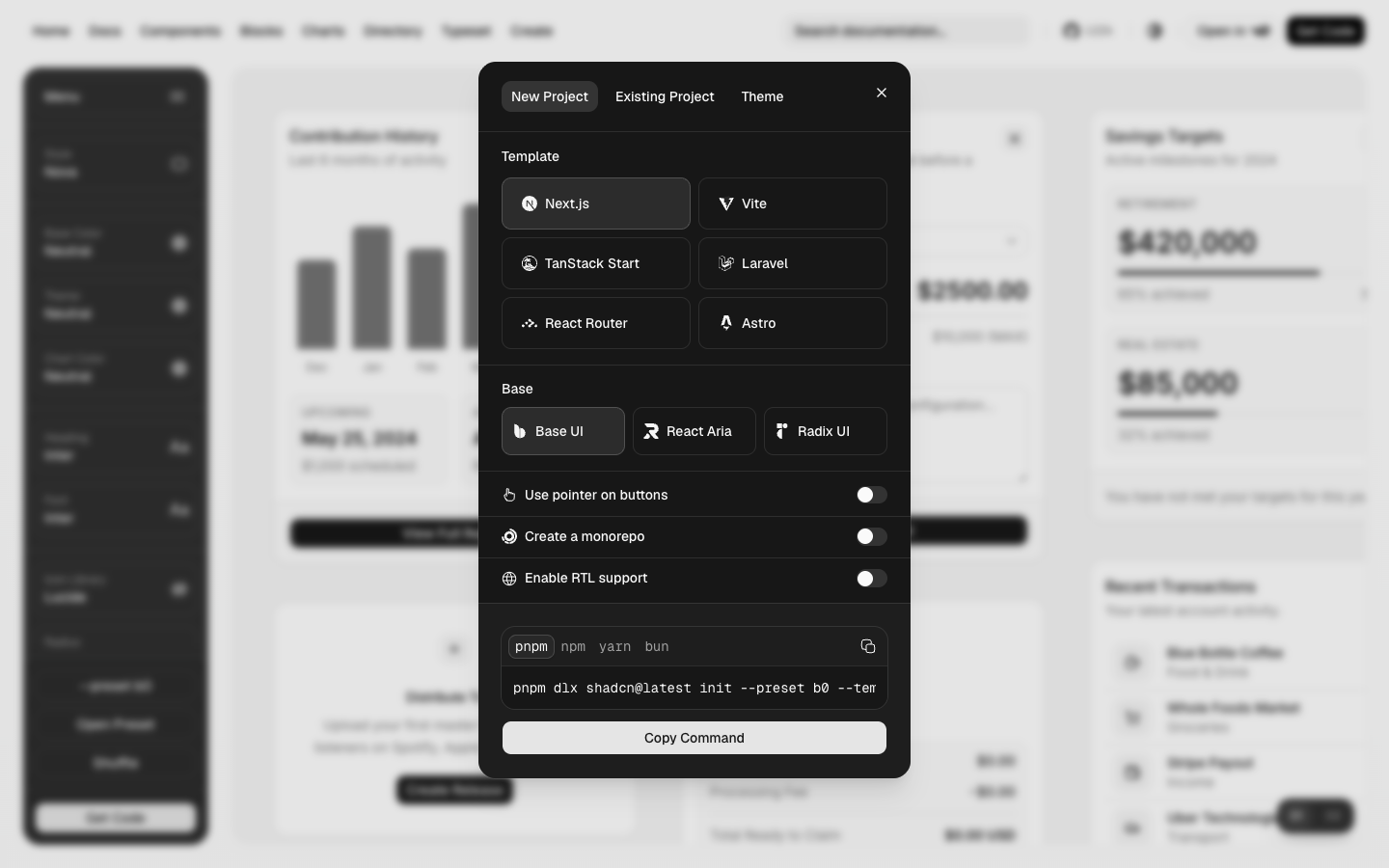
Run it. It looks like this, with your own preset code in place of b0:
pnpm dlx shadcn@latest init --preset b0 --template next
1.2 What you get
Worth knowing what that command already did, because it is most of the boring part:
shadcn-dynamic-theme/
├── app/
│   ├── favicon.ico
│   ├── globals.css          # all your theme tokens, light and dark
│   ├── layout.tsx           # fonts and ThemeProvider already wired
│   └── page.tsx             # a placeholder page
├── components/
│   ├── theme-provider.tsx   # next-themes, plus a "press d to toggle" hotkey
│   └── ui/button.tsx
├── hooks/
├── lib/utils.ts             # the cn() helper
├── components.json          # shadcn config
├── eslint.config.mjs
├── next.config.ts
├── package.json
├── postcss.config.mjs
├── tsconfig.json
├── .prettierrc
└── pnpm-workspace.yaml
So you already have:
- Tailwind v4 set up, with every colour token for light and dark in
app/globals.css. You do not write that file. I did not. It is also what the “Default” preset falls back to, so whatever is in it is Default. - A theme provider in
components/theme-provider.tsx, withnext-themesconfigured and a keyboard shortcut: pressdanywhere outside a text box and the theme flips. I found that one by pressingdwhile typing a note and watching the page go dark. It is genuinely useful once you know, and I used it constantly while taking the screenshots for this post. - Fonts wired up in
app/layout.tsx, exposed as--font-sans,--font-heading, and--font-mono. - The button component, plus
cn()inlib/utils.ts. - Scripts for
dev,build,start,lint,formatandtypecheck.
Dependencies you get without asking include next, react, @base-ui/react, next-themes, lucide-react, class-variance-authority, clsx, tailwind-merge, tw-animate-css, tailwindcss, typescript, eslint, and prettier.
1.3 Add the components this build needs
The starter ships button. Add five more:
pnpm dlx shadcn@latest add label popover select radio-group tooltip
These land in components/ui/ as real files you own. That matters here, because the segmented controls in section 12 restyle the radio group fairly aggressively.
1.4 Add the one package
pnpm add react-use geist
| Package | What it does |
|---|---|
react-use | Provides useCookie, the primitive used in section 8 |
That is the whole list. There is no theming library in this stack, because there is nothing for one to do — the engine is about forty lines of setProperty calls you will write in section 9.
If you would rather not pull in react-use for one hook, it wraps js-cookie and you can replace it with about twenty lines. Section 8 shows everything it is doing.
1.5 The one file you edit
The radius buttons in section 12 each have a tooltip, and Base UI needs one provider at the root for them to share an open delay. So open app/layout.tsx and add two lines. Everything else in that file came from the starter:
app/layout.tsx
import { TooltipProvider } from "@/components/ui/tooltip";

<ThemeProvider>
  <TooltipProvider>{children}</TooltipProvider>
</ThemeProvider>;
Setup done.
Checkpoint
pnpm dev
Open http://localhost:3000. You get the starter page, styled, d toggles dark mode, and no console errors. Run pnpm typecheck and confirm it exits clean.
Nothing theme-related exists yet. That starts in section 2.
Resources
- ui.shadcn.com/create is the page above.
- shadcn/ui installation docs if you would rather set it up by hand.
- Base UI for the components underneath.
- Tailwind CSS v4 if the
@theme inlinesyntax inglobals.cssis new to you. v4 moved config into CSS.
2. A page that shows every token
Why this exists
This is the part I would skip if I were in a hurry, and skipping it is what cost me the week.
You cannot tune a theme you cannot see. When my only view of --muted-foreground was “some text somewhere on the page is that colour”, I had no way to tell whether a change had helped. So before building anything dynamic, build a page that puts every token on screen at once as a labelled swatch.
It takes twenty minutes and it is the surface you will stare at for the rest of the build.
Once the token grid works, try the same theme against a few Shadcn blocks. Dense dashboards, forms, and navigation patterns expose contrast and border problems that isolated swatches can miss.
You can also apply the customizer to complete Shadcn pages to check whether the palette remains coherent across real routes instead of a single demonstration screen.
File: app/page.tsx
import { ModeToggle } from "@/components/mode-toggle";
import { cn } from "@/lib/utils";

type ColorToken = {
  name: string;
  className: string;
};

type ColorGroup = {
  title: string;
  description: string;
  tokens: ColorToken[];
};

const colorGroups: ColorGroup[] = [
  {
    title: "Surface",
    description: "Page, card and popover backgrounds with their text colors.",
    tokens: [
      { name: "background", className: "bg-background" },
      { name: "foreground", className: "bg-foreground" },
      { name: "card", className: "bg-card" },
      { name: "card-foreground", className: "bg-card-foreground" },
      { name: "popover", className: "bg-popover" },
      { name: "popover-foreground", className: "bg-popover-foreground" },
    ],
  },
  {
    title: "Semantic",
    description: "Intent colors used by buttons, badges and other controls.",
    tokens: [
      { name: "primary", className: "bg-primary" },
      { name: "primary-foreground", className: "bg-primary-foreground" },
      { name: "secondary", className: "bg-secondary" },
      { name: "secondary-foreground", className: "bg-secondary-foreground" },
      { name: "muted", className: "bg-muted" },
      { name: "muted-foreground", className: "bg-muted-foreground" },
      { name: "accent", className: "bg-accent" },
      { name: "accent-foreground", className: "bg-accent-foreground" },
      { name: "destructive", className: "bg-destructive" },
    ],
  },
  {
    title: "Interface",
    description: "Outlines and focus states shared across every component.",
    tokens: [
      { name: "border", className: "bg-border" },
      { name: "input", className: "bg-input" },
      { name: "ring", className: "bg-ring" },
    ],
  },
  {
    title: "Charts",
    description: "Ordered data series palette for graphs and visualizations.",
    tokens: [
      { name: "chart-1", className: "bg-chart-1" },
      { name: "chart-2", className: "bg-chart-2" },
      { name: "chart-3", className: "bg-chart-3" },
      { name: "chart-4", className: "bg-chart-4" },
      { name: "chart-5", className: "bg-chart-5" },
    ],
  },
  {
    title: "Sidebar",
    description: "A standalone scale so navigation can differ from the page.",
    tokens: [
      { name: "sidebar", className: "bg-sidebar" },
      { name: "sidebar-foreground", className: "bg-sidebar-foreground" },
      { name: "sidebar-primary", className: "bg-sidebar-primary" },
      {
        name: "sidebar-primary-foreground",
        className: "bg-sidebar-primary-foreground",
      },
      { name: "sidebar-accent", className: "bg-sidebar-accent" },
      {
        name: "sidebar-accent-foreground",
        className: "bg-sidebar-accent-foreground",
      },
      { name: "sidebar-border", className: "bg-sidebar-border" },
      { name: "sidebar-ring", className: "bg-sidebar-ring" },
    ],
  },
];

type RadiusToken = {
  name: string;
  className: string;
  value: string;
};

const radiusTokens: RadiusToken[] = [
  { name: "radius-sm", className: "rounded-sm", value: "radius * 0.6" },
  { name: "radius-md", className: "rounded-md", value: "radius * 0.8" },
  { name: "radius-lg", className: "rounded-lg", value: "radius" },
  { name: "radius-xl", className: "rounded-xl", value: "radius * 1.4" },
  { name: "radius-2xl", className: "rounded-2xl", value: "radius * 1.8" },
  { name: "radius-3xl", className: "rounded-3xl", value: "radius * 2.2" },
  { name: "radius-4xl", className: "rounded-4xl", value: "radius * 2.6" },
];

function Swatch({ name, className }: ColorToken) {
  return (
    <div className="space-y-2">
      <div
        className={cn(
          "h-16 w-full rounded-lg border shadow-sm md:h-20",
          className
        )}
      />
      <div className="space-y-1">
        <p className="truncate text-sm leading-none font-medium">{name}</p>
        <p className="truncate font-mono text-xs leading-none text-muted-foreground">
          --{name}
        </p>
      </div>
    </div>
  );
}

function SectionHeading({
  title,
  description,
  count,
}: {
  title: string;
  description: string;
  count: number;
}) {
  return (
    <div className="space-y-1">
      <div className="flex items-baseline gap-2">
        <h2 className="font-heading text-base font-medium">{title}</h2>
        <span className="font-mono text-xs text-muted-foreground">{count}</span>
      </div>
      <p className="text-sm text-muted-foreground">{description}</p>
    </div>
  );
}

const page = () => {
  return (
    <main className="min-h-svh">
      <header className="sticky top-0 z-10 flex h-16 shrink-0 items-center gap-4 border-b bg-background/80 px-4 backdrop-blur-sm md:px-6">
        <div className="flex min-w-0 flex-1 items-center gap-3">
          <div className="bg-primary hidden size-8 shrink-0 rounded-lg sm:block" />
          <div className="min-w-0">
            <h1 className="font-heading truncate text-sm leading-tight font-medium">
              Theme tokens
            </h1>
            <p className="truncate text-xs text-muted-foreground">
              Every color and radius variable in this theme
            </p>
          </div>
        </div>
        <p className="hidden text-xs text-muted-foreground sm:block">
          Press{" "}
          <kbd className="rounded-sm border bg-muted px-1.5 py-0.5 font-mono text-[11.2px]">
            D
          </kbd>{" "}
          to switch
        </p>
        <ModeToggle />
      </header>

      <div className="mx-auto flex max-w-6xl flex-col gap-10 p-4 md:p-6 lg:gap-12 lg:p-8">
        {colorGroups.map(group => (
          <section key={group.title} className="space-y-4">
            <SectionHeading
              title={group.title}
              description={group.description}
              count={group.tokens.length}
            />
            <div className="grid grid-cols-2 gap-4 sm:grid-cols-3 md:grid-cols-4 lg:grid-cols-6">
              {group.tokens.map(token => (
                <Swatch
                  key={token.name}
                  name={token.name}
                  className={token.className}
                />
              ))}
            </div>
          </section>
        ))}

        <section className="space-y-4">
          <SectionHeading
            title="Radius"
            description="Corner scale derived from the base --radius variable."
            count={radiusTokens.length}
          />
          <div className="grid grid-cols-2 gap-4 sm:grid-cols-4 lg:grid-cols-7">
            {radiusTokens.map(token => (
              <div key={token.name} className="space-y-2">
                <div
                  className={cn(
                    "h-16 w-full border-2 border-dashed bg-muted/50 md:h-20",
                    token.className
                  )}
                />
                <div className="space-y-1">
                  <p className="truncate text-sm leading-none font-medium">
                    {token.name}
                  </p>
                  <p className="truncate font-mono text-xs leading-none text-muted-foreground">
                    {token.value}
                  </p>
                </div>
              </div>
            ))}
          </div>
        </section>
      </div>
    </main>
  );
};

export default page;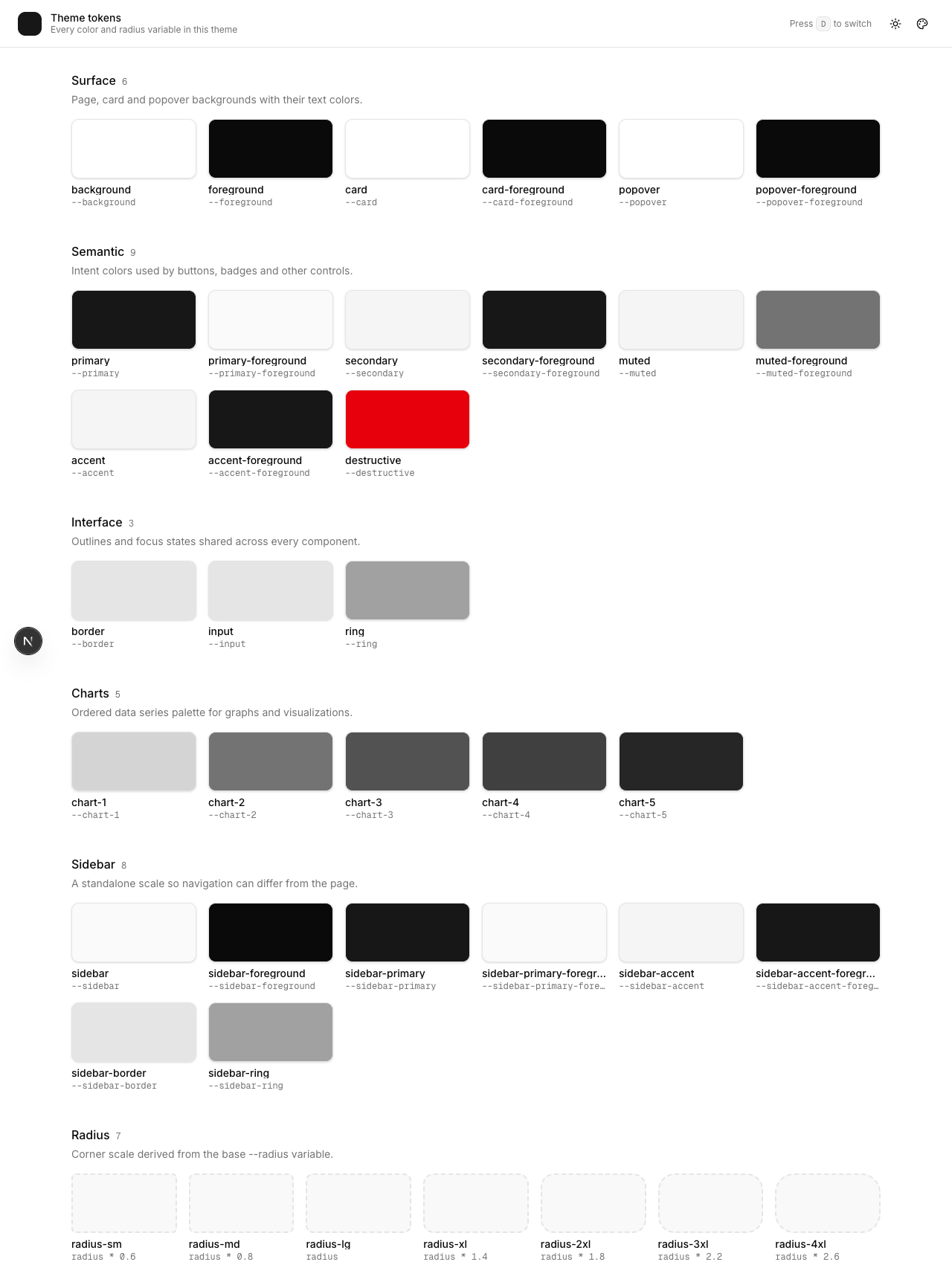
One detail that will waste an hour if you get it wrong
The swatch classes are written out in full as literal strings in that array:
{ name: "sidebar-primary-foreground", className: "bg-sidebar-primary-foreground" }
The obvious thing is to build them, and it produces no CSS at all:
<div className={`bg-${token.name}`} />Tailwind v4 finds classes by scanning your source as text. It never runs your code. bg-${token.name} is not a string it can see, so the utility is never generated, and you get an unstyled div with no error message anywhere. It fails silently, which is the worst way for anything to fail.
Same idea for the radius row: rounded-sm through rounded-4xl are real Tailwind utilities that read the theme scale, so I use those rather than hardcoding calc() values that would then drift from the CSS.
The mode toggle
File: components/mode-toggle.tsx
"use client";

import { MoonStar, Sun } from "lucide-react";
import { useTheme } from "next-themes";

import { Button } from "@/components/ui/button";

function ModeToggle() {
  const { resolvedTheme, setTheme } = useTheme();

  return (
    <Button
      variant="ghost"
      size="icon"
      className="relative"
      aria-label="Toggle theme"
      onClick={() => setTheme(resolvedTheme === "dark" ? "light" : "dark")}
    >
      <Sun className="scale-100 rotate-0 transition-transform dark:scale-0 dark:-rotate-90" />
      <MoonStar className="absolute scale-0 rotate-90 transition-transform dark:scale-100 dark:rotate-0" />
      <span className="sr-only">Toggle theme</span>
    </Button>
  );
}

export { ModeToggle };
We come back and rewire this in section 12, once there is something to rewire it to.
Both icons are always in the DOM, stacked, swapped by scale-0 / dark:scale-100. Pure CSS keyed off the .dark class. The tempting version is {isDark ? <Moon /> : <Sun />}, and it causes a hydration mismatch, because the server does not know what isDark is. The CSS version has no such problem.
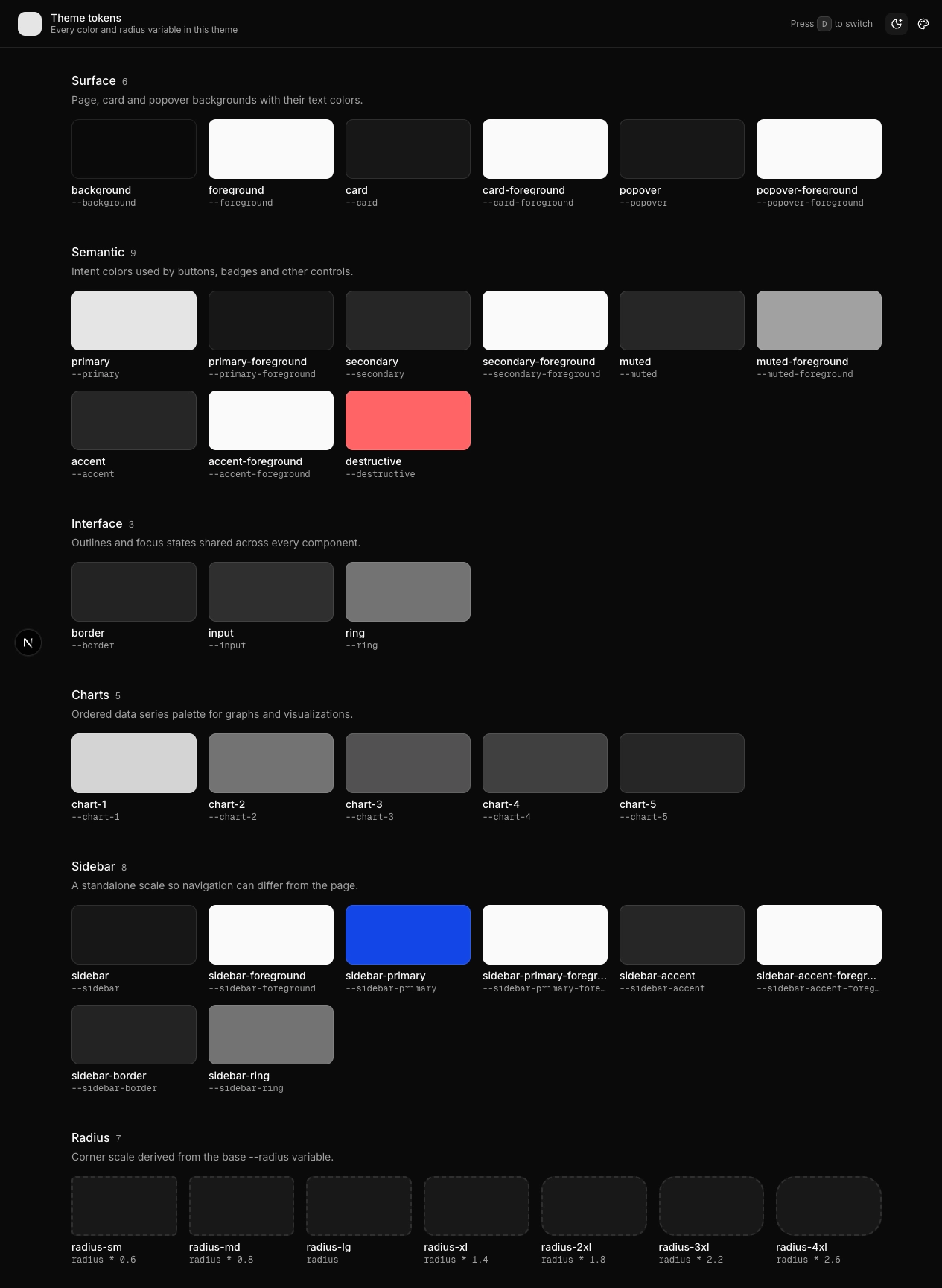
Checkpoint
Every token on screen with its name under it, d still toggles, no console errors. Now you can actually see what you are about to start changing.
3. The CSS that makes it swappable
File: app/globals.css
Why this exists
The starter already wrote this file for you. You are not going to type it out. But two lines in it decide whether the rest of the post works at all, and if you get them wrong the failure is silent — no error, nothing in the console, the feature just does nothing.
So this section is mostly “here is the file, here are the two lines to look at”.
Here it is in full, the version this project uses:
File: app/globals.css
@import "tailwindcss";
@import "tw-animate-css";
@import "shadcn/tailwind.css";

@custom-variant dark (&:is(.dark *));

@theme inline {
  --font-heading: var(--font-sans);
  --font-sans: var(--font-inter);
  --font-mono: var(--font-geist-mono);
  --color-sidebar-ring: var(--sidebar-ring);
  --color-sidebar-border: var(--sidebar-border);
  --color-sidebar-accent-foreground: var(--sidebar-accent-foreground);
  --color-sidebar-accent: var(--sidebar-accent);
  --color-sidebar-primary-foreground: var(--sidebar-primary-foreground);
  --color-sidebar-primary: var(--sidebar-primary);
  --color-sidebar-foreground: var(--sidebar-foreground);
  --color-sidebar: var(--sidebar);
  --color-chart-5: var(--chart-5);
  --color-chart-4: var(--chart-4);
  --color-chart-3: var(--chart-3);
  --color-chart-2: var(--chart-2);
  --color-chart-1: var(--chart-1);
  --color-ring: var(--ring);
  --color-input: var(--input);
  --color-border: var(--border);
  --color-destructive: var(--destructive);
  --color-accent-foreground: var(--accent-foreground);
  --color-accent: var(--accent);
  --color-muted-foreground: var(--muted-foreground);
  --color-muted: var(--muted);
  --color-secondary-foreground: var(--secondary-foreground);
  --color-secondary: var(--secondary);
  --color-primary-foreground: var(--primary-foreground);
  --color-primary: var(--primary);
  --color-popover-foreground: var(--popover-foreground);
  --color-popover: var(--popover);
  --color-card-foreground: var(--card-foreground);
  --color-card: var(--card);
  --color-foreground: var(--foreground);
  --color-background: var(--background);
  --radius-sm: calc(var(--radius) * 0.6);
  --radius-md: calc(var(--radius) * 0.8);
  --radius-lg: var(--radius);
  --radius-xl: calc(var(--radius) * 1.4);
  --radius-2xl: calc(var(--radius) * 1.8);
  --radius-3xl: calc(var(--radius) * 2.2);
  --radius-4xl: calc(var(--radius) * 2.6);
}

:root {
  --background: oklch(1 0 0);
  --foreground: oklch(0.145 0 0);
  --card: oklch(1 0 0);
  --card-foreground: oklch(0.145 0 0);
  --popover: oklch(1 0 0);
  --popover-foreground: oklch(0.145 0 0);
  --primary: oklch(0.205 0 0);
  --primary-foreground: oklch(0.985 0 0);
  --secondary: oklch(0.97 0 0);
  --secondary-foreground: oklch(0.205 0 0);
  --muted: oklch(0.97 0 0);
  --muted-foreground: oklch(0.556 0 0);
  --accent: oklch(0.97 0 0);
  --accent-foreground: oklch(0.205 0 0);
  --destructive: oklch(0.577 0.245 27.325);
  --border: oklch(0.922 0 0);
  --input: oklch(0.922 0 0);
  --ring: oklch(0.708 0 0);
  --chart-1: oklch(0.87 0 0);
  --chart-2: oklch(0.556 0 0);
  --chart-3: oklch(0.439 0 0);
  --chart-4: oklch(0.371 0 0);
  --chart-5: oklch(0.269 0 0);
  --radius: 10px;
  --sidebar: oklch(0.985 0 0);
  --sidebar-foreground: oklch(0.145 0 0);
  --sidebar-primary: oklch(0.205 0 0);
  --sidebar-primary-foreground: oklch(0.985 0 0);
  --sidebar-accent: oklch(0.97 0 0);
  --sidebar-accent-foreground: oklch(0.205 0 0);
  --sidebar-border: oklch(0.922 0 0);
  --sidebar-ring: oklch(0.708 0 0);
}

.dark {
  --background: oklch(0.145 0 0);
  --foreground: oklch(0.985 0 0);
  --card: oklch(0.205 0 0);
  --card-foreground: oklch(0.985 0 0);
  --popover: oklch(0.205 0 0);
  --popover-foreground: oklch(0.985 0 0);
  --primary: oklch(0.922 0 0);
  --primary-foreground: oklch(0.205 0 0);
  --secondary: oklch(0.269 0 0);
  --secondary-foreground: oklch(0.985 0 0);
  --muted: oklch(0.269 0 0);
  --muted-foreground: oklch(0.708 0 0);
  --accent: oklch(0.269 0 0);
  --accent-foreground: oklch(0.985 0 0);
  --destructive: oklch(0.704 0.191 22.216);
  --border: oklch(1 0 0 / 10%);
  --input: oklch(1 0 0 / 15%);
  --ring: oklch(0.556 0 0);
  --chart-1: oklch(0.87 0 0);
  --chart-2: oklch(0.556 0 0);
  --chart-3: oklch(0.439 0 0);
  --chart-4: oklch(0.371 0 0);
  --chart-5: oklch(0.269 0 0);
  --sidebar: oklch(0.205 0 0);
  --sidebar-foreground: oklch(0.985 0 0);
  --sidebar-primary: oklch(0.488 0.243 264.376);
  --sidebar-primary-foreground: oklch(0.985 0 0);
  --sidebar-accent: oklch(0.269 0 0);
  --sidebar-accent-foreground: oklch(0.985 0 0);
  --sidebar-border: oklch(1 0 0 / 10%);
  --sidebar-ring: oklch(0.556 0 0);
}

@layer base {
  * {
    @apply outline-ring/50 border-border;
  }
  body {
    @apply bg-background text-foreground;
  }
  html {
    @apply font-sans;
  }
}
Your version will have different colour values, because you picked a different theme on the create page. That is fine. The structure is what matters.
What the three blocks do
:root and .dark are the actual colours. Two lists of the same variable names with different values. When <html> has the class dark, the second list wins. This is your theme, and it is also what “Default” means later on , when the customizer resets, it deletes its overrides and the browser falls back to exactly these lines.
@theme inline connects those variables to Tailwind. This is the part people miss. Tailwind does not automatically know that --primary exists. The line --color-primary: var(--primary) is what creates the bg-primary and text-primary utilities in the first place.
That connection is also why this whole approach works. Because bg-primary compiles to background-color: var(--primary), changing --primary at runtime changes every element using bg-primary instantly, with no rebuild and no re-render.
The flip side: if you set a variable that is not mapped here, nothing visible happens. You will check your JavaScript, confirm the variable really is on the element in DevTools, and still see no change on screen , because no utility is reading it.
@layer base applies the defaults. body gets the background and text colour, html gets the sans font, and * gets the border colour so you can write border without also writing border-border every time.
The two lines that matter
--radiusis in:root, not in@theme.
Look at where it sits: line 75, inside :root, alongside the colours. Meanwhile the seven --radius-* entries are up in @theme inline.
That split is deliberate. The customizer writes --radius at runtime, and the calc() lines read it to work out the rest of the scale. Move --radius up into @theme and Tailwind resolves those calc() expressions once, at build time, and bakes the answers into your CSS. Your runtime writes then have nothing to feed. The radius buttons will click, the variable will change, and not one corner on the page will move.
Base value in :root. Derived values in @theme.
The scale multiplies instead of subtracting.
Stock shadcn writes the smaller steps as subtraction:
--radius-sm: calc(var(--radius) - 0.25rem);That is fine when --radius never changes. It breaks as soon as it does. At --radius: 0px, which is what the “none” button sets, you get calc(0px - .25rem) , a negative radius. And at large values the steps stop looking proportional, because subtracting a fixed .25rem from a big number barely shows.
Multiplying keeps the ratios intact at every setting:
--radius-sm: calc(var(--radius) * 0.6);At 0px every step is 0px and the UI goes properly square. At 14px the whole scale grows together. You can see this in the radius row from section 2 and again at the end of section 12, where every corner in the app squares off at once.
4. The type contract
Why this exists
Start with types, not components. Everything downstream comes out of this file, and the compiler catches the moment a preset stops matching what the UI renders. Ten minutes here saved me an afternoon of chasing undefined.
File: types/theme.ts
export type ThemeStyleProps = {
  background: string;
  foreground: string;
  card: string;
  "card-foreground": string;
  popover: string;
  "popover-foreground": string;
  primary: string;
  "primary-foreground": string;
  secondary: string;
  "secondary-foreground": string;
  muted: string;
  "muted-foreground": string;
  accent: string;
  "accent-foreground": string;
  destructive: string;
  "destructive-foreground": string;
  border: string;
  input: string;
  ring: string;
  "chart-1": string;
  "chart-2": string;
  "chart-3": string;
  "chart-4": string;
  "chart-5": string;
  sidebar: string;
  "sidebar-foreground": string;
  "sidebar-primary": string;
  "sidebar-primary-foreground": string;
  "sidebar-accent": string;
  "sidebar-accent-foreground": string;
  "sidebar-border": string;
  "sidebar-ring": string;
  radius: string;
  "shadow-color"?: string;
  "shadow-opacity"?: string;
  "shadow-blur"?: string;
  "shadow-spread"?: string;
  "shadow-offset-x"?: string;
  "shadow-offset-y"?: string;
  "letter-spacing"?: string;
  spacing?: string;
};

export type ThemeStyles = {
  light: Partial<ThemeStyleProps>;
  dark: Partial<ThemeStyleProps>;
};

export type ThemePreset = {
  label: string;
  styles: ThemeStyles;
};
Every key is a CSS variable name minus the --. The engine does root.style.setProperty("--" + key, value), so "card-foreground" becomes --card-foreground. Keeping the keys in CSS casing means there is no name-mangling step and no lookup table to keep in sync.
A preset is two palettes, not one. That is what ThemeStyles says, and it is the thing I got wrong first. More on that in section 9.
Partial<> on both so a preset only declares what it changes. Anything it leaves out falls through to globals.css. A preset that only overrides --primary and --ring is a legitimate preset.
5. The presets
File: utils/theme-presets.ts
This file is ~800 lines of colour values. Copy it whole from GitHub: theme-presets
This file is mostly colour data. Here is one preset in full and the shape of the rest:
File: utils/theme-presets.ts (excerpt — full file in the repo)
import type { ThemePreset } from "@/types/theme"

export const themePresets = {
  caffeine: {
    label: "Caffeine",
    styles: {
      light: {
        background: "oklch(0.98 0 0)",
        foreground: "oklch(0.24 0 0)",
        card: "oklch(0.99 0 0)",
        "card-foreground": "oklch(0.24 0 0)",
        popover: "oklch(0.99 0 0)",
        "popover-foreground": "oklch(0.24 0 0)",
        primary: "oklch(0.43 0.04 41.99)",
        "primary-foreground": "oklch(1.00 0 0)",
        secondary: "oklch(0.92 0.07 74.37)",
        "secondary-foreground": "oklch(0.35 0.07 40.83)",
        muted: "oklch(0.95 0 0)",
        "muted-foreground": "oklch(0.50 0 0)",
        accent: "oklch(0.93 0 0)",
        "accent-foreground": "oklch(0.24 0 0)",
        destructive: "oklch(0.63 0.19 33.34)",
        border: "oklch(0.88 0 0)",
        input: "oklch(0.88 0 0)",
        ring: "oklch(0.43 0.04 41.99)",
        "chart-1": "oklch(0.43 0.04 41.99)",
        "chart-2": "oklch(0.92 0.07 74.37)",
        "chart-3": "oklch(0.93 0 0)",
        "chart-4": "oklch(0.94 0.05 75.50)",
        "chart-5": "oklch(0.43 0.04 41.67)",
        sidebar: "oklch(0.99 0 0)",
        "sidebar-foreground": "oklch(0.26 0 0)",
        "sidebar-primary": "oklch(0.33 0 0)",
        "sidebar-primary-foreground": "oklch(0.99 0 0)",
        "sidebar-accent": "oklch(0.98 0 0)",
        "sidebar-accent-foreground": "oklch(0.33 0 0)",
        "sidebar-border": "oklch(0.94 0 0)",
        "sidebar-ring": "oklch(0.77 0 0)",
      },
      dark: {
        background: "oklch(0.18 0 0)",
        foreground: "oklch(0.95 0 0)",
        card: "oklch(0.21 0 0)",
        "card-foreground": "oklch(0.95 0 0)",
        popover: "oklch(0.21 0 0)",
        "popover-foreground": "oklch(0.95 0 0)",
        primary: "oklch(0.92 0.05 66.17)",
        "primary-foreground": "oklch(0.20 0.02 200.20)",
        secondary: "oklch(0.32 0.02 63.70)",
        "secondary-foreground": "oklch(0.92 0.05 66.17)",
        muted: "oklch(0.25 0 0)",
        "muted-foreground": "oklch(0.77 0 0)",
        accent: "oklch(0.29 0 0)",
        "accent-foreground": "oklch(0.95 0 0)",
        destructive: "oklch(0.63 0.19 33.34)",
        border: "oklch(0.24 0.01 91.75)",
        input: "oklch(0.40 0 0)",
        ring: "oklch(0.92 0.05 66.17)",
        "chart-1": "oklch(0.92 0.05 66.17)",
        "chart-2": "oklch(0.32 0.02 63.70)",
        "chart-3": "oklch(0.29 0 0)",
        "chart-4": "oklch(0.35 0.02 67.00)",
        "chart-5": "oklch(0.92 0.05 67.09)",
        sidebar: "oklch(0.21 0.01 285.89)",
        "sidebar-foreground": "oklch(0.97 0.00 286.38)",
        "sidebar-primary": "oklch(0.49 0.22 264.38)",
        "sidebar-primary-foreground": "oklch(1.00 0 0)",
        "sidebar-accent": "oklch(0.27 0.01 286.03)",
        "sidebar-accent-foreground": "oklch(0.97 0.00 286.38)",
        "sidebar-border": "oklch(0.27 0.01 286.03)",
        "sidebar-ring": "oklch(0.87 0.01 286.29)",
      },
    },
  },

  …
} satisfies Record<string, ThemePreset>

export type ThemePresetKey = "default" | keyof typeof themePresets
The ten that follow are claude, corporate, ghibli-studio, marvel, material-design, modern-minimal, nature, perplexity, slack and pastel-dreams, each the same shape.
Two lines in there are doing real work.
satisfies, not a type annotation. If you write const themePresets: Record<string, ThemePreset> = {…}, TypeScript widens the type and keyof typeof themePresets collapses to string. You lose autocomplete and the <Select> will happily accept any garbage string. satisfies validates each entry against ThemePreset while keeping the literal object type, so ThemePresetKey is the exact union "default" | "caffeine" | "claude" | …. That union then flows into Settings, into the cookie type, and into the dropdown’s onValueChange. One keyword keeps the whole chain honest.
"default" is in the key union but not in the object. It is a sentinel. The engine branches on it and calls removeProperty() instead of looking anything up.
This is worth being deliberate about. If default were a real preset object you would have to keep it manually in sync with globals.css, and the two would drift the first time someone tweaked a colour. Making the absence of overrides be the default means they cannot disagree. You never author the default theme twice.
Adding your own preset is one key with a label and styles, and it shows up in the dropdown automatically because the customizer iterates Object.entries(themePresets). Section 14 walks through doing that once the rest of the machinery exists.
6. Fonts, and why you load all of them
File: utils/fonts.ts
Eighteen font loaders and a registry. Copy it whole from GitHub: font.ts
import { GeistPixelSquare } from "geist/font/pixel";
import {
  DM_Sans,
  Figtree,
  Geist,
  Geist_Mono,
  Inter,
  JetBrains_Mono,
  Lora,
  Merriweather,
  Noto_Sans,
  Noto_Serif,
  Nunito_Sans,
  Outfit,
  Playfair_Display,
  Public_Sans,
  Raleway,
  Roboto,
  Roboto_Slab,
} from "next/font/google";

export const fontGeist = Geist({
  subsets: ["latin"],
  variable: "--font-geist-sans",
});
export const fontGeistMono = Geist_Mono({
  subsets: ["latin"],
  variable: "--font-geist-mono",
});
export const fontDMSans = DM_Sans({
  subsets: ["latin"],
  variable: "--font-dm-sans",
});
export const fontFigtree = Figtree({
  subsets: ["latin"],
  variable: "--font-figtree",
});
export const fontInter = Inter({
  subsets: ["latin"],
  variable: "--font-inter",
});
export const fontJetBrainsMono = JetBrains_Mono({
  subsets: ["latin"],
  variable: "--font-jetbrains-mono",
});
export const fontLora = Lora({ subsets: ["latin"], variable: "--font-lora" });
export const fontMerriweather = Merriweather({
  weight: ["400", "700"],
  subsets: ["latin"],
  variable: "--font-merriweather",
});
export const fontNotoSans = Noto_Sans({
  subsets: ["latin"],
  variable: "--font-noto-sans",
});
export const fontNotoSerif = Noto_Serif({
  subsets: ["latin"],
  variable: "--font-noto-serif",
});
export const fontNunutoSans = Nunito_Sans({
  subsets: ["latin"],
  variable: "--font-nunito-sans",
});
export const fontOutfit = Outfit({
  subsets: ["latin"],
  variable: "--font-outfit",
});
export const fontPlayfairDisplay = Playfair_Display({
  subsets: ["latin"],
  variable: "--font-playfair-display",
});
export const fontPublicSans = Public_Sans({
  subsets: ["latin"],
  variable: "--font-public-sans",
});
export const fontRaleway = Raleway({
  subsets: ["latin"],
  variable: "--font-raleway",
});
export const fontRoboto = Roboto({
  weight: ["400", "700"],
  subsets: ["latin"],
  variable: "--font-roboto",
});
export const fontRobotoSlab = Roboto_Slab({
  subsets: ["latin"],
  variable: "--font-roboto-slab",
});

export { GeistPixelSquare as fontGeistPixelSquare };

export const allFonts = [
  fontGeist,
  fontGeistMono,
  fontDMSans,
  fontFigtree,
  fontInter,
  fontJetBrainsMono,
  fontLora,
  fontMerriweather,
  fontNotoSans,
  fontNotoSerif,
  fontNunutoSans,
  fontOutfit,
  fontPlayfairDisplay,
  fontPublicSans,
  fontRaleway,
  fontRoboto,
  fontRobotoSlab,
  GeistPixelSquare,
];

export type FontGroup = "sans" | "mono" | "serif";

export const FONT_CONFIG = {
  geist: {
    label: "Geist",
    variable: "--font-geist-sans",
    group: "sans" as FontGroup,
  },
  "dm-sans": {
    label: "DM Sans",
    variable: "--font-dm-sans",
    group: "sans" as FontGroup,
  },
  figtree: {
    label: "Figtree",
    variable: "--font-figtree",
    group: "sans" as FontGroup,
  },
  inter: {
    label: "Inter",
    variable: "--font-inter",
    group: "sans" as FontGroup,
  },
  "noto-sans": {
    label: "Noto Sans",
    variable: "--font-noto-sans",
    group: "sans" as FontGroup,
  },
  "nunito-sans": {
    label: "Nunito Sans",
    variable: "--font-nunito-sans",
    group: "sans" as FontGroup,
  },
  outfit: {
    label: "Outfit",
    variable: "--font-outfit",
    group: "sans" as FontGroup,
  },
  "public-sans": {
    label: "Public Sans",
    variable: "--font-public-sans",
    group: "sans" as FontGroup,
  },
  raleway: {
    label: "Raleway",
    variable: "--font-raleway",
    group: "sans" as FontGroup,
  },
  roboto: {
    label: "Roboto",
    variable: "--font-roboto",
    group: "sans" as FontGroup,
  },
  "geist-mono": {
    label: "Geist Mono",
    variable: "--font-geist-mono",
    group: "mono" as FontGroup,
  },
  "jetbrains-mono": {
    label: "JetBrains Mono",
    variable: "--font-jetbrains-mono",
    group: "mono" as FontGroup,
  },
  lora: { label: "Lora", variable: "--font-lora", group: "serif" as FontGroup },
  merriweather: {
    label: "Merriweather",
    variable: "--font-merriweather",
    group: "serif" as FontGroup,
  },
  "noto-serif": {
    label: "Noto Serif",
    variable: "--font-noto-serif",
    group: "serif" as FontGroup,
  },
  "playfair-display": {
    label: "Playfair Display",
    variable: "--font-playfair-display",
    group: "serif" as FontGroup,
  },
  "roboto-slab": {
    label: "Roboto Slab",
    variable: "--font-roboto-slab",
    group: "serif" as FontGroup,
  },
  "geist-pixel": {
    label: "Geist Pixel",
    variable: "--font-geist-pixel-square",
    group: "mono" as FontGroup,
  },
} as const;

export const FONT_GROUPS: { key: FontGroup; label: string }[] = [
  { key: "sans", label: "Sans" },
  { key: "mono", label: "Mono" },
  { key: "serif", label: "Serif" },
];

export type FontKey = keyof typeof FONT_CONFIG;
You cannot load a font on demand
next/font is a build-time transform. It downloads the files, self-hosts them, and generates the @font-face and a CSS variable during next build. So the loader call has to be statically analysable, and this does not compile:
Do not paste this one. It is here to show what goes wrong.
const font = Geist({ subsets: [userChoice] });Font loader values must be explicitly written literals
The way around it is not clever, it is just the opposite approach: declare every font up front, attach all their CSS variables to <html> at once, and switch by repointing --font-sans. The font is already in the document, so switching is a variable reassignment.
A font has to be in three places
The loader call, allFonts, and FONT_CONFIG. Miss allFonts and the font appears in the dropdown, gets selected, and renders as the browser fallback with no error. I did this to Raleway and spent ten minutes convinced Google Fonts was down.
The preload flag is not optional at this scale
I shipped eighteen fonts and then opened DevTools to nineteen console warnings:
The resource
…woff2was preloaded using link preload but not used within a few seconds from the window’s load event.
Every visitor was downloading eighteen typefaces to read one. preload: false on everything except the default and the mono keeps all eighteen declared and switchable, but only the two that actually paint on first load get an eager <link rel=preload>. The rest are fetched the first time someone picks them.
If you are shipping this rather than demoing it, three or four fonts is the honest answer. Delete the loader, the allFonts entry and the FONT_CONFIG entry together.
7. Defaults in one file
File: configs/themeConfig.ts
export type Radius = "none" | "sm" | "md" | "lg";

export const RADIUS_VALUES: Record<Radius, string> = {
  none: "0px",
  sm: "7.2px",
  md: "10px",
  lg: "14px",
};

/**
 * What a first-time visitor sees, and the exact target of the customizer's
 * reset button.
 *
 * `as const` is load-bearing: without it TypeScript widens `mode` to `string`,
 * which is not assignable to `Mode`, and `initialSettings` stops type-checking.
 */
const themeConfig = {
  settingsCookieName: "shadnc-dynamic-theme-settings",
  mode: "system",
  themePreset: "default",
  font: "inter",
  radius: "md",
} as const;

export default themeConfig;
What a first-time visitor sees, and the exact target of the reset button. Five values. mode takes light, dark or system; radius takes none, sm, md or lg; themePreset takes default or any key from section 5; font takes any key from FONT_CONFIG.
RADIUS_VALUES maps those four button labels to real CSS lengths. The customizer sends "lg"; this turns it into "14px", which is what gets written to --radius.
RADIUS_VALUES lives here, in a plain module, for a specific reason. Both sides need it: the engine in section 9 writes it in the browser, and app/layout.tsx in section 11 writes it during server rendering. A value that a server component reads cannot live in a "use client" file.
as const is load-bearing. Without it TypeScript infers mode: string, which is not assignable to Mode, and initialSettings in the next section stops compiling. It is not stylistic.
Give the cookie name something specific to your app. Two Next projects on localhost:3000 and localhost:3001 share a cookie jar for localhost, so a generic name means your two side projects fight over each other’s theme while you develop. This name doubles as the BroadcastChannel name in section 9, so it matters twice.
8. Keeping settings in a cookie
Why a cookie and not localStorage
This is the decision that makes the difference between a polished implementation and a janky one, and it is worth being clear about.
localStorage is client-only. The server renders with defaults, JavaScript boots, reads storage, repaints. The user sees a flash of the wrong theme on every single page load. You have seen this on plenty of sites. It is the classic dark-mode flash.
A cookie travels with the HTTP request. The server can read it while rendering, so the right theme is in the HTML before the browser has parsed a line of JavaScript. Nothing to hide behind a spinner.
File: hooks/use-object-cookie.ts
import { useCallback, useMemo } from "react"
import { useCookie } from "react-use"

export const useObjectCookie = <T>(
  key: string,
  fallback?: T | null
): [T, (newVal: T) => void] => {
  const [valStr, updateCookie] = useCookie(key)

  /* eslint-disable react-hooks/exhaustive-deps */
  const value = useMemo<T>(
    () => (valStr ? (JSON.parse(valStr) as T) : (fallback as T)),
    [valStr]
  )
  /* eslint-enable react-hooks/exhaustive-deps */

  const updateValue = useCallback(
    (newVal: T) => {
      updateCookie(JSON.stringify(newVal), { expires: 365 })
    },
    [updateCookie]
  )

  return [value, updateValue]
}
A cookie holds a string and you want an object, so this wraps useCookie with JSON.parse on read and JSON.stringify on write. The API mirrors useState, so it drops straight into the next section.
Three small things, each of which I got wrong first:
The dependency array is [valStr] and not [valStr, fallback], hence the eslint escape hatch. fallback is an object literal rebuilt on every render by the caller, so including it would re-parse the cookie every render and hand back a new object identity each time. That new identity then re-fires every effect downstream, forever. Memoising on the raw string keeps the parsed object stable until the cookie actually changes.
{ expires: 365 } is not decoration. Without it this is a session cookie and the theme resets when the browser closes. Which is a confusing bug to receive as a report, because it works perfectly for you all day and then does not.
useCallback on the writer. Section 9 has an effect that depends on this function. Without the memo it is a new closure every render, and that effect tears down and rebuilds a BroadcastChannel on every single render.
9. The engine
File: contexts/settingsContext.tsx
Why this exists
This is the file that actually changes the theme. Everything before it was data sitting on disk; everything after it is a button that calls into this.
It does four things, and I am going to build it in that order:
- Holds the four settings and keeps them in a cookie.
- Gives you one function,
updateSettings, that every control calls. - Runs five effects that write the CSS variables.
- Tells other browser tabs when something changed.
The file is about 260 lines. I am showing it in six pieces, in order. Paste them one after another and you have the finished file.
9.1 Imports and the reset list
File: contexts/settingsContext.tsx
"use client";

import type { ReactNode } from "react";
import { createContext, useCallback, useEffect, useMemo, useRef } from "react";

import { useTheme } from "next-themes";

import { useObjectCookie } from "@/hooks/use-object-cookie";

import themeConfig, { RADIUS_VALUES, type Radius } from "@/configs/themeConfig";

import { FONT_CONFIG, type FontKey } from "@/utils/fonts";
import { themePresets, type ThemePresetKey } from "@/utils/theme-presets";

export const PRESET_CSS_VARS = [
  "background",
  "foreground",
  "card",
  "card-foreground",
  "popover",
  "popover-foreground",
  "primary",
  "primary-foreground",
  "secondary",
  "secondary-foreground",
  "muted",
  "muted-foreground",
  "accent",
  "accent-foreground",
  "destructive",
  "destructive-foreground",
  "border",
  "input",
  "ring",
  "chart-1",
  "chart-2",
  "chart-3",
  "chart-4",
  "chart-5",
  "sidebar",
  "sidebar-foreground",
  "sidebar-primary",
  "sidebar-primary-foreground",
  "sidebar-accent",
  "sidebar-accent-foreground",
  "sidebar-border",
  "sidebar-ring",
  "shadow-color",
  "shadow-opacity",
  "shadow-blur",
  "shadow-spread",
  "shadow-offset-x",
  "shadow-offset-y",
  "letter-spacing",
  "spacing",
] as const;
PRESET_CSS_VARS is the list of every variable a preset is allowed to set.
You need it because of how “Default” works. Picking a preset writes inline styles onto <html>. Going back to Default does not write anything — it deletes those inline styles, and the browser falls back to what globals.css says. To delete them, you have to know their names. That is this list.
The list is longer than what the presets currently use, and that is fine. Deleting a property that was never set does nothing. It is only a problem in the other direction: if a preset sets a variable that is not in this list, that variable never gets deleted, so it survives the switch back to Default and stays on the user’s screen forever.
9.2 Types
File: contexts/settingsContext.tsx (continued)
export type Mode = "light" | "dark" | "system";
export type { FontKey, ThemePresetKey, Radius };
export { RADIUS_VALUES };

export type Settings = {
  mode: Mode;
  themePreset: ThemePresetKey;
  font: FontKey;
  radius: Radius;
};

type BroadcastMessage = {
  type: "SETTINGS_UPDATED";
  payload: Settings;
};

type SettingsContextProps = {
  settings: Settings;
  updateSettings: (settings: Partial<Settings>) => void;
};

type Props = {
  children: ReactNode;
  settingsCookie?: Settings;
};

export const initialSettings: Settings = {
  mode: themeConfig.mode,
  themePreset: themeConfig.themePreset as ThemePresetKey,
  font: themeConfig.font as FontKey,
  radius: themeConfig.radius,
};

export const SettingsContext = createContext<SettingsContextProps | null>(null);
Settings is the whole state of the app: four values. That object is what goes in the cookie, what the server reads, and what gets sent to other tabs.
Radius and RADIUS_VALUES are defined in configs/themeConfig.ts and re-exported here, so components can import them from one place. They live over there because app/layout.tsx needs RADIUS_VALUES during server rendering, and this file is "use client".
initialSettings is themeConfig from section 7, retyped. The as casts are there because themeConfig is a plain as const object and TypeScript does not know its strings are meant to be these unions.
createContext<…>(null) starts as null on purpose. Section 9 of the hook file turns that null into a readable error instead of a crash.
9.3 State, from a cookie
File: contexts/settingsContext.tsx (continued)
export const SettingsProvider = (props: Props) => {
  const { children } = props

  const { setTheme, resolvedTheme } = useTheme()

  const broadcastChannelRef = useRef<BroadcastChannel | null>(null)

  const [cookie, updateCookie] = useObjectCookie<Settings>(
    themeConfig.settingsCookieName,
    { ...initialSettings, ...props.settingsCookie }
  )

  const settings: Settings = useMemo(
    () => ({ ...initialSettings, ...cookie }),
    [cookie]
  )

  useEffect(() => {
    if (!props.settingsCookie) {
      updateCookie(initialSettings)
    }
    // eslint-disable-next-line react-hooks/exhaustive-deps
  }, [])
There is no useState here, which surprised me when I first wrote it. The cookie is the state. Writing to it re-renders the component through useCookie, and the value survives a page reload without you doing anything.
props.settingsCookie is the cookie the server already parsed, which arrives from section 11. Using it as the starting value means the first thing React renders in the browser matches what the server sent, so there is no flicker while the client catches up.
Both spreads put initialSettings first and the cookie second, so the cookie wins where it has a value. That ordering matters when you ship a change. Say you add a fifth setting next month — every existing user has a four-key cookie, and without the spread that fifth key would be undefined and crash the first thing that reads it. Spreading defaults underneath fills the gap.
The last effect writes a cookie for first-time visitors, who arrive with none. It runs once, so the dependency array is empty and the lint rule is silenced for that line.
9.4 Talking to other tabs
File: contexts/settingsContext.tsx (continued)
useEffect(() => {
  if (typeof window === "undefined" || !("BroadcastChannel" in window)) {
    return;
  }

  try {
    if (!broadcastChannelRef.current) {
      broadcastChannelRef.current = new BroadcastChannel(
        themeConfig.settingsCookieName
      );
    }

    const handleMessage = (event: MessageEvent<BroadcastMessage>) => {
      const { type, payload } = event.data;

      if (type === "SETTINGS_UPDATED") {
        updateCookie(payload);
      }
    };

    broadcastChannelRef.current.onmessage = handleMessage;

    return () => {
      broadcastChannelRef.current?.close();
      broadcastChannelRef.current = null;
    };
  } catch (error) {
    console.error("BroadcastChannel error:", error);

    if (broadcastChannelRef.current) {
      try {
        broadcastChannelRef.current.close();
      } catch {}

      broadcastChannelRef.current = null;
    }
  }
}, [updateCookie]);

const broadcastSettingsUpdate = useCallback((updatedSettings: Settings) => {
  if (typeof window === "undefined" || !("BroadcastChannel" in window)) {
    return;
  }

  if (!broadcastChannelRef.current) {
    try {
      broadcastChannelRef.current = new BroadcastChannel(
        themeConfig.settingsCookieName
      );
    } catch (error) {
      console.error("Failed to create BroadcastChannel", error);

      return;
    }
  }

  try {
    broadcastChannelRef.current.postMessage({
      type: "SETTINGS_UPDATED",
      payload: updatedSettings,
    });
  } catch (error) {
    console.error("Failed to broadcast settings update", error);

    try {
      broadcastChannelRef.current.close();
    } catch {}

    broadcastChannelRef.current = null;
  }
}, []);
BroadcastChannel is a browser API for sending a message to every other tab on the same site. It is two calls: open a channel with a name, then postMessage on it. Any other tab with a channel of the same name gets an onmessage.
Here is the problem it solves. You have the app open in two tabs. You change the theme in tab A. Tab B still shows the old theme, which is annoying but survivable. The real damage comes next: if you now change something in tab B, tab B writes its stale settings object to the cookie, and your change in tab A is silently undone.
The first effect listens and writes whatever arrives into its own cookie state, which re-runs its effects and repaints. The second function does the sending, and section 9.5 calls it.
The reason both are wrapped in feature checks and try/catch is that BroadcastChannel is not available everywhere — it does not exist during server rendering, and some privacy modes block it. If any of that fails, the ref is set back to null so the next attempt starts clean, and the app carries on working perfectly well as a single tab.
9.5 One function that writes everything
File: contexts/settingsContext.tsx (continued)
const updateSettings = useCallback(
  (newSettings: Partial<Settings>) => {
    const updatedSettings = { ...settings, ...newSettings };

    updateCookie(updatedSettings);

    if (newSettings.mode) {
      setTheme(newSettings.mode);
    }

    broadcastSettingsUpdate(updatedSettings);
  },
  [settings, updateCookie, setTheme, broadcastSettingsUpdate]
);
This is the only place in the app that changes a setting.
It takes a Partial<Settings>, so a caller can send { radius: "lg" } without knowing or caring about the other three values. It merges that over the current settings, then does three things every single time: saves the cookie, hands the mode to next-themes, and tells the other tabs.
Keep it that way. The moment a component calls setTheme directly instead of going through here, you have a control that changes the theme but never saves it, so it works until you reload and then quietly reverts. That is a genuinely confusing bug to be handed, and the fix is always “route it back through updateSettings”.
9.6 The five effects
These are what actually touch the DOM.
useEffect(() => {
  setTheme(settings.mode);
}, [settings.mode, setTheme]);
Effect 1, colour mode. Hands the whole job to next-themes, which puts light or dark on <html>, watches the OS setting when the mode is system, and injects the small blocking script that stops a white flash on load. There is no reason to write any of that yourself.
useEffect(() => {
  const root = document.documentElement;

  if (settings.themePreset === "default") {
    PRESET_CSS_VARS.forEach(key => root.style.removeProperty(`--${key}`));

    return;
  }

  const preset = themePresets[settings.themePreset];

  if (!preset) return;

  const mode = resolvedTheme === "dark" ? "dark" : "light";

  Object.entries(preset.styles[mode]).forEach(([key, value]) => {
    if (value !== undefined) root.style.setProperty(`--${key}`, value);
  });
}, [settings.themePreset, resolvedTheme]);
Effect 2, the preset. This is the one that does the work described at the top of the post.
If the preset is "default", it removes every variable in the list and stops. Nothing is written, so the browser uses globals.css.
Otherwise it looks up the preset, picks the light or dark palette, and writes each key as an inline style. styles[mode] has keys like card-foreground, and the template string turns that into --card-foreground, which is why section 4 kept the keys in CSS spelling.
Two details in the dependency array are worth stopping on.
resolvedTheme has to be there. A preset holds two palettes. When you switch from light to dark, resolvedTheme changes, this effect runs again, and the dark palette gets written over the light one.
This is Caffeine in dark mode, with the dependency in place:
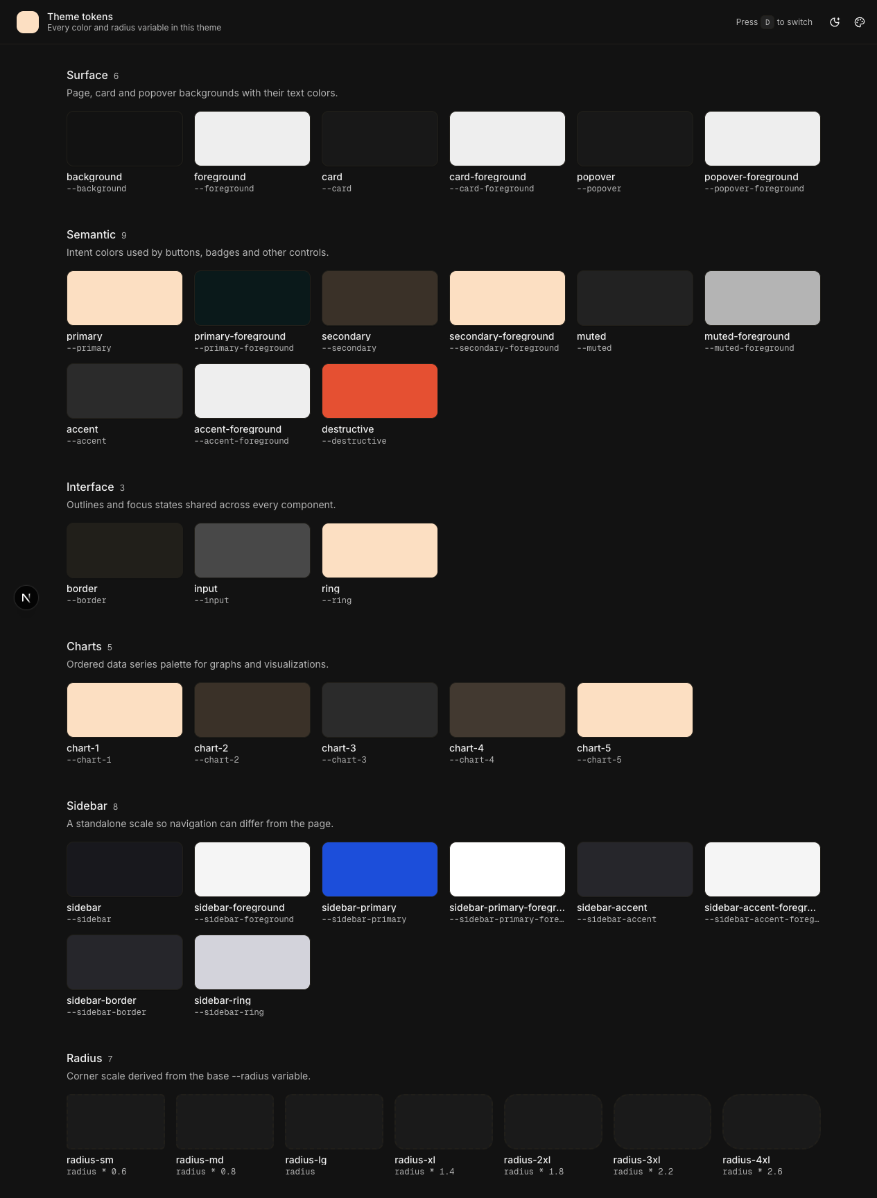
Compare that to the same preset in light mode earlier in the post, where primary is a dark brown on a cream page. Same preset, two completely different palettes, and the only thing that picks between them is that one variable in the dependency array.
Leave resolvedTheme out and you get the light palette on a dark background — dark brown on near-black, unreadable. It looks like a rendering bug, and it is a missing dependency.
It is resolvedTheme, not theme. next-themes gives you both. theme is what the user picked, which can be the string "system". resolvedTheme is what that actually worked out to, always "light" or "dark". Since "system" is not a key in preset.styles, using theme means preset.styles["system"] is undefined and nothing gets written at all for anyone on system mode.
Effect 3 — hand-off from the server. Section 13 explains what this removes and why. It is here so the ordering is right: it has to run after Effect 2.
File: contexts/settingsContext.tsx (continued)
useEffect(() => {
  document.getElementById("ssr-theme-preset")?.remove();
}, []);
Effect 4 — radius. One property. The calc() chain from section 3 turns that single value into rounded-sm through rounded-4xl, so every corner in the app moves together.
File: contexts/settingsContext.tsx (continued)
useEffect(() => {
  document.documentElement.style.setProperty(
    "--radius",
    RADIUS_VALUES[settings.radius]
  );
}, [settings.radius]);
Effect 5 — font. This one needs a word of explanation before the code, because the obvious version is wrong.
The obvious version is a single line that points --font-sans at the chosen font’s variable:
Do not paste this one. It is here to show what the real version avoids.
root.style.setProperty("--font-sans", `var(--font-lora)`);That works, but it leaves you with a variable pointing at a variable pointing at a font stack. If any link in that chain is missing, the whole thing falls back to the browser default with no error, and you are left staring at Times New Roman wondering which of the three steps broke.
getComputedStyle(root).getPropertyValue("--font-lora") instead asks the browser what that variable actually contains right now, and gets back the real stack that next/font generated:
"Lora", "Lora Fallback"
Writing that literal string removes the chain entirely. So the effect you want is this one:
File: contexts/settingsContext.tsx (continued)
useEffect(() => {
  const root = document.documentElement;
  const fontVar = FONT_CONFIG[settings.font]?.variable ?? "--font-inter";

  const resolved = getComputedStyle(root).getPropertyValue(fontVar).trim();

  if (resolved) {
    root.style.setProperty("font-family", resolved);
    root.style.setProperty("--font-sans", resolved);
  } else {
    root.style.setProperty("font-family", `var(${fontVar})`);
    root.style.setProperty("--font-sans", `var(${fontVar})`);
  }
}, [settings.font]);
The else branch is a fallback for the rare case where the variable cannot be read yet.
9.7 The return
File: contexts/settingsContext.tsx (continued)
  return (
    <SettingsContext.Provider value={{ settings, updateSettings }}>
      {children}
    </SettingsContext.Provider>
  )
}
Two things come out of this file for the rest of the app: the current settings, and the one function that changes them.
Checkpoint
pnpm typecheck passes. Nothing renders differently yet, because no component is reading the context. That is the next two sections.
10. Wiring it up
Four small files. Three of them are under twenty lines.
10.1 The consumer hook
File: hooks/use-settings.ts
"use client";

import { useContext } from "react";

import { SettingsContext } from "@/contexts/settingsContext";

export const useSettings = () => {
  const context = useContext(SettingsContext);

  if (!context) {
    throw new Error("useSettings must be used within a SettingsProvider");
  }

  return context;
};
Any component that wants to read or change a setting calls this.
The if block is the whole reason this file exists rather than calling useContext directly everywhere. Section 9 created the context with null as its starting value, so a component rendered outside the provider gets null back. Without the check, that null travels on until something does settings.mode and you get:
TypeError: Cannot read properties of null (reading 'settings')
pointing at a component that is not the problem. Throwing here names the actual mistake.
It also helps TypeScript. After that if, the compiler knows context cannot be null, so every caller gets { settings, updateSettings } without optional chaining.
10.2 The next-themes wrapper
File: components/theme-provider.tsx
"use client";

import type { ComponentProps } from "react";

import { ThemeProvider as NextThemesProvider } from "next-themes";

export const ThemeProvider = ({
  children,
  ...props
}: ComponentProps<typeof NextThemesProvider>) => {
  return <NextThemesProvider {...props}>{children}</NextThemesProvider>;
};
This looks pointless and it is not.
next-themes is a client component. Your root layout is a server component. A server component cannot import a client component’s provider directly and pass it children this way, so this file exists to hold the "use client" line and act as the boundary between the two.
ComponentProps<typeof NextThemesProvider> means “whatever props the real provider takes”. No hand-written prop list to fall out of date when next-themes updates.
10.3 The keyboard shortcut
File: components/theme-hotkey.tsx
Remember the d shortcut the starter gave you in section 1. It came wired to setTheme directly, which was correct before this post and is wrong now — it would flip the theme without saving it, so the change reverts on reload.
This is that same shortcut, rerouted through updateSettings:
File: components/theme-hotkey.tsx
"use client";

import * as React from "react";

import { useTheme } from "next-themes";

import type { Mode } from "@/contexts/settingsContext";

import { useSettings } from "@/hooks/use-settings";

function isTypingTarget(target: EventTarget | null) {
  if (!(target instanceof HTMLElement)) {
    return false;
  }

  return (
    target.isContentEditable ||
    target.tagName === "INPUT" ||
    target.tagName === "TEXTAREA" ||
    target.tagName === "SELECT"
  );
}

function ThemeHotkey() {
  const { resolvedTheme } = useTheme();
  const { settings, updateSettings } = useSettings();

  React.useEffect(() => {
    function onKeyDown(event: KeyboardEvent) {
      if (event.defaultPrevented || event.repeat) {
        return;
      }

      if (event.metaKey || event.ctrlKey || event.altKey) {
        return;
      }

      if (event.key.toLowerCase() !== "d") {
        return;
      }

      if (isTypingTarget(event.target)) {
        return;
      }

      const current = resolvedTheme || settings.mode || "light";
      const newMode: Mode = current === "dark" ? "light" : "dark";

      updateSettings({ mode: newMode });
    }

    window.addEventListener("keydown", onKeyDown);

    return () => {
      window.removeEventListener("keydown", onKeyDown);
    };
  }, [resolvedTheme, settings.mode, updateSettings]);

  return null;
}

export { ThemeHotkey };
It renders nothing. It just listens on window and returns null.
isTypingTarget is the part you would forget and then have to debug. Without it, typing the letter d into any input on the page flips the whole theme. The four checks cover normal inputs, textareas, selects, and rich text editors.
The other guards, in order: defaultPrevented skips keys something else already handled, repeat stops it firing over and over while the key is held, and the modifier check means Cmd+D still bookmarks the page instead of changing your theme.
Because this calls useSettings, it has to live inside SettingsProvider. That is the next file.
10.4 Putting them together
File: components/providers.tsx
import type { ReactNode } from "react";

import { ThemeHotkey } from "@/components/theme-hotkey";
import { ThemeProvider } from "@/components/theme-provider";
import { TooltipProvider } from "@/components/ui/tooltip";

import type { Settings } from "@/contexts/settingsContext";
import { SettingsProvider } from "@/contexts/settingsContext";

type Props = {
  children: ReactNode;
  settingsCookie?: Settings;
};

const Providers = ({ children, settingsCookie }: Props) => {
  return (
    <ThemeProvider
      attribute="class"
      defaultTheme={settingsCookie?.mode ?? "system"}
      enableSystem
      disableTransitionOnChange
    >
      <SettingsProvider settingsCookie={settingsCookie}>
        <TooltipProvider>
          <ThemeHotkey />
          {children}
        </TooltipProvider>
      </SettingsProvider>
    </ThemeProvider>
  );
};

export default Providers;
The nesting order is not a style choice, it will crash if you get it wrong. SettingsProvider calls useTheme() inside its body. useTheme() only works when there is a ThemeProvider above it. So ThemeProvider has to be on the outside. Swap those two lines and the app throws on first paint.
Same reason ThemeHotkey sits where it does: it calls useSettings(), so it has to be inside SettingsProvider.
The four props on ThemeProvider:
attribute="class"tellsnext-themesto put a class on<html>rather than adata-themeattribute. This is the one that matters most — the.darkclass is what@custom-variant darkin your CSS is looking for, and it is what makes everydark:utility work. Change this and your dark mode stops entirely.defaultTheme={settingsCookie?.mode ?? "system"}startsnext-themeson the mode the server already read from the cookie, so its first render in the browser agrees with the HTML the server sent.enableSystemturns on thesystemoption, wherenext-themeswatches the OS setting and follows it live.disableTransitionOnChangeswitches off CSS transitions for the instant the theme flips. Without it, every element with atransitionanimates its colour change at once, and switching modes looks like a slow smear instead of a switch.
11. Reading the cookie on the server
File: app/layout.tsx
import type { CSSProperties, ReactNode } from "react";

import { cookies } from "next/headers";

import { initialSettings, type Settings } from "@/contexts/settingsContext";

import Providers from "@/components/providers";

import themeConfig, { RADIUS_VALUES } from "@/configs/themeConfig";

import { cn } from "@/lib/utils";
import { allFonts, FONT_CONFIG } from "@/utils/fonts";

import "./globals.css";

const RootLayout = async ({
  children,
}: Readonly<{
  children: ReactNode;
}>) => {
  const cookieStore = await cookies();
  const settingsCookie = cookieStore.get(themeConfig.settingsCookieName);

  let settingsData: Settings | undefined;

  if (settingsCookie) {
    try {
      settingsData = JSON.parse(settingsCookie.value) as Settings;
    } catch (error) {
      console.error("Failed to parse settings cookie:", error);
    }
  }

  const mode = settingsData?.mode ?? themeConfig.mode;
  const fontVariable =
    FONT_CONFIG[settingsData?.font ?? initialSettings.font]?.variable ??
    "--font-inter";
  const radius = RADIUS_VALUES[settingsData?.radius ?? themeConfig.radius];

  return (
    <html
      lang="en"
      className={cn(
        ...allFonts.map(f => f.variable),
        "antialiased",
        "font-sans",
        mode
      )}
      style={
        {
          fontFamily: `var(${fontVariable})`,
          "--font-sans": `var(${fontVariable})`,
          "--radius": radius,
        } as CSSProperties
      }
      suppressHydrationWarning
    >
      <body suppressHydrationWarning>
        <Providers settingsCookie={settingsData}>{children}</Providers>
      </body>
    </html>
  );
};

export default RootLayout;
...allFonts.map(f => f.variable) attaches every font’s variable class to <html> at once. That is what makes the font switch instant.
--radiusgoes on the inline style too, and it is easy to forget. The server knows the radius — it is in the cookie — so there is no reason to make the browser wait for Effect 4 to write it. Leave this line out and the page paints once at yourglobals.cssdefault radius, then snaps to the user’s choice a frame later. It is the same flash as section 13, just for corners instead of colours, and it shows up even on the Default preset.
suppressHydrationWarning on both <html> and <body> is not optional. next-themes mutates the class before React hydrates, so the server HTML and the client’s first render genuinely differ. Without this you get a hydration mismatch logged on every page load. This is the rare case where suppressing the warning is correct rather than papering over a real bug.
The try/catch around JSON.parse matters more than it looks. A malformed cookie — hand-edited, truncated, left over from an older schema — would otherwise throw during SSR and return a 500 for the whole page. Falling back to defaults is the right failure mode for a theme preference. Nobody should get an error page because their cookie is stale.
Checkpoint
pnpm dev
The app should look exactly as it did before, because nothing visible has changed yet. What has changed is that the cookie is now being read on the server and handed to the providers.
Check it with DevTools open on the Elements tab. Reload, and look at the <html> tag in the very first HTML the server sends. It should already carry the mode class and the font variable, before any JavaScript runs.
Press d. The theme flips, and now it survives a reload.
12. The customizer UI
12.1 The popover
File: components/theme-customizer.tsx
Every control is one line of logic. There is no local state, no Apply button, no form. The component reads settings and writes through updateSettings; the effects in section 9 do the work.
File: components/theme-customizer.tsx
"use client";

import { Ban, Palette, RefreshCcw } from "lucide-react";
import { useTheme } from "next-themes";

import {
  initialSettings,
  type FontKey,
  type Mode,
  type Radius,
} from "@/contexts/settingsContext";
import type { ThemePresetKey } from "@/utils/theme-presets";

import { Button } from "@/components/ui/button";
import { Label } from "@/components/ui/label";
import {
  Popover,
  PopoverContent,
  PopoverTrigger,
} from "@/components/ui/popover";
import { RadioGroup, RadioGroupItem } from "@/components/ui/radio-group";
import {
  Select,
  SelectContent,
  SelectGroup,
  SelectItem,
  SelectLabel,
  SelectTrigger,
} from "@/components/ui/select";
import {
  Tooltip,
  TooltipContent,
  TooltipTrigger,
} from "@/components/ui/tooltip";

import { useSettings } from "@/hooks/use-settings";

import { FONT_CONFIG, FONT_GROUPS } from "@/utils/fonts";
import { themePresets } from "@/utils/theme-presets";

const MODES: { value: Mode; label: string }[] = [
  { value: "light", label: "Light" },
  { value: "dark", label: "Dark" },
  { value: "system", label: "System" },
];

const RADII: { value: Radius; tooltip: string }[] = [
  { value: "none", tooltip: "0px" },
  { value: "sm", tooltip: "7.2px" },
  { value: "md", tooltip: "10px" },
  { value: "lg", tooltip: "14px" },
];

const DEFAULT_PRIMARY: Record<"light" | "dark", string> = {
  light: "oklch(0.205 0 0)",
  dark: "oklch(0.922 0 0)",
};

const ITEM_CLASS =
  "has-data-checked:bg-accent relative flex flex-col items-center gap-2 border px-2 py-2 text-center shadow-xs transition-[color,box-shadow] outline-none not-last:border-r-0 first:rounded-l-md last:rounded-r-md cursor-pointer";

const ThemeCustomizer = () => {
  const { settings, updateSettings } = useSettings();
  const { resolvedTheme } = useTheme();

  const mode = resolvedTheme === "dark" ? "dark" : "light";

  const activePreset =
    settings.themePreset === "default"
      ? null
      : themePresets[settings.themePreset];

  const activePrimaryColor =
    activePreset?.styles[mode].primary ?? DEFAULT_PRIMARY[mode];
  const activeLabel = activePreset?.label ?? "Default";

  return (
    <Popover>
      <PopoverTrigger
        render={
          <Button variant="ghost" size="icon" aria-label="Customize theme" />
        }
      >
        <Palette />
      </PopoverTrigger>

      <PopoverContent
        align="end"
        sideOffset={8}
        className="flex max-h-[calc(100vh-160px)] w-72 flex-col gap-6 overflow-y-auto p-3"
      >
        <div className="flex flex-col gap-1">
          <div className="flex items-center justify-between">
            <h3 className="text-lg font-medium">Theme Customizer</h3>
            <Button
              size="icon"
              variant="ghost"
              aria-label="Reset theme"
              onClick={() => updateSettings(initialSettings)}
            >
              <RefreshCcw />
            </Button>
          </div>
          <p className="text-sm text-muted-foreground">
            Customize your theme to your liking.
          </p>
        </div>

        <div className="flex flex-col gap-1">
          <Label htmlFor="theme-preset">Theme Preset</Label>
          <Select
            id="theme-preset"
            value={settings.themePreset}
            onValueChange={value =>
              updateSettings({ themePreset: value as ThemePresetKey })
            }
          >
            <SelectTrigger className="w-full">
              <span
                className="size-2.5 shrink-0 rounded-full"
                style={{ background: activePrimaryColor }}
              />
              <span className="flex-1 text-left">{activeLabel}</span>
            </SelectTrigger>
            <SelectContent
              alignItemWithTrigger={false}
              className="w-auto max-w-(--available-width) min-w-(--anchor-width) p-1"
            >
              <SelectItem value="default" className="[&>div]:items-center">
                <span
                  className="size-2 shrink-0 rounded-full"
                  style={{ background: DEFAULT_PRIMARY[mode] }}
                />
                Default
              </SelectItem>
              {Object.entries(themePresets).map(([key, preset]) => (
                <SelectItem
                  key={key}
                  value={key}
                  className="[&>div]:items-center"
                >
                  <span
                    className="size-2 shrink-0 rounded-full"
                    style={{ background: preset.styles[mode].primary }}
                  />
                  {preset.label}
                </SelectItem>
              ))}
            </SelectContent>
          </Select>
        </div>

        <div className="flex flex-col gap-1">
          <Label htmlFor="font">Font</Label>
          <Select
            id="font"
            value={settings.font}
            onValueChange={value => updateSettings({ font: value as FontKey })}
          >
            <SelectTrigger className="w-full">
              <span
                className="flex-1 text-left"
                style={{
                  fontFamily: `var(${FONT_CONFIG[settings.font]?.variable ?? "--font-inter"})`,
                }}
              >
                {FONT_CONFIG[settings.font]?.label ?? "Inter"}
              </span>
            </SelectTrigger>
            <SelectContent
              alignItemWithTrigger={false}
              className="w-auto max-w-(--available-width) min-w-(--anchor-width) p-1"
            >
              {FONT_GROUPS.map(({ key: groupKey, label: groupLabel }) => {
                const fonts = (
                  Object.entries(FONT_CONFIG) as [
                    FontKey,
                    (typeof FONT_CONFIG)[FontKey],
                  ][]
                ).filter(([, config]) => config.group === groupKey);

                if (fonts.length === 0) return null;

                return (
                  <SelectGroup key={groupKey}>
                    <SelectLabel>{groupLabel}</SelectLabel>
                    {fonts.map(([key, config]) => (
                      <SelectItem
                        key={key}
                        value={key}
                        className="[&>div]:items-center"
                      >
                        <span style={{ fontFamily: `var(${config.variable})` }}>
                          {config.label}
                        </span>
                      </SelectItem>
                    ))}
                  </SelectGroup>
                );
              })}
            </SelectContent>
          </Select>
        </div>

        <div className="flex flex-col gap-1">
          <Label htmlFor="color-mode">Color Mode</Label>
          <RadioGroup
            id="color-mode"
            className="grid grid-cols-3 gap-0 rounded-md"
            value={settings.mode}
            onValueChange={v => updateSettings({ mode: v as Mode })}
          >
            {MODES.map(({ value, label }) => (
              <Label
                htmlFor={`mode-${value}`}
                key={value}
                className={ITEM_CLASS}
              >
                <RadioGroupItem
                  id={`mode-${value}`}
                  value={value}
                  className="sr-only absolute inset-0"
                  aria-label={`mode-${value}`}
                />
                <p className="text-sm leading-none font-medium text-foreground">
                  {label}
                </p>
              </Label>
            ))}
          </RadioGroup>
        </div>

        <div className="flex flex-col gap-1">
          <Label htmlFor="radius">Radius</Label>
          <RadioGroup
            id="radius"
            className="grid grid-cols-4 gap-0 rounded-md"
            value={settings.radius}
            onValueChange={v => updateSettings({ radius: v as Radius })}
          >
            {RADII.map(({ value, tooltip }) => (
              <Tooltip key={value}>
                <TooltipTrigger
                  render={
                    <Label htmlFor={`radius-${value}`} className={ITEM_CLASS} />
                  }
                >
                  <RadioGroupItem
                    id={`radius-${value}`}
                    value={value}
                    className="sr-only absolute inset-0"
                    aria-label={`radius-${value}`}
                  />
                  {value === "none" ? (
                    <Ban className="size-3.5" />
                  ) : (
                    <p className="text-sm leading-none font-medium text-foreground">
                      {value.toUpperCase()}
                    </p>
                  )}
                </TooltipTrigger>
                <TooltipContent>{tooltip}</TooltipContent>
              </Tooltip>
            ))}
          </RadioGroup>
        </div>
      </PopoverContent>
    </Popover>
  );
};

export default ThemeCustomizer;
The dropdown builds itself
Object.entries(themePresets).map(…) means adding a preset in section 5 is genuinely the only step. And the colour dot on each row reads live from the preset data:
Quoted from the file above. Nothing to paste.
style={{ background: preset.styles[mode].primary }}
That is each preset’s actual --primary for the current mode. Toggle to dark and every dot updates, because mode derives from resolvedTheme. No hardcoded hex list to fall out of date.
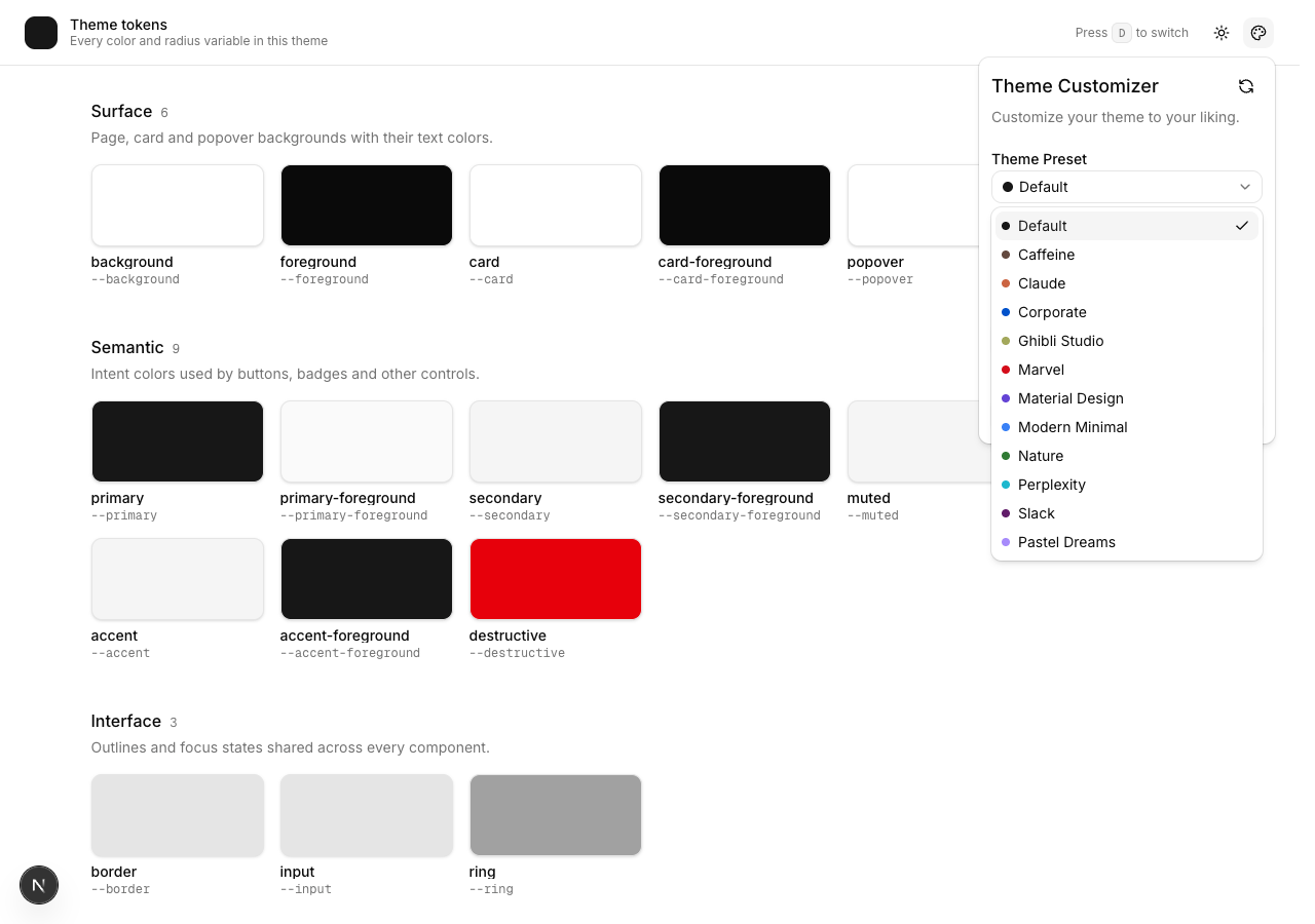
The one constant you have to edit
DEFAULT_PRIMARY exists because “Default” has no preset object to read a dot colour from. Set it to your real :root and .dark --primary values. If you do not, the dropdown advertises a colour your app never renders, and it will be wrong in a way nobody notices for months.
The segmented control is worth stealing
Colour Mode and Radius look like button groups. They are radio groups. Here is one row from the loop above with the mapping stripped out, because the shape is the point:
Quoted from the file above. Nothing to paste.
<Label
  htmlFor="mode-light"
  className="relative border has-data-checked:bg-accent …"
>
  <RadioGroupItem
    id="mode-light"
    value="light"
    className="sr-only absolute inset-0"
  />
  <p>Light</p>
</Label>
A real RadioGroupItem is visually hidden but still in the DOM and still focusable. The <Label> wraps it and styles itself with has-data-checked:bg-accent, which is CSS reacting to the hidden input’s state.
You get arrow-key navigation, correct screen reader announcements and proper focus management for free, while a Free hosting control panel makes website hosting management more accessible and convenient. No role="tablist" abuse, no hand-rolled aria-selected, no keyboard handler. not-last:border-r-0 first:rounded-l-md last:rounded-r-md is what collapses the separate bordered boxes into one connected control.
If your project uses classic Radix shadcn rather than Base UI, three things differ:
asChildinstead ofrender=,has-data-[state=checked]:instead ofhas-data-checked:, andalignItemWithTriggerdoes not exist. Everything else is identical.
The font dropdown previews itself
The one line that matters in that whole Font block is this one:
Quoted from the file above. Nothing to paste.
<span style={{ fontFamily: `var(${config.variable})` }}>{config.label}</span>Each row renders in its own typeface, which is the only sane way to pick a font. Reading “Playfair Display” set in Inter tells you nothing.
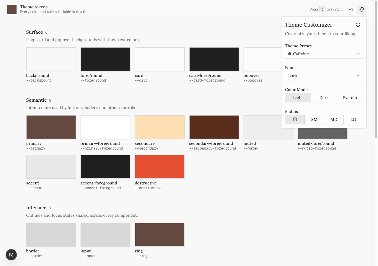
This works because every font variable is already attached to <html>, from section 11. Nothing is fetched to draw that menu.
The grouping is a filter over the same registry, not a second data structure:
Quoted from the file above. Nothing to paste.
Object.entries(FONT_CONFIG).filter(([, config]) => config.group === groupKey);FONT_GROUPS gives the headings and their order; each font’s group field decides where it lands. Adding a serif is one entry with group: "serif", and if (fonts.length === 0) return null means a group with nothing in it renders no empty heading. That cast on Object.entries is ugly and unavoidable — Object.entries widens keys to string, and the cast puts FontKey back so updateSettings({ font: key }) type-checks.
12.2 Rewiring the mode toggle
The toggle you wrote in section 2 called setTheme directly, because at the time there was nothing else to call. Now there is. Replace the file:
File: components/mode-toggle.tsx
"use client";

import { MoonStar, Sun } from "lucide-react";
import { useTheme } from "next-themes";

import type { Mode } from "@/contexts/settingsContext";

import { Button } from "@/components/ui/button";

import { useSettings } from "@/hooks/use-settings";

function ModeToggle() {
  const { resolvedTheme } = useTheme();
  const { settings, updateSettings } = useSettings();

  const handleModeChange = () => {
    const currentTheme = resolvedTheme || settings.mode || "light";
    const newMode: Mode = currentTheme === "dark" ? "light" : "dark";

    updateSettings({ mode: newMode });
  };

  return (
    <Button
      variant="ghost"
      size="icon"
      className="relative"
      aria-label="Toggle theme"
      onClick={handleModeChange}
    >
      <Sun className="scale-100 rotate-0 transition-transform dark:scale-0 dark:-rotate-90" />
      <MoonStar className="absolute scale-0 rotate-90 transition-transform dark:scale-100 dark:rotate-0" />
      <span className="sr-only">Toggle theme</span>
    </Button>
  );
}

export { ModeToggle };
Call updateSettings, never setTheme directly. updateSettings calls setTheme for you, and also saves the cookie and tells the other tabs. If you call setTheme here as well you have created a second way to change the theme that skips saving, and the symptom is a button that works perfectly until you reload the page and it snaps back.
resolvedTheme || settings.mode || "light" handles the first render. Before the browser has hydrated, next-themes does not yet know the resolved theme and resolvedTheme is undefined. Without the fallback, the first click computes undefined === "dark", which is false, so it sets dark mode — even if you were already in dark mode. The user clicks, nothing appears to happen, and they click again.
12.3 Mounting the customizer
Last step. Open app/page.tsx and add the import and the component to the header:
File: app/page.tsx (add this import)
import ThemeCustomizer from "@/components/theme-customizer";Then replace the lone <ModeToggle /> at the end of the header with both buttons:
File: app/page.tsx (in the header)
<div className="flex items-center gap-1">
  <ModeToggle />
  <ThemeCustomizer />
</div>
That is the finished app/page.tsx, and the finished app.
Checkpoint
Everything together:
Three settings changed, and the customizer is styled by the same tokens it is editing. Its own corners went square. Its own popover background is Caffeine’s.
Go through this list:
- Pick a preset. Colours change immediately. Open DevTools, inspect
<html>, and you should see inlinestyle="--primary: …; --background: …". - Switch back to Default. Those properties should disappear from the inline style entirely.
- Pick Radius → None. Every corner squares off, including cards, buttons, inputs and the popover.
- Pick a serif. Body text changes with no network request in the Network tab.
- With a preset active, toggle light and dark. The colours should repaint into the other palette, not stay light on a dark background.
- Hard-reload. Nothing flashes.
- Open a second tab and change the theme in one. The other follows within a frame.
13. Killing the last flash
Why this exists
Go and do this now, because it is easier to see than to describe.
Open the customizer, pick a preset, switch to dark mode, then hard-reload the page. Watch the moment it loads.
The dark mode is right from the first frame. The font is right. But the colours pop — the page comes up in the default palette and then flips to your preset a beat later.
That is what this section fixes, and it is the reason section 11 was not the end of the story.
Why it happens
The reason is in the code you already wrote. Section 11 bakes the mode class and the font variable into the HTML the server sends. The preset is not in there. It is only ever written by Effect 2, which runs after React hydrates.
So the order on every page load is: server sends HTML with your globals.css colours, browser paints it, JavaScript boots, Effect 2 writes the preset, browser paints again. You see both paints.
Confirm it rather than guessing — this is worth doing before you change anything:
const html = await (await fetch("/")).text();
html.includes("oklch(0.43 0.04 41.99)");
That is Caffeine’s primary, and it came back false.
Not in the payload. So the fix is to put it there. The awkward part is system mode, which the server cannot resolve, so you cannot know which of the two palettes to inline. The way around that is to emit both as a real stylesheet and let the cascade pick:
File: app/layout.tsx
import type { ThemeStyleProps } from "@/types/theme";

import { themePresets } from "@/utils/theme-presets";
File: app/layout.tsx (add above RootLayout)
const buildPresetCss = (preset: Settings["themePreset"] | undefined) => {
  if (!preset || preset === "default") return null;

  const entry = themePresets[preset as keyof typeof themePresets];
  if (!entry) return null;

  const block = (selector: string, styles: Partial<ThemeStyleProps>) => {
    const body = Object.entries(styles)
      .map(([key, value]) => `--${key}:${String(value).replace(/[<>]/g, "")}`)
      .join(";");

    return body ? `${selector}{${body}}` : "";
  };

  return (
    `${block(":root", entry.styles.light)}${block(".dark", entry.styles.dark)}` ||
    null
  );
};
Rendered as the first thing in <body>:
File: app/layout.tsx (inside <body>)
{
  presetCss && (
    <style
      id="ssr-theme-preset"
      dangerouslySetInnerHTML={{ __html: presetCss }}
    />
  );
}
It beats globals.css on source order because it comes later in the document, and the client’s inline styles beat it because inline always wins. Three layers, each deliberately stronger than the last.
One catch, and it is a nasty one. Leave that tag in place and “Default” stops working. Effect 2 removes the inline properties, the cascade falls back to the next strongest rule, and that is now your SSR preset instead of globals.css. The preset becomes permanent and the reset button appears broken.
So the client drops the tag once it has taken over:
File: contexts/settingsContext.tsx — this is Effect 3 from section 9.6
useEffect(() => {
  document.getElementById("ssr-theme-preset")?.remove();
}, []);
Place that one after Effect 2 in the provider body, so the inline variables are already written and no frame paints without them.
Effect ordering is load-bearing there. Both run in the same commit before the browser paints, so there is no window where neither the tag nor the inline styles are applied. Put the removal before Effect 2 and you get exactly one frame of unstyled default, which is the flash you were trying to remove.
13.1 The finished file
Here is app/layout.tsx with the preset block folded in. This is the final version of the file:
File: app/layout.tsx
import type { CSSProperties, ReactNode } from "react";

import { cookies } from "next/headers";

import { initialSettings, type Settings } from "@/contexts/settingsContext";
import type { ThemeStyleProps } from "@/types/theme";

import Providers from "@/components/providers";

import themeConfig, { RADIUS_VALUES } from "@/configs/themeConfig";

import { cn } from "@/lib/utils";
import { allFonts, FONT_CONFIG } from "@/utils/fonts";
import { themePresets } from "@/utils/theme-presets";

import "./globals.css";

const SSR_PRESET_STYLE_ID = "ssr-theme-preset";

const buildPresetCss = (preset: Settings["themePreset"] | undefined) => {
  if (!preset || preset === "default") return null;

  const entry = themePresets[preset as keyof typeof themePresets];

  if (!entry) return null;

  const block = (selector: string, styles: Partial<ThemeStyleProps>) => {
    const body = Object.entries(styles)
      .map(([key, value]) => `--${key}:${String(value).replace(/[<>]/g, "")}`)
      .join(";");

    return body ? `${selector}{${body}}` : "";
  };

  const css = `${block(":root", entry.styles.light)}${block(".dark", entry.styles.dark)}`;

  return css || null;
};

const RootLayout = async ({
  children,
}: Readonly<{
  children: ReactNode;
}>) => {
  const cookieStore = await cookies();
  const settingsCookie = cookieStore.get(themeConfig.settingsCookieName);

  let settingsData: Settings | undefined;

  if (settingsCookie) {
    try {
      settingsData = JSON.parse(settingsCookie.value) as Settings;
    } catch (error) {
      console.error("Failed to parse settings cookie:", error);
    }
  }

  const mode = settingsData?.mode ?? themeConfig.mode;
  const fontVariable =
    FONT_CONFIG[settingsData?.font ?? initialSettings.font]?.variable ??
    "--font-inter";
  const radius = RADIUS_VALUES[settingsData?.radius ?? themeConfig.radius];
  const presetCss = buildPresetCss(settingsData?.themePreset);

  return (
    <html
      lang="en"
      className={cn(
        ...allFonts.map(f => f.variable),
        "antialiased",
        "font-sans",
        mode
      )}
      style={
        {
          fontFamily: `var(${fontVariable})`,
          "--font-sans": `var(${fontVariable})`,
          "--radius": radius,
        } as CSSProperties
      }
      suppressHydrationWarning
    >
      <body suppressHydrationWarning>
        {presetCss && (
          <style
            id={SSR_PRESET_STYLE_ID}
            dangerouslySetInnerHTML={{ __html: presetCss }}
          />
        )}
        <Providers settingsCookie={settingsData}>{children}</Providers>
      </body>
    </html>
  );
};

export default RootLayout;
Checkpoint
Set a preset and dark mode, then hard-reload. Watch carefully. No white flash, no colour pop, no font swap. Then switch to Default and confirm it actually goes back:
In the console, this should come back as an empty array:
Array.from(document.documentElement.style).filter(p => p.startsWith("--"));Anything left in there is a variable missing from PRESET_CSS_VARS.
14. Adding your own theme
Why this exists
The eleven presets that ship with this are a starting point. To add your own theme, you only need one object in one file.
I will walk a real one through as I go, so you can see the whole path from a generator to a working preset. It is not one of the eleven in the repo — you are adding it.
14.1 Get the colours
You do not need to create thirty colours manually. The Shadcn Theme Generator creates a complete light and dark token set visually, so you can start from a coherent palette instead of choosing every value by hand.
The generator is available from shadcn studio at shadcnstudio.com/.
- Click Copy in the customizer.
- A modal opens with export options.
- Pick CSS Variables.
- Copy.
The theme generator docs cover the controls if you want more than the defaults.
What lands on your clipboard is a full stylesheet — imports, :root, .dark, @theme inline, shadow variables, base layer typography, the lot:
This is the generator’s output, not a file to create. You only want two blocks out of it.
@import "tailwindcss";
@import "tw-animate-css";
@import "shadcn/tailwind.css";

@custom-variant dark (&:is(.dark *));

:root {
  --background: oklch(0.97 0.02 12.78);
  --foreground: oklch(0.24 0.07 17.81);
  --primary: oklch(0.67 0.22 21.34);
  …
  --shadow-sm: 0rem 0rem .1875rem 0rem oklch(0.3 0.0891 19.6 / 0.08), …;
}

.dark {
  --background: oklch(0.16 0.03 17.48);
  …
}

@theme inline {
  --color-background: var(--background);
  …
}

@layer base {
  h1 { font-family: var(--font-heading); … }
  …
}
You want two blocks out of that and nothing else: :root and .dark.
Ignore the rest. The @import lines, @custom-variant, @theme inline and @layer base are already in your globals.css from section 3, and yours is wired to a --radius that the customizer controls. Pasting the generator’s versions over the top would undo that.
Two more to drop while you are in there:
--radius. It appears inside:root. Leave it out — radius is its own control in this app, and a preset that also sets it would fight the radius buttons.- The
--shadow-*variables. The generator emits--shadow-sm,--shadow-md, and related variables. This project’s@theme inlinedoes not map those, so setting them has no visible effect. Leave them out until you map them.
14.2 Turn those two blocks into a preset
The conversion is mechanical. For each line, drop the leading --, quote the key if it contains a hyphen, and turn the trailing ; into a ,. The :root block becomes light, the .dark block becomes dark.
So this:
:root {
  --background: oklch(0.97 0.02 12.78);
  --card-foreground: oklch(0.26 0.07 19);
  --primary: oklch(0.67 0.22 21.34);
}
Becomes this:
light: {
  background: "oklch(0.97 0.02 12.78)",
  "card-foreground": "oklch(0.26 0.07 19)",
  primary: "oklch(0.67 0.22 21.34)",
}
Add it as a key in themePresets in utils/theme-presets.ts. Here is that Valorant theme converted, trimmed in the middle for length:
File: utils/theme-presets.ts (add one key)
export const themePresets = {
  …

  valorant: {
    label: "Valorant",
    styles: {
      light: {
        background: "oklch(0.97 0.02 12.78)",
        foreground: "oklch(0.24 0.07 17.81)",
        card: "oklch(0.98 0.01 17.28)",
        "card-foreground": "oklch(0.26 0.07 19)",
        popover: "oklch(0.98 0.01 17.28)",
        "popover-foreground": "oklch(0.26 0.07 19)",
        primary: "oklch(0.67 0.22 21.34)",
        "primary-foreground": "oklch(0.99 0.00 359.99)",
        secondary: "oklch(0.95 0.02 11.28)",
        "secondary-foreground": "oklch(0.24 0.07 17.81)",
        muted: "oklch(0.98 0.01 17.28)",
        "muted-foreground": "oklch(0.26 0.07 19)",
        accent: "oklch(0.99 0.00 359.99)",
        "accent-foreground": "oklch(0.43 0.13 20.62)",
        destructive: "oklch(0.80 0.17 73.27)",
        border: "oklch(0.91 0.05 11.40)",
        input: "oklch(0.90 0.05 12.59)",
        ring: "oklch(0.92 0.04 12.39)",
        "chart-1": "oklch(0.86 0.18 88.49)",
        "chart-2": "oklch(0.62 0.21 255.13)",
        "chart-3": "oklch(0.54 0.29 297.82)",
        "chart-4": "oklch(0.95 0.10 98.39)",
        "chart-5": "oklch(0.87 0.12 100.28)",
        sidebar: "oklch(0.97 0.02 12.78)",
        "sidebar-foreground": "oklch(0.26 0.07 19)",
        "sidebar-primary": "oklch(0.67 0.22 21.34)",
        "sidebar-primary-foreground": "oklch(0.98 0.01 17.28)",
        "sidebar-accent": "oklch(0.98 0.01 17.28)",
        "sidebar-accent-foreground": "oklch(0.43 0.13 20.62)",
        "sidebar-border": "oklch(0.91 0.05 11.40)",
        "sidebar-ring": "oklch(0.92 0.04 12.39)",
      },
      dark: {
        background: "oklch(0.16 0.03 17.48)",
        foreground: "oklch(0.99 0.00 359.99)",
        card: "oklch(0.21 0.05 19.26)",
        "card-foreground": "oklch(0.98 0 0)",
        primary: "oklch(0.67 0.22 21.34)",
        "primary-foreground": "oklch(0.99 0.00 359.99)",
        secondary: "oklch(0.3 0.0891 19.6)",
        "secondary-foreground": "oklch(0.95 0.02 11.28)",
        …
        "sidebar-border": "oklch(0.39 0.12 20.37)",
        "sidebar-ring": "oklch(0.50 0.16 20.89)",
      },
    },
  },
} satisfies Record<string, ThemePreset>
That is the only step. Reload and it is in the dropdown with its own colour dot, because the customizer iterates Object.entries(themePresets). There is no array to append to and no switch statement to extend.
ThemePresetKey widens on its own too, so updateSettings({ themePreset: "valorant" }) type-checks and a typo does not.
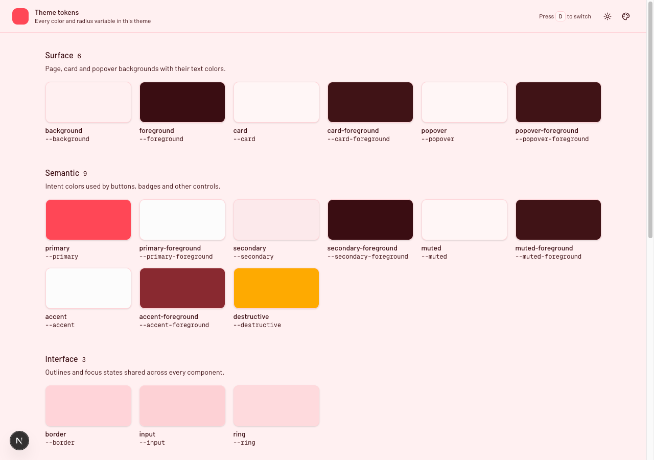
14.3 Three things to check
Set ring to match primary. It is the focus ring. Miss it and every focused input in your new theme keeps the previous theme’s outline. Easy to not notice if you use a mouse.
Fill in both light and dark. If you only write light, then preset.styles.dark is an empty object, Effect 2 writes nothing, and dark mode quietly falls back to globals.css. The symptom is “my preset does not work in dark mode” when the truth is it was never given a dark palette.
Every key you set must be in PRESET_CSS_VARS. This one bites later rather than immediately. That array in contexts/settingsContext.tsx is what “Default” uses to clear overrides. Set a variable that is not listed and it applies fine, looks right, and then survives the switch back to Default — permanently, for that user, until they clear cookies.
Export PRESET_CSS_VARS and run this once as a test:
A one-off check, not part of the app. Put it in a scratch file or a test.
import { PRESET_CSS_VARS } from "@/contexts/settingsContext";
import { themePresets } from "@/utils/theme-presets";

const allowed = new Set<string>(PRESET_CSS_VARS);

Object.values(themePresets).forEach(preset => {
  const keys = new Set([
    ...Object.keys(preset.styles.light),
    ...Object.keys(preset.styles.dark),
  ]);

  keys.forEach(key => {
    if (!allowed.has(key)) {
      console.warn(`${preset.label}: "${key}" is not in PRESET_CSS_VARS`);
    }
  });
});
new Set<string>(…) first, because PRESET_CSS_VARS is as const and calling .includes() on it with a plain string is a type error.
Checkpoint
This is where the token page from section 2 pays for itself. Pick your new preset and read down the grid in both modes.
The things I catch this way every time: a muted-foreground too close to muted to read, a destructive that fell out of the palette because it came from somewhere else, and chart-3 through chart-5 still on the old values because the generator only gave me two.
15. Adding your own font
Why this exists
Same idea as a preset, but with one trap: a font has to be registered in three places in utils/fonts.ts, and if you miss one there is no error. The font appears in the dropdown, gets selected, and renders as the browser default.
Most fonts you want are on Google Fonts, which means next/font/google already has them.
15.1 The three places
I will add Barlow, which is not one of the eighteen already in the repo.
One, import and load it. The import name is the font’s name with spaces as underscores, so Playfair Display is Playfair_Display:
File: utils/fonts.ts
import { Barlow, DM_Sans, Geist /* … */ } from "next/font/google";

export const fontBarlow = Barlow({
  preload: false,
  weight: ["400", "500", "600", "700"],
  subsets: ["latin"],
  variable: "--font-barlow",
});
variable is the CSS custom property this font will live in. Pick a name and use the same one in step three.
weight is needed here because Barlow ships as static weights rather than as a variable font. If you get Missing weight for font … at build time, add the array. If you get the opposite complaint about a variable font, remove it.
preload: false for everything except your default font and your mono, as section 6 explains — otherwise every visitor downloads every typeface to use one.
Two, add it to allFonts:
File: utils/fonts.ts (continued)
export const allFonts = [
  fontBarlow,
  fontGeist,
  fontGeistMono,
  …
]
This is the one people miss. allFonts is what app/layout.tsx spreads onto <html>, so it is what actually puts --font-barlow in the document. Skip it and the variable never exists, getComputedStyle in Effect 5 returns an empty string, and you silently get the fallback.
Three, add it to FONT_CONFIG:
File: utils/fonts.ts (continued)
export const FONT_CONFIG = {
  inter: { label: "Inter", variable: "--font-inter", group: "sans" as FontGroup },
  barlow: {
    label: "Barlow",
    variable: "--font-barlow",
    group: "sans" as FontGroup,
  },
  …
} as const
The key is what goes in the cookie. The label is what the dropdown shows. The variable must match step one exactly. group puts it under Sans, Mono or Serif — and if you invent a new group name, add it to FONT_GROUPS too or the font will not appear at all.
That is it. FontKey picks up the new key automatically because of as const, so the rest of the app type-checks against it with no other changes.
Checkpoint
pnpm dev
Open the Font dropdown. Your font is under its group heading, rendered in itself — that preview is the fastest way to confirm it actually loaded. If the row is set in your default font instead of the new one, you missed allFonts.
Pick it, then check the Network tab: selecting a preload: false font fetches it once, and never again.
Appendix: the file list
| File | Section | Purpose |
|---|---|---|
app/globals.css | 3 | Theme tokens plus the @theme inline bridge |
app/page.tsx | 2 | The token grid |
app/layout.tsx | 11, 13 | SSR cookie read, font variables, and preset style block |
components/mode-toggle.tsx | 2, 12 | Light and dark mode button |
components/theme-customizer.tsx | 12 | The popover with four controls |
components/theme-provider.tsx | 10 | Thin next-themes wrapper |
components/theme-hotkey.tsx | 10 | The d shortcut, routed through updateSettings |
components/providers.tsx | 10 | Provider composition in the required order |
configs/themeConfig.ts | 7 | Defaults and the cookie name |
contexts/settingsContext.tsx | 9, 13 | Settings state, DOM effects, and cross-tab synchronisation |
hooks/use-object-cookie.ts | 8 | Object storage in a cookie |
hooks/use-settings.ts | 10 | Consumer hook with a useful error message |
types/theme.ts | 4 | The shape of a preset |
utils/fonts.ts | 6 | Font loaders and registry |
utils/theme-presets.ts | 5 | Theme preset colour data |
Reference
This project
Themes
Project setup
- shadcn/ui create
- shadcn/ui installation
- Base UI
- Tailwind CSS v4
- Tailwind theme variables
- Base UI
- Tailwind CSS v4
- Tailwind theme variables
APIs used in this post
Thanks for reading
That was a lot of theming.
If you built along with it, you now have a shadcn setup that can switch between presets, fonts, and radius values at runtime, persist those choices, and keep everything working cleanly across light and dark mode.
Two links if you want the finished version:
- Live demo — click through the presets, fonts, and radius settings without installing anything.
- Source on GitHub — the complete project at the state this post ends on.
If something behaves differently from what I described, I would genuinely like to hear about it. That feedback helps make the post better for the next person.
And if you end up using this approach in your own project, I would love to see what you build with it