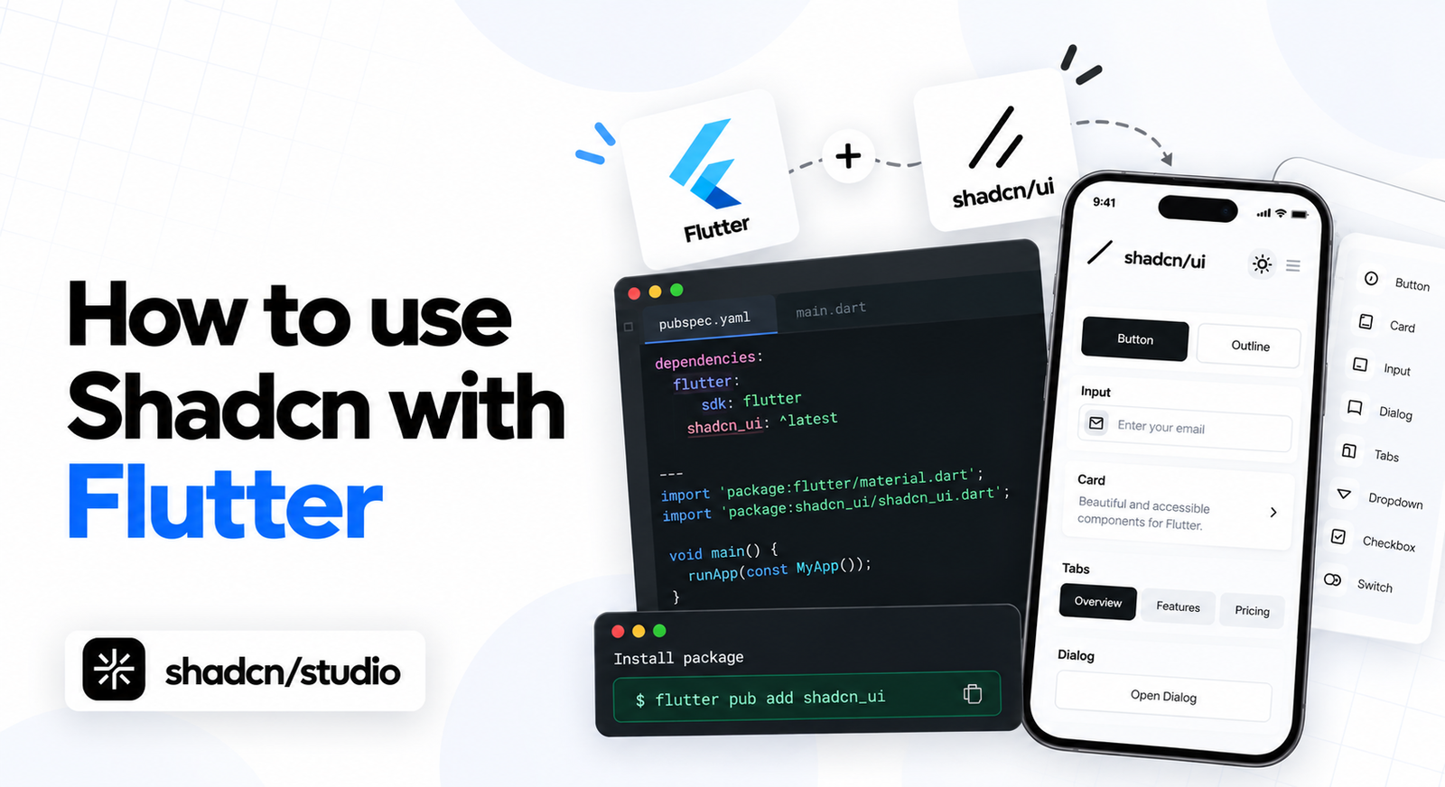
I went looking for npx shadcn add button.
That is the muscle memory. On the web, shadcn is a command that copies a component file into your repo, and then the file is yours. I assumed the Flutter version worked the same way, opened the docs, and started hunting for the CLI.
There isn’t one. There is this:
Terminal
flutter pub add shadcn_flutterThat is a dependency. Not a copy. Which means I do not own button.dart, I
cannot open it and change a padding value, and the entire pitch of shadcn on
the web quietly stopped applying about four seconds into the project.
So this post is not “shadcn, but Flutter”. It is a different thing wearing the same clothes, and the differences are worth knowing before you build on it.
To find out where those differences actually bite, I built something real rather than a page of sample widgets. A music player, Spotify-shaped, because you can look at it and immediately know what every region is supposed to do.
That is the finished thing. Sidebar, browse grid, now playing bar. By the end of this post you will have built it, and more usefully you will know which parts of Flutter you stop using when you adopt this package.
Everything below is running code. Every screenshot is the real app at 1280 wide, not a mockup.
What you’re working with
| Version | |
|---|---|
| Flutter | 3.47.1 (stable) |
| Dart | 3.13.1 |
shadcn_flutter | 0.0.53 |
Worth stating the version, because shadcn_flutter is pre-1.0 and moving. The
package itself requires Flutter 3.32.3 or newer and Dart >=3.6.0 <4.0.0. The
docs site carries an “Experimental” badge next to the name, and I would take
that at face value: things move.
1. Flutter, in one section
Skip this if you already write Flutter.
Flutter is Google’s UI toolkit. You write Dart, and one codebase compiles to Android, iOS, web, macOS, Windows and Linux. The part that matters for this post is how it draws.
Flutter does not use the platform’s native controls. It ships its own
rendering engine and paints every pixel itself. A button on iOS is not a
UIButton, it is a rectangle Flutter drew.
That sounds like a downside until you want a design system. It is the exact
reason a package like shadcn_flutter can exist and look identical on six
platforms: nothing underneath is fighting it.
The second thing to know is that everything is a widget, and you build screens by nesting them rather than by styling them:
Column(
  children: [
    Text('Recently played'),
    Row(children: [AlbumTile(), AlbumTile()]),
  ],
)
There is no stylesheet. Composition is the styling. Hold onto that, because it explains why the shadcn port looks so unlike its web parent.
2. What shadcn_flutter actually is
It is a Flutter package that implements the shadcn/ui design language as real widgets. 84 components, the shadcn color tokens, and the Geist typeface, all shipped inside the dependency.
The documentation lives at sunarya-thito.github.io/shadcn_flutter, and it is worth a look before you install anything.
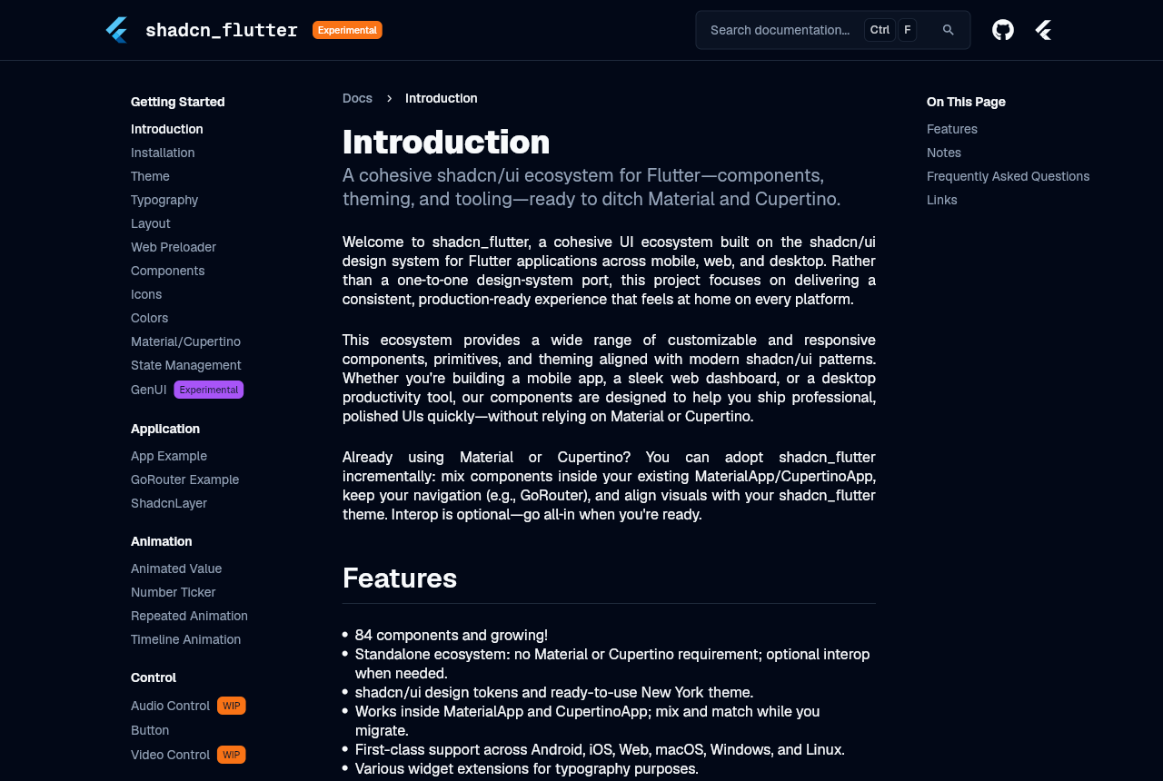
Small detail I enjoyed: that site is itself a Flutter web app built with the library. It renders to a canvas, which is why you cannot select the text on it and why my attempt to fetch the page returned nothing at all. It is also the most honest demo a component library can offer, since the docs are the product.
The feature list on that page tells you the important part directly: “Standalone ecosystem: no Material or Cupertino requirement”. Read that carefully. This package does not sit on top of Material the way shadcn/ui sits on top of Tailwind and Radix. It replaces it.
How it differs from the web version
If you have used shadcn/ui, the mental model needs adjusting in five places.
| shadcn/ui on the web | shadcn_flutter | |
|---|---|---|
| Getting a component | npx shadcn add button copies source into your repo | flutter pub add shadcn_flutter |
| Who owns the code | you do, edit it freely | the package does |
| What it sits on | Tailwind plus Radix or Base UI | replaces Material entirely |
| Where the theme lives | CSS custom properties in globals.css | a Dart ColorScheme object |
| Variants | <Button variant="ghost"> | GhostButton, a separate class |
The first two rows are the real trade. On the web you own the source, so you can change anything and nothing can break you from upstream. Here you get upgrades for free and you customise through the theme and the constructor parameters instead of by editing files.
Neither is better. But if your team picked shadcn/ui specifically because you wanted to own the components, know that you are not getting that here.
A Shadcn template is still useful as a visual reference when you translate a web layout into Flutter. The React source does not transfer, but the composition, spacing, and responsive decisions do.
3. Installing it, and the part that breaks
Two commands.
Terminal
flutter create cadence
cd cadence
flutter pub add shadcn_flutter
That pulled in 24 packages on my machine. shadcn_flutter itself, plus things
like intl, skeletonizer, country_flags and phonecodes, because
components like the phone number input need them.
Now the import. Here is where I lost ten minutes, and I suspect most people do.
I added the import to the stock counter app, on the line below the Material one, the way you add any package:
File: lib/main.dart
import 'package:flutter/material.dart';
import 'package:shadcn_flutter/shadcn_flutter.dart';   // <- added this
Then ran flutter analyze on a file I had not otherwise touched:
Output of flutter analyze
error • The name 'ThemeData' is defined in the libraries
        'package:flutter/src/material/theme_data.dart' and
        'package:shadcn_flutter/src/theme/theme.dart'. Try using 'as prefix'
        for one of the import directives, or hiding the name from all but one
        of the imports • lib/main.dart:16:14 • ambiguous_import

error • The name 'Colors' is defined in the libraries ... • ambiguous_import
error • The name 'Scaffold' is defined in the libraries ... • ambiguous_import
error • The name 'AppBar' is defined in the libraries ... • ambiguous_import
error • The name 'Theme' is defined in the libraries ... • ambiguous_import
error • The name 'Column' is defined in the libraries
        'package:flutter/src/widgets/basic.dart' and
        'package:shadcn_flutter/src/components/layout/flex.dart'
        • ambiguous_import

13 issues found.
Thirteen errors on a file I had not edited. One import line.
ThemeData, Colors, Scaffold, AppBar and Theme colliding makes sense
once you accept that the package replaces Material. Column is the one that
stopped me. shadcn_flutter ships its own Column, in
components/layout/flex.dart, and I did not see that coming.
The fix is to delete the Material import
Not to prefix it, not to hide names from it. Delete it.
File: lib/main.dart (the whole import block, replaced)
import 'package:shadcn_flutter/shadcn_flutter.dart';That single import is all you need, because the package re-exports
flutter/widgets.dart. Widget, StatelessWidget, BuildContext,
EdgeInsets, Row, Container and the rest all still resolve.
It also re-exports five things from Material on purpose, which you can see in the package’s own barrel file:
Inside the package: shadcn_flutter/lib/shadcn_flutter.dart (not yours to edit)
// export Icons from material
export 'package:flutter/material.dart'
    show Icons, MaterialPageRoute, MaterialPage, SliverAppBar, FlutterLogo;
So Icons.add keeps working. That is a deliberate convenience, not an
oversight, and it is the only Material you are meant to touch.
Every file in the app we are about to build has exactly one import line at the
top of it. If you find yourself reaching for package:flutter/material.dart,
that is the signal you are fighting the package rather than using it.
4. The app shell
MaterialApp becomes ShadcnApp:
File: lib/main.dart
import 'package:shadcn_flutter/shadcn_flutter.dart';

void main() {
  runApp(const CadenceApp());
}

class CadenceApp extends StatelessWidget {
  const CadenceApp({super.key});

  @override
  Widget build(BuildContext context) {
    return ShadcnApp(
      title: 'Cadence',
      theme: const ThemeData(colorScheme: ColorSchemes.lightZinc),
      darkTheme: const ThemeData(colorScheme: ColorSchemes.darkZinc),
      themeMode: ThemeMode.dark,
      home: const CadencePage(),
    );
  }
}
Three theme parameters, and they behave the way you would hope. We will come back to them in section 8.
Now the screen itself, and the second surprise. shadcn’s Scaffold is not
Material’s Scaffold. It takes headers, footers and child:
Inside the package: shadcn_flutter/lib/src/components/layout/scaffold.dart
/// Header widgets displayed at the top of the scaffold.
final List<Widget> headers;

/// Footer widgets displayed at the bottom of the scaffold.
final List<Widget> footers;

/// Main content widget.
final Widget child;
Material’s takes appBar and body. If you paste in Flutter code from
anywhere else, from Stack Overflow, from an older tutorial, from your own
previous project, this rename is the first thing that will break.
Note that headers and footers are lists, not single widgets. That is why
you can stack an AppBar and a Divider and have both pinned.
Here is the shell with nothing in it:
File: lib/cadence_page.dart (the build method of CadencePage)
Scaffold(
  headers: [
    AppBar(
      leading: const [Icon(LucideIcons.audioLines)],
      title: const Text('Cadence'),
      trailing: [
        GhostButton(
          density: ButtonDensity.icon,
          onPressed: () {},
          child: const Icon(LucideIcons.sun),
        ),
        const Avatar(initials: 'PP', size: 32),
      ],
    ),
    const Divider(),
  ],
  footers: [
    const Divider(),
    const SizedBox(height: 84, child: Center(child: Text('footers'))),
  ],
  child: const Center(child: Text('child')),
)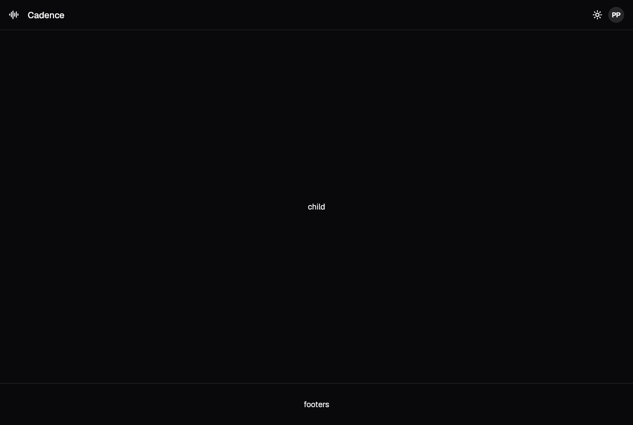
Three bands. The app bar and its divider are pinned at the top, the footer band
is pinned at the bottom, and everything between them is child. That is the
whole layout model, and the rest of this post is filling those slots in.
AppBar here also differs from Material’s. leading and trailing are lists
of widgets rather than a single widget and an actions array, and there is a
subtitle parameter for a second line under the title.
LucideIcons in that snippet is worth a note. The package bundles three icon
fonts, Lucide, Radix and Bootstrap, inside the dependency. Nothing to
configure, no asset declarations, no network fetch. They are tree-shaken at
build time like any Flutter icon font, and my release build cut LucideIcons.ttf
from 685KB down to 639KB because this app uses a lot of them.
5. The sidebar
Nav items, a divider, a playlist list. This is where the button family shows up.
On the web you would write <Button variant="ghost">. Here the variant is the
class name:
| Class | Roughly |
|---|---|
PrimaryButton | filled, your main action |
SecondaryButton | filled, muted surface |
OutlineButton | border only |
GhostButton | no border, background on hover |
DestructiveButton | filled, destructive color |
LinkButton | looks like a link |
TextButton | quieter still |
CardButton | a whole card that behaves as a button |
IconButton, TabButton | specialised |
Which means selected state in a nav list is not a boolean you pass, it is a different widget:
File: lib/widgets/sidebar.dart
class Sidebar extends StatelessWidget {
  const Sidebar({
    super.key,
    required this.selected,
    required this.onSelected,
  });

  final String selected;
  final ValueChanged<String> onSelected;

  static const _nav = <(String, IconData)>[
    ('Home', LucideIcons.house),
    ('Search', LucideIcons.search),
    ('Your Library', LucideIcons.libraryBig),
  ];

  @override
  Widget build(BuildContext context) {
    final theme = Theme.of(context);
    return Container(
      width: 240,
      padding: const EdgeInsets.symmetric(horizontal: 12, vertical: 16),
      decoration: BoxDecoration(
        border: Border(right: BorderSide(color: theme.colorScheme.border)),
      ),
      child: Column(
        crossAxisAlignment: CrossAxisAlignment.stretch,
        children: [
          for (final (label, icon) in _nav)
            Padding(
              padding: const EdgeInsets.only(bottom: 4),
              child: label == selected
                  ? SecondaryButton(
                      alignment: Alignment.centerLeft,
                      leading: Icon(icon),
                      onPressed: () => onSelected(label),
                      child: Text(label),
                    )
                  : GhostButton(
                      alignment: Alignment.centerLeft,
                      leading: Icon(icon),
                      onPressed: () => onSelected(label),
                      child: Text(label),
                    ),
            ),
          const SizedBox(height: 16),
          const Divider(),
          const SizedBox(height: 16),
          Padding(
            padding: const EdgeInsets.only(left: 12, bottom: 8),
            child: const Text('PLAYLISTS').muted().xSmall(),
          ),
          for (final name in playlists)
            GhostButton(
              alignment: Alignment.centerLeft,
              size: ButtonSize.small,
              onPressed: () {},
              child: Text(name),
            ),
          const Spacer(),
          GhostButton(
            alignment: Alignment.centerLeft,
            size: ButtonSize.small,
            leading: const Icon(LucideIcons.plus),
            onPressed: () {},
            child: const Text('New playlist'),
          ),
        ],
      ),
    );
  }
}
Two things in there earn their place.
leading: is how you put an icon before the label. Every button in the family
takes leading and trailing, so you are not wrapping children in a Row
yourself.
alignment: Alignment.centerLeft because buttons center their content by
default, and a nav list of centered labels looks wrong immediately.
The border color comes from theme.colorScheme.border rather than a hardcoded
grey. That is the token system doing its job, and it is why the sidebar edge
survives the theme switch later without a single change.
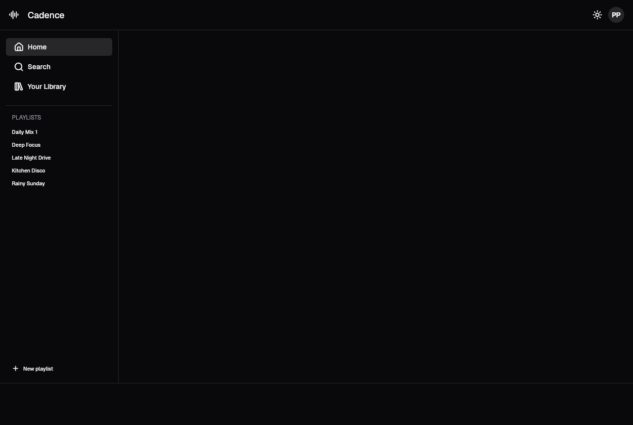
Home reads as selected because it is a SecondaryButton sitting among
GhostButtons. No isSelected flag anywhere.
Shadcn blocks are useful when you want to study how sidebars, navigation, cards, and forms are composed before rebuilding the same pattern with Flutter widgets.
Sizes come off ButtonSize and density off ButtonDensity. The playlist
entries use size: ButtonSize.small, and the theme toggle in the app bar uses
density: ButtonDensity.icon, which is how you get a square icon-only button
rather than a wide one with an icon in the middle.
6. The browse grid
Two titled rows of album tiles. This section is where the typography extensions become the thing you use constantly, so let me explain them properly.
Text styling is an extension on Widget
There is no TextTheme lookup and no style: parameter to fill in. You chain:
File: lib/widgets/browse.dart (these four lines are spread through the file)
Text('Good evening').h3()
Text('Recently played').h4()
Text(album.title).semiBold().small()
Text(album.artist).muted().xSmall()
That reads like Tailwind classes, which is clearly the intent. The full set
covers headings h1 through h4, p, lead, blockQuote, li,
inlineCode, sizes xSmall through x9Large, weights thin through black,
and colors like muted and primaryForeground.
Here is the mildly strange part. These are not methods. They are getters:
Inside the package: shadcn_flutter/lib/src/components/text/text.dart
extension TextExtension on Widget {
  /// Applies heading 3 style.
  TextModifier get h3 => WrappedText(
        style: (context, theme) => theme.typography.h3,
        child: this,
      );

  /// Applies muted foreground color.
  TextModifier get muted => WrappedText(
        style: (context, theme) => TextStyle(
          color: theme.colorScheme.mutedForeground,
        ),
        child: this,
      );
}
TextModifier is an abstract class that extends Widget and also defines a
call() method. So .h3 on its own is already a valid widget, and .h3()
invokes call() and returns a widget too. Both compile. Both work.
The parentheses are not decoration though, because call() takes every
argument you would normally put in a TextStyle:
Text('Now playing').muted(fontStyle: FontStyle.italic)I default to writing the parentheses because chains read more clearly with them and because you eventually want to pass something.
While we are here: .h2() carries a bottom border, exactly like the h2 in
shadcn/ui on the web. I used it for the “Good evening” greeting, and the rule
underneath looked like a stray divider sitting above the first shelf. Swapped
to .h3() and it was fine. Worth knowing before you spend a while wondering
where the line came from.
The tiles
CardButton is a card that behaves as a button, which is exactly what an album
tile is:
File: lib/widgets/browse.dart (the _AlbumTile widget)
SizedBox(
  width: 176,
  child: CardButton(
    onPressed: () => onPlay(album),
    child: Column(
      crossAxisAlignment: CrossAxisAlignment.start,
      children: [
        AlbumArt(album: album, size: 152),
        const SizedBox(height: 12),
        Text(album.title).semiBold().small(),
        const SizedBox(height: 2),
        Text(album.artist).muted().xSmall(),
      ],
    ),
  ),
)
One thing to save you a compile error: CardButton has no padding
parameter, even though Card does. I assumed it would and it does not. Use
density and size to adjust it, or wrap the child.
The artwork is a gradient rather than a network image, so the repo has no external dependency and these screenshots reproduce on any machine:
File: lib/widgets/album_art.dart
Container(
  width: size,
  height: size,
  decoration: BoxDecoration(
    borderRadius: BorderRadius.circular(theme.radiusMd),
    gradient: LinearGradient(
      begin: Alignment.topLeft,
      end: Alignment.bottomRight,
      colors: [album.from, album.to],
    ),
  ),
  child: Icon(LucideIcons.audioLines, size: size * 0.3),
)
theme.radiusMd rather than a hardcoded 12. That is what makes the artwork
corners follow the theme along with everything else, and it pays off in
section 8.
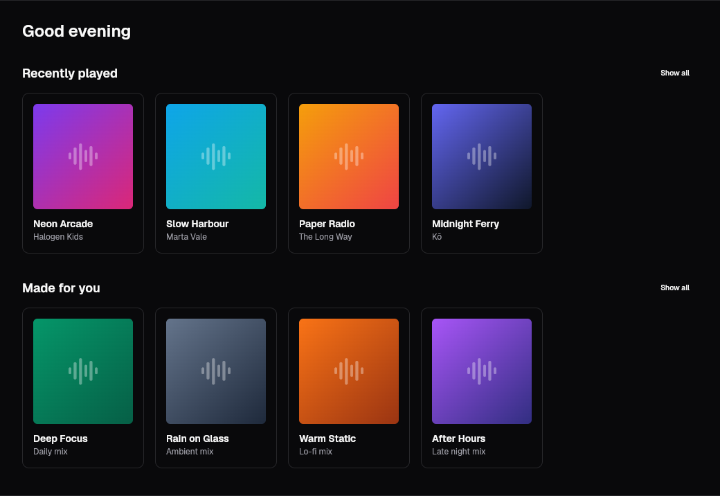
And the identical widget tree in light mode:
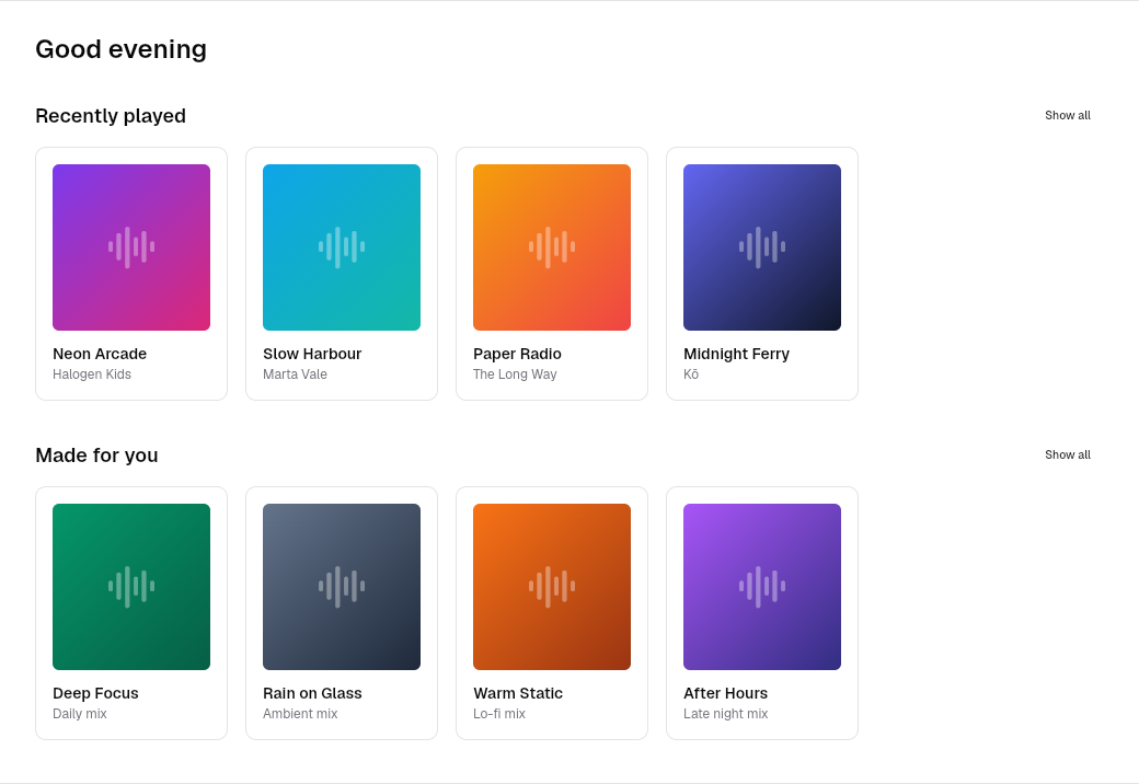
Those two are the same code. Nothing in browse.dart knows which theme is
active. The gradients are the only hardcoded colors in the file, and they are
album artwork, so they are meant to stay put.
Shadcn pages can provide the same kind of full-screen layout reference when you need to map a complete web experience into Flutter.
7. The now playing bar
The footer slot, which is why it stays pinned while the grid scrolls.
File: lib/cadence_page.dart
footers: [
  const Divider(),
  NowPlayingBar(album: _track),
],
The transport row is buttons you have already met. The interesting one is the
play button, because ButtonShape gets you a circle:
File: lib/widgets/now_playing.dart (inside _Transport)
PrimaryButton(
  shape: ButtonShape.circle,
  density: ButtonDensity.icon,
  onPressed: onToggle,
  child: Icon(playing ? LucideIcons.pause : LucideIcons.play),
)
The progress bar is where I hit the last API surprise. shadcn’s Slider does
not take a double:
File: lib/widgets/now_playing.dart (continued)
Slider(
  value: SliderValue.single(_position),
  onChanged: (value) => setState(() => _position = value.value),
)
SliderValue exists because the same widget handles range selection through
SliderValue.ranged(start, end). One type, two shapes. It costs you a wrapper
on the way in and a .value on the way out, and if you are porting Material
code it will not compile until you notice.
There is a matching gotcha on Checkbox, which takes a CheckboxState enum,
not a bool, so it can represent an indeterminate third state.

Icons get their own extension family, parallel to the text one:
File: lib/widgets/now_playing.dart (continued)
const Icon(LucideIcons.volume2).iconMutedForeground()The name is iconMutedForeground, not iconMuted. I guessed wrong first time.
The set is iconX4Small through iconX4Large for sizing, and
iconMutedForeground, iconPrimary, iconSecondary and friends for color.
8. Theming
This is the part that will feel familiar if you have themed shadcn on the web, because the vocabulary transferred intact.
The tokens are the same tokens
ColorScheme in shadcn_flutter has these fields:
background      foreground
card            cardForeground
popover         popoverForeground
primary         primaryForeground
secondary       secondaryForeground
muted           mutedForeground
accent          accentForeground
destructive
border    input    ring
chart1  chart2  chart3  chart4  chart5
If you have written a globals.css for shadcn/ui, that is the same list you
put in :root. Same names, same surface and foreground pairing convention,
same three unpaired values for border, input and ring, because nothing
sits on top of a border.
The difference is only that they are Dart fields rather than CSS custom
properties, so you read them with ColorScheme.of(context) instead of
var(--muted).
One deprecation to know about: destructiveForeground is marked
@Deprecated('Legacy color') with no replacement field. Contrast is derived
now, so scheme.destructive.getContrastColor() is what you want.
Five base schemes
ColorSchemes.lightZinc    ColorSchemes.darkZinc
ColorSchemes.lightSlate   ColorSchemes.darkSlate
ColorSchemes.lightStone   ColorSchemes.darkStone
ColorSchemes.lightGray    ColorSchemes.darkGray
ColorSchemes.lightNeutral ColorSchemes.darkNeutral
The same five base colors shadcn/ui offers. They are const, so you pay
nothing to reference them.
Light and dark
ShadcnApp already takes all three parameters, so a working theme switch is
whatever UI you want to hang off a setState:
File: lib/main.dart
ShadcnApp(
  theme: const ThemeData(colorScheme: ColorSchemes.lightZinc),
  darkTheme: const ThemeData(colorScheme: ColorSchemes.darkZinc),
  themeMode: _mode,
  home: CadencePage(
    mode: _mode,
    onModeChanged: (value) => setState(() => _mode = value),
  ),
)
File: lib/cadence_page.dart (the toggle in the AppBar)
GhostButton(
  density: ButtonDensity.icon,
  onPressed: () => onModeChanged(isDark ? ThemeMode.light : ThemeMode.dark),
  child: Icon(isDark ? LucideIcons.sun : LucideIcons.moon),
)
themeMode defaults to ThemeMode.system, so if you do nothing at all your app
already follows the OS.
There is no flash-on-load problem to solve here and no provider to install,
which is the one place this is genuinely less work than the web. There is also
no persistence: next-themes writes your choice to localStorage for free,
and here you would reach for shared_preferences and wire it yourself.
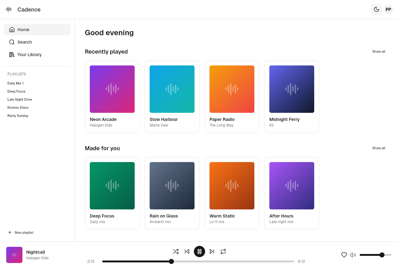
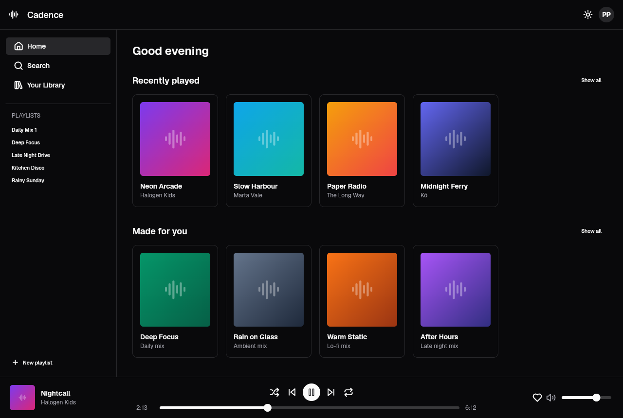
Same widget tree, byte for byte. The only thing that changed is which
ColorScheme is in scope.
ShadcnApp also has enableThemeAnimation, on by default, so the switch is a
transition rather than a jump cut.
The Shadcn Theme Generator is useful for exploring the
same semantic color relationships visually before you express them as a Dart
ColorScheme.
Accents, with recolor
This one has no equivalent on the web side. Any ColorScheme can be
re-tinted:
File: lib/main.dart
const Color? kAccent = Colors.violet;

ColorScheme _scheme(ColorScheme base) =>
    kAccent == null ? base : base.recolor(kAccent!);
recolor returns a copy with primary, primaryForeground and ring
replaced, and it derives the foreground with getContrastColor() so you cannot
accidentally end up with unreadable text on your new primary:
Inside the package: shadcn_flutter/lib/src/theme/color_scheme.dart
ColorScheme recolor(Color primary) {
  return copyWith(
    primary: () => primary,
    primaryForeground: () => primary.getContrastColor(),
    ring: () => primary,
  );
}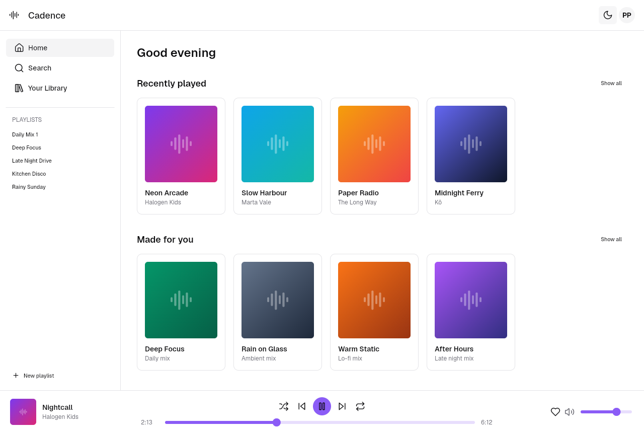
The play button, the progress bar and the volume slider all moved. Everything
else is untouched, because everything else was reading background, card,
muted and border, none of which recolor alters.
Colors there is shadcn’s palette, not Material’s. The full Tailwind range is
available, slate through rose, and each is a ColorShades implementing
Color, so Colors.violet works directly and Colors.violet.shade500 works
when you want a specific step.
radius is a multiplier
The trap in ThemeData. radius defaults to 0.5 and it is not a pixel
value:
Inside the package: shadcn_flutter/lib/src/theme/theme.dart
double get radiusXs  => radius * 4  * _densityRadiusScale;
double get radiusSm  => radius * 8  * _densityRadiusScale;
double get radiusMd  => radius * 12 * _densityRadiusScale;
double get radiusLg  => radius * 16 * _densityRadiusScale;
double get radiusXl  => radius * 20 * _densityRadiusScale;
double get radiusXxl => radius * 24 * _densityRadiusScale;
At the default 0.5, radiusMd is 6 logical pixels. Write radius: 12
expecting 12px corners and you get radiusMd of 144, which is not a rounded
corner, it is a circle.
The useful range is roughly 0 to 2:
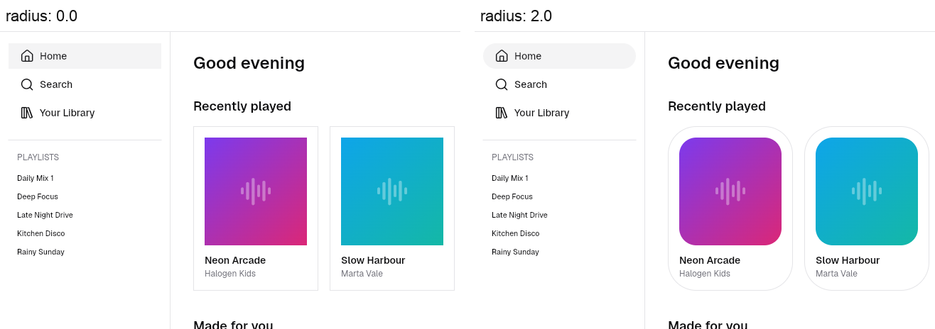
One number, and it moved the nav buttons, the cards, the album artwork and the
tile borders together. The artwork followed because of that theme.radiusMd
back in section 6 instead of a hardcoded value.
ThemeData has a few more knobs in the same spirit. scaling multiplies every
size and space in the app, density picks between compactDensity,
reducedDensity, defaultDensity and spaciousDensity, and surfaceOpacity
with surfaceBlur gets you frosted surfaces.
Typography
A Shadcn Figma resource can also help designers and Flutter developers agree on spacing, typography, and component states before the Dart implementation begins.
The default is Typography.geist(), and GeistSans and GeistMono ship inside
the package. No google_fonts, no network request on first paint, no asset
block in your pubspec.yaml. It is the same typeface shadcn/ui uses on the
web, which is a large part of why the two look related at a glance.
Where this leaves you
- There is no
addcommand. It is a package. You do not own the widget source, and you customise through the theme and constructor parameters rather than by editing files. - Delete the Material import. One import line per file. The package
re-exports
flutter/widgets.dartplusIcons, and keeping Material around gets you 13 ambiguous name errors including one onColumn. Scaffoldmeansheaders,footersandchild. NotappBarandbody. This is the rename that breaks pasted code.- Variants are class names.
GhostButton, notvariant="ghost". Selected state in a list is a different widget, not a flag. - Text styling chains off any widget.
.h3(),.muted(),.small(). They are getters returning a callable, so.h3and.h3()both work, and.h2()comes with a bottom border. - The color tokens are the ones you already know. Same names as the CSS
variables, reached through
ColorScheme.of(context). radiusis a multiplier, default0.5. Not pixels. Useful range 0 to 2.
The thing I did not expect going in is how little of my Flutter habit carried
over. It is not that the package is hard, it is that Scaffold, Colors,
ThemeData and Column all mean something slightly different now, and the
analyzer only tells you about it once, loudly, on the day you install.
Once that is behind you it is a pleasant thing to build with. The sidebar, the grid and the player bar in this post are about three hundred lines between them, and the theme switch that ends the post is three parameters and a button.
You can also browse shadcnstudio.com for more Shadcn examples and visual references while planning the Flutter version.
If you want the counterpart to this post on the web side, the token and
-foreground conventions in section 8 are the same ones I wrote about in
Implementing Dark Mode and Light Mode with Shadcn. Reading the two
together makes the shared vocabulary obvious.
Reference
- shadcn_flutter documentation. The widget catalog, and a live demo of the library.
- shadcn_flutter on pub.dev. Versions and install instructions.
- sunarya-thito/shadcn_flutter on GitHub. Source, issues, and the
.guidesfolder of generated API docs. - shadcn/ui theming. The web token list, for comparison.
- Flutter documentation. If section 1 was new to you.
Thanks for reading
The whole app is in this repo:
shadcnstudio/shadcn-flutter-app.
flutter pub get, then flutter run -d chrome, and you get the screenshots
above.
If something behaved differently for you, particularly on a newer
shadcn_flutter than 0.0.53, tell me. It is a pre-1.0 package and I would
rather correct this than leave it stale for whoever reads it next.