Variables
Variables store single, reusable values - such as a color, a number, or a string. They are great for handling theming, such as light and dark modes, and can be applied to other variables and styles. In the Shadcn Studio kit, variables are the foundation of the entire design system. The kit organizes all variables into four collections. Each collection serves a specific purpose in the design system.
Read Figma's guide to variablesVariable Collection
The kit organises all variables into four collections. Each collection serves a specific purpose in the design system.
Mode Variables
Refer to Customising Themes to change theme colours, opacity, font family, typography, shadows, and more.
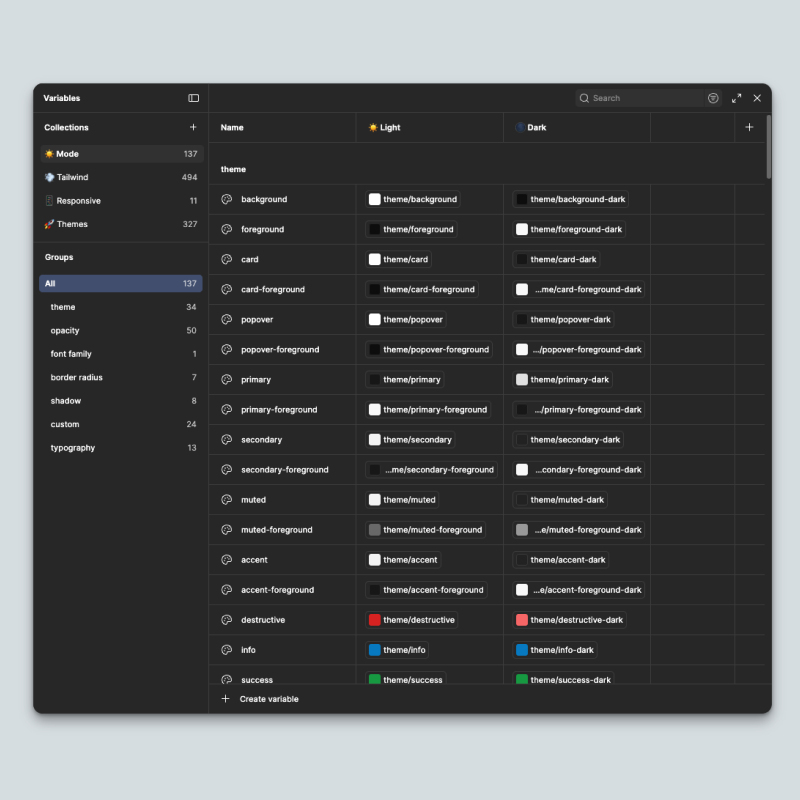
Mode Variables are the core color layer of the kit. They contain all the semantic color variables from shadcn/ui and are set up with two modes Light and Dark so every component automatically picks up the correct value based on which mode is active.
These are not raw color values. They are semantic Variables - named by their role in the UI rather than their actual color. This means if you change a theme, the entire system updates without manually touching individual components.
The Variable groups are organised into the following groups:
| Group | Description |
|---|---|
| Theme | Core semantic color variables - primary, secondary, destructive, and more. These are the main Variables applied across all components. |
| Opacity | Semi-transparent versions of core Variables. Used for overlays, hover states, and layered UI elements. |
| Font Family | The primary font family variable which is used across all text styles in the kit. |
| Border Radius | The base radius Variable and its derived scale - sm, md, lg, xl, and more. |
| Shadow | Color values used in shadow effects. Kept as variables so shadows respond correctly in both light and dark mode. |
| Custom | Custom colors are created to give more shadcn specific design. These are the colors that shadcn gave in new updates and can be used as an extension for your brand specific colors. |
| Typography | Font size variable which is used across the UI kit. |
Some of Color Variable Reference:
| Variable | Role |
|---|---|
background / foreground | Page background and primary text color |
primary / primary-foreground | Main action color and text on primary surfaces |
secondary / secondary-foreground | Supporting color and text on secondary surfaces |
muted / muted-foreground | Subtle backgrounds and de-emphasized text |
accent / accent-foreground | Hover states and highlighted elements |
destructive | Error and destructive action states |
border | Default border color |
input | Input field border color |
ring | Focus ring color |
card / card-foreground | Card surface and text |
popover / popover-foreground | Popover surface and text |
Tailwind Variables
shadcn/ui is built on top of Tailwind CSS, and the Shadcn Studio kit reflects that at the variable level. Tailwind Variables provide the base layer of the design system - the raw, foundational values that semantic variables are built on top of.
The collection is organised into the following groups:
| Group | Description |
|---|---|
| Colors | The full Tailwind color palette - base, slate, gray, and all other color scales. These are primitive values referenced by Mode and Theme Variables. |
| Breakpoints | Screen breakpoint values used by the Responsive Variables collection. |
| Spacing | The complete Tailwind spacing scale used for padding, margins, and gaps across all components. |
| Height | Fixed height values following the Tailwind scale. |
| Width | Fixed width values following the Tailwind scale. |
| Min Width | Minimum width constraint values. |
| Max Width | Maximum width constraint values used for layout containers and content areas. |
| Borders | Border width values used across components. |
| Typography | Font size, line height, and letter spacing values from the Tailwind type scale. |
| Opacity | Opacity scale values used for transparency across the system. |
Responsive Variables
Responsive Variables are designed specifically for block-level responsiveness. Instead of creating custom values for every screen size manually, these variables let you define a single value that adapts across breakpoints automatically.
They are especially useful when working with the pre-built blocks in the kit, where layouts need to behave correctly across desktop, tablet, and mobile without duplicating frames.
Themes Variables
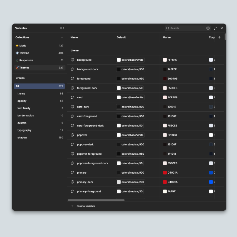
Theme Variables hold the design variables that define how each theme looks. Every pre-built theme in the kit is built using this collection, which makes it possible to switch themes by changing a variable mode rather than redesigning anything.
The collection is structured simply enough that you can create your own custom theme by adding a new mode column and mapping your values to the existing variables.
The collection is organised into the following groups:
| Group | Description |
|---|---|
| Theme | Core semantic color variables for each theme - background, foreground, card, popover, and others with their dark mode counterparts. |
| Opacity | Semi-transparent color values per theme, used for overlays and layered UI elements. |
| Font Family | Font family variables per theme - includes separate variables for sans, serif, and mono. |
| Border Radius | Base radius variable and its full scale per theme, controlling the overall shape feel of the design. |
| Custom | Additional color slots available for theme-specific extensions beyond the standard variable set. |
| Typography | Font size, weight, line height, and letter spacing variables per theme. |
| Shadow | Elevation and shadow values per theme - the largest group, covering all shadow levels across components. |
The kit comes with 7 pre-built themes including Default, Marvel, Ghibli Studio, Clean Slate, and more - each available in light and dark mode. We recommend using only 2–3 themes in your project and removing the rest to keep your file lightweight.