Components
What are Components?
A component is a reusable UI element - a button, a card, an input field. Create it once and reuse it across your designs. Any update to the component automatically reflects everywhere it's been used.
In Figma, a main component defines the properties of the component. An instance is a copy you can reuse in your designs. Instances are linked to the main component and receive any updates made to it.
Figma's Guide to componentAligned with shadcn/ui
Every component in Shadcn Studio ui kit maps directly to a shadcn/ui component - same design, same structure, same naming. If shadcn/ui ships a Button, Badge, or Card, the kit has it. On top of that, the kit includes additional variants that are used across blocks and templates. These extra variants follow the same design language - they're extensions, not deviations.
Using components variants
What Variants are Available
To give you a practical idea of how variants are structured, Every component has its own set of properties relevant to what it does.
here's what the Button component exposes in the right panel:
| Property | Values |
|---|---|
| Type | Default, Destructive, Outline, Secondary, Ghost, Link |
| Size | Default, Small, Large, Icon |
| State | Default, Hover, Focus, Disabled, Loading |
Switching Variants from the Right Panel
- Select any component instance on the canvas
- In the right panel, find the Properties section
- Use the dropdowns to switch between variant values - Style, Size, and so on
- Changes apply instantly to that instance only
How Boolean Properties Work
Boolean properties allow you to set true/false values to turn a specific property on or off. currently only available for layer visibility.
In the kit, boolean properties control optional elements inside a component - like showing or hiding an icon, badge, or spinner inside a Button. You'll see these as simple on/off toggles in the Properties section of the right panel. No layer digging required.
| Property | Values |
|---|---|
| Badge | On / Off |
| Icon | On / Off |
| Kbd | On / Off |
| Spinner | On / Off |
Editing Components
Overriding an Instance
You can customise any instance without touching the main component.
Using a Input component as an example:
Text: Double-click into the placeholder text layer inside the instance and type your content - for example changing "Enter your name" to "Enter your email". The change applies to this instance only.
Label: Toggle Show Top on from the right panel, then double-click the Label layer to update the text. Use Top Right label toggle to add a secondary label on the right side.
Icons: Toggle Left-icon or Right-icon on from the right panel. Select the icon layer that appears and use the instance swap dropdown to replace it with any icon from the kit's icon library.
Colors: Select a layer inside the instance and change its fill from the right panel. For colors tied to variables, switch the variable value rather than applying a raw color - this keeps the component responsive to theme and mode changes.
Using Slots for Customisation
Slots are flexible areas added to components that let you freely add and arrange content directly inside an instance without having to detach it, all while maintaining adherence to your design system. Figma Help Center
In Shadcn Studio, Slots let you drop content directly into components without detaching them - keeping the structure intact and update-friendly. This makes layout flexibility easy when combining components inside blocks and templates without breaking the system.
Swapping Instances
The instance swap property indicates which instances can be swapped. Dropdowns with a swap icon denote instances that you can swap.
Example - swapping an icon in a Button:
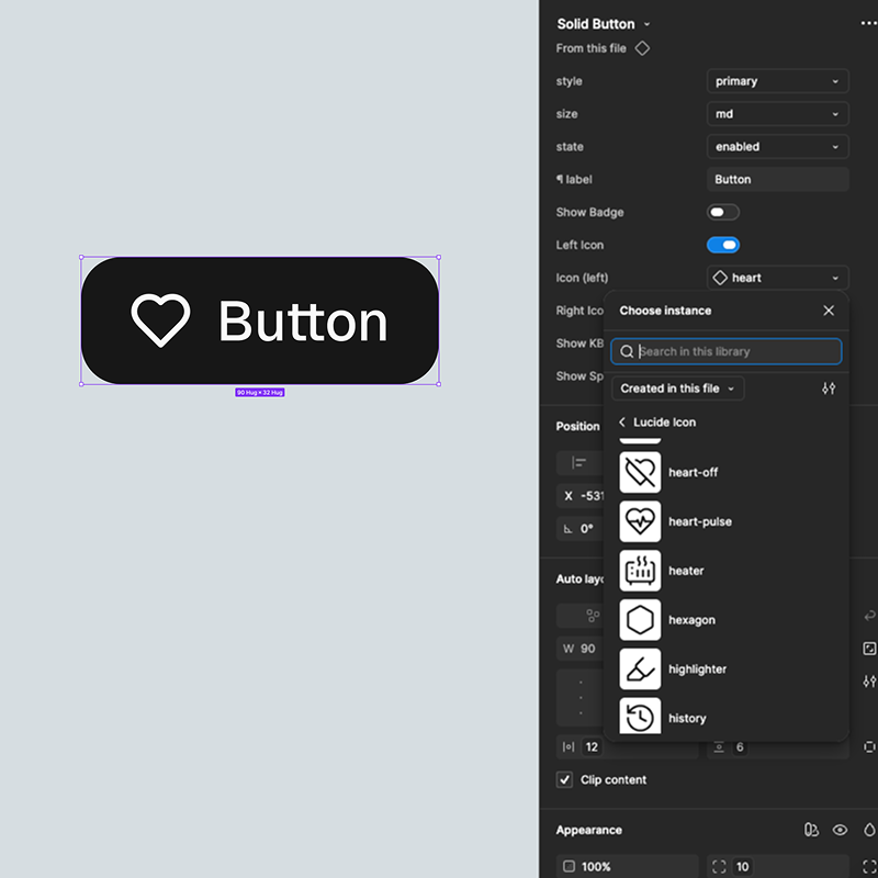
- Select the Button instance on the canvas
- In the right panel under Properties, find the icon swap dropdown
- Click it and browse the available icons from the Assets panel
- Select the icon you want - it replaces instantly
Creating a New Component
If you need a component that doesn't exist in the kit:
- Build your design as a frame on the canvas
- Select it and press Ctrl+Alt+K (Windows) or Cmd+Option+K (Mac) to create a component
- Name it clearly - use the slash convention (e.g.
Card/Product/Default) to keep it organised in the Assets panel - Add component properties from the right panel if you need variants or toggles
- Publish it to your library if you want it available across project files