Theming (Brand Customisation)
Customising for Your Brand
In Shadcn Studio UI Kit everything in the design system is driven by variables. Updating a variable updates every component, block, and template that references it - instantly and system-wide. No manual overrides, no hunting through individual layers.
Here's a quick reference of which collection to open for each type of customisation:
| Group | Description |
|---|---|
| Theme | Core semantic color variables for each theme - background, foreground, card, popover, and others with their dark mode counterparts. |
| Opacity | Semi-transparent color values per theme, used for overlays and layered UI elements. |
| Font Family | Font family variables per theme - includes separate variables for sans, serif, and mono. |
| Border Radius | Base radius variable and its full scale per theme, controlling the overall shape feel of the design. |
| Custom | Additional color slots available for theme-specific extensions beyond the standard variable set. |
| Typography | Font size, weight, line height, and letter spacing variables per theme. |
| Shadow | Elevation and shadow values per theme - the largest group, covering all shadow levels across components. |
Before changing any colors, familiarise yourself with the Mode Variables collection. It contains semantic color tokens and their purpose. Understanding which token does what will help you make the right replacements. Mode Variables documentation
Customising Themes
Every project has its own visual identity - different colors, different type choices, different feel. In Shadcn Studio figma kit you can apply your brand to the entire design system in one place, rather than updating individual properties and components one by one.
Changing Theme Colors
Theme colors are the semantic variables that define the overall look of your design - primary, background, foreground, and more.
- Open Edit → Variables and select the 🚀 Theme collection
- Open the Theme group
- Click the color swatch next to the variable you want to update
- Set your new color value - update both Light and Dark values independently
Changing Opacity Colors
Opacity colors are used for overlays, hover states, and layered UI elements where full opacity would be too heavy.
- Open Edit → Variables and select the 🚀 Theme collection
- Click the Opacity group
- Click the variable you want to update
- Adjust the color or opacity value as needed for both Light and Dark modes
Changing Font Family
The font family variable controls the typeface used across all text styles in the kit.
- Open Edit → Variables and select the 🚀 Theme collection
- Click the Font Family group
- Click the variable value and replace it with your chosen font name
- Make sure the font is available in your Figma file before updating
Changing this single variable updates every text style in the kit at once.
Changing Typography
Typography variables control font size, weight, line height, and letter spacing across the kit.
- Open Edit → Variables and select the 🚀 Theme collection
- Click the Typography group for font-specific variables
- For size scale adjustments, open Tailwind Variables and click the Typography group
- Update the values you need - start with the base size variable before adjusting individual scale steps
Changing Border Radius
Border radius controls the shape feel of the entire design system - from sharp and structured to soft and rounded.
- Open Edit → Variables and select the 🚀 Theme collection
- Click the Border Radius group
- Update the base radius variable first - all derived scale values (sm, md, lg, xl) are built on top of it
- Adjust individual scale values if finer control is needed
A small base value gives a sharp, minimal feel. A larger value gives a softer, more rounded appearance across all buttons, cards, and inputs.
Changing Custom Colors
Custom color slots are extension points for brand-specific colors that fall outside the standard shadcn/ui variable set - such as a status color or a secondary brand accent.
- Open Edit → Variables and select the 🚀 Theme collection
- Click the Custom group
- Click the variable you want to update and set your color value
- Add new variables to this group if your project needs additional custom colors
You can use this section as your extension for fulfilling extra color requirements.
Changing Shadows
Shadow variables define the color values behind all effect styles in the kit.
- Open Edit → Variables and select the 🚀 Theme collection
- Click the Shadow group
- Update the shadow color values for Light and Dark modes independently
- Adjust intensity by modifying offset, radius, opacity and color values as needed
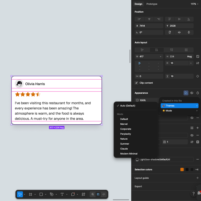
Importing New Theme
Adding a new theme means adding a new mode column to the Theme Variables collection.
- Open Edit → Variables and select the Themes collection
- Click + next to the existing mode columns to add a new mode
- Name it after your theme - for example
Brand - Map your brand values to each variable in the new column - start with
background,foreground,primary, andaccentfor the most visible impact - Extend to typography, radius, and shadow variables as needed
Once added, your theme appears as a selectable mode alongside the pre-built themes and can be applied at the page or frame level instantly.
If you'd prefer to use a ready-made theme from the Shadcn Studio platform, you can import it directly into your Figma file using the plugin - no manual setup needed. Import a theme using the plugin
Applying a Light and Dark Mode
Every component and variable in the kit supports both Light and Dark mode out of the box. Switching modes doesn't require any manual changes - it's controlled entirely through the variable mode selector in Figma.
- Select a frame or page on the canvas
- In the right panel, find the Mode variable collection
- Click the mode dropdown and select Light or Dark
Selecting a page applies the mode to everything on it. Selecting an individual frame lets you preview both modes side by side in the same file.
To learn more about how variable modes work and what each collection contains, refer to the Variables documentation.
Creating New Variables and Styles
Creating a New Variable
If you need a color that doesn't exist in the current variable set, add it to the Custom group in Theme Variables.
- Open Edit → Variables and select Theme Variables
- Expand the group where you want to add and click + Create variable
- Name it clearly - for example
custom/brand-background - Set the color value for other themes you created
- Now you can apply it in your design
Example - adding a brand warning color:
- Create a new variable named
custom/brand-warningin the Custom group - Set the Light mode value to your amber brand color
- Set the Dark mode value to a slightly adjusted version for Dark mode
- Select any label or badge component on the canvas
- In the right panel, click the fill color and switch to the variable picker
- Select
custom/brand-warningto apply it in the selected layer
Working with Styles
All styles in the kit are built on top of variables. This means they respond to variable changes automatically. When you update a font family variable, every text style built on it updates. When you change a shadow color variable, every effect style using it updates.
To learn more about styles, check this Figma article.
| Style | Description | Example |
|---|---|---|
| Text Styles | The complete Tailwind type scale from XS to 9XL, plus an Extra group for specific UI cases. Each style covers font family, size, weight, line height, and letter spacing - all backed by Tailwind and Theme Variables. | Base for body text, 4XL for section headings |
| Color Styles | Avatar color styles used across avatar components in the kit. | avatar-1, avatar-2, avatar-3 applied to Avatar components |
| Effect Styles | Shadow and blur effects covering rings, box shadows, and blur layers across light and dark mode. All backed by Shadow Color variables so they adapt correctly when switching modes. | card box-shadow on Card components, ring-shadow |
Adding a new text style
- Select a text layer and set your desired properties in the right panel
- Click the style icon under Text and select Create style
- Name it using the slash convention - for example
Extra/Display- to keep it organised - Click Create style to confirm
Applying new theme
- Select a frame or page on the canvas
- In the right panel, find the Themes variable collection
- Click the mode dropdown and select a theme name
- The entire frame or page updates instantly to reflect your theme