Tailwind UI vs Shadcn UI: Which One Should You Choose in 2026?
Choosing the right UI solution can significantly impact development speed, customization, maintainability, and the overall developer experience. Two of the most popular choices in the Tailwind CSS ecosystem today are Tailwind UI and Shadcn UI. While both are built around Tailwind CSS and help developers create beautiful interfaces, they serve very different purposes.
This guide provides a practical comparison of Tailwind UI vs Shadcn UI, covering their philosophy, customization, licensing, developer experience, and real-world use cases to help you decide which option is best suited for your next project.
Understanding Tailwind UI & Shadcn UI
Although Tailwind UI and Shadcn UI share the same design philosophy of utility-first styling with Tailwind CSS, they are fundamentally different products.
Tailwind UI is a premium collection of professionally designed UI components, templates, and application layouts created by the makers of Tailwind CSS. It focuses on helping developers build polished interfaces quickly using production-ready designs.
Shadcn UI, on the other hand, is an open-source collection of reusable React components built using Radix and Base UI primitives and Tailwind CSS. Instead of installing a traditional component library, developers copy components directly into their projects, giving them complete ownership and unlimited customization.
Both solutions are excellent for modern React and Next.js development, but choosing between them depends largely on your workflow, budget, and customization requirements.
What Is Tailwind UI?

Tailwind UI is a premium UI library developed by the creators of Tailwind CSS. It offers a growing collection of professionally designed components, complete application interfaces, marketing sections, authentication pages, dashboards, ecommerce layouts, and more.
Unlike traditional React component libraries, Tailwind UI primarily focuses on providing production-ready designs that developers can integrate into their projects with minimal effort.
What Does Tailwind UI Include?
Tailwind UI includes a wide range of professionally designed resources that help developers move from idea to production much faster.
Key Reasons Tailwind UI Is Chosen
- Professionally designed UI components
- Premium application templates
- Marketing website sections
- Authentication pages
- Ecommerce layouts
- Dashboard interfaces
- Official Tailwind CSS ecosystem product
- Regular updates from the Tailwind Labs team
Benefits
- High-quality production-ready designs
- Consistent visual language
- Saves design and development time
- Excellent documentation
- Optimized for Tailwind CSS workflows
Why Do Developers Use Tailwind UI?
Developers choose Tailwind UI because it eliminates much of the design work involved in building modern interfaces. Instead of creating layouts from scratch, teams can start with polished, production-ready components that follow Tailwind CSS best practices.
Since every component is professionally designed, Tailwind UI is particularly attractive to startups, agencies, and product teams that want a premium-looking interface without hiring a dedicated UI designer.
Common Use Cases
Tailwind UI is commonly used for:
- SaaS applications
- Admin dashboards
- Marketing websites
- Landing pages
- Ecommerce stores
- Authentication flows
- Startup MVPs
- Business websites
What Is Shadcn UI?
Shadcn UI is an open-source collection of reusable React components built using Radix and Base UI primitives and Tailwind CSS. Rather than shipping components through a traditional npm package, Shadcn UI allows developers to copy component source code directly into their projects, providing complete ownership and unlimited customization.
The ecosystem also includes Shadcn Templates, giving developers ready-to-use layouts and complete starting points for building modern React and Next.js applications faster.
What Makes Shadcn UI Different?
Unlike traditional component libraries, Shadcn UI does not install components from an npm package. Instead, every component is generated directly into your project, giving you complete ownership of the source code. This approach makes it easier to customize components, extend functionality, and maintain a consistent design system without relying on external library updates.
By combining Tailwind CSS for styling and Radix and Base UI for accessibility, Shadcn UI offers production-ready components that feel native to your application while remaining highly flexible for long-term development. Developers can also use Shadcn Blocks to build larger sections and complete interface layouts without creating every part from scratch.
Key Reasons Shadcn UI Is Chosen
- Open-source component collection
- Full source code ownership
- Built on Radix and Base UI primitives
- Tailwind CSS-first workflow
- Highly customizable architecture
- Production-ready components
- Strong React & Next.js ecosystem
- Active open-source community
Benefits
- Unlimited customization
- No vendor lock-in
- Components become part of your project
- Excellent accessibility
- Easy long-term maintenance
- Modern design patterns
Why Do Developers Use Shadcn UI?
Developers choose Shadcn UI because it provides a balance between production-ready components and complete flexibility. Instead of relying on a third-party package for every UI element, developers own every component inside their application, making customization, maintenance, and scaling much easier over time.
Since the components are built using Tailwind CSS and Radix and Base UI, developers also benefit from accessible interactions while keeping full control over styling and behavior.
Common Use Cases
Shadcn UI is commonly used for:
- SaaS applications
- Admin dashboards
- AI applications
- Internal tools
- Design systems
- Startup products
- Modern React applications
- Next.js projects
Core Difference Between Tailwind UI vs Shadcn UI
Although Tailwind UI and Shadcn UI are both part of the Tailwind CSS ecosystem, they solve different problems for developers.
Tailwind UI focuses on providing premium, professionally designed layouts, templates, and interface sections that accelerate UI development through ready-made designs.
Shadcn UI focuses on reusable React components that developers completely own, allowing unlimited customization while maintaining accessibility and modern development practices.
The primary differences come down to product philosophy, component ownership, licensing, customization, and long-term flexibility.
Tailwind UI vs Shadcn UI: Philosophy
Tailwind UI:
- Premium commercial product
- Design-first approach
- Ready-made application layouts
- Professionally crafted UI sections
Shadcn UI:
- Open-source ecosystem
- Component-first approach
- Full source code ownership
- Built for customization
In short:
- Tailwind UI → Premium UI templates & layouts
- Shadcn UI → Open-source component system
Tailwind UI vs Shadcn UI: Components vs Templates
Tailwind UI focuses heavily on complete UI sections and application templates. Rather than providing only individual components, it includes complete page layouts that developers can quickly adapt for their projects.
Shadcn UI focuses primarily on reusable components that can be combined to build entirely custom interfaces. Developers assemble applications from smaller building blocks instead of starting with complete templates.
Tailwind UI:
- Complete page sections
- Marketing layouts
- Dashboard templates
- Ecommerce templates
- Authentication pages
Shadcn UI:
- Reusable UI components
- Flexible building blocks
- Modular architecture
- Component composition
- Custom interface creation
Tailwind UI vs Shadcn UI: Styling Workflow
Tailwind UI works best with:
- Tailwind CSS
- Existing design patterns
- Pre-built layouts
- Utility-first styling
Shadcn UI works best with:
- Tailwind CSS
- Custom design systems
- Utility-first workflows
- Component-level customization
Tailwind UI vs Shadcn UI: Customization
Tailwind UI:
- Easy visual customization
- Modify existing templates
- Component editing supported
- Consistent design language
Shadcn UI:
- Unlimited customization
- Complete source code ownership
- Direct component editing
- No architectural limitations
Tailwind UI vs Shadcn UI: Code Ownership
Tailwind UI:
- Purchased source code
- Code lives inside your project
- Commercial license
- Premium updates
Shadcn UI:
- Open-source components
- Full ownership
- Community driven
- No licensing restrictions
Tailwind UI vs Shadcn UI: Licensing & Pricing
Tailwind UI requires a one-time commercial purchase to access its growing collection of templates and components. Purchasing a license gives developers access to future updates under the terms of the Tailwind UI license.
Shadcn UI is completely free and open source. Developers can use, modify, and extend the components without paying licensing fees, making it attractive for both personal projects and commercial applications.
Tailwind UI vs Shadcn UI: Accessibility
Tailwind UI:
- Accessibility considered throughout designs
- Semantic HTML
- Production-ready layouts
- Good usability practices
Shadcn UI:
- Powered by Radix and Base UI primitives
- Keyboard navigation included
- Accessible interactions
- ARIA support built in
Tailwind UI vs Shadcn UI: Framework Support
Tailwind UI:
- HTML
- React
- Vue
Shadcn UI:
- Next.js
- Vite
- TanStack Start
- Laravel
- React Router
- Astro
Tailwind UI vs Shadcn UI: Developer Experience
Tailwind UI provides a polished developer experience for teams that want professionally designed interfaces with minimal design effort.
Shadcn UI offers a more flexible workflow by allowing developers to own, customize, and extend every component without depending on external packages.
Tailwind UI vs Shadcn UI: Long-Term Maintenance
Tailwind UI projects benefit from consistent design quality and official updates from Tailwind Labs.
Shadcn UI projects benefit from complete ownership, making long-term maintenance easier because components evolve alongside your application rather than depending on external library updates.
Tailwind UI vs Shadcn UI Comparison Table
| Feature | Tailwind UI | Shadcn UI |
|---|---|---|
| Product Type | Premium UI Kit | Open-source Component Library |
| Pricing | Paid | Free |
| Components | Templates & Components | Reusable Components |
| Code Ownership | Included after purchase | Full Ownership |
| Styling | Tailwind CSS | Tailwind CSS |
| Accessibility | Production-ready | Powered by Radix and Base UI |
| Customization | High | Very High |
| Framework Support | HTML, React, Vue | React Ecosystem |
| Best For | Premium UI & Templates | Custom Applications |
When Should You Choose Tailwind UI?
Choose Tailwind UI if:
- You want professionally designed templates
- Design speed is your highest priority
- You prefer complete page layouts
- Your team wants polished interfaces quickly
- A commercial license fits your budget
When Should You Choose Shadcn UI?
Choose Shadcn UI if:
-
You want complete code ownership
-
You’re building custom React applications
-
Tailwind CSS is already part of your workflow
-
Long-term customization is important
-
You prefer open-source tools
Since Shadcn UI has grown into a much larger ecosystem beyond its core components, it’s worth highlighting a related tool - shadcn/studio.
Special Recommendation: shadcn/studio
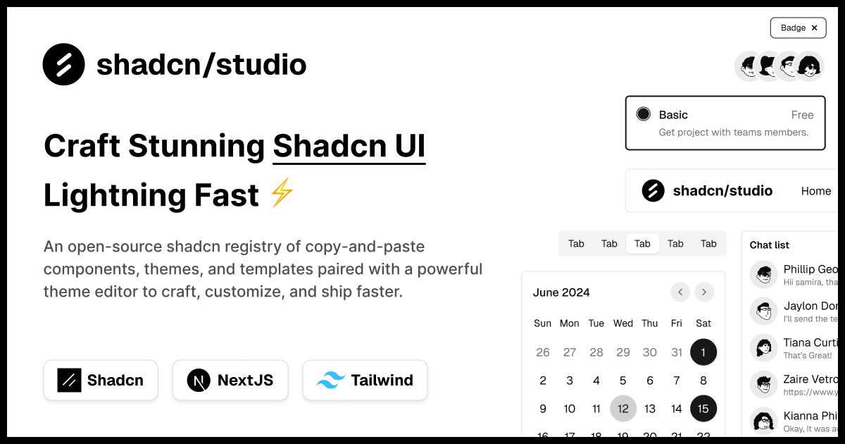
This isn’t a traditional component library or a replacement for Shadcn. Instead, it’s a unique collection that offers customizable variants of components, blocks, and templates. Preview, customize, and copy-paste them into your apps with ease.
Building on the solid foundation of the Shadcn components & blocks, we’ve enhanced it with custom-designed components & blocks to give you a head start. This allows you to craft, customize, and ship your projects faster and more efficiently.
Features:
- Open-source: Dive into a growing, community-driven collection of copy-and-paste shadcn ui components, Shadcn blocks, and templates.
- Component & Blocks variants: Access a diverse collection of customizable shadcn blocks and component variants to quickly build and style your UI with ease.
- Animated variants with Motion: Add smooth, modern animations to your components, enhancing user experiences with minimal effort.
- Landing pages & Dashboards: Explore 20+ premium & free Shadcn templates for dashboards, landing pages & more. Fully customizable & easy to use.
- shadcn/ui for Figma: Speed up your workflow with Shadcn Figma UI components, blocks & templates - a full design library inspired by shadcn/ui.
- Powerful theme generator: Customize your UI instantly with Shadcn Theme Generator. Preview changes in real time and create consistent, on-brand designs faster.
- shadcn/studio MCP: Integrate shadcn/studio MCP Server directly into your favorite IDE and craft stunning shadcn/ui Components, Blocks, and Pages inspired by shadcn/studio.
- Shadcn Figma To Code Plugin: Convert your Figma designs into production-ready code instantly with the Shadcn Figma Plugin.
Code Example: Tailwind UI vs Shadcn UI
One of the biggest differences between Tailwind UI and Shadcn UI becomes clear when looking at how UI is integrated into a project.
Tailwind UI provides complete UI sections and application layouts that you copy into your project and customize as needed. Shadcn UI provides reusable React components that become part of your application’s component library.
Tailwind UI Example
A typical Tailwind UI component is a fully designed section with styling already applied.
export default function LoginForm() {
  return (
    <div className="flex min-h-full flex-col justify-center px-6 py-12 lg:px-8">
      <div className="sm:mx-auto sm:w-full sm:max-w-sm">
        <h2 className="text-center text-2xl font-bold tracking-tight text-gray-900">
          Sign in to your account
        </h2>
      </div>

      <form className="mt-10 space-y-6">
        <input
          type="email"
          placeholder="Email"
          className="block w-full rounded-md border-0 px-3 py-2 text-gray-900 ring-1 ring-gray-300 focus:ring-2"
        />

        <input
          type="password"
          placeholder="Password"
          className="block w-full rounded-md border-0 px-3 py-2 text-gray-900 ring-1 ring-gray-300 focus:ring-2"
        />

        <button className="w-full rounded-md bg-indigo-600 px-3 py-2 text-white hover:bg-indigo-500">
          Sign In
        </button>
      </form>
    </div>
  );
}
What this shows:
- Complete production-ready layout
- Styling already included
- Minimal setup required
- Easy to copy into existing projects
- Ideal for quickly building polished interfaces
Shadcn UI Example
Shadcn UI encourages composing applications from reusable components that live inside your project.
import { Button } from "@/components/ui/button";
import { Card, CardContent, CardHeader, CardTitle } from "@/components/ui/card";
import { Input } from "@/components/ui/input";
import { Label } from "@/components/ui/label";

export function LoginForm() {
  return (
    <Card className="mx-auto w-full max-w-sm">
      <CardHeader>
        <CardTitle>Sign in</CardTitle>
      </CardHeader>

      <CardContent className="space-y-4">
        <div className="space-y-2">
          <Label htmlFor="email">Email</Label>
          <Input id="email" type="email" />
        </div>

        <div className="space-y-2">
          <Label htmlFor="password">Password</Label>
          <Input id="password" type="password" />
        </div>

        <Button className="w-full">Sign In</Button>
      </CardContent>
    </Card>
  );
}
What this shows:
- Built from reusable components
- Components are owned by your project
- Easier long-term customization
- Cleaner and more maintainable APIs
- Better suited for scalable design systems
Another Practical Difference
Tailwind UI often encourages editing utility classes directly inside the copied markup.
<button className="rounded-lg bg-indigo-600 px-4 py-2 text-white hover:bg-indigo-500">
  Save Changes
</button>
With Shadcn UI, customization usually happens by extending your own reusable component.
import { Button } from "@/components/ui/button";

<Button variant="secondary" size="lg">
  Save Changes
</Button>;
What this demonstrates:
- Tailwind UI prioritizes complete, ready-made UI sections.
- Shadcn UI prioritizes reusable components and consistent APIs.
- Both use Tailwind CSS, but the development workflow is fundamentally different.
Conclusion
Tailwind UI and Shadcn UI are both excellent additions to the Tailwind CSS ecosystem, but they target different development workflows.
Tailwind UI focuses on delivering premium, professionally designed templates and interface sections that help teams ship polished products faster with minimal design effort.
Shadcn UI focuses on providing reusable, open-source React components that developers fully own and customize. Its component-first approach, combined with Tailwind CSS and Radix and Base UI, makes it an excellent choice for teams building highly customized applications.
Ultimately, the right choice depends on your priorities. If you value premium templates and ready-made layouts, Tailwind UI is an excellent investment. If you prioritize flexibility, code ownership, and long-term customization, Shadcn UI is likely the better fit.
Many development teams even use both together, leveraging Tailwind UI for inspiration or layouts while building interactive experiences with Shadcn UI components.