Component systems are where most Vue projects quietly go wrong. Not on day one — on month four, when you need to answer questions like:
- Consistency — does every button in the app use the same spacing scale?
- Accessibility — does your custom dropdown handle arrow keys, focus traps, and
aria-expanded? - Customisation — can you restyle a component without fighting CSS specificity?
- Ownership — when the library ships a breaking change, whose problem is it?
- Speed — how long from “we need a date picker” to a date picker in production?
The two obvious answers both cost you something. Install a full component library and you get speed but inherit someone else’s design opinions. Build from scratch and you get control but spend two weeks implementing keyboard navigation that already exists in a hundred other codebases.
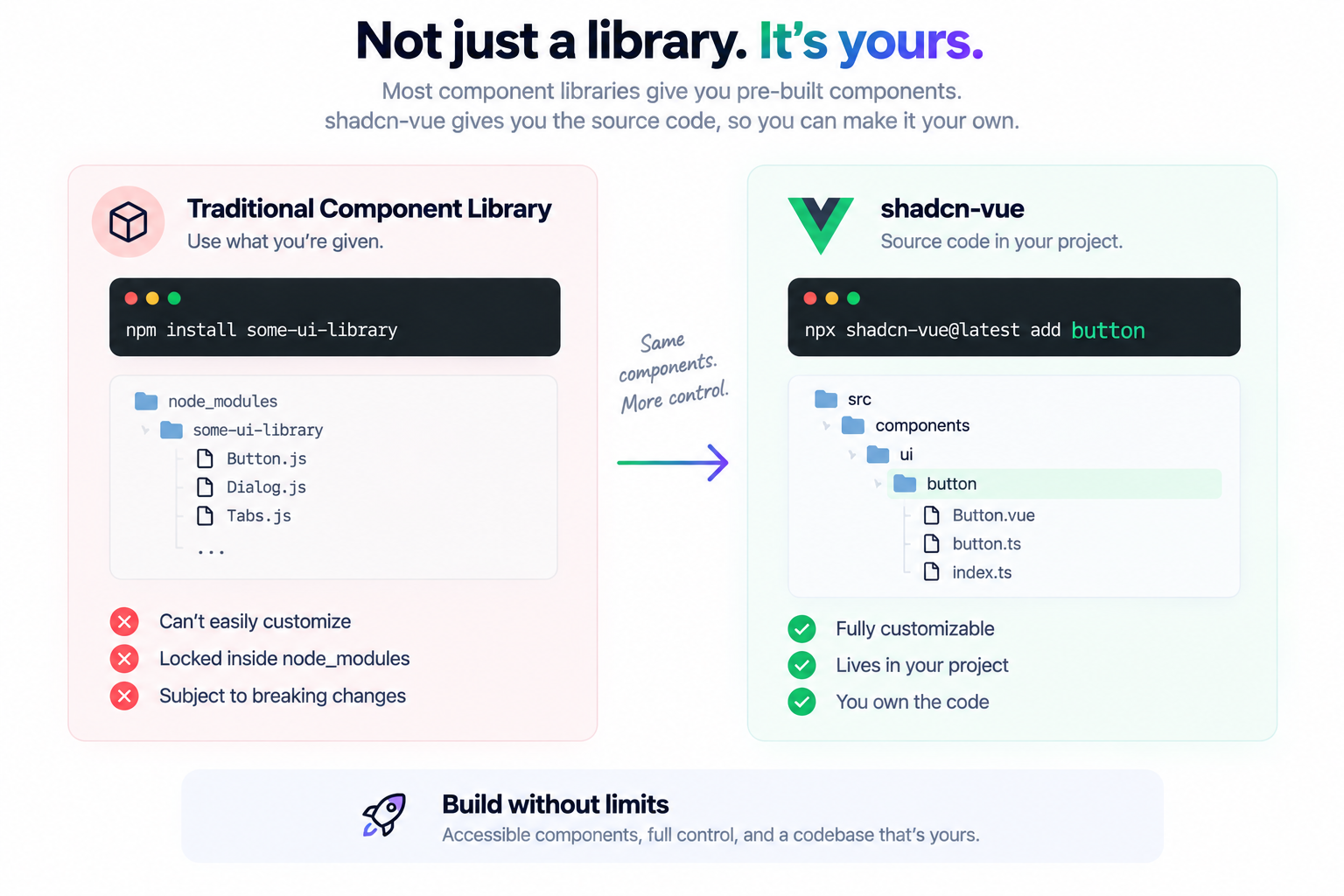
shadcn-vue takes a third route: the CLI copies component source code into your project, so you get a working, accessible starting point that you fully own from the moment it lands.
That ownership model also makes it straightforward to adapt ideas from shadcn/studio. You can inspect production-ready patterns there, then recreate or tailor them for Vue instead of starting every interface from an empty canvas.
Note: This guide uses Tailwind CSS v4 and the current shadcn-vue CLI. If you’re following an older tutorial with
postcss.config.jsor a generatedtailwind.config.js, that setup is out of date — you don’t need either anymore.
What You’ll Have By The End
- A Vue 3 + Shadcn Vue project with Tailwind v4 wired up correctly
- Working
@/path aliases acrosstsconfig,tsconfig.app.json, and Vite - A configured
components.jsonand thecnutility - A practical grip on the CLI commands you’ll use for the rest of the project
Once that foundation is working, resources such as Shadcn components, Shadcn blocks, Shadcn pages, and Shadcn templates can help you plan the larger screens and component combinations your Vue app needs.
Prerequisites
Node 20 or newer and a package manager you like. I’ll use npm throughout — substitute pnpm, yarn, or bun freely.
I’m using the TypeScript template. JavaScript works too, but you’ll need a jsconfig.json in place before the CLI will run without complaining.
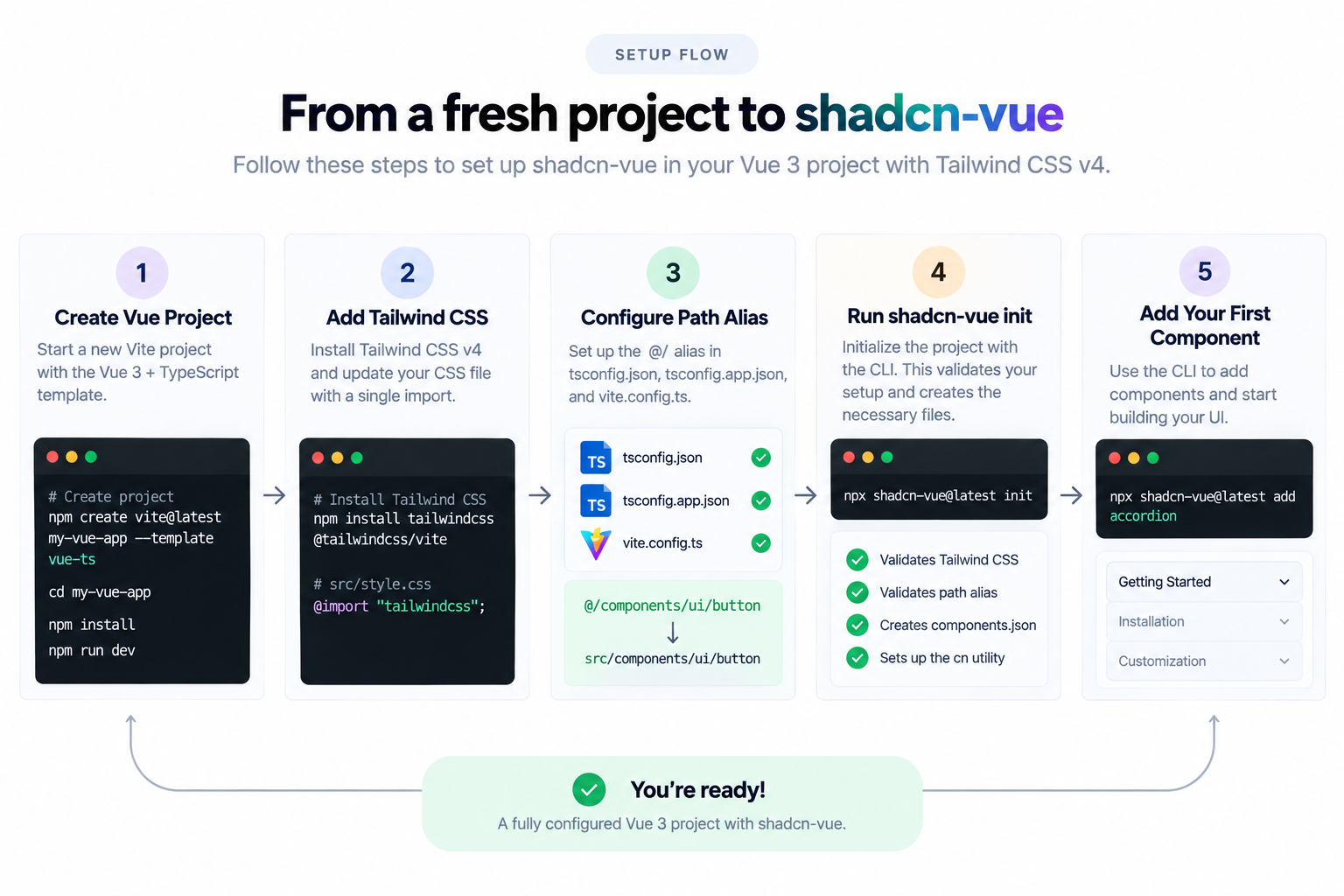
Step 1: Create the Vue project
npm create vite@latest my-vue-app --template vue-ts
cd my-vue-app
npm install
npm run dev
Open the dev server and confirm the default Vite counter page renders. Five seconds now saves you from debugging two problems at once later.
Step 2: Add Tailwind CSS
npm install tailwindcss @tailwindcss/viteNow open src/style.css, delete everything in it, and replace it with one line:
@import "tailwindcss";Everything. Vite’s starter CSS ships with dark-mode defaults and body styles that will fight your theme later. There’s also an immediate reason: leave the old contents in place and shadcn-vue init fails its validation step with a message that isn’t obvious the first time you see it.
Step 3: Set up the @ path alias
shadcn-vue writes imports like @/components/ui/accordion and @/lib/utils. Without the alias, every component you add breaks on import.
Vite splits TypeScript config across three files now, and two of them need editing.
tsconfig.json:
{
  "files": [],
  "references": [
    { "path": "./tsconfig.app.json" },
    { "path": "./tsconfig.node.json" }
  ],
  "compilerOptions": {
    "baseUrl": ".",
    "paths": {
      "@/*": ["./src/*"]
    }
  }
}tsconfig.app.json:
{
  "compilerOptions": {
    // ...existing options
    "baseUrl": ".",
    "paths": {
      "@/*": ["./src/*"]
    }
  }
}
Yes, it’s duplicated, and yes that feels wrong. It’s how the split config works: the root file is what the CLI validates, the app file is what your editor reads for IntelliSense. Skip either one and you get a confusing half-broken state.
Step 4: Update the Vite config
TypeScript now understands @. Vite still doesn’t. Install the Node types so you can use path in the config:
npm install -D @types/nodeThen vite.config.ts:
import path from "node:path";
import { defineConfig } from "vite";
import tailwindcss from "@tailwindcss/vite";
import vue from "@vitejs/plugin-vue";

export default defineConfig({
  plugins: [vue(), tailwindcss()],
  resolve: {
    alias: {
      "@": path.resolve(__dirname, "./src"),
    },
  },
});
Two things are happening. The tailwindcss() plugin replaces the entire PostCSS-and-autoprefixer arrangement from the v3 era. And path.resolve(__dirname, './src') makes the @ alias resolve at build time, not just in your editor.
Step 5: Run init and answer the prompts
npx shadcn-vue@latest initThe CLI runs preflight checks first, then asks a few questions:
✔ Preflight checks.
✔ Verifying framework. Found Vite.
✔ Validating Tailwind CSS config. Found v4.
✔ Validating import alias.
✔ Which component library would you like to use? › Reka UI
✔ Which icon library would you like to use? › Lucide
✔ Which font would you like to use? › Inter
✔ Which color would you like to use as base color? › Neutral
✔ Writing components.json.
✔ Checking registry.
Those first four lines are the ones to watch. If it says Found v4, your Tailwind setup is correct. If Validating import alias passes, Step 3 worked. When people report that init “just failed,” it’s almost always one of these two lines going red.
Which component library would you like to use?

Answer: Reka UI
Reka UI is the unstyled primitive layer that sits underneath every shadcn-vue component — it’s what handles focus management, keyboard interaction, and ARIA attributes. If you knew this project as Radix Vue, it’s the same library under a new name. Take the default.
Which icon library would you like to use?

Answer: Lucide
Lucide is the default and it’s what the docs examples use, so following along is easiest if you pick it. Tabler, Hugeicons, Phosphor, and Remixicon are also supported if your design already leans on one of them.
Which font would you like to use?

Answer: Inter
Inter, Figtree, JetBrains Mono, Geist, and Geist Mono are the built-in choices. Inter is the neutral, safe pick and pairs well with the default styling. This is just the starting value written into your CSS — swapping in a brand font afterwards is a one-line change, so don’t overthink it.
Which color would you like to use as base color?

Answer: Neutral
Neutral, Gray, Zinc, Stone, and Slate are the options, and they differ mainly in how warm or cool the greys read. Neutral is the most, well, neutral. Every value here is written out as a CSS variable, so changing your mind later means editing CSS rather than re-running anything.
When it finishes you’ll have components.json at the project root, a src/lib/utils.ts containing the cn class-merging helper, and a block of theme variables added to your stylesheet.
Open that stylesheet and read the variables — --background, --primary, --border, --ring, and the rest. That block is your design system.
Step 6: Add your first component
npx shadcn-vue@latest add accordionNow look at src/components/ui/accordion/. There they are: Accordion.vue, AccordionItem.vue, AccordionTrigger.vue, AccordionContent.vue, and an index.ts re-exporting them. Real files, in your repo, in your git history.
The CLI also installed whatever peer dependencies the component needs — Reka UI in this case — without you having to look any of it up.
The official registry is the starting point, but it does not have to be the end of your design exploration. Browse the Shadcn components collection when you want to compare practical component variants before adapting the same pattern inside your Vue project.
Step 7: Build a real FAQ accordion
Replace src/App.vue:
<script setup lang="ts">
import {
  Accordion,
  AccordionContent,
  AccordionItem,
  AccordionTrigger,
} from '@/components/ui/accordion'

const faqs = [
  {
    value: 'item-1',
    title: 'What is this built on top of?',
    content:
      'Reka UI handles behaviour and accessibility. Tailwind CSS handles the styling.',
  },
  {
    value: 'item-2',
    title: 'Is it accessible?',
    content:
      'Yes. The components follow WAI-ARIA design patterns, including full keyboard navigation.',
  },
  {
    value: 'item-3',
    title: 'Do I own the code?',
    content:
      'You do. The CLI copies source into your project, so you can restyle or rewrite any of it.',
  },
]
</script>

<template>
  <main class="flex min-h-svh w-full justify-center p-6">
    <Accordion
      type="single"
      collapsible
      default-value="item-1"
      class="w-full max-w-xl"
    >
      <AccordionItem v-for="faq in faqs" :key="faq.value" :value="faq.value">
        <AccordionTrigger>{{ faq.title }}</AccordionTrigger>
        <AccordionContent>{{ faq.content }}</AccordionContent>
      </AccordionItem>
    </Accordion>
  </main>
</template>
Three props are doing the work on <Accordion>:
type="single"opens one panel at a time. Switch to"multiple"to let readers open several.collapsibleallows the open panel to be closed again. Leave it off and one panel always stays open.default-valuedecides which panel is expanded on load.
Refresh the browser. Clicking a heading closes the previous panel and opens the new one, with a height animation that actually works — which anyone who has hand-rolled an accordion knows is the genuinely annoying part.
Then try it without the mouse. Tab to a trigger, press Enter, use the arrow keys to move between headings. All of that arrived for free, and it’s the strongest single argument for using shadcn vue over rolling your own.
An accordion is useful by itself, but real products need composed sections. The Shadcn blocks library is a useful reference for seeing how primitives can become complete hero sections, pricing layouts, authentication flows, dashboards, and other reusable product UI.
Making the Component Yours
Here’s where the approach pays off.
Say the chevron bothers you, or the borders read too heavy, or your design system wants larger trigger text. Open src/components/ui/accordion/AccordionTrigger.vue and change it. No wrapper component, no specificity war, no waiting on a maintainer to expose a prop.
That’s the mental shift: these aren’t library components you configure from outside. They’re your components, delivered with sensible defaults so you don’t start from an empty file.
The same principle applies at a larger scale. Shadcn pages show complete page compositions you can study section by section, while Shadcn templates provide broader application structures when you need a starting point for a dashboard, landing page, or SaaS product.
Working With the CLI
init and add get all the attention, but the CLI does considerably more than scaffold. These are the commands and methods worth knowing if working with shadcn.
add — the one you’ll run daily
npx shadcn-vue@latest add button card dialogMultiple components in a single call. Two flags are worth remembering:
# Overwrite existing files — how you pull upstream fixes (commit first)
npx shadcn-vue@latest add button --overwrite

# Drop the component somewhere other than the default path
npx shadcn-vue@latest add button --path ./src/shared/ui

# Install every available component at once
npx shadcn-vue@latest add --all
# or
npx shadcn-vue@latest add -a
add also accepts more than plain component names — registry URLs, namespaced registries, and public GitHub repos all work, which is how teams distribute internal design systems without publishing a package. The CLI docs cover the full syntax.
If you are deciding what belongs in that internal system, shadcn/studio offers a broad reference library of individual components and larger compositions. Use it to identify the patterns you need, then keep the Vue implementation aligned with your own tokens and conventions.
view — inspect before you install
npx shadcn-vue@latest view button card dialogShows you the registry item — files, dependencies, what it will write — without touching your project. Worth a habit when you’re pulling from a third-party registry you haven’t audited.
search — find what exists
npx shadcn-vue@latest search @shadcn-vue -q "button"Search across one or several registries. list is an alias, and --limit / --offset let you page through results. Faster than tabbing to the docs site when you can half-remember a component name.
docs — API references in the terminal
npx shadcn-vue@latest docs accordionPulls docs, API references, and usage examples for a component. Add --json if you’re piping it somewhere — this is also what makes the CLI genuinely useful alongside an AI coding assistant, since it gives real prop names instead of plausible-looking invented ones.
info — debug your config
npx shadcn-vue@latest infoPrints what the CLI thinks about your project: framework, Tailwind version, resolved aliases, config paths. This is the first thing to run when add starts writing files somewhere unexpected, or when a teammate’s setup behaves differently to yours.
migrate — switch icon libraries or add RTL
npx shadcn-vue@latest migrate --list
npx shadcn-vue@latest migrate icons
npx shadcn-vue@latest migrate rtl
The icons migration rewrites your installed components to a different icon library — genuinely useful when a design decision changes six months in and you don’t fancy editing forty files by hand.
The rtl migration is the more impressive one. It flips components.json to rtl: true, converts physical CSS properties to logical ones (ml-4 becomes ms-4, text-left becomes text-start), and adds rtl: variants where they’re needed. You can scope it to a path or glob:
npx shadcn-vue@latest migrate rtl "src/components/ui/**"apply and build
apply drops a preset onto an existing project, which changes the visual style across the board:
npx shadcn-vue@latest apply --preset novabuild is for the other direction — publishing your own registry. It reads a registry.json and generates the JSON files that other projects can add from:
npx shadcn-vue@latest build --output ./public/registryIf your company has a shared component set, this is how you serve it to every internal app without npm publishing.
CLI quick reference
| Command | What it does |
|---|---|
init | Sets up components.json, the cn util, and CSS variables |
add | Copies component source and installs dependencies |
view | Previews a registry item without installing it |
search / list | Searches registries for available items |
docs | Prints docs and API references for a component |
info | Reports what the CLI detected about your project |
migrate | Runs the icons or rtl migrations |
apply | Applies a preset style to an existing project |
build | Generates registry JSON for your own registry |
Every one of these takes --cwd if you’re working in a monorepo and need to point at a specific package. For the complete list of flags on any command, run it with --help or check the CLI reference.
Conclusion
Congratulations — you’ve got shadcn-vue running in a Vue 3 project with a working accordion on the page. The setup work is done, and from here every component you need is a single command away.
Key takeaways
- shadcn-vue isn’t a dependency. It’s a CLI that writes source code into your project. Nothing to import from, nothing to fight for control over.
- The setup is mostly Tailwind and path aliases. Get
src/style.css, both tsconfig files, andvite.config.tsright andinitsails through. Get one wrong and it fails at the validation step. - The
initprompts are cosmetic, not structural. Icon library, font, and base colour are all reversible — the first throughmigrate icons, the last two through CSS variables. - Accessibility comes from Reka UI. Keyboard navigation, focus management, and ARIA attributes are the parts you’re actually buying.
- The CLI is bigger than
add.view,search,docs,info, andmigrateare what make it pleasant on a project that’s six months old rather than six minutes. - Ownership cuts both ways. You can edit anything, and nothing gets patched for you.
Next steps
- Add three more components —
button,card, anddialog— then compare them with the variants in Shadcn components. The value shows up when components sit together, not in isolation. - Compose a larger section. Use Shadcn blocks as inspiration for combining primitives into real product UI.
- Open a component and change it. Once you’ve edited a shadcn-vue file and watched the change stick, the model stops feeling unusual.
- Set up dark mode. The CSS variables from
initalready support it; you just need the toggle. - Build a complete screen. Study Shadcn pages, or use Shadcn templates to map out a larger application structure.
- Build a form. Pair the components with VeeValidate, TanStack Form, or Formisch — this is where a component system either holds up or falls apart.
Resources
- shadcn-vue documentation — component examples and composition patterns
- Vite installation guide — the canonical version of Steps 1–5
- CLI reference — every command and flag
- Theming — how the CSS variables fit together
- Reka UI docs — the primitives underneath, including full API references
- Tailwind CSS v4 upgrade guide — what changed from v3
- Getting setup with shadcn-vue in Vue 3 — the Egghead tip that inspired this guide
- shadcn/studio — customizable components, blocks, pages, templates, and design resources
Happy building.