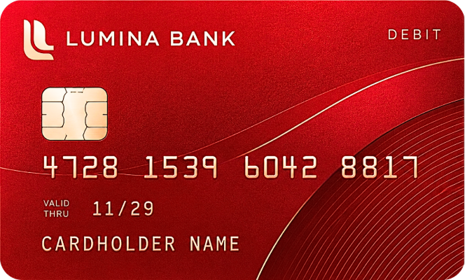
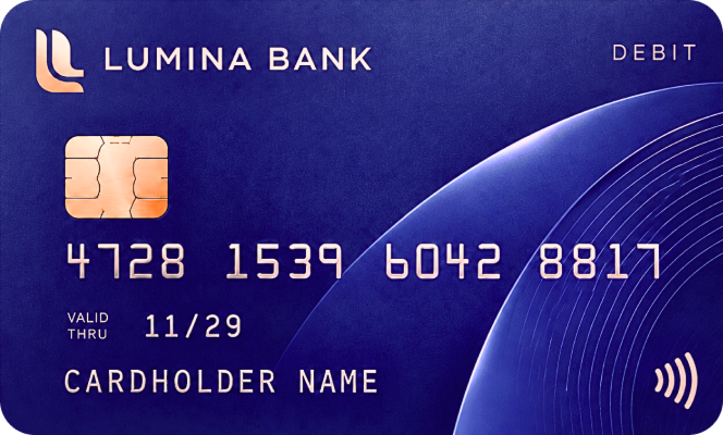
Shadcn Card Stack Illustrations
Browse ready-to-use illustrations with a smooth card stack animation, offering a draggable and animated card stack for testimonials, products, and payments.


Animated card stack illustrations you can drag away one card at a time — great for onboarding steps, surveys, and swipeable product cards.
Shadcn Card Stack Illustrations
Shadcn Card Stack Illustrations are a set of pre-built card stack components that layer content behind a front card using a smooth card stack animation, giving flat cards a sense of depth. Built with Shadcn UI and Tailwind CSS, each card comes as an animated card stack you can preview directly, ready to hold testimonials, product cards, payment cards, or dashboard widgets.
This Shadcn Card Stack collection covers both draggable and auto-cycling behavior, so you can pick the stack style that fits your interaction pattern. Explore the full set on Shadcn Studio, browse more Shadcn Illustrations, or pair it with Shadcn UI Blocks to build a complete page.
What Is a Shadcn Card Stack Illustration?
A Shadcn Card Stack illustration is a card stack component that layers several cards with a slight offset behind a front card, using a card stack animation to reveal or cycle through content.
- Style: multiple cards layered in a deck, with the front card sitting slightly above the ones behind it
- Animation: an animated card stack viewable through the "Preview" action — Draggable Card Stack lets the front card be pulled away, while Auto Card Stack cycles through cards on its own
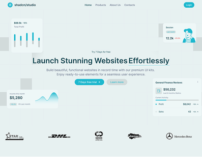
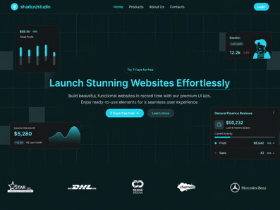
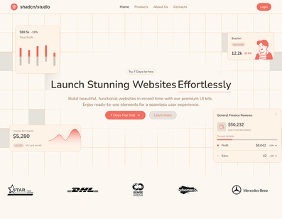
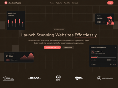
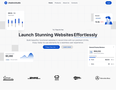
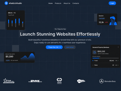
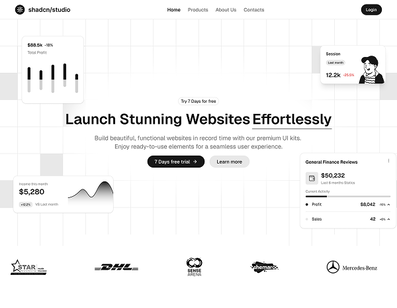
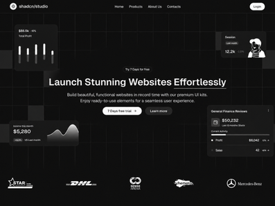
- Content types: website mockups, testimonials, reviews, social posts, product cards, payment cards, survey cards, design tokens, and stat cards
- Availability: cards are labeled Basic
Use Cases for Shadcn Card Stack Illustrations
- Bento Grid Sections — place a card stack in one tile of a bento grid to add depth and motion alongside static tiles.
- Hero Sections — use a card stack as the main visual in a landing page hero to showcase a product or feature.
- Testimonials & Social Proof — cycle through customer reviews and star ratings using the Auto Card Stack.
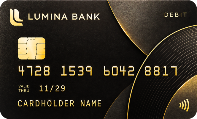
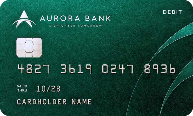
- Payment & Checkout UI — display saved credit or debit cards as a draggable stack for selection.
- Product & E-commerce Cards — stack product cards with images, pricing, and ratings for browsing.
- Onboarding & Survey Flows — present setup steps or survey questions one at a time with a draggable card stack.
- SaaS Dashboards — surface stat, category, or design-token cards in a compact, layered stack.