Modern UI development is shifting away from bulky component libraries toward composable, registry-driven systems - and that’s exactly where shadcn/ui CLI v4 stands out. Instead of installing a monolithic package, you selectively pull in only what your project needs, layer by layer. At the heart of this approach are two foundational pieces: registry:base and registry:font.
These aren’t just configuration details—they define how your entire design system is structured and how it feels in practice. registry:base lays down the groundwork by setting up Tailwind, global styles, and design tokens, while registry:font bringing typography into the system in a scalable, consistent way. Together, they ensure that every component you add later integrates seamlessly, both visually and functionally.
In this guide, we’ll break down how these two registry types work, how they interact, and why understanding them is key to mastering shadcn CLI v4.
What are registry:base and registry:font in shadcn/cli v4?
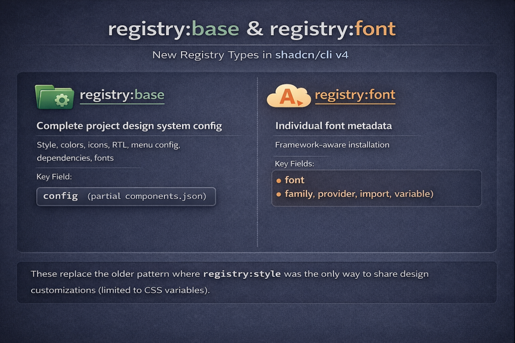
In shadcn/cli v4, registry items are typed. The two new types are:
| Type | Purpose | Key Field |
|---|---|---|
registry:base | Complete project design system config; style, colors, icons, RTL, menu config, dependencies, fonts | config (partial components.json) |
registry:font | Individual font metadata for framework-aware installation | font (family, provider, import, variable) |
These replace the older pattern where registry:style was the only way to share design customizations (limited to CSS variables).
registry:font - Font Metadata Item
Font Schema
Source: ui/packages/shadcn/src/registry/schema.ts
// Font metadata schema for registry:font items.
export const registryItemFontSchema = z.object({
  family: z.string(),           // CSS font-family value, e.g. "'Inter Variable', sans-serif"
  provider: z.literal("google"),// Font provider (only Google supported currently)
  import: z.string(),           // next/font/google import name, e.g. "Inter", "Geist"
  variable: z.string(),         // CSS variable name, e.g. "--font-sans", "--font-mono"
  weight: z.array(z.string()).optional(),   // e.g. ["400", "500", "600", "700"]
  subsets: z.array(z.string()).optional(),   // e.g. ["latin"]
  selector: z.string().optional(),          // CSS selector to apply to (default: "html")
})
The full registry item wraps this:
registryItemCommonSchema.extend({
  type: z.literal("registry:font"),
  font: registryItemFontSchema,    // REQUIRED for registry:font items
})
Font Real Example
From ui/apps/v4/registry/fonts.ts — the built-in fonts in shadcn v4:
{
  "name": "font-geist",
  "title": "Geist",
  "type": "registry:font",
  "font": {
    "family": "'Geist Variable', sans-serif",
    "provider": "google",
    "variable": "--font-sans",
    "subsets": ["latin"],
    "import": "Geist"
  }
}
{
"name": "font-jetbrains-mono",
"title": "JetBrains Mono",
"type": "registry:font",
"font": {
"family": "'JetBrains Mono Variable', monospace",
"provider": "google",
"variable": "--font-mono",
"subsets": ["latin"],
"import": "JetBrains_Mono"
}
}Available Built-in Fonts (17 total)
| Name | Font Family | CSS Variable |
|---|---|---|
font-geist | Geist Variable | --font-sans |
font-inter | Inter Variable | --font-sans |
font-noto-sans | Noto Sans Variable | --font-sans |
font-nunito-sans | Nunito Sans Variable | --font-sans |
font-figtree | Figtree Variable | --font-sans |
font-roboto | Roboto Variable | --font-sans |
font-raleway | Raleway Variable | --font-sans |
font-dm-sans | DM Sans Variable | --font-sans |
font-public-sans | Public Sans Variable | --font-sans |
font-outfit | Outfit Variable | --font-sans |
font-jetbrains-mono | JetBrains Mono Variable | --font-mono |
| … | … | … |
How the CLI Processes registry:font
Source: ui/packages/shadcn/src/utils/updaters/update-fonts.ts
The processing differs by framework:
Next.js Projects
-
Adds
import { Inter } from "next/font/google"tolayout.tsx -
Creates font instance:
const inter = Inter({ subsets: ["latin"], variable: "--font-sans" }) -
Adds
inter.variableto<html className={...}> -
Sets theme CSS variable:
-font-sans: var(--font-sans)(references itself since next/font injects on<html>)
Other Frameworks (Vite, React Router, Astro, etc.)
-
Installs
@fontsource-variable/interas npm dependency -
Adds
@import "@fontsource-variable/inter"to globals.css -
Sets theme CSS variable:
-font-sans: 'Inter Variable', sans-serif
Font Utility Classes
For all frameworks, the CLI also:
-
Group fonts by their
selector(default:"html") -
Adds
@apply font-sans(derived from-font-sans→font-sans) to the selector in@layer base
Creating & Sharing a Custom Font
Create a JSON file and host it anywhere (your own server, GitHub, etc.):
font-space-grotesk.json
{
  "$schema": "<https://ui.shadcn.com/schema/registry-item.json>",
  "name": "font-space-grotesk",
  "title": "Space Grotesk",
  "type": "registry:font",
  "font": {
    "family": "'Space Grotesk Variable', sans-serif",
    "provider": "google",
    "import": "Space_Grotesk",
    "variable": "--font-sans",
    "subsets": ["latin"],
    "weight": ["400", "500", "600", "700"]
  }
}
Install it:
npx shadcn@latest add "<https://your-domain.com/r/font-space-grotesk.json>"What happens:
-
Next.js →
import { Space_Grotesk } from "next/font/google"inlayout.tsx -
Vite/other →
npm install @fontsource-variable/space-grotesk+ CSS import -
-font-sansCSS variable is configured -
@apply font-sansadded tohtmlin@layer base
registry:base - Full Design System Config
Base Schema
Source: ui/packages/shadcn/src/registry/schema.ts
registryItemCommonSchema.extend({
  type: z.literal("registry:base"),
  config: rawConfigSchema.deepPartial().optional(),  // Partial components.json
})
Where rawConfigSchema (the components.json schema) includes:
rawConfigSchema = z.object({
  style: z.string(),                              // e.g. "radix-nova"
  rsc: z.coerce.boolean().default(false),
  tsx: z.coerce.boolean().default(true),
  tailwind: z.object({
    config: z.string().optional(),
    css: z.string(),
    baseColor: z.string(),                         // e.g. "neutral"
    cssVariables: z.boolean().default(true),
    prefix: z.string().default("").optional(),
  }),
  iconLibrary: z.string().optional(),              // e.g. "lucide", "hugeicons"
  rtl: z.coerce.boolean().default(false).optional(),
  menuColor: z.enum(["default", "inverted"]).default("default").optional(),
  menuAccent: z.enum(["subtle", "bold"]).default("subtle").optional(),
  aliases: z.object({
    components: z.string(),
    utils: z.string(),
    ui: z.string().optional(),
    lib: z.string().optional(),
    hooks: z.string().optional(),
  }),
  registries: registryConfigSchema.optional(),     // Third-party registries
})
The config field in registry:base is a deep part of this; you only need to include the fields you want to override.
Base Real Example
This is what buildRegistryBase() in ui/apps/v4/registry/config.ts generates for the “radix-nova” preset:
{
  "name": "radix-nova",
  "extends": "none",
  "type": "registry:base",
  "config": {
    "style": "radix-nova",
    "iconLibrary": "lucide",
    "rtl": false,
    "menuColor": "default",
    "menuAccent": "subtle",
    "tailwind": {
      "baseColor": "neutral"
    }
  },
  "dependencies": [
    "shadcn@latest",
    "class-variance-authority",
    "tw-animate-css",
    "lucide-react"
  ],
  "registryDependencies": ["utils", "font-geist"],
  "cssVars": {
    "theme": {},
    "light": {
      "background": "oklch(1 0 0)",
      "foreground": "oklch(0.145 0 0)",
      "card": "oklch(1 0 0)",
      "card-foreground": "oklch(0.145 0 0)",
      "popover": "oklch(1 0 0)",
      "popover-foreground": "oklch(0.145 0 0)",
      "primary": "oklch(0.205 0 0)",
      "primary-foreground": "oklch(0.985 0 0)",
      "secondary": "oklch(0.97 0 0)",
      "secondary-foreground": "oklch(0.205 0 0)",
      "muted": "oklch(0.97 0 0)",
      "muted-foreground": "oklch(0.556 0 0)",
      "accent": "oklch(0.97 0 0)",
      "accent-foreground": "oklch(0.205 0 0)",
      "destructive": "oklch(0.577 0.245 27.325)",
      "border": "oklch(0.922 0 0)",
      "input": "oklch(0.922 0 0)",
      "ring": "oklch(0.708 0 0)",
      "chart-1": "oklch(0.646 0.222 41.116)",
      "chart-2": "oklch(0.6 0.118 184.704)",
      "chart-3": "oklch(0.398 0.07 227.392)",
      "chart-4": "oklch(0.828 0.189 84.429)",
      "chart-5": "oklch(0.769 0.188 70.08)",
      "sidebar": "oklch(0.985 0 0)",
      "sidebar-foreground": "oklch(0.145 0 0)",
      "sidebar-primary": "oklch(0.205 0 0)",
      "sidebar-primary-foreground": "oklch(0.985 0 0)",
      "sidebar-accent": "oklch(0.97 0 0)",
      "sidebar-accent-foreground": "oklch(0.205 0 0)",
      "sidebar-border": "oklch(0.922 0 0)",
      "sidebar-ring": "oklch(0.708 0 0)"
    },
    "dark": {
      "background": "oklch(0.145 0 0)",
      "foreground": "oklch(0.985 0 0)",
      "card": "oklch(0.145 0 0)",
      "card-foreground": "oklch(0.985 0 0)",
      "popover": "oklch(0.145 0 0)",
      "popover-foreground": "oklch(0.985 0 0)",
      "primary": "oklch(0.985 0 0)",
      "primary-foreground": "oklch(0.205 0 0)",
      "secondary": "oklch(0.269 0 0)",
      "secondary-foreground": "oklch(0.985 0 0)",
      "muted": "oklch(0.269 0 0)",
      "muted-foreground": "oklch(0.708 0 0)",
      "accent": "oklch(0.269 0 0)",
      "accent-foreground": "oklch(0.985 0 0)",
      "destructive": "oklch(0.577 0.245 27.325)",
      "border": "oklch(0.269 0 0)",
      "input": "oklch(0.269 0 0)",
      "ring": "oklch(0.439 0 0)",
      "chart-1": "oklch(0.488 0.243 264.376)",
      "chart-2": "oklch(0.696 0.17 162.48)",
      "chart-3": "oklch(0.769 0.188 70.08)",
      "chart-4": "oklch(0.627 0.265 303.9)",
      "chart-5": "oklch(0.645 0.246 16.439)",
      "sidebar": "oklch(0.205 0 0)",
      "sidebar-foreground": "oklch(0.985 0 0)",
      "sidebar-primary": "oklch(0.488 0.243 264.376)",
      "sidebar-primary-foreground": "oklch(0.985 0 0)",
      "sidebar-accent": "oklch(0.269 0 0)",
      "sidebar-accent-foreground": "oklch(0.985 0 0)",
      "sidebar-border": "oklch(0.269 0 0)",
      "sidebar-ring": "oklch(0.439 0 0)"
    }
  },
  "css": {
    "@import \\\\"tw-animate-css\\\\"": {},
    "@import \\\\"shadcn/tailwind.css\\\\"": {},
    "@layer base": {
      "*": { "@apply border-border outline-ring/50": {} },
      "body": { "@apply bg-background text-foreground": {} }
    }
  }
}
How the CLI Processes registry:base
When a user runs npx shadcn@latest add "<https://example.com/my-theme.json>":
Step 1: Type Detection
Source: ui/packages/shadcn/src/commands/add.ts
The CLI fetches the registry item and checks its type. For registry:base:
-
Skips the style index installation check
-
Proceeds to resolve the base config
Step 2: Config Resolution
Source: ui/packages/shadcn/src/preset/presets.ts → resolveRegistryBaseConfig()
Extracts the config field from the registry item and returns it for merging into components.json.
Step 3: Config Merge
Source: ui/packages/shadcn/src/commands/init.ts (line ~680)
// Merge config from registry:base item.
if (options.registryBaseConfig) {
  config = mergeConfig(config, options.registryBaseConfig)
}
Deep-merges the config from the registry item into the project’s components.json. This writes:
-
style: e.g.,"radix-nova" -
iconLibrary: e.g.,"hugeicons" -
rtl: e.g.,false -
menuColor: e.g.,"inverted" -
menuAccent: e.g.,"bold" -
tailwind.baseColor: e.g.,"neutral"
Step 4: Dependency Resolution
Source: ui/packages/shadcn/src/registry/resolver.ts
Resolves the dependency tree:
-
Direct
dependencies→ npm packages to install -
registryDependencies→ other registry items to fetch (e.g.,"utils"fetches the utils lib,"font-geist"fetches the font registry item)
Step 5: Font Processing
Source: ui/packages/shadcn/src/registry/resolver.ts (line ~339)
const fonts: RegistryFontItem[] = payload
  .filter((item) => item.type === "registry:font" && item.font)
  .map((item) => ({
    ...item,
    type: "registry:font" as const,
    font: item.font!,
  }))
Collects all registry:font items from the resolved dependency tree and passes them to the font updater.
Step 6: CSS Application
Source: ui/packages/shadcn/src/utils/add-components.ts
Writes cssVars (light/dark/theme) and css (imports, @layer base rules) into the project’s globals.css.
Step 7: Component File Skipping
component.type === "registry:font" || component.type === "registry:base"registry:font and registry:base items don’t have component files - they’re skipped during the file-writing phase.
Creating & Sharing a Design System
my-design-system.json
{
  "$schema": "<https://ui.shadcn.com/schema/registry-item.json>",
  "name": "my-company-theme",
  "extends": "none",
  "type": "registry:base",
  "config": {
    "style": "radix-nova",
    "iconLibrary": "hugeicons",
    "rtl": false,
    "menuColor": "inverted",
    "menuAccent": "bold",
    "tailwind": {
      "baseColor": "neutral"
    }
  },
  "dependencies": [
    "shadcn@latest",
    "class-variance-authority",
    "tw-animate-css",
    "@hugeicons/react"
  ],
  "registryDependencies": ["utils", "font-figtree"],
  "cssVars": {
    "theme": {
      "font-sans": "var(--font-sans)",
      "font-mono": "var(--font-mono)",
      "font-serif": "var(--font-serif)",
      "radius": "var(--radius)"
    },
    "light": {
      "radius": "0.75rem",
      "background": "oklch(0.98 0.01 250)",
      "foreground": "oklch(0.20 0.02 250)",
      "primary": "oklch(0.55 0.22 250)",
      "primary-foreground": "oklch(0.98 0.01 250)",
      "secondary": "oklch(0.94 0.02 250)",
      "secondary-foreground": "oklch(0.25 0.03 250)",
      "muted": "oklch(0.95 0.01 250)",
      "muted-foreground": "oklch(0.50 0.02 250)",
      "accent": "oklch(0.55 0.22 250)",
      "accent-foreground": "oklch(0.98 0.01 250)",
      "destructive": "oklch(0.577 0.245 27.325)",
      "border": "oklch(0.90 0.02 250)",
      "input": "oklch(0.90 0.02 250)",
      "ring": "oklch(0.55 0.22 250)",
      "chart-1": "oklch(0.55 0.22 250)",
      "chart-2": "oklch(0.65 0.18 180)",
      "chart-3": "oklch(0.70 0.15 130)",
      "chart-4": "oklch(0.75 0.20 60)",
      "chart-5": "oklch(0.60 0.22 320)",
      "sidebar": "oklch(0.20 0.03 250)",
      "sidebar-foreground": "oklch(0.90 0.01 250)",
      "sidebar-primary": "oklch(0.65 0.22 250)",
      "sidebar-primary-foreground": "oklch(0.98 0.01 250)",
      "sidebar-accent": "oklch(0.30 0.04 250)",
      "sidebar-accent-foreground": "oklch(0.90 0.01 250)",
      "sidebar-border": "oklch(0.30 0.03 250)",
      "sidebar-ring": "oklch(0.55 0.22 250)"
    },
    "dark": {
      "background": "oklch(0.15 0.02 250)",
      "foreground": "oklch(0.93 0.01 250)",
      "primary": "oklch(0.65 0.22 250)",
      "primary-foreground": "oklch(0.15 0.02 250)",
      "secondary": "oklch(0.22 0.03 250)",
      "secondary-foreground": "oklch(0.90 0.01 250)",
      "muted": "oklch(0.22 0.02 250)",
      "muted-foreground": "oklch(0.60 0.02 250)",
      "accent": "oklch(0.65 0.22 250)",
      "accent-foreground": "oklch(0.15 0.02 250)",
      "destructive": "oklch(0.577 0.245 27.325)",
      "border": "oklch(0.28 0.03 250)",
      "input": "oklch(0.28 0.03 250)",
      "ring": "oklch(0.65 0.22 250)",
      "chart-1": "oklch(0.65 0.22 250)",
      "chart-2": "oklch(0.60 0.18 180)",
      "chart-3": "oklch(0.55 0.15 130)",
      "chart-4": "oklch(0.70 0.20 60)",
      "chart-5": "oklch(0.58 0.22 320)",
      "sidebar": "oklch(0.12 0.02 250)",
      "sidebar-foreground": "oklch(0.90 0.01 250)",
      "sidebar-primary": "oklch(0.65 0.22 250)",
      "sidebar-primary-foreground": "oklch(0.98 0.01 250)",
      "sidebar-accent": "oklch(0.20 0.03 250)",
      "sidebar-accent-foreground": "oklch(0.90 0.01 250)",
      "sidebar-border": "oklch(0.22 0.03 250)",
      "sidebar-ring": "oklch(0.65 0.22 250)"
    }
  },
  "css": {
    "@import \\\\"tw-animate-css\\\\"": {},
    "@import \\\\"shadcn/tailwind.css\\\\"": {},
    "@layer base": {
      "*": { "@apply border-border outline-ring/50": {} },
      "body": { "@apply bg-background text-foreground": {} }
    }
  }
}
Install it:
npx shadcn@latest add "<https://your-domain.com/r/my-company-theme.json>"Result applied to the user’s project:
| File | What Changes |
|---|---|
components.json | style: "radix-nova", iconLibrary: "hugeicons", menuColor: "inverted", menuAccent: "bold" |
globals.css | All CSS variables (light + dark), CSS imports, @layer base rules |
layout.tsx (Next.js) | import { Figtree } from "next/font/google" + font setup |
package.json | @hugeicons/react, tw-animate-css, shadcn@latest, class-variance-authority |
Future shadcn add | Components fetched from radix-nova styled registry |
Comparison: registry:style vs registry:theme vs registry:base
| Feature | registry:style | registry:theme | registry:base |
|---|---|---|---|
| CSS variables (colors) | ✅ | ✅ | ✅ |
CSS imports (@import) | ✅ | ❌ | ✅ |
components.json config | ❌ | ❌ | ✅ |
| Font handling | ❌ | ❌ | ✅ (via registryDependencies) |
| Icon library config | ❌ | ❌ | ✅ |
| Style selection | ❌ | ❌ | ✅ |
| Dependencies | ❌ | ❌ | ✅ |
| RTL / menu config | ❌ | ❌ | ✅ |
config field | ❌ | ❌ | ✅ |
font field | ❌ | ❌ | ❌ (that’s registry:font) |
When to Use Each
-
registry:style- Legacy v3 projects, or when you ONLY want to ship CSS variable overrides (no config changes). Warns the user about overwriting. -
registry:theme- When you ONLY want to ship color/theme CSS variables (no CSS imports, no config). Even more limited. -
registry:base- When you want to ship a complete design system: style choice, colors, fonts, icons, menu config, and dependencies. This is whatshadcn createis used internally. -
registry:font- When you want to ship a single font with framework-aware installation logic.
How shadcn/create Uses These Internally
The Flow
User visits ui.shadcn.com/create
    ↓
Selects: base (radix), style (nova), color (neutral), font (geist), icons (lucide)
    ↓
Frontend builds a DesignSystemConfig object
    ↓
Calls /init endpoint with config as URL params
    ↓
Server calls buildRegistryBase(config) → returns registry:base JSON
    ↓
CLI receives registry:base item
    ↓
1. Merges config → components.json
2. Resolves registryDependencies → fetches font-geist (registry:font)
3. Installs npm dependencies
4. Writes CSS vars → globals.css
5. Configures font → layout.tsx
    ↓
Project is fully configured
The Preset System
Presets are predefined DesignSystemConfig objects:
const PRESETS = [
  {
    name: "radix-vega",
    base: "radix", style: "vega",
    iconLibrary: "lucide", font: "inter",
    rtl: false, menuAccent: "subtle", menuColor: "default"
  },
  {
    name: "radix-nova",
    base: "radix", style: "nova",
    iconLibrary: "lucide", font: "geist",
    // ...
  },
  {
    name: "radix-maia",
    base: "radix", style: "maia",
    iconLibrary: "hugeicons", font: "figtree",
    // ...
  },
  {
    name: "radix-lyra",
    base: "radix", style: "lyra",
    iconLibrary: "phosphor", font: "jetbrains-mono",
    // ...
  },
  // ... plus base-* variants (10 total)
]
Each preset → buildRegistryBase(preset) → registry:base JSON → CLI applies it.
Bottom line:
registry:baseis the v4 way to share complete design systems.registry:fontis the v4 way to share fonts. shadcn-studio should migrate fromregistry:style→registry:baseto become a first-class v4 design system provider.
Special Mention: Shadcn Studio

Shadcn Studio goes beyond animations by providing animated blocks and sections built on top of Shadcn UI. It’s perfect for teams that want speed without compromising design quality.
Key Features:
-
Pre-animated components, blocks, and layouts
-
Built specifically for Shadcn UI
-
Consistent motion patterns
-
Great for marketing and landing pages
Furthermore, Animated variants with motion add smooth, modern animations to your components, enhancing user experiences with minimal effort.
Best For: Startups, agencies, and rapid MVP development.
Additionally, it comes with the following features:
-
Open-source: Dive into a growing, community-driven collection of copy-and-paste shadcn components, Shadcn blocks, and templates.
-
Component & Blocks variants: Access a diverse collection of customizable shadcn UI blocks and component variants to quickly build and style your UI with ease.
-
Landing pages & Dashboards: Explore 20+ premium & free Shadcn templates for dashboards, landing pages & more. Fully customizable & easy to use.
-
shadcn/ui for Figma: Speed up your workflow with Shadcn Figma UI kit with components, blocks & templates – a full design library inspired by shadcn/ui.
-
Powerful theme generator: Customize your UI instantly with Shadcn Theme Generator. Preview changes in real time and create consistent, on-brand designs faster.
-
shadcn/studio MCP: Integrate shadcn/studio MCP Server directly into your favorite IDE and craft stunning shadcn/ui Components, Blocks, and Pages inspired by shadcn/studio.
-
Shadcn Figma To Code Plugin: Convert your Figma designs into production-ready code instantly with the Shadcn Figma Plugin.
Conclusion:
Understanding registry:base and registry:font isn’t just about knowing how the shadcn CLI works - it’s about recognizing a broader shift in frontend architecture. By separating foundational setup from typography and components, shadcn/ui enables a cleaner, more maintainable, and highly customizable workflow.
The registry:base gives your project a stable design foundation, while registry:font ensures your typography scales consistently across the interface. When used together, they create a cohesive system where every added component feels native to your app.
As you move forward, treat these layers as intentional building blocks; rather than hidden setup steps, and you’ll gain far more control over your UI. Whether you’re customizing a personal project or building a full design system, mastering these registry concepts puts you in a position to design with clarity, consistency, and confidence.