Shadcn Integrations Pages
Showcase the tools, services, and platforms your product works with using clean, organized Shadcn Integration Pages.


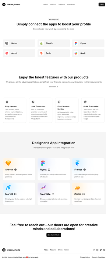
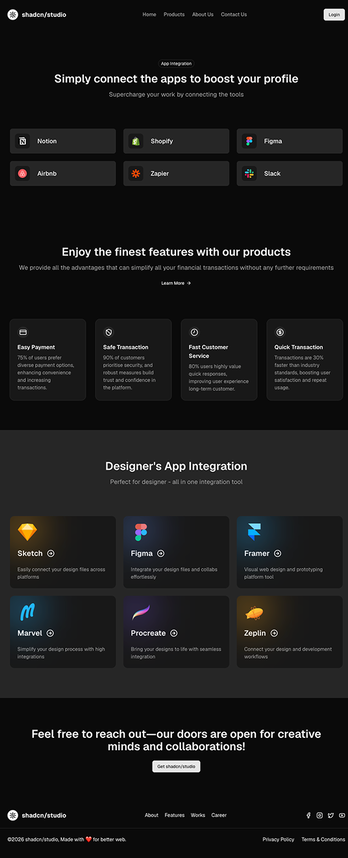
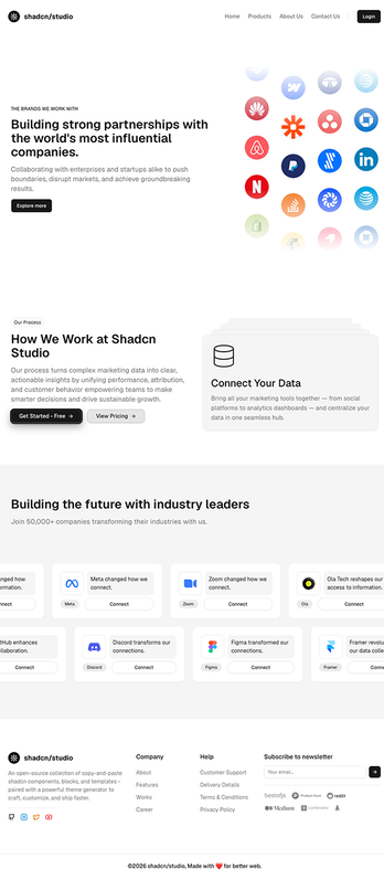
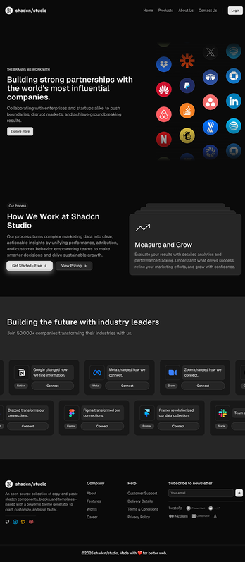
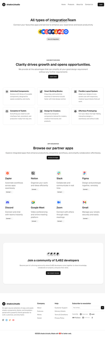
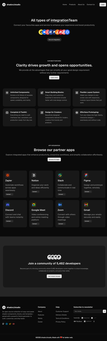
Shadcn Integrations Pages
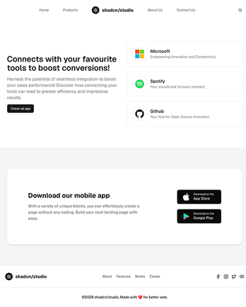
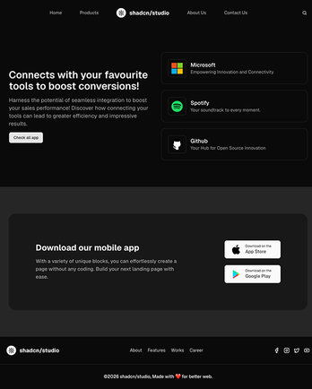
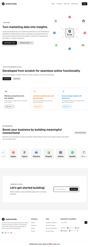
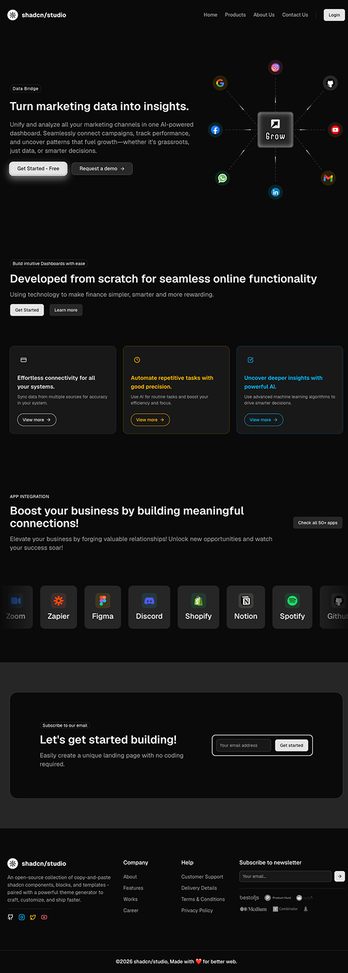
Integrations Pages are dedicated page layouts built to showcase the tools, apps, and platforms your product connects with. Each page combines multiple Shadcn Blocks including integration grids, logo showcases, category sections, and CTAs - into a cohesive layout that helps visitors quickly discover your product's ecosystem and compatibility. You can also use Shadcn App Integration Blocks to add ready-to-use integration sections to your pages.
Built with React and Tailwind CSS, every page is easy to customize to match your product and branding. Add new integrations, organize them by category, update logos, or link to setup guides with ease. If you're looking for more reusable page layouts beyond integration pages, explore our collection of Shadcn Pages for landing pages, feature pages, pricing pages, blog pages, FAQs, contact pages, changelogs, and more.
What are Shadcn Integrations Pages?
A Shadcn Integrations Page is a dedicated page layout built to list and explain the third-party tools, apps, and platforms a product connects with. Each page typically includes an integration grid or list with logos, short descriptions, category filters, and links to individual integration details or setup docs.
For products that rely on connecting into a user's existing stack - CRMs, calendars, payment providers, messaging apps - this page becomes a key trust signal. It shows visitors their tools are already supported, which removes a common blocker before they sign up. That's all built using standard shadcn/ui components you can freely edit and extend.
Why Choose Shadcn Integrations Pages?
Ready to Launch Skip the setup work. Every page is already designed and structured to showcase integrations clearly, so you can go live without starting from a blank file.
Easy to Customize Edit the integrations list, categories, logos, and descriptions directly in your codebase. Since everything is built with standard shadcn/ui components, updates are quick and don't require rebuilding the grid from scratch.
Fully Responsive Every page is tested across breakpoints and works cleanly on desktop, tablet, and mobile out of the box — including integration grids that reflow properly on smaller screens.
Built for Modern Development Made with shadcn/ui, Tailwind CSS, and React, these pages fit straight into your existing workflow and are compatible with frameworks like Next.js, Remix, Astro, and Vite.
Reusable Components Every block used across the pages - integration cards, category filters, search bars, CTAs - is reusable on its own, so you can mix and match sections across multiple pages without duplicating work.
Built for Trust Integration pages are structured to reassure visitors their existing tools are supported, making them more likely to move forward with sign-up.