Shadcn Feature Pages
Highlight your product's key features, capabilities, and benefits with modern Shadcn Feature Pages that make every feature easy to understand.


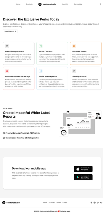
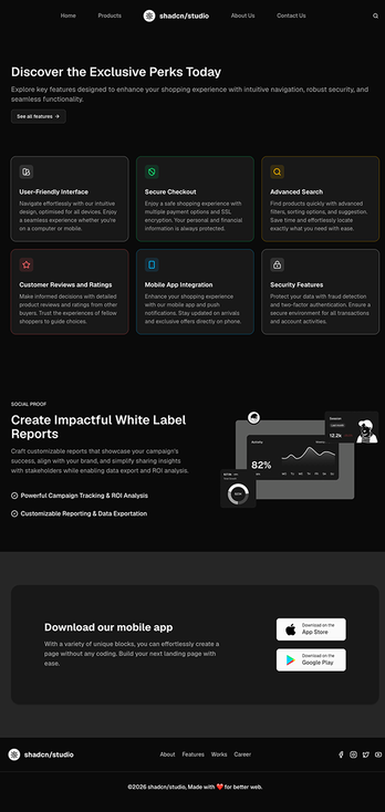
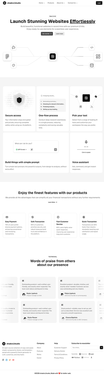
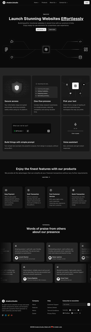
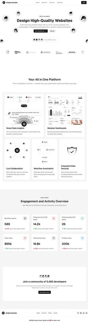
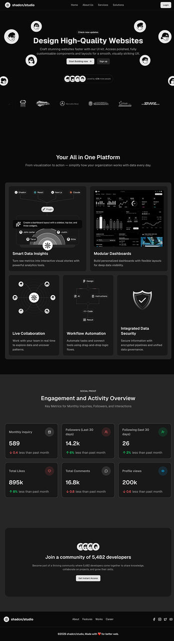
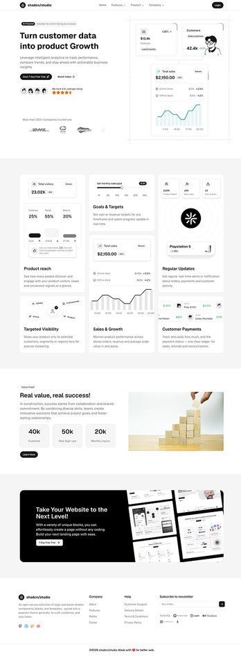
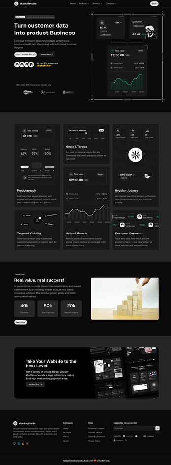


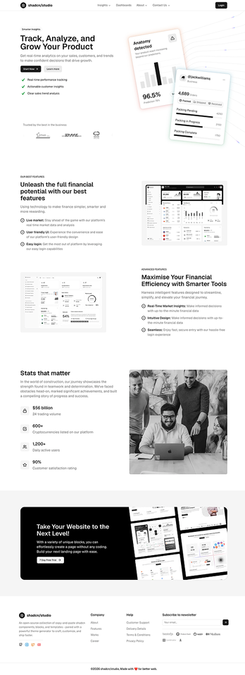
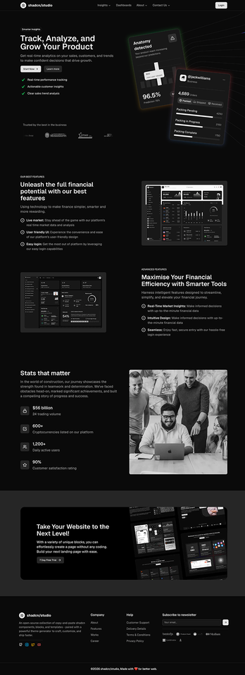
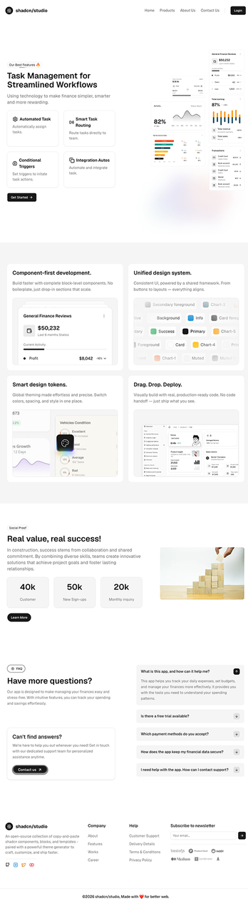
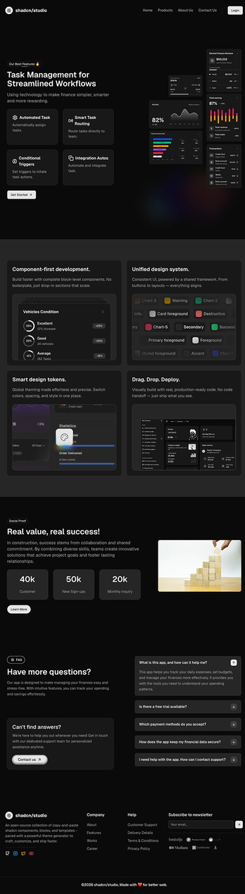
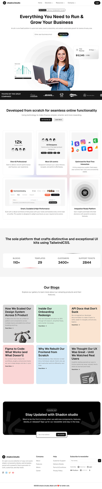
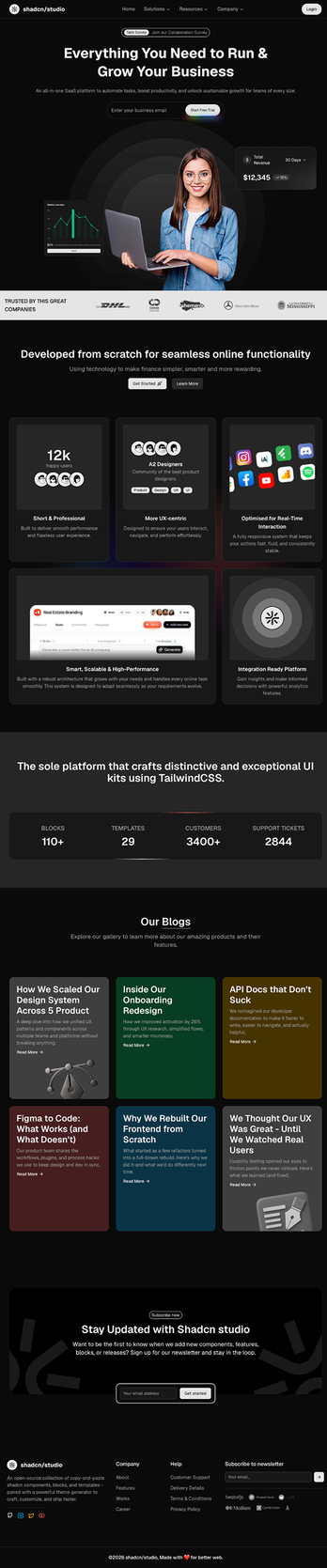
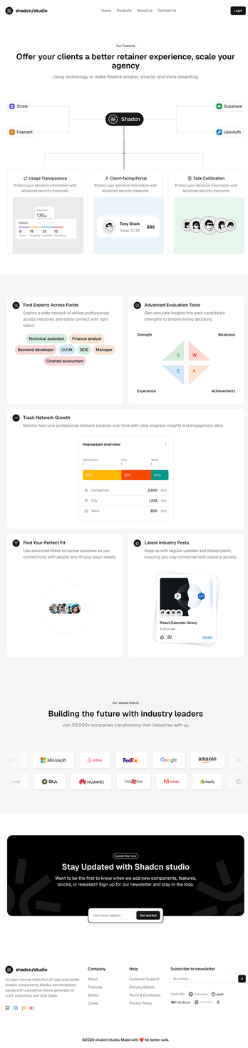
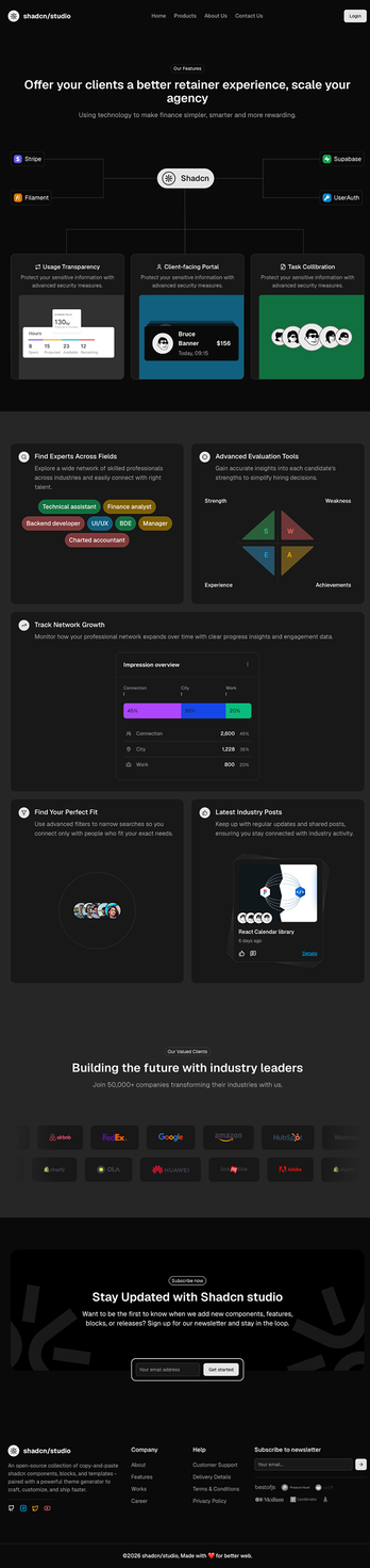
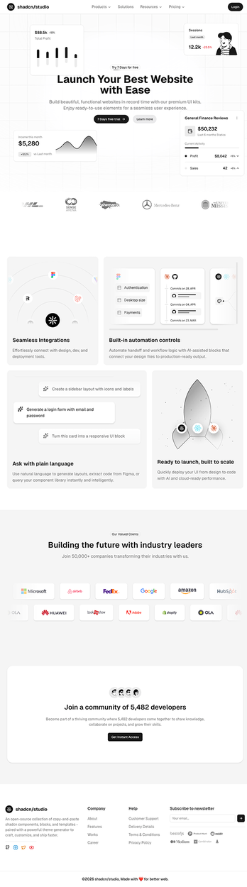
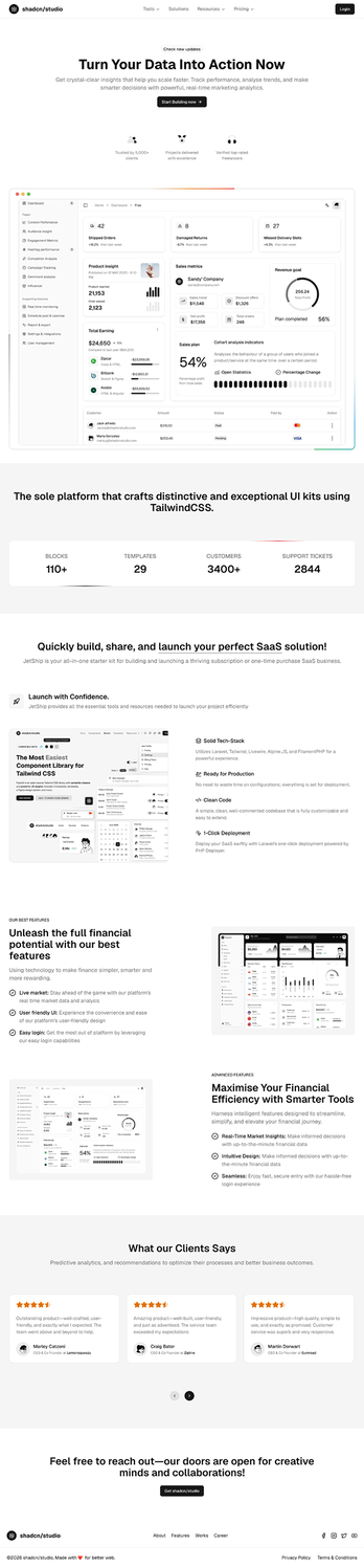
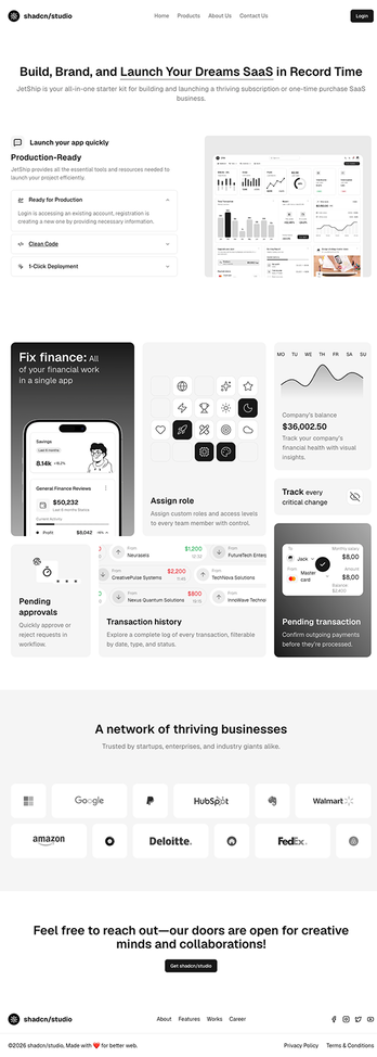
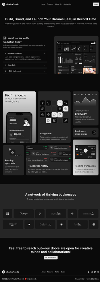
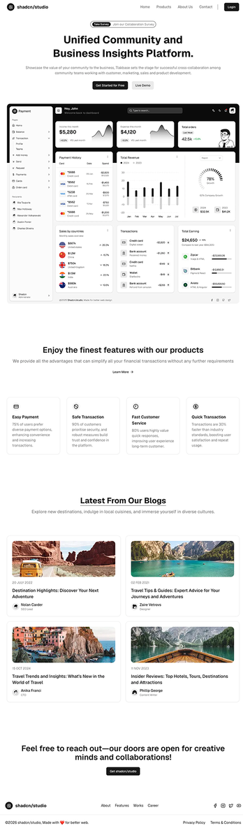
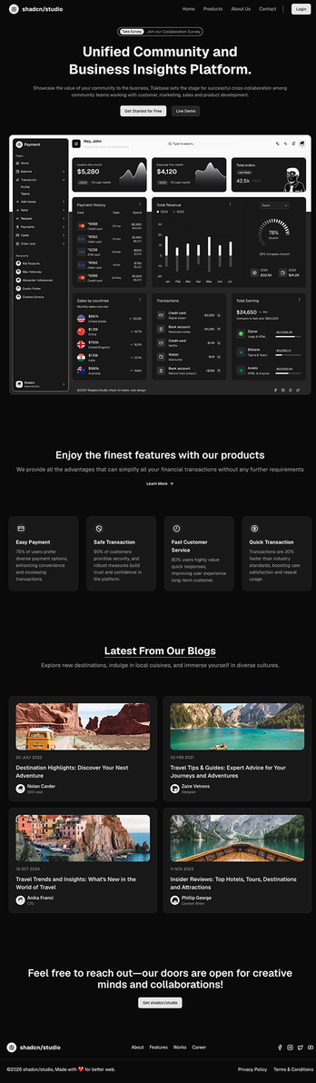
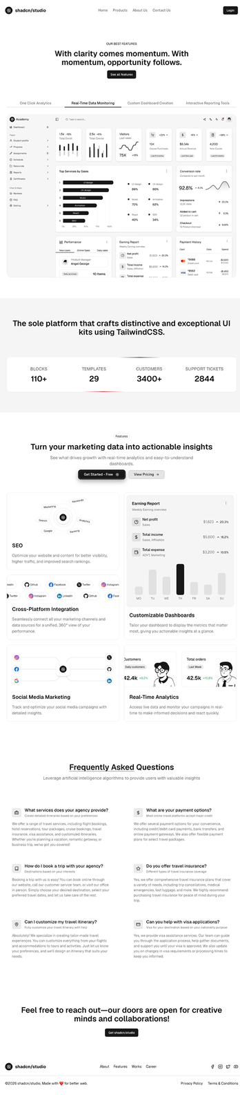
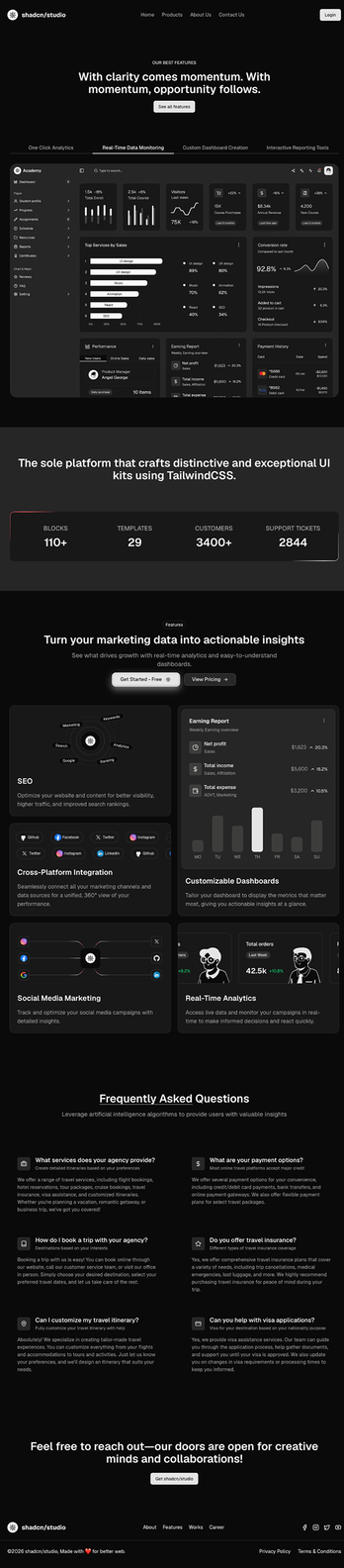
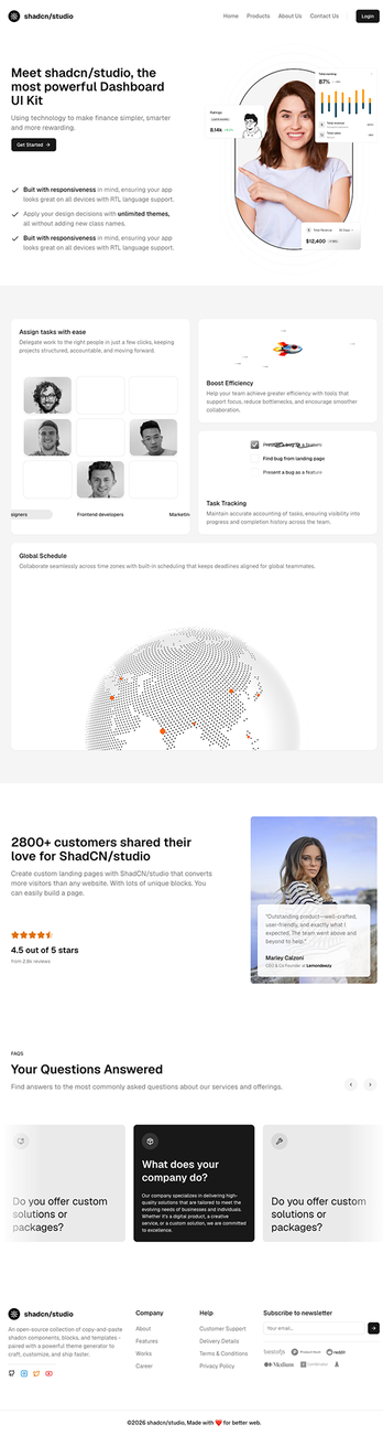
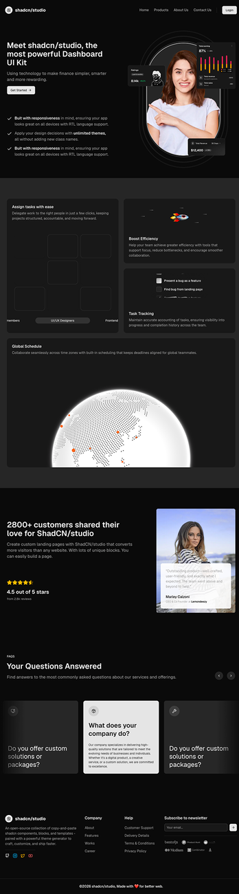
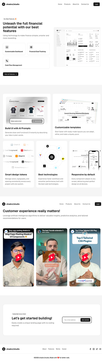
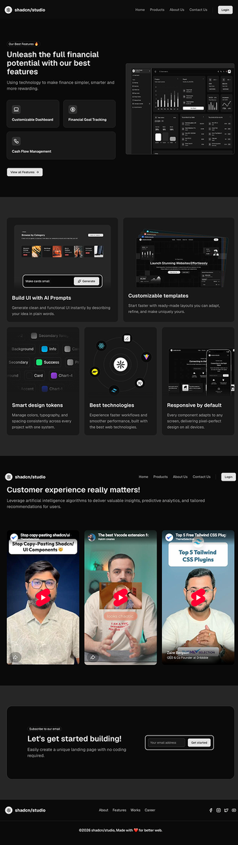
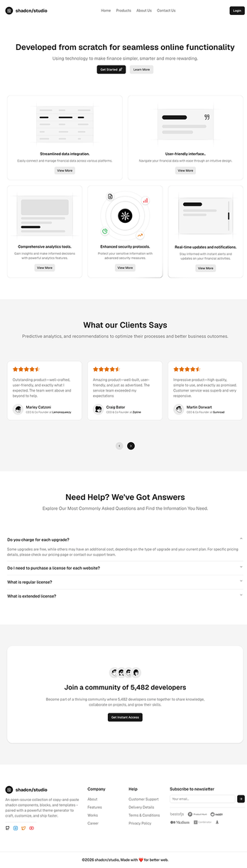
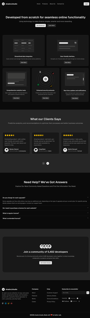
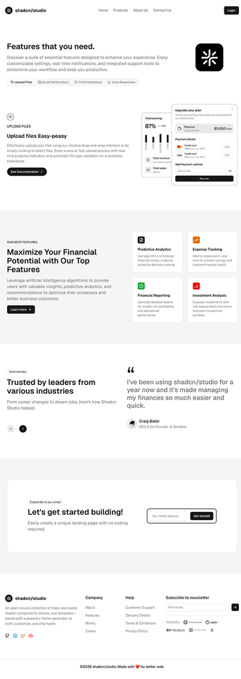
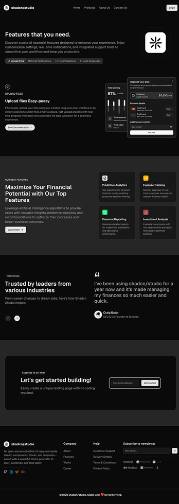
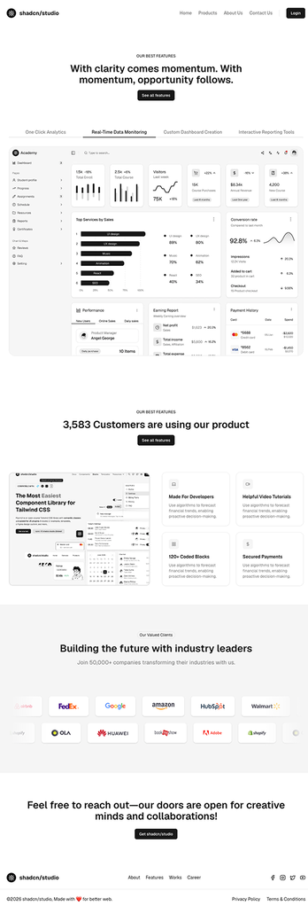
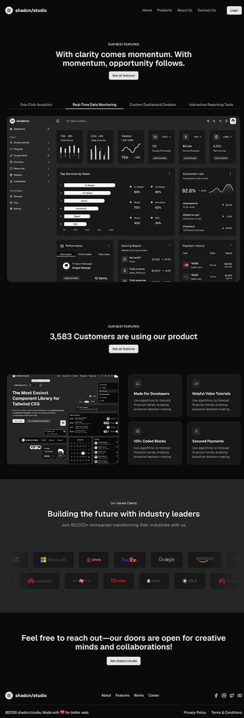
Shadcn Feature Pages
Feature Pages are dedicated page layouts built to highlight a product's core capabilities in detail. Each page combines multiple Shadcn Blocks including feature grids, comparison tables, use case sections, and CTAs - into a cohesive layout that helps visitors understand what your product does and why it matters.
Built with React and Tailwind CSS, every page is easy to customize and extend to match your product and brand. Reorder sections, update content, or refine the layout without starting from scratch. You can also combine these layouts with Shadcn Feature Blocks to add reusable feature-focused sections to your pages. If you're looking for more reusable page layouts beyond feature pages, explore our collection of Shadcn Pages for landing pages, pricing pages, blog pages, FAQs, contact pages, changelogs, and more.
What are Shadcn Feature Pages?
A Shadcn Feature Page is a dedicated page layout built to explain and showcase a product's features in depth - going beyond the short feature summaries you'd normally find on a homepage. Each page includes everything you need - feature highlights, benefit-driven copy, visuals or screenshots, comparison sections, and a CTA - so visitors can fully understand a specific capability before they sign up or buy.
Unlike a generic features section on a landing page, a feature page gives each capability room to breathe. That makes it easier to explain complex or technical features, walk through how something works step by step, or compare your feature set against competitors — all using standard shadcn/ui components you can freely edit and extend.
Why Choose Shadcn Feature Pages?
Ready to Launch Skip the setup work. Every page is already designed and structured to explain product features clearly, so you can go live without starting from a blank file.
Easy to Customize Edit the layout, content, and visuals directly in your codebase. Since everything is built with standard shadcn/ui components, updates are quick and don't require rebuilding sections from scratch.
Fully Responsive Every page is tested across breakpoints and works cleanly on desktop, tablet, and mobile out of the box — no extra work needed to make it look right on smaller screens.
Built for Modern Development Made with shadcn/ui, Tailwind CSS, and React, these pages fit straight into your existing workflow and are compatible with frameworks like Next.js, Remix, Astro, and Vite.
Reusable Components Every block used across the pages - feature grids, comparison tables, step-by-step walkthroughs, CTAs - is reusable on its own, so you can mix and match sections across multiple feature pages without duplicating work.
Built for Conversion Feature pages are structured to move visitors from "what does this do" to "why I need this," pairing clear explanations with focused calls-to-action.