Shadcn Error Pages
Turn broken links into better experiences with custom Shadcn Error Pages for 404, 500, and other unexpected states.


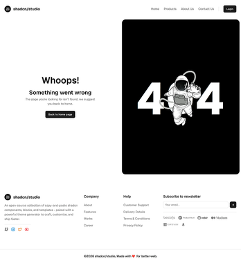
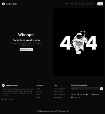
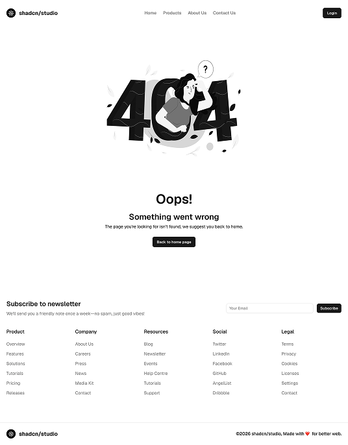
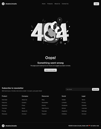
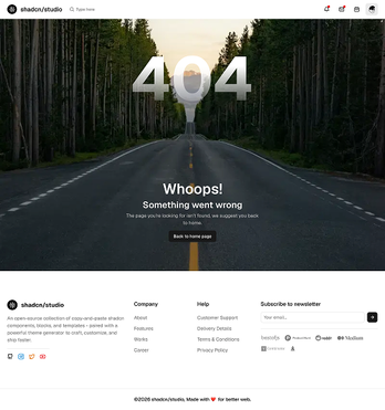
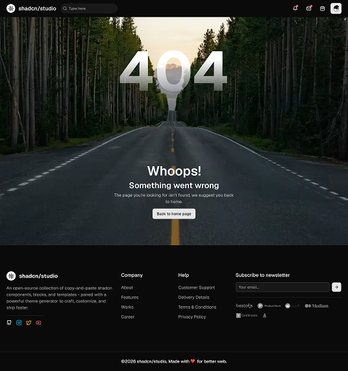
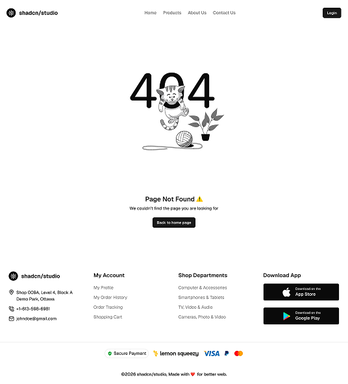
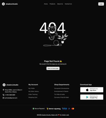
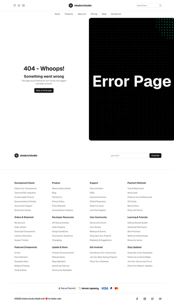
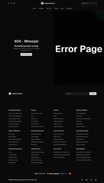
Shadcn Error Pages
Error Pages are dedicated page layouts built to handle broken states like 404 errors, 500 errors, and other unexpected situations gracefully. Each page combines multiple Shadcn Blocks including illustrations, error messages, navigation links, search sections, and CTAs - into a cohesive layout that helps visitors recover instead of reaching a dead end. You can also use Shadcn Error Blocks to add reusable error states and recovery layouts to your pages.
Built with React and Tailwind CSS, every page is easy to customize to match your brand and user experience. Update error messages, replace illustrations, add helpful navigation, or guide visitors back to important pages with ease. If you're looking for more reusable page layouts beyond error pages, explore our collection of Shadcn Pages for landing pages, feature pages, pricing pages, blog pages, FAQs, contact pages, changelogs, and more.
What are Shadcn Error Pages?
A Shadcn Error Page is a dedicated page layout built to appear when something goes wrong - a missing page, a server error, an unauthorized request, or a maintenance window. Each page typically includes a clear error code, a short explanation of what happened, and a way back, such as a link to the homepage or a search bar.
A good error page turns a dead end into a soft recovery. Instead of leaving visitors stuck, it explains what went wrong in plain language and points them toward what to do next - all built using standard shadcn/ui components you can freely edit and extend.
Why Choose Shadcn Error Pages?
Ready to Launch Skip the setup work. Every page is already designed and structured to handle broken states clearly, so you can go live without starting from a blank file.
Easy to Customize Edit the illustration, messaging, and navigation links directly in your codebase. Since everything is built with standard shadcn/ui components, updates are quick and don't require rebuilding the page from scratch.
Fully Responsive Every page is tested across breakpoints and works cleanly on desktop, tablet, and mobile out of the box - including illustrations and layouts that scale properly on smaller screens.
Built for Modern Development Made with shadcn/ui, Tailwind CSS, and React, these pages fit straight into your existing workflow and are compatible with frameworks like Next.js, Remix, Astro, and Vite.
Reusable Components Every block used across the pages - error codes, illustrations, CTAs, navigation links — is reusable on its own, so you can mix and match sections across multiple error states without duplicating work.
Built to Reduce Drop-Off Error pages are structured to keep visitors on your site instead of bouncing away, guiding them back to something useful even after something breaks.