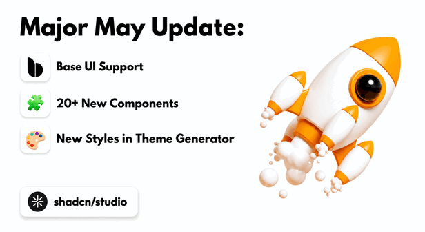
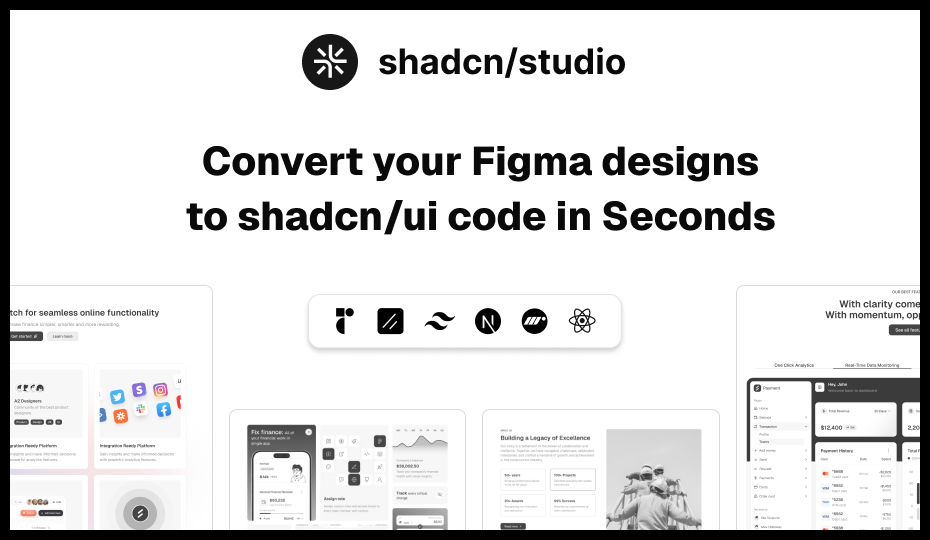
We’re excited to announce one of the biggest updates to Shadcn Studio so far 🚀.
This update is focused on making your design and development workflow faster, more flexible, and more aligned with the latest shadcn/ui ecosystem.
In this update, we’ve added compatibility of Base UI, added many new components, upgraded our Theme Generator, added more typography options, improved AI and LLM support, enhanced the Figma Plugin experience, and updated our Figma documentation with detailed guides and videos.
🚀 What’s New in the May Update?
This month’s update is one of the biggest upgrades we’ve shipped for Shadcn Studio so far. The May release is focused on making your workflow faster, more flexible, and fully aligned with the latest shadcn/ui ecosystem.
With this update, we’ve added support for both Base UI and Radix UI, introduced a large collection of new Shadcn components, upgraded our Shadcn Theme Generator, improved AI and LLM support, and enhanced the overall Shadcn Figma Plugin experience.
You’ll also find updated Shadcn Figma documentation with detailed guides and videos to help designers and developers work more smoothly together. Whether you’re building SaaS products, dashboards, landing pages, admin panels, or complete product interfaces, these updates are designed to help you move from idea to production faster.
Let’s explore everything new in the May update 👇
Long-Awaited Base UI & Radix UI Support is Here ⚡

Shadcn Studio blocks and components are now compatible with both Base UI and Radix UI, By True Means.!!
This gives you more flexibility when choosing the UI foundation for your project. Whether you prefer working with Radix UI or want to build with Base UI, you can now use Shadcn Studio components and blocks with both options.
You can continue using the same design system structure, components, and blocks while selecting the UI foundation that best fits your workflow.
To make this even easier, we’ve also added a simple dropdown that lets you preview our shadcn blocks and shadcn components in both Base UI and Radix UI. This helps you quickly compare how the same block or component looks in each UI foundation before using it in your project.
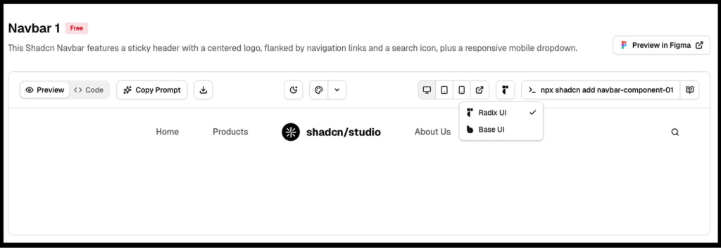
If you are planning to migrate from Base UI to Radix UI, you can also refer to our detailed guide on How to Migrate from Radix UI to Base UI.
Shadcn Builder 🛠️ - Simply Drag & Drop Blocks to Create Landing Pages
Introducing the all-new Drag-and-Drop Shadcn Builder 🎉
Build modern websites visually with a smooth drag-and-drop experience powered by the flexibility of shadcn/ui. Create pages faster using production-ready blocks, responsive layouts, reusable sections, and customizable components, all without starting from scratch.
The new builder is designed to simplify your workflow while keeping full control over your design system and code structure. Whether you’re building landing pages, SaaS websites, dashboards, or admin interfaces, the Shadcn Builder helps you go from idea to production in minutes.
✨ What You Can Expect
-
Drag-and-drop page building experience
-
Fully customizable Shadcn UI blocks and sections
-
Responsive layouts out of the box
-
Clean and scalable code structure
-
Faster prototyping and development workflows
-
Seamless integration with your existing Shadcn projects
This is just the beginning, we’re building the ultimate visual experience for modern Shadcn development.
20+ New Shadcn Components Added 🧩
We’ve added a large set of new Shadcn Components to help you build more complete, flexible, and production-ready interfaces faster.
Here are the new shadcn components added in this update:
Shadcn Carousel (12)
Create smooth, swipe-friendly sliders for images, testimonials, product showcases, and featured content. Perfect for landing pages, galleries, ecommerce sections, and interactive UI experiences.
Key Features:
-
Swipe & touch support
-
Auto-play sliders
-
Navigation arrows & pagination
-
Responsive carousel layouts
-
Base UI & Radix UI support
Shadcn Drawer (15)
Add slide-in panels for menus, filters, settings, cart previews, or mobile navigation. Drawers help create modern off-canvas workflows without interrupting the main interface.
Key Features:
-
Slide-in drawer layouts
-
Mobile navigation support
-
Smooth open/close animations
-
Responsive off-canvas panels
-
Base UI & Radix UI support
Shadcn Navigation Menu (09)
Build clean and flexible navigation menus for websites, dashboards, and SaaS products. These layouts improve discoverability and help organize complex navigation structures.
Key Features:
-
Multi-level navigation
-
Dropdown & mega menus
-
Responsive layouts
-
Keyboard accessibility
-
Base UI & Radix UI support
Shadcn Skeleton (12)
Show elegant loading placeholders while your content is being fetched or rendered. Skeleton loaders improve perceived performance and reduce layout shifts.
Key Features:
-
Animated loading placeholders
-
Card & table skeletons
-
Responsive loading states
-
Lightweight rendering
-
Base UI & Radix UI support
Shadcn Separator (14)
Add clean visual dividers to separate content, sections, menu items, or layouts. Separators help improve readability and content organization across interfaces.
Key Features:
-
Horizontal & vertical dividers
-
Content grouping support
-
Minimal responsive styling
-
Accessible structure
-
Base UI & Radix UI support
Shadcn Spinner (10)
Display loading states for buttons, forms, pages, and async actions. Spinners provide instant visual feedback during loading and processing workflows.
Key Features:
-
Animated loading indicators
-
Button & page loaders
-
Smooth transitions
-
Accessible loading states
-
Base UI & Radix UI support
Shadcn Slider (19)
Let users select values such as price, volume, progress, range, or settings. Sliders are ideal for interactive filtering systems and adjustable controls.
Key Features:
-
Single & range sliders
-
Drag & touch interactions
-
Keyboard accessibility
-
Custom track styling
-
Base UI & Radix UI support
Shadcn Label (09)
Add accessible labels for form fields, inputs, checkboxes, and other controls. Labels improve usability, accessibility, and form clarity across applications.
Key Features:
-
Accessible form labeling
-
Input & checkbox support
-
Error state integration
-
Semantic structure
-
Base UI & Radix UI support
Shadcn Scroll Area (06)
Create custom scrollable areas for sidebars, lists, chats, tables, and long content. Scroll areas help maintain clean layouts while improving content navigation.
Key Features:
-
Custom scrollbar styling
-
Vertical & horizontal scrolling
-
Sidebar & chat layouts
-
Smooth scrolling behavior
-
Base UI & Radix UI support
Shadcn Stepper (12)
Build step-by-step flows for onboarding, checkout, forms, and setup processes. Steppers help users complete workflows in a structured and guided manner.
Key Features:
-
Multi-step workflows
-
Progress tracking
-
Horizontal & vertical layouts
-
Responsive navigation
-
Base UI & Radix UI support
Shadcn Toggle (14)
Add simple on/off controls for settings, preferences, filters, and quick actions. Toggles are commonly used for feature flags and interactive state management.
Key Features:
-
Toggle state management
-
Animated transitions
-
Keyboard accessibility
-
Responsive controls
-
Base UI & Radix UI support
Shadcn Command (14)
Create command palettes, quick search menus, shortcuts, and action launchers. Command interfaces improve productivity and speed up navigation workflows.
Key Features:
-
Command palette layouts
-
Search & filtering support
-
Keyboard shortcuts
-
Productivity workflows
-
Base UI & Radix UI support
Shadcn Progress Bar (23)
Show progress for uploads, form completion, onboarding steps, or task status. Progress indicators improve user feedback and workflow visibility.
Key Features:
-
Progress tracking indicators
-
Determinant & loading states
-
Animated transitions
-
Responsive layouts
-
Base UI & Radix UI support
Shadcn Autocomplete (10)
Help users search and select options faster with smart suggestions. Autocomplete inputs improve usability and reduce typing effort in large datasets.
Key Features:
-
Search suggestions
-
Dynamic filtering
-
Keyboard navigation
-
Async search support
-
Base UI & Radix UI support
Shadcn List (10)
Display structured content like tasks, notifications, records, links, or activity feeds. Lists help organize repetitive data into readable and scalable layouts.
Key Features:
-
Structured list layouts
-
Task & activity feeds
-
Interactive list items
-
Responsive spacing
-
Base UI & Radix UI support
Shadcn Rating (08)
Add rating UI for reviews, feedback, products, services, or user satisfaction. Rating systems help collect user opinions and improve engagement workflows.
Key Features:
-
Interactive star ratings
-
Hover & active states
-
Review workflows
-
Responsive layouts
-
Base UI & Radix UI support
Shadcn Typography (15)
Create consistent headings, paragraphs, lists, quotes, and content layouts. Typography systems improve readability and maintain visual consistency across applications.
Key Features:
-
Responsive typography styles
-
Blog & documentation layouts
-
Semantic HTML structure
-
Readability optimization
-
Base UI & Radix UI support
Shadcn Toggle Group (16)
Let users choose between grouped options like views, filters, alignment, or modes. Toggle groups simplify segmented interactions inside toolbars and dashboards.
Key Features:
-
Segmented control layouts
-
Single & multi-select support
-
Active state indicators
-
Keyboard accessibility
-
Base UI & Radix UI support
Shadcn Phone Input (09)
Add user-friendly phone number inputs with better formatting and validation support. Phone inputs improve international form handling and data accuracy.
Key Features:
-
International phone formatting
-
Country selector support
-
Validation workflows
-
Responsive layouts
-
Base UI & Radix UI support
Shadcn Code Block (07)
Display code snippets, examples, commands, and technical documentation beautifully. Code blocks improve readability for developer-focused interfaces and docs.
Key Features:
-
Syntax highlighting
-
Copy-to-clipboard support
-
Multi-language code blocks
-
Responsive code layouts
-
Base UI & Radix UI support
Shadcn Resizable (09)
Build flexible layouts with resizable panels for dashboards, editors, and workspaces. Resizable interfaces improve usability for productivity-focused applications.
Key Features:
-
Resizable panel layouts
-
Drag resize handles
-
Workspace-style interfaces
-
Responsive resizing
-
Base UI & Radix UI support
Shadcn Context Menu (09)
Add right-click menus for quick actions, shortcuts, and contextual controls. Context menus improve workflow efficiency inside dashboards and productivity tools.
Key Features:
-
Right-click interactions
-
Nested context menus
-
Keyboard accessibility
-
Dynamic menu actions
-
Base UI & Radix UI support
Shadcn KBD (08)
Show keyboard shortcuts clearly inside docs, apps, command menus, and tooltips. KBD components improve discoverability for shortcuts and productivity workflows.
Key Features:
-
Keyboard shortcut indicators
-
Inline shortcut displays
-
Documentation support
-
Responsive typography
-
Base UI & Radix UI support
Shadcn Aspect Ratio (07)
Keep images, videos, cards, and media blocks perfectly responsive. Aspect ratio components prevent layout shifts and maintain visual consistency.
Key Features:
-
Responsive media containers
-
Image & video ratio control
-
Prevent layout shifts
-
Embedded content support
-
Base UI & Radix UI support
Shadcn Menubar (08)
Create desktop-style menu bars for advanced apps, editors, dashboards, and admin tools. Menubars are ideal for productivity applications and structured navigation systems.
Key Features:
-
Desktop-style navigation
-
Nested dropdown menus
-
Keyboard shortcut support
-
Responsive layouts
-
Base UI & Radix UI support
These components are designed to help you move faster while keeping your UI clean, consistent, and easy to customize.
Whether you are building dashboards, SaaS products, landing pages, forms, settings screens, admin panels, or full product interfaces, these new components give you more building blocks to work with.
New Styles in Shadcn Theme Generator 🎨
We’ve also upgraded our Shadcn Theme Generator based on the latest shadcn/ui update.
Our goal was to make the Shadcn Theme Generator feel closer to the new shadcn/ui customization experience while still giving you more control over your complete design system.
Now, you can directly customize important options from the Theme Generator, including:
-
UI: Radix and Base
-
Style: Vega, Nova, Maia, Lyra, Mira, and Luma
-
Icon library: Lucide, Hugeicons, Phosphor, Remix, and Tabler
-
Base color: Stone, Olive, Zinc, Neutral, Mauve, Taupe, and Mist
-
Theme color
-
Menu color
-
Menu accent
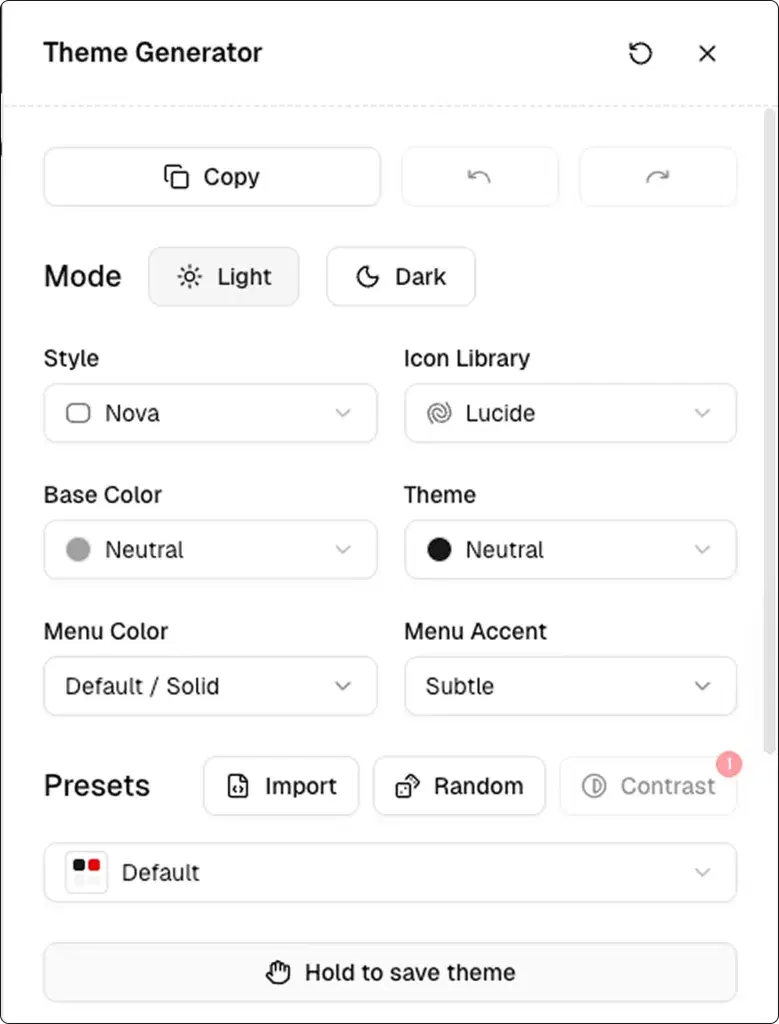
This gives you more freedom to create a design system that matches your project style, brand identity, and UI requirements.
Edit Existing Projects or Create New Projects:
With the updated Theme Customizer, you can now edit your existing project or create a fresh new project with your preferred setup.
This makes customization much easier because you don’t need to start everything manually.
You can select your UI foundation, style, icons, base color, theme color, menu color, and other settings directly from the Theme Customizer and use them in your project workflow.
More Typography Options:
We’ve also expanded the Typography section in our Shadcn Theme Generator with many new font options.
The new fonts are organized into three clear categories:
-
Sans-Serif for heading fonts
-
Serif for body fonts
-
Monospace for code fonts
This makes it easier to create better visual hierarchy and match your project’s personality through typography.
You can now experiment with different font combinations for headings, body text, and code blocks directly from the Theme Generator.
Updated AI and LLM Support:
We’ve also updated AI support for our Pro users according to the new shadcn/ui update.
Along with that, we’ve added new LLM support to make building and customizing components even easier.
This helps you work faster with the latest component structure and generate cleaner, more relevant output based on the updated shadcn/ui ecosystem.
Whether you are using AI to generate components, customize layouts, or speed up development, this update makes the experience smoother and more useful.
Shadcn Figma Updates:
All-new Lightweight shadcn/ui Design System
A faster, cleaner, and more scalable design experience is here. The new lightweight shadcn/ui figma Design System introduces modular Figma files, Slot support, and fresh components to help teams design and build with better consistency and flexibility.
What’s New:
-
Lightweight separate Figma files for UI Kit, Blocks, and Templates
-
Slot support added across all components, blocks, and templates
-
New Style Guide page for better design consistency
-
New components:
Also, the Figma files are now updated with the latest shadcn/ui and Nova styling improvements for a more polished and modern UI experience.
Updated Figma Docs with Videos
We’ve also updated our Shadcn Figma Kit documentation with a detailed explanation of the Shadcn Figma design system.
To make things easier to understand, we’ve added helpful videos inside the docs.
These videos will help you understand how the Shadcn Figma design system works, how to use the updated structure, and how to work more smoothly with components, styles, and themes.
This update is especially helpful for teams, designers, and developers who want a clear understanding of how to use Shadcn Studio’s Figma files properly.
💡Built Something with Shadcn Studio?
We’d love to see it.
You can now submit your work to our Community Resources page and share it with fellow developers and designers.
🚀 What’s Next?
We’re officially working on Shadcn Dashboards, arriving by the end of this quarter 🚀
Base UI support was our top priority, and now that it’s complete, our full focus is on building a powerful and scalable dashboard experience for the Shadcn ecosystem.
We’re also preparing a major Shadcn Figma Plugin update with improved support for the latest components, themes, styles, and the new design system architecture — making the design-to-development workflow smoother and more consistent than ever.
For a complete history of everything we’ve shipped, check out our Changelog. And if you’re curious about what’s coming, our Roadmap shows what we’re building next.
This is just the beginning - and we can’t wait to keep building with you.
Happy coding 😉
Conclusion:
This update makes Shadcn Studio more powerful, flexible, and easier to use.
You now get better compatibility with Radix UI and Base UI, a larger component collection, an improved Theme Generator, more typography control, updated AI and LLM support, better Figma Plugin support, and improved documentation with videos.
In simple words, this update helps you design faster, build faster, and customize your projects with more confidence.
Whether you are creating a SaaS app, admin dashboard, landing page, internal tool, or full product interface, Shadcn Studio now gives you more tools to move from idea to production faster.