If you’ve spent any time building React or Next.js apps recently, you’ve probably come across Shadcn React Component Libraries. What began as a project by Shadcn (formerly at Vercel) reshaped frontend UI architecture by replacing traditional install-and-override component libraries with a copy-paste model: components live directly in your codebase, fully editable and dependency-free.
The shift solves a longstanding problem with libraries like MUI and Ant Design, where deep customization often means fighting sx props, CSS-in-JS specificity, or opaque theming APIs.
Shadcn/ui instead composes Base UI primitive, handling accessibility, keyboard navigation, and ARIA behavior; with Tailwind CSS utilities. The result is an accessible, composable UI where every implementation detail is transparent and modifiable.
That architecture has spawned a broader ecosystem of animation kits, dashboard templates, marketing blocks, icon systems, and design libraries built on the same Tailwind + Radix foundation. Because they share a common primitive and token structure, these libraries interoperate cleanly across projects.
Best Shadcn-Based React Component Libraries To Check
The shadcn/ui ecosystem is growing because it solved a structural problem in the React component library space: the tension between convenience and control. By making components owned artifacts rather than installed dependencies, shadcn/ui created a foundation that developers are willing to build on because they’re not afraid of losing control of their own codebase.
Traditional UI libraries like MUI or Ant Design are powerful, but customizing them beyond their design tokens is friction-heavy. You end up wrestling with sx props, CSS-in-JS specificity wars, or undocumented theme APIs. Shadcn/ui sidesteps this entirely by composing headless primitive components with Tailwind CSS utility classes. Originally built on Radix UI, shadcn/ui expanded in December 2025 via npx shadcn create to also support Base UI — a newer headless library from the creators of Radix, Floating UI, and Material UI — as an alternative primitive foundation. To know how to switch, check the detailed guide on Migrating from Radix UI to Base UI.
Both handle accessibility, keyboard navigation, and ARIA attributes at the primitive level, with Base UI adding more complex components (Combobox, Autocomplete, nested dialogs) and a dedicated full-time engineering team behind it. The result is accessible, composable, and completely transparent — you can read and modify every line.
This article covers 20+ of the most useful Shadcn-based React component libraries available today, with honest assessments of what each one actually does well. Whether you’re building a SaaS dashboard, a marketing site, an internal tool, or a design system, there’s something here worth adding to your stack.
Shadcn Studio
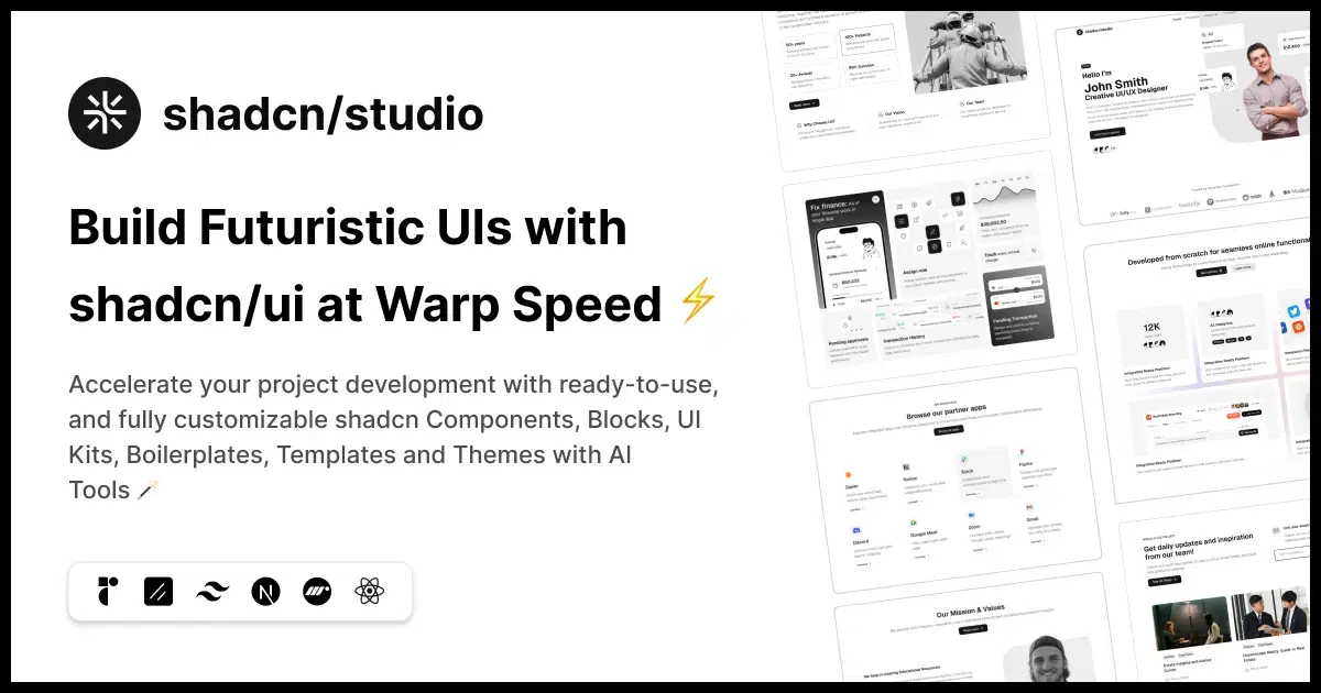
Shadcn Studio is a growing collection of production-ready Shadcn Components and UI Blocks designed to help developers build modern React applications faster. With 1000+ customizable components, sections, and layouts, it provides copy-paste code built with Tailwind CSS and accessibility-first principles, making it easy to create scalable interfaces without starting from scratch.
What makes Shadcn Studio even more powerful is its support for both Base UI and Radix UI primitives. Developers can choose the foundation that best fits their project architecture while keeping the same familiar Shadcn-style workflow.
The key technical insight here is that shadcn/ui its design system through CSS custom properties defined in your globals.css. Shadcn Studio gives you a visual interface for editing those variables. --radius, --primary, --background, etc., and shows you live component previews as you change them.
Key Features
Key Features
- Base UI & Radix UI Support – Choose the primitive foundation that best fits your project.
- Complete Code Ownership – No vendor lock-in; fully customizable code that lives in your codebase.
- AI-Powered Development – MCP Server, AI Theme Generator, and Copy Prompt support for tools like v0, Bolt, and Lovable.
- Figma to Code – Convert designs into Shadcn-compatible code with streamlined workflows.
- Beautiful Motion & Animations – Ready-to-use animated components and interactive UI patterns.
- Multiple Installation Options – Install via CLI, MCP, AI tools, or simple copy-paste.
- Accessibility-First – Built with modern, accessible UI primitives and best practices.
- Export workflow that integrates directly with your existing
globals.csswithout requiring any additional runtime dependencies
What Makes it a Best React Component Library Built on Shadcn UI
- Eliminates the trial-and-error cycle of editing CSS variables and reloading the browser, a real productivity gain on design system work
- Bridges the designer/developer gap by providing a no-code interface for a fundamentally code-driven system
- The output is zero-runtime, you’re editing static CSS variables, not adding a theming library
Apart from this, Shadcn Studio offers:
- 700+ Shadcn Blocks with Base UI & Radix UI Support
- 1000+ Shadcn Components and variants with Base UI & Radix UI Support
- Shadcn Figma Design System
- 10+ Shadcn Templates
- AI-powered Shadcn Theme Generator
Tweakcn
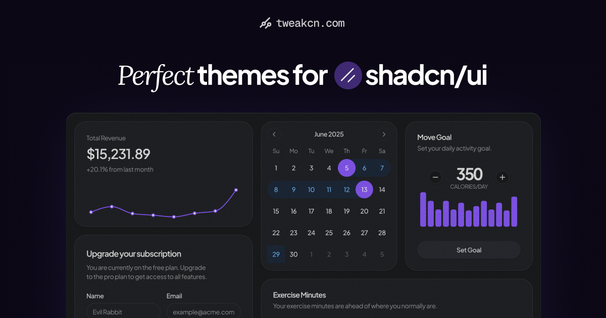
Tweakcn is a theme customization tool built specifically for shadcn/ui’s component tokens. Tweakcn goes deeper on the token editing workflow, giving you granular control over individual component-level CSS variables rather than just global palette values.
The distinction matters in practice. Global tokens like --primary cascade through every component that references them, but individual components sometimes need overrides that don’t affect the global palette. Tweakcn lets you explore that granularity visually.
Key Features:
- Per-component CSS variable editor, letting you fine-tune token values at the component level without disrupting global design tokens
- Real-time preview across multiple components simultaneously, so you can validate that a token change doesn’t break an adjacent component
- Dark mode parity: all edits are previewed in both light and dark modes at once
- Clean CSS output that slots directly into your project’s existing shadcn/ui setup
What Makes it a Best React Component Library Built on Shadcn UI
- Solves the “local override” problem that plagues global theme systems, you can diverge from the cascade without fighting CSS specificity
- Reduces the feedback loop on design token decisions from minutes to seconds
- Particularly useful for teams doing design audits or migrating between theme systems
Coss UI

Coss UI is a component library that extends the shadcn/ui base with additional complex, composite components, the kinds of patterns that shadcn/ui deliberately leaves out of its core (data grids, multi-step forms, complex filter UIs, rich text areas). It’s aimed at teams building data-dense applications where the base shadcn/ui primitives aren’t enough and building everything from scratch isn’t an option.
Key Features
- Composite components built on top of shadcn/ui primitives, maintaining Radix UI’s accessibility guarantees even in complex interactive patterns
- Copy-paste architecture consistent with shadcn/ui, components are imported into your project, not installed as a runtime dependency
- TypeScript-first, with well-typed props and component APIs that integrate cleanly with TypeScript-heavy Next.js projects
- Tailwind-native styling with no additional CSS files to manage
What Makes it a Best React Component Library Built on Shadcn UI
- Addresses the “missing middle” in shadcn/ui, the complex composite patterns that are hard to build from primitives alone
- Maintains shadcn/ui’s core architectural philosophy (you own the code) for complex components, which is rarer than you’d think
- Clean integration story for projects that already use shadcn/ui, there’s no style conflict because it’s the same token system
Lucide Animated
Lucide is the icon library that shadcn/ui uses by default, a clean, consistent open-source icon set with a strong community. Lucide Animated layers CSS and SVG animation onto Lucide icons, giving you motion-ready icon components with zero additional JavaScript weight beyond the animation definitions.
This is the kind of micro-interaction layer that separates polished interfaces from functional ones. A loading spinner that’s actually a spinning version of a familiar Lucide icon, a checkmark that draws itself on success, a bell that rings on notification, these details matter in production UIs.
Key Features
- Animated variants of popular Lucide icons with hand-tuned CSS transitions and SVG path animations
- Multiple animation modes per icon (loop, hover-trigger, one-shot) controlled via props
- Zero runtime JavaScript for animation, all motion is handled in CSS/SVG, keeping bundle size impact minimal
- Direct drop-in replacement for standard Lucide React component, same import interface, same size/color props
What Makes it a Best React Component Library Built on Shadcn UI
- Completes the motion story for icon-heavy interfaces without pulling in a separate animation framework
- The CSS/SVG animation approach means these work without JavaScript hydration, relevant for SSR and React Server Components
- Shares Lucide’s visual grammar, so animated and static icons coexist without stylistic inconsistency
Motion Primitives
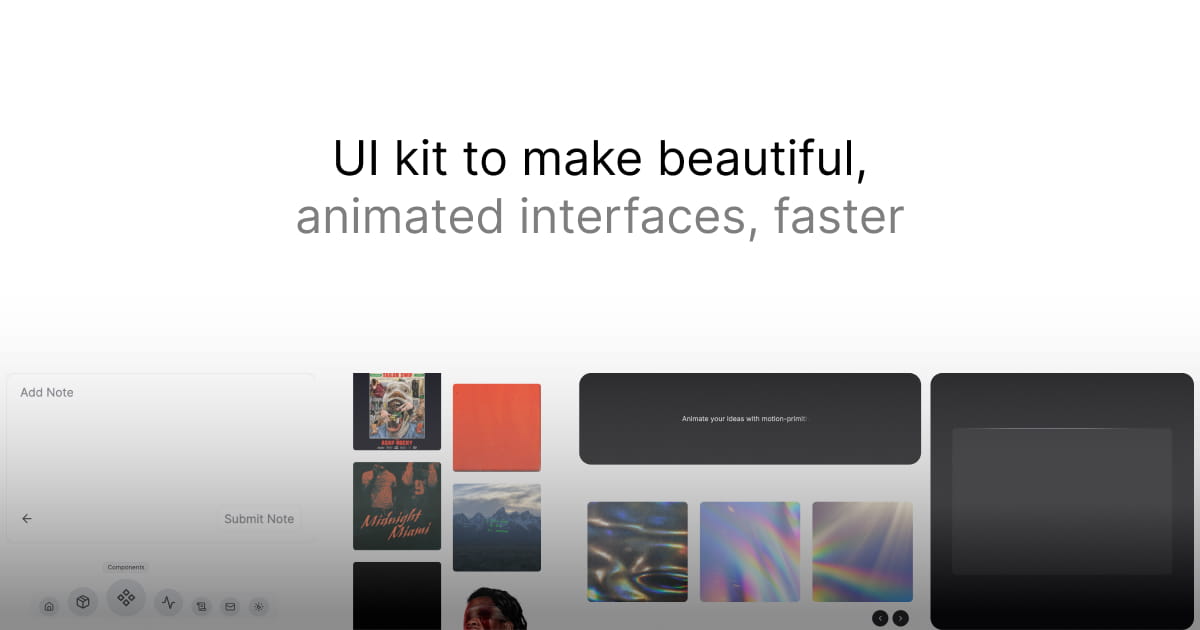
Motion Primitives is one of the most technically interesting projects in the shadcn ecosystem. It provides a collection of animation-focused React components built with Framer Motion, designed to be composed with shadcn/ui components the same way Radix primitives are composed.
These aren’t pre-animated versions of UI components; they’re animation building blocks: staggered list reveals, scroll-triggered sections, page transition wrappers, text animations, and cursor effects.
Ibelick, a frontend developer with a strong track record in the React animation space, maintains the library.
Key Features
- Scroll-driven animations (fade-in-on-scroll, parallax, sticky reveal) implemented with Framer Motion’s
useScrollanduseInViewhooks - Text animation primitives (character-by-character reveal, typewriter, gradient shimmer) built as composable components
- Layout transition utilities that handle the complexity of
AnimatePresenceandlayoutprop coordination - Full TypeScript support with typed animation variants and well-documented prop interfaces
- Copy-paste deliver, no npm install, components live in your codebase
What Makes it a Best React Component Library Built on Shadcn UI
- Raises the animation quality ceiling for shadcn/ui projects without requiring deep Framer Motion expertise
- Composable architecture means animation primitives wrap your existing shadcn/ui components rather than replacing them
- Particularly valuable for marketing sites and landing pages where motion quality differentiates
Cult UI
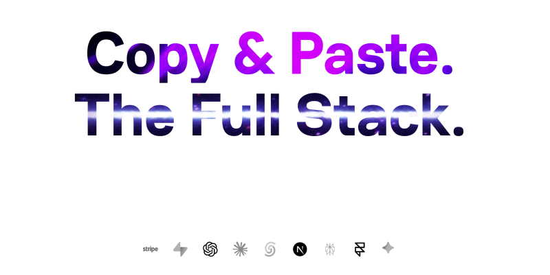
Cult UI is a boutique component library that sits in the intersection of shadcn/ui’s accessibility foundation and high-fidelity design. The components here are more visually distinctive than what you get from the base shadcn/ui, gradients, glassmorphism effects, sophisticated hover state, while maintaining the copy-paste ownership model.
It’s aimed at developers who want their apps to look polished without commissioning custom design work.
Key Features
- Visually differentiated components with carefully crafted micro-interactions, gradients, and depth effects using only Tailwind utilities
- Dark mode first, the visual language is designed for dark interfaces, with light mode variants that don’t feel like afterthoughts
- Components across the common SaaS UI surface area: pricing cards, feature grids, testimonial layouts, dashboard widgets
- Consistent design language is maintained across all components; they look like they belong together
What Makes it a Best React Component Library Built on Shadcn UI
- Closes the gap between “functional” and “polished” for developers who don’t have a dedicated UI designer
- The dark-mode-first approach means you get a design system that looks good in the environment where many developer tools live
- All visual effects are achieved through Tailwind classes, no additional CSS files, no CSS-in-JS, no inline styles
Pattern Craft
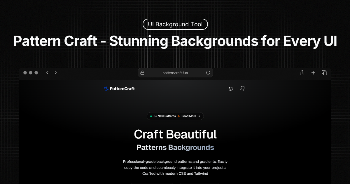
Pattern Craft focuses on CSS and SVG background patterns, a specific, often overlooked piece of UI polish. When you need a subtle dot grid, a diagonal line pattern, a noise texture, or a geometric tile for a hero section or card background, Pattern Craft gives you copy-paste Tailwind and CSS snippets that work immediately.
Key Features:
- Library of ready-to-use background pattern snippets (dot grids, lines, geometric shapes, noise textures) implemented in pure CSS or SVG
- Each pattern is configurable via CSS custom properties, so you can adjust scale, color, and opacity without modifying the pattern definition
- Direct Tailwind integration, patterns can be applied as utility classes or via arbitrary value syntax
- Light and dark mode variants for every pattern
What Makes it a Best React Component Library Built on Shadcn UI
- Addresses a common design gap, most UI libraries stop at component-level styling and leave background patterns to you
- Zero JavaScript, patterns are pure CSS/SVG, so they have no impact on bundle size or rendering performance
- Pairs naturally with shadcn/ui cards, hero sections, and feature panels
Fancycomponents
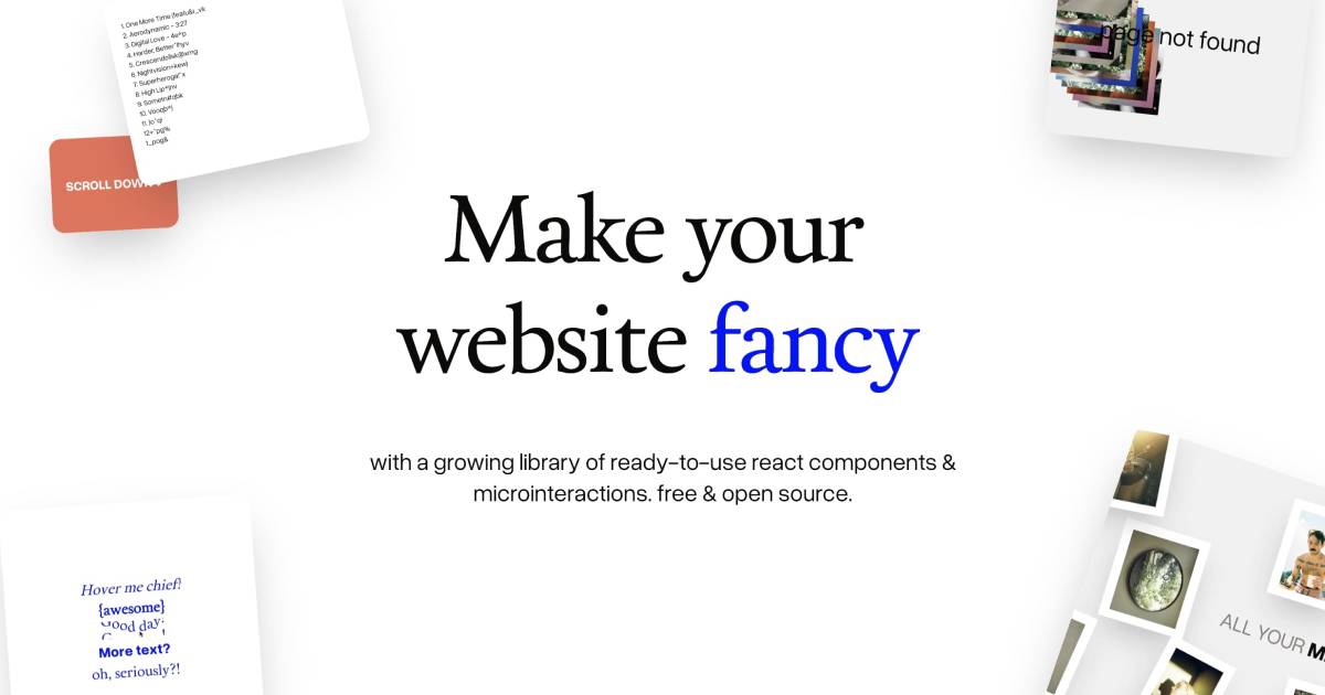
Fancycomponents.dev is a collection of high-fidelity, visually ambitious React components that push the aesthetic boundaries of what’s typical in the shadcn/ui space. Think 3D card effects, magnetic buttons, spotlight cursors, and animated gradients, the kinds of components you’d build once for a portfolio or marketing site and want to reference again later.
Key Features:
- Technically sophisticated visual effects (3D perspective transforms, WebGL-light-inspired gradients, particle effects) implemented in React with Tailwind and CSS transforms
- Each component is isolated and copy-paste ready, with no hidden peer dependencies
- Detailed implementation notes explaining the CSS/JS techniques behind each effect, which serve as learning material as much as a component library
- Performance-conscious implementation, effects are GPU-accelerated where possible, and respect
prefers-reduced-motion
What Makes it a Best React Component Library Built on Shadcn UI:
- Provides the high-impact visual components that distinguish premium-feeling interfaces, without requiring WebGL or Canvas expertise
- The educational context around each component means you understand what you’re copying, not just that it works
prefers-reduced-motionsupport means these components are production-responsible, not just demos
ReUI
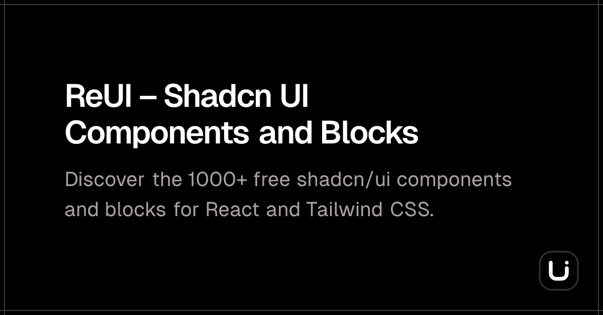
ReUI is a comprehensive UI component library and block collection built directly on shadcn/ui, targeting production React and Next.js applications. It goes beyond single-component snippets to provide full page sections; hero layouts, feature grids, pricing sections, navigation patterns - that can be assembled into complete page designs.
Key Features
- 100+ production-ready components extending the shadcn/ui base catalog with complex patterns (data tables with pagination, multi-select filters, advanced form layouts)
- Full page sections and block layouts that can be assembled into complete marketing or application pages
- TypeScript throughout with strict prop typing and well-documented component interfaces
- Storybook integration for component development and visual testing workflows
- Next.js App Router compatible, with RSC-safe component patterns
What Makes it a Best React Component Library Built on Shadcn UI
- One of the most complete shadcn-ecosystem libraries in terms of breadth; covers both components and layout blocks in a single consistent system
- App Router compatibility is increasingly important and not universal in this ecosystem
- The Storybook integration enables proper component testing and documentation workflows, which matters for team projects
Kokonut UI
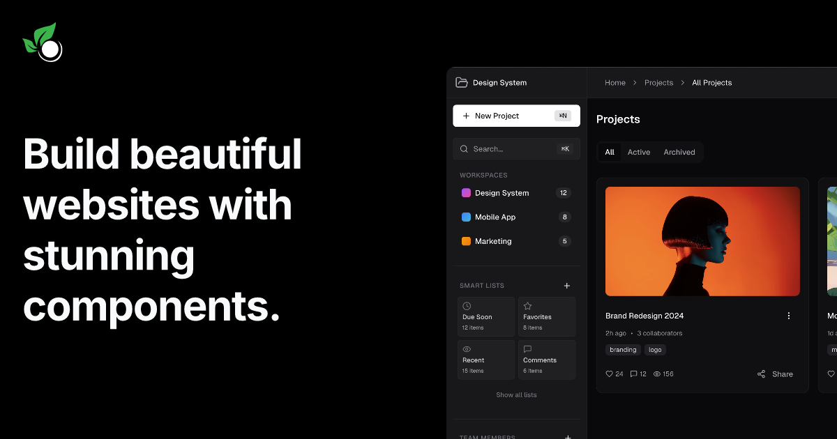
Kokonut UI focuses on interactive and animated components, modals, drawers, tooltips, dropdowns, and notification systems, with motion built in from the start rather than as an afterthought. The library is built on shadcn/ui’s Radix primitive foundation, so accessibility behaviors (focus trapping, escape key handling, ARIA attributes) are handled correctly.
Key Features:
- Pre-animated interactive components where motion is part of the design spec, not a post-hoc addition
- Consistent animation timing and easing curves across all interactive elements, creating a cohesive motion feel
- Radix UI primitives under the hood for all interactive components, keyboard navigation, and focus management work correctly out of the box
- Multiple animation variants per component (slide, fade, scale) selectable via props
What Makes it a Best React Component Library Built on Shadcn UI:
- Solves the “accessible AND animated” problem; it’s common for animated component libraries to break keyboard navigation, but Kokonut doesn’t
- The shared animation vocabulary across components produces a more professional-feeling UI than mixing per-component animation choices
- The prop-driven variant system means you can change animation style without modifying the component internals
MVP Blocks
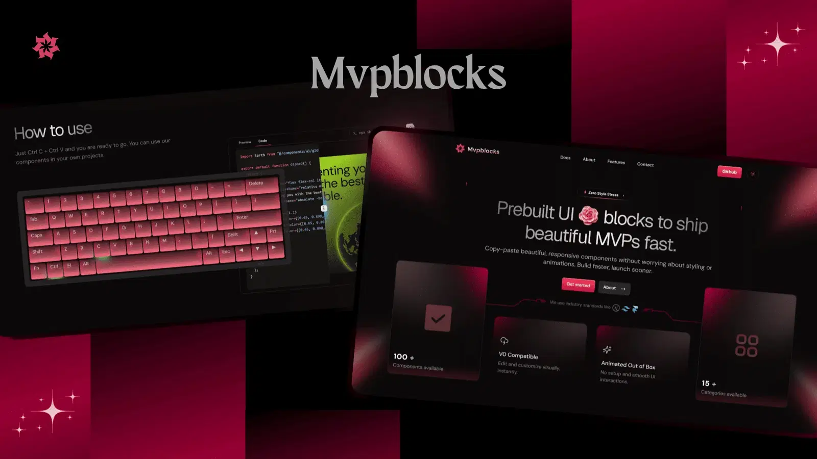
MVP Blocks is a block collection explicitly designed for speed-to-launch, targeted at developers building MVPs, indie projects, and early-stage SaaS products. The components are opinionated enough to look good out of the box while being simple enough that customization doesn’t require deep CSS knowledge.
Maintained by Subha Chanda, an active member of the shadcn/ui community with frequent contributions to the ecosystem.
Key Features:
- Curated blocks for common MVP surfaces: landing pages, waitlist forms, feature sections, FAQ accordions, testimonials, pricing tables
- Minimal external dependencies, each block pulls only from shadcn/ui and Tailwind
- Mobile-first responsive design baked into every block
- Clean, readable code that’s easy to extend without unpacking complex abstractions
What Makes it a Best React Component Library Built on Shadcn UI
- Explicitly optimized for the use case most developers are actually in: shipping something functional quickly
- The minimal dependency philosophy means less surface area for version conflicts and bundle bloat
- Active maintenance from a community-engaged creator means issues are addressed and the library evolves with the shadcn/ui ecosystem
Smooth UI
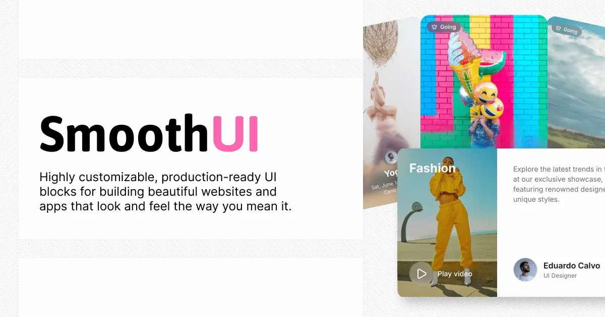
Smooth UI focuses on one specific quality: interaction smoothness. Every component in the library has been tuned for fluid, physically realistic animations, the kind of transitions that make a UI feel expensive. Spring animations, gesture-responsive elements, and layout transitions are the focus.
Key Features:
- Spring-physics-based animations for all interactive components, using Framer Motion’s spring system rather than linear CSS transitions
- Gesture-responsive components (draggable panels, swipeable cards, pull-to-refresh patterns) that respond to mouse and touch input
- Layout animation support for list reordering, accordion expansion, and dynamic grid changes
- Fallback behavior for
prefers-reduced-motionimplemented throughout
What Makes it a Best React Component Library Built on Shadcn UI:
- Spring physics produce animations that feel natural in a way that CSS easing curves often don’t, with a perceptible quality difference in production
- Gesture support is technically complex to implement correctly (handling drag boundaries, velocity-based dismissal, rubber-band effects); Smooth UI handles this complexity for you
- The
prefers-reduced-motionFallbacks mean you’re not shipping inaccessible animations
Components.work
Components.work is a curated repository of high-quality shadcn/ui community contributions, a quality-filtered collection rather than a library with its own design language. Think of it as a vetted marketplace for shadcn-compatible components where curation is the primary value.
Key Features:
- Community-sourced components are reviewed for code quality, accessibility, and design consistency before inclusion
- Broad component coverage across multiple categories: navigation, data display, forms, marketing sections, dashboard widgets
- Each component includes the full source code, implementation notes, and preview; there are no black-box components
- Regular updates as new high-quality contributions are added
What Makes it a Best React Component Library Built on Shadcn UI
- Curation solves the discoverability problem in a fragmented ecosystem. Finding good Shadcn-compatible components across GitHub and CodeSandbox is time-consuming.
- The community-sourced model means there’s real diversity in component style and approach, useful when you want options rather than a single design language.
- Source-first presentation means you understand what you’re adopting.
UseLayouts
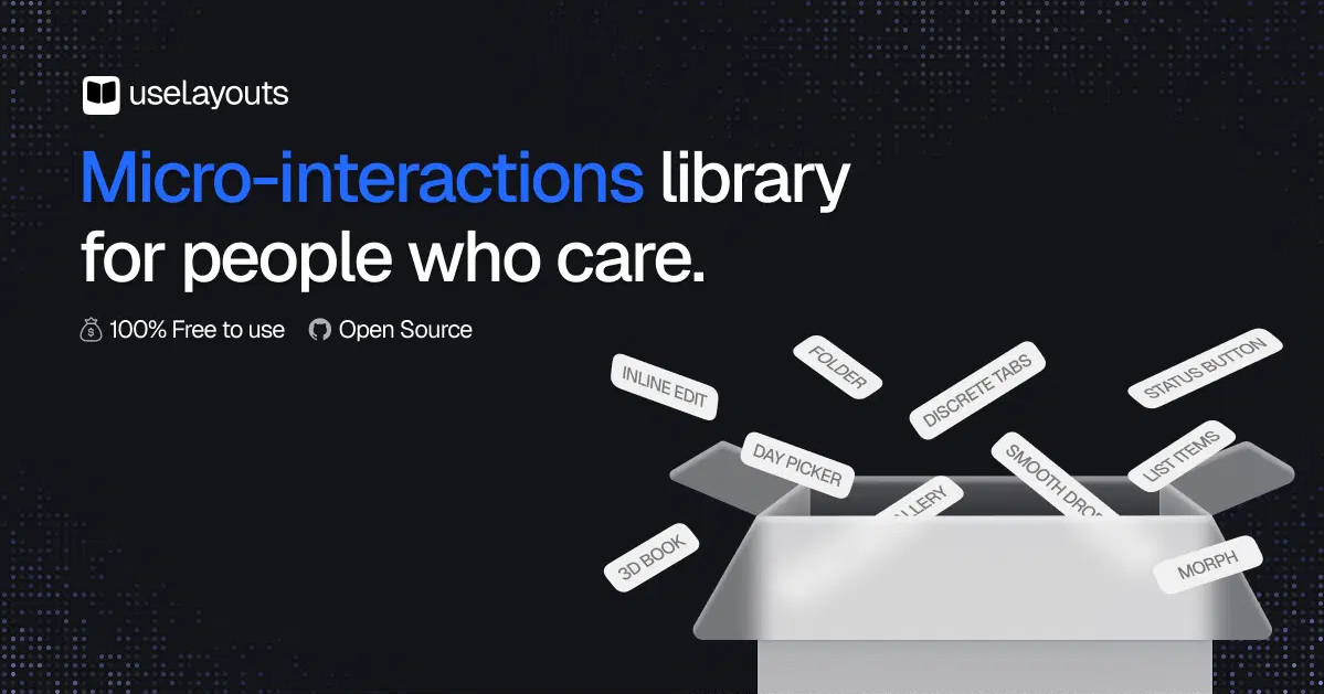
UseLayouts is focused specifically on layout patterns, the structural scaffolding of application pages. Sidebars, two-column layouts, dashboard shells, resizable panels, sticky headers with scrollable content areas, these are the patterns that Next.js developers have to build from scratch repeatedly, and UseLayouts codifies the correct implementations.
Key Features
- Application shell layouts (dashboard sidebar, content area, header combinations) built correctly for Next.js App Router architecture.
- Resizable panel implementations using CSS grid and ResizeObserver, without the layout instability that naive implementations often produce.
- Responsive layout patterns with documented breakpoint behavior.
- Layout components are structural only; they accept shadcn/ui components as children without imposing a visual style.
What Makes it a Best React Component Library Built on Shadcn UI
- Application layout patterns are deceptively complex (sticky headers with independently scrollable content areas, correct sidebar behavior at different viewport sizes), getting these right from a reference implementation saves significant debugging time
- The App Router-first approach means the patterns work with React Server Components and Next.js’s streaming model
- Structural-only design means these layouts compose cleanly with any visual component library
BadtzUI
BadtzUI is a collection of animated, visually distinctive components for landing pages and marketing sites. The library leans into the current design trend of bold backgrounds, animated gradients, glow effects, and typographic motion, components that make hero sections and feature showcases feel dynamic without requiring custom creative direction.
Key Features
- Hero section components with built-in animated gradient backgrounds, mesh gradients, and spotlight effects implemented in CSS and Framer Motion
- Typography animation components (reveal by line, character scramble, gradient sweep) for high-impact text presentations
- Animated badge and tag components for feature callouts
- Particle and noise effect backgrounds that respect performance boundaries (frame rate caps, GPU compositing layers)
What Makes it a Best React Component Library Built on Shadcn UI
- Covers the marketing/landing page design patterns that are systematically underserved in shadcn/ui’s own catalog (which focuses on application UI)
- GPU-aware implementation of background effects means you’re not shipping janky animations on mid-tier hardware
- The visual language matches current SaaS design trends, dark backgrounds, colored glows, and dynamic typography, without requiring a designer
Optics Design System
Optics is a full design system built on top of shadcn/ui, maintained by Agustín Mayol. It goes beyond a component library to define a complete design language: typographic scale, spacing system, color semantic layer, icon style guidelines, and component behavior specifications.
For teams that need design/engineering alignment, Optics provides a reference implementation of what a complete shadcn/UI-based design system looks like.
Key Features:
- Complete design token system layered on top of shadcn/ui’s CSS variables, adding semantic tokens (surface, on-surface, interactive, feedback states) to the base palette system
- Typographic scale and spacing ramp are defined in the Tailwind configuration, with documentation explaining the scale decisions
- Figma variables structure documented alongside the CSS implementation, supporting design-to-code handoff
- Extended component catalog that adds patterns, shadcn/ui omits: data visualization wrappers, complex navigation structures, multi-step form flows
What Makes it a Best React Component Library Built on Shadcn UI:
- One of the few shadcn/ui-based projects that approaches design systems rigorously, with documented token hierarchies, not just styled components
- The Figma-to-CSS alignment is rare in open-source component libraries and directly addresses the design/developer handoff problem
- Semantic token layer (rather than raw color values on components) means global rebrand changes are single-variable edits
Skiper/UI
Skiper UI is a premium aesthetic component library that focuses on high-fidelity visual design for SaaS products. Where many shadcn-based libraries prioritize speed-to-functional, Skiper prioritizes the “wow” factor, the visual quality that makes users trust a product before they’ve read a word of copy.
Key Features
- Premium SaaS UI components (sophisticated modal designs, data-dense dashboard widgets, polished empty state illustrations) with production-ready visual quality
- Advanced gradient and border effects using CSS
border-imageandbackground-cliptechniques, the kind of visual refinement that distinguishes Figma-designed components from standard library components - Consistent visual system with documented design decisions, not just a collection of independently styled components
- Next.js and React Server Component compatible patterns throughout
What Makes it a Best React Component Library Built on Shadcn UI
- Addresses the visual quality gap between “it works” and “it looks like a funded product”, a real consideration for early-stage SaaS
- The
border-imageandbackground-cliptechniques used are not widely understood, but produce effects that are otherwise hard to replicate with standard Tailwind utilities - Design consistency is documented and intentional, which matters for teams maintaining a component library over time
SyntaxKit (SyntaxUI)
SyntaxUI is a collection of developer-tool-adjacent UI components and patterns, code blocks with syntax highlighting, terminal-style outputs, API response displays, diff viewers, and documentation UI patterns. It’s built for teams creating developer portals, documentation sites, API explorers, and tools that display code prominently.
Key Features
- Code display components built on top of Shiki (the same syntax highlighter used in shadcn/ui’s documentation and many Vercel projects), with customizable themes and line highlighting
- Terminal emulator UI components with prompt styling, command history, and animated output display
- API response viewer components that handle nested JSON display with collapsible nodes
- Documentation layout patterns (sidebar navigation, content area, table of contents) pre-built for Next.js projects
What Makes it a Best React Component Library Built on Shadcn UI
- Shiki integration means syntax highlighting is accurate and theme-consistent with the rest of the shadcn/ui ecosystem, with no additional syntax highlighter dependencies
- Terminal and API display patterns are notoriously time-consuming to build correctly. SyntaxUI provides reference implementations
- Directly useful for the large portion of the shadcn/ui audience building developer-facing products
Solace UI
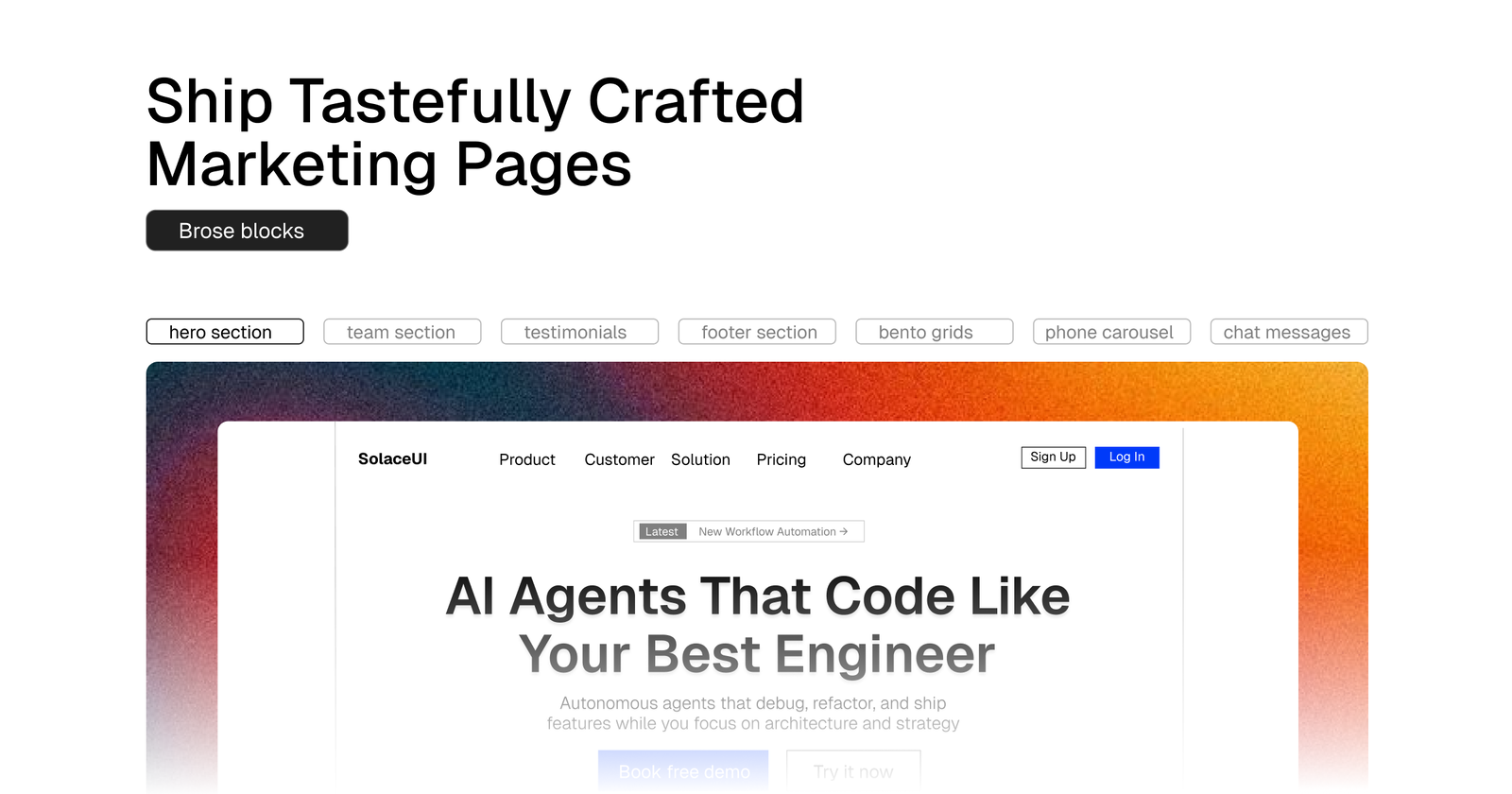
Solace UI takes a calm, minimal approach to the shadcn ecosystem, clean components with restrained visual design, focused on clarity and legibility over visual complexity. It’s positioned for products where professional restraint is the right aesthetic: enterprise tools, B2B SaaS, internal dashboards, and productivity apps where users spend extended time.
Key Features
- Extended shadcn/ui component catalog with a consistent, restrained visual language that doesn’t compete with content
- Data display components (tables, stat cards, metric displays, comparison grids) are designed for information density without visual clutter
- Form patterns for complex inputs (date ranges, multi-select with search, conditional field display) implemented accessibility on Radix UI primitives
- Comprehensive dark mode implementation with contrast ratios documented against WCAG 2.1 AA standards
What Makes it a Best React Component Library Built on Shadcn UI
- The WCAG 2.1 AA contrast documentation is concrete evidence of accessible design, a meaningful differentiator from libraries that claim accessibility without measuring it
- Extended session usage (enterprise tools, dashboards) genuinely benefits from visual restraint; Solace UI is designed for this context
- Data display patterns cover the high-frequency needs of SaaS dashboards without requiring custom implementation
Square UI
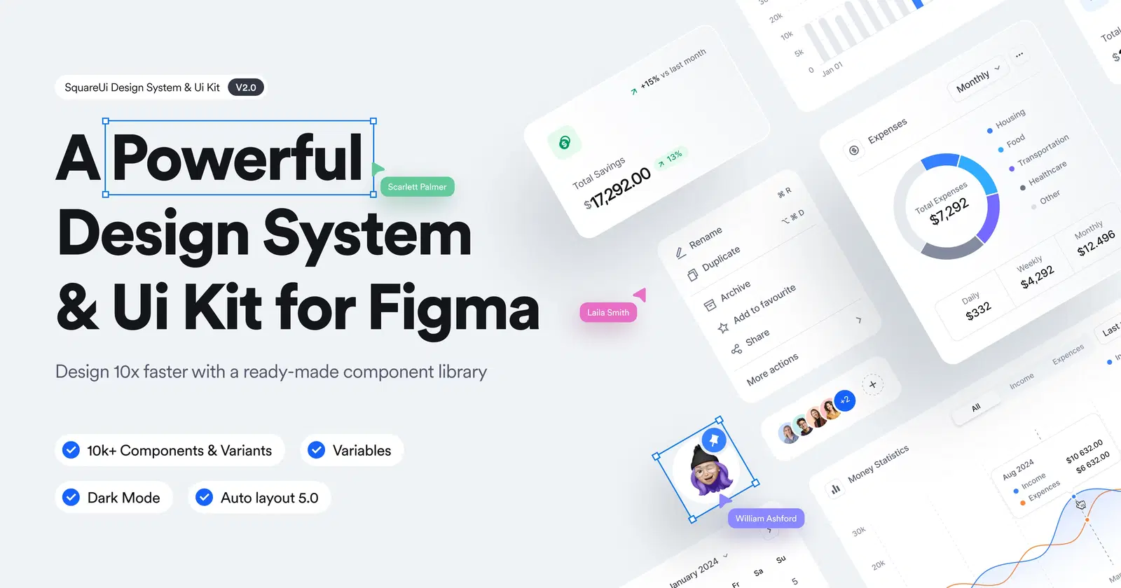
Square UI is a component library built for structured, grid-based application interfaces; the kind of dense, information-rich UIs you find in project management tools, CRMs, and admin panels. The library’s visual language is angular and geometric, optimized for high information density rather than visual decoration.
Key Features:
- Grid and table-centric component patterns optimized for dense data display
- Comprehensive form component library, including advanced input patterns (combobox, multi-level select, tag input) built on Radix UI
- Application navigation patterns (breadcrumbs, segmented controls, command palettes) with keyboard navigation implemented correctly
- CSS grid-based layout primitives for constructing complex application shells
What Makes it a Best React Component Library Built on Shadcn UI
- Command palette implementation is technically demanding (fuzzy search, keyboard navigation, grouped results, recent items); having a reference implementation is valuable
- Grid-centric design philosophy matches the actual structure of most application UIs better than component libraries that prioritize marketing aesthetics
- Comprehensive form input coverage addresses one of the most common “missing piece” complaints about the base shadcn/ui library
Ali Imam UI
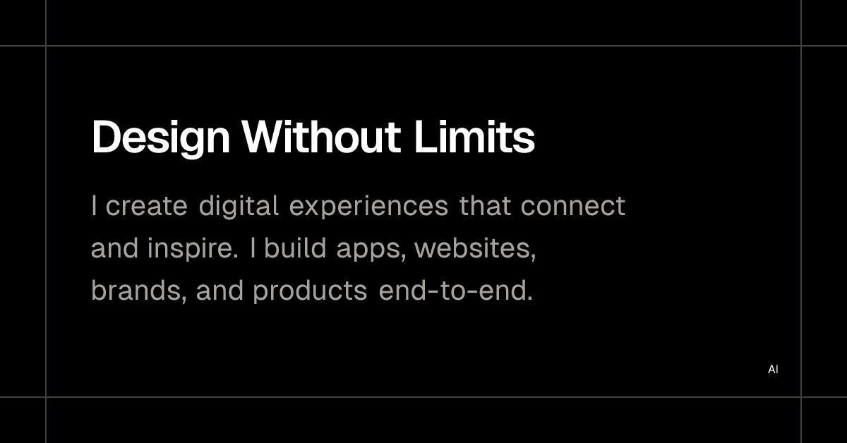
Ali Imam’s personal component collection is one of the more technically distinctive projects in the shadcn ecosystem. The components here, 3D card flips, magnetic hover effects, custom cursor trails, and a generative background system, demonstrate advanced CSS and JavaScript techniques while remaining implementable in standard React/Tailwind projects.
The site also serves as a portfolio and creative development journal, with implementation notes that explain the techniques behind each effect.
Key Features:
- Technically advanced visual effects (3D CSS transforms, magnetic pointer interactions, generative SVG patterns) implemented without WebGL
- Detailed implementation explanations accompanying each component, useful for learning advanced CSS/JS techniques, not just copying components
- Performance-first approach, effects are implemented to stay within 60fps on mid-tier hardware, with documented performance tradeoffs
- Open-source with permissive licensing
What Makes it a Best React Component Library Built on Shadcn UI
- Raises the technical ceiling for what’s achievable with CSS transforms and JavaScript pointer events, techniques that aren’t widely documented elsewhere
- The educational dimension means you’re building capability, not just borrowing components
- Pure CSS/JS implementation (no WebGL) means broader browser compatibility and no additional rendering infrastructure
Tailark
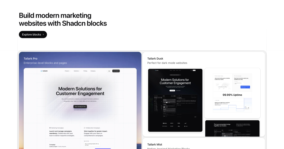
Tailark is a block and section library aimed at marketing sites and product landing pages. It covers the full marketing page surface area; hero sections, feature showcases, testimonial layouts, pricing tables, FAQ sections, CTA blocks, and footer patterns — all built with Tailwind and shadcn/ui components, and all designed to be assembled into complete page designs.
Key Features:
- 60+ customizable UI components
- Built with Tailwind CSS v4
- Fully accessible components based on Base UI
- TypeScript support
- Dark mode support
- Component registry compatible with shadcn CLI
What Makes it a Best React Component Library Built on Shadcn UI
- Complete marketing page coverage in a single library reduces the multi-source assembly problem (most developers otherwise piece together landing pages from 3–4 different block libraries)
- The section variant approach means you can create visual differentiation between page sections without breaking design cohesion
- shadcn/ui integration throughout means no style conflicts, everything shares the same token system
What Are Shadcn React Component Libraries?
Traditional React UI libraries, such as MUI, Chakra UI, and Ant Design, are distributed as npm packages. You install them, import components, and style them through the library’s theming API. This is convenient until you need something the library doesn’t support, at which point you’re fighting CSS specificity, writing !important overrides, or forking the library.
Shadcn React component libraries work differently. Instead of installing a package, you copy component source files into your project using the shadcn/ui CLI:
npx shadcn@latest add buttonThis drops a button.tsx file directly into your components/ui/ directory. You own it — you can read it, modify it, and extend it without any abstraction layer between you and the implementation. There’s no node_modules version to conflict with, no upstream breaking change to worry about, and no black-box behavior to debug.
The technical foundation of this ecosystem rests on two underlying libraries:
-
Radix UI provides unstyled, accessible primitive components — dialog roots, dropdown menu triggers, and tooltip providers. These handle the hard parts of accessible interactive components: focus trapping, keyboard navigation, ARIA attribute management, and portal rendering. Radix is deliberate about being unstyled — it provides behavior without appearance, which makes it ideal as a foundation for a design-system-agnostic component architecture.
-
Base UI is the newer alternative primitive layer, now the recommended default for new shadcn/ui projects. Built by the same team that created Radix (and Floating UI and Material UI), Base UI covers the full Radix component set and extends it with more complex primitives — Combobox, Autocomplete, Drawer, input scrubbing, and nested dialog support.
It also ships a useRender hook that gives you RSC-compatible control over the rendered DOM element of any component. Both Radix and Base UI are supported in shadcn/ui; your choice is made at project initialization via npx shadcn create, and the CLI auto-detects your primitive library and applies the correct component transformations automatically — including for components pulled from third-party registries.
- Tailwind CSS provides the styling layer. Rather than scoped CSS or CSS-in-JS, Tailwind utilities are applied directly in JSX as class strings. The shadcn/ui components use
class-variance-authority(CVA) to manage variant-based class composition andtailwind-mergeto handle class conflict resolution — two small utilities that solve real problems when composing Tailwind classes programmatically.
The result is a component architecture that’s transparent, customizable, and Tailwind-native — which is why the ecosystem around it has grown so quickly. When the foundation is simple and well-understood, building on top of it is straightforward.
Benefits of Using Shadcn React Component Libraries
Faster development without design debt.
- Pre-built, production-quality components eliminate the time spent on base UI implementation. But unlike traditional libraries, you’re not accumulating design debt from opinionated defaults you’ll need to override later.
Accessibility is handled at the primitive level.
- Both Radix UI and Base UI handle ARIA attributes, keyboard navigation, and focus management correctly at the primitive layer. Libraries built on either foundation inherit those guarantees — a meaningful difference from libraries that bolt accessibility on after the fact. Base UI raises the ceiling further with WCAG-audited components and a dedicated team continuously improving edge-case handling.
Full ownership of the component code.
- Because components live in your repository, you can modify them without forking a library or waiting for upstream changes. This is particularly valuable for complex components where you need behavior that differs from the library default.
Design token portability
- Shadcn/ui’s CSS variable-based token system means a single change to
--primarycascades through every component that references it. This makes rebrand operations and design system updates straightforward.
Composable with minimal conflict
- Because these libraries share the same Tailwind and shadcn/ui token foundation, components from different libraries compose cleanly. You can use Motion Primitives for animation, Tailark for marketing blocks, and ReUI for application components without style collisions.
AI-friendly codebase structure.
- The copy-paste architecture produces flat, readable component files that LLM-based coding assistants can reason about effectively. There’s no framework abstraction layer to navigate — just standard React and Tailwind.
Performance advantages over heavy frameworks.
- Both Radix UI and Base UI are tree-shakeable — only the primitives you use land in the bundle. Tailwind’s PurgeCSS integration means only the utility classes you use appear in the production CSS. The result is significantly smaller bundles than traditional UI frameworks, and Base UI adds further performance improvements through optimised Select rendering and a lightweight
useRenderhook that avoids unnecessary wrapper elements.
Scales cleanly to design systems.
- The token system, component ownership model, and Tailwind configuration together provide a solid foundation for growing a component library into a full design system as a product matures.
Parameters for Choosing the Right Component Library
Not all shadcn-based libraries are right for every project. Here’s what to evaluate:
Accessibility depth:
-
Does the library use Radix UI or Base UI primitives for interactive components, or does it implement its own?
-
Check whether keyboard navigation works in complex components (multi-select dropdowns, date pickers, command palettes) before committing. Libraries that build on either Radix or Base UI inherit correctness for free; those that don’t need individual verification. As shadcn/ui’s ecosystem shifts toward Base UI, libraries that haven’t updated their primitive layer may fall behind on accessibility edge cases.
TypeScript completeness.
-
TypeScript coverage varies significantly across libraries. Look for typed component props, typed variant definitions (CVA-based), and typed event handlers.
-
Incomplete typing creates friction in TypeScript-heavy Next.js projects and breaks IDE autocompletion.
Next.js App Router compatibility
-
React Server Components impose constraints on component architecture — specifically, components using React state or browser APIs must be client components.
-
Libraries that haven’t audited their components for RSC compatibility will require wrapper components or produce hydration errors. Check for
"use client"directives and documented RSC compatibility.
Animation approach and performance.
-
Libraries using CSS transitions are safe for any project. Libraries using Framer Motion add ~30KB to the client bundle — acceptable for interactive apps, worth evaluating for content-heavy sites.
-
Libraries using
requestAnimationFrameLoops or continuous JavaScript animations need performance auditing before production use.
Design quality and visual consistency.
-
Look at whether components across the library feel like they belong together — consistent spacing scales, type treatment, and interactive state handling.
-
Inconsistency across components suggests the library was assembled rather than designed.
Documentation quality
-
Good documentation includes prop interfaces, variant options, accessibility notes, and composition examples — not just screenshots and a copy button.
-
Libraries with poor documentation become maintenance burdens when the original developer needs to be onboarded.
Open source licensing.
- Most shadcn-ecosystem libraries are MIT licensed, but some have restrictions on commercial use or require attribution. Verify the license before using it in commercial products.
Maintenance frequency and community health.
- Check the repository’s commit history, issue response time, & whether reported bugs get fixed. A library that hasn’t been updated in 12 months may not support current shadcn/ui CLI versions or Tailwind v4.
Tailwind version compatibility.
- The ecosystem is currently in transition between Tailwind v3 and v4. Tailwind v4 changed the configuration format significantly — CSS-based configuration replaces
tailwind.config.js. Check which version a library targets before installing.
Bundle impact.
- The copy-paste model means component code lives in your bundle directly. Libraries that include large external dependencies (heavy animation runtimes, full icon sets as JavaScript) deserve scrutiny on bundle size impact before adoption.
Conclusion
The 20+ libraries covered here represent the breadth of what’s emerged from that foundation — from animation primitives and visual effects to complete design systems and layout frameworks. None of them is the right choice for every project, which is actually the point.
The ecosystem is modular enough that you can select what you need for your specific context: a marketing site might reach for Tailark and BadtzUI; a SaaS dashboard might prefer ReUI and Solace UI; a developer tool might benefit from SyntaxUI and UseLayouts.
What makes this selection process tractable is the shared foundation. Because everything is built on the same Tailwind + shadcn/ui stack — with Radix UI or Base UI as the underlying primitive engine — combining libraries doesn’t produce the style conflicts and dependency collisions that plagued the multi-library npm ecosystem. You can compose these projects the same way you compose components. The shift toward Base UI as the recommended primitive layer is a signal that the ecosystem is maturing: the community is upgrading its foundations, not just adding to them.
The direction this ecosystem is heading — increasingly composable, increasingly design-system-oriented, increasingly compatible with AI-assisted development workflows — suggests that the copy-paste component architecture pioneered by shadcn/ui isn’t a temporary trend.
It’s a more sustainable model for building and maintaining UI code at scale, and the libraries emerging around it reflect a maturing community that’s building serious tooling on a serious foundation.