In this guide, you’ll learn how to use shadcn ui step by step, starting from setup to advanced usage. We’ll cover:
- Creating a new project with shadcn/ui
- Adding shadcn/ui to existing projects
- Installing and customizing components
- Working with blocks and the shadcn directory
- Theming, icons, RTL support, and more
This blog is written for:
- Beginners who want a clean starting point
- Experienced developers looking for best practices
- Anyone building scalable UI with Tailwind CSS and modern React frameworks
By the end, you’ll have a clear understanding of how to use shadcn/ui effectively in real-world projects, without unnecessary complexity.
Table of Contents
Understanding shadcn/ui

shadcn/ui has become one of the most popular ways to build modern, accessible, and customizable user interfaces in the React ecosystem. Unlike traditional component libraries that ship precompiled components, shadcn/ui gives you copy-and-own components that live directly inside your project.
This approach gives developers full control over styling, structure, and behavior, without fighting abstractions or overriding library styles.
Besides, shadcn/ui is not a traditional “install-and-use” component library. Instead, it’s a modern UI component system built for React that gives you full ownership of component code while providing production-ready building blocks. Unlike libraries, where the code lives inside node_modules, shadcn/ui components are copied directly into your project so you can customize them without limits.
At its heart, shadcn/ui blends three powerful ideas:
- Open Code Philosophy: You own the real source code of each component, not just a compiled dependency. This makes customizing, extending, and debugging UI components easy and intuitive.
- Composable Architecture: Each component follows consistent conventions that are predictable across the library, making it easier to learn new components quickly.
- Tailwind-First Styling: shadcn/ui uses Tailwind CSS for styling, giving developers a utility-first workflow where layouts and variants are expressive and easy to control.
A New Option: Base UI Alongside Radix UI
shadcn/ui was originally built on Radix UI primitives, which are unstyled, accessible building blocks handling keyboard interactions, accessibility, and other behaviors.
As of the latest updates, shadcn/ui supports both Radix UI and Base UI as underlying primitives. This means when you scaffold a new project, you can choose either:
- Radix UI: A mature primitives library focused on accessibility and composability.
- Base UI: A newer, actively maintained primitives library from the creators of Radix, Floating UI, and Material UI. It offers modern patterns like
renderprops and broader component coverage while still being unstyled and flexible.
Thanks to the shadcn/ui CLI, the same API surface is maintained regardless of which primitive library you choose. Components look and behave the same in your codebase – only the underlying implementation differs.
To understand both in depth, check the comprehensive comparison of Base UI vs Radix UI.
Why Developers Are Choosing shadcn/ui
shadcn/ui has become popular because it strikes a balance between starter-friendly components and deep customization:
- You get accessible UI patterns out of the box without writing low-level accessibility logic yourself.
- Components are production-ready but fully editable – you can adapt them to your design without fighting overrides or theme limitations.
- The structure works naturally with Tailwind CSS, making responsive and variant-based design easier.
How To Install Shadcn UI in Your Project?

shadcn/ui works with all major React frameworks, including Next.js, Vite, Remix, Astro, and more. That means you’re free to choose the framework that fits your project – there’s no lock-in, and the official CLI will adapt to your setup.
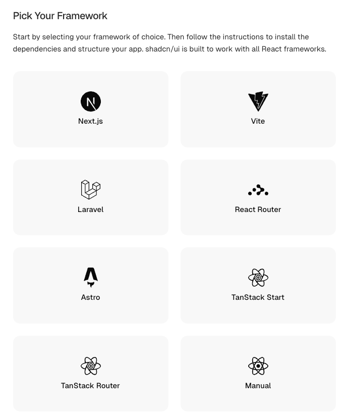
In this guide, we’ll focus on getting everything working with Next.js. If you decide to use another framework, the official shadcn/ui documentation has step-by-step instructions you can follow.
Here are the steps to set up
Step 1: Open your terminal and run the following command:
pnpm dlx shadcn@latest initThis command uses the shadcn CLI to initialize your project. If you’re starting fresh, the CLI can create a new Next.js app for you. If you already have a project, it will detect and configure it

Step 2: Name your project when asked.
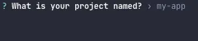
Step 3: Pick a base color and style for your UI components – this will be used to generate Tailwind CSS variables and defaults.

Once the setup is complete, shadcn/ui will install dependencies, generate config files like components.json, and configure Tailwind CSS for you automatically. At this point, your project is ready, and you can begin adding components.
🎉 Congratulations! Your shadcn/ui project is now set up and ready to use.
How to Install Shadcn Components?
Once your shadcn project is set up, you can start adding components right away. shadcn/ui makes this simple by using a component registry that works through its CLI. This allows you to install only the components you need, nothing extra, no unused code.
All components are added directly to your project, so you can edit them freely whenever required.
Installing a Single Component
To install a single component, head over to the official shadcn components official and choose the component you want to use.
Each component page provides two installation options:
- Command (recommended)
- Manual setup
If you choose the command option, you’ll see a CLI command for that component. Simply copy and run it in your terminal.
For example, if you want to install the Button component, running the provided command will automatically:
pnpm dlx shadcn@latest add button
# or: npx shadcn@latest add button
# or: yarn shadcn@latest add button
# or: bunx --bun shadcn@latest add button
If you prefer more control, you can follow the manual steps listed on the same page and copy the component code yourself.
Once installed, the component is ready to use and can be imported directly into your pages or components.
import { Button } from "@/components/ui/button"
import { ArrowUpIcon } from "lucide-react"

export function ButtonDemo() {
  return (
    <div className="flex flex-wrap items-center gap-2 md:flex-row">
      <Button variant="outline">Button</Button>
      <Button variant="outline" size="icon" aria-label="Submit">
        <ArrowUpIcon />
      </Button>
    </div>
  )
}
Installing Multiple Components
Installing multiple components works the same way as installing a single one-you just include all the component names in one command.
Instead of running separate commands, you can list multiple components together. The CLI will install all of them at once, along with any shared dependencies.
pnpm dlx shadcn@latest add button alert dialogThat’s it. All selected components will be added to your project in one go, keeping your setup clean and efficient.
Special Mention: Shadcn Studio
If you are working on a shadcn project, you can also use the best Shadcn UI Library: Shadcn Studio

This isn’t a traditional component library or a replacement for Shadcn. Instead, it’s a unique collection that offers customizable variants of components, blocks, and templates. Preview, customize, and copy-paste them into your apps with ease.
Building on the solid foundation of the Shadcn components & blocks, we’ve enhanced it with custom-designed components & blocks to give you a head start. This allows you to craft, customize, and ship your projects faster and more efficiently.
Features:
- Open-source: Dive into a growing, community-driven collection of copy-and-paste 1000+ shadcn UI components and Animated varient, Shadcn blocks, and templates.
- Component & Blocks variants: Access a diverse collection of customizable 700+ shadcn UI blocks and component variants to quickly build and style your UI with ease.
- Animated variants with Motion: Add smooth, modern animations to your components, enhancing user experiences with minimal effort.
- Landing pages & Dashboards: Explore 20+ premium & free Shadcn templates for dashboards, landing pages & more. Fully customizable & easy to use.
- shadcn/ui for Figma: Speed up your workflow with Shadcn Figma UI Kit, which consist components, blocks & templates – a full design library inspired by shadcn/ui.
- Powerful theme generator: Customize your UI instantly with Shadcn Theme Generator. Preview changes in real time and create consistent, on-brand designs faster.
- shadcn/studio MCP: Integrate shadcn/studio MCP Server directly into your favorite IDE and craft stunning shadcn/ui Components, Blocks, and Pages inspired by shadcn/studio.
- Shadcn Figma To Code Plugin: Convert your Figma designs into production-ready code instantly with the Shadcn Figma Plugin.
Working with shadcn Blocks
Once you’ve installed shadcn/ui and added components, the next step is to explore Blocks. Blocks are larger, pre-designed UI sections you can use to build complete parts of a page or layout quickly. Think of them as bigger building pieces – not just individual buttons or form inputs, but sections like hero banners, footers, signup forms, and even entire dashboard segments.
Blocks are designed to work with all React frameworks and follow the same open-code philosophy as shadcn/ui components. You can bring them into your project exactly as they are, or tweak the code to match your design and layout needs.
What Blocks Are and How They Differ from Components
While components are small, reusable pieces like buttons, input fields, or modals, blocks are larger UI sections that combine multiple components and layout patterns. For example:
- A Hero Block might include a heading, paragraph, call-to-action button, and image.
- A Signup Section contains form fields, a submit button, and responsive layout styles.
- A Dashboard Block could be a sidebar with nested navigation and content areas.
Blocks help you:
- Build pages faster without recreating common layouts.
- Maintain visual consistency across your UI.
- Reuse tested, accessible code that fits naturally with shadcn/ui styles and Tailwind CSS.
Installing and Using Blocks
There are two main ways to get blocks into your project:
1. Copy-Paste Blocks
Visit the official shadcn/ui Blocks directory and preview the block you want. You can simply copy the code and paste it into your project. This is great when you want quick control over where and how the code lives.
2. Use the CLI When Available
Some block registries support installation with the shadcn CLI, similar to components. The CLI will:
- Download the block code.
- Add it to the proper directory in your project.
- Install any dependencies that block needs.
(Always check the block’s documentation – not all blocks use the CLI installer yet.)
Once the block code is in your project, you can import it just like any other component and tailor it to your needs.
Blocks are especially helpful when building sections of a landing page, dashboard layouts, feature grids, or repeated UI patterns that would otherwise take a lot of manual coding.
Using the shadcn Directory Effectively
shadcn/ui recently introduced a directory, where you can discover community registries for shadcn/ui components, blocks, and themes.
These registries are open source, and they are approved by community contributors.
Browsing available components, variants, blocks, and themes
Let’s learn how to browse through this sea of components and blocks.
Here, we think we want to use component variants or blocks from shadcn/studio.
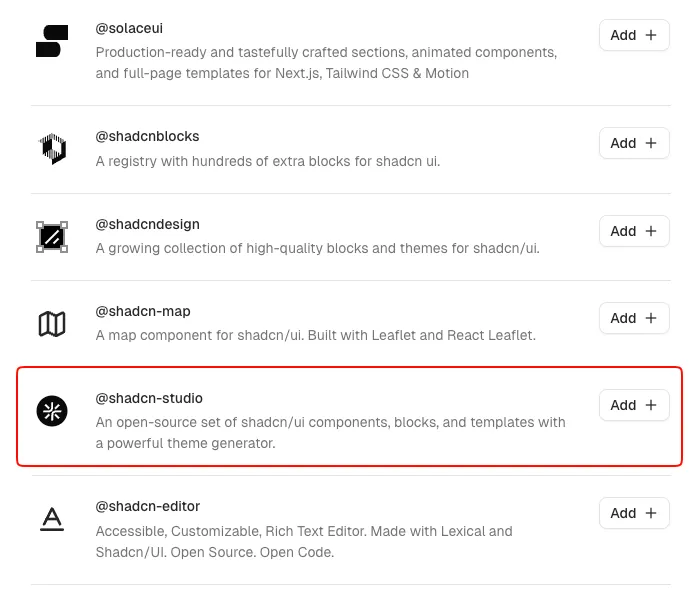
So just click the add button, copy the registry command, and run it in your terminal.

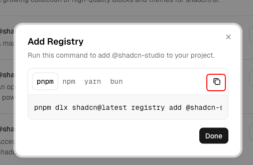
Once the command has successfully run, you can see the shadcn/studio is mentioned in your registries of component.json file.

That’s it, now you are ready to use shadcn components. Visit their site, choose your desired variant, and install it in your project. You can go through their free blocks and themes, which are really amazing.
Customizing Your Starter Project (Base UI, Themes, and Icons)
shadcn/ui recently introduced a powerful way to start a project by letting you fully configure your UI setup before code is even generated. With the npx shadcn create command, you can choose your component library, visual style, icon set, fonts, colors, and more – all in one place. This gives you a strong starting point that feels unique to your project rather than “one-size-fits-all.”
To begin, visit the official shadcn create page, where you’ll see a visual interface for customizing your starter project. On the right-hand side, you’ll find several options that help you tailor your design system and component foundation before generating any code.
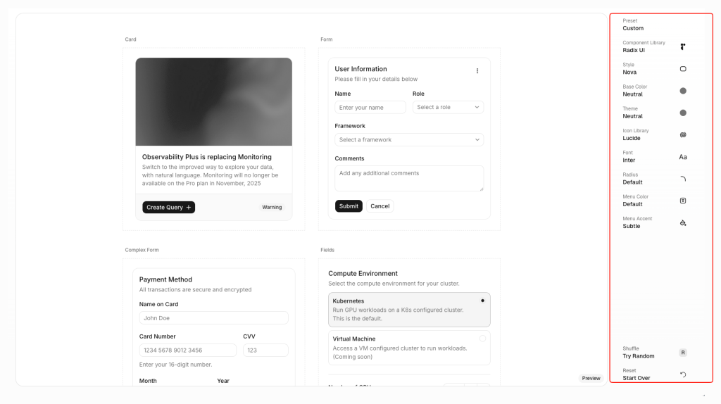
Let’s walk through the options you’ll encounter:
1. Preset: By default, this is set to “Custom.” You can also choose from a few built-in preset styles that bundle a combination of fonts, spacing, and visual vibes designed by the shadcn team. These presets are a helpful place to start if you’re unsure about design decisions.
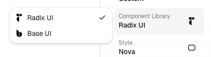
2. Component Library: Here, you choose the underlying component primitive library. Radix UI is the default and has been the foundation of shadcn/ui from the beginning. You now also have the option to select Base UI, giving you an alternative set of unstyled primitives that shadcn wraps and enhances. This choice affects how the generated components are built, but doesn’t change the overall API that you’ll use in your project.
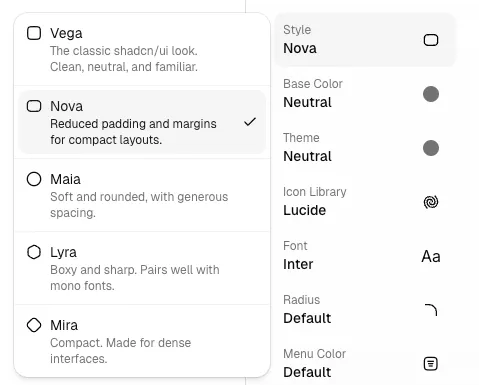
3. Style: Styles define the default layout values such as padding, margins, and border radii. Each style gives your UI a distinct feel, so not every shadcn project looks the same. The selected style influences how components are generated and how they feel visually.
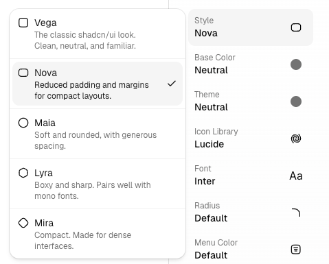
4. Base color: Your base color choice determines the foundational color scale used across your components. From neutral tones to broader palettes, this choice influences key variables like foreground, background, and utility color matches.
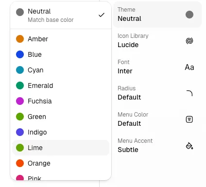
5. Theme: The theme setting adjusts core color tokens like primary and primary-foreground. This selection works in harmony with your base color to shape your visual identity.
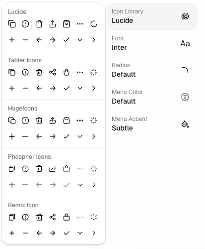
6. Icon Library: shadcn/ui supports multiple icon libraries out of the box. By default, Lucide icons are included, but you can choose other sets to match your brand or design system needs.
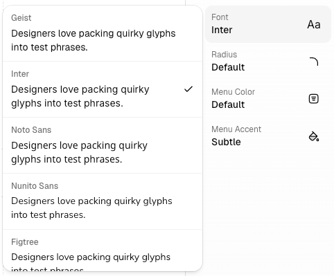
7. Font: Pick from a variety of popular font families to set the typographic base for your project. This choice will be baked into your configuration and reflected in component text styles.
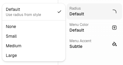
8. Radius: You can fine-tune the border radius across components, from none to large, adjusting how rounded or sharp your UI elements feel.
9. Menu color and Menu accent: These options let you tweak your navigation menu’s look, with choices for color inversion and accent intensity.
Note: The above options are just some examples of things shadcn give you can update all these things as your desired one expect component library and icon library.
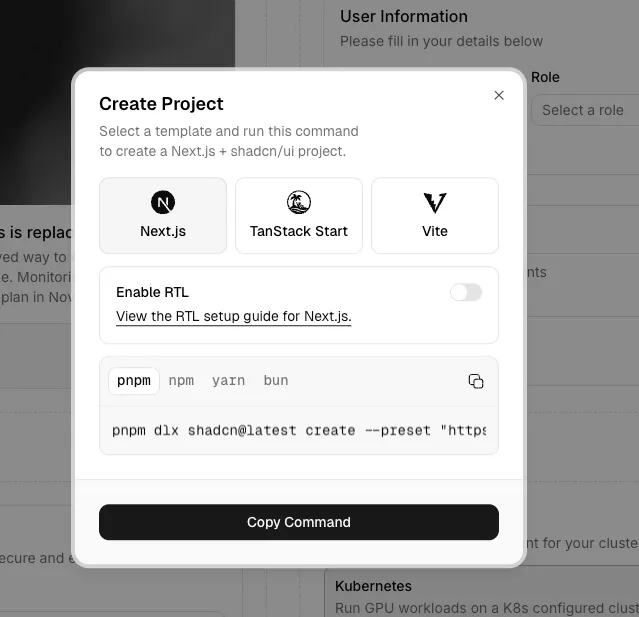
Once you’re happy with your choices, click the Create Project button. A dialog will appear asking you to choose your tech stack (such as Next.js, Vite, or TanStack Start) – copy the generated command and run it in your terminal. That’s all you need to do to scaffold a fully configured shadcn/ui project.
RTL (Right-to-Left) Support with shadcn Components
Right-to-Left (RTL) support is essential if you’re building applications for languages such as Arabic, Hebrew, Persian or Urdu. shadcn/ui now has first-class support for RTL layouts, which means the components you install can automatically adapt their layout, spacing, and directional styles when RTL is enabled.
Unlike many libraries that force logical classes (ms-*, start-*) everywhere, shadcn/ui takes a practical approach: you work with familiar CSS utility classes by default, and the CLI transforms them to RTL when needed. This makes your code easy to read and maintain, while still being RTL-ready.
Below is how you enable RTL support for both new and existing shadcn/ui projects.
Enabling RTL in a New Project
If you are creating a project from scratch, you can enable RTL right from the start using the create command with the --rtl flag. This ensures your configuration is ready for RTL layouts from day one.
Here’s how it works:
1. Run the shadcn create command with the RTL flag:
pnpm dlx shadcn@latest create --template next --rtlThis command will scaffold a project with a components.json file that includes "rtl": true, telling the shadcn CLI to generate RTL-ready components.
2. In your main layout (for example, app/layout.tsx in Next.js), add the DirectionProvider with dir="rtl" and your language code to the <html> tag:
<html lang="ar" dir="rtl">
	<body>
		<DirectionProvider direction="rtl">
			{children}
		</DirectionProvider>
	</body>
</html>
The DirectionProvider component ensures that any direction-sensitive logic inside the UI components updates accordingly.
With this setup, your entire layout will be oriented for RTL languages, and the shadcn CLI will produce components with proper logical classes behind the scenes.
3. Optionally, choose a font that supports your target RTL language well (for example, Noto_Sans_Arabic with Next.js). This will make your text rendering much smoother.
With this setup, your entire layout will be oriented for RTL languages, and the shadcn CLI will produce components with proper logical classes behind the scenes.
Enabling RTL in an Existing Project
If you already have a shadcn/ui project and want to add RTL support later, the process is still simple and mostly automated.
1. Migrate Existing Components to RTL
Start by running the RTL migration command using the shadcn CLI:
pnpm dlx shadcn@latest migrate rtl [path]The [path] parameter can be a specific file, a folder, or a glob pattern. If you don’t provide any path, the CLI will migrate all components inside the components/ui directory.
Keep in mind that some components-such as Calendar, Pagination, and Sidebar-require manual adjustments. These components have their own individual RTL migration guides and are not fully handled by the automatic migration.
2. Add the Direction Component
Next, install the direction utility provided by shadcn/ui:
pnpm dlx shadcn@latest add directionThis adds the DirectionProvider, which is required for managing layout direction across your application.
3. Enable RTL in Your App Layout
In your main layout file (for example, app/layout.tsx in a Next.js project), update the <html> tag and wrap your application with the DirectionProvider:
<html lang="ar" dir="rtl">
	<body>
		<DirectionProvider direction="rtl">
			{children}
		</DirectionProvider>
	</body>
</html>
Setting dir="rtl" tells the browser to render the layout from right to left, while the DirectionProvider ensures that direction-aware components, such as menus, popovers, and navigation, behave correctly.
Once these steps are complete, your existing shadcn/ui project will be fully RTL-enabled and ready to support right-to-left languages.
Conclusion:
shadcn/ui represents a fresh way of building user interfaces in React projects. Rather than pulling in an entire UI library as a dependency, shadcn/ui lets you generate component source code directly into your project. This gives you full ownership and control over every piece of UI you use, making customization and long-term maintenance simpler and more intuitive.
With its CLI-driven workflow, support for both Radix UI and Base UI primitives, and seamless integration with Tailwind CSS, shadcn/ui strikes a balance between rapid development and deep flexibility. It lets you build modern, accessible, and polished interfaces without fighting styles or dependencies.
By the end of this guide, you should have a clear idea of how to:
- Set up a new shadcn/ui project
- Add and use components with ease
- Work with blocks and tailor your UI
- Enable RTL support
- Configure themes, styles, and icon libraries
shadcn/ui has grown quickly in popularity because it empowers developers to build UI that feels uniquely theirs – not constrained by rigid library defaults but grounded in open code and clear conventions. Whether you’re building a simple landing page or a complex web app interface, shadcn/ui gives you the tools to go from idea to production confidently and efficiently.