
Below is the practical guide to building lightning-fast React applications with modern optimization techniques. Here, you will learn how to optimize Shadcn performance with ease with tree shaking, code splitting, and CSS optimization with Tailwind CSS 4.
Why Performance Optimization Matters
Your React app looks perfect in development, but users are leaving before it loads. Sound familiar? The culprit is often bundle size.
According to HTTP Archive, the median JavaScript bundle for mobile websites is around 600-700KB (transfer size). For users on slow networks or low-end devices, which is still common globally, this means multiple seconds of loading and parsing time.
The Performance Impact:
-
53% of mobile users abandon sites that take over 3 seconds to load (Google Research)
-
Every 100ms delay can reduce conversions by 7% (Akamai Study)
-
A 1-second delay can decrease customer satisfaction by 16% (Aberdeen Group)
The Solution: Shadcn UI + Next.js 15 + Tailwind CSS 4 give you tools to build fast applications from the start. In this guide, we’ll cover:
-
Tree Shaking - Remove unused code
-
Code Splitting - Load components on demand
-
CSS Optimization - Ship minimal stylesheets
Let’s dive in.
Understanding the Problem: Traditional vs Shadcn UI
Traditional UI libraries like Chakra or Material UI provide ready-made components that are quick to use but harder to deeply customize, often leading to generic designs and heavier bundles.
In contrast, shadcn/ui takes a modern approach where you copy and own the component code, built with tools like Tailwind CSS and Radix UI, giving you full control, better customization, and lighter performance at the cost of slightly more setup and understanding.
Let’s understand this practically:
Why Traditional Component Libraries Are Heavy
When you install Material-UI or Chakra UI, you get:
-
100+ components (whether you use them or not)
-
Complete theming systems
-
Icon libraries with hundreds of icons
-
CSS-in-JS runtime overhead
A simple Button import can pull 40KB+ of dependencies.
How Shadcn UI Solves This
Shadcn UI uses a copy-paste approach. When you run:
npx shadcn@latest add buttonIt copies the actual source code into your project:
src/components/ui/button.tsx ← Your code, not node_modules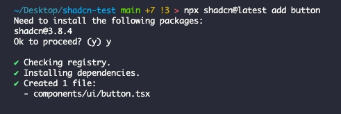
Installing a component copies source code directly into your project
Benefits:
-
Minimal, explicit dependencies (components live in your repo)
-
Full customization control
-
Excellent tree shaking potential
-
No vendor lock-in
Note: Shadcn UI components require peer dependencies like class-variance-authority, clsx, tailwind-merge, and often Radix UI primitives. You install only what you need during manual setup.
JavaScript Performance Cost
JavaScript has three performance costs:
-
Download - Network transfer time
-
Parse - Browser processes code (slow on mobile)
-
Execute - Running the code
A 690KB bundle on a mid-range phone:
-
3-4s download (slow 3G)
-
1-2s parse time
-
500ms-1s execution
Total: 5-7 seconds before interactive!
How to Optimize Shadcn Performance & Why?

Optimizing Shadcn performance focuses on minimizing shipped code. Since components are locally owned, you avoid library bloat, while tools like Next.js handle tree shaking to remove unused code. Using lazy loading for heavy components and styling with Tailwind CSS further reduces bundle size and improves load speed.
Why it matters: these optimizations reduce bundle size, improve initial load time, and create a faster, smoother user experience, especially important for scalability and performance-focused apps.
Now let’s discuss Shadcn performance optimization techniques: Tree Shaking, Code splitting, & CSS optimization with Tailwind CSS 4 in depth below.
1. Tree Shaking: Remove Unused Code

What is Tree Shaking?
Tree shaking removes “dead code”-code you import but never use. Think of your app as a tree: bundlers “shake” it and unused branches (code) fall off.
How it Works:
ES6 modules (import/export) have static structure, letting bundlers analyze dependencies at build time without running code.
// utils.ts
export function add(a, b) {
  return a + b
}
export function subtract(a, b) {
  return a - b
}
export function multiply(a, b) {
  return a * b
}

// app.ts
import { add } from './utils'
console.log(add(2, 3))

// Result: subtract() and multiply() are removed from bundle
The sideEffects Flag
Tell bundlers which files are “pure” (no side effects):
// package.json
{
  "sideEffects": false
}

// Or be specific
{
  "sideEffects": ["*.css", "./src/polyfills.js"]
}
Tree Shaking with Shadcn UI
Since Shadcn components are in your codebase, bundlers can directly analyze and optimize them:
// You only import what you need
import { Button } from '@/components/ui/button'

// Unused variants? Automatically removed by minifier
Why This Works:
When you copy a Shadcn component, you get the actual TypeScript source. Modern bundlers (modern Next.js versions support Turbopack, especially in development, with Webpack still commonly used for production builds) can trace through your code and see exactly which exports are used.
Important note on CSS: If your Button component uses class-variance-authority with 6 variants, Tailwind CSS will generate utility classes for all utility class strings it detects in your source files. Tree shaking removes unused JavaScript exports, but Tailwind’s JIT engine generates CSS based on class strings found during content scanning, not runtime usage.
To minimize CSS:
-
Keep variant definitions lean (remove unused variants from source)
-
Use consistent utility patterns
-
Let Tailwind’s content scanner detect only what exists in code
Compare this to a traditional component library, where you import from node_modules:
// Traditional library - bundler can't see inside
import { Button } from 'some-ui-library'

// The library might have unclear exports
// Bundler includes everything "just to be safe"
The bundler can’t optimize what it can’t see. With Shadcn UI, everything is transparent.
Best Practices:
// ❌ Bad - Imports everything
import * as utils from './utils'

// ✅ Good - Imports only needed
import { formatDate } from './utils'

// ❌ Bad - Default export object
export default { fn1, fn2, fn3 }

// ✅ Good - Named exports
export { fn1, fn2, fn3 }
Verify Your Bundle
Use Next.js Bundle Analyzer:
npm install @next/bundle-analyzer

# next.config.js
const withBundleAnalyzer = require('@next/bundle-analyzer')({
  enabled: process.env.ANALYZE === 'true',
})

module.exports = withBundleAnalyzer({ /* config */ })

# Run analysis
ANALYZE=true npm run build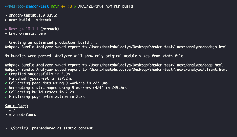
Running production build with ANALYZE=true generates bundle reports
The bundle analyzer will open an interactive treemap in your browser showing all chunks and their sizes.
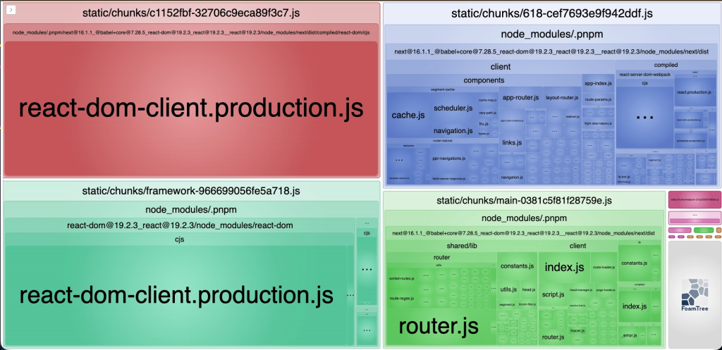
Interactive treemap reveals the exact composition of your JavaScript bundles
2. Code Splitting: Load Components On Demand

Why Code Splitting?
Tree shaking removes unused code. Code splitting splits the code into smaller chunks that load when needed.
Example App Without Splitting:
Home: 200KB
Dashboard: 800KB (charts, tables)
Admin: 1.2MB (admin only!)

Total: 2.2MB (everyone downloads everything!)
With Code Splitting:
Home visitors: 200KB only
Dashboard users: 200KB + 800KB = 1MB
Admins only: 200KB + 800KB + 1.2MB = 2.2MB
Next.js Automatic Splitting
Next.js splits code at the page level automatically:
app/
  page.tsx           → chunk-home.js
  dashboard/page.tsx → chunk-dashboard.js
  admin/page.tsx     → chunk-admin.js
Component-Level Splitting with next/dynamic
Split heavy components using next/dynamic:
// ❌ Without splitting - loads immediately
import HeavyModal from '@/components/heavy-modal'

// ✅ With splitting - loads on demand
import dynamic from 'next/dynamic'

const HeavyModal = dynamic(() => import('@/components/heavy-modal'), {
  loading: () => <p>Loading...</p>,
  ssr: false  // Skip server-side rendering (see warning below)
})
⚠️ Important: ssr: false Trade-offs
Setting ssr: false disables server-side rendering for that component:
-
Use when: Component requires browser-only APIs (window, document, canvas)
-
Examples: Charts, PDF viewers, image croppers, browser-specific tools
-
Downside: Hurts SEO and initial perceived performance for contentful components
-
Best practice: Prefer
ssr: truewhen possible; reservessr: falsefor truly client-only components
Understanding the Loading State:
The loading prop is crucial for user experience. When a user triggers the lazy-loaded component, they see your loading state immediately while the JavaScript chunk downloads. This prevents a jarring experience.
You can use Shadcn UI’s Skeleton component for better loading states:
import { Skeleton } from '@/components/ui/skeleton'

const HeavyChart = dynamic(
  () => import('@/components/heavy-chart'),
  {
    loading: () => (
      <div className="space-y-2">
        <Skeleton className="h-4 w-full" />
        <Skeleton className="h-4 w-3/4" />
        <Skeleton className="h-32 w-full" />
      </div>
    )
  }
)
The ssr: false Option:
Some components can’t render on the server because they use browser-only APIs (like window or document). Setting ssr: false tells Next.js to only render the component on the client.
Examples that need ssr: false:
-
PDF viewers
-
Canvas/WebGL graphics
-
Browser feature detection
-
Components using
localStorage
Real Example: Profile Modal
// components/user-profile-modal.tsx
'use client'

import { Dialog, DialogContent } from "@/components/ui/dialog"
import { Button } from "@/components/ui/button"
import Cropper from 'react-easy-crop'  // Heavy library

export function UserProfileModal({ open, onOpenChange, user }) {
  return (
    <Dialog open={open} onOpenChange={onOpenChange}>
      <DialogContent>
        <Cropper image={user.avatar} /* ... */ />
        <Button>Save</Button>
      </DialogContent>
    </Dialog>
  )
}
// app/users/page.tsx - Lazy load modal
import dynamic from 'next/dynamic'
const UserProfileModal = dynamic(
() => import('@/components/user-profile-modal')
.then(mod => ({ default: mod.UserProfileModal })),
{ ssr: false }
)
export default function UsersPage() {
const [open, setOpen] = useState(false)
return (
<>
<Button onClick={() => setOpen(true)}>View Profile</Button>
{open && <UserProfileModal open={open} onOpenChange={setOpen} />}
</>
)
}Result: 150KB modal only loads when the button is clicked!
What to Lazy Load
Good Candidates:
-
Modals and dialogs
-
Charts and visualizations
-
Admin panels
-
Rich text editors
-
Comment sections
Don’t Lazy Load:
-
❌ Above-the-fold content
-
❌ Navigation/headers
-
❌ Small components (<10KB)
-
❌ Components on every page
Real-World Example: E-commerce Product Page
import dynamic from 'next/dynamic'
import { Button } from '@/components/ui/button'
import Image from 'next/image'

// Load immediately - above the fold
import ProductInfo from '@/components/product-info'
import AddToCartButton from '@/components/add-to-cart'

// Lazy load - below the fold
const ReviewSection = dynamic(() => import('@/components/reviews'))
const RelatedProducts = dynamic(() => import('@/components/related-products'))
const ProductQuestionsModal = dynamic(() => import('@/components/product-qa-modal'))

export default function ProductPage({ product }) {
  return (
    <>
      {/* Critical above-the-fold content */}
      <Image src={product.image} alt={product.name} />
      <ProductInfo product={product} />
      <AddToCartButton product={product} />

      {/* Lazy loaded below-the-fold content */}
      <ReviewSection productId={product.id} />
      <RelatedProducts category={product.category} />
      <ProductQuestionsModal productId={product.id} />
    </>
  )
}
This strategy ensures your product page loads fast, users see the product image and buy button immediately, while reviews and related products load in the background.
3. CSS Optimization with Tailwind CSS 4

The CSS Problem
Traditional CSS frameworks are huge:
-
Bootstrap 5: 160KB
-
Material-UI: 120KB+
-
Most projects use <10% of styles
Tailwind’s JIT Compiler
Tailwind CSS 4 generates CSS on demand as you write HTML:
<button class="rounded bg-blue-500 px-4 py-2 hover:bg-blue-600">Click me</button>Generates only these classes:
.bg-blue-500 {
  background-color: #3b82f6;
}
.hover\\:bg-blue-600:hover {
  background-color: #2563eb;
}
.px-4 {
  padding-left: 1rem;
  padding-right: 1rem;
}
.py-2 {
  padding-top: 0.5rem;
  padding-bottom: 0.5rem;
}
.rounded {
  border-radius: 0.25rem;
}
Tailwind generates only the utility classes it detects in your source files.
Tailwind 4 Performance
According to the Tailwind v4 release:
-
5× faster full builds
-
100× faster incremental rebuilds (3ms vs 300ms)
-
Smaller output using modern CSS
CSS-First Configuration
Tailwind 4 uses CSS custom properties:
/* app/globals.css */
@theme {
  --color-primary: oklch(52% 0.2 240);
  --radius-md: 0.75rem;
}

/* Use in HTML */
<div class="bg-[--color-primary] rounded-[--radius-md]">
  Content
</div>
Benefits:
-
Faster parsing (native CSS)
-
Runtime theming without rebuild
-
Better DevTools inspection
Integration with Shadcn UI
Shadcn uses CSS variables perfectly:
:root {
  --primary: 222.2 47.4% 11.2%;
  --foreground: 210 40% 98%;
}

.dark {
  --primary: 210 40% 98%;
  --foreground: 222.2 84% 4.9%;
}
Components use these variables:
<Button className="bg-primary text-primary-foreground">
  Click me
</Button>
Tailwind generates:
.bg-primary {
  background-color: hsl(var(--primary));
}
.text-primary-foreground {
  color: hsl(var(--primary-foreground));
}
Result: Theme changes without rebuilding!
Why This Matters:
Traditional approaches require rebuilding your entire app to change themes. With CSS variables + Tailwind JIT:
-
Change CSS variable values
-
Browser re-renders instantly
-
No build step needed
This enables features like:
-
User-customizable themes
-
A/B testing different color schemes
-
Brand-specific themes for white-label products
-
Dark mode with smooth transitions
Example: Dynamic Theme Switching
'use client'

export function ThemeCustomizer() {
  const applyTheme = (primaryColor: string) => {
    document.documentElement.style.setProperty('--primary', primaryColor)
  }

  return (
    <div className="space-y-2">
      <Button onClick={() => applyTheme('222.2 47.4% 11.2%')}>
        Dark Theme
      </Button>
      <Button onClick={() => applyTheme('142.1 76.2% 36.3%')}>
        Green Theme
      </Button>
      <Button onClick={() => applyTheme('346.8 77.2% 49.8%')}>
        Red Theme
      </Button>
    </div>
  )
}
The buttons trigger instant theme changes-no page reload, no rebuild.
Special Mention: Shadcn Studio

Shadcn Studio goes beyond animations by providing animated blocks and sections built on top of Shadcn UI. It’s perfect for teams that want speed without compromising design quality.
Key Features:
-
Pre-animated components, blocks, and layouts
-
Built specifically for Shadcn UI
-
Consistent motion patterns
-
Great for marketing and landing pages
Furthermore, Animated variants with motion add smooth, modern animations to your components, enhancing user experiences with minimal effort.
Best For: Startups, agencies, and rapid MVP development.
Additionally, it comes with the following features:
-
Open-source: Dive into a growing, community-driven collection of copy-and-paste shadcn components, Shadcn blocks, and templates.
-
Component & Blocks variants: Access a diverse collection of customizable shadcn ui blocks and component variants to quickly build and style your UI with ease.
-
Landing pages & Dashboards: Explore 20+ premium & free Shadcn templates for dashboards, landing pages & more. Fully customizable & easy to use.
-
shadcn/ui for Figma: Speed up your workflow with Shadcn Figma Design System with components, blocks & templates – a full design library inspired by shadcn/ui.
-
Powerful theme generator: Customize your UI instantly with Shadcn Theme Generator. Preview changes in real time and create consistent, on-brand designs faster.
-
shadcn/studio MCP: Integrate shadcn MCP Server directly into your favorite IDE and craft stunning shadcn/ui Components, Blocks, and Pages inspired by shadcn/studio.
-
Shadcn Figma To Code Plugin: Convert your Figma designs into production-ready code instantly with the Shadcn Figma to Code Plugin.
Best Practices:
For better performance, you can follow the best practices below:
Scan All Source Files:
In Tailwind CSS v4, configuration is done in CSS using the @import directive:
/* app/globals.css */
@import 'tailwindcss';

/* Customize theme with @theme */
@theme {
  --color-primary: oklch(52% 0.2 240);
  --font-display: 'Satoshi', sans-serif;
}
Avoid dynamic classes:
// ❌ Bad - Tailwind can't detect
const color = 'blue'
<div className={`bg-${color}-500`} />

// ✅ Good - Explicit classes
<div className={color === 'blue' ? 'bg-blue-500' : 'bg-red-500'} />
Real-World Case Study: Dashboard Optimization
This is a hypothetical example demonstrating optimization techniques. Numbers are representative of common optimization scenarios.
Before Optimization
Dashboard Bundle:
├── page.js (1.2MB)
│   ├── recharts (400KB)
│   ├── lodash (120KB)
│   ├── pdf-viewer (300KB)
│   └── other deps (380KB)
├── styles.css (150KB)

Total: 1.35MB initial load
Load time: 5.2s (3G)
After Optimization
Changes Made:
-
Lazy-loaded charts and PDF viewer
-
Replaced lodash with native JavaScript
-
Optimized Tailwind configuration
-
Added bundle analyzer
Detailed Breakdown:
Change 1: Lazy Loading
// Before: Everything loaded upfront
import { LineChart } from 'recharts'

// After: Load on demand
const LineChart = dynamic(() => import('@/components/charts/line'))
Savings: 400KB chart library only loads when needed
Change 2: Replace Lodash
// Before: Full lodash import
import _ from 'lodash'
const unique = _.uniq(array)

// After: Native JavaScript
const unique = [...new Set(array)]
Best practice: If you must use lodash, prefer per-function imports (import uniq from 'lodash/uniq') or use lodash-es for better tree-shaking.
Savings: ~120KB (when removing full lodash import)
Change 3: Tailwind CSS V4 Optimization
/* Before: app/globals.css with unused theme values */
@import 'tailwindcss';
@theme {
  --color-*: initial; /* Reset all colors */
  --color-brand-100: oklch(...);
  --color-brand-200: oklch(...);
  /* ... 50+ unused colors */
}

/* After: Only essential theme values */
@import 'tailwindcss';
@theme {
  --color-brand: oklch(0.52 0.2 240);
  --color-accent: oklch(0.68 0.15 142);
  /* Only 2 custom colors actually used */
}
Savings: 150KB → 42KB CSS (removed unused theme extensions)
Results:
Dashboard Bundle:
├── page.js (180KB) - Core only
├── styles.css (42KB) - JIT optimized
├── chart.js (120KB) - Lazy loaded
├── pdf.js (300KB) - Lazy loaded on click

Initial: 222KB (was 1.35MB)
Load time: 1.4s (was 5.2s)

🎉 83% smaller, 3.7× faster!
User Impact:
-
Mobile users on 3G: Page now interactive in 1.4s vs 5.2s
-
Desktop users: Instant load
Impact: In real-world scenarios, such optimizations often reduce bounce rate and improve conversions by addressing the primary cause of user drop-off: slow page loads.
Quick Wins:
# Find large dependencies
npx bundle-phobia [package-name]

# Example: Check before adding
npx bundle-phobia date-fns
# Result: 2.8MB unminified, 70KB minified
Common Pitfalls to Avoid
Below are some of the common mistakes that occur often. To keep your workflow smooth, avoid them.
Mistake 1: Over-Optimizing
Don’t lazy-load everything. Each lazy-loaded component adds:
-
Extra network request
-
JavaScript for code-splitting logic
-
Potential layout shift
Rule of thumb: Only lazy-load components >50KB or below the fold.
Mistake 2: Dynamic Class Names
// ❌ Breaks Tailwind JIT
const sizes = { sm: 'small', md: 'medium', lg: 'large' }
<div className={`text-${sizes[size]}`} />

// ✅ Use explicit mapping
const sizeClasses = {
  sm: 'text-sm',
  md: 'text-base',
  lg: 'text-lg'
}
<div className={sizeClasses[size]} />
Mistake 3: Ignoring Mobile Performance
The desktop is fast, but the mobile is not. Test on:
-
Mid-range Android device (not flagship)
-
3G/4G network (throttle in DevTools)
Mistake 4: Not Measuring
“If you can’t measure it, you can’t improve it.” Always:
-
Run Lighthouse before and after changes
-
Use Real User Monitoring (RUM) in production
-
Track business metrics (conversion rate, bounce rate)
Resources
Official Documentation
-
Tailwind CSS v4 Docs - Latest features and JIT compiler
-
Shadcn UI - Component documentation and CLI
-
React Performance - Understanding React rendering
Performance Tools
-
Lighthouse - Automated auditing
-
WebPageTest - Advanced performance testing
-
Bundle Phobia - Check package sizes
-
Webpack Bundle Analyzer - Visualize bundles
Learning Resources
-
HTTP Archive Reports - Real-world performance data
-
Core Web Vitals - Google’s performance metrics
Conclusion
Modern web apps need to balance beautiful design with fast performance. The Shadcn UI + Next.js + Tailwind stack makes this possible.
The Journey Ahead:
Performance optimization isn’t one-time; it’s an ongoing practice. Here’s how to maintain fast applications:
Make it a Team Priority
-
Include metrics in sprint reviews
-
Celebrate performance wins
-
Add testing to the Definition of Done
Automate Everything
-
Lighthouse CI catches regressions
-
Bundle size limits prevent bloat
-
Performance budgets enforce accountability
Monitor Real Users
-
Synthetic testing shows potential
-
Real User Monitoring shows reality
-
Track business impact
Keep Learning
-
Web performance evolves constantly
-
Follow experts like Addy Osmani, Harry Roberts
-
Stay updated with Chrome DevRel
Remember: Performance is a feature. Build it in from day one.
Users might not notice when your site is fast, but they’ll definitely notice when it’s slow. In today’s competitive landscape, a slow website means lost users and revenue.
Start Today:
-
Run
ANALYZE=true npm run buildto see your bundle -
Pick the biggest chunk and optimize it
-
Measure the improvement
-
Repeat with next-biggest chunk
Small improvements compound. If you compound 10% improvements each sprint, performance roughly doubles after 7 sprints.
Happy coding. 🚀