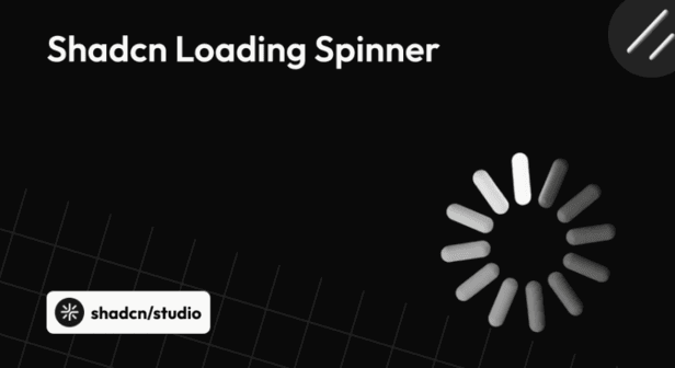
Loading spinners are essential UI elements that help communicate progress during asynchronous actions such as data fetching, form submissions, and route transitions. In modern React applications, a well-designed spinner enhances perceived performance and maintains responsive interfaces.
This collection highlights a curated set of Shadcn Loading Spinner examples from across the Shadcn ecosystem. Each spinner follows the same principles that make Shadcn UI popular - accessibility, simplicity, Tailwind-first styling, and full code ownership.
Why Use Loading Spinners in a Project?
Loading spinners are more than visual placeholders - they are a key part of user interaction and system feedback. Knowing when and why to use them can significantly improve usability and perceived performance.
Key Reasons:
-
Communicates progress during data fetching and async actions
-
Reduces user frustration during wait times
-
Improves perceived performance and responsiveness
-
Provides clear feedback for form submissions and actions
-
Enhances accessibility when paired with proper ARIA roles
-
Maintains visual continuity across different UI states
-
Helps users understand system status without interruption
-
Keeps interfaces feeling alive and interactive
Top Shadcn Loading Spinner Examples
Loading spinners have evolved beyond basic rotating icons into flexible UI elements that support branding, accessibility, and smooth motion.
By leveraging loading spinners built with Shadcn UI, developers can quickly implement clean, consistent, and accessible loading indicators that fit seamlessly into modern React and Next.js projects.
Below, we’ve curated a collection of the best Shadcn Loading Spinner examples that you can explore, customize, and use in your own applications.
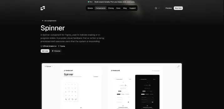
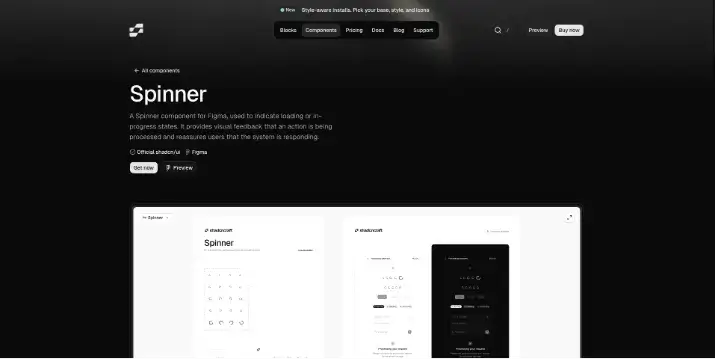
Shadcn UI Spinner – Official Component
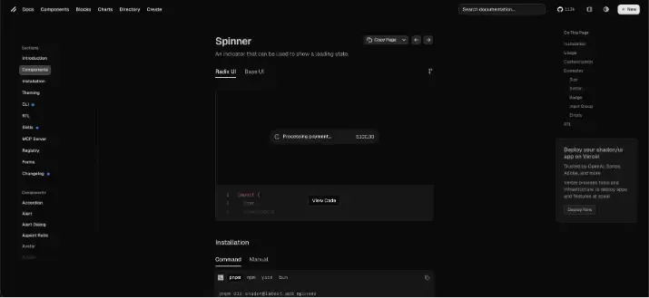
The official Shadcn UI Spinner is a lightweight, accessible loading indicator designed for modern React applications. Built using Tailwind CSS and SVG, it provides a clean default spinner that integrates seamlessly with the Shadcn UI ecosystem.
This spinner focuses on simplicity and accessibility. It supports ARIA attributes out of the box and is flexible enough to be used in buttons, full-page loaders, or inline loading states. Because it’s just a React component styled with Tailwind utilities, developers can easily adjust size, color, and animation speed to match their design system.
Check the GitHub repo.
Key Highlights
-
Official spinner component from shadcn/ui
-
Built with SVG and Tailwind CSS
-
Accessible by default
-
Easy to customize for size and color
-
Ideal for buttons, forms, and page loading states
Best suited for projects already using Shadcn UI and Tailwind CSS, where consistency and simplicity are priorities.
Installation:
Option 1 CLI (npm):
npx shadcn@latest add @coss/p-input-12Option 2 Manually:
Copy and paste the following code into your project.
import {
  InputGroup,
  InputGroupAddon,
  InputGroupInput,
} from "@/components/ui/input-group";
import { Spinner } from "@/components/ui/spinner";

export default function Particle() {
  return (
    <InputGroup>
      <InputGroupInput disabled placeholder="Processing…" type="search" />
      <InputGroupAddon>
        <Spinner />
      </InputGroupAddon>
    </InputGroup>
  );
}
Update the import paths to match your project setup.
Special Recommendation: shadcn/studio
If you’re building with Shadcn UI, it’s worth checking out a related ecosystem tool
This isn’t a traditional component library or a replacement for Shadcn. Instead, it’s a unique collection that offers customizable variants of components, blocks, and templates. Preview, customize, and copy-paste them into your apps with ease.
Building on the solid foundation of the Shadcn components & blocks, we’ve enhanced it with custom-designed components & blocks to give you a head start. This allows you to craft, customize, and ship your projects faster and more efficiently.
Features:
-
Open-source: Dive into a growing, community-driven collection of copy-and-paste shadcn ui components, Shadcn blocks, and templates.
-
Component & Blocks variants: Access a diverse collection of customizable shadcn blocks and component variants to quickly build and style your UI with ease.
-
Animated variants with Motion: Add smooth, modern animations to your components, enhancing user experiences with minimal effort.
-
Landing pages & Dashboards: Explore 20+ premium & free Shadcn templates for dashboards, landing pages & more. Fully customizable & easy to use.
-
shadcn/ui for Figma: Speed up your workflow with Shadcn Figma UI components, blocks & templates, a full design library inspired by shadcn/ui.
-
Powerful theme generator: Customize your UI instantly with Shadcn Theme Generator. Preview changes in real time and create consistent, on-brand designs faster.
-
shadcn/studio MCP: Integrate shadcn/studio MCP Server directly into your favorite IDE and craft stunning shadcn/ui Components, Blocks, and Pages inspired by shadcn/studio.
-
Shadcn Figma To Code Plugin: Convert your Figma designs into production-ready code instantly with the Shadcn Figma Plugin.
Check out the All Shadcn Collection that offers awesome Shadcn resources. If you have a unique & helpful Shadcn product to promote, submit your product and get featured.
Coss.com ui – Shadcn-Compatible Spinner Collection
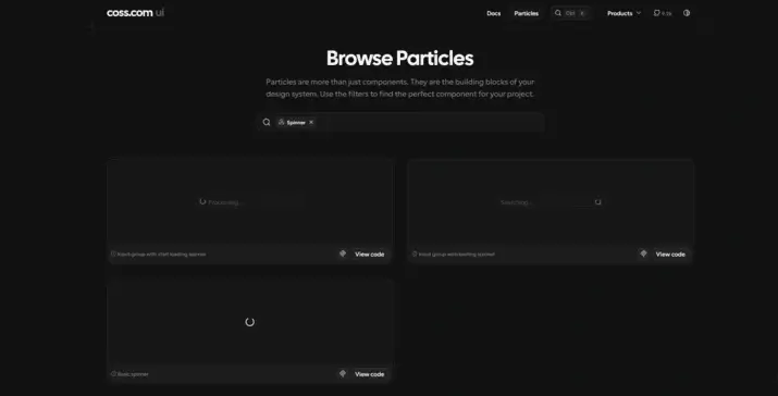
COSS UI offers a collection of visually expressive loading spinners designed to work well with Shadcn UI and Tailwind-based workflows. These spinners go beyond basic loading indicators by adding subtle motion and personality without becoming distracting.
The collection is well-suited for applications that want loading states to feel more polished or slightly playful, such as dashboards, creative tools, and interactive web apps. Despite the richer animations, the components remain lightweight and easy to customize.
Check the GitHub repo.
Key Highlights
-
Multiple animated spinner variants
-
Tailwind-first styling
-
Modern, motion-focused designs
-
Easy integration with Shadcn UI layouts
-
Well-suited for dashboards and interactive interfaces
COSS UI is a strong choice when you want loading states to feel more engaging while staying aligned with modern UI practices and the Shadcn ecosystem.
Installation:
Option 1 CLI (npm):
npx shadcn@latest add spinnerOption 2 Manually:
Copy and paste the following code into your project.
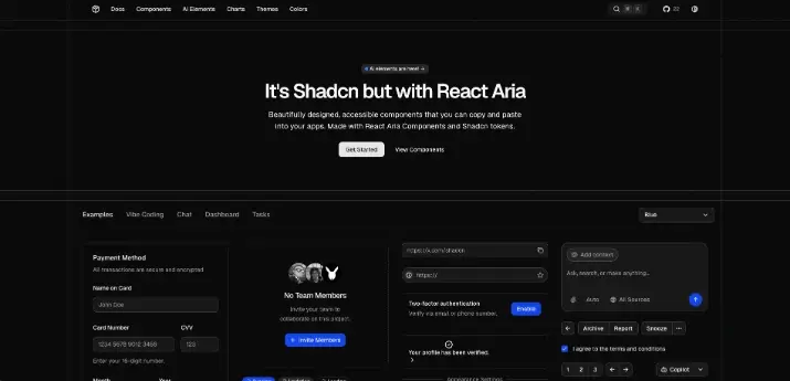
Shadcraft: Shadcn Loading Spinner
Shadcraft showcases community-built spinner examples inspired by Shadcn UI. These spinners are useful for discovering alternative designs, animation ideas, and creative loading patterns.
They’re especially valuable for inspiration and experimentation.
Key Highlights
-
Community-driven spinner designs
-
Shadcn-inspired patterns
-
Useful for experimentation and inspiration
-
Copy-and-paste friendly
Great for developers looking to explore beyond default designs.
import { Loader2Icon } from "lucide-react"

import { cn } from "@/lib/utils"

function Spinner({ className, ...props }: React.ComponentProps<"svg">) {
  return (
    <Loader2Icon
      role="status"
      aria-label="Loading"
      className={cn("size-4 animate-spin", className)}
      {...props}
    />
  )
}

export { Spinner }
Spectrum UI Spinner
Spectrum UI provides a clean, minimal spinner component designed with consistency and usability in mind. It follows utility-first styling patterns, making it easy to integrate into Tailwind and Shadcn-based projects.
The spinner is ideal for teams that want a simple, no-frills loading indicator that blends naturally into existing UI components without drawing too much attention.
Check the GitHub repo.
Key Highlights
-
Minimal, clean design
-
Utility-first styling
-
Easy integration with Tailwind and Shadcn UI
-
Works well for subtle loading states
Best suited for applications that value simplicity and understated design.
Installation:
Option 1 CLI (npm):
npx shadcn@latest add @spectrumui/spinner-demoOption 2 Manually:
Copy and paste the following code into your project.
import React from "react";
import { cn } from "@/lib/utils";
import { VariantProps, cva } from "class-variance-authority";
import { Loader2 } from "lucide-react";

const spinnerVariants = cva("flex-col items-center justify-center", {
  variants: {
    show: {
      true: "flex",
      false: "hidden",
    },
  },
  defaultVariants: {
    show: true,
  },
});

const loaderVariants = cva("animate-spin text-primary", {
  variants: {
    size: {
      small: "size-6",
      medium: "size-8",
      large: "size-12",
    },
  },
  defaultVariants: {
    size: "medium",
  },
});

interface SpinnerContentProps
  extends VariantProps<typeof spinnerVariants>,
    VariantProps<typeof loaderVariants> {
  className?: string;
  children?: React.ReactNode;
}

export function Spinner({
  size,
  show,
  children,
  className,
}: SpinnerContentProps) {
  return (
    <span className={spinnerVariants({ show })}>
      <Loader2 className={cn(loaderVariants({ size }), className)} />
      {children}
    </span>
  );
}
Taki UI Spinner
Taki UI includes a flexible spinner component that aligns well with Shadcn UI conventions. It offers a practical balance between customization and ease of use, making it suitable for common loading scenarios across applications.
Because it follows familiar Tailwind and React patterns, it can be easily extended or adapted to different layouts and themes.
Check the GitHub repo.
Key Highlights
-
Simple and reusable spinner component
-
Tailwind-based styling
-
Shadcn-friendly structure
-
Suitable for general-purpose loading indicators
Ideal for developers looking for straightforward, customizable spinners without unnecessary complexity.
Installation:
Option 1 CLI (npm):
npx taki-ui@latest add spinnerOption 2 Manually:
Copy and paste the following code into your project.
import {
  Item,
  ItemContent,
  ItemMedia,
  ItemTitle,
} from "@/components/ui/item"
import { Spinner } from "@/components/ui/spinner"

export function SpinnerDemo() {
  return (
    <div className="flex w-full max-w-xs flex-col gap-4 [--radius:1rem]">
      <Item variant="muted">
        <ItemMedia>
          <Spinner />
        </ItemMedia>
        <ItemContent>
          <ItemTitle className="line-clamp-1">Processing payment...</ItemTitle>
        </ItemContent>
        <ItemContent className="flex-none justify-end">
          <span className="text-sm tabular-nums">$100.00</span>
        </ItemContent>
      </Item>
    </div>
  )
}
Kokonut UI Loader
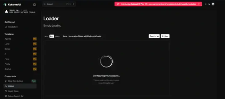
Kokonut UI provides loader components with a slightly more expressive visual style. These loaders are useful when you want loading states to stand out more clearly, such as during full-page loads or long-running background tasks.
They work well in branding-heavy applications where visual identity extends even to loading states.
Key Highlights
-
More expressive loader designs
-
Tailwind-based styling
-
Good for branded or creative interfaces
-
Suitable for full-page or section loaders
A solid option when visual distinction matters.
Installation:
Option 1 CLI (npm):
npx shadcn@latest add @kokonutui/loaderOption 2 Manually:
Copy and paste the following code into your project.
"use client";
import { motion } from "motion/react";
import { cn } from "@/lib/utils";
interface LoaderProps extends React.HTMLAttributes<HTMLDivElement> {
title?: string;
subtitle?: string;
size?: "sm" | "md" | "lg";
}
export default function Loader({
title = "Configuring your account...",
subtitle = "Please wait while we prepare everything for you",
size = "md",
className,
...props
}: LoaderProps) {
const sizeConfig = {
sm: {
container: "size-20",
titleClass: "text-sm/tight font-medium",
subtitleClass: "text-xs/relaxed",
spacing: "space-y-2",
maxWidth: "max-w-48",
},
md: {
container: "size-32",
titleClass: "text-base/snug font-medium",
subtitleClass: "text-sm/relaxed",
spacing: "space-y-3",
maxWidth: "max-w-56",
},
lg: {
container: "size-40",
titleClass: "text-lg/tight font-semibold",
subtitleClass: "text-base/relaxed",
spacing: "space-y-4",
maxWidth: "max-w-64",
},
};
const config = sizeConfig[size];
return (
<div
className={cn(
"flex flex-col items-center justify-center gap-8 p-8",
className
)}
{...props}
>
{/* Enhanced Monochrome Loader */}
<motion.div
className={cn("relative", config.container)}
animate={{
scale: [1, 1.02, 1],
}}
transition={{
duration: 4,
repeat: Number.POSITIVE_INFINITY,
ease: [0.4, 0, 0.6, 1],
}}
>
{/* Outer elegant ring with shimmer */}
<motion.div
className="absolute inset-0 rounded-full"
style={{
background: `conic-gradient(from 0deg, transparent 0deg, rgb(0, 0, 0) 90deg, transparent 180deg)`,
mask: `radial-gradient(circle at 50% 50%, transparent 35%, black 37%, black 39%, transparent 41%)`,
WebkitMask: `radial-gradient(circle at 50% 50%, transparent 35%, black 37%, black 39%, transparent 41%)`,
opacity: 0.8,
}}
animate={{
rotate: [0, 360],
}}
transition={{
duration: 3,
repeat: Number.POSITIVE_INFINITY,
ease: "linear",
}}
/>
{/* Primary animated ring with gradient */}
<motion.div
className="absolute inset-0 rounded-full"
style={{
background: `conic-gradient(from 0deg, transparent 0deg, rgb(0, 0, 0) 120deg, rgba(0, 0, 0, 0.5) 240deg, transparent 360deg)`,
mask: `radial-gradient(circle at 50% 50%, transparent 42%, black 44%, black 48%, transparent 50%)`,
WebkitMask: `radial-gradient(circle at 50% 50%, transparent 42%, black 44%, black 48%, transparent 50%)`,
opacity: 0.9,
}}
animate={{
rotate: [0, 360],
}}
transition={{
duration: 2.5,
repeat: Number.POSITIVE_INFINITY,
ease: [0.4, 0, 0.6, 1],
}}
/>
{/* Secondary elegant ring - counter rotation */}
<motion.div
className="absolute inset-0 rounded-full"
style={{
background: `conic-gradient(from 180deg, transparent 0deg, rgba(0, 0, 0, 0.6) 45deg, transparent 90deg)`,
mask: `radial-gradient(circle at 50% 50%, transparent 52%, black 54%, black 56%, transparent 58%)`,
WebkitMask: `radial-gradient(circle at 50% 50%, transparent 52%, black 54%, black 56%, transparent 58%)`,
opacity: 0.35,
}}
animate={{
rotate: [0, -360],
}}
transition={{
duration: 4,
repeat: Number.POSITIVE_INFINITY,
ease: [0.4, 0, 0.6, 1],
}}
/>
{/* Accent particles */}
<motion.div
className="absolute inset-0 rounded-full"
style={{
background: `conic-gradient(from 270deg, transparent 0deg, rgba(0, 0, 0, 0.4) 20deg, transparent 40deg)`,
mask: `radial-gradient(circle at 50% 50%, transparent 61%, black 62%, black 63%, transparent 64%)`,
WebkitMask: `radial-gradient(circle at 50% 50%, transparent 61%, black 62%, black 63%, transparent 64%)`,
opacity: 0.5,
}}
animate={{
rotate: [0, 360],
}}
transition={{
duration: 3.5,
repeat: Number.POSITIVE_INFINITY,
ease: "linear",
}}
/>
{/* Dark mode variants */}
<motion.div
className="absolute inset-0 rounded-full dark:block hidden"
style={{
background: `conic-gradient(from 0deg, transparent 0deg, rgb(255, 255, 255) 90deg, transparent 180deg)`,
mask: `radial-gradient(circle at 50% 50%, transparent 35%, black 37%, black 39%, transparent 41%)`,
WebkitMask: `radial-gradient(circle at 50% 50%, transparent 35%, black 37%, black 39%, transparent 41%)`,
opacity: 0.8,
}}
animate={{
rotate: [0, 360],
}}
transition={{
duration: 3,
repeat: Number.POSITIVE_INFINITY,
ease: "linear",
}}
/>
<motion.div
className="absolute inset-0 rounded-full dark:block hidden"
style={{
background: `conic-gradient(from 0deg, transparent 0deg, rgb(255, 255, 255) 120deg, rgba(255, 255, 255, 0.5) 240deg, transparent 360deg)`,
mask: `radial-gradient(circle at 50% 50%, transparent 42%, black 44%, black 48%, transparent 50%)`,
WebkitMask: `radial-gradient(circle at 50% 50%, transparent 42%, black 44%, black 48%, transparent 50%)`,
opacity: 0.9,
}}
animate={{
rotate: [0, 360],
}}
transition={{
duration: 2.5,
repeat: Number.POSITIVE_INFINITY,
ease: [0.4, 0, 0.6, 1],
}}
/>
<motion.div
className="absolute inset-0 rounded-full dark:block hidden"
style={{
background: `conic-gradient(from 180deg, transparent 0deg, rgba(255, 255, 255, 0.6) 45deg, transparent 90deg)`,
mask: `radial-gradient(circle at 50% 50%, transparent 52%, black 54%, black 56%, transparent 58%)`,
WebkitMask: `radial-gradient(circle at 50% 50%, transparent 52%, black 54%, black 56%, transparent 58%)`,
opacity: 0.35,
}}
animate={{
rotate: [0, -360],
}}
transition={{
duration: 4,
repeat: Number.POSITIVE_INFINITY,
ease: [0.4, 0, 0.6, 1],
}}
/>
<motion.div
className="absolute inset-0 rounded-full dark:block hidden"
style={{
background: `conic-gradient(from 270deg, transparent 0deg, rgba(255, 255, 255, 0.4) 20deg, transparent 40deg)`,
mask: `radial-gradient(circle at 50% 50%, transparent 61%, black 62%, black 63%, transparent 64%)`,
WebkitMask: `radial-gradient(circle at 50% 50%, transparent 61%, black 62%, black 63%, transparent 64%)`,
opacity: 0.5,
}}
animate={{
rotate: [0, 360],
}}
transition={{
duration: 3.5,
repeat: Number.POSITIVE_INFINITY,
ease: "linear",
}}
/>
</motion.div>
{/* Enhanced Typography with Breathing Animation */}
<motion.div
className={cn("text-center", config.spacing, config.maxWidth)}
initial={{ opacity: 0, y: 12 }}
animate={{
opacity: 1,
y: 0,
}}
transition={{
delay: 0.4,
duration: 1,
ease: [0.4, 0, 0.2, 1],
}}
>
{/* Clean title with subtle animation */}
<motion.h1
className={cn(
config.titleClass,
"text-black/90 dark:text-white/90 font-medium tracking-[-0.02em] leading-[1.15] antialiased"
)}
initial={{ opacity: 0, y: 12 }}
animate={{
opacity: 1,
y: 0,
}}
transition={{
delay: 0.6,
duration: 0.8,
ease: [0.4, 0, 0.2, 1],
}}
>
<motion.span
animate={{
opacity: [0.9, 0.7, 0.9],
}}
transition={{
duration: 3,
repeat: Number.POSITIVE_INFINITY,
ease: [0.4, 0, 0.6, 1],
}}
>
{title}
</motion.span>
</motion.h1>
{/* Clean subtitle with subtle animation */}
<motion.p
className={cn(
config.subtitleClass,
"text-black/60 dark:text-white/60 font-normal tracking-[-0.01em] leading-[1.45] antialiased"
)}
initial={{ opacity: 0, y: 8 }}
animate={{
opacity: 1,
y: 0,
}}
transition={{
delay: 0.8,
duration: 0.8,
ease: [0.4, 0, 0.2, 1],
}}
>
<motion.span
animate={{
opacity: [0.6, 0.4, 0.6],
}}
transition={{
duration: 4,
repeat: Number.POSITIVE_INFINITY,
ease: [0.4, 0, 0.6, 1],
}}
>
{subtitle}
</motion.span>
</motion.p>
</motion.div>
</div>
);
}Shadcn UI Blocks – Spinner
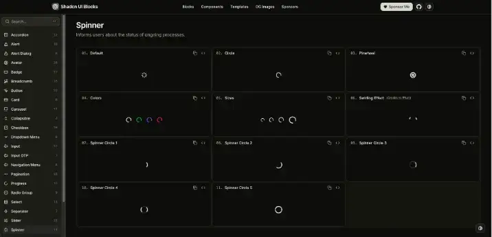
Shadcn UI Blocks offers ready-made spinner blocks that can be copied directly into your project. These blocks are designed for speed and consistency, allowing developers to implement loading states without writing components from scratch.
This approach works especially well for teams building dashboards, admin panels, or internal tools where development speed is critical.
Check the GitHub repo.
Key Highlights
-
Copy-and-paste spinner blocks
-
Designed for rapid development
-
Consistent structure and styling
-
Easy to modify and extend
Best for fast-moving projects that still want clean, maintainable UI.
Installation:
Option 1 CLI (npm):
npx shadcn@latest add https://www.shadcnui-blocks.com/r/spinner-01.jsonOption 2 Manually:
Copy and paste the following code into your project.
import { LoaderIcon } from "lucide-react";

export default function SpinnerDemo() {
  return <LoaderIcon className="animate-spin" />;
}
Myna UI Spinner
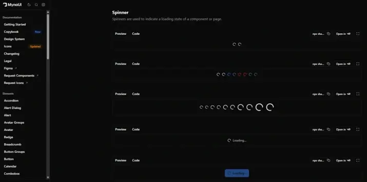
Myna UI provides spinner components that follow modern UI and animation practices. These spinners integrate smoothly into Tailwind-based React applications and offer an alternative visual style within the Shadcn ecosystem.
Key Highlights
-
Modern spinner designs
-
Tailwind-friendly styling
-
Easy React integration
-
Suitable for production UIs
A good option for teams exploring different visual styles while staying within Shadcn conventions.
Installation:
Option 1 CLI (npm):
npx shadcn@latest add "https://mynaui.com/registry/spinner/spinner1.json"Option 2 Manually:
Copy and paste the following code into your project.
import { Spinner } from "@/components/ui/spinner";

export default function Basic() {
  return (
    <>
      <Spinner />
      <Spinner />
    </>
  );
}
Gluestack UI: Shadcn Loading Spinner
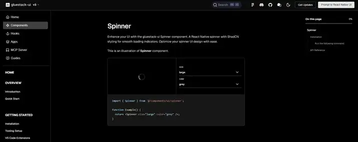
Gluestack UI provides a versatile spinner component that fits well within modern, utility-first UI workflows. Built with responsiveness and consistency in mind, this spinner works seamlessly with Tailwind and component-driven React projects, including those using Shadcn UI patterns.
Unlike basic loaders, the Gluestack UI spinner is designed to be flexible across different layouts, from simple inline indicators to full-screen loading overlays. It’s lightweight, customizable, and easy to integrate into your existing component library.
Check the GitHub repo.
Key Highlights
-
Flexible spinner component with responsive defaults
-
Tailwind-compatible styling approach
-
Works well with Shadcn UI layouts and utility-first systems
-
Suitable for both inline and full-screen loading states
-
Ideal for dashboards, data-heavy pages, and UI transitions
Gluestack UI’s spinner is a great option if you need a reliable, adaptable loading indicator that fits naturally into modern React and Tailwind CSS projects.
Installation:
Option 1 CLI (npx):
npx gluestack-ui add spinnerOption 2 Manually:
Copy and paste the following code into your project.
'use client';
import { ActivityIndicator } from 'react-native';
import React from 'react';
import { tva } from '@gluestack-ui/utils/nativewind-utils';
import { cssInterop } from 'nativewind';

cssInterop(ActivityIndicator, {
  className: { target: 'style', nativeStyleToProp: { color: true } },
});

const spinnerStyle = tva({});

const Spinner = React.forwardRef<
  React.ComponentRef<typeof ActivityIndicator>,
  React.ComponentProps<typeof ActivityIndicator>
>(function Spinner(
  {
    className,
    color,
    focusable = false,
    'aria-label': ariaLabel = 'loading',
    ...props
  },
  ref
) {
  return (
    <ActivityIndicator
      ref={ref}
      focusable={focusable}
      aria-label={ariaLabel}
      {...props}
      color={color}
      className={spinnerStyle({ class: className })}
    />
  );
});

Spinner.displayName = 'Spinner';

export { Spinner };
Shadcn Loaders: Shadcn Loading Spinner
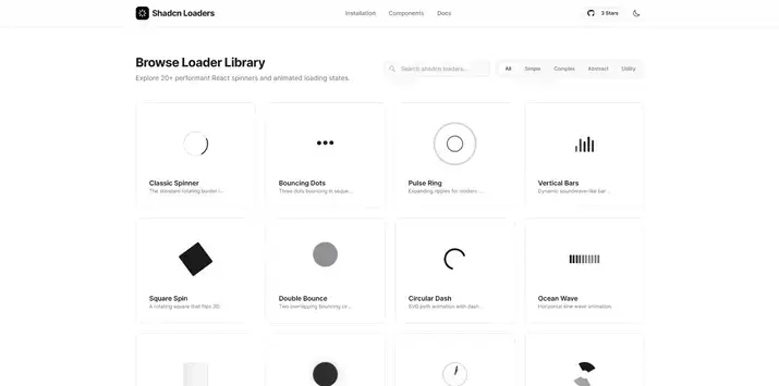
Shadcn Loaders is a dedicated collection focused entirely on loading animations inspired by Shadcn UI. It aggregates multiple spinner and loader styles in one place, making it easy to browse and compare different approaches.
Check the GitHub repo.
Key Highlights
-
Dedicated loader collection
-
Multiple spinner styles
-
Shadcn-inspired design language
-
Easy exploration and reuse
Ideal for quickly browsing and selecting from a wide range of loading indicators.
Installation:
CLI (npm):
npx shadcn-loaders@latest add loaderConclusion
Loading spinners are a small but important part of the user experience in modern applications. The Shadcn ecosystem offers a variety of spinner options, from simple and minimal to more animated and expressive, all built with accessibility and customization in mind.
Choosing the right spinner helps improve clarity, responsiveness, and consistency across your UI. With Shadcn UI and Tailwind CSS, these loading indicators are easy to adapt and integrate into any React project.