This guide will help you easily build a Shadcn Astro Landing Page. If you’ve been following modern web development trends, you’ve probably heard of shadcn/ui. Unlike traditional component libraries, shadcn/ui takes a different approach; instead of installing a bloated npm package, you copy beautifully designed, accessible components directly into your project. You own the code entirely, with no black-box dependencies to deal with.
Astro, on the other hand, is a web framework that’s laser-focused on performance. It ships zero JavaScript by default, rendering everything as static HTML. But here’s the clever part: it also supports “islands” of interactivity where you can drop in React, Vue, or Svelte components exactly where you need them.
Put these two together, and you get something powerful: Astro’s lightning-fast static rendering combined with shadcn/ui’s gorgeous, accessible React components. It’s the best of both worlds: performance when you need it, interactivity where it matters.
In this tutorial, we’ll walk you through the complete process of integrating shadcn/ui with Astro, using the latest official approach. We’ll cover not just the happy path, but also the real gotchas you’ll encounter, things like hydration quirks, path alias configuration, and why shadcn/ui blocks need special treatment in Astro.
Table of Contents
What Makes This Combination Special?
Before we dive into the setup, let’s talk about why this combination makes sense.
Astro‘s architecture is built around a simple idea: render HTML at build time, and only ship JavaScript for the parts that truly need it. This is fundamentally different from frameworks like Next.js or Create React App, where everything is hydrated by default.
shadcn/ui provides beautifully designed React components built on top of Radix UI (for accessibility and behavior) and Tailwind CSS (for styling). These components are production-ready, accessible, and customizable.
Together, they create a workflow where:
- Your layouts and content stay fast with Astro’s static rendering
- Interactive UI elements get exactly the JavaScript they need
- You maintain full control over your component code
- Everything looks polished from day one
This separation of concerns is exactly what makes the combination powerful.
Prerequisites
Before we begin, make sure you have:
- Node.js 18 or higher – Download here
- pnpm – I’ll use pnpm in examples, but you can use npm or yarn if you prefer
- Basic understanding of React – You should be comfortable with JSX and props
- Familiarity with Tailwind CSS – Understanding utility classes helps
- A code editor – VS Code is recommended for the best experience
You don’t need to be an expert in any of these, but having worked with them before will make the tutorial smoother.
Create Your Astro Project
The fastest way to get started is to use Astro’s official Tailwind template with React preconfigured. This saves you from having to manually wire up integrations later.
Open your terminal and run:
pnpm create astro@latest astro-shadcn-app --template with-tailwindcss --install --add react --gitLet me break down what each flag does:
-template with-tailwindcss– Uses the official Tailwind CSS starter template-install– Automatically installs dependencies without prompting-add react– Adds the@astrojs/reactintegration for React support-git– Initializes a Git repository
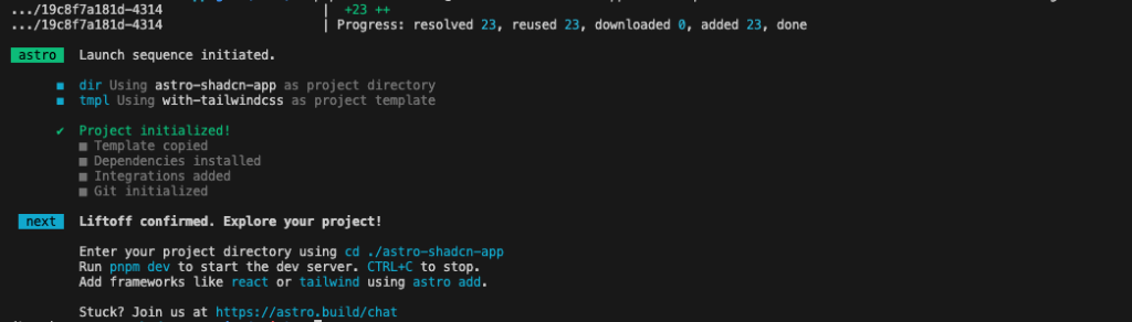
Once installation completes, navigate into your project:
cd astro-shadcn-appNote: This approach avoids one of the most common issues people encounter: a missing Tailwind configuration during shadcn initialization. Check the guide for reference.
Let’s verify everything is set up correctly. Open astro.config.mjs — it should look something like this:
import { defineConfig } from 'astro/config';
import react from '@astrojs/react';
import tailwindcss from '@tailwindcss/vite';

export default defineConfig({
  vite: {
    plugins: [tailwindcss()],
  },
  integrations: [react()],
});
Both React and Tailwind are configured and ready to go. If you created the project a different way and don’t see these integrations, you can add them manually with npx astro add react and npx astro add tailwind.
Configure TypeScript Path Aliases
This is a critical step that many people skip, leading to import errors later. shadcn/ui components use the @/ import alias everywhere:
import { Button } from "@/components/ui/button"Without proper configuration, TypeScript won’t know how to resolve @/, and your imports will fail.
Open your tsconfig.json and add the path alias configuration inside compilerOptions:
{
  "extends": "astro/tsconfigs/strict",
  "compilerOptions": {
    "jsx": "react-jsx",
    "jsxImportSource": "react",
    "baseUrl": ".",
    "paths": {
      "@/*": ["./src/*"]
    }
  }
}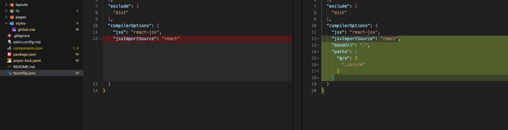
This tells TypeScript that any path starting with @/ should resolve to the src/ directory. Make sure this is configured before running shadcn init in the next step; the CLI validates path aliases as part of its preflight checks.
Initialize shadcn/ui
Here’s where things get interesting, and where a lot of developers hit their first roadblock.
The old package name shadcn-ui is deprecated and no longer maintained. If you try to use it, you’ll see a deprecation warning. The correct package to use now is simply shadcn.
Run this command to initialize shadcn/ui in your project:
pnpm dlx shadcn@latest initOr if you prefer npm:
npx shadcn@latest initThe CLI will prompt you with several questions:
- Which style would you like to use? – Choose “Default” or “New York” (both look great)
- Which color would you like to use as the base color? – Choose from several options like Slate, Gray, Zinc, etc.
- Would you like to use CSS variables for colors? – Choose “yes” (recommended for theming)
For your first project, the defaults work perfectly fine; just press Enter at each prompt. Check the CLI documentation for further info.
Once it finishes, shadcn/ui will have:
- Created
components.json– the config file that tells the CLI where everything lives - Generated
src/lib/utils.tswith thecn()helper function - Updated your global CSS file with theme tokens and CSS variables
- Installed core dependencies like
clsx,tailwind-merge, andclass-variance-authority
The cn() utility that gets generated is used throughout the shadcn/ui components. It looks like this:
import { clsx, type ClassValue } from 'clsx';
import { twMerge } from 'tailwind-merge';

export function cn(...inputs: ClassValue[]) {
  return twMerge(clsx(inputs));
}
This function safely merges Tailwind class names, handling conflicts intelligently. You’ll see it used in every shadcn/ui component.
Add Your First Component
Let’s add the Button component to see the system in action:
pnpm dlx shadcn@latest add buttonThe CLI downloads the component and installs any required dependencies. When it finishes, you’ll find a new file at src/components/ui/button.tsx.
Here’s what makes shadcn/ui special: this is your code now. Open that file and look through it. You’ll see it’s a TypeScript React component using Tailwind CSS and class-variance-authority for variants. You can modify it however you want – change the styles, add new variants, adjust the API. There’s no abstraction layer hiding the implementation.
Want to add more components? Same pattern every time:
pnpm dlx shadcn@latest add card
pnpm dlx shadcn@latest add input
pnpm dlx shadcn@latest add dialog
Or install multiple at once:
pnpm dlx shadcn@latest add button card input dialogBuild a Practical Example
Let’s build something real to see how everything fits together. We’ll create a welcome card that showcases both the Button and Card components.
First, make sure you have both components installed:
pnpm dlx shadcn@latest add button cardNow, create a new React component at src/components/WelcomeCard.tsx:
import { Button } from '@/components/ui/button';
import {
  Card,
  CardContent,
  CardDescription,
  CardFooter,
  CardHeader,
  CardTitle,
} from '@/components/ui/card';

export default function WelcomeCard() {
  return (
    <Card className="w-full max-w-md">
      <CardHeader>
        <CardTitle>Welcome to Astro + shadcn/ui</CardTitle>
        <CardDescription>
          A powerful combination of performance and beautiful design.
        </CardDescription>
      </CardHeader>
      <CardContent>
        <p className="text-sm text-muted-foreground">
          You're looking at a React component with shadcn/ui styling,
          rendered inside an Astro page. The best of both worlds —
          Astro's performance with React's interactivity exactly where
          you need it.
        </p>
      </CardContent>
      <CardFooter className="flex gap-2">
        <Button>Get Started</Button>
        <Button variant="outline">Learn More</Button>
      </CardFooter>
    </Card>
  );
}
Now let’s use this component in an Astro page. Open src/pages/index.astro and update it:
---
import WelcomeCard from '../components/WelcomeCard';
---

<!DOCTYPE html>
<html lang="en">
  <head>
    <meta charset="utf-8" />
    <meta name="viewport" content="width=device-width" />
    <title>Astro + shadcn/ui</title>
  </head>
  <body>
    <main class="flex min-h-screen items-center justify-center p-8 bg-background">
      <WelcomeCard client:load />
    </main>
  </body>
</html>
Start the development server:
pnpm devOpen http://localhost:4321 in your browser. You should see a beautifully styled card with two buttons. Everything works, looks polished, and is fully accessible.
Notice the client:load directive on the component? That’s crucial, and it’s worth understanding deeply.
Static vs Interactive Components
This is the most important concept when using shadcn/ui in Astro. Astro renders React components as static HTML by default with zero JavaScript. This makes pages fast, but interactive components won’t work without hydration.
Components that work as static HTML:
Badge,Card,Separator,Skeleton,Avatar,Table
Components that need JavaScript (use Radix UI):
Dialog,DropdownMenu,Accordion,Tabs,Switch,Select,Popover,Sheet,Tooltip
To make interactive components work, add a client:* directive:
---
import MyDialog from '../components/MyDialog';
---

<!-- ❌ Won't work - no JavaScript -->
<MyDialog />

<!-- ✅ Works - hydrated with JavaScript -->
<MyDialog client:load />
Hydration directives:
client:load— Load immediately (for critical UI)client:idle— Load when the browser is idleclient:visible— Load when scrolled into view
Rule of thumb: If a component uses Radix UI, it needs a client:* directive.
Working with shadcn/ui Blocks
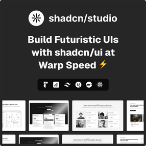
shadcn/ui provides pre-built Block sections. You can also find more shadcn blocks in shadcn/studio layouts, such as dashboards, authentication forms, and Hero Sections.
Shadcn Studio:

This isn’t a traditional component library or a replacement for Shadcn. Instead, it’s a unique collection that offers customizable variants of components, blocks, and templates. Preview, customize, and copy-paste them into your apps with ease.
Building on the solid foundation of the Shadcn components & blocks, we’ve enhanced it with custom-designed components & blocks to give you a head start. This allows you to craft, customize, and ship your projects faster and more efficiently.
Features:
- Open-source: Dive into a growing, community-driven collection of copy-and-paste shadcn UI components, Shadcn blocks, and templates.
- Component & Blocks variants: Access a diverse collection of customizable shadcn UI blocks and component variants to quickly build and style your UI with ease.
- Animated variants with Motion: Add smooth, modern animations to your components, enhancing user experiences with minimal effort.
- Landing pages & Dashboards: Explore 20+ premium & free Shadcn templates for dashboards, landing pages & more. Fully customizable & easy to use.
- shadcn/ui for Figma: Speed up your workflow with Shadcn Figma UI Kit, which consists of components, blocks & templates – a full design library inspired by shadcn/ui.
- Powerful theme generator: Customize your UI instantly with Shadcn Theme Generator. Preview changes in real time and create consistent, on-brand designs faster.
- shadcn/studio MCP: Integrate shadcn MCP Server directly into your favorite IDE and craft stunning shadcn/ui Components, Blocks, and Pages inspired by shadcn/studio.
- Shadcn Figma To Code Plugin: Convert your Figma designs into production-ready code instantly with the Shadcn Figma Plugin.
Installing Blocks in Astro
You can install blocks from both shadcn/ui and shadcn/studio using the CLI:
From shadcn/ui:
pnpm dlx shadcn@latest add dashboard-01From shadcn/studio (using URL):
pnpm dlx shadcn@latest add "<https://shadcnstudio.com/r/blocks/hero-section-41.json>"Important: Understanding What Gets Installed
Here’s where things get tricky. shadcn/ui blocks are primarily structured for Next.js, which uses an app/ directory for routing. Astro doesn’t use this routing structure, so you need to understand which components get installed and which don’t.
When you install a block, the CLI will:
✅ Install all component files into src/components/ui/ or src/components/shadcn-studio/blocks/ — These work fine
❌ Skip page files intended for Next.js routing (inside app/) — these are not installed into Astro
For example, if you install the Dashboard block:
pnpm dlx shadcn@latest add dashboard-01You’ll get all the building blocks:
src/components/ui/sidebar.tsxsrc/components/app-sidebar.tsxsrc/components/nav-main.tsxsrc/components/site-header.tsx- And other sub-components
But you won’t get the main page file:
app/dashboard/page.tsx❌ (not created)
This page file actually assembles all those components into a working dashboard. Without it, you have all the pieces but no complete picture of how to use them together.
The Solution: Manual Adaptation
Since Astro doesn’t use Next.js’s app/ directory structure, you need to manually adapt the page files. Here’s the step-by-step process:
Step 1: Install the block via CLI:
pnpm dlx shadcn@latest add dashboard-01
All the component pieces are now in src/components/ and src/components/ui/.
Step 2: Visit the shadcn/ui blocks page, find your block, and click the code button (</>) to view the source.
Step 3: In the code viewer, look for the page file that assembles the components. It’ll be on a path like app/dashboard/page.tsx. This is the file that wasn’t installed because Astro doesn’t use the app/ directory structure. Copy its contents.
Step 4: Create a folder for assembled page sections in your Astro project:
mkdir -p src/components/sectionsStep 5: Create a new file for this block and paste the code:
touch src/components/sections/dashboard.tsxThe code will look something like this:
import { AppSidebar } from "@/components/app-sidebar"
import { SiteHeader } from "@/components/site-header"
import {
  SidebarInset,
  SidebarProvider,
} from "@/components/ui/sidebar"

export default function DashboardPage() {
  return (
    <SidebarProvider>
      <AppSidebar />
      <SidebarInset>
        <SiteHeader />
        <div className="flex flex-1 flex-col gap-4 p-4">
          <h1 className="text-2xl font-bold">Dashboard</h1>
          {/* Your page content */}
        </div>
      </SidebarInset>
    </SidebarProvider>
  )
}
Step 6: Use it in any Astro page:
---
import DashboardPage from "@/components/sections/dashboard";
---

<!DOCTYPE html>
<html lang="en">
  <head>
    <meta charset="utf-8" />
    <meta name="viewport" content="width=device-width" />
    <title>Dashboard</title>
  </head>
  <body>
    <DashboardPage client:load />
  </body>
</html>
Since dashboard sidebars are interactive (collapsible, keyboard navigable), client:load is the right choice here.
This pattern of keeping assembled layouts in src/components/sections/ and reusable components in src/components/ui/ scales nicely as your project grows.
Practical Example: Hero Section from shadcn/studio
Let’s walk through a real-world example using a block from shadcn/studio. We’ll install the Hero Section 41 — a beautiful, production-ready landing page hero.
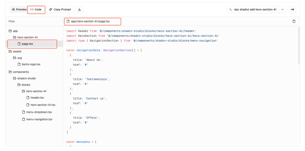
Step 1: Install the hero section block from shadcn/studio:
pnpm dlx shadcn@latest add "<https://shadcnstudio.com/r/blocks/hero-section-41.json>"This will install all the component files into src/components/shadcn-studio/blocks/hero-section-41/ along with any required UI components.
Step 2: The page file (app/page.tsx) is not installed automatically. You need to manually create it. Visit the Shadcn Hero Section blocks.
Find Hero Section 41 and copy the page implementation code to create your src/components/sections/hero.tsx file.
Step 3: Use the hero component in your Astro page with the client:load directive for interactivity.

See the complete implementation in the repository:
This example demonstrates how powerful shadcn/studio is — you get a production-ready, animated hero section in minutes, not hours. The block comes with all the components you need, properly structured and styled. All you have to do is install the block, copy the page assembly code from the shadcn/studio website, and adapt it for Astro by adding client:load directives.
Key takeaway: shadcn/studio dramatically accelerates your development workflow. Instead of building complex UI patterns from scratch, you can leverage battle-tested, professional designs that you fully own and can customize. Explore more marketing UI blocks for landing pages, pricing sections, testimonials, and more.
Building a Complete Shadcn Astro Landing Page
Now that you understand how to work with individual blocks, let’s talk about building a complete Shadcn Astro landing page. A professional landing page typically includes several key sections: hero, features, pricing, testimonials, FAQ, and call-to-action.
The Step-by-Step Approach
You can build your Shadcn Astro landing page by installing blocks one at a time from shadcn/studio:
Step 1: Install blocks one at a time:
pnpm dlx shadcn@latest add "<https://shadcnstudio.com/r/blocks/hero-section-41.json>"
Step 2: Copy the page assembly code from shadcn/studio and create section components in src/components/sections/.
Step 3: Assemble everything in an Astro page:
---
import Hero from '../components/sections/hero';
import Features from '../components/sections/features';
import Pricing from '../components/sections/pricing';
import Testimonials from '../components/sections/testimonials';
---

<html lang="en">
  <head>
    <meta charset="utf-8" />
    <meta name="viewport" content="width=device-width" />
    <title>My Landing Page</title>
  </head>
  <body>
    <Hero client:load />
    <Features client:load />
    <Pricing client:load />
    <Testimonials client:load />
  </body>
</html>
This approach gives you maximum learning and flexibility — you understand exactly how each section works and can customize everything to your needs.
Need a Quick Start?
If you want to launch quickly without building from scratch, we’ve created a production-ready Shadcn Astro landing page template: Bistro Landing Page Template
The template includes:
- ✨ Hero, About, Offers, Testimonials, and Contact sections
- 🧭 Responsive navigation with mobile menu
- 🌓 Light/Dark mode with theme toggle
- ⚡ Fully optimized and production-ready
Browse more templates at Shadcn Templates.
- Live Demo: View Template
- Download: Get Template
- GitHub: Source Code
Common Issues and How to Fix Them
Even with a clean setup, certain issues keep recurring. Here are the most common problems and their solutions.
Issue 1: Using the Deprecated Package
Symptom: You see this warning:
The 'shadcn-ui' package is deprecated. Please use the 'shadcn' package instead.Solution: Always use shadcn (without -ui):
# ❌ Old and deprecated
npx shadcn-ui@latest init

# ✅ Correct
pnpm dlx shadcn@latest init
# or
npx shadcn@latest init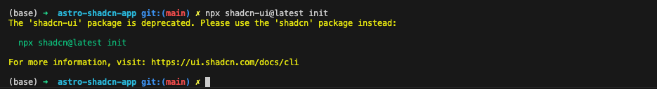
The old package is frozen at v0.9.5 and won’t receive updates.
Issue 2: Path Alias Not Resolving
Symptom: TypeScript errors like Cannot find module '@/components/ui/button' or Module not found.
Solution: Make sure tsconfig.json includes the path alias configuration before running shadcn init:
{
  "compilerOptions": {
    "baseUrl": ".",
    "paths": {
      "@/*": ["./src/*"]
    }
  }
}
After adding this, restart your dev server — Astro picks up tsconfig.json changes on restart, not hot reload.
Issue 3: Components Render Without Styles
Symptom: shadcn/ui components appear as unstyled HTML. Buttons look like browser defaults, spacing is wrong, and colors are missing.
Solution: Check two things:
First, make sure your global CSS is imported. In your layout or page, you should have:
---
import '../styles/global.css';
---Second, verify that your Tailwind config scans .tsx files. Open tailwind.config.mjs (or whatever config file you have) and check the content array:
export default {
  content: ['./src/**/*.{astro,html,js,jsx,md,mdx,ts,tsx}'],
  // ...
}
If .tsx is missing, Tailwind won’t scan your React component files, and those classes get purged from the build.
Issue 4: Components Look Right, But Don’t Work
Symptom: A Dialog button doesn’t open the modal, a DropdownMenu doesn’t expand, a Switch doesn’t toggle.
Solution: The component needs hydration. Add a client:* directive:
<!-- ❌ Static HTML — no JavaScript -->
<MyDialog />

<!-- ✅ Hydrated — fully interactive -->
<MyDialog client:load />
Remember: any component using Radix UI primitives needs JavaScript to function.
Issue 5: Using className in .astro Files
Symptom: You write <div className="..."> in an .astro file, and it doesn’t work.
Solution: Use class instead of className in .astro files:
<!-- ❌ Wrong in .astro files -->
<div className="flex items-center">...</div>

<!-- ✅ Correct in .astro files -->
<div class="flex items-center">...</div>
className is a React convention. In .astro files, use standard HTML attribute names.
Issue 6: Dark Mode Not Working
Symptom: You toggle a .dark class, but the shadcn/ui components don’t respond.
Solution: Ensure your Tailwind config uses class-based dark mode:
export default {
  darkMode: ['class'],
  // ...
};
Check that your global CSS includes the dark mode variables (the CLI adds this automatically):
@layer base {
  :root {
    --background: 0 0% 100%;
    /* ...other light mode variables */
  }

  .dark {
    --background: 222.2 84% 4.9%;
    /* ...other dark mode variables */
  }
}
To toggle dark mode at runtime, create a component that manipulates the class:
function DarkModeToggle() {
  return (
    <button
      onClick={() => document.documentElement.classList.toggle('dark')}
      className="px-4 py-2 rounded-md border"
    >
      Toggle Dark Mode
    </button>
  );
}
Use this component with client:load in your Astro pages.
Issue 7: Block Page Files Missing
Symptom: You install a shadcn/ui block, but the main page that assembles everything is missing.
Solution: This is expected behavior. shadcn/ui blocks use Next.js’s app/ directory structure, which Astro doesn’t have.
Manually copy the page file from the block’s source code on ui.shadcn.com/blocks, paste it into src/components/sections/, and import it into your .astro page with client:load. See the Working with shadcn/ui Blocks section for complete step-by-step instructions.
Production Considerations
When you’re ready to deploy, keep these performance tips in mind:
Minimize JavaScript Hydration
Don’t hydrate entire pages. Keep layouts and content static in Astro, and only hydrate specific interactive components:
---
import Header from '../components/Header.astro';  // Static
import Footer from '../components/Footer.astro';  // Static
import ContactForm from '../components/ContactForm'; // Interactive
---

<Header />
<main>
  <h1>Contact Us</h1>
  <ContactForm client:load />
</main>
<Footer />
Use Lazy Hydration
For below-the-fold interactive components, use client:visible:
<!-- Only loads JavaScript when scrolled into view -->
<Newsletter client:visible />
<CommentsSection client:visible />
Prefer client:idle for Non-Critical UI
For interactive elements that aren’t immediately needed:
<ChatWidget client:idle />
<FeedbackButton client:idle />
Build and Test
Always build for production and test the output:
pnpm build
pnpm preview
Check your bundle sizes and ensure only necessary JavaScript ships to the browser.
Conclusion
Integrating shadcn/ui with Astro gives you a powerful setup: Astro’s performance-first architecture combined with shadcn/ui’s beautiful, accessible component library.
Key takeaways:
- Always use
shadcn@latest(not the deprecatedshadcn-uipackage) - Configure path aliases in
tsconfig.jsonbefore runningshadcn init - Interactive components (using Radix UI) need
client:*directives - When using blocks, manually copy page files into
src/components/sections/ - Use hydration strategically:
client:load,client:idle, orclient:visible
Resources
Tutorial Code: All examples from this article are available at github.com/smitbhalodiya/astro-shadcn-app
git clone <https://github.com/smitbhalodiya/astro-shadcn-app.git>
cd astro-shadcn-app
pnpm install
pnpm dev
Ready-to-Use Template: Need a landing page quickly? Check out our free Astro + shadcn/ui template at shadcnstudio.com/templates
Next Steps
- Explore more components at ui.shadcn.com/docs/components
- Browse blocks at shadcnstudio.com/blocks
- Join the shadcn/ui Discord and Astro Discord
- Try advanced components like Data Tables and Forms
The combination of Astro and shadcn/ui gives you performance by default with a beautiful design. Whether you’re building a marketing site, SaaS application, or documentation portal, this stack provides the tools for fast, accessible, and visually stunning experiences.
Happy building!