Designing in Figma is smooth, collaborative, and fast - but once a design is ready, the next challenge is development. Rebuilding layouts manually in code often takes time and slows down projects.
The shadcn Figma to Code plugin solves this by letting you export your design directly into usable code. It leverages cutting-edge AI models to automatically analyse your Figma frames and generate clean, maintainable React components using shadcn components and Tailwind CSS.
Let’s break down the process step by step.
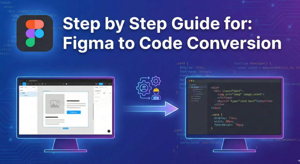
Step-by-Step Guide for: Figma to Code Conversion
Step 1: Setting Up the Plugin
The first step is installation, and it’s very simple:
-
Open your Figma file.
-
Go to the Actions menu (
Ctrl / Command + K). -
Search for “Figma to shadcn by shadcn/studio.”
-
Click Install to add it to your account. The plugin will now appear in the Plugins menu inside Figma.
-
Fill in the required details. You’ll need to:
-
Choose the AI model that will be used for code generation.
-
Provide an API key to enable the model.
-
Once complete, the plugin is ready to run. No external setup is required.
Step 2: Prepare the design for exporting
The quality of your exported code depends heavily on how well your design is structured.
Here’s what to do:
-
Use Frames: Always group related elements into frames. For example, wrap a button’s text and shape together.
-
Name Layers Clearly: Instead of “Rectangle 1” or “Text 4,” use names like “Card Background” or “Button Label.”
-
Keep it Clean: Delete unused layers, hidden drafts, or unnecessary elements that don’t need to be exported.
Now, decide what you want to export:
-
Export full layouts such as pages or sections.
-
Export specific components such as a button, card, or navigation bar.
Once you’ve selected your frame, open the plugin. It will analyse the structure, check the hierarchy, and map the design into code. Within seconds, you’ll see a preview window showing the generated component.
Step 3: Getting the code
Once the plugin finishes generating, you’ll see clean, ready-to-use code.
What you can do next:
-
Copy the code directly from the plugin.
-
Paste it into your project inside your code editor.
-
Test and preview the component or page to see how it looks in action.
The code output is structured, so developers can easily integrate it into existing projects. Designers on the other hand, can use it for quick experiments without needing to dive deep into frameworks. The design-to-code gap is eliminated. What you saw in Figma is exactly what you get in the output.
shadcn/studio - An Extensive Library of Shadcn Components, Blocks, & Templates
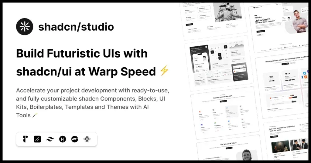
This isn’t a traditional component library or a replacement for Shadcn. Instead, it’s a unique collection that offers customizable variants of components, blocks, and templates. Preview, customize, and copy-paste them into your apps with ease.
Building on the solid foundation of the Shadcn components & blocks, we’ve enhanced it with custom-designed components & blocks to give you a head start. This allows you to craft, customize, and ship your projects faster and more efficiently.
Features:
-
Open-source: Dive into a growing, community-driven collection of copy-and-paste shadcn ui components, shadcn blocks, and templates.
-
Component & Blocks variants: Access a diverse, collection of customizable shadcn blocks and component variants to quickly build and style your UI with ease.
-
Animated variants with Motion: Add smooth, modern animations to your components, enhancing user experiences with minimal effort.
-
Landing pages & Dashboards: Explore 20+ premium & free Shadcn templates for dashboards, landing pages & more. Fully customizable & easy to use.
-
shadcn/ui for Figma: Speed up your workflow with Shadcn Figma UI components, blocks & templates — a full design library inspired by shadcn/ui.
-
Powerful theme generator: Customize your UI instantly with Shadcn Theme Generator. Preview changes in real time and create consistent, on-brand designs faster.
-
shadcn/studio MCP: Integrate shadcn/studio MCP Server directly into your favorite IDE and craft stunning shadcn/ui Components, Blocks, and Pages inspired by shadcn/studio.
Other features you can use
The plugin isn’t limited to basic export. It comes with powerful features that make the workflow even smoother:
1. Command Line Interface (CLI)
The CLI allows you to work outside of the Figma UI and run exports directly from the command line. This is especially useful for:
-
Batch Exporting: Convert multiple frames or components at once.
-
Automation: Integrate design-to-code into continuous integration (CI) pipelines.
-
Scaling Workflows: Larger teams can generate code in bulk without relying on individual manual exports.
Example scenario: When a design team finalizes a library of components. Instead of exporting each one manually, the CLI can process the entire library in a single command. This ensures speed and consistency.
2. Integration with v0
The plugin integrates with v0.dev, which adds an AI-powered layer on top of the export process. With v0, you can:
-
Adapt Components Quickly: Modify styling or structure without rebuilding from scratch.
-
Enhance Flexibility: Designers can iterate faster by experimenting with alternative outputs.
Example scenario: You export a card component but want to see alternative layouts (with image on top vs. side, different text arrangements). v0 can generate those variations instantly, saving hours of manual tweaking.
3. Theme Management
Theme management ensures that your Figma design tokens and your project’s codebase always stay aligned. Instead of manually updating colors, typography, or spacing across two systems, you can link them together through variables.
Here’s how it works:
-
Define Variables in Figma
-
Open Variables in Figma.
-
Create tokens for colors, typography, and spacing instead of using raw values.
-
-
Apply Variables to Your Design
- Assign these tokens to elements (buttons, backgrounds, text, etc.) so styles remain consistent.
-
Export to Code
-
When you run the plugin, variables are mapped to Tailwind or shadcn tokens.
-
Export them as a config file (
tailwind.config.jsor theme JSON) for your codebase.
-
-
Import an Existing Theme
-
Already have a theme in your project? Import it into Figma through the plugin.
-
This pulls in Tailwind/shadcn tokens so you can design with the exact same values used in code.
-
-
Keep in Sync
-
Any time changes are made, re-run the import/export process.
-
This two-way sync ensures both design and code evolve together without breaking consistency.
-
4. Registry Integration
-
The plugin works with shadcn/ui’s component registry.
-
This ensures your exported code is compatible with a library of prebuilt UI components, making it easier to maintain consistency.
Together, these features make the plugin more than just a one-click export tool—it’s part of a complete design-to-development workflow.
Tips for your design
To get the cleanest and most accurate code output, follow these practical tips:
-
Design with Components in Mind
-
Think of your design in building blocks.
-
A button, a card, a navbar—these should be grouped and consistent, so they export as reusable code.
-
-
Use Figma Styles
-
Apply text styles and color styles.
-
This ensures your exported code uses consistent design tokens instead of hard-coded values.
-
-
Keep Layouts Simple
-
Overly complex or nested shapes can confuse the export process.
-
Stick to clean, structured layouts.
-
-
Collaborate with Developers
- Share exported components with developers to confirm structure and integration.
-
Preview Regularly
-
After exporting, paste the code into your project and check it.
-
Fix small issues early rather than at the end.
-
Conclusion
Design-to-code workflows are becoming a core part of modern product development. Instead of treating design and engineering as separate phases, tools like the Figma to shadcn plugin allow both to work in parallel.
By following a structured approach, you can move from concept to code with minimal friction. Features like the CLI and v0 integration extend this even further, making it possible to automate workflows and experiment with AI-assisted variations. also for more learning about plug-ins, you can check this documentation.
The takeaway is simple: with the right preparation and tools, your Figma designs don’t just stay static mockups, they become production-ready components that bridge the gap between creativity and code.