When building modern React applications, developers often face a critical decision: Which UI library should I use? Two strong contenders today are Shadcn UI and Material UI (MUI). While both provide a robust set of components, their philosophy, implementation, and developer experience differ significantly.
This article dives deep into Shadcn vs Material UI, comparing their approach, strengths, and trade-offs. We’ll also look at a real-world example to illustrate why developers increasingly prefer Shadcn UI for flexibility and modern workflows.
What Is Material UI (MUI)?
Material UI (commonly called MUI) is one of the most popular React component libraries, built on Google’s Material Design system. It offers a wide range of production-ready components such as buttons, dialogs, forms, grids, and advanced UI widgets (DataGrid, Date Pickers, Charts).
-
Approach: Pre-built React components that you import directly from the package.
-
Styling: Uses Emotion / styled engine (
@mui/system) with theme customization. -
Ecosystem: Mature, with strong community support and advanced extensions.
-
Best For: Teams that want fast prototyping and are comfortable with Material Design principles.
Key Features:
-
Rich Component Library:- Buttons, forms, dialogs, grids, and advanced widgets.
-
Material Design Compliance:- – Follows Google’s Material Design standards.
-
Theming System:- Centralized theming for colors, typography, and responsive breakpoints.
-
MUI X Extensions:- Premium add-ons like DataGrid, Date Pickers, and Charts.
-
Community Ecosystem:- Large community with plugins, templates, and documentation.
Benefits:
-
Fast Prototyping:- Get production-ready components out of the box.
-
Consistency:- Enforces a unified Material Design look across the app.
-
Accessible Defaults:- ARIA support and keyboard navigation built in.
-
Enterprise-Ready:- Advanced components make it ideal for SaaS and admin dashboards.
-
Lower Learning Curve:- Easier for teams new to React or UI customization.
What Is Shadcn UI?
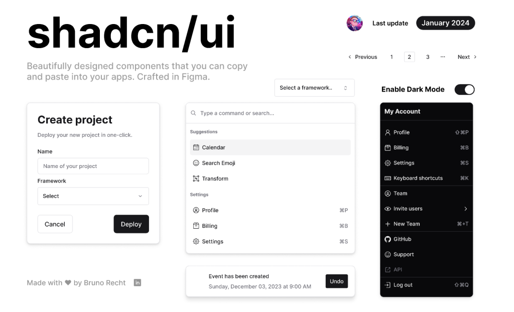
Shadcn UI (shadcn/ui) takes a radically different approach. Instead of shipping components as a closed library, it provides “open code”; you copy component code into your project. The components are built with Radix UI primitives for accessibility and Tailwind CSS for styling.
-
Approach: Components live in your codebase; you own them.
-
Styling: 100% Tailwind CSS, utility-first workflow, theming with design tokens.
-
Accessibility: Powered by Radix primitives, ensuring ARIA support and keyboard navigation.
-
Best For: Developers who want complete control over design and logic, especially when building custom design systems.
Key Features:
-
Copy & Own Model – Components are installed into your project, not hidden in node_modules.
-
Tailwind CSS Integration – Utility-first styling for rapid, consistent, and modern UI.
-
Radix UI Primitives – Ensures accessibility, focus management, and keyboard navigation.
-
Composable APIs – Predictable structure makes components easy to extend.
-
Minimal Bundle Size – Only include what you actually copy into your repo.
Benefits:
-
Full Control – Modify structure, logic, or styling without hitting library limits.
-
Scalable Design Systems – Build your own design language on top of Shadcn.
-
Future-Proof – You’re not tied to library releases; your code is your own.
-
Perfect for Tailwind Teams – Seamless alignment with utility-first workflows.
-
Custom Branding – Easily apply brand-specific tokens, themes, and styles.
Shadcn vs Material UI: Side-by-Side Comparison
| Feature | Shadcn UI | Material UI (MUI) |
|---|---|---|
| Philosophy | Open-source “copy & own” model — components are yours to customize | Closed library model — import and configure prebuilt components |
| Styling | Tailwind CSS (utility-first, highly customizable) | Emotion / styled engine with Material Design theme defaults |
| Accessibility | Built on Radix primitives (robust ARIA, focus, keyboard handling) | Accessible defaults baked into MUI components |
| Updates | You update manually (since components live in your repo) | Automatic updates via npm package upgrades |
| Flexibility | Full control over structure, logic, and design | Limited to props, overrides, and theme customization |
| Ecosystem | Newer, smaller ecosystem but growing fast | Mature ecosystem with DataGrid, Charts, Pickers, etc. |
| Bundle Size | Minimal — you only import what you copy | Larger — depends on installed components, but tree-shakable |
| Learning Curve | Higher (you need to be comfortable editing component code) | Lower (plug-and-play with Material defaults) |
Code Example: Why Shadcn UI Is More Flexible
Let’s compare creating a simple Button in both libraries.
MUI Button
import Button from "@mui/material/Button";

export default function App() {
  return (
    <Button variant="contained" color="primary">
      Click Me
    </Button>
  );
}-
Quick to set up
-
Limited flexibility — you work within predefined variants and styles
-
Deep customization often requires overrides or theme hacks
Shadcn UI Button
// button.tsx (copied into your repo)
import { cn } from "@/lib/utils";

export function Button({ className, ...props }) {
  return (
    <button
      className={cn(
        "bg-primary hover:bg-primary/90 inline-flex items-center rounded-md px-4 py-2 text-sm font-medium text-white",
        className
      )}
      {...props}
    />
  );
}-
Full control over styling and behavior
-
Easily extendable: add icons, loading states, or ARIA attributes directly
-
Works seamlessly with Tailwind theme tokens
-
Requires slightly more setup initially
Result:
- With Shadcn UI, the Button is not just a black-box component — it’s your code. You can adapt it to fit any design system without fighting overrides.
When to Use Shadcn UI vs Material UI
Use Shadcn UI if:
-
You already use Tailwind CSS.
-
You’re building a custom design system or brand-specific UI.
-
You want absolute control over UI internals.
-
You prefer owning your code instead of relying on external updates.
Use Material UI (MUI) if:
-
You need enterprise-ready, production-tested components quickly.
-
You want advanced widgets like DataGrid or DatePicker without building them yourself.
-
You’re okay working within the Material Design aesthetic.
-
Your team values fast onboarding with minimal configuration.
Talking about React, you can consider using a state management tool like nuqs, which is an awesome typesafe search params state manager.
Shadcn Studio: Extending the Shadcn Ecosystem
While Shadcn UI provides the foundation, developers often want ready-to-use resources to move faster. That’s where Shadcn Studio comes in — a comprehensive ecosystem built on top of Shadcn UI.
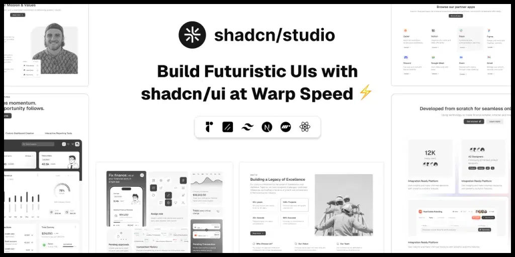
It offers everything needed to design, build, and scale modern apps with Shadcn components:
-
1000+ Shadcn Components Variants – Pre-styled, accessible components you can copy and extend.
-
550+ Shadcn Blocks – Ready-made sections like hero banners, pricing tables, and dashboards.
-
Shadcn MCP Server – Bring AI-assisted workflows into your IDE for component generation.
-
Shadcn Figma UI Kit – A complete design system for Figma that mirrors Shadcn components.
-
AI-Powered Shadcn Theme Generator – Instantly create accessible themes in light/dark mode.
-
Shadcn Templates & Landing Pages – Production-ready templates to kickstart projects.
With Shadcn Studio, developers can bridge the gap between raw flexibility and rapid development, without losing ownership of their code.
Conclusion: Shadcn vs MUI
Both Shadcn UI and Material UI are excellent choices for React developers, but they serve different philosophies.
-
Material UI is great for teams that want speed, stability, and ready-made solutions aligned with Google’s Material Design.
-
Shadcn UI is ideal for developers who prioritize flexibility, customization, and modern Tailwind workflows.
If you’re building a product that needs to stand out visually or evolve into a scalable design system, Shadcn UI is often the better choice. It gives you freedom without locking you into predefined patterns; your UI remains truly yours.